Learn how you can Unlock Limitless Customer Lifetime Value with CleverTap’s All-in-One Customer Engagement Platform.
Attracting and keeping users engaged is crucial for growing your app. Even more, it’s important to stay competitive in a space that is always growing. Whether you’re in the hospitality, Fintech, or entertainment space, techniques such as app onboarding prove to be effective when it comes to the success of your app.
With proper app onboarding, user retention rates have been seen to increase by 50%.* So, how do you deliver an intuitive onboarding experience that educates new users on the essential mechanics of your app, sells them on its value, and gets them to experience its benefits as fast as possible?
Let’s jump in!
Stepping back, let’s quickly define app onboarding. App onboarding is the first point of contact a user has with an app and is the most critical phase in the user’s experience.
Essentially, the app onboarding process is the user’s first impression of the app — if it’s designed correctly, the user will be more likely to come back. 25% of users quit an app after one use and 77% of users drop an app just 72 hours after download.*
App onboarding success is crucial for users as it helps establish the tone of your app and builds on the user’s interest. Your first-time user experience needs to achieve three main goals:
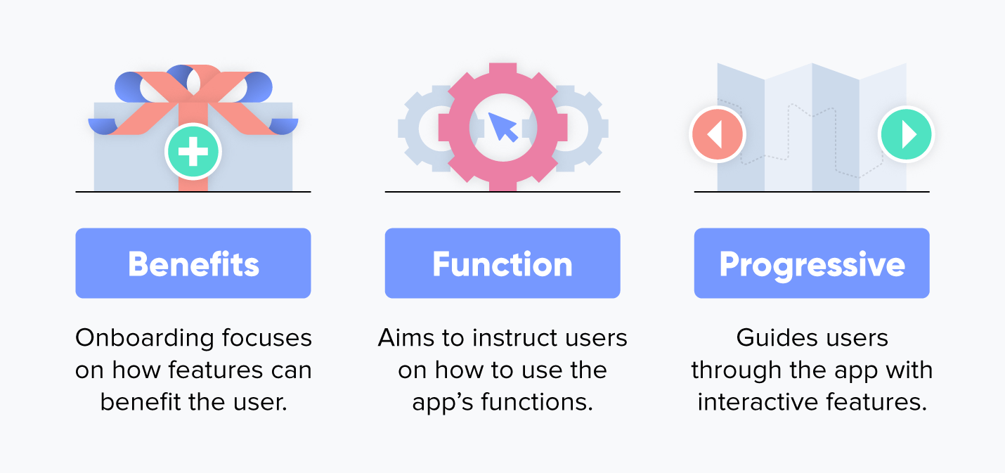
There are many different types of app onboarding, which can make choosing the best strategy tricky. Explore these three most common types of app onboarding to decide which is the most suitable for your app.
Benefits onboarding, or feature promotion, highlights the benefits of your app and how it can improve your users’ lives. The goal of using the benefits method is to boost your conversion rate by encouraging more people to use your platform. This type of onboarding also allows you to describe what the app does rather than the mechanics of how to use it.
This type of app onboarding shows users the common functions of your app. Function-based approaches, also known as instructional-based, also dive deeper into how these functions accomplish the goals of the app. Usually a demo video is added so that new users can see how the app’s UI will function.
Progressive onboarding shows more complex workflows in your app. This typically includes gesture-driven interactions and new information that pops up as the user navigates through the various steps of onboarding.
If you’re looking for a strategy to boost engagement on your app, here are some best practices to follow when implementing a successful onboarding structure.
72% of users say completing the app onboarding process in less than a minute is an important factor in their decision to keep using an app.*
Achieve that first impression — and boost user retention rates — by making the app onboarding process as quick and easy as possible.
For example, only ask for essential personal details and permissions, and stick to the key features and UI elements that are absolutely necessary to help users experience the app’s value.
For instance, a movie ticketing app should request location access (and explain that it’s needed to find nearby theaters and showtimes), but skip requesting access to camera or contacts. You can always introduce additional aspects like connecting social networks or enrolling in a rewards program in later sessions, or highlight them in welcome emails.
You should also aim to use fewer words — stick to the point to keep the user engaged. Keep the first user experience simple, and don’t ask for more than you need.
Not everyone wants to be handheld through the onboarding process. Tech-savvy users in particular may want to dive right in and explore the app themselves, without sitting through the grand tour.
In fact, music video streaming app Vevo found that adding a skip option to their onboarding flow increased logins by nearly 10%, and the number of successful sign-ups jumped by almost 6%.*
When you A/B test your onboarding flow, consider running an experiment that allows users to skip the entire process (or portions of it) to see what performs best for your particular user base.
There’s been some debate* recently about whether you should pre-prompt for push notifications, but we’ve seen that giving users an idea of exactly what they’re signing up for does boost opt-in rates.
In fact, a recent study by B2B research company Clutch* backs us up: 82% of users say it’s somewhat to very important to know why an app is asking for information like device permissions, payment info, or personal details. That’s more than 4 out of 5 mobile app users.
Every one of your users downloads your app for a reason. Your onboarding process needs to show that you’ll meet their expectations. In fact, one of the biggest reasons new users churn is apps not living up.
Whether your onboarding flow is a product walkthrough, new user registration, or feature carousel, keep the focus on benefits, not features.
Another effective way to get people who download your app to keep using it is to offer them something valuable for completing simple onboarding tasks, whether it’s filling out a profile, choosing a paid subscription, or making a first purchase.
Incentives could be in-app currency or rewards points, a free shipping or promo code, or access to exclusive features or content.
Are you looking for a streamlined way to speed up the process of new users discovering your app’s core value? Let them jump right in and experience it before asking them to sign up or taking them on a product tour.
Consider Airbnb — users can browse listings and available dates, and are only asked to sign up when they’re ready to actually book a trip.
By letting users see what your app has to offer, they know what completing the onboarding or sign up process is worth to them.
Onboarding users doesn’t happen just inside your app. You need to engage new users on multiple channels to bring them back to your app and encourage them to explore.
Complementary welcome emails, push notifications, and in-app messages should work together to help users experience the app’s core value and nudge them to complete the onboarding process.
Send personalized messages based on what users have already done in your app to encourage them to take the next step, like completing a registration, interacting with other users, or consuming personalized content.
No matter the channel, all your onboarding messages should be simple and direct with an obvious call-to-action. Don’t spam users with dozens of user engagement messages, and don’t try to cover every feature or benefit in a single email.
Users are unpredictable — and they’re not all the same.
Every user base and app vertical is different. As a smart mobile marketer, you understand the importance of continually A/B testing the onboarding experience to find what works for your users.
In addition to onboarding best practices, use these app onboarding examples from today’s hottest apps as inspiration to successfully activate and retain new users.
When Facebook acquired WhatsApp for a jaw-dropping $19 billion in 2014, it had 450 million MAUs. As of February 2020, the app has grown to 2 billion MAUs, with over 50 billion messages sent per day.
According to CEO Jan Koum,* the foundation for that growth is the app’s simplicity, reliability, and security — and all three values are highlighted in the WhatsApp onboarding flow.
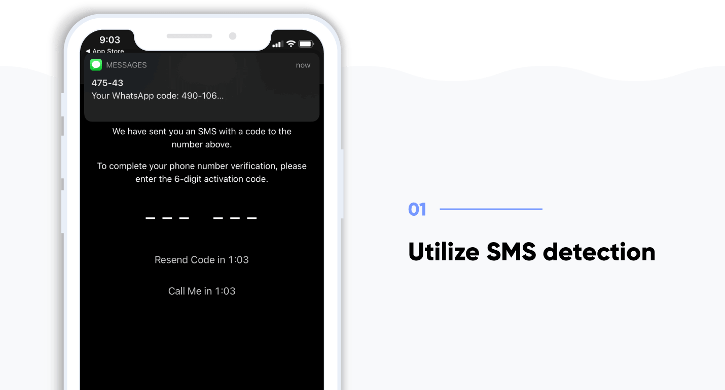
WhatsApp automatically detects SMS to simplify phone verification, so that users don’t have to leave the app to dig through their messages for a code to enter. This makes onboarding fast, provides an excellent new user experience, and makes it less likely that users will get distracted by something outside the app and forget to complete the onboarding flow.
Takeaway: Simplify sign-up with SMS detection.
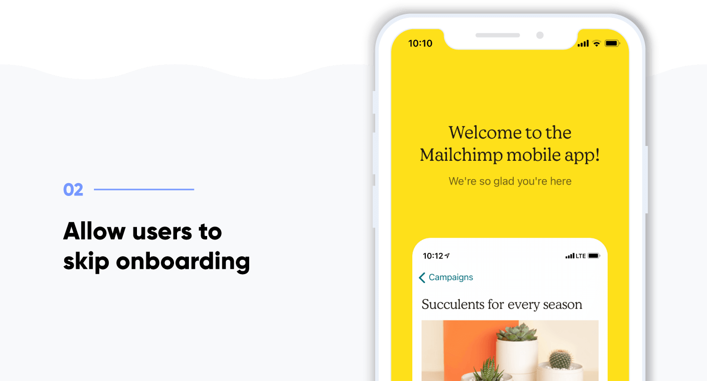
Many apps that offer a skip option do so at the very beginning of the onboarding flow with a “Skip the tour” button. Mailchimp’s onboarding ux gives users the option on every screen.
This puts the user in the driver’s seat, so they can leave the onboarding flow as soon as they feel they’re ready to use the app. And it gives them an essential “out” if they get bored or frustrated with the onboarding flow — instead of closing the entire app, they just exit the onboarding process.
Takeaway: Give the user options by adding a “Skip the tour” button.
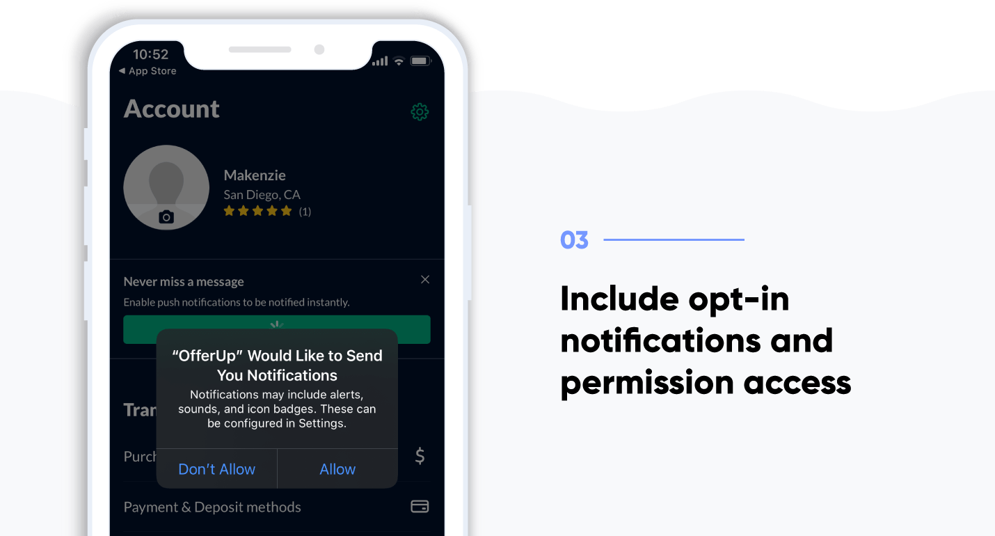
OfferUp, an app that makes it easy to buy and sell used items, focuses on streamlining the selling process and by giving users a convenient way to message potential buyers and sellers.
Essential to each of those goals is convincing new users to opt-in to critical permissions, including camera access and message notifications.
But instead of asking for too much too fast, OfferUp sets up a logical reason to opt-in to notifications: get a convenient alert as soon as someone expresses interest in buying your stuff.
Takeaway: Convince users to opt-in notifications and permissions.

Venmo, a mobile payment powerhouse, immediately communicates its core value of quickly and conveniently sharing payments with friends, and offers powerful social proof, in one cleverly-designed welcome screen.
The very first thing new users see upon first-time app launch is a live feed of Venmo transactions. It’s a smart way to showcase all the varied uses for the app — and how popular it is. The app processed $9.4 billion in payments in the third quarter of 2017, a 93% year-over-year increase.*
Takeaway: Communicate your core value right away on your onboarding welcome screen.

The food delivery branch of ubiquitous ride-hailing app Uber is raking in the dough: as of early 2021, it has more than 66 million active users.*
UberEats succeeds in the crowded delivery market because it knows what users want — fresh food, ASAP — and removes every friction point on the way to placing that first order.
After collecting essential details like user location, the app immediately shows new users restaurants that can deliver food within 30 minutes and displays a prominent $20 off coupon on multiple screens.
The message is clear: get delicious food conveniently delivered, quickly, and save money at the same time.
Takeaway: Make reaching the goal easy for the user without any roadblocks.
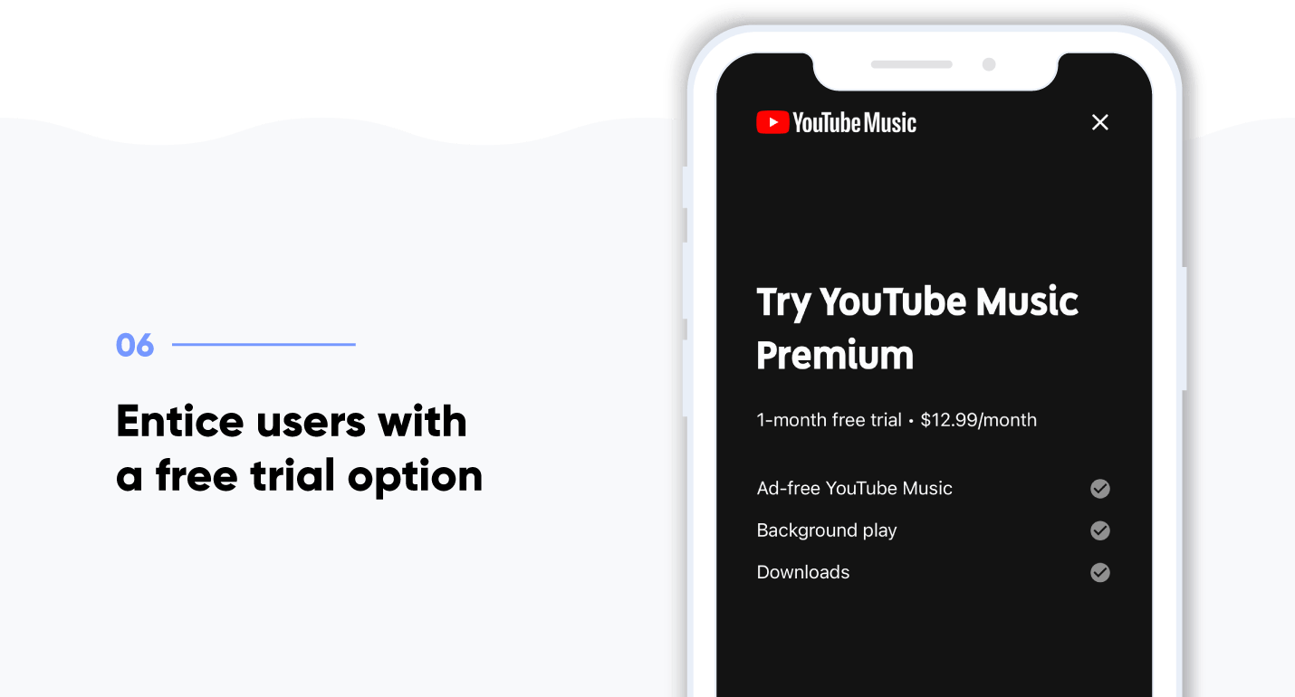
Like Amazon Prime Video, this membership-based music streaming app requires users to create an account and subscribe to the service. Unlike the Amazon app, which simply prompts users to log in or create a new account, YouTube Music features a prominent free trial button.
Takeaway: Consider offering users a free trial on your sign-up screen.
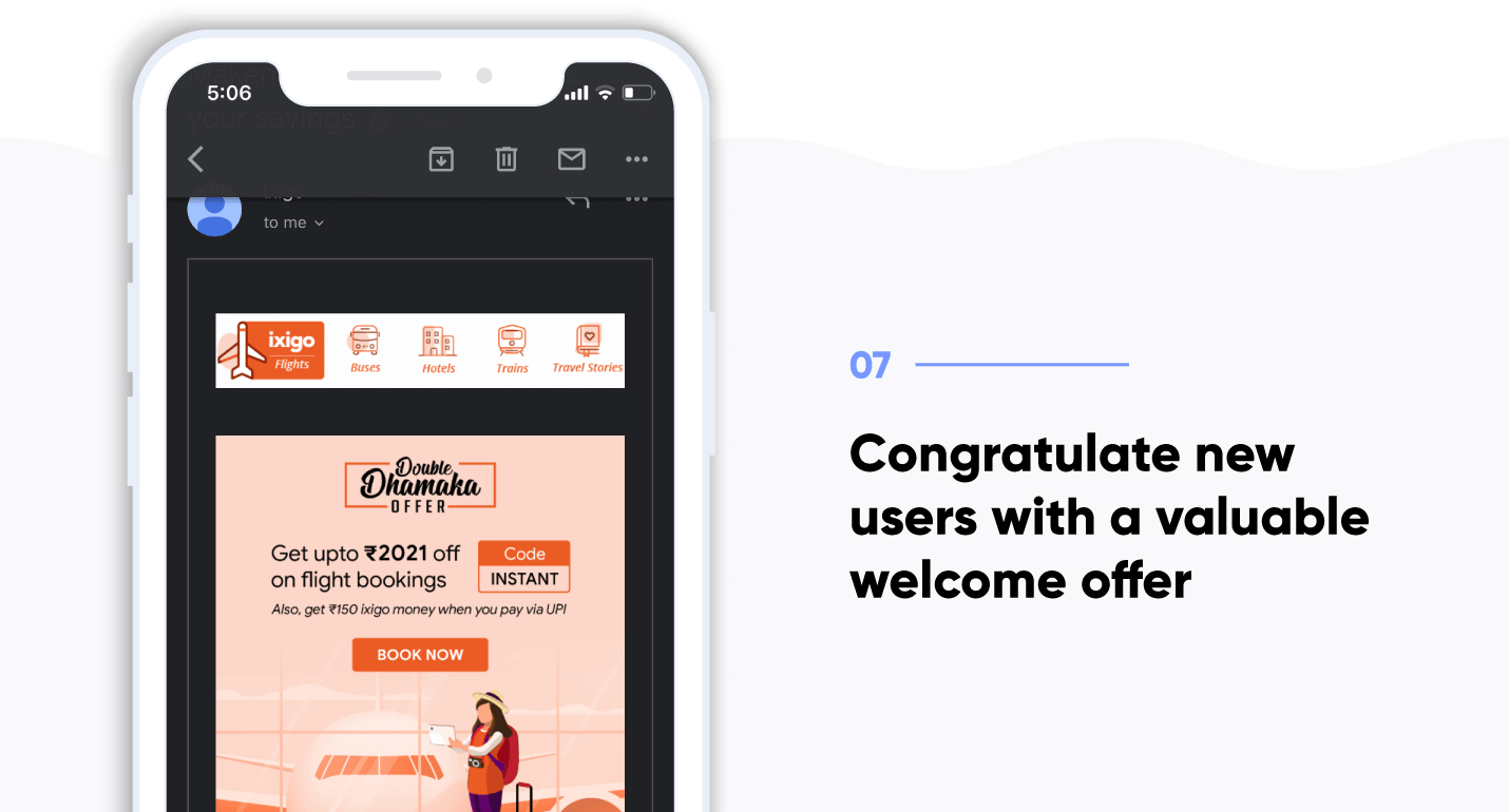
With 30% month-over-month growth and 12 million MAUs, Ixigo is the world’s fastest-growing travel app.* Additionally, they invest heavily in acquiring and activating new users through cost-effective content marketing and app store optimization to fuel that growth.*
To activate new users, Ixigo automatically sends an email within 10 minutes of signing up on the app. Their compelling subject line teasing a welcome gift sees an impressive 54% open rate.
The onboarding email features dynamic visuals and simple, flattering copy that treats signing up as an accomplishment. The entire email is focused on persuading the user to take one action: book their first flight.
Takeaway: Entice users with a sign-up verification email that teases an exciting offer.
App onboarding can take on many forms and can boost user engagement if done right. However, there are a few mistakes to avoid.
The main goal of app onboarding is not only to show the features of your app, but also show how it will benefit the user.
If your app onboarding does not give clear instructions on how to navigate the app, then the user will likely get confused and uninstall. Include a short walkthrough or step-by-step guide, but don’t take up too much space explaining the obvious.
Creativity in your UX is great when it comes to differentiating your app from competitors, but onboarding is one instance where it’s better to keep design simple. New users may become confused and frustrated with your UI and it could impact their ability to navigate the app.
Too much information can overload, confuse, or even bore new users. Worse, it may give the impression that your app is overly complicated. Show them only what they need to get to the first conversion.
Once a user has completed a key step in the onboarding process — completing a profile, uploading their first photo, or creating their first playlist, for example — consider setting up a pop up to celebrate.
Good onboarding requires the right mix of educating users on how to use your app, and selling them on the value you offer.
Want to know if you’re giving your new users the best onboarding experience? Learn how easy it is to successfully onboard and engage users with CleverTap.
See how today’s top brands use CleverTap to drive long-term growth and retention