


Table of Contents
Categories
Most Popular


It’s no secret the shelf life of a mobile app is short. On average, users delete an app just 6 days after download.1 Ouch.
With so much competition vying for their attention, users have no time (or space) to waste on an app they don’t like or know they won’t use.
This is why the first-time user experience is such an important part of retaining users.
What is the First-Time User Experience?
The first-time user experience, often referred to as FTUE, is a user’s first impression of your app.
Once they download and open the app for the first time, what do your users see? Do you offer a quick tour of the app or prompt users to create a profile?
Everything from the colors and images to the calls-to-action and language influence the FTUE, and ultimately, whether your users stay or not. 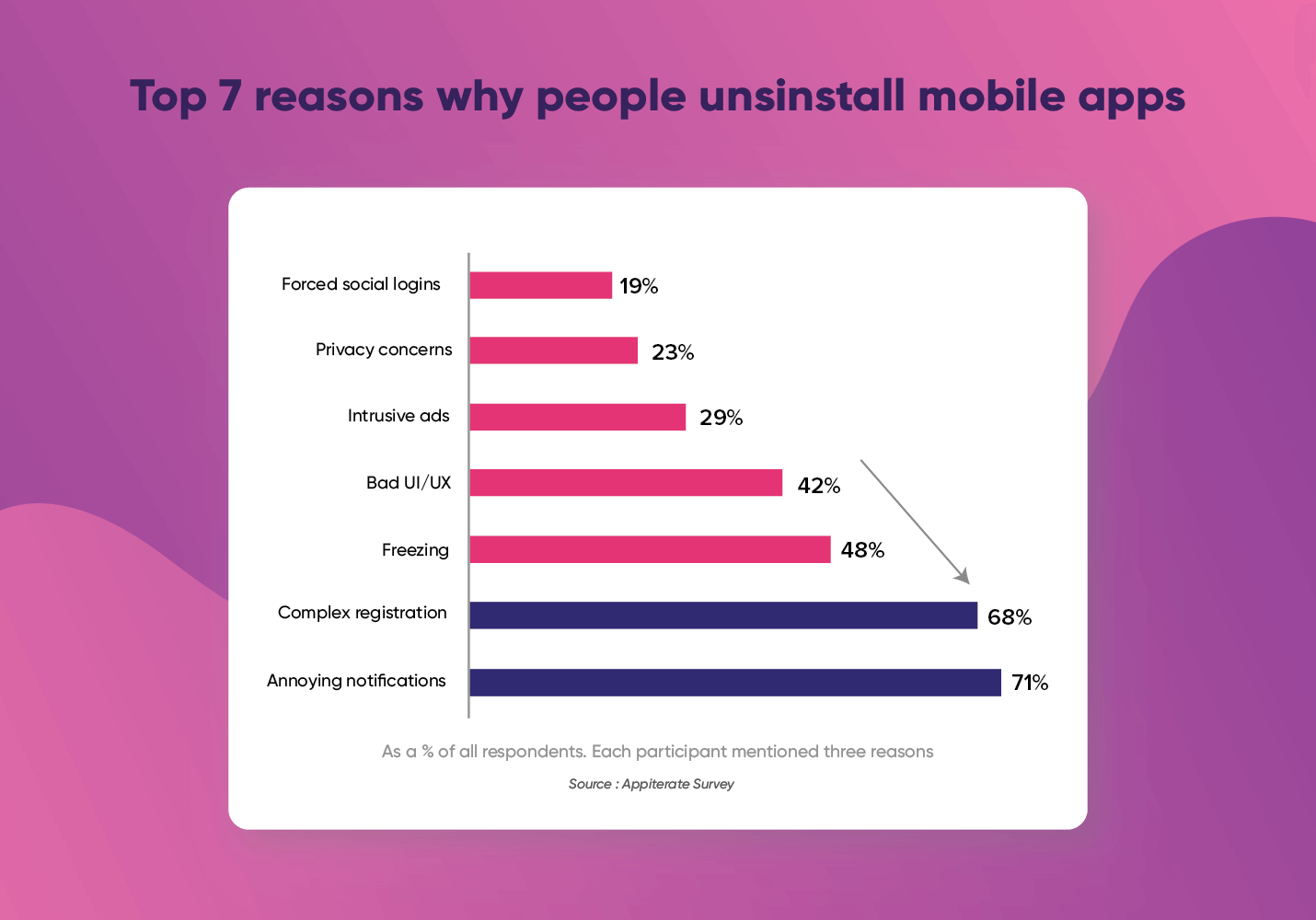
If your FTUE is too ambiguous or complicated, users will leave. Retaining users after the first week is about requesting what you need from the user so you can successfully deliver what they want from your app.
Here are proven first-time user experience best practices (with examples!) that boost user retention:
1. Make it clear what you want them to do
Everyone downloads an app for a reason. Whether it’s to listen to music, have goods delivered, or just to pass the time, users expect to achieve a specific goal when they download your app.
The most successful user onboarding helps users reach their goal by delivering value as soon as possible. 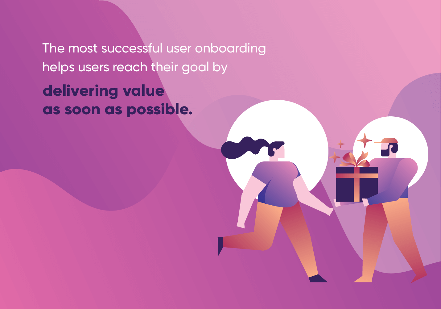
A common mistake apps make during the first-time user experience is requesting personal details like an email address or location access too soon, without giving a reason why they need it. 82% of users say they want apps to provide a clear reason for requesting personal information.2
Instead, think about what personal information your users already know they need to give you.
If you’re a food delivery app, they know they need to provide their address. If you’re a travel app, they know they have to provide you with target destinations and estimated travel dates. Asking for this information up front can help users see value almost instantly.
Example: Instacart
Once downloaded, Instacart gives you a clear and simple action item: enter your zip code. 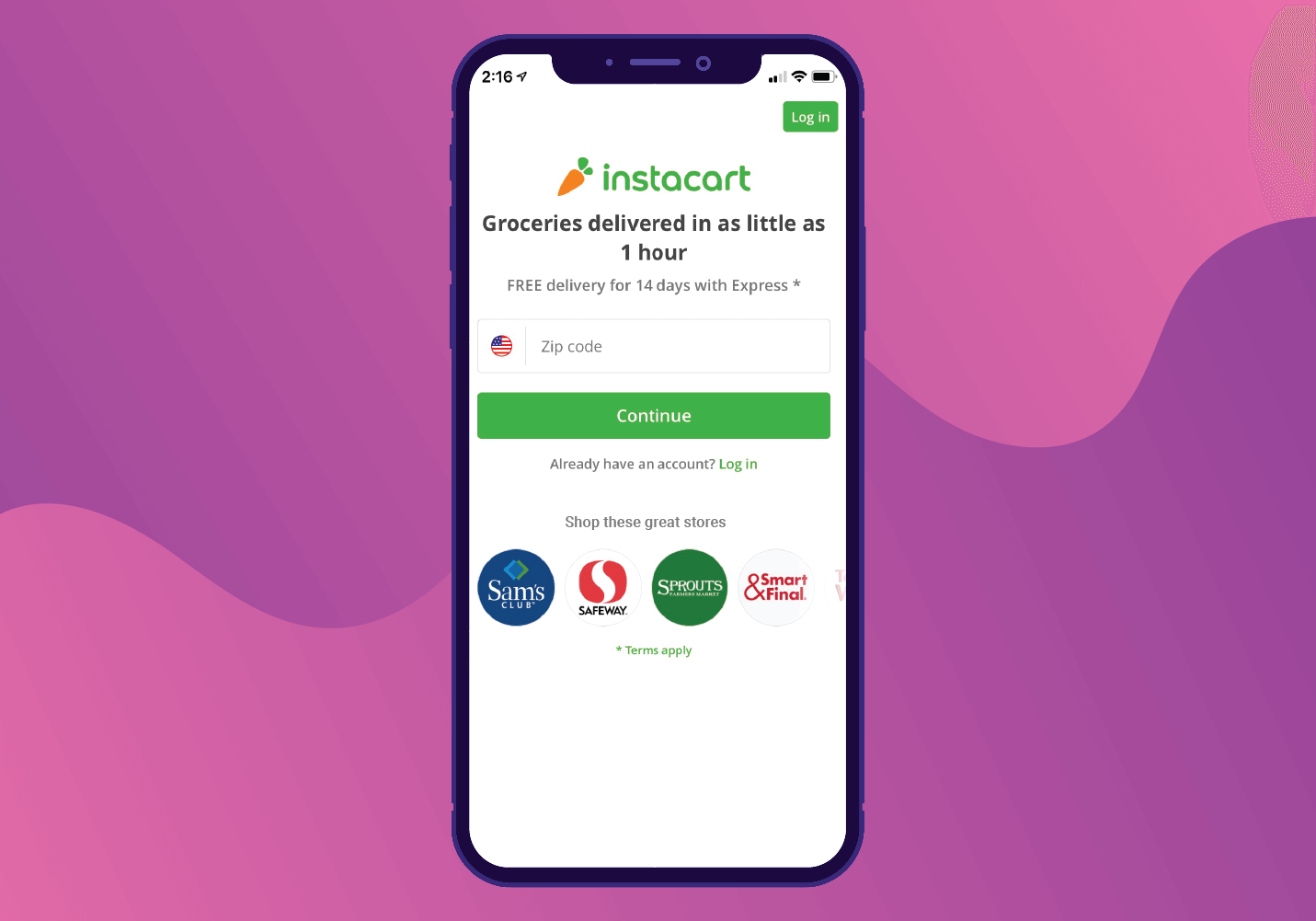
Next, it asks which store you want groceries delivered from today. This encourages further engagement while telling the user the grocery stores that can deliver through the app. 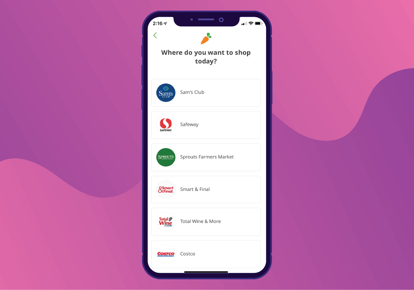
Then, it requests your email and explains why: order updates and receipts. 
2. Get personal
If there’s anything we’ve learned from social media apps like Facebook and Instagram, it’s that users love to share opinions.
Asking for likes and dislikes is one way to engage a new user while further personalizing their experience. Especially for streaming services and content curating apps, having users select their preferences during the onboarding process allows them to choose what they wish to get out of your app.
You can learn more about your user, and they can learn more about the topics they care about. Everyone wins!
Example: Reddit
The first step in their first-time user experience involves selecting your interests. Notice how Reddit doesn’t request any personal information right away. 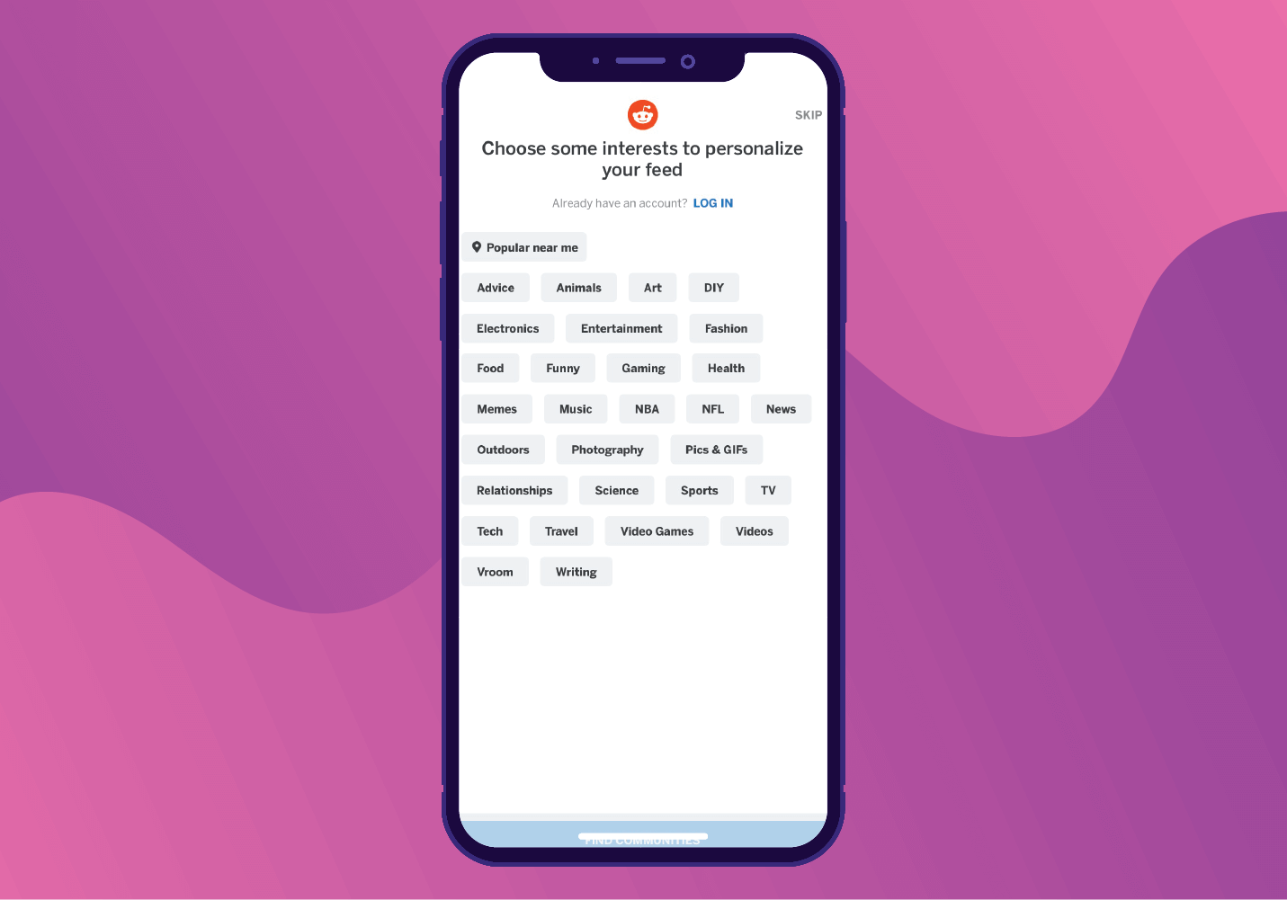
Next, it instantly drops you into a list of suggested communities based on your interests. 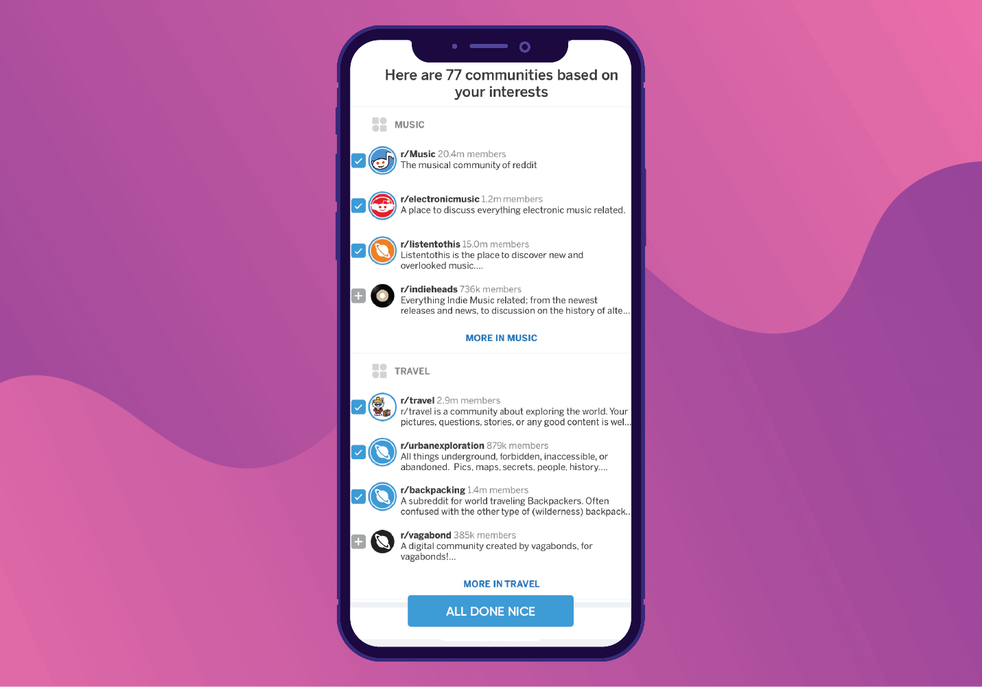
From there it drops you into your personalized news feed. Only when you go to perform an action like share or comment does it ask you to create an account. This prevents users from abandoning the app before seeing value. 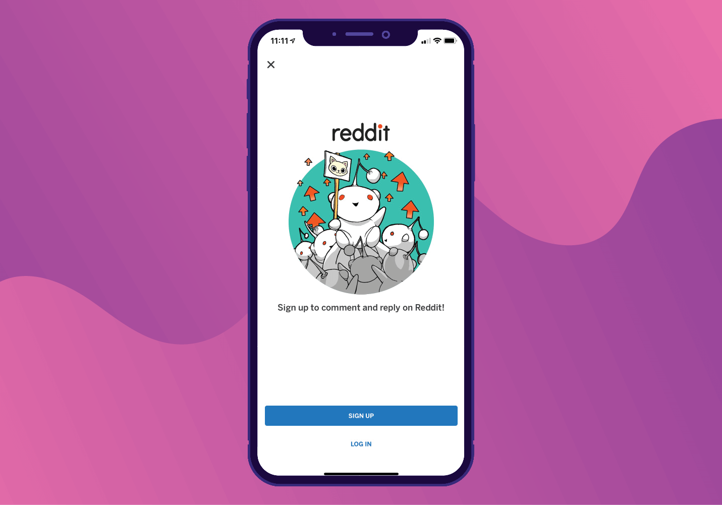
3. Show them what to expect
For some apps, the first-time user experience is about setting expectations with a product tour. This gets the user familiar with the look and feel of the app and helps them assess whether they will actively use it.
This tactic is recommended for apps with a strong UX design and a product experience for a complicated topic, such as banking. If you drop users inside a banking app with complicated terminology and complex UI, users feel overwhelmed.
Example: Clarity Money
On first-time app launch, the app shows you exactly what to expect when you use the app regularly along with samples of the UI. Clear goals and visual examples give the user an overview of the app before they jump in. 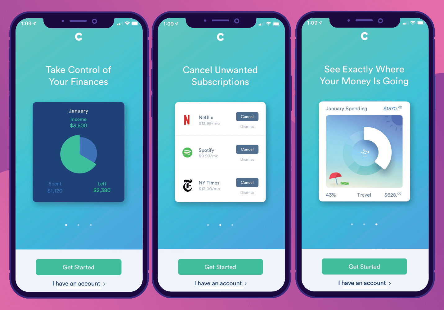
4. Encourage & reward activity
The best first-time user experiences often incentivize users by rewarding them when they complete an action.
According to the Goal Gradient Effect3, people are more intrinsically motivated as they move closer to a goal. For example, people are more likely to contribute to a charitable campaign if it’s close to reaching its goal.4
Profile milestones, checklists, and progress bars are great ways to visualize progress and motivate the user to keep going.
Example: Duolingo
Duolingo’s onboarding flow evaluates the user’s familiarity with a language by quizzing them on simple words. A progress bar shows how close the user is to reaching their next goal and provides encouragement to push them along. 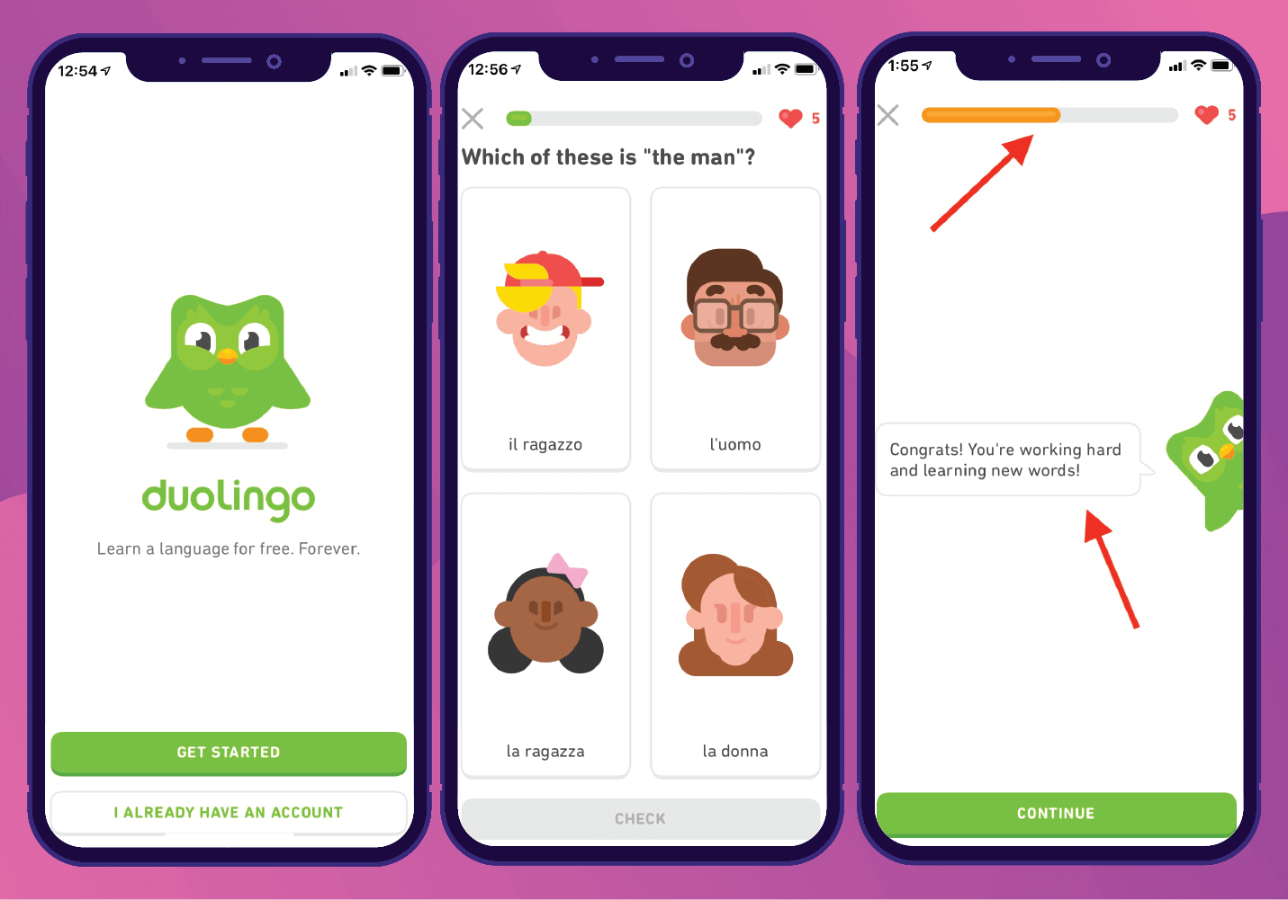
5. Learn what makes them stay… get rid of what doesn’t
Users want to be told what to do when they open your app. If they’re asked to do too much, they get lost and leave.
Tracking engagement helps you spot which actions cause users to drop during the onboarding experience. Are you requesting too much information too soon? Are users adding things to their cart but not buying?
A conversion funnel is a great way to visualize where users are dropping off. Once you define specific stages within the funnel you’d like to see, the conversion funnel shows you how users are progressing through those actions.
Here’s an example of what a conversion funnel looks like in CleverTap: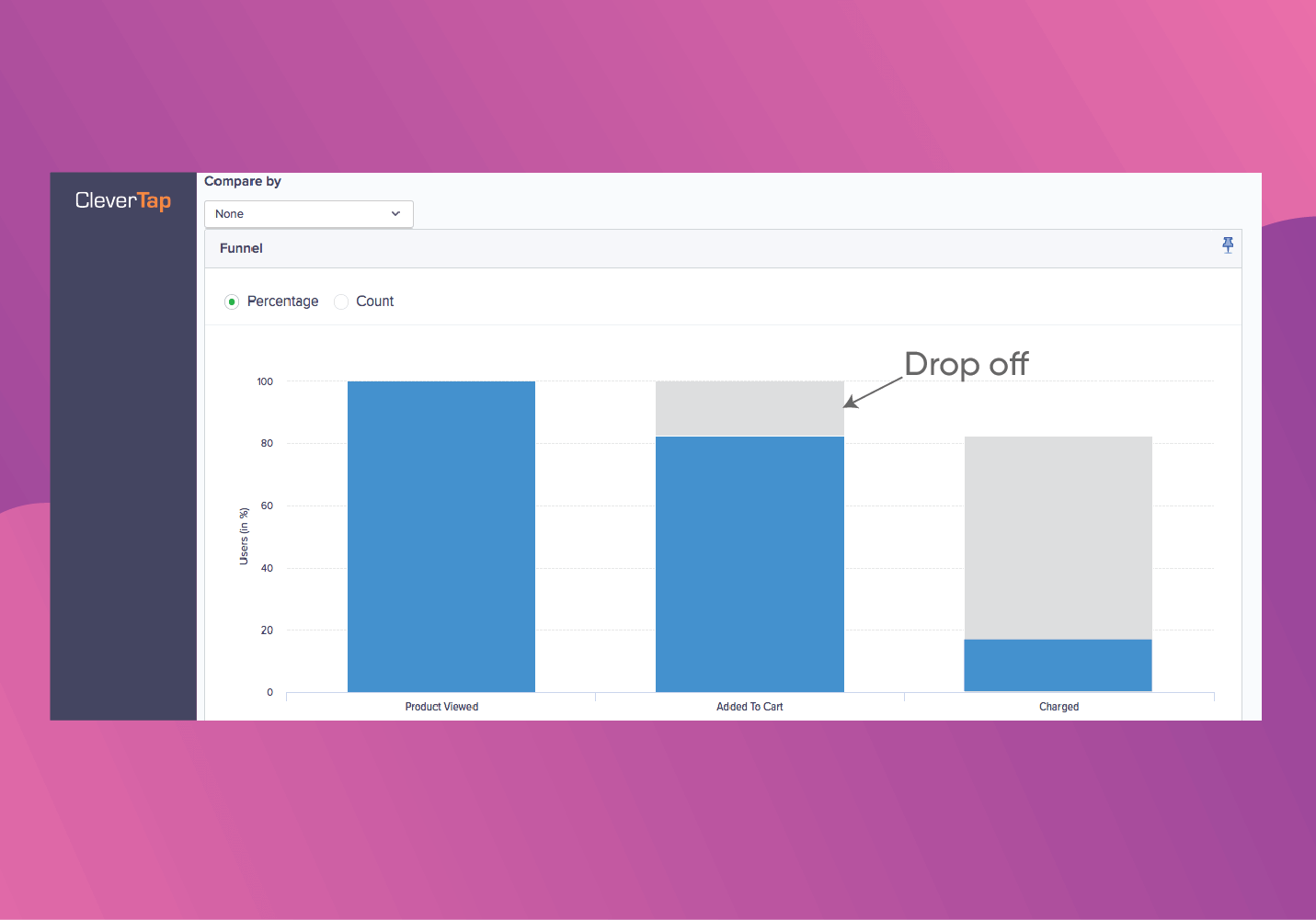
Example: Spotify
With a whopping 26% free-to-paid conversion rate,5 it’s safe to say Spotify has a spectacular first-time user experience.
Once you download the app, you’re prompted to create an account… or just simply link to your Facebook account. 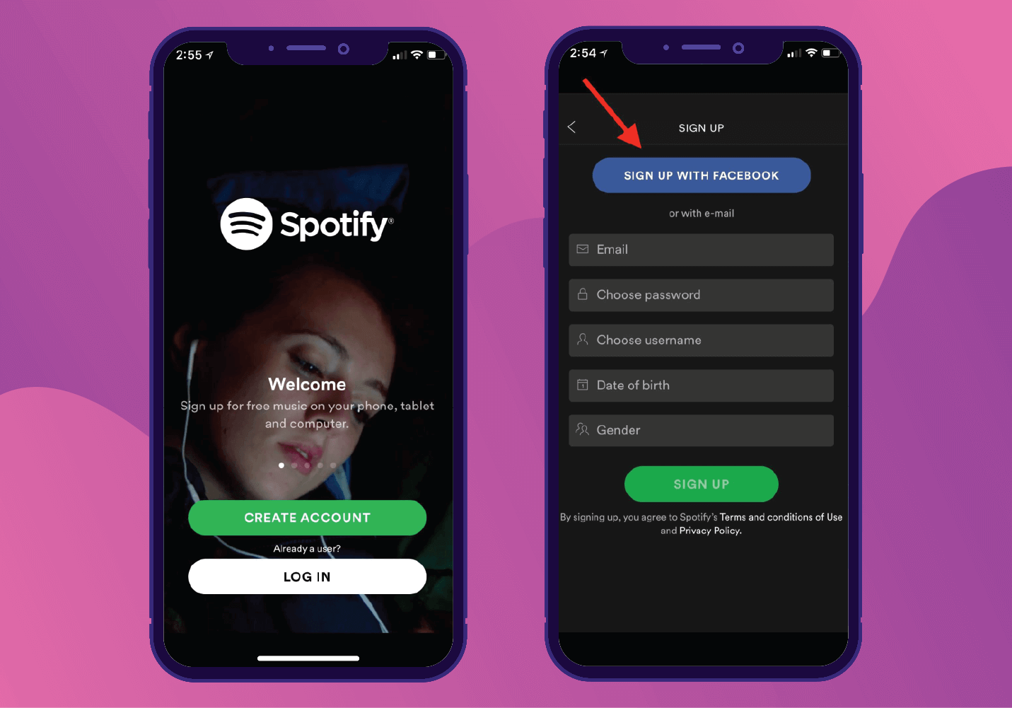
With 80% of mobile users having Facebook accounts, signing up couldn’t be any easier. In fact, apps see a 20% increase in conversions when giving users the option to sign up through Facebook.6
Learn what makes it easy for your users to move through the funnel by understanding which actions matter. If they don’t use it, lose it.
Don’t Make Their First Time the Last Time
The first-time user experience can make or break your app’s success. When executed well, it justifies acquisition costs and boosts retention.
There is no one-size-fits-all answer to what makes the best onboarding experience. What works for one app might not work for another. But learning how to bring value to your users during their first interaction with your brand not only gets them through the door but keeps them coming back.
The Art of Onboarding Mobile App Users
Subharun Mukherjee 
Heads Cross-Functional Marketing.Expert in SaaS Product Marketing, CX & GTM strategies.
Free Customer Engagement Guides
Join our newsletter for actionable tips and proven strategies to grow your business and engage your customers.
