

















































Table of Contents
Categories
Most Popular


In the previous part, we looked at some of the popular tricks for Feature Engineering and got a broad overview of each trick. In this part, we will look at the first three tricks in detail. The examples discussed in this article can be reproduced with the source code and datasets available here.
i) Bringing numerical variables on the same scale
Standardization is a popular pre-processing step in Data Preparation. It is done to bring all the variables on the same scale so that your machine learning algorithms give equal importance to all the variables and do not distinguish based on scale.
Let’s take an example with K-means Clustering, a popular data mining and unsupervised learning technique. We will work with publicly available wine data from the UCI Machine Learning Repository. The dataset contains the results of a chemical analysis of wines grown in a specific area of Italy. Three types of wine are represented in the 178 samples, with the results of 13 chemical analyses recorded for each sample. The sample data set is below:
First 10 Rows
| Type | Alcohol | Malic | Ash | Alcalinity | Magnesium | Phenols | Flavanoids | Nonflavanoids | Proanthocyanins | Color | Hue | Dilution | Proline |
|---|---|---|---|---|---|---|---|---|---|---|---|---|---|
| 1 | 14.23 | 1.71 | 2.43 | 15.6 | 127 | 2.80 | 3.06 | 0.28 | 2.29 | 5.64 | 1.04 | 3.92 | 1065 |
| 1 | 13.20 | 1.78 | 2.14 | 11.2 | 100 | 2.65 | 2.76 | 0.26 | 1.28 | 4.38 | 1.05 | 3.40 | 1050 |
| 1 | 13.16 | 2.36 | 2.67 | 18.6 | 101 | 2.80 | 3.24 | 0.30 | 2.81 | 5.68 | 1.03 | 3.17 | 1185 |
| 1 | 14.37 | 1.95 | 2.50 | 16.8 | 113 | 3.85 | 3.49 | 0.24 | 2.18 | 7.80 | 0.86 | 3.45 | 1480 |
| 1 | 13.24 | 2.59 | 2.87 | 21.0 | 118 | 2.80 | 2.69 | 0.39 | 1.82 | 4.32 | 1.04 | 2.93 | 735 |
| 1 | 14.20 | 1.76 | 2.45 | 15.2 | 112 | 3.27 | 3.39 | 0.34 | 1.97 | 6.75 | 1.05 | 2.85 | 1450 |
| 1 | 14.39 | 1.87 | 2.45 | 14.6 | 96 | 2.50 | 2.52 | 0.30 | 1.98 | 5.25 | 1.02 | 3.58 | 1290 |
| 1 | 14.06 | 2.15 | 2.61 | 17.6 | 121 | 2.60 | 2.51 | 0.31 | 1.25 | 5.05 | 1.06 | 3.58 | 1295 |
| 1 | 14.83 | 1.64 | 2.17 | 14.0 | 97 | 2.80 | 2.98 | 0.29 | 1.98 | 5.20 | 1.08 | 2.85 | 1045 |
| 1 | 13.86 | 1.35 | 2.27 | 16.0 | 98 | 2.98 | 3.15 | 0.22 | 1.85 | 7.22 | 1.01 | 3.55 | 1045 |
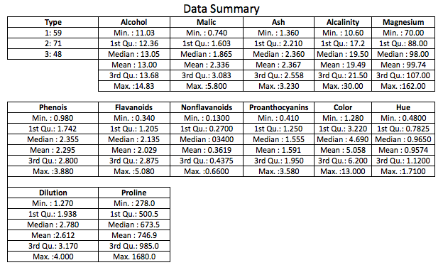
As can be observed from the summary, the variables aren’t on the same scale. In order to identify the 3 types of wine (see ‘Type’), we will cluster the data using K-means clustering, with and without bringing the variables on the same scale.
A wide variety of indices have been proposed to find the optimal number of clusters in partitioning the data during the clustering process. We will use NbClust, a popular package in R that provides up to 30 indices for determining the ideal number of clusters, given a range of clusters. The cluster that is chosen by the maximum number of indices will be the ideal cluster size. We shall iterate between 2 and 15 and select the ideal cluster number with the help of NbClust.
Without Standardization
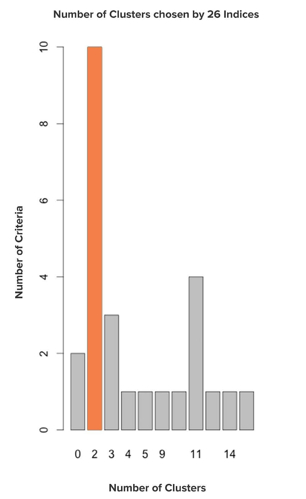
Based on the above graph, 2 clusters is the ideal cluster number among all the clusters provided since the majority of the indices have proposed ‘2’. But, from the data, we know that there are 3 types of wine. So we can easily reject this.
With Standardization
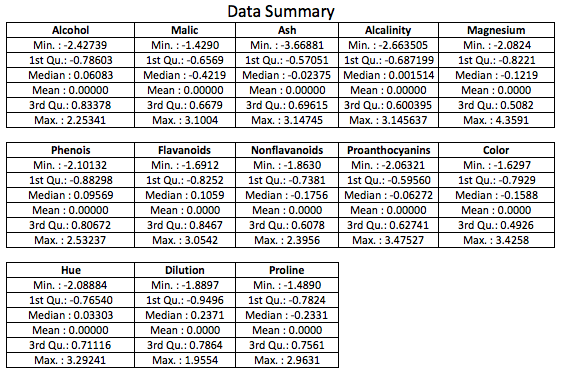
We will standardize the wine data score provided using z-score and ignore the ‘Type’ column. Below is the data summary post-standardization:
Let’s now run the NbClust algorithm to estimate the ideal number of clusters.
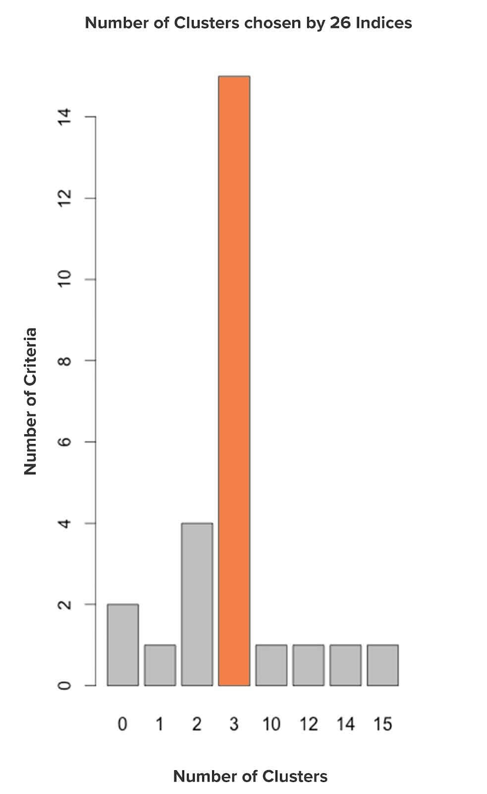
Based on the above graph, 3 clusters is the ideal cluster number among all the clusters provided since the majority of the indices have proposed ‘3’. This clustering looks promising considering the fact that there are 3 types of wine.
Evaluating Clusters formed
We will run the K-means algorithm based on the cluster number provided by NbClust to cluster the data. We will use the Confusion Matrix to evaluate the performance of the classification arrived after clustering. Confusion Matrix is a tabular representation of Actual (wine type from data) vs. Predicted values (clusters). The off-diagonals (in orange) represent the observations that are misclassified, and the diagonals (in blue) represent the observations that are correctly classified.
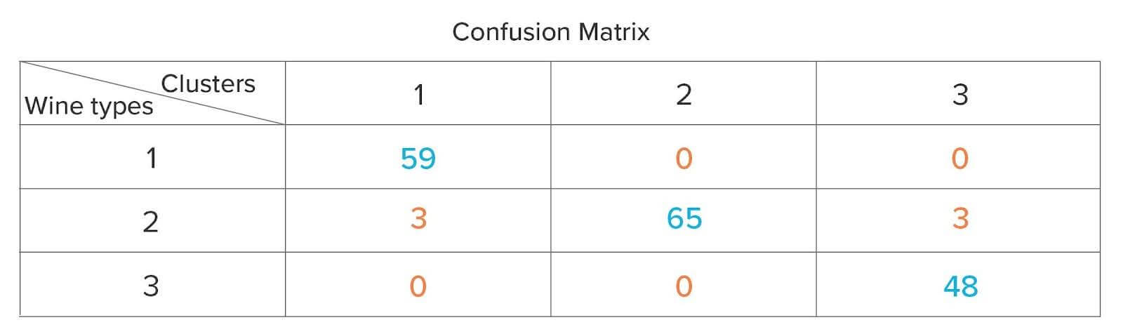
The ideal scenario would be where all the observations corresponding to a wine type belong to only one of the 3 clusters. In the above matrix, there are 6 (3 + 3) misclassified observations that belong to Type 2 wine, but 3 of those observations are present in Cluster 1, and the rest in Cluster 3 instead of Cluster 2.
With standardized data, the best cluster size predicted was more accurate than non-standardized data. Additionally, the classification performance based on the clustering with the standardized data was extremely encouraging.
ii) Binning/Converting Numerical to Categorical Variable
Converting numerical to categorical variables is another useful feature engineering technique. It could not only help you to interpret and visualize the numerical variable but also add an additional feature, which could eventually increase the performance of the predictive model by reducing noise or non-linearity.
Let’s look at an example where we have data on the age of the users and whether they have interacted with an app during a particular time period. Below are the first 10 rows and the summary of the data:
Age / OS / Interact
| Age | OS | Interact |
|---|---|---|
| 18 | iOS | 1 |
| 23 | iOS | 1 |
| 20 | Android | 0 |
| 22 | Android | 0 |
| 21 | Android | 0 |
| 16 | iOS | 1 |
| 21 | Android | 1 |
| 79 | iOS | 0 |
| 16 | iOS | 0 |
| 22 | Android | 1 |
| 24 | iOS | 1 |
Data Summary
| Age | OS | Interact |
|---|---|---|
| Min.:16.00 | Android:98 | 0:65 |
| 1st Qu.:21.00 | iOS:67 | 1:100 |
| Median:29.00 | ||
| Mean:33.63 | ||
| 3rd Qu.:42.00 | ||
| Max.:79.00 |
We have 165 users aged between 16 and 79 years, of which 98 are on Android and 67 are on iOS. The 1 and 0 for the ‘Interact’ variable refer to users who have interacted with the app frequently and occasionally, respectively.
We need to build a model to predict whether a user interacts with an app based on the above information. We will use 2 approaches, one where we take Age as it is and the other where we create an additional variable by grouping or binning the age in buckets. Though we can use several methods like domain expertise, visualization, and predictive models to bin ‘Age,’ we will bin ‘Age’ based on a percentile approach.
Age Summary
| Statistic | Value |
|---|---|
| 1st Quartile | 21 |
| 2nd Quartile | 29 |
| 3rd Quartile | 42 |
| Mean | 33.63 |
| Min. | 16 |
| Max. | 79 |
Based on the above table, 25% of the users’ age are below 21, 50% are between 21 and 42, and the rest 25% greater than 42. We will use these breakpoints to bin the users into different age group buckets and create a new variable ‘Age Group’.
Age Group Summary
| Age Group | Count |
|---|---|
| < 21 | 41 |
| ≥ 21 & < 42 | 82 |
| ≥ 42 | 42 |
Since we have binned the users’ ages, let’s build a model to predict whether the users will interact with the app with the help of Logistic Regression since the dependent variable is a binary variable.
Model Summary
Logistic Regression Model Summary
| Independent Variable | Dependent variable: Interact | |
|---|---|---|
| Model A | Model B | |
| Age | -0.049*** | -0.062* |
| AgeGroup: ≥21 & < 42 | 1.596* | |
| AgeGroup: > 42 | 1.236 | |
| OS: iOS | 2.150*** | 2.534*** |
| Constant | 1.483** | 0.696 |
| Observations | 165 | 165 |
| Residual Deviance | 157.2 | 149.93 |
| AIC | 163.2 | 159.93 |
* p < 0.05; ** p < 0.01; *** p < 0.001
Model A has taken only ‘Age’ and ‘OS’ as the independent variables, whereas Model B has taken ‘Age’, ‘Age Group’ and ‘OS’ as the independent variables.
Model Discrimination
There are various metrics to discriminate between various Logistic Regression Models like Residual Deviance, Log Likelihood, AIC, SC, AUC, etc. For the sake of simplicity, we will only look at Residual Deviance and AIC (Akaike Information Criterion). The lower the number for the metrics mentioned, the better the model. Based on the results for AIC and Residual Deviance obtained, Model B appears to be the best among the two. Binning has proved to be useful in the above case since the variable formed due to binning has turned out to be statistically significant for the model indicated by * if we assume a 5% cut-off for the p-value. The binned variable is able to capture some part of the non-linearity of the relationship between Age and Interact. Model B can be improved further with the help of dummy variables, which will be discussed in the next part.
iii) Reducing Levels in Categorical Variables
Rationalizing the levels or attributes in Categorical variables could lead to better models and computational efficiency. Consider the example given below detailing the number of App launches by City
| City | App Launched | Percentage (%) | Cumulative (%) | |
|---|---|---|---|---|
| 1 | NewYork_City | 23878145 | 25 | 25 |
| 2 | LosAngeles | 20057642 | 21 | 46 |
| 3 | SanDeigo | 17192264 | 18 | 64 |
| 4 | SanFrancisco | 14326887 | 15 | 79 |
| 5 | Arlington | 9551258 | 10 | 89 |
| 6 | Houston | 6208318 | 6.5 | 95.5 |
| 7 | Philadelphia | 1528201 | 1.6 | 97.1 |
| 8 | Phoenix | 1146151 | 1.2 | 98.3 |
| 9 | Chandler | 764101 | 0.8 | 99.1 |
| 10 | Dallas | 334294 | 0.35 | 99.45 |
| 11 | Austin | 171923 | 0.18 | 99.63 |
| 12 | Jacksonville | 105064 | 0.11 | 99.74 |
| 13 | Riverside | 66859 | 0.07 | 99.81 |
| 14 | Pittsburgh | 57308 | 0.06 | 99.87 |
| 15 | Mesa | 38205 | 0.04 | 99.91 |
| 16 | Miami | 28654 | 0.03 | 99.94 |
| 17 | FortWorth | 23878 | 0.02 | 99.96 |
| 18 | Irvine | 19103 | 0.02 | 99.98 |
| 19 | Tampa | 9551 | 0.01 | 99.99 |
| 20 | Fresno | 4776 | 0.01 | 100 |
It can be observed from the above table that 95% of the App Launches are accounted for by 6 cities out of the 20. In fact, we can combine the remaining 14 cities into one level and name it as ‘Others’ with the 5% share.
Let’s look at the states to which these cities belong to and find out if States could group all the cities.
| City | State | App Launched | |
|---|---|---|---|
| 1 | NewYork_City | NewYork | 23878145 |
| 2 | LosAngeles | California | 20057642 |
| 3 | SanDeigo | California | 17192264 |
| 4 | SanFrancisco | California | 14326887 |
| 5 | Arlington | Texas | 9551258 |
| 6 | Houston | Texas | 6208318 |
| 7 | Philadelphia | Pennsylvania | 1528201 |
| 8 | Phoenix | Arizona | 1146151 |
| 9 | Chandler | Arizona | 764101 |
| 10 | Dallas | Texas | 334294 |
| 11 | Austin | Texas | 171923 |
| 12 | Jacksonville | Florida | 105064 |
| 13 | Riverside | California | 66859 |
| 14 | Pittsburgh | Pennsylvania | 57308 |
| 15 | Mesa | Arizona | 38205 |
| 16 | Miami | Florida | 28654 |
| 17 | FortWorth | Texas | 23878 |
| 18 | Irvine | California | 19103 |
| 19 | Tampa | Florida | 9551 |
| 20 | Fresno | California | 4776 |
| State | App Launched | |
|---|---|---|
| 1 | Arizona | 1948457 |
| 2 | California | 51667531 |
| 3 | Florida | 143269 |
| 4 | NewYork | 23878145 |
| 5 | Pennsylvania | 1585509 |
| 6 | Texas | 16289671 |
As per the table, the information related to the cities could be summarized by the corresponding 6 States.
In the above example, we have tried to reduce the categorical levels by 2 approaches, the first one by combining the levels which have a low number of App Launches using frequency distribution, and the other by creating a new variable, ‘State’, using logic. Reducing the levels helps in making data computationally less expensive and easier for visualization, which in turn helps in making better sense of data and could also reduce the danger of overfitting (overfitting leads to a good fit on the data used to build the model or in-sample data but may poorly fit out-of-sample or new data).
In this part, we have looked at the first three tricks in detail. The ensuing part will discuss tricks four to six in detail.

Jacob Joseph 
Heads Data Science.Expert in AI, Data & Analytics and awarded 40 under 40 Data Scientists in India.
Free Customer Engagement Guides
Join our newsletter for actionable tips and proven strategies to grow your business and engage your customers.