Learn how you can Unlock Limitless Customer Lifetime Value with CleverTap’s All-in-One Customer Engagement Platform.

In the world of data analysis, one tool is often left unused. While being a very powerful analytics tool, cohorts are often pushed aside due to their seemingly complex nature. With a lot to offer in the way of data analysis, let’s take a deeper (yet simplified) look into cohorts.
Let’s start by explaining what they are. Cohorts help you analyze actions or the behavior of a group of people sharing a common characteristic during a particular time span.When it comes to marketing, the term “cohort” refers to specific experiences, events or other factors shared by a group of consumers.
Cohorts allow you to see data through a more “micro” lens, giving you details on a certain piece of the overall analytic puzzle.
For example – One of the first pieces of data every developer or analyst wants to know about their app is the retention rate. Sure you can get people to download your app, but you want to know how many you can keep. Retention rate is a critical metric since “User retention is real growth rather than just user acquisition”. In this case, the users who’ve installed your mobile app and then interacted with it within the five days measure the retention rate.
Typically, this information is shown in a tabular format as below: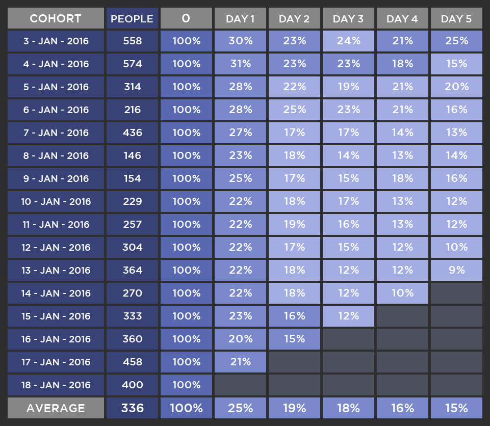 In the table above, of the 558 users who installed the app on Jan 3rd, 30% came back and visited the app 1 day later, 23% visited 2 days later, 24% visited 3 days later, 21% visited 4 days later and 25% visited 5 days after their first app launch.
With this type of data, it can be difficult to read between the numbers and make a quick inference. As an analyst, you will want to understand the trend of the retention over the five days and additionally, the trend between periods, say the 1st and the 3rd day after the acquisition.
Additionally, you will want to measure the total count of retained and acquired users. These counts are useful because for a few cohorts; the retention rates may be low while the number of acquired users remains high, which is not desirable.
Suppose, we are interested in looking at the retention numbers on the 1st, 3rd and 5th day since installing the app. This cohort data is summarized visually in the cycle plot below: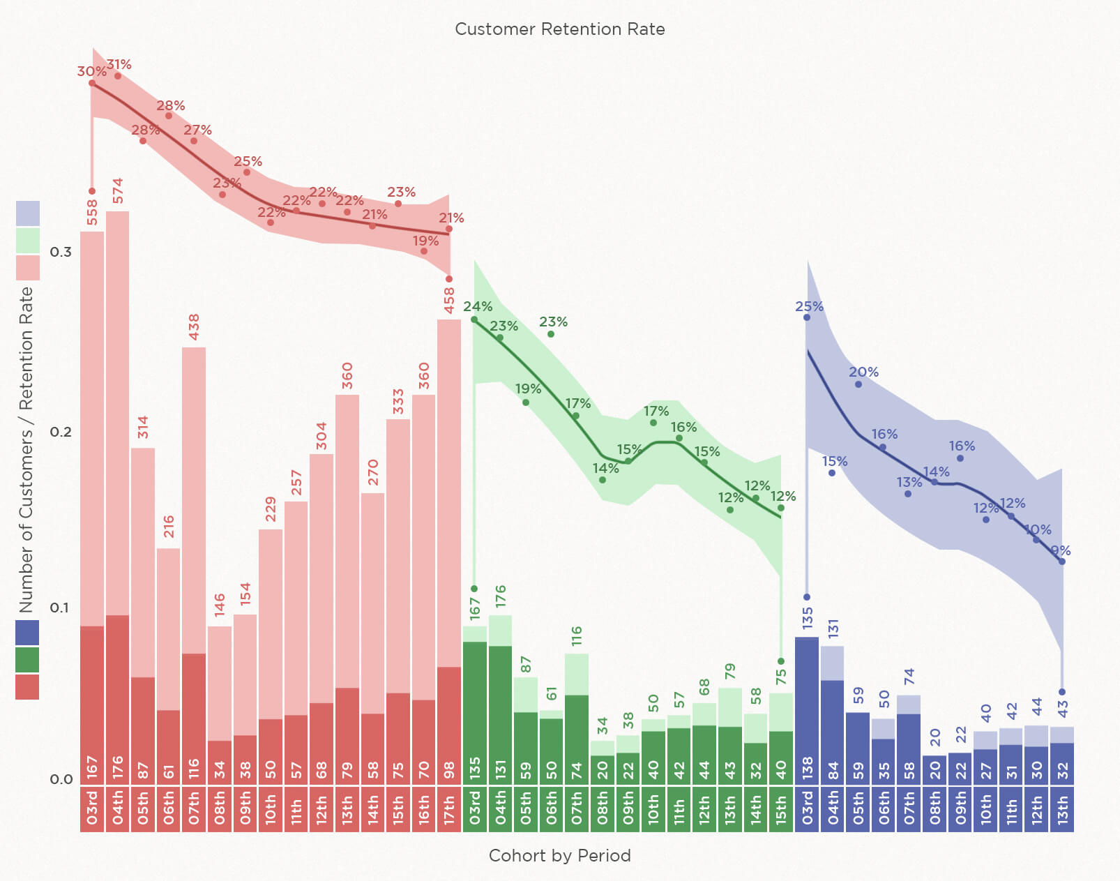 The above chart shows the trend of the daily cohorts over each of the chosen period i.e. Day 1, Day 3 and Day 5 from the start for each cohort.
The light and dark shades shown in the bar chart refer to the total and retained count of users respectively. The pink bar chart shows the daily cohorts through the end of day 1; the green chart shows the daily cohorts from day 1 to day 3, and the indigo chart shows the daily cohorts from day 3 to day 5. On day 1 (Jan 3rd), the total users acquired are 558 whereas the retained users are 167 shown in shades of pink. For the same cohort, on day 3, the total users are the same as the retained users from day 1, only 167. Out of those 167, only 135 were retained. A downward trend is starting to emerge
The trend analysis on the top of the bar charts shows the retention rate for daily cohorts from Day 1, Day 3 and Day 5 shown in pink, green, and indigo respectively. The three color bands shown around the line represent the confidence band around the smoothened line for retention rates.
Insights:
With the use of cohorts, we can learn a lot about the overall trend, trends within a particular period, outliers, and when combined with other information such as marketing tactics and the user acquisition strategy implemented during the days of the test we can draw reasonable conclusions and further strengthen our acquisition and retention strategies.