You know that a key part of being a world-class marketer is testing: your campaigns, your product — your customer experience as a whole. Using that testing data to continuously improve your efforts is essential for aligning your efforts with your customers’ evolving expectations.
And since you’ve been following our blog, you know that focusing on retention is the single most important thing you can do to grow your bottom line and your brand.
So the question becomes: where do you start when it comes to retention experiments?
Obviously, we’re big advocates of data-driven marketing. Ideally, you should be testing everything from your App Store page to your final win-back campaign.
But you’ve got to start somewhere, and we say your primary focus should be on this question: Can you get new users to come back to your app?
If the answer is no, none of the other stuff matters.
If you want to keep users coming back, you’ve got to start by optimizing your new user onboarding.
Here are 8 tests we recommend running to perfect your onboarding flow and help new users experience that aha moment within your app.
User Onboarding A/B Tests: Experimenting for Better Customer Retention
Test 1: Learn from churn
Send a survey to users who churned within the first week with just one simple question: Why did you stop using the app?
Theories about what’s causing new users to churn don’t mean much compared to direct insights. You might learn something surprising about your app’s functionality, bugs, product/market fit, or even whether you’re attracting the right users with your acquisition campaigns.
Use the answers you get to inform your testing strategy. Does your onboarding experience need some surface-level tweaks, or do you need to go back to the drawing board?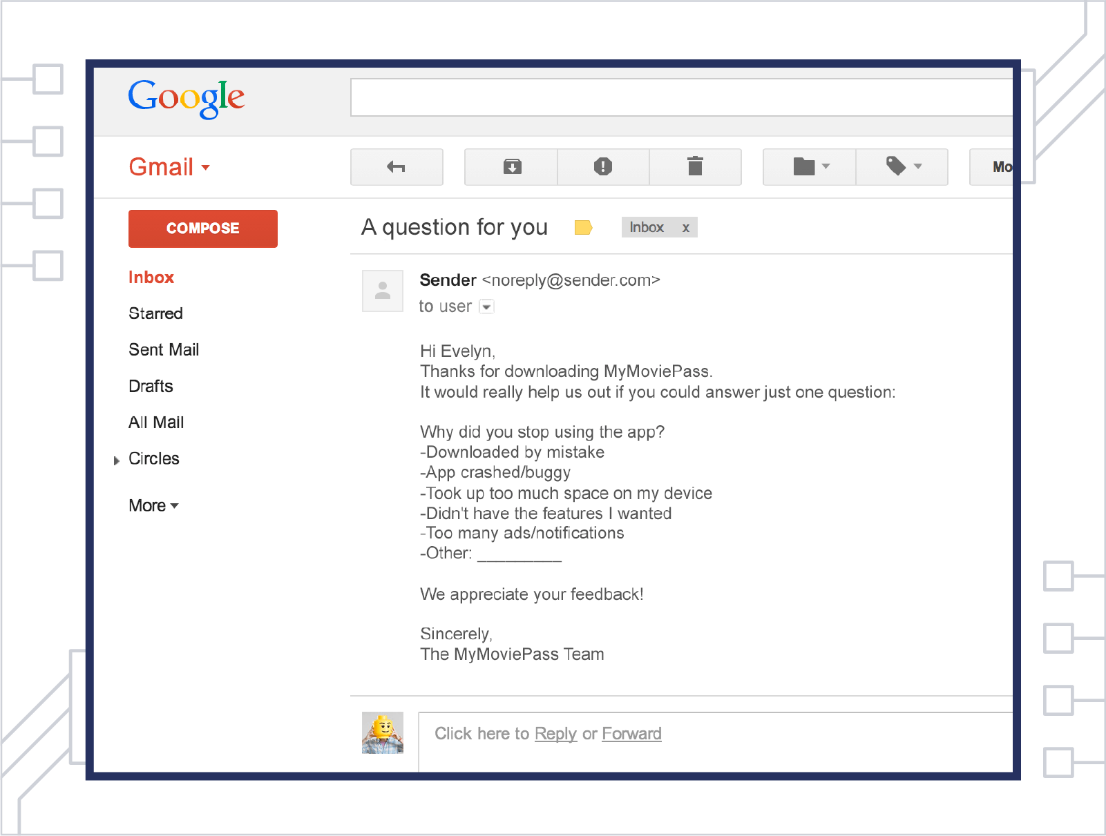
Test 2: Examine your App Store page
Onboarding doesn’t start with the initial app launch. It starts with a new user’s very first impression of your app.
And since app stores are still the #1 driver of app discovery, your listing page is likely a user’s first exposure to your app and your brand — and it’s establishing user expectations that your app needs to live up to.
So take a fine-tooth comb to your listing page to make sure you’re clearly communicating the benefit your app provides and optimizing the page for downloads.
A/B Test:
- App name, subtitle, and description copy — including search keywords
- Preview video and screenshots
- Icon design
- Promotional text
- App Store vs. Google Play listings
If the expectations you set on your app store page aren’t immediately reinforced on first-time app launch, new users are guaranteed to churn.
Further Reading:
- App Store Optimization + Ranking Factors
- 10 App Store Optimization Tips to Send Your App to the Top of the Charts (Infographic)
- The Mobile Marketer’s Guide to App Store A/B Testing
Test 3: Is an onboarding flow necessary?
Some apps benefit from a short product tour or UI overlay to help new users navigate the app and discover key features. Others fare better just letting users explore the app on their own without interference. Which approach is best for you?
A/B Test:
- Tour vs. No tour
- Tour length: number of screens and onboarding steps
- Videos vs. UI overlays
- Permissions requests (type and placement)
Slack’s onboarding is designed to appeal to two kinds of users: those new to the app who need a brief introduction to the product, and those who want to skip the tour and sign in immediately.
Test 4: Experiment with personalized onboarding flows
Do different types of users need different onboarding experiences?
Say you have a fitness app that connects athletes with personal trainers for personalized workout plans and advice. Each type of user is coming to the app for different reasons, possibly using different feature sets, and so on. So ask each new user whether they’re a trainer or an athlete on first-time app launch to determine which onboarding flow they experience.
Meditation and mindfulness app Calm begins their first-time user experience with one question: what are your goals for using the app? Based on the user’s responses, it drops them straight into the “For You” section of the app, loaded with personalized content that supports the user’s stated goals.
Test 5: Optimize for conversions
What one thing will most help new users get value from your app? Is it conducting a search? Uploading a photo? Streaming a song or video?
Whatever that key action is for your app, put all your focus on building experiments that will help you get more people to do it. (If you’re not sure what that one thing is, use behavioral cohorts or Flows to see what your most successful users are doing in your app and when.)
For investing app Wealthfront, having new users link their bank account is key for getting them hooked on the app and enrolled in their investment services. Their onboarding flow is built to prompt this key action, with copy that clearly explains the benefits of linking an account and providing quick access to major banks.
Once the app has this information, it immediately drops users into the personalized Path tool, which lets them learn more about their financial health by adjusting retirement age, planned savings, housing costs, etc.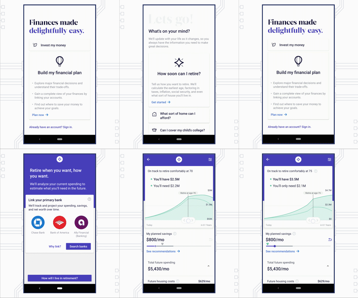
A/B Test:
- Highlighting (or hiding) certain features for first-time users
- CTAs
- Animations and other microinteractions that reinforce the desired user action
Test 6: Perfect the registration process
First question: do you really need users to register? If so, is it necessary to include it in your first-time user experience?
Consider Airbnb — users need to register to use the service, but it isn’t until they’re ready to complete a booking that Airbnb prompts them to create an account.
A/B Test:
- Social login options
- Timing and placement of registration request
- Number of fields and screens – what’s the minimum amount of information you need to deliver value?
Test 7: Dig into the details
Try it now vs. Free trial; Create your account vs. Sign up — what seems like small potatoes could actually make a significant difference in getting users to complete the key actions that get them hooked on your app.
So test button colors and placement. Test design assets. Test copy. Just remember, every test should have a clear goal: helping users experience your app’s value. The point isn’t just to make random updates — experiments should be methodical and purposeful.
Test 8: Assess your welcome email
Onboarding doesn’t exclusively happen inside the app. Your welcome email to new users is an essential piece of the puzzle.
What aspects do you need to introduce in the app, and which can you introduce in your welcome email?
For example, a movie ticketing app might ask a new user just one question: where are you located?
With this information, the app can immediately show new users nearby theaters, showtimes, and local promotions in order to prompt that first ticket purchase. The welcome email can then highlight helpful features like personalized movie recommendations and customer loyalty programs.
Open rates for welcome emails are a staggering 57.8%.* With that big of an opportunity to capture new users, it’s essential you experiment and get the message right.
A/B Test:
- Subject lines
- Body copy (focus on benefits rather than features)
- CTA
- Timing
- Different message sequences tailored to specific new user segments (acquisition channel, campaign, user type, etc.)
Your welcome message should reaffirm your app’s core value, provide an incentive to launch the app, include personalization where possible, and be optimized for mobile.
Headspace’s messages set the gold standard for welcome emails. See their entire sequence and learn more welcome message best practices here. 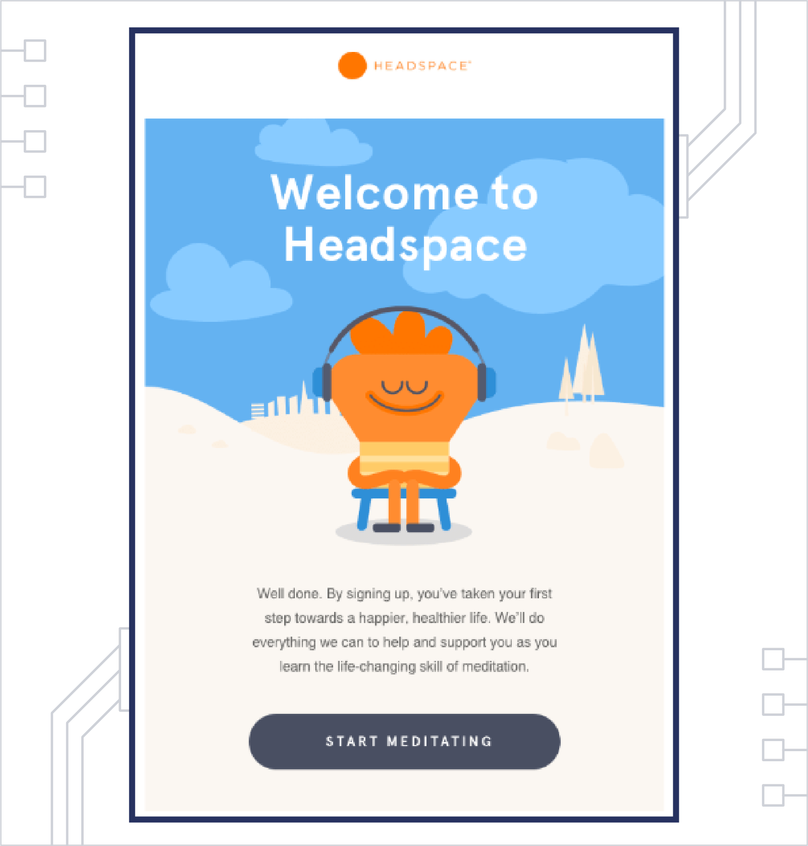
Testing Tips & Best Practices
As VP of Experiments and Retention at Acorns, Hila Qu is an expert at running effective retention experiments.
In our interview with Qu, she shared how her team deploys the scientific method to improve app stickiness and user retention during the onboarding process.
“We try to understand the entire user flow after acquisition, so that we can figure out the roadblocks users are facing,” says Qu. “We want to learn which barriers we can remove so that users can achieve their goals as quickly as possible.”
Here are the steps Qu takes to apply the scientific method: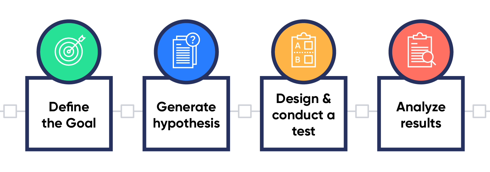
Step 1. Define the goal.
Qu starts with a goal, such as improving user retention for those who were acquired via a particular channel, or reducing churn during the first three days after download.
Step 2. Generate hypotheses.
Once Qu has a goal, she can generate a set of hypotheses. These hypotheses are ideas for what problems users might be experiencing, and which changes could improve retention.
Step 3. Design and conduct a test.
If your hypothesis is that users are dropping off because they aren’t using a key feature, you might design a test where you offer a quick feature walkthrough to see if it makes a difference. Even for the same problem there could be multiple solutions, so a lot of creativity and persistence goes into designing tests.
Step 4. Analyze results.
Qu and her team analyze their results to determine whether a hypothesis is right or wrong. If it’s right, then the team is satisfied: they proved their goal and solved their problem. They make the change, apply whatever they learned to the next experiment, and look for any opportunity to further improve the results.
If the hypothesis is proven wrong, the team tries to understand if the result is due to a faulty experiment, or because the hypothesis itself was wrong. If the hypothesis is wrong, then that’s a conclusion that can be applied to later experiments.
Explore More: Free Customer Retention Rate Calculator by CleverTap!
Get it Right, Right from the Start
If you want to keep users coming back to your app, you have to provide value with every engagement campaign, every app launch, every conversion — every single interaction they have with your brand. And while each of these touchpoints is important, none is more significant than your onboarding flow.
Successfully onboarding new users not only improves retention; it can boost lifetime value by up to 500%.
There’s no ideal onboarding template that works for every app. That’s why experimenting to discover what works for your unique users is essential — and why it’s important to use a marketing platform that makes it easy to quickly test, learn, and optimize your strategies.
CleverTap’s A/B and multivariate testing capabilities help you create the perfect user experience by bringing together your marketing creativity with data-driven insights.

See how today’s top brands use CleverTap to drive long-term growth and retention
Shivkumar M 
Head Product Launches, Adoption, & Evangelism.Expert in cross channel marketing strategies & platforms.
Free Customer Engagement Guides
Join our newsletter for actionable tips and proven strategies to grow your business and engage your customers.

