


Table of Contents
Categories
Most Popular


A magician never reveals his secrets.
Although your app should be a magical experience for users, it should be no secret what your product or service does.
When users recognize the value being offered, they experience an “Aha Moment.”
It’s a magical moment for us as mobile marketers because our ideas and efforts are validated. How then can we make these occurrences faster and more frequent?
If you are experiencing churn because users don’t understand what your product does, continue reading or jump to our infographic for strategies to help your users find their aha moment.
What is The Aha Moment?
The Aha Moment is the exact point in time when a user understands the value proposition of a product or service.
When users come to understand something they previously didn’t recognize or know, they have a moment of epiphany, referred to interchangeably as the aha moment or eureka effect.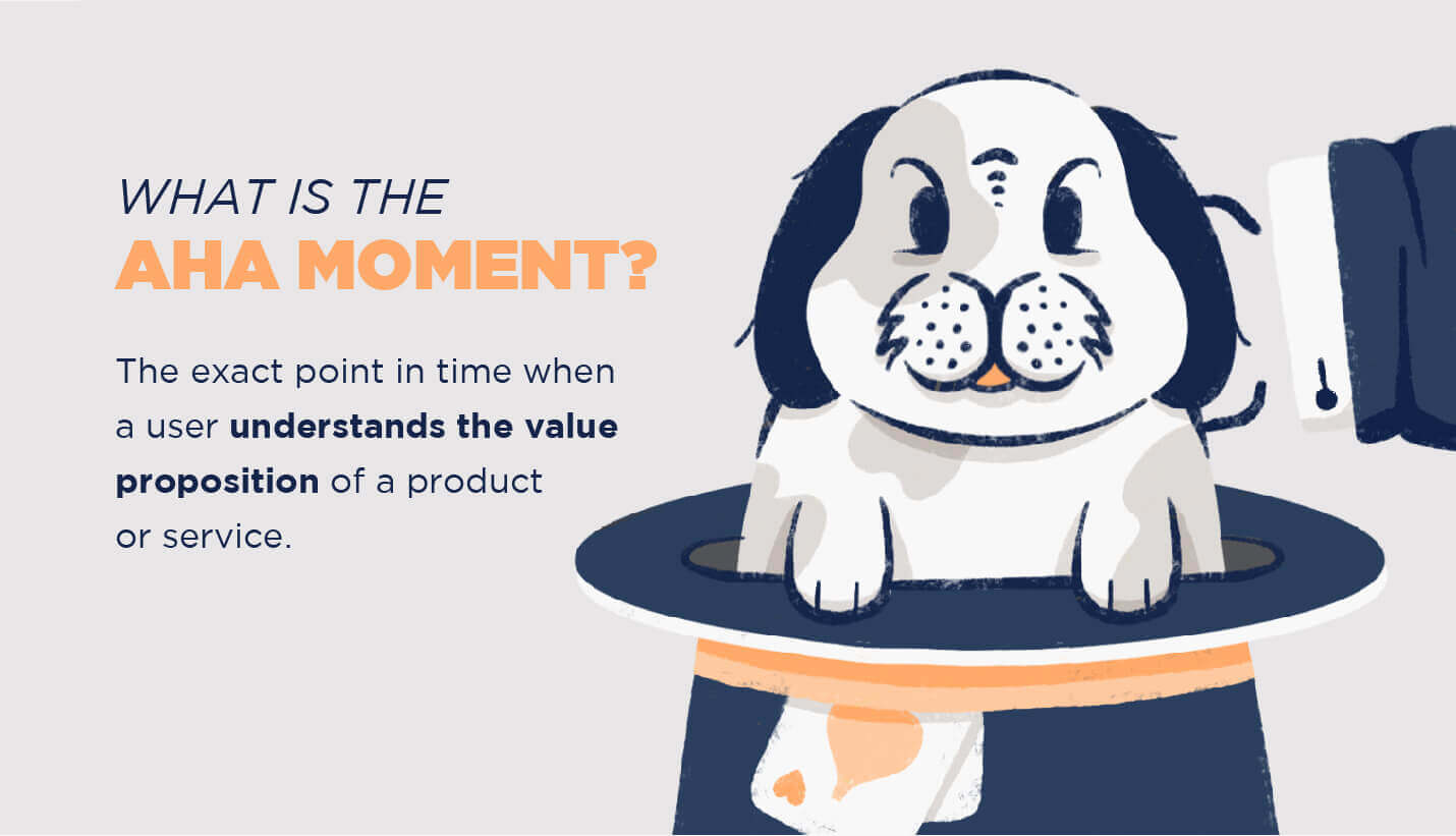
Many times when someone visits a new storefront, website, or mobile app, the intended purpose of the product isn’t immediately apparent: “So, what are they selling?” More often, we browse through some shelves, navigate a website, or investigate an app store listing to get a better understanding of what the product is.
Sometimes it takes users experiencing multiple aha micro-moments before they finally get it. Users analyze each element presented by the company — and while they might not be clear individually, the bigger picture can become visible when taken as a whole.
You might even have users saying, “Ah, ah, oh…Aha!” as the chain reaction of micro-moments build to the aha moment.
The Aha Moments Your Business Depends On
Aha moments may not occur during a user’s first encounter with a product.
Sometimes, it can take days, weeks, or even years to fully understand all the subtleties and nuances of a product. The goal, however, is that each subsequent aha moment after a user’s initial encounter comes from their discovery of an auxiliary feature — not the core value proposition.
For example: if an Uber user loved the ability to schedule a ride a day in advance, they’d understand a single feature — which is great. If that same user later discovered, in amazement, that they could order a ride in minutes, this would be an aha moment for a key feature that should have been clear initially.
If Uber recognized that some users only ever scheduled rides in advance, they could segment these riders and send them informative push notifications about how to order a ride in minutes.
Make Aha Happen Before “Huh?”
Any hesitancy before a download or purchase must be replaced with the confidence of a loud momentous Aha!
Otherwise, if a potential customer takes their hand off the screen to scratch their head, this lack of understanding could be enough friction for them to abandon their cart or decide to uninstall your app.
Achieving aha moments quickly is a goal every marketer aspires to. But all users (and marketers, for that matter) bring their individual backgrounds, unique experiences, and cognitive biases into the experience.
We might assume our products are intuitive and easy to use, but we have to assume the opposite in order to succeed. The curse of knowledge, for example, is a cognitive bias that deceives many product managers and marketers into believing everyone understands how the product works, just as they do.1
This could open the door for an abundance of “huh?” moments instead of aha moments. To counteract this bias, you should approach every feature, interface, and message objectively, as if you were coming to the product with no background knowledge.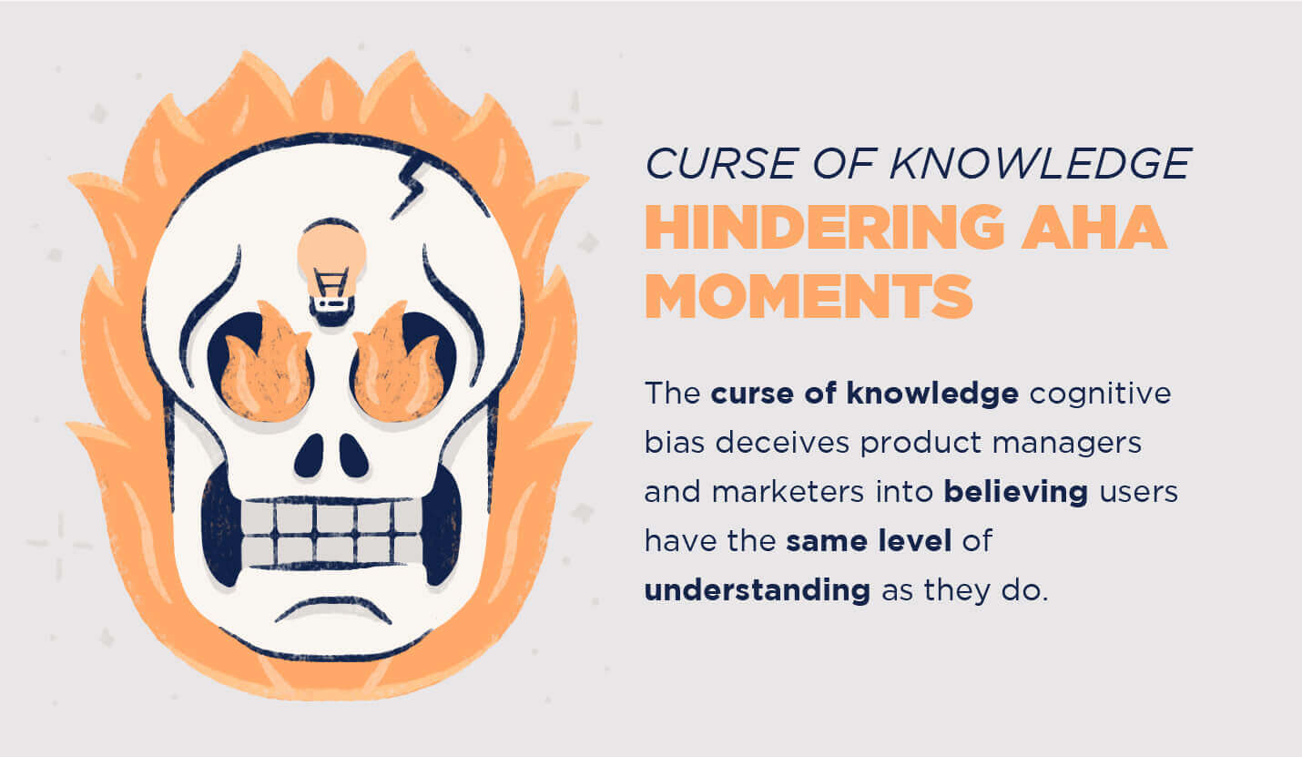
Turn Aha Moments To Long-Term Engagements
How do we turn a single aha moment into, well, more of them?
Guiding users to aha moments for new features— or even established, albeit underutilized ones— is challenging.
Many apps with a large set of features experience feature creep, meaning the product becomes bloated and overwhelming, making it unlikely that many users will explore its full potential.
There are strategies to keep feature creep contained. One such strategy is to bundle rarely used features into a single page or hidden behind a single button. This will remove clutter and keep the core functionality as the focal point for users.
If we use a mobile banking app as an example, most users have aha moments when they check account balances and transaction history, but never fully leverage the depth of features such as mobile check deposits, QR code payments, or fingerprint authorization.
One strategy to keep aha moments coming for users is to maintain a consistent user experience while slowly introducing them to helpful and relevant functionality triggered throughout the customer journey
If a feature is regularly used by your hardcore group of power users but not by the larger base of users, it could be unclear to the average user how to use the feature.
Let’s cover some of the strategies that can help promote aha moments among your users.
Aha Moment Strategies
Although not all users are likely to have the aha moment you expect, use these strategies to ensure users gain a clear understanding of how your product is improving their lives.
Think of them as engagement strategies dedicated entirely to the core feature.
As more users reach their aha moment, they will spread the word about your app, leading to organic referrals and word-of-mouth growth.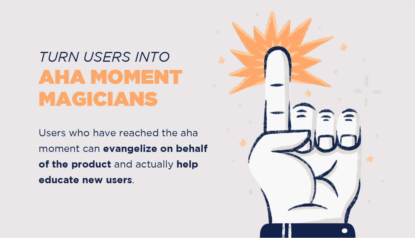
01. Clarify the Value Proposition
Although the value proposition may appear a small and minor detail, it should have the most impact per word.
When a potential user arrives at your home page, app store listing, or physical location, it should be immediately clear what product or service you offer. It could be an ambitious mission statement or the core feature of your product, but either way, make it clear.
Respect the power of a succinct product description and clear imagery. The combination of a clear and concise value proposition with supporting imagery can bring the “time to aha” down to record-breaking speed.
02. Set The Stage With Supporting Materials
One thing that can actually prolong or even prevent an aha moment is a complicated onboarding process. Overwhelmed users might exit the onboarding flow and possibly the product entirely.
Instead of educating new users on every nuance, focus on the product’s core functionality and make sure it’s clear. Evernote does a good job of this by guiding new users through the process of creating their first note, which is their core feature.
Make helpful resources or more information easily accessible if the user wants to explore on their own. If there is an auxiliary tool, such as a browser extension, that will enhance the user’s experience, make this option clear.
Evernote also does this well by including an onboarding checklist for users to “use Evernote like a pro.” The checklist also provides instructions for each step of the way, including how to install their useful browser extension.
It can also be a good strategy to incentivize users with some amount of functionality for free, such as a freemium feature set. Once users have their aha moment they’re more willing to upgrade to premium.
03. Give Hints, Not Homework
Onboarding tooltips and road signs have a lot in common. They must be understandable at a glance and informative at first pass.
Providing new users with hints of the fastest route to their aha moment can be useful, but they should not complicate the situation further. The first hint is the most important because users will decide whether to receive more hints or to exit the onboarding process to learn on their own
When using tooltips and informative hints within your onboarding strategy, set expectations by outlining the number of hints and including a progress bar. Many users will opt out of these tooltips which is another reason to make product education as clear and intuitive as possible.
If the tooltips feel forced or unnecessary, users will abandon onboarding entirely. Which segues into our next strategy, dealing with new users who immediately become inactive.
04. Trigger Instructional Push Notifications For Inactives
If users download your app and immediately become inactive, you can assume they have yet to experience their aha moment.
In this case, you may need to help them understand how the product works and how it can impact their lives. Brief instructional push notifications can be a great alternative to the traditional onboarding walkthrough.
Use RFM analysis to segment new users that are already at risk of uninstalling and trigger informative push notifications to increase their engagement and understanding.
05. Monitor User Journeys To Pinpoint Source of Confusion
Users often won’t explicitly tell you when they don’t understand a feature or worse, when they don’t understand your app’s purpose, but their usage can speak louder than words.
Tracking user journeys can enlighten areas of the UI or overall user experience that are sources of frustration.
The combination of a user journey map and triggered notifications can be a powerful tool to engage, educate, and retain users.
06. Harness The Power of Social Proof
Providing users with proof that the product is used (and loved) by their peers can prepare users for their aha moment. Even if the user doesn’t understand what the product does immediately, they will often assume it is a valuable product by the fact other people regularly use it.
Twitter suggests “10 people to follow” during onboarding which exhibits recent activity from influential people.2 Replacing an otherwise blank screen with usage data, Twitter illustrates what their product can look like in its ideal form.
Another source of social proof is to simply show usage in real time. Venmo, for example, displays transactions from people all around the world as they are happening. This stream of usage proves that many people use the product, which makes it more approachable.
Have You Had an Aha Moment Yet?
Implement these strategies to test a more intuitive mobile app user experience, one where new users understand why your app is a must-have.
Many of these strategies can be achieved by integrating CleverTap’s intelligent mobile marketing platform within your mobile app strategy. You can learn more about the tools CleverTap offers and find more strategies to deploy them by scheduling a demo now. 
See how today’s top brands use CleverTap to drive long-term growth and retention
Subharun Mukherjee 
Heads Cross-Functional Marketing.Expert in SaaS Product Marketing, CX & GTM strategies.
Free Customer Engagement Guides
Join our newsletter for actionable tips and proven strategies to grow your business and engage your customers.
