


Table of Contents
Categories
Most Popular


Improving website conversion rate is key to boosting your sales and engagement. This guide shares 21 effective strategies to optimize your site, enhance user experience, and turn visitors into loyal customers.
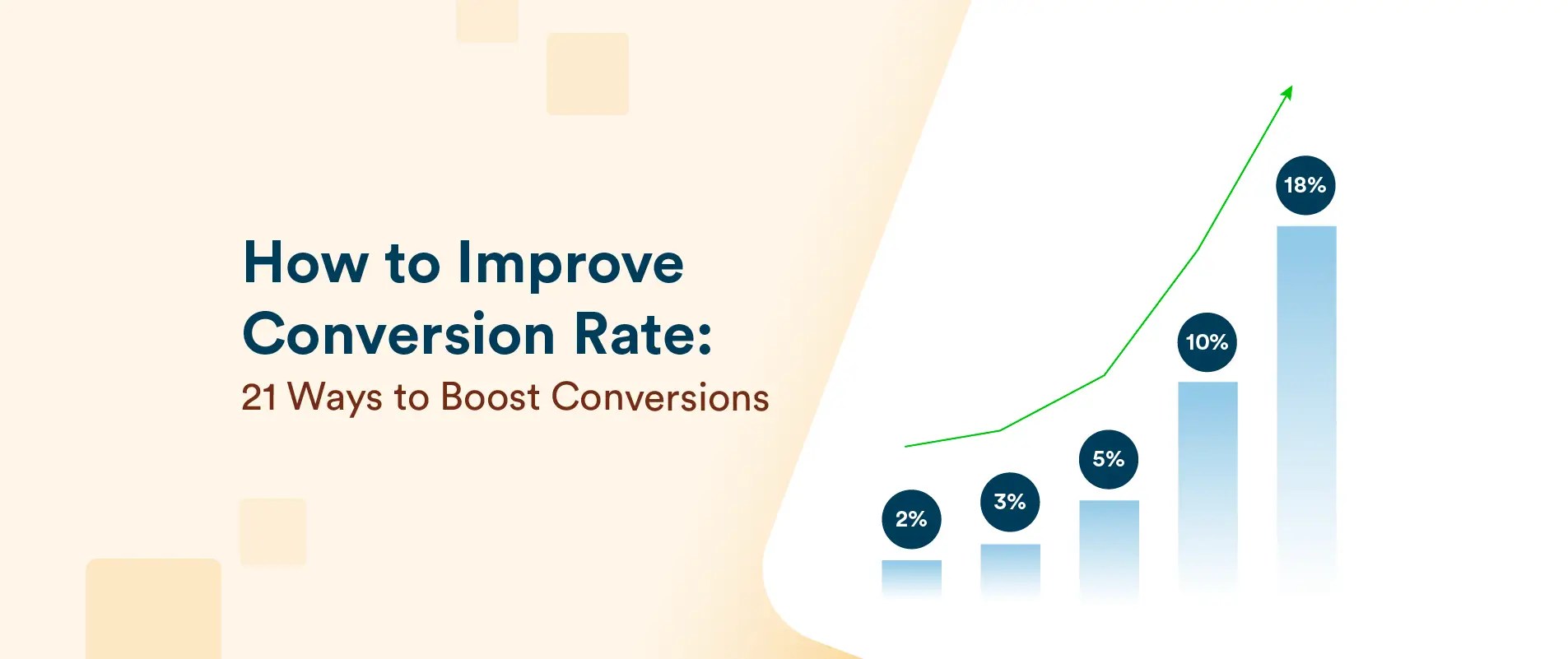
Conversion rates can shape the fate of any online business. According to recent industry data, the average website conversion rate hovers around 2% to 5%. However, some top performers sometimes exceed 10%.* Even minor improvements can translate into significant revenue gains. Hence, marketers need to use smart, tested methods to turn casual shoppers into repeat customers and keep up with what buyers want.
These benchmarks show both the complexity and the potential of conversion rate optimization. Let’s explore how to make the user experience better, guide buyers along, and secure higher returns for your marketing buck.
21 Tips & Tactics to Increase Conversion Rates
Boosting your website conversion rates doesn’t have to be a guessing game. Here are 21 proven tips and tactics to help you turn more visitors into customers and maximize your results.
1. Run A/B Tests to Discover What Works Best
The foundation of any conversion optimization strategy is experimentation. A/B testing allows you to compare two or more variations of a webpage or element to identify what performs best. It’s not just about tweaking button colors but also uncovering deep insights into user preferences.
Start with hypotheses based on observed behavior. For instance, are users dropping off at a specific point? Test a shorter form. Are CTAs underperforming? Test different language or placement.
Split your audience evenly, monitor conversion rate metrics such as click-through rates and sign-ups, and analyze results. Moreover, focus on one variable at a time during testing, be it the CTA, headline, or page layout. This way, you can pinpoint what’s driving the change.
2. Streamline Navigation to Reduce Friction
Your site’s navigation is the roadmap visitors use to explore your offerings. If it’s cluttered or confusing, they’ll leave. To streamline navigation, start by conducting usability tests and analyzing heatmaps to identify bottlenecks.
Try to limit top-level categories to five or six with clear and intuitive labels like “Shop Men’s Shoes” instead of vague terms like “Products,” if you have an array of products. Also, include breadcrumbs to help users easily retrace their steps and ensure your search bar is easy to find and delivers accurate results.
Consider tailoring navigation for different user segments. For example, Airbnb improved conversions by 10% when they simplified their homepage for Asian users. They replaced cluttered “Neighborhood” links with a localized “Top Travel Destinations” feature.* Over time, Airbnb has kept on optimizing its homepage to suit the needs of users across the globe.
Regularly review metrics like bounce rates and clicks to identify weak points and refine your navigation. A clear, intuitive structure ensures users find what they need quickly, reducing friction and increasing conversion rate.

Source: Airbnb
3. Communicate Value and Address Objections
Your value proposition should immediately capture attention, clearly showing how your product solves a problem better than competitors. Highlight your unique selling proposition (USP) —what sets you apart and makes your offering the best choice. Moreover, avoid vague claims like “We offer great customer service” and instead focus on specific benefits like “24/7 support to resolve issues anytime.”
Equally important is addressing objections. Visitors often hesitate due to concerns about pricing, quality, or trust. Display a “30-day money-back guarantee” prominently to ease fears about making a bad investment. Add trust signals like SSL badges, testimonials, and secure checkout logos to reassure users that their data is safe and their purchase is risk-free.
Think of your website as a conversation. Answer questions like “Why should I choose you?” and “What happens if I’m not satisfied?” directly on product or checkout pages. Combine a compelling value proposition with proactive objection handling to build trust and guide users to convert.
4. Use Behavioral Analytics to Optimize User Journeys
Behavioral analytics provides a roadmap to understand how users interact with your site and where they disengage. Begin by tracking key metrics like click-through rates, bounce rates, session duration, and conversion funnel data. Use this data to identify problem areas—are users abandoning carts at checkout? Are specific product pages underperforming?
To apply this effectively:
- Map Customer Journeys: Outline each step of the user experience to find where drop-offs occur. This includes understanding how users navigate from landing pages to purchase completion.
- Segment Your Audience: Categorize users into groups like first-time visitors, repeat users, and cart abandoners. Tailor strategies to address the unique behavior of each segment.
- Test Fixes: If users leave at a specific point, experiment with changes—simplifying forms, optimizing CTAs, or improving page load speeds.
- Track the Impact: Implement solutions and monitor how these adjustments impact user flow and conversion rates.
For example, Albo, a challenger banking app in Mexico, used CleverTap to analyze user journeys and optimize onboarding. By identifying drop-offs and tailoring their messaging, they boosted user adoption and retention. This level of insight allows you to pinpoint where users disengage and address the issue with precision. Behavioral analytics should be the foundation of your strategy, giving you a detailed roadmap to refine every aspect of the user experience.
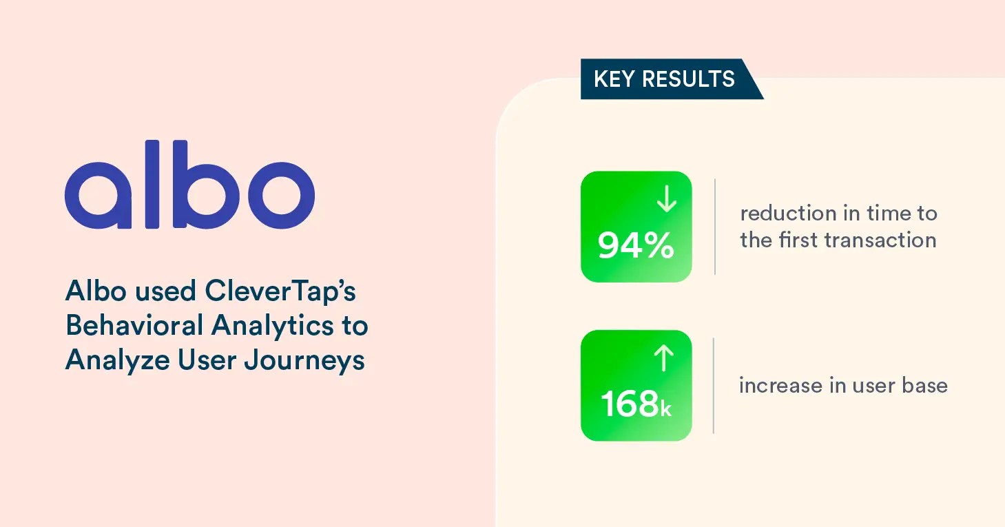
Click to Read the Full Case Study
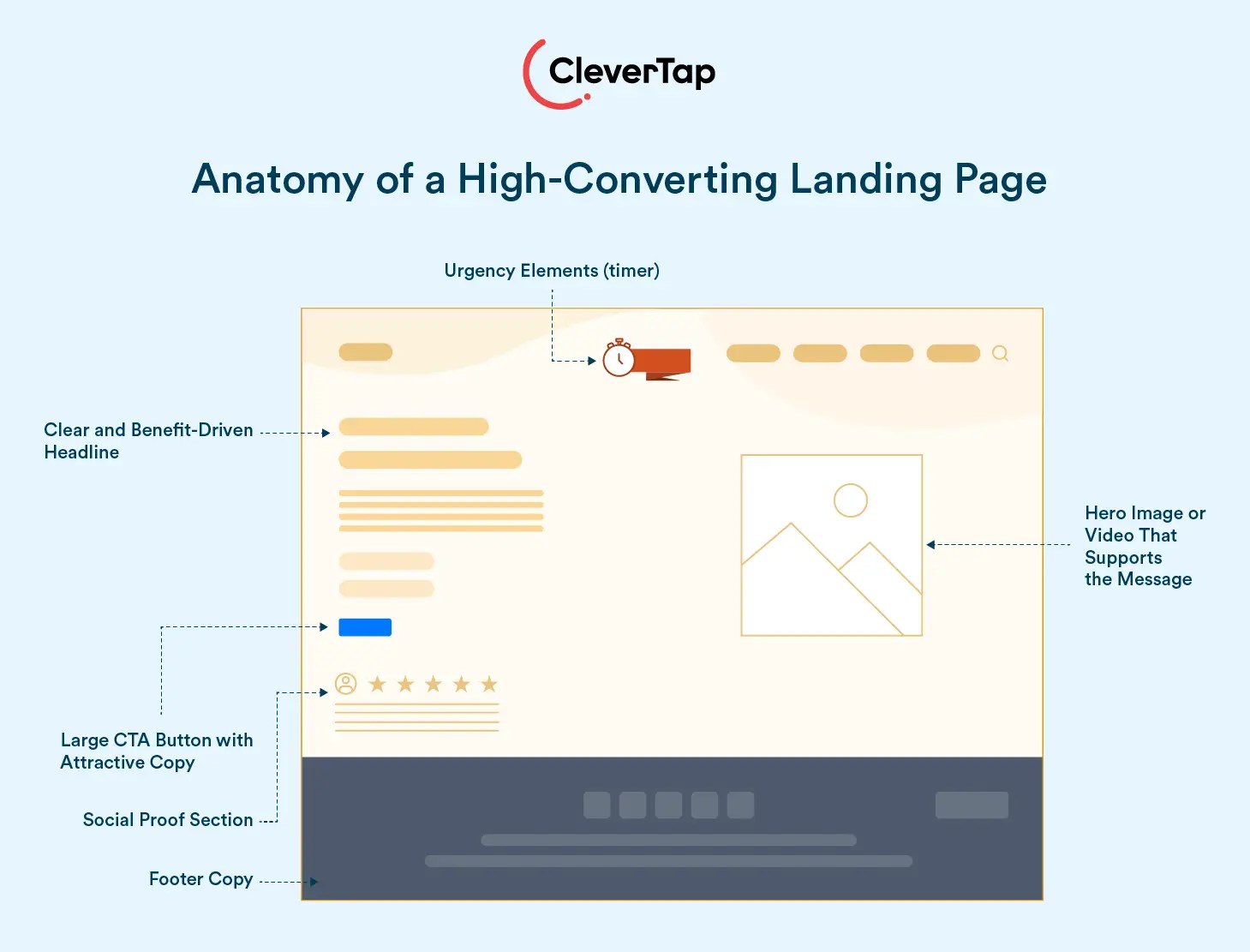
5. Create High-Impact Landing Pages
Landing pages are the foundation of conversions, designed with one primary goal—whether it’s collecting leads, driving downloads, or closing sales. To succeed, every element must work together to guide users seamlessly toward a single action.
Start with a clear, benefit-driven headline that grabs attention and immediately communicates value. Follow this with concise supporting text that reinforces the message. Use visuals strategically—a high-quality hero image or video can create an emotional connection and explain the offering effectively.
CTAs should be bold, actionable, and visible. Use clear phrases like “Sign Up Now” or “Claim Your Discount,” and ensure they stand out visually through contrasting colors and strategic placement (above the fold and repeated lower down).
Remove distractions such as extra navigation links or irrelevant content to keep users focused on the goal. Add elements of urgency or scarcity, like countdown timers or “Limited Stock” messages, to prompt immediate action.
Incorporate social proof—testimonials, reviews, or badges—near the CTA to build trust and reassure hesitant users. Lastly, run A/B tests on key elements like headlines, images, and CTAs to continuously improve performance.
A high-performing landing page is concise, user-focused, and laser-targeted to optimize website conversion rate.
6. Prioritize Mobile Optimization
With mobile accounting for over half of all web traffic, delivering a seamless mobile experience is no longer optional—it’s essential for driving conversions. A mobile-responsive design is a good starting point, but to truly excel, you need to adopt a mobile-first mindset.
Start by simplifying mobile web navigation to make it intuitive and clutter-free. Use larger, touch-friendly buttons and ensure forms are concise, reducing the effort required to complete actions. Additionally, optimize page load times, as even a one-second delay can lead to significant drop-offs.
Mobile users often prefer shorter forms, streamlined checkout processes, and CTAs designed for easy thumb access. Placing critical action buttons within reach zones and offering autofill options can significantly reduce friction.
Mobile optimization should not only be focused on making your site functional on smaller screens but also on creating a smooth, enjoyable experience that meets the expectations of today’s mobile-savvy users. Prioritize these changes to boost engagement, reduce bounce rates, and drive higher conversions.
Learn how to increase your app conversion rate using these 25 strategies.
7. Integrate Live Chat for Real-Time Support
Live chat provides users with immediate answers to their questions. It reduces the likelihood of abandonment. Real-time support keeps users who are confused about shipping options or need help choosing a product engaged. Chatbots can handle common inquiries, but offering the option to speak with a human for more complex issues adds a personal touch.
Integrating live chat is especially valuable during the checkout process, where last-minute doubts often arise. Address these concerns in real time to prevent drop-offs and boost conversions. A well-trained support team or advanced chatbot functionality can make live chat a significant contributor to your overall strategy.
8. Leverage Personalization to Boost Engagement
Personalization turns a generic experience into one that feels uniquely tailored to each user. Analyze behavior, preferences, and browsing history to deliver targeted recommendations, offers, and messages that align with individual needs. This can include product recommendations based on browsing history, dynamic homepage content, interactive push notifications, or email campaigns tailored to users’ recent activity.
To implement effective personalization, start by collecting and analyzing data. Look at what users are browsing, adding to their carts, or abandoning. Use this data to send targeted emails, display relevant product suggestions, or create retargeting ads that highlight exactly what the user showed interest in.
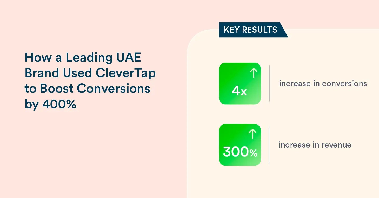
A leading UAE fashion retailer used CleverTap to achieve a 4x boost in e-commerce conversions by transitioning from generic notifications to hyper-personalized campaigns. Instead of sending broad messages like “Check out our latest deals,” they focused on specific products users had browsed or added to their carts.
Personalization works because it mirrors the user’s interests, making them feel understood and valued. The result? Higher engagement, better retention, and significantly improved conversion rates.
Click to Read the Full Case Study
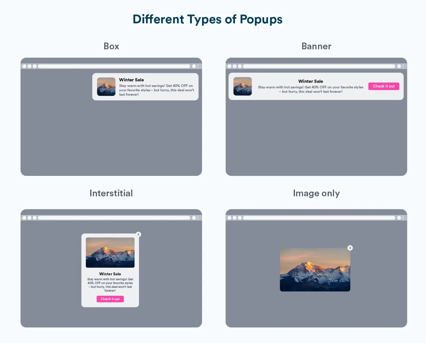
9. Incorporate Exit-Intent Popups Strategically
Exit-intent popups are a powerful way to recover potentially lost conversions. These popups detect when a user is about to leave and present an enticing offer, such as a discount or free shipping. For example, if someone is abandoning their cart, you might display a message like, “Wait! Complete your purchase now and get 10% off.” However, make sure to design and deploy these in a way that feels helpful rather than intrusive.
The key is to ensure your popups add value without frustrating the user. When done right, they can turn abandonment into action and significantly boost conversions.
10. Collect Customer Feedback and Use Surveys
Your customers know better than anyone what’s working and what’s not. Use surveys and feedback forms to gather insights about their experience. Short, targeted surveys—such as post-purchase feedback or exit surveys for abandoning users—can reveal valuable data you might otherwise miss.
For example, you might discover that users find your checkout process confusing or that they prefer different payment methods. Acting on this feedback shows customers you value their input and helps you refine your offering.
11. Optimize Your Checkout Process and Recover Cart Abandonments
The checkout process is a critical point where many users drop off. Simplify it by reducing form fields to only essential ones, such as name, email, and payment details. Add progress indicators like “Step 2 of 3” to reassure users and ensure all costs, including shipping and taxes, are transparent upfront—surprises at checkout lead to abandonment. Provide multiple payment options, including digital wallets and guest checkout, to minimize friction.
Decathlon’s experience highlights the importance of these steps. They streamlined their checkout process in Taiwan by removing unnecessary steps, reducing form fields, and clarifying payment options.* Results? Much higher customer satisfaction and better conversion rates.
Don’t stop at checkout optimization. Abandoned carts are an opportunity to recover sales. Send follow-up emails reminding users of their items, including product images, prices, and benefits like free shipping or limited stock alerts. Personalized emails with targeted offers are far more effective than generic reminders. Finally, monitor analytics to identify and fix bottlenecks in the checkout flow and ensure that every step supports a smooth user experience.
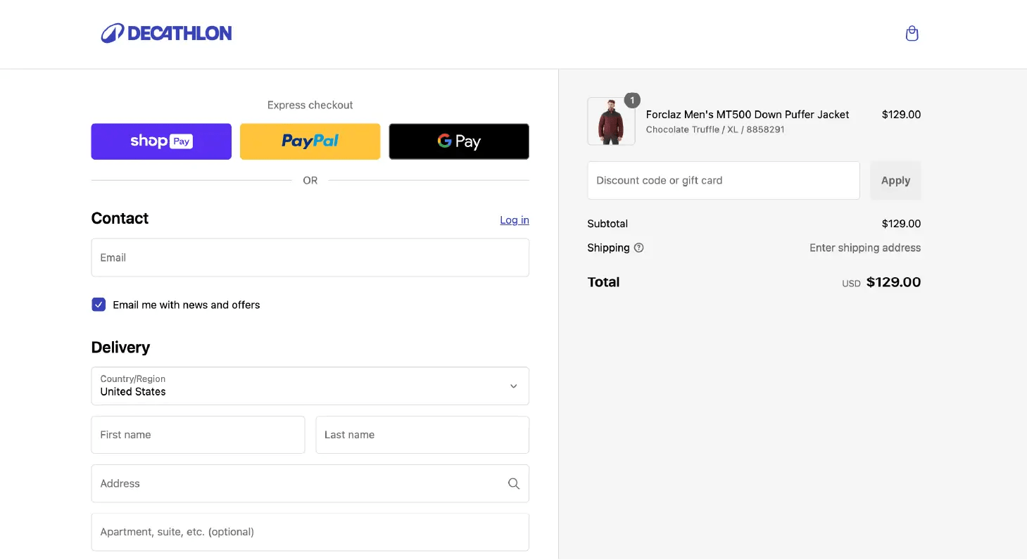

Source: Decathlon
12. Engage with Interactive Content and Dynamic Copy
Interactive content, like quizzes or recommendation engines, engages users while offering value. For example, a gift-finder tool or product quiz can simplify decisions and collect data to refine campaigns. To implement, focus on solving user needs and integrate these tools seamlessly into your site. Monitor performance to fine-tune effectiveness.
Dynamic copy enhances personalization by adapting text to user behavior. Instead of “Welcome back,” use “Welcome back, Sarah! Items in your wishlist are selling fast.”
Tools like CleverTap’s Scribe make it easy to create personalized messages for websites, push notifications, and emails. These copies include personalized details like product names, images, prices, and deep links to resume checkout. Scribe also enables the creation of dynamic, targeted notifications that are tailored to user interests and behaviors.
13. Use FOMO, Scarcity, and Urgency Tactics
Human psychology is a powerful tool in conversion optimization, and nothing triggers immediate action like FOMO (fear of missing out). When users sense they might lose access to something valuable, they’re more likely to act quickly. Scarcity and urgency create a sense of exclusivity and time sensitivity, driving faster decision-making.
For example, displaying “Only 2 left in stock” on a product page can encourage hesitant users to buy before they miss out. Similarly, countdown timers like “Sale ends in 3 hours!” create urgency that nudges visitors to act before it’s too late. Push notification examples like, “Trending Now: Everyone’s streaming Velvet Horizon Season 2! Watch it now before spoilers take over!” effectively combines FOMO with urgency to motivate immediate engagement.
The key to success lies in balance. Hence, use these tactics strategically and authentically. Overuse can dilute their impact and frustrate users, so reserve them for genuinely time-sensitive opportunities to maintain trust while driving conversions.
14. Implement Smart CTAs
Your call-to-action (CTA) is the linchpin of your conversion funnel, directly influencing whether users take the desired next step. A well-crafted CTA is a strategic trigger that guides users toward action, it could be for signing up, making a purchase, or exploring more. The key to an effective CTA lies in clarity, directness, and alignment with user intent.
Netflix provides an excellent example of a high-performing CTA. Their homepage prominently features a bold red “Get Started” button accompanied by a copy promising “Unlimited movies, TV shows, and more.” The design ensures the CTA stands out visually, while the message reinforces the value proposition and compels immediate action.
When designing your CTAs, ensure they’re visually distinct, strategically placed in high-visibility areas, and paired with benefit-driven messaging. For instance, instead of a generic “Submit,” use action-oriented text like “Start Your Free Trial” or “Get My Discount.”
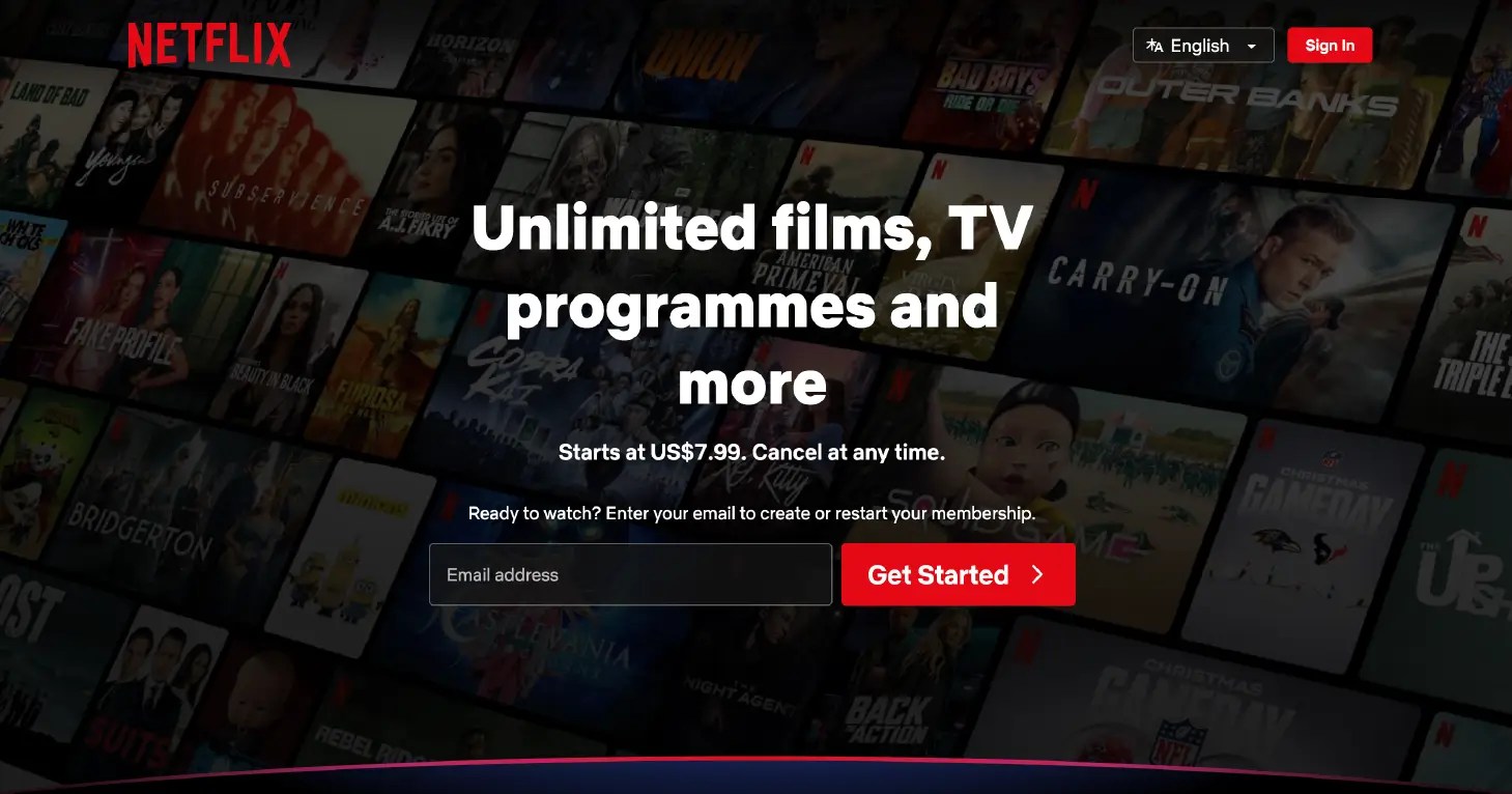
Source: Netflix
15. Speed Up Your Site’s Load Time
Research shows that a one-second delay in page load time can result in a 7% drop in conversions. In today’s fast-paced digital environment, users expect websites to load instantly. If yours doesn’t, they’ll abandon it and move on to a competitor.
To optimize your site’s load time, start by compressing images, enabling browser caching, and minimizing unnecessary scripts. Use tools like Google PageSpeed Insights to identify performance bottlenecks and address them promptly. Additionally, consider leveraging a content delivery network (CDN) to ensure faster load times across geographic locations.
A fast-loading website not only improves user experience but also positively impacts your SEO rankings, driving more traffic to your site.
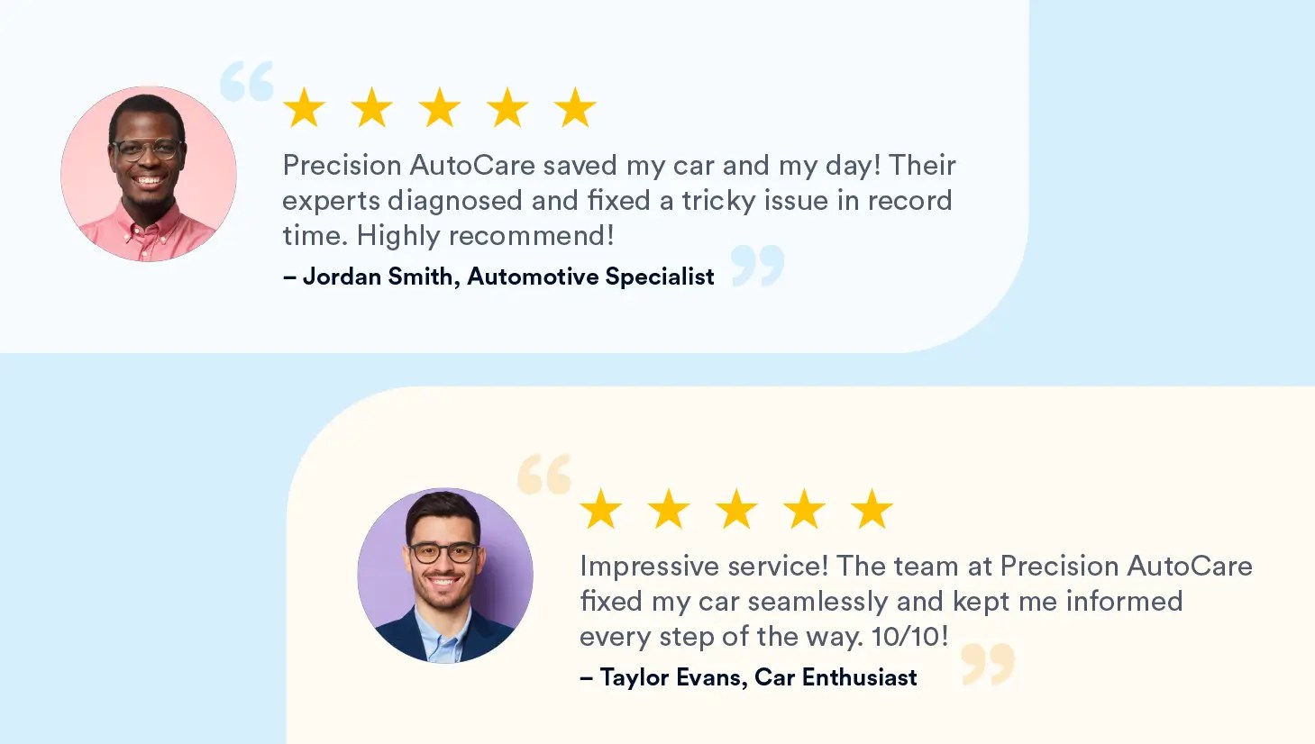
16. Showcase Social Proof Prominently
Social proof is essential for building trust and converting hesitant visitors. Start by actively collecting customer reviews, testimonials, case studies, and user-generated content (UGC). Use automated tools to request reviews post-purchase and guide customers to share specific details about how your product or service solved their problems. Highlight these endorsements prominently on product pages, landing pages, or near CTAs for maximum impact.
For best results, include reviewer details such as names, photos, or credentials to add authenticity. Encourage customers to share photos or videos of your product in action and feature this UGC across your site to make your brand relatable and credible.
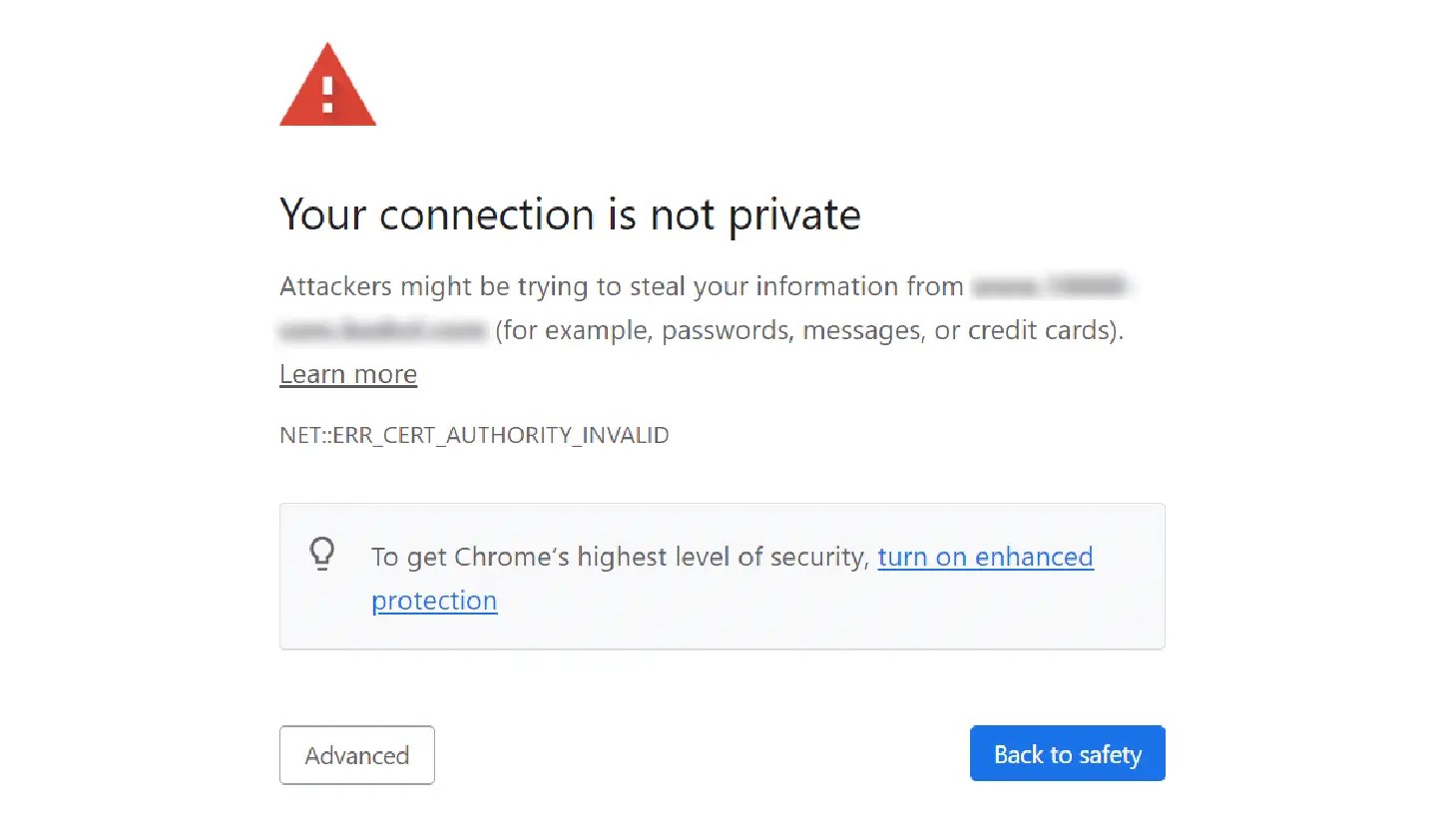
17. Enhance Trust Signals Throughout Your Site
Trust is the crux of conversions. If users perceive your website as untrustworthy, they won’t complete their journey—no matter how enticing your offer is. Start with the basics: ensure your site has an SSL certificate (indicated by the padlock icon and HTTPS). A warning like “Your connection is not private” can immediately drive users away.
Beyond technical security, showcase policies like “Money-Back Guarantee” or “Hassle-Free Returns” to reduce purchase anxiety. Clearly display contact information and ensure your site’s design looks professional and credible. Trust signals, both visual and contextual, create an environment where users feel safe sharing their information and making purchases.
Establishing trust signals is especially critical for improving conversion rate for fintech apps.
18. Leverage Retargeting Ads to Re-engage Visitors
Not every visitor will convert on their first visit, but that doesn’t mean they’re lost forever. Retargeting ads allow you to re-engage users who’ve interacted with your site but didn’t complete their desired action. These ads are highly effective because they target warm leads—users already familiar with your brand.
For instance, if someone browsed a specific product but didn’t purchase it, you can serve them a dynamic ad showcasing that exact item, accompanied by a limited-time discount. Retargeting ads can also highlight benefits they might have overlooked, such as free shipping or exclusive features. By staying top-of-mind and presenting relevant offers, retargeting ensures you recapture lost opportunities and drive conversions.
19. Focus on Visual Hierarchy and Value Proposition
Your website’s design should guide users’ attention to the most important elements. This is where visual hierarchy comes into play. By using size, color, contrast, and placement strategically, you can ensure key information—such as your value proposition and CTAs—stands out immediately.
Apple’s website is a masterclass in visual hierarchy. When you land on their page, your eyes are drawn first to the headline, which communicates their value proposition succinctly. Next, the imagery reinforces the message, and finally, the CTA invites you to act.
By organizing content in a way that flows naturally, you make it easier for users to process information and take the next step. Remember, your value proposition should always be front and center. If users can’t see why they should choose you within seconds, you’ve already lost them.

Source: Apple
20. Use Advanced Attribution Models to Refine Campaigns
Attribution is critical for understanding which marketing efforts are driving results. While many marketers rely on last-click attribution, this approach often oversimplifies complex customer journeys. Advanced models, such as time decay or position-based attribution, provide a more holistic view by assigning credit to multiple touchpoints throughout the journey.
For example, a user might first discover your brand through a social media ad, sign up for your newsletter after reading a blog post, and finally convert after receiving an email. Advanced attribution models help you understand how these interactions work together, enabling you to allocate resources more effectively. By identifying the channels and strategies that deliver the best ROI, you can optimize your campaigns and drive better results.
21. Build Email Campaigns That Nurture Leads
Email marketing remains one of the most powerful tools for driving conversions, but generic email blasts are a thing of the past. To truly engage your audience, create personalized, segmented campaigns that cater to each recipient’s specific needs and behaviors. Start by analyzing user data—purchase history, browsing habits, or preferences—and segment your audience into meaningful groups. This enables you to craft messages that feel tailored to each individual.
Include dynamic, action-oriented CTAs to guide recipients, whether it’s reminding them about abandoned carts, showcasing products they’ve browsed, or offering exclusive discounts based on their interests. Timing is also critical, so schedule emails when users are most likely to engage.
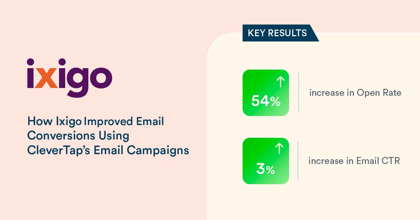
Tools like CleverTap streamline this process by enabling real-time segmentation and automated delivery. Ixigo, for instance, improved its email open rates by using CleverTap to tailor campaigns based on travel interests. With subject lines like “Ready to Book Your Next Adventure?” and targeted offers, they increased engagement and conversions significantly. Replicating such strategies ensures your emails feel personal, relevant, and compelling, turning leads into loyal customers.
How CleverTap Can Help Boost Conversions
CleverTap is a comprehensive customer engagement platform that simplifies the execution of many conversion-boosting strategies outlined here. Its analytics suite provides deep insights into user behavior, helping you identify friction points and optimize the customer journey. With built-in A/B testing, you can refine messaging, layouts, and offers based on real-time data, ensuring every decision drives measurable results.
Personalization is effortless with CleverTap’s segmentation tools, enabling you to deliver dynamic recommendations, targeted push notifications, and behavior-triggered campaigns. Additionally, the platform streamlines tools like exit-intent popups and lifecycle management, helping you engage users at the right moment. By unifying these capabilities, CleverTap empowers marketers to refine their strategies, boost conversions, and drive sustained growth.
Drive personalized engagement and increase conversions with CleverTap.
Subharun Mukherjee 
Heads Cross-Functional Marketing.Expert in SaaS Product Marketing, CX & GTM strategies.
Free Customer Engagement Guides
Join our newsletter for actionable tips and proven strategies to grow your business and engage your customers.
