We thrive on stories. We’ve been telling them for generations. Stories are tools for communication. But more importantly, they’re a means of building community. When people gather round the fire to weave stories, they do so to convey information, to entertain, and to build a sense of unity.
In essence, that’s what a user journey map is for. It tells a visual story of how a user or customer (we refer to them interchangeably) interacts with your brand.
The ultimate goal is not just to inform, but to build stronger bonds between you and your customers.
What is a User Journey Map?
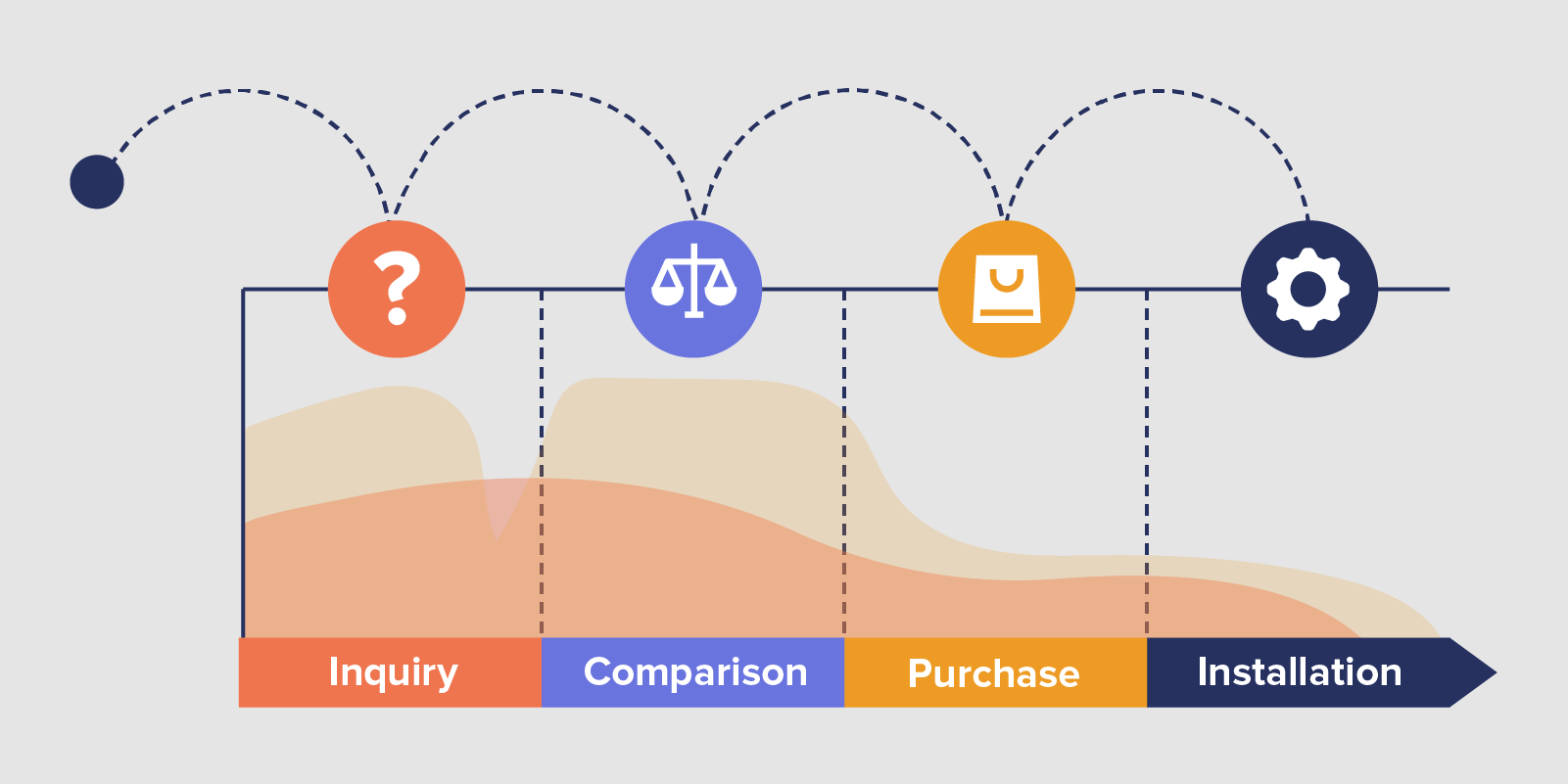
A user journey map is a visual representation of the “story” from a customer’s perspective. Like the sample above, the customer journey map is a graphic.
There are many formats for presenting the customer story. The most common is the infographic. It’s easily digestible and contains a combination of visuals and text.
The most important aspect of the map is that it be from the user’s point-of-view. This is not a product roadmap that outlines how you plan to release new features over the course of a year. Rather, it is a retelling of the user journey from onboarding to conversion and beyond.
What is the Purpose of a User Journey?
The user journey helps you visualize your product from the customer’s point-of-view via a user journey map. It helps focus the lens on how customers experience your product or service.
Creating journey maps may be more common in the marketing industry. But they do have an important role to play in your work no matter what industry you’re in.
As brands, we can get caught up in a flurry of new features. It’s a quest to improve the product – but from our point-of-view. We forget that customers don’t always ask for the features we release.
The user journey map is a reminder that users have varying expectations. And some of these may intersect with your actual business objectives.
It’s also a tool that forces us to look at areas of the user experience that need improvement. The goal, after all, is to engage and ultimately retain our customers.
The Art of Onboarding Mobile App Users
What is the Difference Between User Journey and User Flow?
A common area of misunderstanding is user journey vs user flow. Is a user journey identical to a user flow? Not at all. To understand what is the difference between user journey and user flow, the key word is “emotion.”
User flows are simply the listing of steps that a customer takes to achieve a goal within your app. No emotion involved. The term “flows” comes from flow charts, where each action leads to a result.
User journeys on the other hand map out the customer’s feelings, expectations, and questions as they use your app. Here, it’s all about emotions. How does a customer feel as they use your product or interact with your company? Elated? Frustrated? Entertained?
User Journey Maps Show How Customers Experience Your Brand
Remember that every customer has a story. And every interaction between your brand and your customer becomes a part of that story. When you graph these interactions over time, you chart a journey map of how your brand appears to the user.
What a User Journey Map Looks Like
Here’s what a sample user journey map might look like. You are able to map all the major points where a customer interacts with your business onto either a positive or negative area even as you lay out the experiences over a timeline.
These touchpoints will include everything from reading your app store description or banner ads all the way to interacting with your customer success team and accessing your help documentation.
Note how it starts with a customer pain point in the lower left and how that problem prompts them to find your app. It then follows the user as they figure out how to use your app and learn how things work.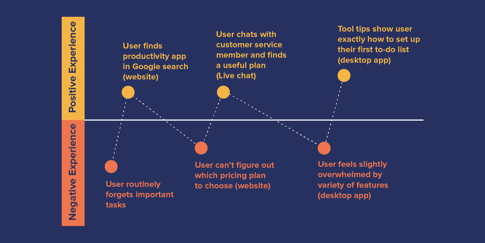
How Do You Analyze User Journey?
It’s important to note that user journeys are unique to your product and to your customers. There is no one-size-fits-all process for looking at your journeys, but there are a few common elements to pay attention to. How do you analyze user journey? By looking at:
- Unneeded interactions: You don’t need to bombard your customers with extraneous touchpoints. Optimize! Lessen the steps needed to accomplish something.
- Negative experiences: Low points are areas where expectations are not met, or where users had negative experiences with your brand. Figure out which of those low points to prioritize and work at reversing these negative experiences.
- Successes: Just as valuable are the areas where your app met or even exceeded expectations. What did you do right? How can that success be duplicated in other areas of the user journey?
- Omnichannel friction: Because user journeys often jump from device to device, you have to look at those times when shifting to a new channel breaks the journey, for example: an email offer leading to your brand’s homepage instead of a landing page, or a coupon in a push notification that merely launches the app instead of showing the same coupon within the app.
- Time spent at each stage: As users move from experience to experience, see how long it takes them to move forward and whether this timing is ideal.
User Journey Template
A good template for any customer journey map will involve around five basic elements: personas, timeline, actions, channels, and feelings/expectations/questions. These elements allow you to pinpoint the complete experience a user undergoes.
In creating your customer journey map template, note that the focus is NOT your product. Once you settle into that idea, building it becomes much easier.
Personas
This map is about your users. But which ones? This is where customer personas come into play.
Personas allow you to generalize about certain groups of users. But they also give you enough specific details (e.g. demographics and psychographics) to help you understand their needs and expectations.
Timeline
The second element is a timeline. Remember that this map has a specific duration, with a beginning, middle, and end. The end will be a conversion, purchase, or installation of your app. You map out the interactions that a user has with you over this duration.
Actions
What is the user doing at every interaction with your app or brand? Watching an onboarding video? Clicking a push notification?
Feelings, Expectations, and Questions
At every interaction, you need to chart the emotional state a user is in.
On the chart, split the y-axis of your timeline into positive and negative emotional states. The x-axis should be time.
Are users annoyed by a popup? Or are they happy with a download? Use customer feedback as well as your behavioral analytics to note the moods they experience.
Look for the events in the user journey that confuse your customers or anger them. This will give you a chance to focus on the problem areas. Improving these will affect the total user experience for your customers.
Also, don’t forget to figure out what the expectations were during an interaction, and what questions could be running through their minds. This extra data will give you a more complete picture of why users behave a certain way.
Channels
Finally, what channel is the user on when interacting with you and your brand? Are they watching the onboarding tutorial on a desktop? Are they exiting an in-app notification on their mobile device? Or are they conversing with a salesperson via Skype?
What are the 7 Steps to Map the Customer Journey?
Now to build it. A good customer journey map will involve 7 basic steps:
- Researching your audience
- Building personas
- Identifying pain points per persona
- Mapping the timeline and touchpoints
- Optimizing your interactions
- Finding the insight
- Revising based on insight
Putting all these elemnents together entails a good deal of collaboration with your various teams: everyone from marketing and customer success all the way to data analysis and development. But the idea is to put all the information together so you can lay it out into a document or whiteboard.
1. Researching Your Audience
Begin with the existing data you already have about your user journey. Grab it from:
- Your mobile analytics tool
- Website analytics
- Your customer service team
- Existing customer interviews
But also, go out and gather new research you need to make a useful journey map:
- Ask for feedback via interviews
- Schedule focus group discussions
- Look through comments on social media
- Send surveys to users
What you are looking for are the extremes: the positive and negative experiences. What do people like in your app? What do people complain about? In this case, neutral feedback won’t be very helpful as it doesn’t confirm you’re doing things right or wrong.
2. Building Personas
User personas are nothing more than fictitious representations of your ideal customers.
We suggest you create no more than four personas. Don’t get carried away. What you simply need is customer representations that capture the background, demographics, lifestyle, personality, and app preferences of your four most common buyer segments.
3. Identifying Pain Points Per Persona
Here’s where the exercise puts into perspective the data you’ve gathered about your ideal customers: what are their pain points? Why would they look at your app to solve them? How can your app and your company solve their problem?
4. Mapping the Timeline & Touchpoints
Next you will need to map out all the various touchpoints. This can happen after the research phase, or simultaneously.
Gather the various stakeholders of this project in a room or a virtual communication channel (e.g. Slack channel, Wiki, etc.). And list out all the times when your customer personas touch your brand.
What are these touchpoints? Where and when do they happen?
List everything including:
- Emails
- Banner ads
- Landing pages
- In-app notifications
- Support chats
They can be as simple as a scheduled notification or as complicated as downloading your app’s SDK.
Next, add the feelings, expectations, and emotions that your personas undergo at each interaction.
5. Optimizing Interactions
As mentioned in an earlier section, after you’ve mapped out all the different ways a customer interacts with your company, the next step is to figure out how to optimize and streamline these interactions. How can you make things easy for your users? How can you take away possible roadblocks to them becoming lifetime customers? How can you engage them so they continue to use your app and rely on your brand in the months to come?
6. Finding the Insight
After it’s all been built, analyze the user journey and find the insight, particularly where your app’s Aha! Moment is. How can you more efficiently move a new user toward that aha moment? What actions can your company take to improve the user experience for your app users?
7. Revising Based on Insight
As in everything related to development and improvement of a product, the cycle is never ending. You glean new insights, you then implement them back into your product and keep refining the user journey and the entire UX until everything is streamlined.
When to Build a User Journey Map
When is the best time to start building this map? Obviously, you can’t begin until you have users. It will be more beneficial to wait until you’ve collected enough users to have varying experiences. And this number will depend on your industry and the type of app.
Ideally though, you should begin mapping in the early days of your growth – before your user base grows into the thousands, before any viral success comes your way. Why?
- To understand every touchpoint where you interact with customers
- To ensure your customers are happy with how they’re experiencing your brand before you get too big
- To uncover opportunities you may not see any other way
How Your User Journey Map Plus CleverTap Increases Engagement
This user journey charted on a timeline is now a tool that allows you to step into your customers’ shoes. Use it to empathize with them.
Wherever there is a problem area, take a look at what improvements you can make. Wherever they experience frustration, optimize the experience or get rid of stumbling blocks. Make things smoother. Make communication clearer. Meet their expectations. Engage them.
CleverTap lets you turn all this insight into action. CleverTap’s Journeys lets you use visuals to build omnichannel campaigns to engage and delight your customers. This feature makes it easy to get users to increase usage of your app, and further, to move them toward conversion.
The user journey map is there to help you figure out how to improve your customers’ stories. And with CleverTap, a simple visual timeline is all you need to begin building a better experience for your customers.

The Art of Onboarding Mobile App Users
Shivkumar M 
Head Product Launches, Adoption, & Evangelism.Expert in cross channel marketing strategies & platforms.
Free Customer Engagement Guides
Join our newsletter for actionable tips and proven strategies to grow your business and engage your customers.

