


Table of Contents
Categories
Most Popular


Human beings try to find patterns to explain the reason behind almost every phenomenon, but that doesn’t mean that there is a pattern to rely on. Superstitions are a classic example where spurious patterns were generalized to explain many a phenomena. As Analysts, we are on the lookout for patterns and quite often, either knowingly or unknowingly we rely on spurious patterns. Let’s take a look at some spurious patterns in univariate, bivariate & multivariate analysis:
a) Univariate Analysis
Univariate analysis is when we analyze a single variable at a time. Generally the default choice for visualizing numerical variables is Histogram. Histogram is a quick way to infer the distribution of the underlying variables. Let’s analyze the variable ‘x’ given below:
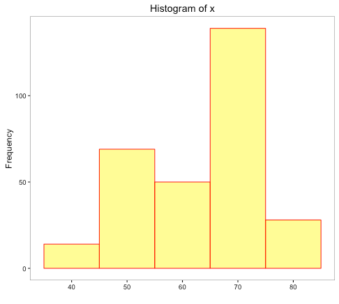
From the shape of the histogram, it seems the distribution is left-skewed, but does it picture the entire story? The data is represented on 5 intervals between 35 and 85. A little over 45% of the observations are in the interval – 65 to 75. What if we change the number of intervals from the current 5 to something higher that could give a better distribution of data among the intervals?
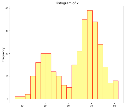
In this histogram, each interval is of size 2 approximately. There seems to be a change in the shape of the distribution now. The original inference of left-skewed distribution is now replaced with a shape that has 2 peaks.
In the above histograms, we played with the interval size or break points represented on the x-axis. What if we play with the y-axis on which the frequency of the points in each interval is shown?
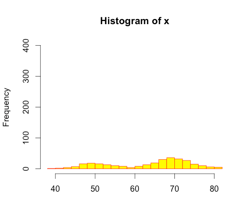
In the above histogram, we have just changed the scale of the y-axis with the maximum frequency of 400 instead of 100. It seems from the histogram that there isn’t much difference in the number of data points in each interval shown by height of each bar and the data seems close to uniform distribution. This obviously isn’t the case. We need to be careful while searching patterns or drawing inferences about the distribution of data through visual examination with help of histograms.
b) Bivariate Analysis
We analyze 2 variables at a time in bivariate analysis. In order to check the existence of a pattern in 2 numerical variables, the popular choice includes use of line charts to visualize and/or use of correlation coefficient to quantify the movement of the 2 variables (Check out this article to compare different variables).
For example: Suppose we have a time series data of 2 variables, x-axis could represent the time and with the help of 2 y-axes, the data pertaining to the variables could be plotted on each axis.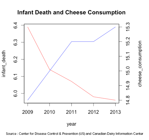
The above line chart plots the data on infant deaths per thousand and per capita cheese consumption of United States from the year 2009 to 2013. It does appear that both move in the opposite direction i.e. if one increases, the other decreases and vice-versa. What if we change the range in one or both the y-axes?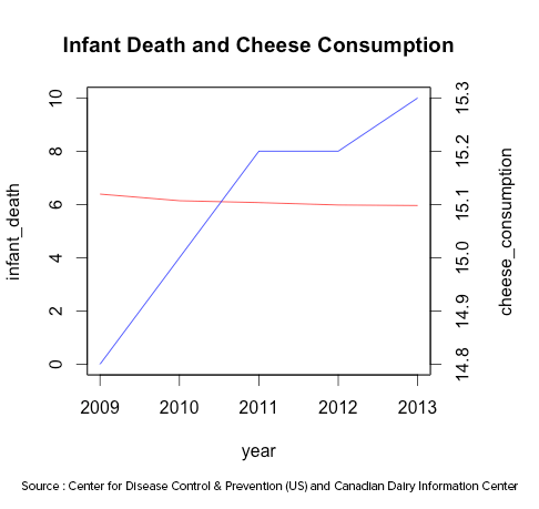
In the above chart, we changed the range of infant deaths. With that change, the variables don’t seem to move in opposite direction. Similar to the example shown in the univariate analysis, with the manipulation of y-axis, we could alter the end result.
Another way to compare the numerical variables is correlation coefficient. The correlation coefficient of Infant Deaths and Cheese Consumption is -0.97. It seems that both the variables move against each other and are negatively correlated.
Does it make sense to draw an inference about the cheese consumption and infant deaths from the line chart and correlation coefficient? It may seem that if the cheese consumption increases/decreases, infant deaths decrease/increase or vice-versa? It is quite obvious that the existence of a relationship is pure fallacy. It may be a pure coincidence or some other unknown factor(s) could be driving such behavior. Thus, line charts and correlation coefficient are not sufficient to conclude the existence of relationship between 2 variables.
(c) Multivariate Analysis
We are living in the age of Big Data. The promise of big data include better insights and better predictive models with the increase in volume, variety and speed of data mined, but, can we use big data indiscriminately or is there any risk involved?
Google Flu Trends
In 2008, a team of researchers from Google announced a remarkable achievement in one of the world’s top scientific journals, Nature. It was remarkable because one could track the spread of influenza across US without waiting for medical check-up. Google scientists claimed that they can estimate the influenza activity in each region of United States with a reporting lag of about 1 day compared to weeks by Center for Disease Control and prevention (CDC).
So how did they do it?
Google found a correlation between what people searched online (search terms) and whether they had flu symptoms. It was fast, cheap and theory free.
So what went wrong?
In the interval of 2011-2013, it started throwing inaccurate estimates with the highest inaccuracy at the peak of the flu season in 2013 where it estimated almost twice as many flu related doctor visits as CDC. There were many reasons to explain the inaccuracy like vulnerability of the prediction model to over fitting due to millions of search terms fitted to CDC data and searches being correlated with CDC’s data by pure chance, changing search behavior over time, etc.
Over-reliance on Correlation
One of the key common metric to identify patterns in the examples shown for bivariate and multivariate analysis is Correlation. Unless you know the factors driving such correlation, you have no idea what might cause the correlation to break down and cease to exist. Additionally, even though you are dealing with tons of data, you are dealing with only a sample of the bigger dataset i.e. the population (Check out this article to find out how little data can be more beautiful than big data). It may so happen that for few samples, the variables can be correlated.
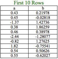
Let’s understand the breakdown of correlation with the help of a simple example. We will be working with a dataset with 10 million observations of 2 variables, a & b.
We shall assume that the entire dataset is the population.
Correlation coefficient of ‘a’ and ‘b’ = 0.07
In real life, the datasets we work with are samples of the population and generally, we assume that such samples are representative of the population. We will draw out 4 random samples containing 100,000 observations and record the correlation coefficient of ‘a’ and ‘b’ in such samples. The samples drawn are such that observations drawn for one sample are not considered for the next sample.
Sample 1: 0.717
Sample 2: 0.405
Sample 3: 0.067
Sample 4: 0.068
The above results indicate that the sample correlation coefficient is quite different as compared to the population correlation coefficient for Samples 1 and 2.
Why did this happen?
Even though there wasn’t any correlation between the variables in the population, the correlation coefficient was medium to high for a couple of samples, which was due to pure chance. This could be one of the reasons explaining the inaccuracy of estimates based on correlation for Google Flu Trends, in addition to other factors.
Closing Thoughts
Many a times the role of an analyst demands identifying patterns to explain different phenomena. Under pressure, bias or sheer excitement, he/she might uncover spurious patterns. Hence, the factors driving the identified patterns need to be determined not only to understand if the identified patterns are reliable but also, the reason behind the deviation of such patterns in future. As an analyst, one needs to keep in mind that the Journey is more important than reaching the Destination.
Source Code to reproduce the examples mentioned in the article available here.
Jacob Joseph 
Heads Data Science.Expert in AI, Data & Analytics and awarded 40 under 40 Data Scientists in India.
Free Customer Engagement Guides
Join our newsletter for actionable tips and proven strategies to grow your business and engage your customers.
