How do you know which is the better call-to-action button? Or which sign-up form is more effective?
In such a competitive landscape as mobile marketing, there’s little room for intuition. Especially since you have a wide array of tools that get you the data you need to make an informed decision.
A/B testing is one such tool. And this article will walk you through how to design A/B testing effectively so you don’t waste resources wondering what works and what doesn’t.
What is A/B Testing?
A simple way to define A/B testing is you make a change in one element of your marketing campaign and compare it to a version where that one element did not change.
An element can be a CTA button, a chunk of text, an image, any single part of a marketing message. Then compare the data to see which version is more effective.
This is a tried-and-true process used by marketers to measure the effectiveness of one test variable against another.
In actual use, this means pitting one email or push notification or CTA against another in order to quantify which leads to a more effective user response. The measured change in impact of one variable can be measured in click-through rates, time spent on page, form submissions, or any other conversion metric.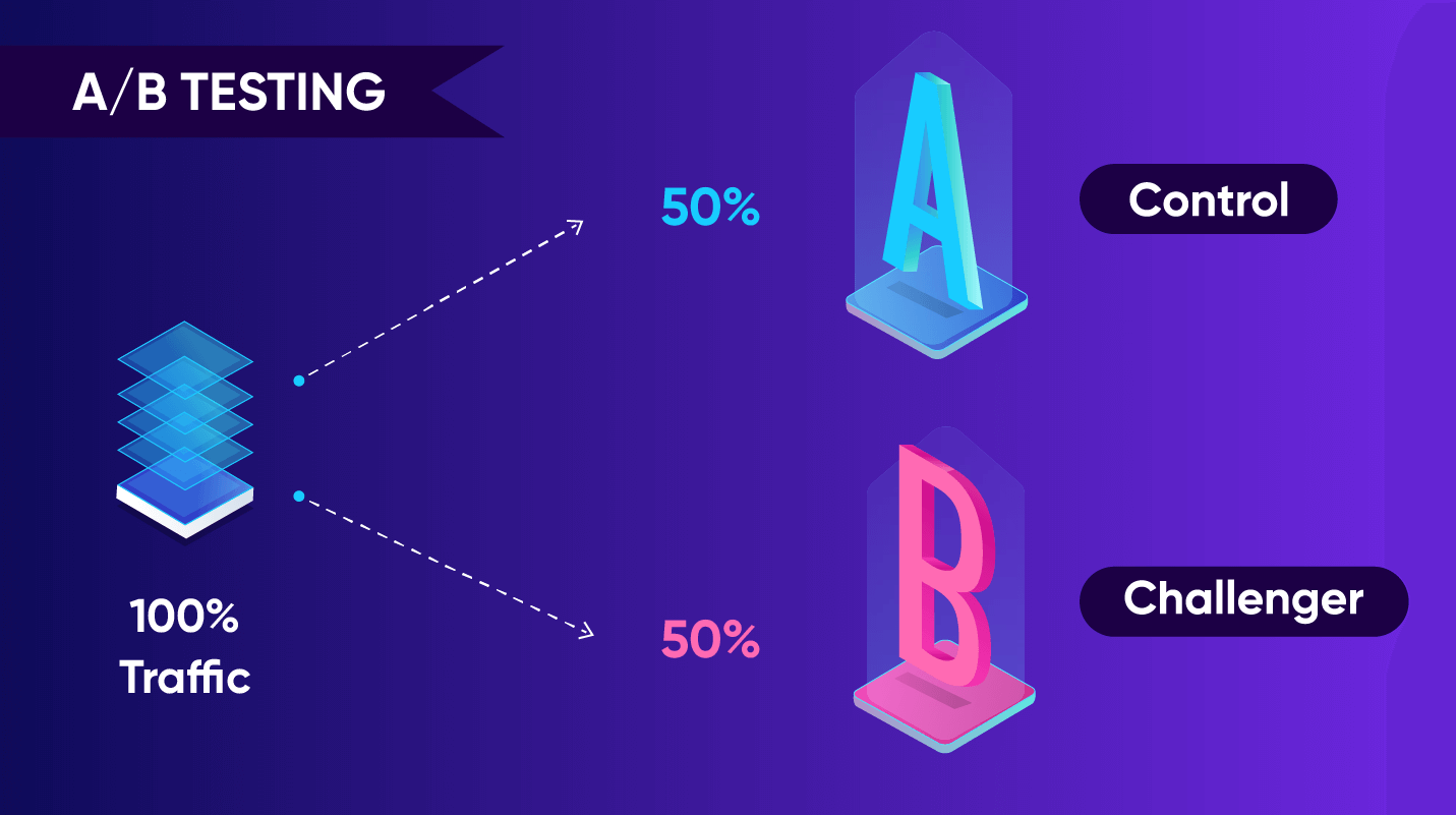
While we’ve tackled A/B tests (or split testing) before, we still need to define A/B testing design, and how important it is to construct your tests in a manner that leads to actionable insights.
Why Bother with A/B Testing?
- First, data-driven decisions are impossible without proper A/B testing. You cannot predictably rely on hunches and gut instincts to bring your campaigns success.
- Second, A/B testing allows you to choose the elements that resonate the most with your chosen user segments. This means you’re actually working to improve the user experience even at the granular level of body copy, button color, or push notification timing.
- Third, it maximizes your ROI. Instead of spending time and resources creating multiple creative campaigns over a time period, testing variants allow you to pick what works from your existing catalog of marketing resources and fashion something that’s engineered to succeed. This results in increased traffic, higher conversion rates, lower bounce rates, better engagement, and of course decreased churn.
What is A/B testing’s entire point? To figure out the best variation to use and when you land on a winner, keep using it until it stops delivering results.
3 Elements of Any A/B Test
If you’re going to be testing a variation for effective marketing, then you need to have three variables in place. (And if these variables sound like they come from an elementary school science class, that’s because A/B tests are indeed scientific experiments!)
Every A/B test needs an independent variable, a control variable (or control group), and a dependent variable.
- The independent variable: This is the element that you will test for. You can also think of this as the “cause” or the challenger. E.g.: a newly-designed orange Buy button.
- The dependent variable: This is what is measured or observed, also known as ”the effect.” E.g.: a 10% increase in mobile purchases.
- The control variable: This is a variation of the element that doesn’t change throughout the experiment. E.g.: your original white Buy button.
Design A/B Testing to Test For These Things
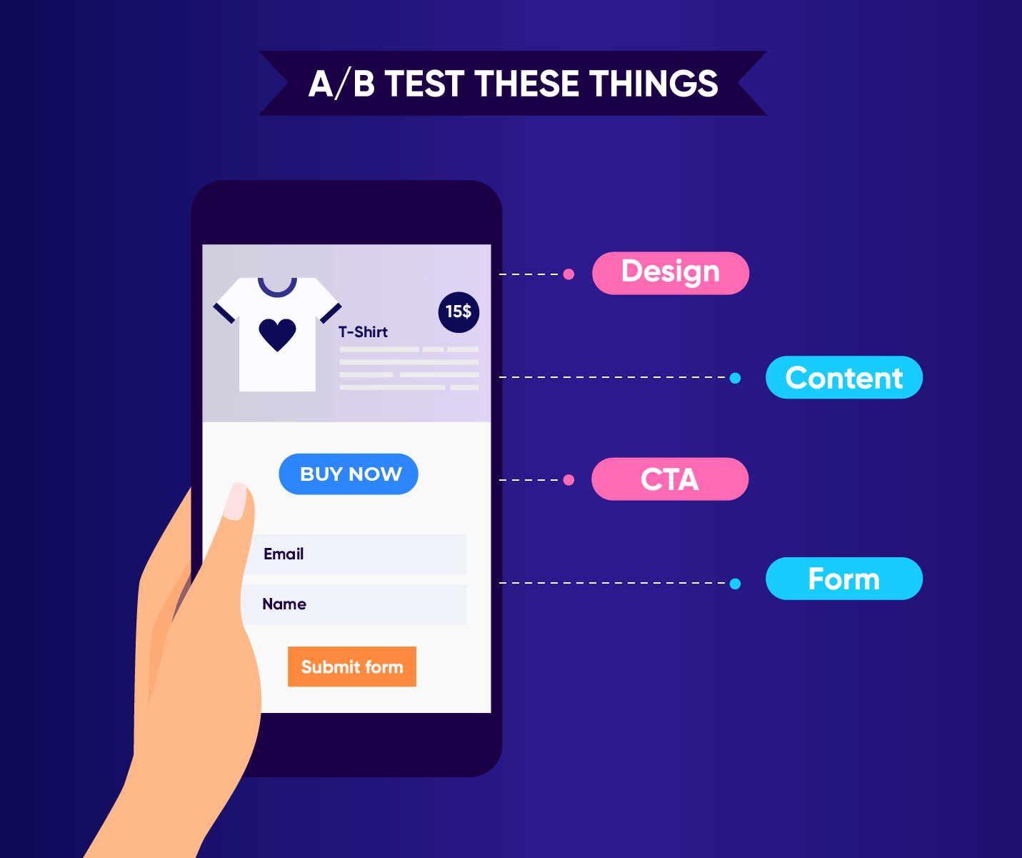
There are basically four main categories you should be testing in your mobile marketing campaigns:
- CTA
- Messaging (content)
- Design
- Forms
1. The CTA
Possibly the most important element of any campaign, the CTA (or call-to-action) is what impacts your conversion rate. Everything on your creative should lead the app user to tap the CTA.
The CTA can take many forms, depending on what constitutes a conversion in your campaign: it can be a download, registration, purchase or any action that benefits your brand.
Your A/B tests can focus on:
- Testing if the CTA stands out from the rest of the creative elements: Check which variation of color or size is more clickable.
- Testing the CTA copy: Test if the text on a CTA button makes a difference. Also whether the paragraph leading to your CTA affects click-through rates.
2. The Messaging / Content
If you’re sending an email, the subject line is the first thing you should test.
The rest of your A/B tests can focus on:
- Testing which messaging is more effective: Be sure to test the first 50 characters of copy since those are the ones first seen on push notifications and SMS.
- Testing text layout: Try a short version of your text vs. a medium length version, or test easy-to-read chunks vs. longer paragraphs.
- Testing tone of voice: Do your readers respond better to a formal or casual tone?
Check out our best practices on copywriting for mobile marketing.
3. Design
Design is another huge influencer in marketing. If the images and layout aren’t conducive to reading your message, then all things fail.
Your A/B tests can focus on:
- Testing which hero images or videos are more effective: Determine which creatives resonate with your audience.
- Testing the aesthetics of your CTA buttons: What colors or shapes or fonts make it irresistible to a user’s thumb?
- Testing layout variations: Which layouts result in better conversions?
4. Forms
Remember that forms are a staple for lead generation and are quite effective when you want to harvest email addresses in exchange for a valuable resource. Use A/B tests to ensure the user experience doesn’t break down at your form by:
- Testing the most effective length of a submission form: Strangely enough, sometimes a longer form works better than a short one. Test to find out.
- Testing the placement of your form on your mobile landing page: Should you place it above the fold, below it, or both?
- Testing the design of the submit button: Does a graphical button work better than simple text?
5. Other Tests
In a previous blog post, we detailed seven more A/B tests you can do to increase user engagement.
These tests include:
- Your app icon
- Whether to delay your registration process
- Aspects of your onboarding flow
- Push notification opt-in messaging
- Timing of your push notifications
- Choice of body font
- CTA button positioning
Should You A/B Test Everything?
Just because you can test everything we listed above doesn’t mean you should.
After all, there are lots of best practices available that can give you advice on anything from using effective colors for CTA buttons to crafting text for retention-boosting push notifications.
So use those tips as guidelines and test only when you have a hypothesis that needs to be proven.
Design A/B Testing Using This Process & Framework
Your A/B test can be created by using this simple framework: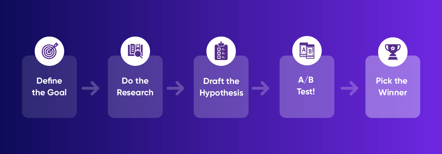
1. Goal
What do you want the user to accomplish? What tests will help you achieve that goal?
2. Research and Analysis
What are your current metrics? Some examples include your click-through rates, the number of users you sign up within a given period, and so on. Establish a baseline so you know when the needle moves because of your testing or simply a fluke of your current process.
3. Hypothesis
Decide the metric you’ll be measuring beforehand and include this metric in your hypothesis.
Some examples of hypotheses include:
- A push notification to your user segment of 18-30 year-olds will have higher engagement rates at 5 PM than at 10 AM. [Metric: engagement]
- Users are more likely to use Feature A than Feature B. [Metric: time using feature]
- Your CTRs vary depending on whether users are on Android vs iOS. [Metric: CTR]
Write out your hypothesis in a way that is measurable, where results can easily be shown to have succeeded or failed.
4. Test the Hypothesis
This is where the rubber finally meets the road and you experiment with variations.
Some tips to keep in mind when choosing your variations:
- If you need to calculate the ideal sample size for each variant you’re testing, then use our Advanced A/B Testing Calculator.
- Pick only one variable to test. If you test too many elements at once, you won’t know which one affected the outcome. If you need to test multiple elements at once, that’s multivariate testing.
- Run only one test at a time on a campaign. One campaign, one test. Otherwise, your results will get overly complicated and you won’t know which test worked.
- Group your test audience randomly and equally. There’s such a thing as bias. To avoid this, use machine learning tools to randomly group your test audience into equally-sized groups.
- Run the control and challenger tests at the same time. Otherwise, time might become an additional factor affecting your results.
- Let the test run long enough to get useful data. While we can’t be prescriptive about the length of your tests (depends on your industry, your users, and the type of app), a good length for your tests should be a minimum of one to two weeks. Any shorter and you won’t get any significant data.
5. Pick the Winner
Finally, using the metric and the goal you specified above, look at the data and find the obvious winning variant — the one that resonated best with your target audience. And use this winner until it stops giving you worthwhile results.
A/B Testing Tools
There are a ton of A/B testing tools you can use to test your website and online marketing materials. Even when you get into a niche like mobile A/B testing, there are tools of every type and stripe — from basic split testing packages to all-in-one mobile marketing platforms.
We would be remiss however if we didn’t mention that CleverTap has a powerful A/B testing functionality that allows you to:
- Experiment with past behavioral segmentation: Analyze campaigns sent to user segments based on what they did in the past and furthermore launch a mobile A/B test to a percentage of your audience or send out an absolute number of messages.
- Split delivery: Choose what percentage of your target audience receives which variant.
- Segment: Deliver to a subset of the target audience.
Read More About Mobile A/B Testing
- 7 A/B Tests to Try
- A Marketer’s Guide to A/B Testing
- Screen A/B Testing for Mobile Applications: Using Data to Design Better User Experiences
- What is a Control Group and Why is it Important in Testing?
- The Mobile Marketer’s Guide to App Store A/B Testing

Metrics That Matter for Growth: A Handbook for Mobile Marketers
Shivkumar M 
Head Product Launches, Adoption, & Evangelism.Expert in cross channel marketing strategies & platforms.
Free Customer Engagement Guides
Join our newsletter for actionable tips and proven strategies to grow your business and engage your customers.


