


Table of Contents
Categories
Most Popular


Visualizing time series data for the analysis of numerical information like revenue, app launches, uninstalls, etc. can help analysts quickly reveal an underlying trend. The graph below displays the visualization of time series data: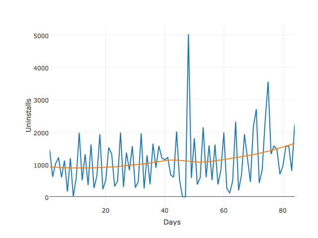
The above graph captures the essence of a slight uptrend over the course of 12 weeks but leaves out further details of what’s happening during each of those weeks or weekdays.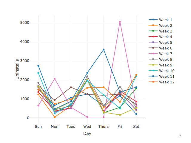
Each line in the graph represents the time series for each week. Friday has the highest rate of uninstalls which peaks in week 7. Monday, Wednesday, and Thursday have zero uninstalls during each of the 12 weeks which makes it difficult to determine a trend over this period.
A cycle plot shows both the cycle or trend and the day-of-the-week or the month-of-the-year effect. This retains the strength of both the above plots. Let’s look at the trend for each day of the week over the same period: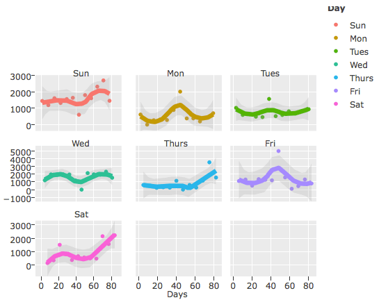
Insights:
- The trend for uninstalls holds steady with the exception of Saturday, Thursday, and Sunday, which are seeing a clear uptrend in uninstalls.
- Uninstalls for Friday seem to be the most volatile as shown by the width of the confidence band represented by the shade around the trend.
- Points outside the confidence band could be considered outliers and can be probed further.
It can thus be concluded with the above example that cycle plots can be regarded as a useful tool for visualizing time series data.
Click on this link to view an example to analyze Cohort data with Cycle Plot
Source Code and Dataset to reproduce the above article available here
Jacob Joseph 
Heads Data Science.Expert in AI, Data & Analytics and awarded 40 under 40 Data Scientists in India.
Free Customer Engagement Guides
Join our newsletter for actionable tips and proven strategies to grow your business and engage your customers.
