


Table of Contents
Categories
Most Popular


As a mobile marketer, you already have oceans of data at your fingertips. You have customer data, revenue data, DAUs, ARPU, CTRs, and more acronyms as far as the eye can see.
But how do you make sense of all this information and turn it into something useful? Something that can inform your decisions so your mobile app becomes an effective revenue generator? One answer lies in visualizing your data.
What is Data Visualization?
Data visualization is a type of visual communication. You create, study, and share data in a graphical manner in order to see patterns, determine priorities, and communicate necessary next steps.
In a data graphic, numbers are represented by charts and various images designed to give the reader the larger context.
When you follow the data visualization best practices we outline below, you will be able to squeeze an enormous amount of data into a smaller, more finite space and still communicate efficiently with your audience.
General Data Visualization Guidelines from Tufte
Whether you’re creating an infographic for content marketing purposes or a chart for your stakeholder report, assembling and then presenting data can be downright chaotic if you’re not sure how to go about it apart from plugging numbers into Excel.
If you must process complicated information and show it visually, then turn to some tried and true principles set forth by Edward Tufte.01

The Mobile Marketing Metrics that Matter to CMOs
Tufte is an American statistician, computer science professor, and author of the book The Visual Display of Quantitative Information02, which is required reading for anyone involved in information design. He lays out the theory and practice needed for the design of data graphics.
If you distill Tufte’s points, you arrive at two main reasons why you should stick to his data visualization best practices:
- You need to communicate complex ideas with clarity, precision, and efficiency.
- You must give the viewer the greatest number of ideas in the shortest time with the least ink in the smallest space.
In the first chapter alone, Tufte outlines several principles of graphical excellence that should be included in any discussion on data visualization guidelines.
1. Show the data. And as much of it as possible. Allow the reader to examine several levels of detail – from a broader overview down to a fine structure, should they choose to dive into specifics. It should all be there for them to interpret.
For example, here’s a data graph on the rise in adult obesity in Europe from 1976 to 2016.03 Here, you have the option to view the graphic as a whole and simply look at the trend over the course of four decades. Or you can focus on the details of specific years.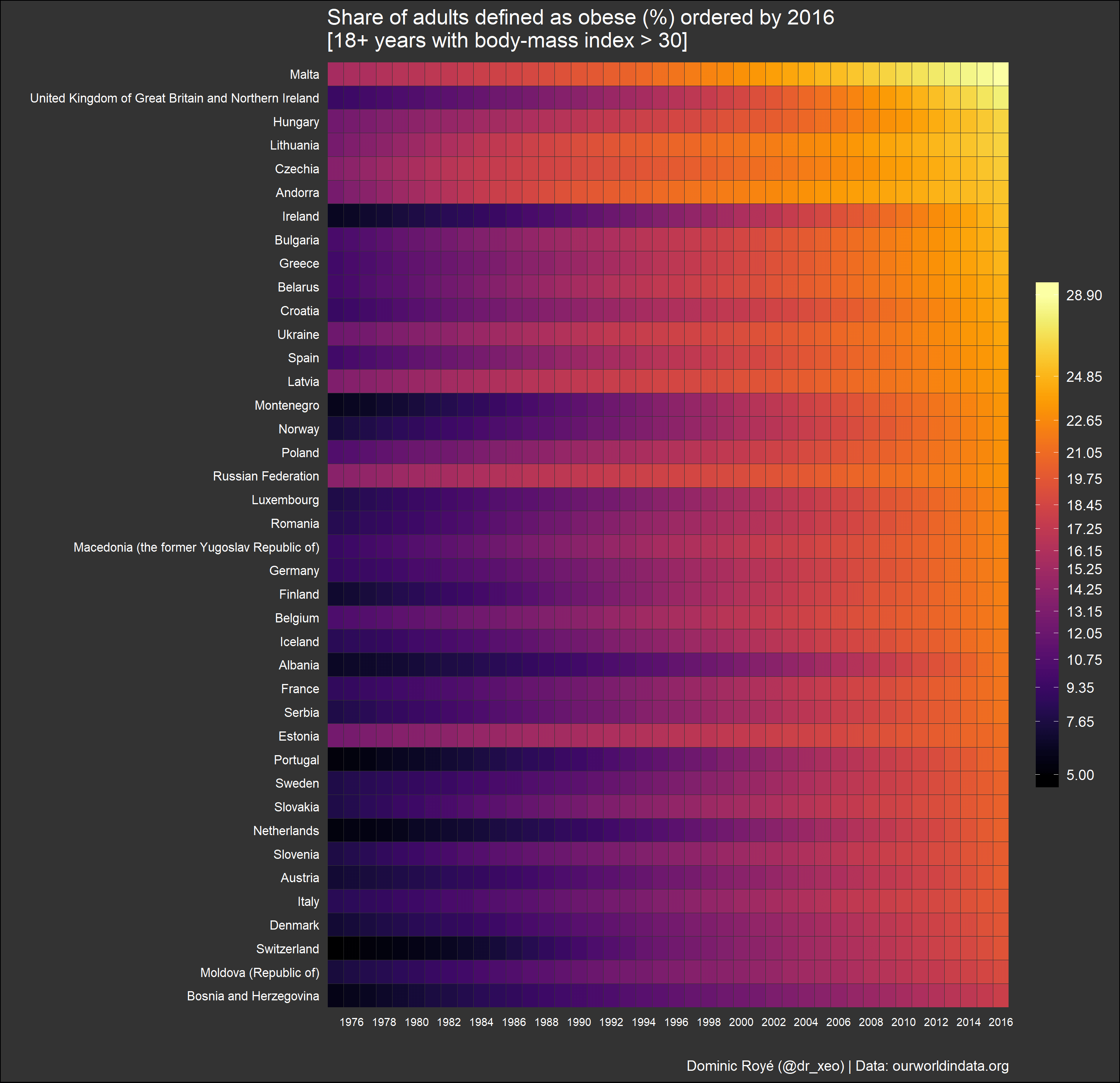
2. Lead the reader to think about the substance – the actual topic, and not the process used to mine the data or design the illustration. All the best data visualization examples try not to distract readers with design that screams for attention or takes away discussion from the actual information at hand.
3. Make large data sets logical and consistent. You’re dealing with large chunks of information, so you have to be able to design a visual that captures it all in a manner that is both easy to digest and is pleasing to the eye.
For example, below you see a visualization from CleverTap’s Retention Cohorts. Here, you see a percentage breakdown of how many app users you retain over time. Whether you’re dealing with millions of users or several thousands, this line graph makes it easy to understand why it’s crucial to engage users within the first 2 days… before they uninstall.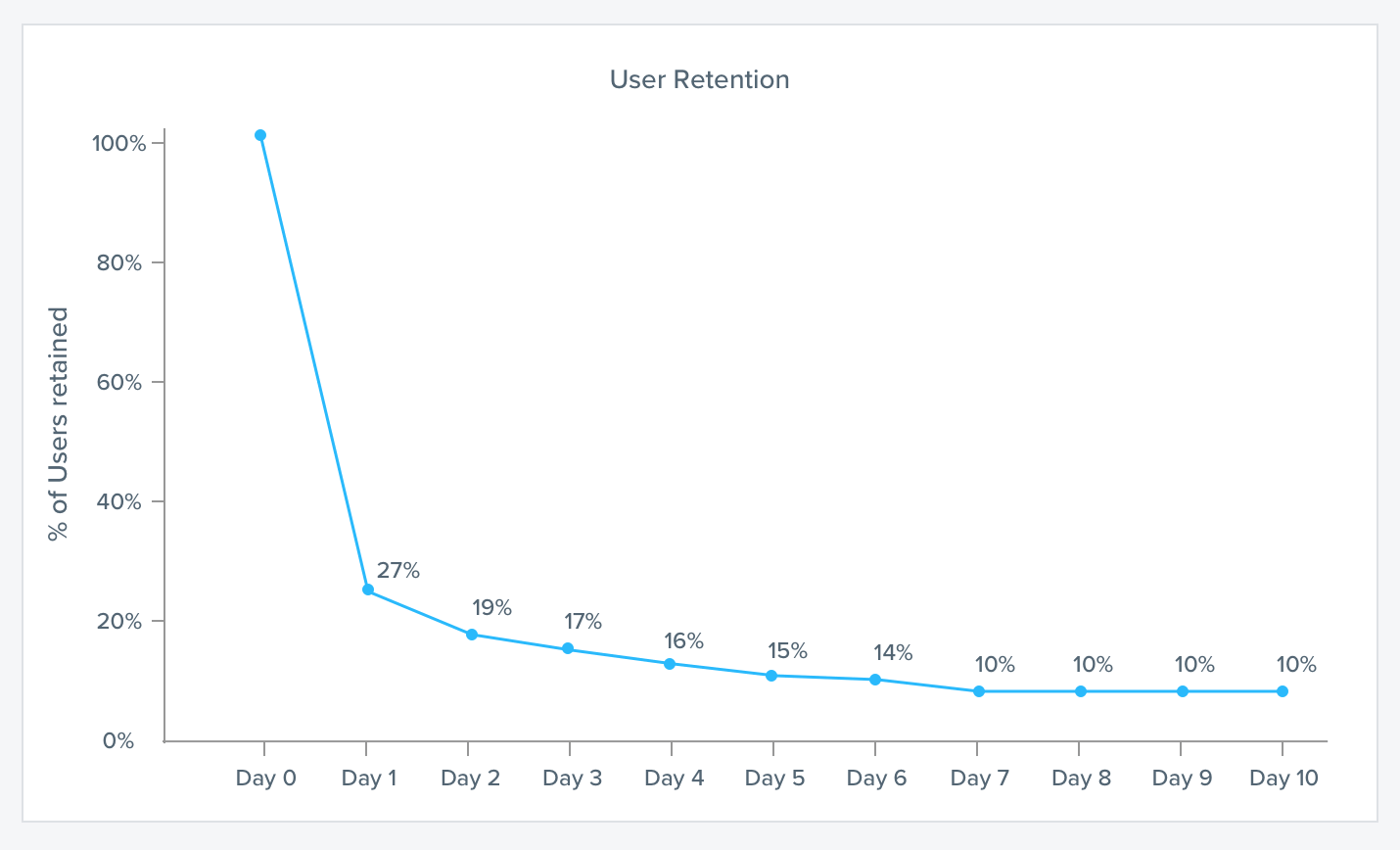
4. Tell the truth about the data. Avoid distortion. Be fair with the data and present it without twisting it to fit your agenda. No fake news allowed.
5. Serve a clear purpose. Make the purpose clear in your descriptions, your tabulations, even in how you design and decorate your visualizations. In addition, don’t release any graphics that have no descriptions in them. There are way too many charts and graphics on the web that have no title, no way to track where it came from, or what it’s describing. So much for communication.
6. Encourage readers to compare different pieces of data. Ideally, readers can interact with the data themselves in order to compare information. But if you have something like a static infographic or chart, find ways to highlight pertinent sections, or to color code elements that can be compared.
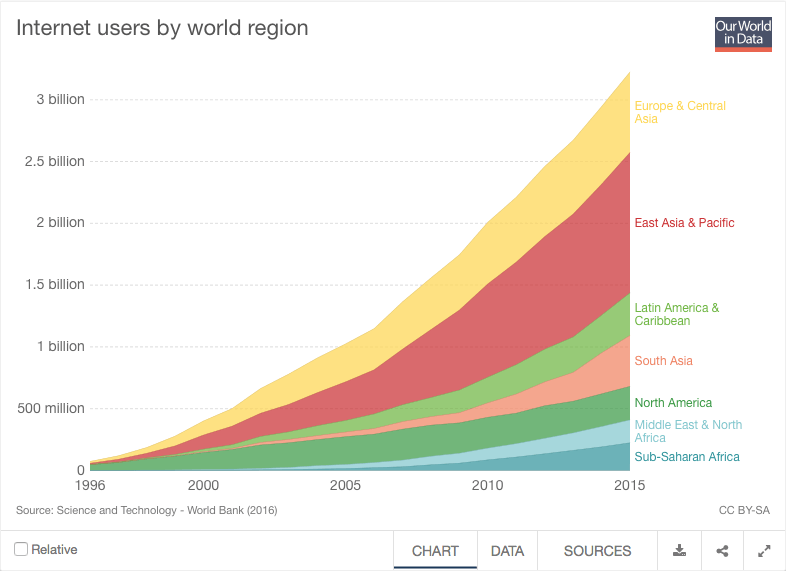
Take this data graph of internet users by world region.04 In it, you have a very concise visualization of the rise in internet users, color coded by geographic region. This leads to easier comparison between regions. A bonus is that the graph gives you two extra tabs so you can get at the data in CSV form or look at the sources.
Also Read: What is Database Marketing? Definition, Examples & Strategies
Data Visualization Best Practices 2018
While Tufte’s guidelines are spot-on for any kind of data graphic, there are a few specific tips and suggestions that are relevant to our situation right now.
Mobile Chart Design Tips
With Google rolling out its mobile-first indexing in 2018, it is now crucial for every marketer to produce content that is mobile friendly from the get-go.05
This means not just UX and UI are affected, but even those in charge of producing mobile chart design. Some tips:
- Use cascading style sheets (CSS) to ensure images look great no matter the mobile device being used. This is the tech behind apps and websites that are responsive. CSS allows you to customize how things look for each device without having to change the underlying HTML code.
- Just remember to optimize images from the start. Relying only on CSS to resize large images may not always work. Instead, optimize for speed even before uploading your images.
- Use contrast in your design. Make the graphs or visuals pop by utilizing contrasting colors for the background. This helps your users see important details immediately.
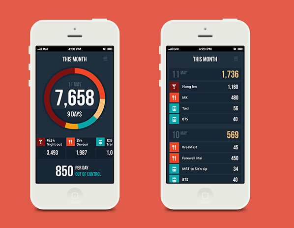
- Ensure the eye reads from top left to bottom right. This is how the Western eye naturally reads information on a page. Most important details in your mobile chart design should be on the top left.The mockup below shows a design for an expenses manager mobile app.06 Note how the most important chart is large and placed up at the top where the spending breakdown for the month is. The color coding legend is immediately below to provide context to the breakdown.
Less is More
We’ve reached a period in time where we can be inundated by data if we choose to be. Just reading your Facebook feed or managing your email inbox is already a time-consuming and sometimes overwhelming task.
For data visualization best practices 2018, you need to simplify and allow the reader to focus on the essentials. That means using less colors, using less design elements, and not stuffing every last data point into your visualization. How will the reader see the point of your data graphic if they’re struggling to make sense of all the visual noise?
Some tips:
- Limit pie charts to only 5 values. Anything more and you get tiny slices you can’t even see.
- Use stacked charts to see values over a time period.
- Use horizontal bar charts to see values over a time period, primarily if you need longer text descriptions. Vertical ones have little space for text.
- Limit your color palette07. While finding a great palette is an art unto itself, make sure readers can easily distinguish between the different hues you use in the graphic.
For example, here’s a mockup of a time tracker app with a pie chart that has exactly 5 values. But the color palette used allows you to distinguish one slice from another.![]()
Data Visualization Dashboard Best Practices
Above, we talked about data visualization guidelines in general. But when it comes to dashboards specifically, there is an added layer of responsibility that is absent from, say, an infographic or a pie chart for a printed stockholder report.
Business dashboards, especially for mobile apps, are created in order to give you actionable insights. If the graphics don’t do their job correctly, you won’t know what your next steps as a marketer should be.
Make It Easy to Interpret
Because dashboards are all about information that will lead you to take action, they must present data that is easy to interpret and that can be digested in seconds. When you can comprehend the graphic quickly, you can take action right away.
For example, with CleverTap Funnels, you can view a dashboard that splits user funnels in order to compare actions taken by geography. In the screenshot below, you can immediately see a need to focus engagement strategies on your London-based users – get them to add items into their cart and then incentivize them to purchase.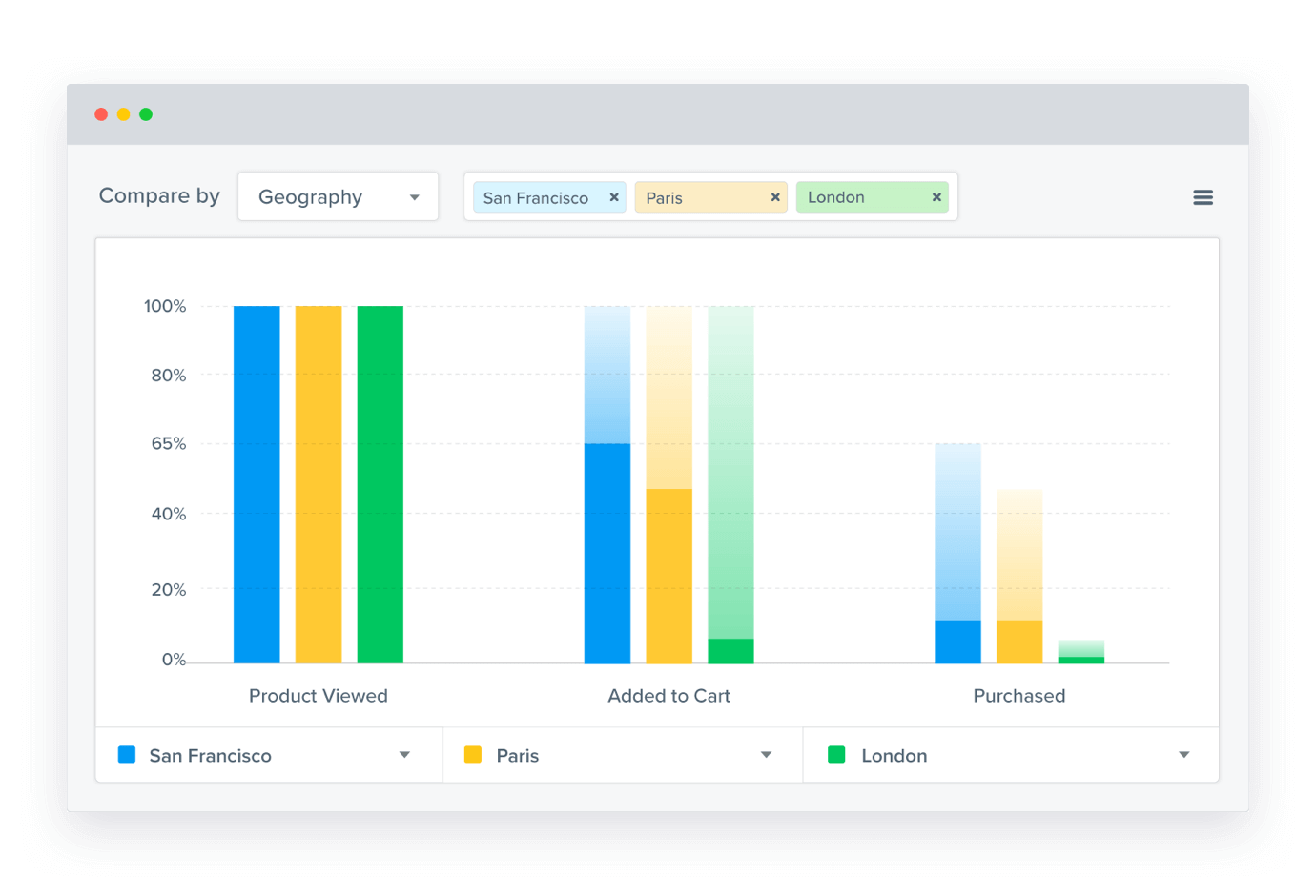
Know Your Goal and Audience
What’s the objective of your data visualization? Is it to prove to stakeholders that you need more budget for your marketing tactics? Is it to show users that they’re missing out on a great many deals by not signing up for your push notifications? The goal dictates what data to present and what you want to say through your visuals.
An integral part of this step is knowing the audience you are communicating with since each type of audience has different needs.
In the example below is a CleverTap custom dashboard for an ecommerce app, which allows a marketing head to see at a glance how the entire category is performing, the number of dropoffs in the purchase funnel, the number of users who purchased at least once, and the count of frequent buyers.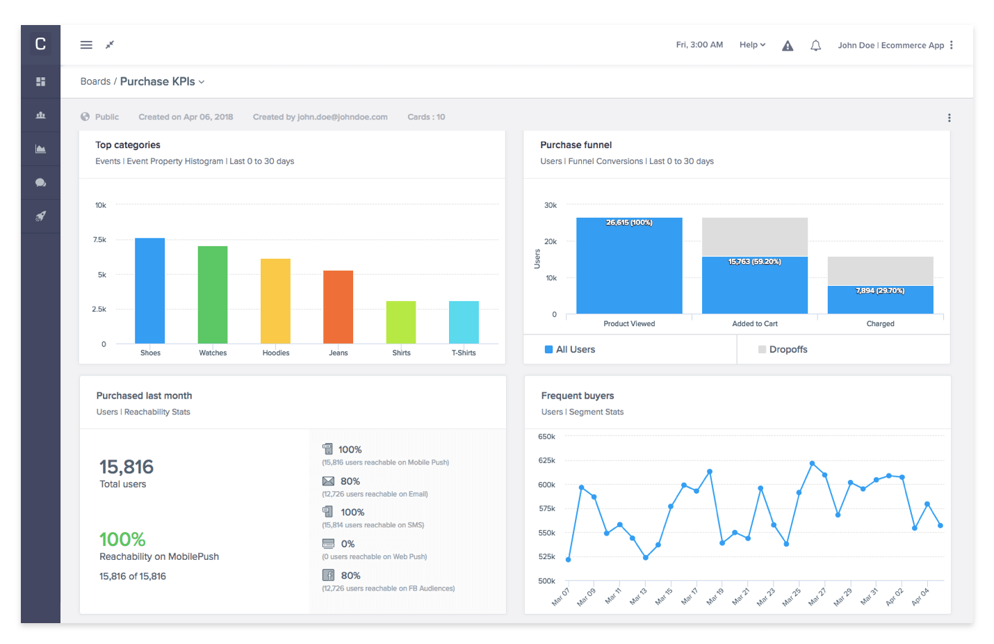
Give Users the Right Type of Dashboard
To round out these data visualization dashboard best practices, you need to know which kind of dashboard you’re presenting to your audience. There are three types of dashboards that you can give users:
- Strategic: These dashboards are designed for C-suite executives and department heads and provide a broad overview of the performance of the organization in relation to KPIs. These dashboards are designed to answer routine questions that every executive will want answered such as: how many MQLs do we have? How much revenue did we generate last month? These don’t need much interaction as the dashboard is meant to simply inform.
- Analytical: These dashboards are interactive. They offer analysts and data/analytics team members a way to investigate and play with the data in order to answer questions posited by stakeholders.
- Operational: These dashboards are set up with regularly updated data that fulfills a very specific need in daily operations, and has data that is not a high level view. Rather, it is more granular since it deals with the specifics that executives don’t need to see.
Conclusion: Data Visualization Serves a Purpose
When done right, the best data visualization examples are an incredible asset to a mobile marketer who thrives on making data-driven decisions. It’s another avenue through which you can share and consume information. And because of its visual representation, it’s often a quicker way to comprehend what is happening with your mobile app.
Use the guidelines wisely to create charts and dashboards that reinforce a strong metric-driven culture within your organization.
Read More on The Metrics That Matter to CMOs
Not sure what metrics should show up in the dashboard for your CMO? Download our free whitepaper: The Mobile Marketing Metrics that Matter to CMOs.
The Mobile Marketing Metrics that Matter to CMOs
Shivkumar M 
Head Product Launches, Adoption, & Evangelism.Expert in cross channel marketing strategies & platforms.
Free Customer Engagement Guides
Join our newsletter for actionable tips and proven strategies to grow your business and engage your customers.
