

















































Table of Contents
Categories
Most Popular


Cohort analysis groups users who share a common starting point or behavior and tracks how their behavior changes over time. It helps marketers and product teams compare retention, engagement, conversion, and churn across cohorts, identify where users drop off, and understand which experiences are associated with stronger long-term outcomes.
This guide explains how to read a cohort table, choose useful cohort types, conduct a cohort analysis, and act on the findings.
What is Cohort Analysis?
Cohort analysis is a longitudinal analysis method that groups users by a shared starting point, characteristic, or behavior and tracks how those groups perform over time. Unlike aggregate metrics, which combine users into a single average, cohort analysis preserves the time dimension so teams can see whether retention, engagement, conversion, or other behaviors are improving or declining for specific groups.
In practical terms, a cohort is simply a group of users who have something meaningful in common, such as signing up in the same week, making their first purchase during the same campaign, or completing the same product action. Marketers can then follow each group over time to understand when engagement drops, which cohorts retain better, and whether changes to onboarding, campaigns, or the product are associated with better outcomes.
Monitoring these cohorts helps businesses pinpoint behavioral trends, assess the effectiveness of campaigns or onboarding flows, and optimize both marketing and product strategies. This makes cohort analysis especially useful for identifying what is working, what needs improvement, and when users tend to disengage.
For instance, an e-commerce platform might compare the purchasing behaviors of users acquired through different marketing channels, while a subscription service might identify time periods or actions that correlate with increased churn. However, for insights to be meaningful, cohorts must be clearly defined. If cohorts are too broad, too small, or based on non-representative user actions, the resulting analysis may be misleading or inconclusive.
Cohort analysis differs from RFM analysis (Recency, Frequency, Monetary value), which categorizes users by purchase behavior and customer value. While RFM is useful for segmentation based on transactional patterns, cohort analysis focuses on time-based behavioral changes. It is especially powerful when combined with behavioral segmentation or psychographic segmentation to gain a deeper understanding of user engagement.
A practical example would be sending an email campaign to 1,000 users and measuring how many of them make a purchase on Day 1, Day 2, Day 3, and so on. If a new cohort receives a similar campaign a few weeks later, comparing the two sets of results can reveal whether the timing, message, or context made a difference. Another example could involve an app tracking the percentage of new users who return each day for the first 10 days after installation, helping teams assess early retention trends.
To illustrate the concept, here’s an example of cohort analysis. With this cohort chart, let’s track a daily cohort of users who launched an app for the first time and revisited it over the next 10 days.
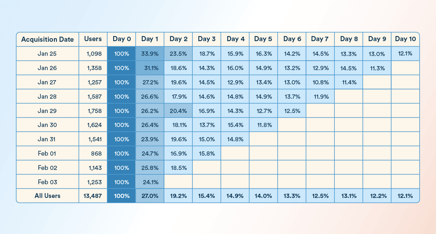
Focusing on the January 26 cohort as an example:
- Initial Launch: 1,358 users launched the app
- Day 1 Retention: 31.1 percent
- Day 4 Retention: 16.0 percent
- Day 7 Retention: 12.9 percent
- Day 10 Retention: 12.1 percent
From this data, we can see that by Day 7, only around one in eight users who launched the app on January 26 were still active. When looking at the broader “All Users” row, which represents a total of 13,487 users across all cohorts, Day 1 retention stands at 27.0 percent and gradually drops to 12.1 percent by Day 10.
This pattern shows that most attrition occurs during the first few days. It tells teams where to investigate, but not what caused the decline. Onboarding friction, acquisition quality, product value, or other factors may contribute and should be investigated separately.
How to Read a Cohort Table
A cohort table usually organizes users by when they entered the cohort and shows how their behavior changes as time passes.
- Rows represent cohorts: Each row contains users who share the same starting point, such as users who installed an app during the same day or week.
- Columns represent time since the starting event: Day 0 is when users enter the cohort, followed by Day 1, Day 2, Day 7, or other intervals.
- Cells show the selected metric: In a retention cohort, each cell shows the percentage of users from that cohort who returned during that period.
Read across a row to see how one cohort behaves as it ages. Read down a column to compare different cohorts at the same point in their lifecycle. For example, comparing Day 7 across several acquisition cohorts can show whether newer groups are retaining better or worse than earlier ones.
Key Concepts in Cohort Analysis
These core terms help you understand and apply cohort analysis more effectively:
- Cohorts: Groups of users who share a common trait or starting point, such as sign-up date or first transaction. Used to analyze how similar users behave over time.
Example: Track weekly acquisition cohorts to compare retention performance by marketing channel. - Retention Rate: Measures the percentage of users in a cohort who continue engaging with your app or product after a set period (e.g., Day 1, Day 7). Retention rate is a key metric for evaluating user stickiness.
Example: Use Day 1 and Day 7 retention rates to assess how well your onboarding drives repeat engagement. - Churn Rate: The percentage of users who drop off or stop engaging over time. Churn rate helps identify friction points in the user journey.
Example: A retention drop after Day 3 may point to a poor post-onboarding experience. - Activation Rate: Tracks the percentage of users who reach a key milestone that signals value realization, like completing onboarding or making their first purchase.
Example: Compare early activation rates with subsequent retention to understand whether users who reach key milestones are more likely to remain engaged.
Key Metrics to Analyze Across Cohorts
- Retention Rate by Cohort: Measures the percentage of users in each cohort who continue returning or engaging after a specific period. Comparing Day 1, Day 7, or Week 4 retention rate across cohorts helps identify whether retention is improving or declining over time.
- Conversion Rate by Cohort: Shows how different cohorts progress toward important goals such as purchases, upgrades, subscriptions, or feature adoption. Comparing conversion rate across cohorts can reveal which acquisition sources, onboarding experiences, or customer behaviors are associated with stronger outcomes.
- Activation Rate by Cohort: Measures how many users in each cohort reach a meaningful early milestone, such as completing onboarding, making a first purchase, or using a core feature. This is particularly useful for understanding whether changes to the early customer experience improve subsequent engagement.
- Customer Lifetime Value by Cohort: Tracks customer lifetime value across cohorts to identify which acquisition sources, customer behaviors, or lifecycle experiences are associated with higher-value customers over time.
You might like to read: 14 customer retention metrics & KPIs to measure retention (with formulas)
Types of Cohorts
Cohort analysis becomes far more powerful when you segment users based on how they enter or interact with your product. The right cohort structure helps you identify when churn or engagement shifts occur and investigate the behaviors or conditions associated with those changes. Here are the key types of cohorts to consider:
Acquisition Cohorts: Identifying Key Drop-Off Points
Acquisition cohorts group users based on when they first entered your product or app, typically by day, week, or month of acquisition. These cohorts help track how retention and engagement evolve from the moment users first arrive, making them essential for identifying early churn and assessing onboarding effectiveness.
Acquisition cohorts track users from their first interaction, such as sign-up date or first app launch, and reveal how retention changes over time. They help pinpoint when customer engagement starts to decline, especially during the critical early stages.
To visualize how retention changes across acquisition cohorts, here’s a sample cohort chart showing 7-day retention by install date from Day 0 to Day 10:
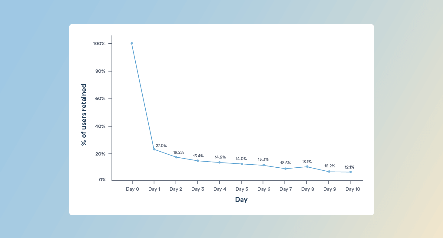
The graph shows a sharp drop-off after Day 0, with retention falling from 100 percent to 27 percent on Day 1. This means nearly three out of four users do not return after their first session. Retention continues to decline steadily over the next several days, landing at 12.1 percent by Day 10.
This pattern shows that the largest loss of users occurs immediately after Day 0. That makes the first-use experience an important area to investigate, but the cohort chart alone cannot identify the cause. Teams can test changes to onboarding, guidance, acquisition targeting, and early-value moments to determine what improves Day 1 retention.
Insight: Acquisition cohort analysis helps you pinpoint the earliest signs of churn. A sharp Day 1 drop-off tells you where to investigate first. Examine onboarding, acquisition quality, early product value, and other Day 0–1 experiences, then test which changes improve retention.
Acquisition cohort analysis is ideal for identifying when churn occurs, but to understand why users drop off, you’ll need to explore behavioral cohorts.
Behavioral Cohorts: Identifying Behaviors Associated With Retention and Churn
Behavioral cohorts group users based on the actions they take, or don’t take, within a specific time window. These cohorts allow you to identify how specific behaviors impact long-term engagement, making them powerful for uncovering what drives retention, monetization, or churn.
Behavioral cohorts are formed by grouping users based on specific in-app actions within a defined time period, such as making a transaction, launching the app, or abandoning a cart. These cohorts help uncover which behaviors drive long-term engagement and which ones signal early churn risk.
Let’s examine two real behavioral cohorts based on the charts below.
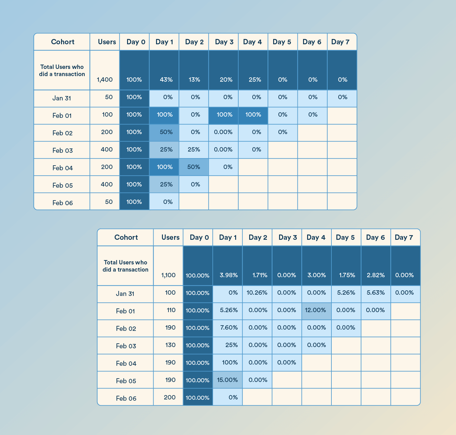
Users Who Completed a Transaction
In the first cohort, we’re tracking 1,400 users who completed a transaction. Day 1 retention stands at 43 percent, which is relatively high. This then drops to 13 percent by Day 2.
There is a retention spike on Day 3 and Day 4, climbing to 20 percent and 25 percent, respectively. This shows that more users returned during this period, but the cohort data alone cannot explain why. Teams should compare campaign exposure, product events, and other changes during those days before attributing the increase to a specific intervention. The spike on Day 4, in particular, points to an opportunity for follow-up strategies like personalized product recommendations, loyalty nudges, or limited-time offers to maintain momentum.
Insight: Users who transact early can still show significant subsequent drop-off. Investigate the period immediately after the first transaction and test whether relevant follow-up improves repeat engagement.
Users Who Abandoned a Cart
Now compare this with a behavioral cohort of 1,100 users who abandoned a cart. Retention drops sharply: only 3.98 percent re-engage on Day 1, and just 1.71 percent on Day 2. Engagement remains extremely low throughout the week, with Day 7 retention at zero percent.
This cohort shows very low return rates after cart abandonment, particularly during the first two days. That makes early re-engagement a useful strategy to test using approaches such as reminders, product information, social proof, or targeted incentives.
Insight: This cohort shows the steepest decline during the first two days, making that period a useful window for testing re-engagement strategies.
By comparing these behavioral cohorts, you can identify critical engagement windows and customize campaigns accordingly. Users who complete transactions may need nudges to return and buy again, while cart abandoners require fast, high-impact interventions to recover lost revenue.
Tip: Pair behavioral cohort analysis with campaign triggers. Use automated journeys to activate specific flows based on the user’s last meaningful action.
Time-Based Cohorts: Measuring the Impact of Timing and Context
Time-based cohorts group users by when they performed a specific action or were active during a particular period, such as a marketing campaign, holiday season, or product update window. These cohorts help you analyze how external context or timing affects user behavior.
These cohorts are especially useful when you’re trying to evaluate the influence of time-sensitive factors, such as a festive sale, seasonal content, or pricing changes, on user retention or engagement.
For example, a retail app might compare user retention across cohorts active during Black Friday, New Year’s, and a regular month to measure the long-term value of promotion-driven users.
By comparing time-based cohorts, you can determine:
- Whether your campaigns attract long-term users or short-term opportunists
- How different timing windows influence onboarding or purchase behaviors
- Whether product or pricing changes had a positive or negative retention impact
Insight: Time-based cohort analysis is essential for evaluating the lasting impact of external events and internal product changes.
Segment-Based Cohorts: Personalizing by User Type
Segment-based cohorts are formed by grouping users with shared attributes, such as location, device type, subscription tier, or customer persona. These cohorts help you understand how different user segments engage with your product over time and which groups require more personalized strategies.
Segment-based analysis is useful for identifying patterns tied to specific user types. For instance, power users on iOS may behave differently from low-engagement Android users, or freemium users may require different nudges than paying subscribers.
For example, a music streaming app might find that premium users on iOS show higher retention than free users on Android, prompting a targeted upgrade campaign or device-specific feature optimization.
Use segment-based cohorts to:
- Prioritize product improvements for specific user groups
- Design tailored onboarding flows or lifecycle journeys
- Identify which user segments are underperforming and why
Insight: Segment-based cohorts help you align engagement strategies with the needs, limitations, and expectations of different user types.
Size-Based Cohorts: Comparing Small vs. Large User Groups
Size-based cohorts group users according to the scale of the segment they belong to, such as early-access users in a beta test versus a full public launch audience. This helps you evaluate how user behavior changes as your product or campaign scales from controlled environments to wider audiences.
These cohorts are especially useful when testing how scalable your product experience, messaging, or onboarding truly is. What works well for a small, high-intent group may not translate to broader audiences without friction.
Example: A mobile app may find that beta users retained 40 percent by Day 7, but public launch users retained only 12 percent, indicating that what resonated with early adopters didn’t carry over at scale.
Use size-based cohorts to:
- Validate whether early results hold up under broader user volumes
- Identify product or UX breakdowns that occur when scaling
- Fine-tune feature rollout plans before going fully live
Insight: Size-based cohorts help expose scalability gaps that aren’t visible during small-scale tests or controlled rollouts.
Benefits of Cohort Analysis
Cohort analysis uncovers actionable insights into user behavior, helping you optimize marketing and product strategies. By identifying when and why cohorts churn, you can build targeted retention strategies. Analyzing high-engagement cohorts shows where to invest time and resources for a stronger customer experience and long-term growth.
Reduces Churn
By tracking when users from specific cohorts drop off, you can detect patterns in disengagement at a daily, weekly, or event-driven level. This allows teams to time interventions more precisely, whether through targeted campaigns or in-product nudges. Unlike aggregate churn metrics, cohort-level analysis highlights churn inflection points and decay rates, making it easier to take corrective action early.
Improves Retention
Analyzing the behavior of high-retention cohorts helps identify what keeps users engaged, such as completed actions, session depth, or usage frequency. These insights inform improvements in onboarding, activation, and lifecycle communication, enabling teams to reinforce successful behaviors and replicate them across future cohorts.
Optimizes Acquisition Quality
Cohort analysis goes beyond volume-based metrics by revealing which acquisition sources lead to longer-lasting, higher-value users. By examining post-acquisition retention and engagement patterns across channels, marketers can reallocate spend toward sources that deliver sustainable user growth and better return on investment.
Exposes Drop-Offs in the Customer Journey
Cohort tracking enables visibility into how users progress, or fail to progress, through lifecycle stages such as onboarding, activation, engagement, and monetization. By identifying which cohorts stall at specific stages, teams can focus on removing friction or improving guidance to accelerate time-to-value and reduce lifecycle leakage.
Measures Long-Term Impact of Changes
Unlike A/B tests that focus on immediate metrics, cohort analysis allows you to assess the long-term effects of product releases, onboarding redesigns, or campaign changes. Comparing cohorts from before and after an initiative helps teams assess whether longer-term behavior changed alongside the intervention. Controlled experiments or additional analysis are still needed to establish causation.
How to Conduct a Cohort Analysis
A cohort analysis delivers meaningful insight only when it follows a focused, structured approach. Below is a step-by-step walkthrough of how to conduct one, starting from defining the objective to creating and interpreting a fully functional cohort chart or table. We’ll use a mobile app’s 7-day retention analysis as an example to illustrate the process.
1. Set a Clear Goal for the Analysis
Every cohort analysis should begin with a focused objective. The goal defines the type of cohort you’ll build (e.g., acquisition, behavioral), the time window for analysis, and the metrics you’ll measure.
For example, if you’re trying to understand early retention trends, your goal might be: “Measure how many new users return to the app over the first 7 days post-install.”
Without this specificity, you risk collecting data that doesn’t align with your business question or, worse, making decisions based on noise rather than signal.
2. Define the Cohorts Precisely
Once the goal is clear, define what qualifies users to be in the same cohort. This could be based on acquisition date, signup event, first transaction, or any other shared starting point relevant to your analysis.
In our example, we’ll use daily acquisition cohorts. Each cohort will contain all users who installed the app on a specific day in January—e.g., Jan 1 cohort, Jan 2 cohort, and so on.
Make sure that:
- The event used to define cohort entry is mutually exclusive and clear (e.g., first install date).
- Users are only assigned to one cohort, unless you’re explicitly doing multi-event or overlapping cohort studies.
3. Select the Right Metrics to Track Over Time
After defining the cohorts, determine what behavior you want to observe longitudinally. This could be retention (returning users), conversion (purchasing), activation (completing onboarding), or any other user action that signals value.
For this walkthrough, we’ll focus on retention, specifically, whether users in each cohort return to the app on subsequent days (Day 1 through Day 7). This allows you to observe engagement decay and assess how sticky or valuable the experience is during the first week.
Early retention can be a useful signal of onboarding effectiveness, acquisition quality, and whether users are finding recurring value in the product.
4. Structure the Cohort Table (Rows, Columns, and Values)
Now that you’ve defined cohorts and metrics, it’s time to build the actual cohort table—the analytical foundation of your insights.
How to Structure the Table:
- Rows: Each row represents a cohort. In our case, that’s one row per day in January (e.g., Jan 1 to Jan 31), each consisting of all users who installed the app on that day.
- Columns: Each column represents the number of days after acquisition. For example: Day 0 (install day), Day 1 (next day), up to Day 7.
- Cells: The cell at the intersection of row and column contains the retention rate, calculated as:
Day X Retention = (Users from cohort who returned on Day X ÷ Total users in that cohort) × 100
In a raw data sheet, you’ll typically start with a row showing:
Jan 1 | 1,200 users | 100% | 28% | 17% | 12% | …
Where:
- “1,200 users” is the cohort size
- “100%” is Day 0 (install day)
- Subsequent percentages show how many returned from Day 1 to Day 7 retention
This structure forms the basis for identifying drop-offs, evaluating patterns, and comparing performance across time-based user groups.
5. Populate the Table with Real Data
This is where your analytics tool or backend data comes in. Pull the raw event logs or aggregated metrics that match your cohort definition and behavior metric.
For each day:
- Count how many users entered the product (e.g., installed the app) to determine cohort size.
- Then, for each following day, count how many from that same cohort returned to the app.
Let’s say:
- On Jan 5, 1,000 users installed the app.
- On Day 1, 300 returned → 30% retention.
- On Day 2, 180 returned → 18% retention.
- By Day 7, 100 remained → 10% retention.
These percentages populate your cohort table horizontally from left to right for that cohort.
Ensure that your data is clean and consistent. Double-counting users, misaligned event timestamps, or cohort leakage (users assigned to the wrong day) can distort your entire analysis.
6. Visualize the Cohort Table
Once the table is populated, visualize it to make patterns easier to detect. The two most common formats are:
- Cohort Table with Conditional Formatting: Use color gradients to highlight high vs. low retention. For instance, darker cells for high retention, lighter for drop-offs. This helps you immediately spot cohorts that outperform or underperform.
- Retention Curves: Plot Day X retention (Y-axis) over time (X-axis) for each cohort. Overlay multiple cohorts on the same graph to compare patterns.
These visualizations not only make the data digestible but also help communicate insights to stakeholders who may not be deep in the analytics themselves.
To see these concepts in action, here’s a sample 7-day retention cohort chart for Jan 1–7:
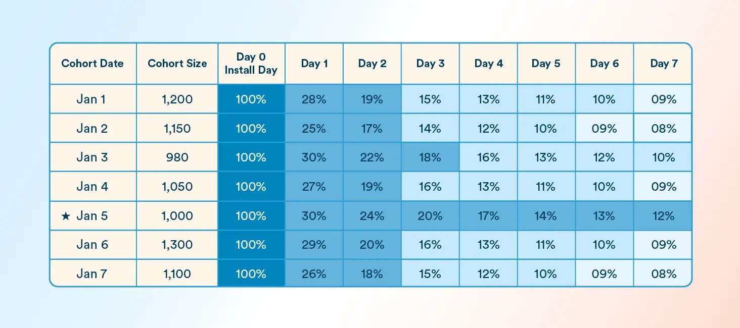
This cohort table displays 7-day retention performance by acquisition date. Each row represents a daily cohort, and each column shows what percentage of that group returned to the app on a given day. Color-coded shading (dark to light blue) highlights retention strength to help identify drop-offs, success patterns, and behavior shifts across segments.
Color Legend:
| Color Description | Retention Range |
| Dark Blue | 100% (Day 0 – install day) |
| Medium Blue | High retention (20% – 30%) |
| Light Blue | Moderate retention (13% – 19%) |
| Very Light Blue | Low retention (≤ 12%) |
Annotation:
Jan 5 ★ – Personalized onboarding feature launched
7. Interpret Patterns and Extract Insights
Now comes the most critical step: interpreting what the data tells you.
Look for:
- Drop-off inflection points: Where does retention plummet? Is there a consistent drop on Day 2 or Day 3?
- Outlier cohorts: Are there cohorts that perform significantly better or worse than the rest? What was different about that day (e.g., marketing source, product update)?
- Decay trends: Is the retention curve flattening at a specific point, or does it decline steadily?
Returning to our example, suppose the Jan. 5 cohort shows 30% Day 1 retention compared with a 25% average and the personalized onboarding feature launched on Jan. 5. The result is consistent with improved retention after the change, but cohort analysis alone does not establish that the feature caused the improvement. Comparing additional cohorts or running a controlled experiment would provide stronger evidence.
Over time, cohort analysis evolves from a retrospective diagnostic into a proactive tool for identifying opportunities, validating experiments, and improving the customer experience at every touchpoint.
Common Cohort Analysis Mistakes and Limitations
Cohort analysis becomes misleading when the cohort definition, comparison period, or interpretation is weak. Watch for these common issues:
- Poorly Defined Cohorts: Cohorts that are too broad or based on loosely defined events can combine users with very different behaviors. Define the start event, return event, and time window precisely.
- Small Sample Sizes: A small cohort can produce large percentage swings that look meaningful but may reflect only a handful of users. Check cohort size before drawing conclusions.
- Comparing Immature Cohorts: Newer cohorts have not had enough time to reach later lifecycle periods. For example, compare Day 30 retention only among cohorts that have actually existed for at least 30 days.
- Ignoring Seasonality and External Factors: Holidays, campaigns, pricing changes, product releases, or acquisition-channel shifts can affect cohort performance independently of the experience being analyzed.
- Confusing Correlation With Causation: A cohort may perform better after a product or campaign change, but that does not prove the change caused the improvement. Use additional analysis or controlled experiments to validate important hypotheses.
How to Select the Right Tool for Cohort Analysis
Choosing the right tool for cohort analysis is crucial for gaining actionable insights. Look for a platform that offers flexibility, intuitive data visualization, and advanced analytics. Here’s what to keep in mind when evaluating your options:
- Cohort Creation: The tool should allow you to define cohorts based on various criteria.
- Data Visualization: An effective tool provides clear visualizations, like retention curves.
- Usability: The tool should integrate easily with your systems and be user-friendly.
How CleverTap Helps Turn Cohort Insights Into Action
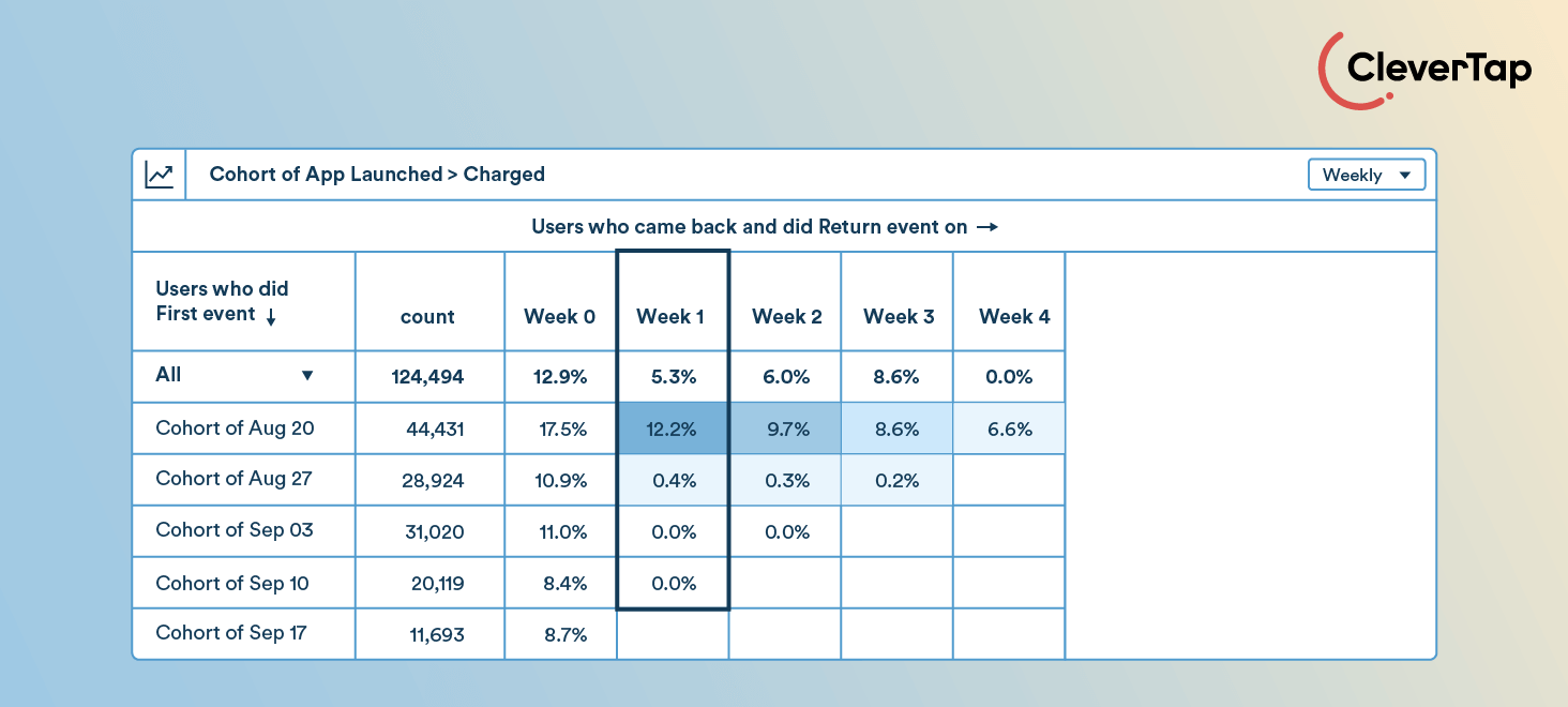
CleverTap is a customer engagement platform that brings behavioral analytics, customer segmentation, omnichannel engagement, and AI-powered decisioning into the same system. For cohort analysis, this means teams can move beyond simply observing retention patterns to comparing customer groups, investigating changes in behavior, and using those insights to improve engagement across the lifecycle.
Build Cohorts Around the Behaviors That Matter
CleverTap lets teams define cohort analysis around two key events: a Start Event, which determines when a user enters the cohort, and a Return Event, which defines the behavior being measured afterward. The two events can be the same or different depending on the question being investigated.
For example, teams can analyze:
- Users who install an app and return to launch it
- Users who sign up and later make a purchase
- Users who watch content and return to watch again
- Users who complete a transaction and continue engaging afterward
This makes cohort analysis useful beyond basic app-retention measurement. Teams can study onboarding, conversion, repeat purchases, content engagement, feature adoption, and other lifecycle behaviors using the same framework.
Analyze Different Forms of Retention and Re-engagement
Not every retention question requires the same analysis. CleverTap supports different ways of measuring return behavior depending on what marketers and product teams want to understand. Current cohort capabilities include:
- Specific-day retention: Measures whether users return on an exact day after entering the cohort, such as Day 1, Day 7, or Day 30.
- Unbounded retention: Measures whether users return on or after a particular point in their lifecycle, making it useful for longer-term retention analysis.
- Return frequency: Measures how many different days users return during a selected period, helping identify highly engaged or power users.
Teams can also evaluate more than retention percentage. Depending on the analysis, CleverTap can measure retention rate, total return events, events per user, or the sum of a numeric event property, such as revenue generated by a cohort after its first purchase.
Compare Cohorts to Understand Why Performance Differs
A cohort becomes more useful when it can be compared with another relevant group. CleverTap allows teams to compare multiple customer segments within an analysis and split results using properties such as geography, device or operating system, campaign source, and other customer or event attributes.
For example, marketers could compare:
- Paid vs. free users
- New vs. returning customers
- Users acquired through different campaigns
- Android vs. iOS users
- Customers from different regions
- Users exposed to different onboarding or product experiences
These comparisons help teams move beyond seeing that retention changed and start investigating which customer groups, acquisition sources, or experiences are associated with the difference.
Read Patterns Through Cohort Tables and Trend Views
CleverTap presents cohort performance through detailed cohort tables and trend lines. In the cohort table, rows represent individual cohorts, columns represent time since the Start Event, and cells show the selected return metric. This makes it possible to compare cohorts at equivalent points in their lifecycle and identify where retention begins to decay.
Trend views make those differences easier to spot visually. Teams can compare selected cohorts, examine retention curves, look for seasonal patterns or anomalies, and analyze how engagement frequency changes over time. This is particularly useful when evaluating changes such as a campaign launch, onboarding update, or product release.
Turn Cohort Findings Into Customer Engagement
Cohort analysis tells teams where customer behavior differs. CleverTap’s segmentation and engagement capabilities help turn those findings into action.
For example, if analysis shows that customers who complete a specific onboarding action have stronger Day 30 retention, marketers can encourage more new customers toward that behavior. If one acquisition cohort declines sharply after Day 3, teams can investigate that experience and build an appropriate follow-up journey. If a particular customer group shows stronger repeat-purchase behavior, marketers can use those insights to inform loyalty, cross-sell, or retention strategies.
Because analytics and engagement exist within the same customer engagement platform, insights from cohort analysis can inform segmentation and lifecycle strategies across channels such as push notifications, email, in-app messaging, SMS, WhatsApp, and web experiences.
Add Long-Term and Live Customer Context With TesseractDB™
Cohort analysis becomes more useful when teams have access to enough customer history to understand behavior over meaningful periods. TesseractDB™ is CleverTap’s customer-data foundation, bringing together long-term behavioral history with live activity, profile attributes, and campaign responses. This context supports analytics, segmentation, and personalization without forcing teams to look at recent behavior in isolation.
This means cohort findings can be interpreted alongside a broader view of the customer relationship. A recent drop in engagement, for example, can be understood in the context of previous purchases, historical engagement, campaign interactions, and current activity.
Go From Cohort-Level Patterns to Live 1:1 Personalization With CleverAI™
Cohort analysis is inherently a group-level analytical method. It helps identify patterns such as which groups retain better, where engagement declines, or which behaviors are associated with stronger outcomes.
Once that pattern is understood, CleverAI™ can add individual-level intelligence. CleverAI™ is built around Live 1:1 Personalization, combining historical context with current customer behavior to determine what is most relevant for each individual rather than applying the same treatment to everyone in a cohort.
Marketers define the business goal, strategy, and guardrails. CleverAI™ then connects customer context with specialized intelligence across areas such as predictions, recommendations, timing, channels, and sequences. At the center, the Tesseract Decisioning Engine™ evaluates the available choices against the customer’s context and marketer-defined goal to rank the most relevant message, offer, channel, moment, sequence, experience, or even no action.
Want deeper retention insights? See CleverTap’s cohort analysis in action.
Case Study: How BukuKas Improved New User Activation by 60% Using CleverTap
BukuKas is an Indonesian digital ledger platform for small businesses. The team used CleverTap to analyze onboarding, retention, user cohorts, and customer segments while improving product adoption and engagement. Cohort analysis helped the team compare acquisition quality across periods and channels and evaluate whether specific features were associated with stronger long-term retention. Here’s how CleverTap helped BukuKas hit outstanding goals:
Goals For BukuKas
- Total Cost of Ownership (TCO) Reduction: Needed an integrated solution for product analytics, A/B testing, and CRM.
- Engagement Automation: Required automated and personalized engagement strategies.
- User Education: Needed to help users transition from physical ledgers to digital.
Solutions with CleverTap
- Funnels: Tracked user behavior from app launch to feature engagement.
- Product Experiences: Enabled A/B testing and rapid feature iteration.
- Cohort Analysis: Provided insights into user retention and engagement across different groups.
- RFM Analysis: Identified valuable and at-risk users for targeted retention efforts.
Results
- 60% improvement in onboarding conversion: BukuKas improved its onboarding funnel conversion rate by 60% over six months while using CleverTap analytics and engagement capabilities.
- Streamlined operations: Reduced complexity with an integrated platform.
- Improved retention: Better understanding of user behavior through detailed analysis.
CleverTap’s cohort analysis offers powerful insights into user behavior, helping businesses track and compare engagement across different groups. This enables tailored strategies that improve user retention and drive growth.
Want to turn cohort insights into stronger retention and more relevant customer engagement?
CleverTap helps you analyze customer behavior, uncover retention patterns, and turn those insights into personalized engagement across the customer lifecycle. Book a demo.
Frequently Asked Questions About Cohort Analysis
What is the difference between cohort analysis and segmentation?
Segmentation groups users based on shared characteristics or behaviors, often to understand or target them at a particular point in time. Cohort analysis follows a defined group over time to understand how its behavior changes. A cohort can therefore be considered a segment that is analyzed longitudinally.
What is the difference between cohort analysis and funnel analysis?
Funnel analysis measures how users progress through a defined sequence of steps, such as signup, onboarding, and purchase. Cohort analysis compares how groups of users behave over time. Funnels are useful for identifying where users drop within a process, while cohorts are useful for understanding how retention, engagement, or conversion changes across groups and lifecycle periods.
What is the difference between cohort analysis and RFM analysis?
RFM analysis groups customers according to Recency, Frequency, and Monetary value to identify behavioral and value-based segments. Cohort analysis groups users around a shared starting point, behavior, or characteristic and tracks how those groups perform over time. RFM is primarily useful for customer segmentation, while cohort analysis is particularly useful for longitudinal behavior and retention analysis.
What is the difference between cohort analysis and retention analysis?
Retention analysis measures how many users continue returning or engaging over time. Cohort analysis is one way to perform retention analysis by comparing retention across different user groups. It can also be used to study other metrics such as conversion, engagement frequency, feature adoption, and customer value.

Shivkumar M 
Head Product Launches, Adoption, & Evangelism.Expert in cross channel marketing strategies & platforms.
Free Customer Engagement Guides
Join our newsletter for actionable tips and proven strategies to grow your business and engage your customers.