


Table of Contents
Categories
Most Popular


It is a well known fact that visualizing time series information is always better than viewing the same information in a tabular format.
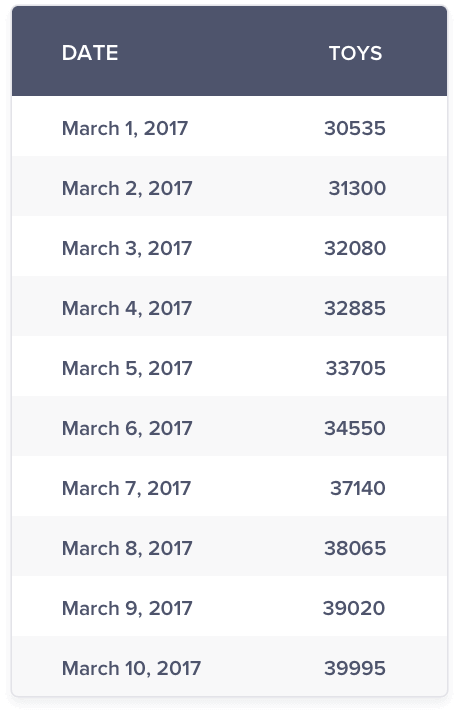
Here, we are analyzing the daily revenue from the toys segment of an e-commerce store. One look at the graph above reinforces the fact that visualizing the time series data makes it easier to draw insights than just looking at the tabular data. But, just analyzing the revenue from toys segment is not the only use case. We are most likely to compare revenues from different segments against each other.
Assume you have been given the task to analyze the daily sales revenue for the month of March for different segments of an e-commerce store.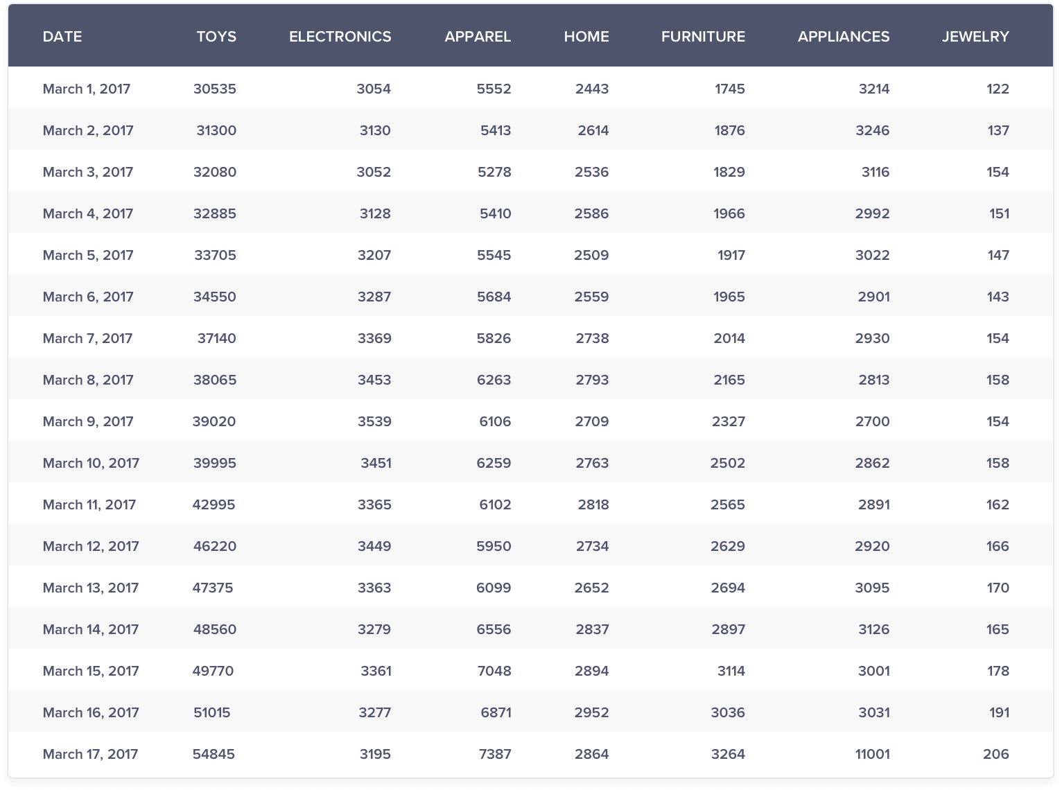
Let’s begin the analysis with the comparison of 2 segments at a time.
You can instantly make a qualified judgement that the furniture sales growth is higher than the home sales growth.
Let’s now compare the daily sales of toys and jewelry segments.
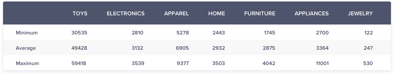
It seems as if the daily sales of jewelry is seeing a flat growth close to zero compared to an upward trend in toys. But, a closer look at the range of both the products indicate the real reason behind such a graph. The daily apparel sales range between 30000 to 66000 whereas the jewelry sales volume range between 120 to 500. This huge difference in scale results in the trend line of toys dominating the trend line of jewelry. Hence, the growth in the jewelry sales is not apparent.
One way to overcome the above issue is to plot the daily sales of toys and jewelry sales on 2 different y-axes as shown below:
From the above graph, it is clearly evident that the trends when shown with two y-axes or secondary axis reveal that there is a healthy growth in sales in the jewelry segment.
Great, we have made some progress to compare 2 trend lines. In general, though, we may most likely be comparing more than 2 trend lines.
Let’s now compare the sales from all the segments.
Except for revenues from toys, all other segments seem to show a flattish growth with appliances segment revenue showing an upward blip on March 17. The high scale of revenues from toys has dominated the revenues of other segments. Hence, comparison of toy segment against other segments is not possible in the current state. You can choose to ignore the comparison with toys segment but the next highest revenue that will dominate the revenue segment is apparel. You will most likely face a similar issue.
What is a general solution for a such a problem? How can we visualize such data for enabling the discovery of meaningful insights?
Let’s explore a few solutions.
Log Method
In marketing, one mostly deals with positive numbers with zero being an exception. If we assume the time series data to be positive numbers, taking the log helps in bringing down the difference in scale of the different trend lines to a large extent except in few circumstances. The log scale also helps to maintain the inherent trend.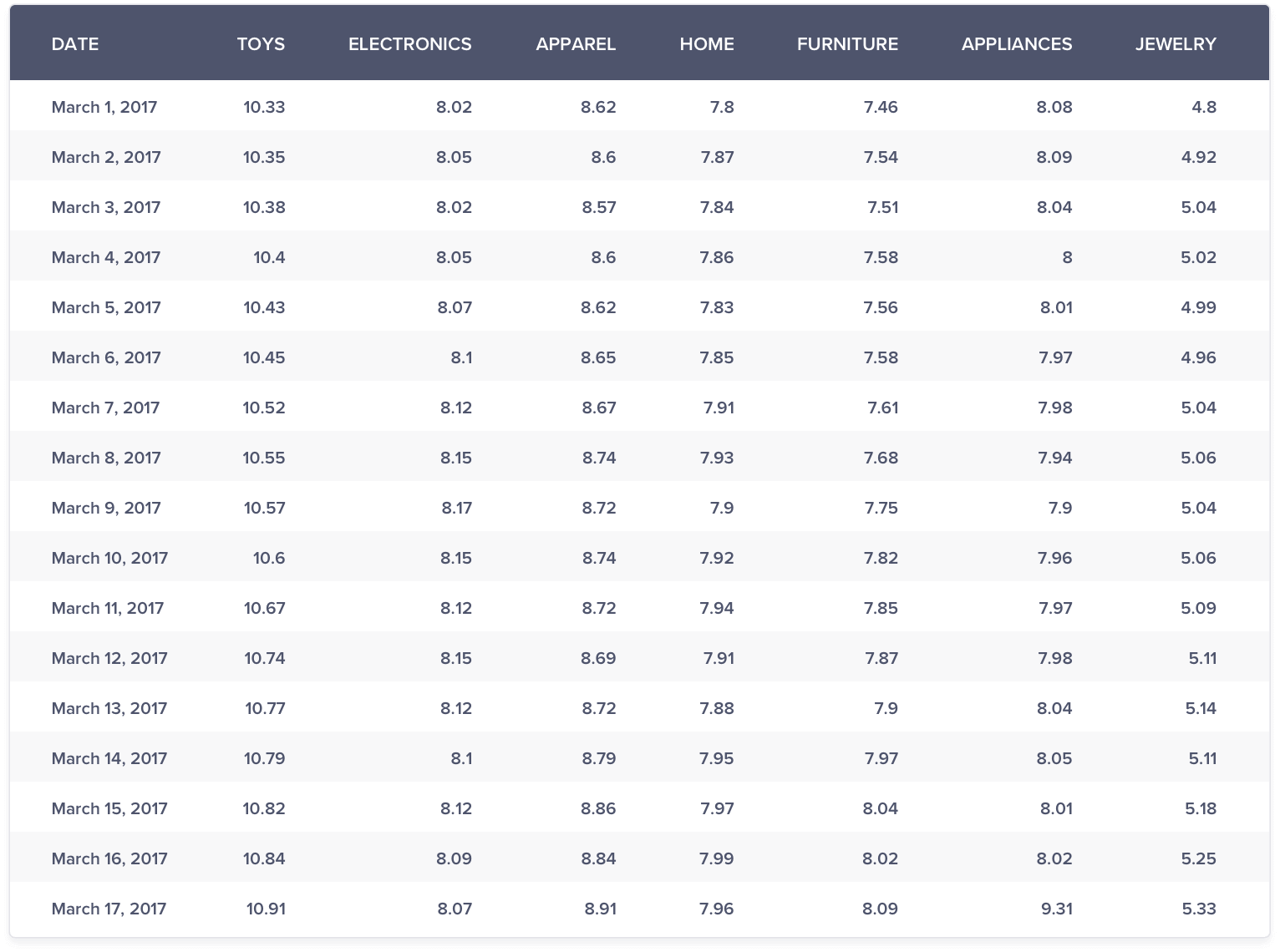
The above graph (f) does a much better job of comparison than graph (e).
Few insights that pop out are:
- Jewelry sales growth seems the highest
- Toys, Apparel and Furniture sales growth shows a similar upward trend
- There’s not much to choose between the other segments
Couple of scenarios where log will not help:
- Non-positive numbers: Since log of non-positive numbers is undefined, data containing non-positive numbers cannot be compared.
- Extreme difference in scale: Except for toys, apparel and jewelry, it was difficult to make sense of the relative growth among other segments. This is because you had the toys segment which had a relatively high scale and the jewelry segment which had relatively low scale and the other segments somewhere in between.
Max Method
Turns out, a much simpler approach could be to just show each data point as a ratio of the respective maximum point in the series.
For each time series data:
Transformed Data Value = Original Data Value / Maximum of respective time series data
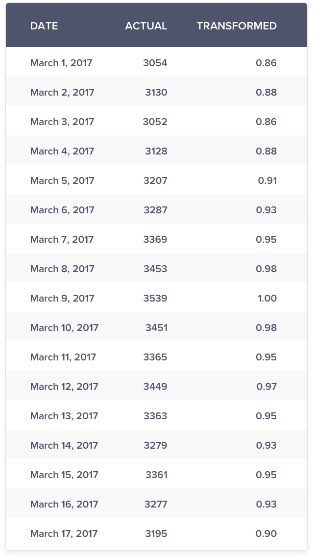
Consider the sales data for electronics:
Maximum Value: 3539
Transformed Value on March 01 = 3054/3539 = 0.86
In marketing, you would be mostly dealing with non-negative data. Hence, the range/scale of the transformed data is guaranteed to be between 0 & 1 unlike the log scale method.
Likewise, you can get the respective ratio for other segments too.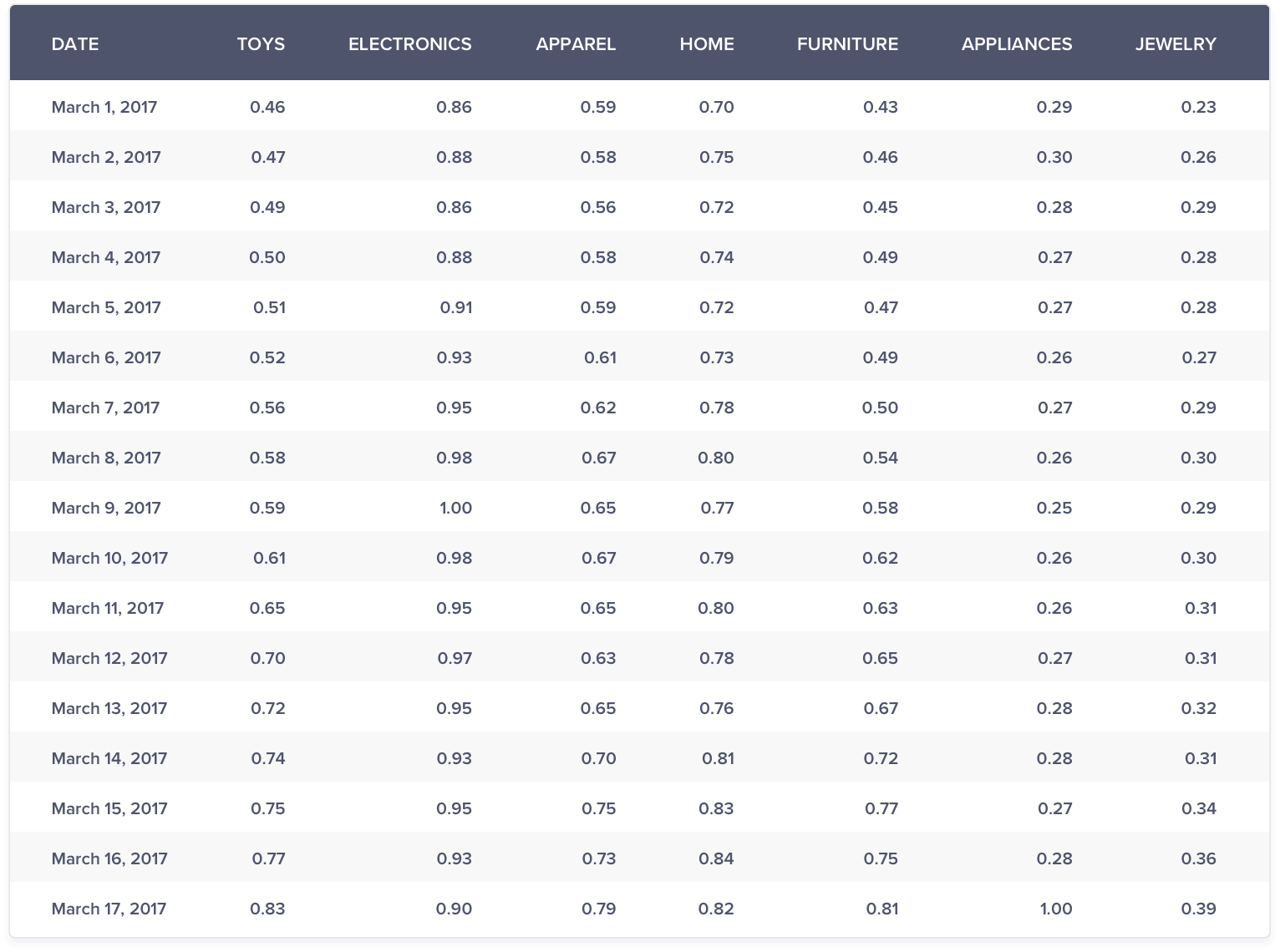
The above graph (g) is much better than graph (e) and (f). It is easier to compare sales growth among various segments.
Few insights that pop out are:
- The growth in Jewelry sales is clearly the highest
- All segments except electronics and grocery is seeing a consistent upward trend in sales
- Electronics is seeing a divergent and a declining trend in sales
Chance of Occurrence / Probability Method
With the help of the max method, you can compare trends against each other quite easily. But what if you would not only like to compare trends against each other but also with itself?
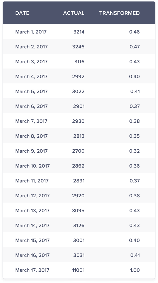
Take the case of appliances. There is a single upward blip on March 17 where the sales shot up by more than 5 to 6 times compared to a normal day. Due to this, the sales on that single day dominated all the other days and it is difficult to infer the volatility, if any on another day.
What if instead of plotting the data point, you plotted the chance of observing a value as high as the data point. In mathematical terms, it means you are calculating the
Probability of obtaining the result as extreme as the data point given the data series or
Probability (Data Point lesser than or equal to a Data Value given all the data points)
This is commonly known as p-value in statistical terms.
The chance of observing data point as extreme as 3,241 is 0.46
Compared to graph (h) and (i), you are able to view the trend and volatility in the data much better in the above graph.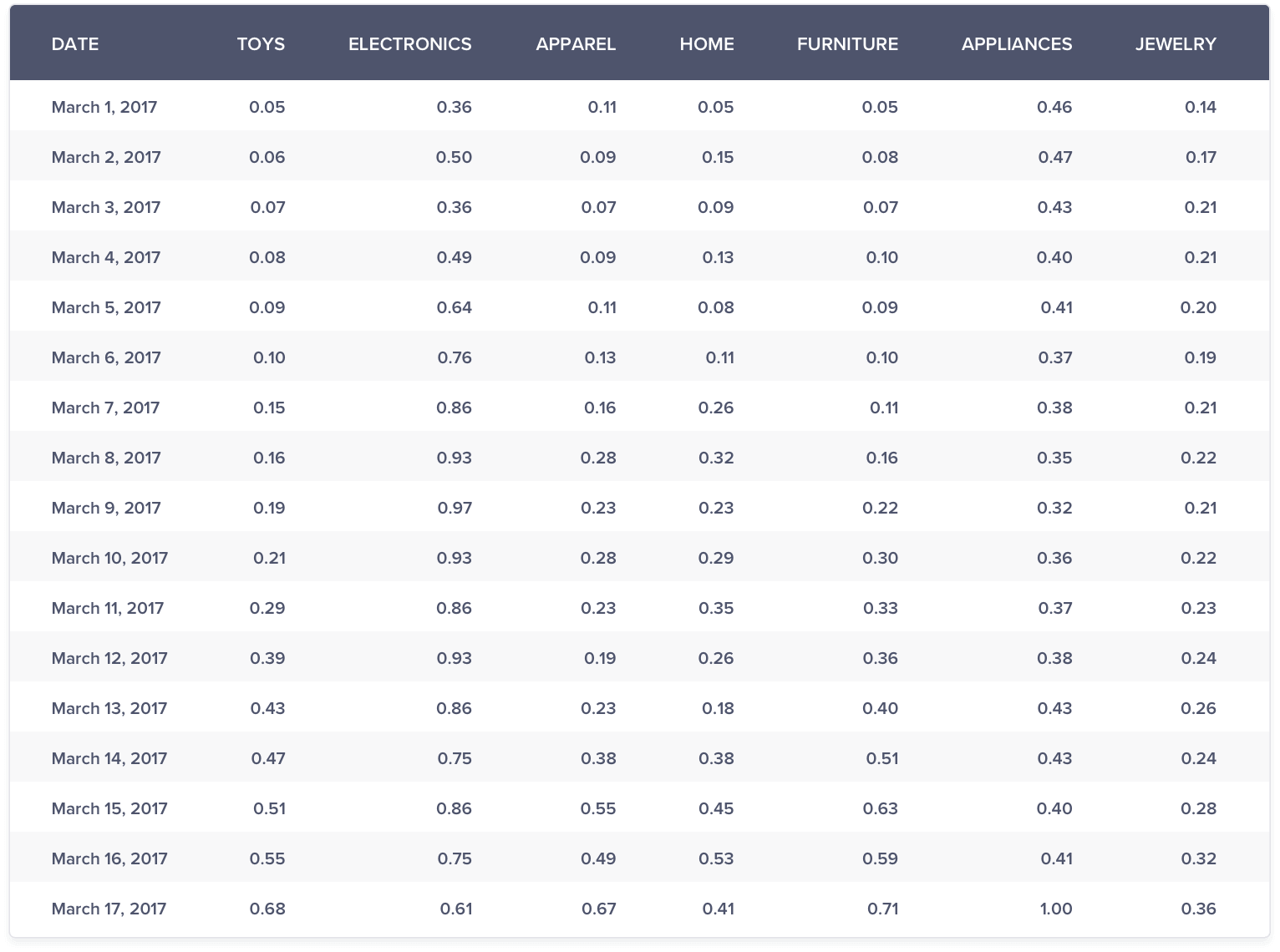
With the help of the above graph, you are able to uncover all the insights as discovered by the max method. But, in addition to the trend comparison, you are also able to view the volatility much better within each trend. This method guarantees a range between 0 & 1 and is suitable for both negative as well as positive numbers.
Conclusion
Comparing different trends becomes difficult when you are faced with a large difference in the scale of at least one trend. In this article, we saw that with the use of the max and probability methods, we could overcome this issue and uncover hidden insights within the data.
The Intelligent Mobile Marketing Platform
Jacob Joseph 
Heads Data Science.Expert in AI, Data & Analytics and awarded 40 under 40 Data Scientists in India.
Free Customer Engagement Guides
Join our newsletter for actionable tips and proven strategies to grow your business and engage your customers.
