Boosting push notification retention requires thoughtful strategies to keep users engaged and coming back. This guide provides expert tips to help you create notifications that enhance retention, capture attention, and build lasting user loyalty.
Smart marketers know that user retention is the lifeblood of any successful app. Even a small 10% uptick in retention can increase your business’s value by over 30%.* But let’s face it, keeping users engaged isn’t getting any easier.
With so many apps out there fighting for attention, your push notifications need to do more than just pop up—they’ve got to make users want to come back for more. Push notification retention is now a top priority for mobile marketers who want to turn one-time users into loyal fans.
In this guide, we’re sharing expert tips to help you craft notifications that not only grab attention but also build lasting engagement and loyalty.
The Role of Push Notifications in Retention
Let’s clear something up straight off the bat: not all push notifications are directly, or immediately linked to ROI. But all pushes are crucial—because once you get users back into your app, you can continue to dazzle them with all the value and delight you’re providing.
Say you send a push notification to a user who started creating her profile inside your dating app. She nearly finished the signup process but didn’t add a photo.
Inviting her back into the app to add her photo gives her a chance to become more familiar with the app and gives you a chance to offer her more value.
This is a win-win situation that can boost your retention rates—and keep you out of the 25% of apps that are only used once and then abandoned.
Two Types of Push Notifications
No matter your app’s purpose, all of your push notifications will fall into one of two categories: transactional pushes or engagement pushes.
1. Transactional Push Notifications
Transactional pushes deliver time-sensitive information—for instance, “Hey, your flight’s gate number has changed,” “Your package was delivered to the front porch,” or “Here’s a receipt for that thing you just bought.”
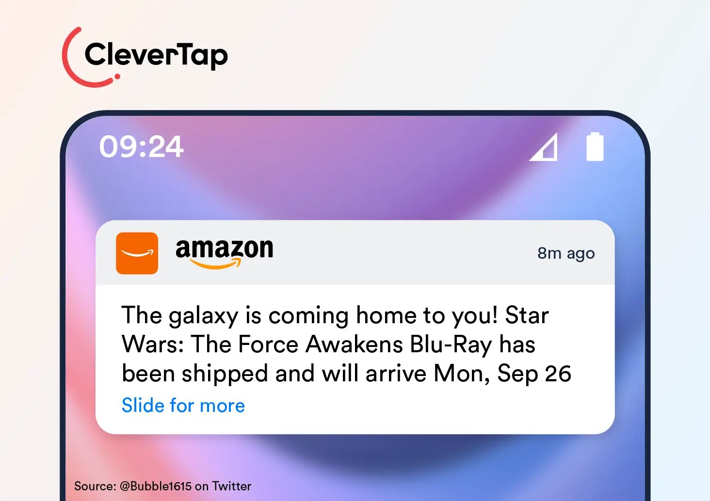
Users expect these notifications and may have specifically opted in to receive them (especially in the case of retail and delivery apps).
Even when a transactional push doesn’t lead to a tap or app open, it builds retention by providing the user with the information they need.
In fact, most users expect apps to inform them of updates via their lock screens. According to The Guardian’s Mobile Innovation Lab, 84% of users across several push notification studies dismissed a notification because they’d been informed and didn’t need it anymore.
So don’t be discouraged if your transactional notifications tend to get lower open rates than your other pushes. They’re still helping you boost or maintain user retention.
2. Engagement Push Notifications
Engagement notifications are designed to grab a user’s attention and encourage them to interact with your app. These types of pushes may not be expected or specifically opted into, which makes it all the more important (and tricky) to get them right.
Here’s the Pokemon Go app congratulating its user base on a job well done:
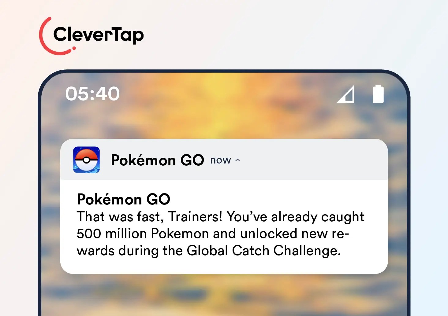
Highly engaging push alerts focus on the user. And we mean focus on the user at every level: in the message’s content (which should be tailored to the user’s activity or preferences), in the push send timing (which should be optimized for when the user is most likely to see it), and even in the push’s word-for-word copy.
Whether they’re transactional, engagement-boosting, or both simultaneously, all of your push notifications must follow three basic principles. They’ve got to be relevant, timely, and actionable.
Let’s break each of these principles down.
Principle 1: Every Push Must Be Relevant
Relevancy is one of those concepts that sounds easy, but when you break it down, you realize it’s more complex than you thought.
So, what makes a push notification relevant? It requires a combination of factors, like users’ in-app behavior, location, how useful the content of your push is, the level of personalization, and more.
Whew. If it helps, you can think of relevance as an equation:

Notifications must be relevant to what your users are doing, who they are, where they are, and the actions they’ve taken (or haven’t taken) inside your app.
To parse all that data, you’ll have to segment your users.
Not just by age, location, gender identity, and common bulk demographic segmentation but also by characteristics like device type, usage habits, typical session length and frequency, customer or profile type, and most frequent in-app behaviors.
Know What Users Do Inside Your App…
Keep an eye on your users’ most frequent in-app behaviors. For example –
- How often do they open the app?
- Do they tend to engage at certain times of the day or on certain days of the week?
- Have they created a playlist, bought a product, completed a quiz, or followed any other user journey to its conclusion?
- Did they get stuck somewhere on that journey?
Also, notice whether users prefer a specific product or product type. This isn’t just for shopping apps—if your app doesn’t sell physical products, simply think about your own category distinctions. For example, movie ticketing apps should be keeping tabs on users’ favorite/most purchased genres.
Keep in mind that you can segment users based on their past activity as well as their real-time activity.
…And What They Don’t Do
Along with in-app behavior, segment by what users haven’t done in your app. For example, abandoned cart notifications occur when a user has added a product to their cart but hasn’t purchased.
Location-Based Notifications
Another way to keep your push notifications relevant? Location. Both the user’s geolocation and the location where they tend to use your app most.
Is your user at home? At work? At the gym? On a road trip? Did they just cross a state line?
When users enable location access for your app you can send them notifications that entice them to engage with your app, like “Hey, FIRSTNAME, welcome to Chicago! Check out these must-see attractions.”
Knowing your user’s location will help you send useful notifications that improve CTRs, like these prompts from Google Maps:
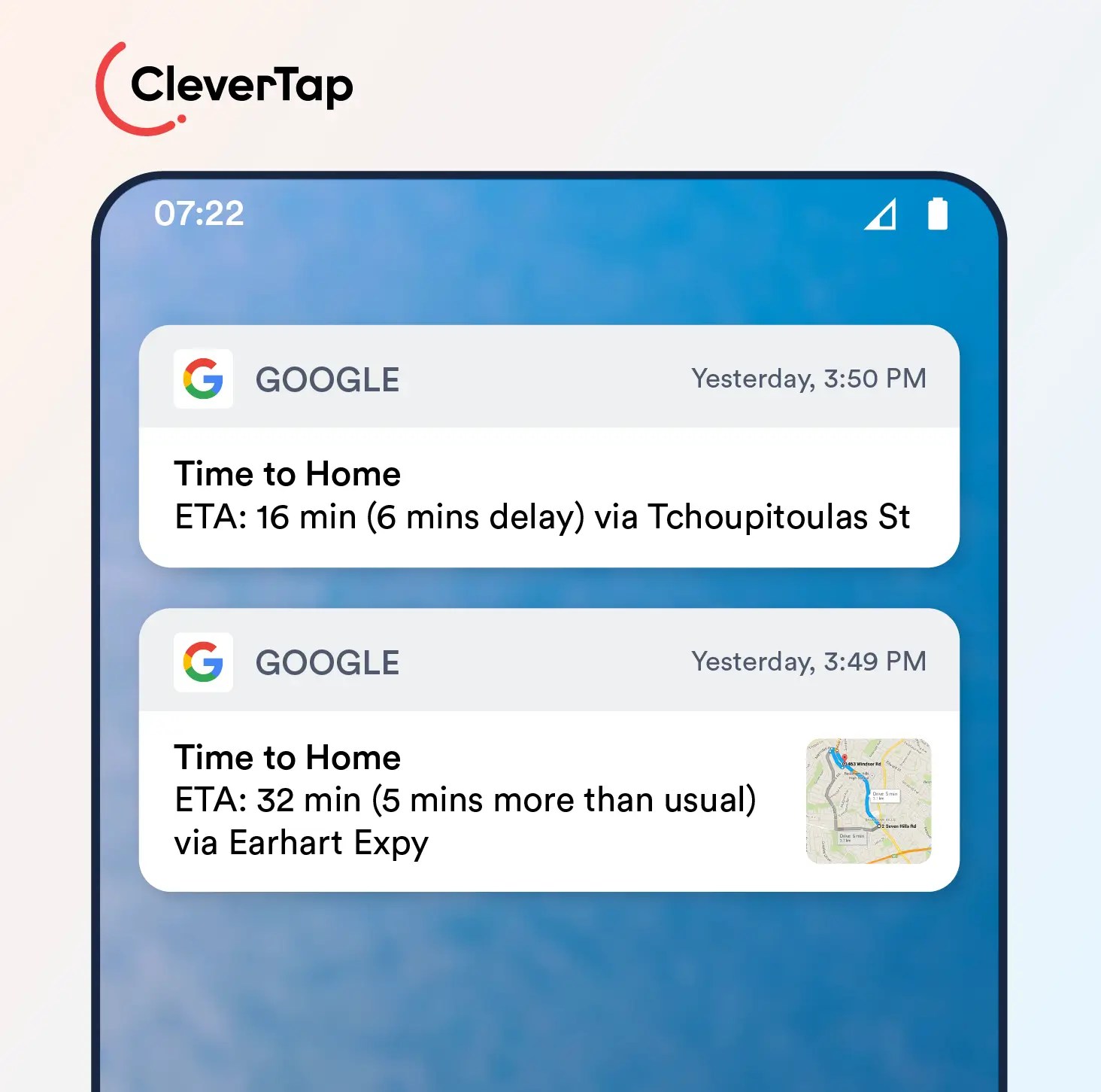
In this case, a user who wants to avoid traffic and get home faster is likely to open the app to find a better route home.
Relevance = Usefulness
Relevant notifications are useful and valuable to your users. To be truly useful, a notification helps users:
- Feel good
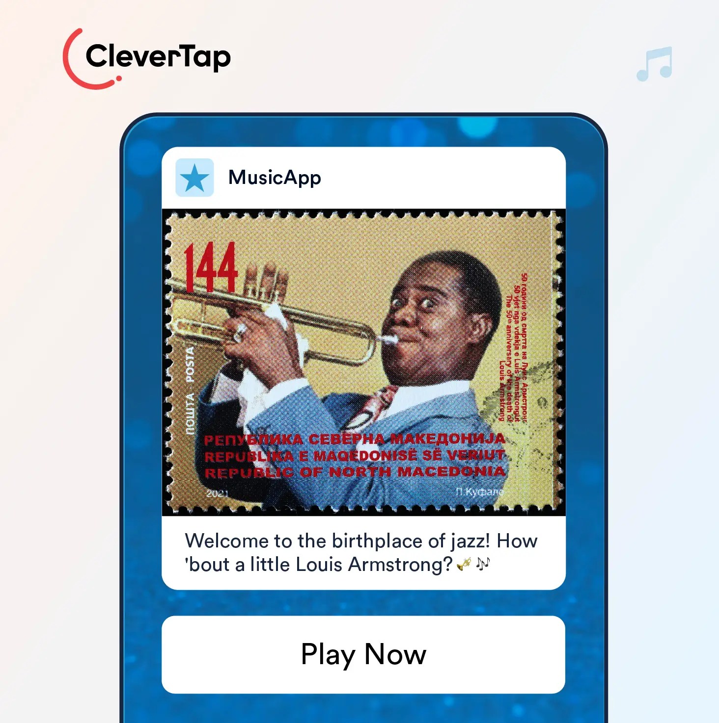
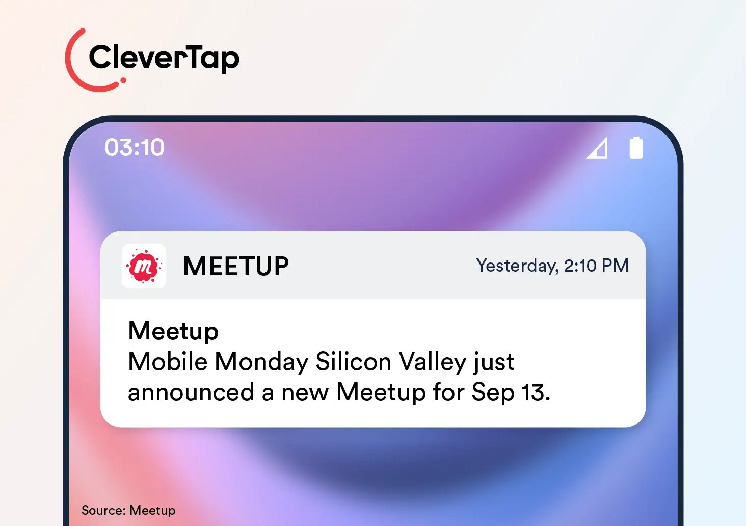
- Discover something new
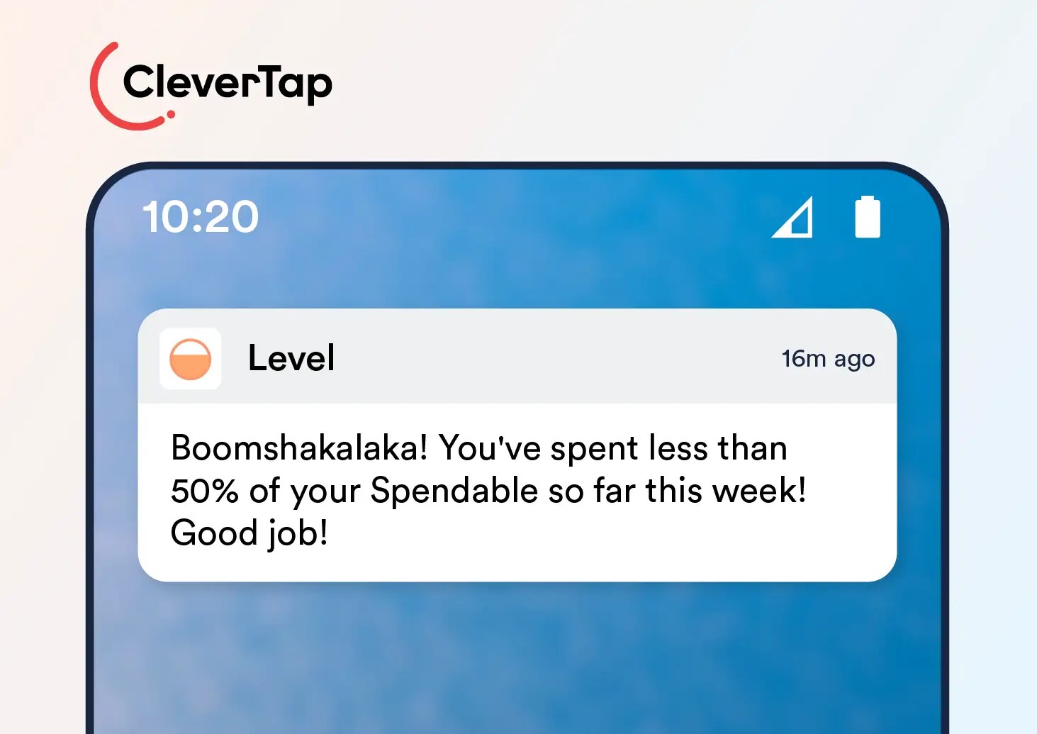
- Accomplish something
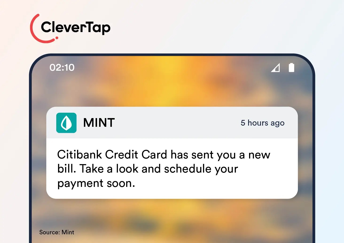
- Accomplish something faster or better
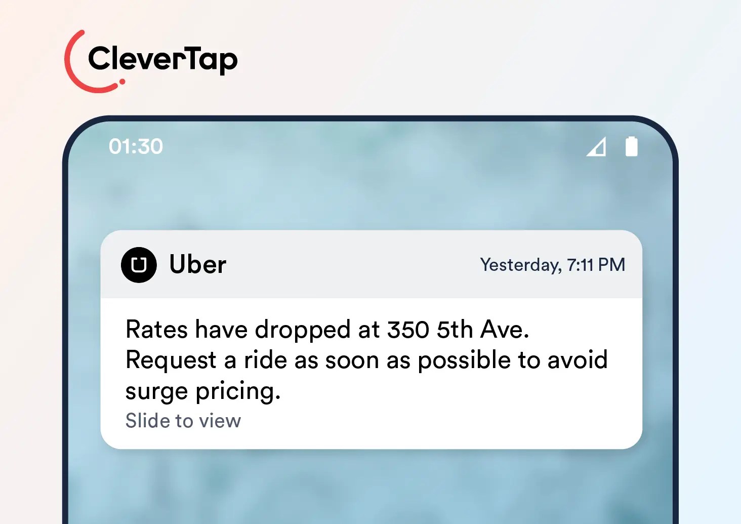
Essentially, useful notifications help users build habits around your app. Users will automatically turn to your app (and no one else’s).
Make no mistake—creating a best-in-category app is a noble mobile aspiration. But it’s not the most important aspect of retention.
Marketing psychologist Nir Eyal has studied the science of user retention extensively. He notes that encouraging users to build habits around your app creates a “monopoly of the mind.” Users won’t even consider using a competitor app simply because they’re already attached to yours.
Why Irrelevant Notifications Are the Kiss of Death
Users can be fickle, as you well know. They’ve got a world of competing apps to choose from, and they’ll delete yours in a second if they perceive it as useless.
So, before we move on to Principle 2, consider every push notification you create and consider whether it’s truly relevant to the end user. This is especially important when it comes to retaining new users who may not have had a chance to experience your app’s value.

What Makes Push Notifications Successful
Principle 2: Every Push Must Be Timely
Timing matters. Poorly timed notifications frustrate users and can cause them to delete your app.
Urgent, time-sensitive, or location-sensitive notifications should be sent immediately. Don’t delay shipping updates, food delivery notifications, or airline gate changes.
Otherwise, check your customer engagement metrics to see when each cohort’s engagement is highest, and send pushes accordingly. You can also use this handy formula to trigger behavior-based pushes at the right time:

According to Andrew Chen’s analysis of bulk push notification data, pushes sent and opened “trended upward throughout the day, with a small peak around noon, a slightly larger one around 3 pm, and the largest in the evening.”
This makes sense, considering most people are off work in the evenings and more likely to have time to open notifications. But sending users a barrage of after-work pushes in an effort to boost retention is not the best idea.
How Many Notifications Are Too Many?
46% of users would disable push notifications if an app sent between 2 and 5 messages in a single week, and 32% would stop using the app altogether if it sent between 6-10 notifications in a week’s time.
Along with helping you create more personalized pushes, segmenting users also allows you to specify who will receive certain notifications—so you can avoid annoying users who are already active in your app.
Once you’ve created rules around who will get which messages and when, start A/B testing the number of pushes you send. Then watch your data carefully. At what point does engagement start to improve? The moment you see an increase in app uninstalls, you know you’ve sent one push too many.
Dissatisfied users will likely let you know that they’re unhappy with your push frequency:
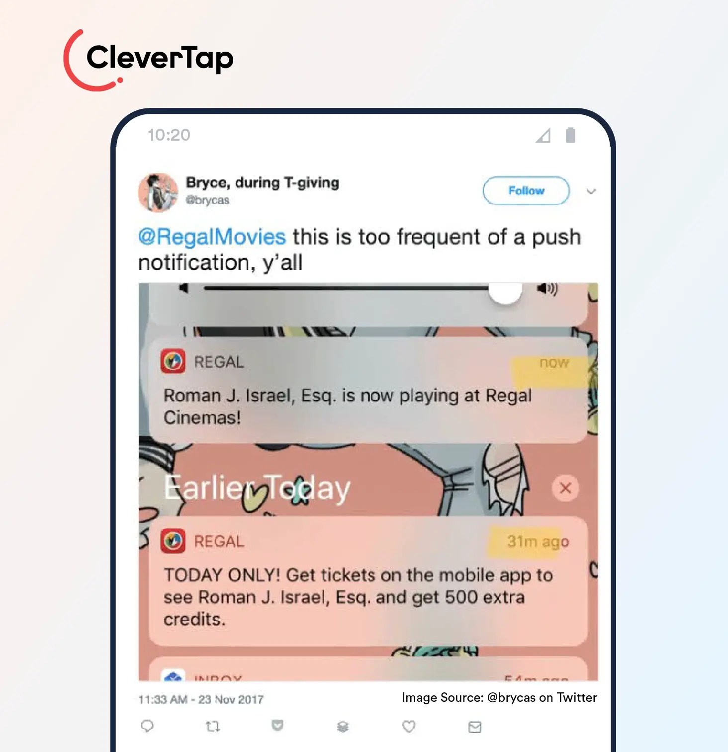
Here are some things the e-commerce platform, Sellbrite, recommends when planning timed pushes:
- Set frequency caps that prevent a user from receiving more than, say, 5 messages in 7 days
- Define “cool-down” periods where you’ll stay off your user’s lock screen
- Include algorithms to prioritize some pushes over others—so a user doesn’t get a “10% off” coupon instead of their food delivery notification.
Abiding by these guidelines will help you avoid sending users into a Hulk-like rage and ensure your app’s longevity on their phones. If you do send regularly, don’t send the exact same push over and over. Your users will get used to it, which makes it easier for them to ignore it.
Also, make sure to follow push notification best practices to ensure that your messages make a difference.
Principle 3: Every Push Should be Actionable
If I were a guest in your house and you told me, “There’s ice cream in the freezer,” I’d think longingly of a bowl of Rocky Road… but I probably wouldn’t make a move.
But if you said, “There’s ice cream in the freezer. Grab a bowl from the cabinet over the sink and help yourself”? I’d be wiping chocolate off my chin six seconds later.
People need to be told what to do. Implying or suggesting won’t do the trick. We need clear calls to action.
You could have the most well-written, visually appealing push notification in the world, but without a specific call to action, your efforts will be wasted on most users.
To create a clear call to action, first define what you want your user to do.
Then ask yourself: why would THEY want to do this?
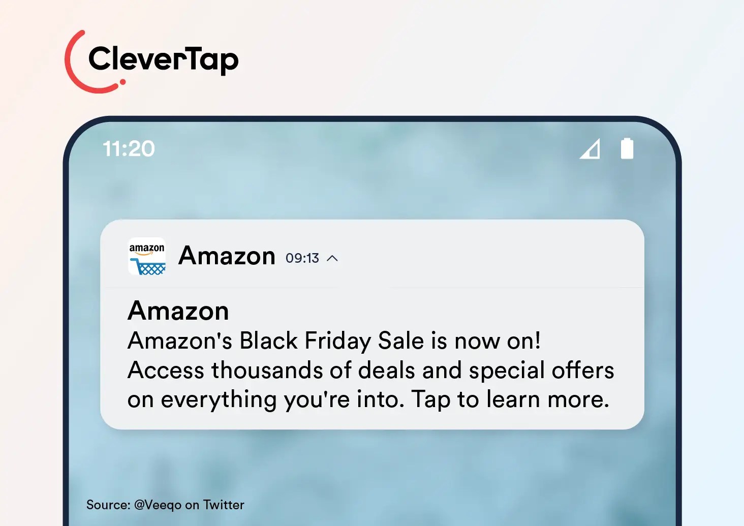
To effectively entice users to click, your push content has to make the benefits of tapping crystal-clear—all in the space of just a few dozen characters.
Here’s Amazon explaining why users should shop its Black Friday sale (“on everything you’re into”), then explicitly inviting them to act (“Tap to learn more”):
Exceptions to the Rule: CTA-less Notifications
Now, before you argue—yes, it is possible for a push notification to provide value without needing the user to tap through.
In some cases, notifications without a CTA can improve user retention in a different way. Consider these “Mindful Moment” notifications from meditation app Headspace:
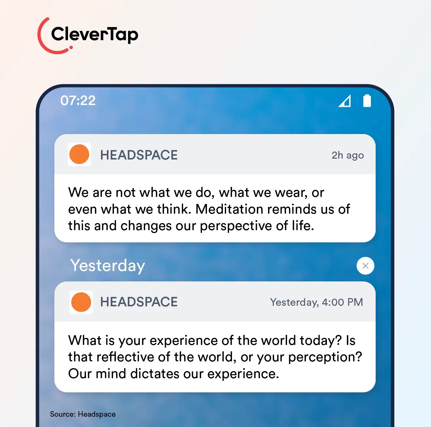
Neither of these pushes includes a direct call to action to the user, nor do they require the user to open the app.
But they still prompt the user to take a specific action: practice mindfulness. Which in turn will motivate them to meditate more regularly using the Headspace app.
Push Notification Power Words
Now let’s talk copy: the words you’ll use to compel your user to take action.
Urgency, scarcity, exclusivity, and ease are powerful motivators. Limited-time-only or exclusive offers make it easier to override the “I’ll do it later” reflex.
And when you show users that taking action is easy, it lowers their resistance to act.
Here at CleverTap, we analyzed over 11 billion push messages to find the “power words” that are linked to higher push notification open rates. Words that appeared most often—across retail, travel, delivery, entertainment, and media apps—included:
- New (because humans are hardwired to seek out novelty)
- Save (because who doesn’t love feeling like a savvy shopper?)
- Limited (because Ooh! This offer won’t be around forever)
- Exclusive (because we all want to feel special)
Here’s Apple Music presenting just-released music using both “new” and “now”:

If you’re looking for inspiration to write engaging push messages, our list of push notification power words is a great place to start. But you can write a perfectly compelling call to action without using any of these words as long as you know what motivates your users.
Learn to Write a Call to Value
Feeling comfortable writing calls to action already, or looking for an approach that keeps the focus squarely on the user?
Try writing a “call to value.” A call to value is built on exactly the same idea as a CTA—getting the user to take action—but instead of telling them what to do, it tells them what they’ll GET.
Or, as Joanna Wiebe of Copy Hackers explains it:
Depending on where your prospect is in the conversion funnel or path, you’re likely to want to choose from one of these two options for your button copy:
- Calls to value, where the button copy amplifies the value of moving forward
- Calls to action, where the button copy amplifies the action of moving forward
Let’s look at an example. Here’s a typical push notification with the CTA in bold:
“Today only: sale on designer denim! Shop now“
And here’s a version of the same CTA written as a call to value (the bolded part is the actual CTV):
“Strut your stuff in style with our designer denim collection.”
The difference might seem subtle, but these two approaches each have a place at different stages in your relationship with your users.
For example, you might focus more on calls to value at the beginning of a campaign or when your aim is primarily to prove your app’s usefulness to a new user.
Toward the end of a campaign, or once a user has developed habits around your app, you can focus on the more direct call to action.
At the end of the day, your aim should be to help your users understand or visualize how taking action will help them become a better version of themselves.
(Bonus) Principle 4: Stand Out!
One last thing. Let’s talk about what separates good push notifications from great ones —the ones thrilled users tweet about:
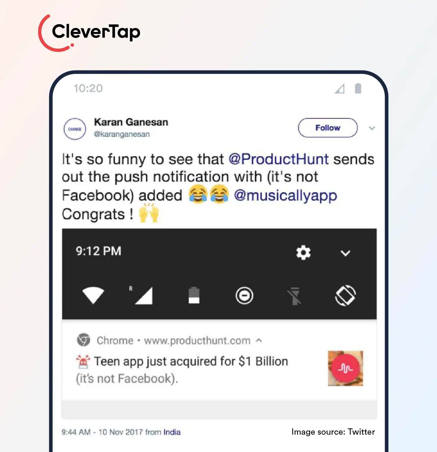
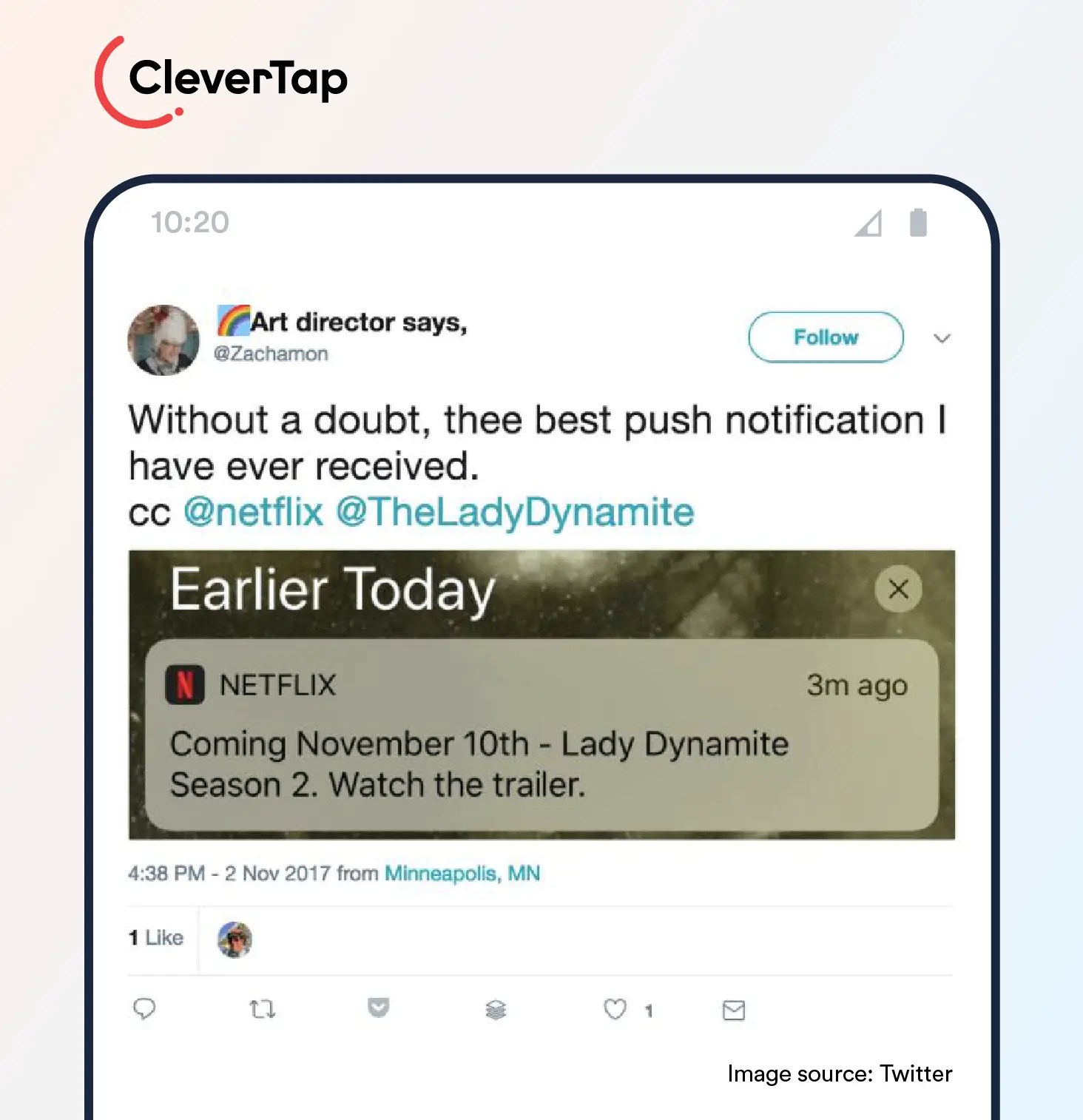
One Way to Stand Out? Delight and Intrigue
In the world of digital marketWhy is it so important to stand out? I’m going to throw a little math at you.
Your users could have up to 80+ apps downloaded on their phones.*
Let’s say half of those apps are sending regular push notifications. And that half of those apps have a careful push campaign strategy in place, complete with personalization.
That’s potentially dozens of useful notifications competing with YOUR pushes for your user’s attention. Mobile research platform, Dscout, found that the average Android user touches their phone 2,617 times a day.
That comes out to about 2.42 hours of mobile screen time every single day (the lion’s share of which was spent on Google or Facebook).
Dscout also found that nearly half of those interactions happened on lock screens—touches the researchers didn’t even count in their final numbers.
If Dscout’s Android sample is truly representative of a diverse demographic, that means people are spending an extra 2 hours a day looking at their lock screens on top of the 2.42 hours they’re already on their phones.
Considering that each of those idle lock-screen glances is an opportunity to grab your user’s attention and improve your app retention, your push notifications MUST stand out.
ing and great UX, being delightful boils down to understanding your user’s frame of mind, and their needs and wants.
It’s up to you to know what copy and content will make your users take notice.
Consider taking your user by surprise (in a positive way, of course). For example, a retail store could trigger a discount offer push notification when a user is near one of its stores.
But along with the discount code, the push could offer an unexpected compliment.
[FIRSTNAME], you’re absolutely glowing today.
Stop by [STORE NAME] for 15% off till 5 pm!
An easy way to create intrigue is by opening a loop in your push notifications. Think of this as starting a story that draws the user in and intimating that the end of the story can be found in the app. Here’s how USA Today does it:
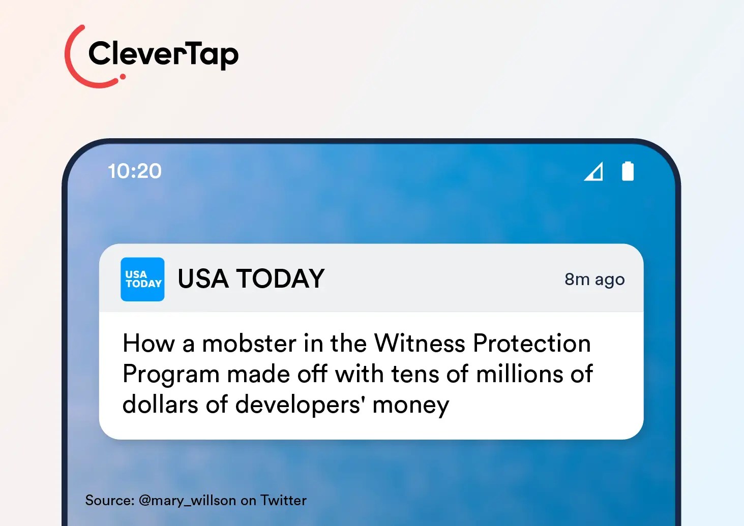
Plant the seed of curiosity in your user’s mind. They’ll want to know more, and they’ll tap for it.
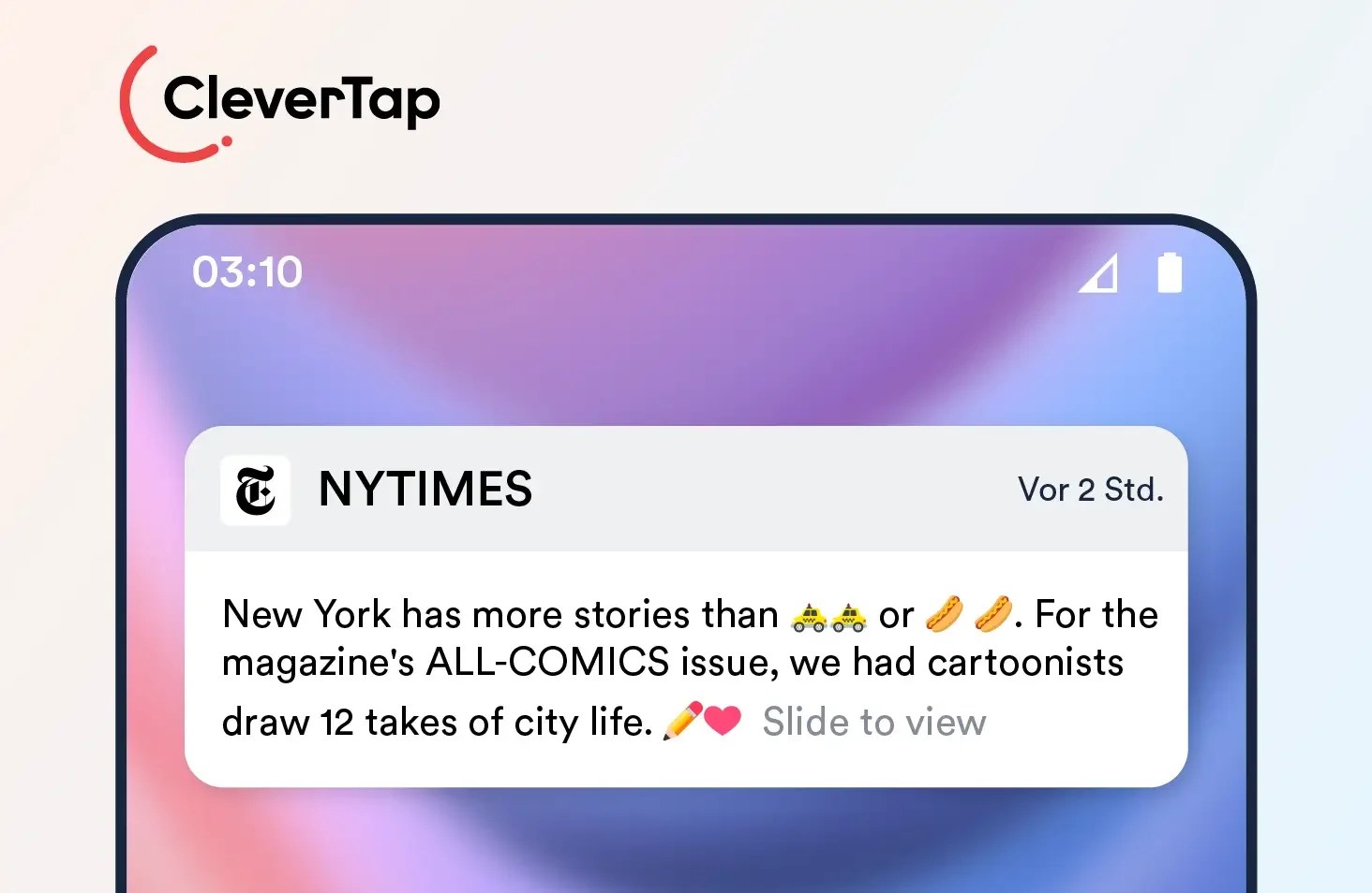
Don’t worry. Nine times out of ten, you don’t need to overthink it. It can be as simple as trying a tactic no one else seems to be using, like including an inordinate number of emoji in a push. The New York Times did exactly that:
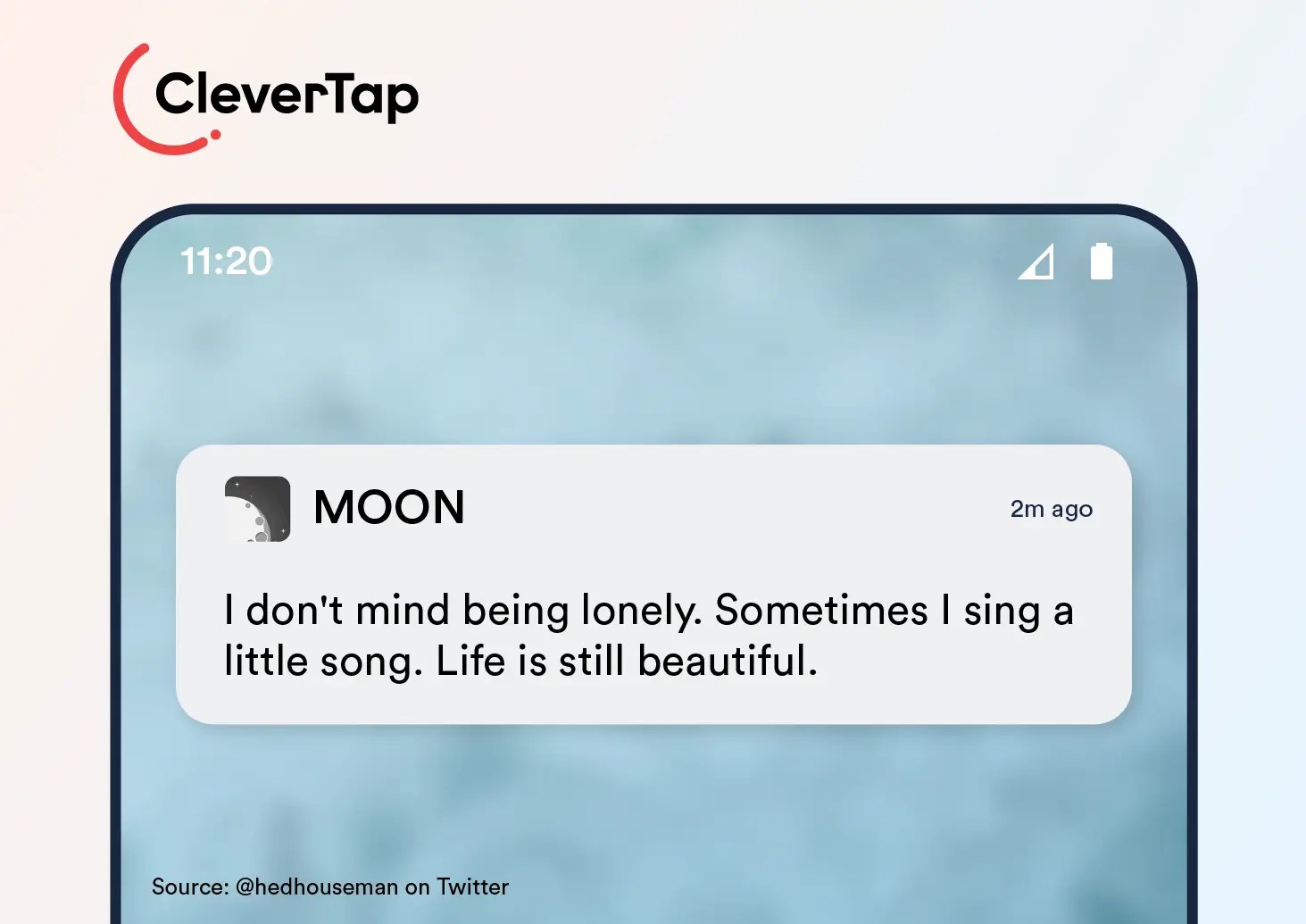
Meanwhile, Moon (an app that tracks lunar phases) sent a push that felt closer to a poem than an astronomical update:
Create Unique Content for Targeted Users
For the more ambitious and resourceful mobile marketers among us: go a step further and create unique content for a segment of your users, then invite them into the app with a totally irresistible push.
Unbounce recently created a campaign that took personalization to the next level. The campaign included highly personalized variants of emails, landing pages, and even used the recipients’ first names in its videos.
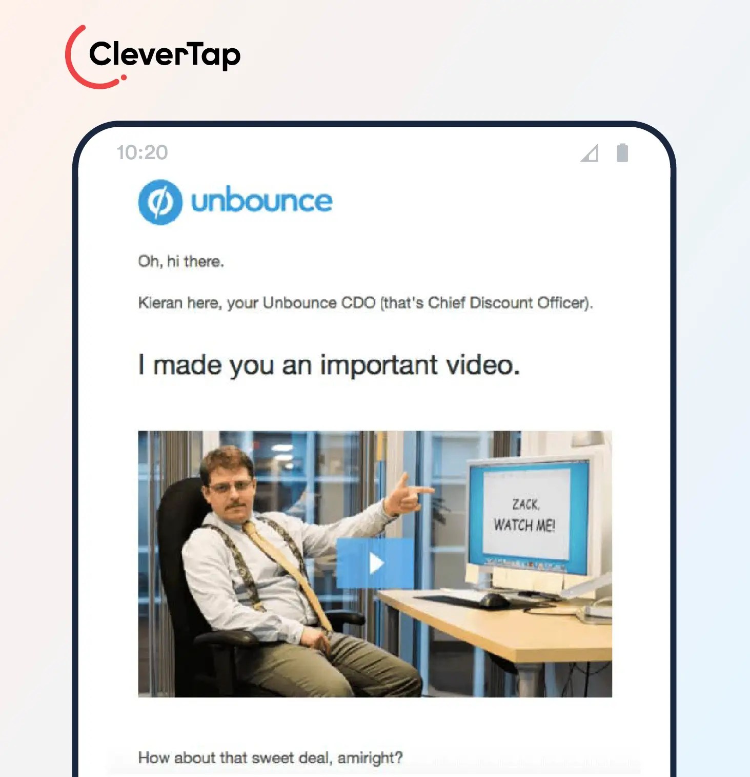
The campaign helped Unbounce exceed its conversion goals around a tricky subject (product pricing changes). It even became the basis of Unbounce staffer Alexa Hubley’s talk at the company’s 2017 Call to Action conference.
Business video platform Vidyard has also taken this approach, creating genuinely personalized, bespoke videos for a small segment of its users. HubSpot writer Amanda Zantal-Wiener heard about the approach from her colleague Kyle, who forwarded her an email from Vidyard.
The email contained a video starring a Vidyard staffer (whose name is Cole) holding a whiteboard with Kyle’s name on it. During the course of the 51-second video, Cole encouraged Kyle to reach out with any questions about using video for business.
But that wasn’t all. Kyle was seriously impressed by Cole and Vidyard’s dedication to personalizing their sales outreach, and so was Zantal-Wiener.
She noted:
He wasn’t kidding. [Vidyard] could have just superimposed each recipient’s name onto the whiteboard in this video and kept the same script for each one. But it didn’t stop there—Cole, the gentleman speaking in the video, not only addressed Kyle by his first name but also referred to his specific colleagues and the conversations he had with them.2
Taking this approach when you have tens or hundreds of thousands of users is definitely time-consuming and costly, even when you have access to tools like Cloudinary and Unbounce’s own Dynamic Text Replacement feature.
But what if you segmented your user base to target only users with a large social following (AKA influencers) and made a video or other personalized offer for them?
Now we’re talking about more manageable numbers—and a group of well-connected users who will be incredibly gratified by the effort your app’s team puts into providing real value.
All the data you need for this type of outreach is already at your fingertips. It’s up to you to decide how to use it best.
Combine this type of highly targeted segmentation with truly personalized campaigns, and you’ve got a foolproof recipe for raising retention rates.
Stand Out with Rich Media
Along with taking up more space on the lock screen (claim that real estate is your own!), pushes that include imagery automatically engage the visual processing parts of your user’s brain.
It’s the classic “Show, don’t tell” adage in mobile marketing form.
Rich push notifications may garner lower open rates at the campaign level, especially at first. But mobile marketer Guy Horrocks expects that on a broader scale, rich media pushes will drive higher long-term conversions. So along with paying attention to taps, keep an eye on your view-through conversions.
One last note about rich media pushes: to display correctly, they require iOS 10. That means you need to code and send a similar version of your notification for users with older devices or operating systems.
Final Thoughts: Change Your Perspective
Review your current push notifications. Are they written in the second person (i.e. “you” voice)?
While writing in the second person is conventional copywriting wisdom—and for a good reason, since it can work especially well in calls to action—you have an opportunity to stand out with a simple shift.
Let’s look at an example push notification written in the second person:
“See the latest headlines for your area, [FIRSTNAME]”
In its current form, the copy addresses the user directly. But in another, easily testable version, the copy could include an “I” or “we” perspective:
“We curated the latest news in your area, [FIRSTNAME]”
The reasoning behind this is that it positions your app as an individual rather than a faceless company—which can make it easier for users to connect with you.
Lots of marketers have seen great results when sending emails from a person representing a brand or company versus sending directly from the brand itself. It translates to push as well.
How CleverTap’s Push Notifications Can Boost Retention
Want to take your Push Notification Retention to the next level? CleverTap offers a suite of tools designed to make your push campaigns more effective and engaging:
- User segmentation allows you to target users based on their behavior, location, and preferences. This ensures your messages are always personalized and relevant to each user group.
- With rich media support, you can include images, videos, GIFs, and emojis in your push notifications. Making your messages visually appealing and interactive helps capture users’ attention instantly.
- CleverTap’s A/B Testing enables you to experiment with different message formats, timings, and channels. Its advanced feature, IntelliNODE, allows you to test up to 35 different journey paths, helping you identify the most effective strategies for higher engagement and conversions.
- CleverTap’s AI-powered engine, Clever.AI, predicts user behavior, generates personalized content, and automates interactions. It delivers messages that resonate emotionally, enhancing both retention rates and conversions.
- With detailed analytics, you can track key metrics like delivery rates, open rates, click-through rates, and conversions in real time. These insights allow you to continuously refine and improve your push campaigns based on what’s working best.
- Scribe, CleverTap’s AI writing assistant, helps you craft the perfect message tone. Whether you want to spark joy, create FOMO, or build trust, Scribe makes your content engaging and effective.
- RenderMax ensures your notifications get seen:
- Handles Strict Device Protocols: Seamlessly renders notifications across all Android devices, even those with strict push rules.
- Works Around Battery Optimization: Re-renders notifications when devices wake from battery-saving modes, giving your messages another chance to be noticed.
With these features, CleverTap and RenderMax help you overcome common push notification challenges, ensuring your messages are delivered, seen, and acted upon. Boost your push notification retention today, book a demo with CleverTap!
Use This Yes/No Checklist for Your Next Push Campaign
Use this checklist for every push notification campaign you put together. You’re looking for mostly Yes responses to ensure that each and every one of your push notifications works to improve your app retention.
RELEVANCE
- BEHAVIOR: Is the push triggered by user action or inaction?
- LOCATION: Is the push related to the user’s geographic location?
- USEFULNESS: Will the push help the user accomplish something or trigger a positive emotion?
TIMING
- Is the push immediate or urgent? If so, have you created a “frequency cap” to avoid overwhelming your user?
- Will you be sending other pushes within 24 hours of this push? If so, have you designated rules about which segment will receive which pushes?
ACTIONABILITY
- CLARITY: Is it clear what ACTION the user should take, or what VALUE they’ll receive?
- POWER WORDS: Does your push include one of the 250+ push power words?
UNIQUENESS
- SURPRISE + DELIGHT: Will the push surprise, delight, or intrigue your user?
- VISUAL APPEAL: Will the push stand out on a crowded lock screen?
- PERSONALIZATION: Have you tailored the push content to each individual user as much as possible?
The Intelligent Mobile Marketing Platform
Subharun Mukherjee 
Heads Cross-Functional Marketing.Expert in SaaS Product Marketing, CX & GTM strategies.
Free Customer Engagement Guides
Join our newsletter for actionable tips and proven strategies to grow your business and engage your customers.

