


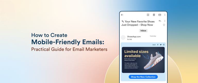

Table of Contents
Categories
Most Popular

Email marketing offers a high return on investment (ROI) of $36 for every dollar spent. 42% of people use mobile devices to open emails, compared to desktops. If businesses are not designing their email campaigns for mobile responsiveness, they are missing out on engaging a large audience segment.
Poor mobile formatting and higher loading times lower email engagement rates and hurt conversions. This blog will cover the pillars of mobile-friendly email designs, strategies, best practices, and benefits of mobile email marketing. It also highlights key metrics to track and shares real-world examples.
What is Mobile Email Marketing?
Mobile email marketing refers to the optimization of email campaigns specifically for mobile devices. It ensures that the email message is accessible, readable, and actionable, no matter the device. With nearly half the users opening emails on mobile devices, it is no longer enough for marketers to optimize emails only for desktop viewing. Emails must now be tailored to fit smaller screens and vertical layouts across mobile devices.
Although often used interchangeably, responsive and mobile-friendly email design are distinct concepts.
- Mobile-Friendly Design: Emails with a simple, static layout, larger fonts, and buttons to ensure basic readability on smaller screens. They do not adapt dynamically to screen size, but are easy to read on mobile devices.
- Responsive Design: Uses CSS media queries to automatically adjust layout, font sizes, and images based on the device’s screen size. It offers a seamless experience across all devices, such as a desktop, tablet, or mobile, without any user action required.
- Mobile Version: This is a separate version of the email optimized for mobile, accessed through a link. While not as seamless as responsive design, it’s useful for users with devices or apps that don’t support responsive formats, like older BlackBerry models or in certain versions of the Gmail app.
Benefits of Mobile-Friendly Emails
Writing mobile-first emails comes with its benefits.
- Enhanced Reach and Wider Audience: The majority of email users access their inboxes on mobile devices, making mobile optimization crucial to reach a broad audience.
- Increased Deliverability: Mobile-friendly emails are less likely to be flagged as spam, leading to higher deliverability rates.
- Faster Load Time and Seamless Navigation: These emails are optimized for performance, navigation on smaller screens, and ease of readability. This provides an overall positive customer experience.
- Increased Engagement and Conversion: The average mobile email open rate is 21.33%, as per research. Mobile-friendly emails tend to have a higher engagement and email conversion rate as users are more likely to engage with emails that are easy to read and interact with.
- Effect on Brand Perception: Unreadable text, awkward layouts, unclickable links, and slow-loading images can frustrate users and lead to high bounce rates. Poor mobile experience damages brand perception and can lead to more unsubscribers.
The 4 Pillars of Mobile-Friendly Email Designs
Mobile-friendly emails should be visually appealing and functional on all mobile devices. Follow these four pillars to design emails that suit mobile behavior and constraints.
1. Content and Copy
On mobile, attention spans are shorter and screen space is limited. Effective mobile email copywriting should be:
- Clear and concise: Get to the point quickly. Use short paragraphs, bullet points, and bold text for key takeaways.
- Action-driven: Include a compelling CTA early, and make it easily tappable. Ensure the CTAs are well-spaced and not cluttered, making it easy for users to navigate and click on the desired link.
- Scannable: Most users skim, so break up content with headings and line breaks. Avoid lengthy paragraphs with complex formatting.
2. Layout and Structure
Mobile users scroll vertically. However, mobile screens can also flip from portrait to landscape and vice versa. The mobile-friendly email needs to look good and respond well in both these formats. Follow these design tips:
- Use single-column layout formats rather than multi-column.
- Maintain touch-friendly spacing for links and buttons (at least 44x44px tap targets).
- Use logical hierarchy to place the most important content and CTAs near the top.
3. Visual Design
The key is to strike the right balance between aesthetics and speed. Include the following in your mobile-friendly emails:
- Optimized images that load quickly and display well on high-DPI screens.
- Minimalist design that avoids clutter and focuses attention.
- Use a minimum font size of 14px to provide sufficient contrast between text and background colors.
- Use brand-consistent elements to reinforce identity while keeping mobile usability in mind.
4. Technical Foundations
A strong code ensures emails render correctly across clients and devices:
- Responsive coding using media queries for fluid layouts.
- Fallbacks for fonts and images, like text alternatives for images, to ensure readability even if assets don’t load.
- Test across email clients like Gmail, Outlook, and Apple Mail to catch rendering issues.
Mobile Email Design Strategies
There are three core strategies to consider when designing emails for mobile: Scalable, Fluid, and Responsive mobile email designs. Each strategy offers a different approach to achieving mobile compatibility.
1. Scalable Email Design
This strategy employs a single-column layout that is easy to read on both desktop and mobile devices, requiring no complex code adjustments. It uses large fonts and big buttons.
Pros:
- Easy to build and test
- Works well across most email clients
- Low development overhead
Cons:
- Not optimized for specific screen sizes
- May look overly simplistic or bulky on a desktop screen
2. Fluid Email Design
A fluid email design strategy uses percentage-based widths so content stretches or contracts to fit the screen size. Emails with a fluid design are well-suited for text-heavy emails and adapt the layout without relying on CSS media queries.
Pros:
- More adaptable than scalable
- Works even in clients that don’t support media queries
- Better use of screen space
Cons:
- Can break on extreme screen sizes
- Requires careful planning to avoid layout shifts
3. Responsive Email Design
Emails with a responsive design use CSS media queries to adjust layout, font size, spacing, and image scaling based on device screen size. They need more advanced coding and implementation than scalable or fluid designs.
Pros:
- Fully optimized experience across all devices
- Most professional-looking approach
- Maximizes engagement and usability
Cons:
- Requires advanced coding skills
- More testing and QA are needed
- Not supported in some legacy email clients
The best email marketing strategy depends on your brand’s goals, team expertise, and email volume. Scalable email designs are ideal for small teams or simple campaigns with limited development resources. Fluid designs are best for brands that want flexibility without complexity. Responsive emails are better suited for high-volume senders, e-commerce brands, or those prioritizing a polished user experience and conversions.
Mobile Email Marketing Best Practices
Crafting emails for mobile users demands more than just responsive design—it requires a mobile-first mindset. Here are mobile email marketing best practices to ensure your emails are engaging, accessible, and conversion-ready on small screens:
1. Optimize Subject Line and Preheader for Mobile Scannability
Mobile inboxes typically truncate subject lines after 30–40 characters, so keep them short, front-loaded, and benefit-focused. Use the preheader text as a secondary hook to expand on the subject line and encourage opens. Together, they serve as your email’s elevator pitch.
Example:
Subject: Your 20% Discount Awaits
Preheader: Don’t wait—expires in 12 hours!
2. Use a Single-Column Layout for Vertical Flow
A single-column layout ensures seamless vertical scrolling and optimal readability on small screens. It prevents awkward horizontal movement or broken formatting that multi-column designs often suffer from on mobile. Keep content blocks stacked, clean, and focused on one action per section.
Pro Tip: Design your emails for 320–480px widths and test how they scale.
3. Use Large, Legible Fonts for Easy Reading
Mobile screens demand clarity. Use at least 14px for body text and 22–28px for headers to maintain legibility without zooming or eye strain. Stick to simple, web-safe fonts like Arial, Helvetica, or Georgia. Maintain a comfortable line height (~1.4x font size) to make the reading experience effortless.
Pro Tip: Avoid dense paragraphs and use short lines with lots of white space to guide the eye. Use font hierarchy and line spacing (~1.4x font size) for better readability.
4. Design Bold, Tap-Friendly CTAs with Adequate Spacing
Your call-to-action should be thumb-friendly—visually bold, sized at least 44x44px, and surrounded by generous padding. Avoid text-only CTAs or links buried in long sentences. Instead, use high-contrast buttons with action-driven text like “Get My Discount” or “Start Free Trial.”
Placement Tip: Repeat the CTA at the end for longer emails, especially for scanners.
5. Optimize Images for Speed and Add Descriptive Alt Text
Slow-loading images kill engagement. Compress images to reduce file size without sacrificing quality, and use responsive formats like WebP or optimized PNGs. Total email weight should ideally stay under 100 KB. Always include alt text to describe key visuals in case images are blocked or fail to load.
Example alt text: Use an alt text like “Tap here to claim your 20% off coupon.”
6. Design with Tap-Friendliness in Mind
Avoid placing tappable elements too close together. Leave enough padding to prevent accidental clicks. Ensure links, buttons, and menus are easy to interact with using a single thumb.
Tip: Left-align buttons or center them for thumb reachability, especially on larger phones.
7. Design for Both Light and Dark Modes
With dark mode now standard on mobile devices, your emails must look good in both themes. Avoid hardcoded white backgrounds or black text overlays. Use transparent PNGs, test for color contrast, and avoid color combinations that disappear in dark mode.
Pro Tip: Outline logos or icons to retain visibility across background colors.
8. Personalize Content Using Behavioral Segmentation
Mobile users engage more with content that feels tailored. Go beyond using a first name and leverage behavioral segmentation to deliver dynamic content based on actions like purchase history, browsing activity, or cart abandonment. Segment users by intent, recency, or interest, and adjust the message to match. Personalized email marketing boosts relevance, which drives engagement, especially when users are on the go.
Example: “Hi Sarah, you left your headphones in the cart—grab them now with 10% off.”
9. Minimize Text Blocks and Use Clear Visual Hierarchy
Mobile readers scan, not read. Use short paragraphs, bullet points, bold subheads, and white space to chunk content and draw attention to key ideas. Each section should answer one question or lead to one action.
Quick structure: Headline → Value prop → Visual/CTA → Trust point
10. Place Key Content Above the Fold
Mobile users decide in seconds whether to scroll or delete. Place your most important message—headline, offer, or CTA—within the first 250–300px. Don’t rely on scroll behavior for engagement; hook users right away.
Example: A flash sale countdown or discount code works well above the fold.
11. Design for One-Handed, Thumb-Friendly Navigation
Most users hold their phones with one hand. Position CTAs and key links where the thumb naturally rests (center or bottom of the screen). Avoid placing actionable elements too close together to prevent mis-taps.
Tip: Use plenty of vertical padding between links and buttons to reduce friction.
12. Test Across Devices and Email Clients
Don’t assume your email looks great just because it works on Gmail. Rendering varies across platforms like Apple Mail, Outlook, and Android clients. Test across devices using tools like Litmus or Email on Acid, and always send test emails to real phones for final QA.
Bonus: Check how the email performs in both light and dark modes during testing.
How to Test and Measure Mobile Email Performance
Optimizing emails for mobile responsiveness also needs rigorous testing and measuring of performance to ensure campaigns deliver consistently across devices.
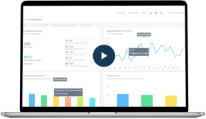
Before hitting send, preview how the email will appear on mobile screens. An email marketing platform like CleverTap offers device-specific previews, allowing marketers to visualize email rendering across popular smartphone models and operating system environments. This helps catch issues like image misalignment, font scaling errors, and broken CTAs before they reach the subscriber’s inbox.
Mobile behavior varies widely, making A/B testing a non-negotiable practice. Marketers can test email elements like subject lines, CTA size and placement, layouts, and send times to optimize mobile engagement. These tests help identify what drives higher open rates and user interaction.
While responsive design handles many variations, inconsistencies still arise due to the fragmented mobile ecosystem. A Gmail app on Android may interpret the HTML differently than Apple Mail on iOS. Use testing tools within platforms like CleverTap to simulate these environments and gather insights.
Key Mobile Email Marketing Metrics to Track
It is essential to track the right mobile email marketing metrics for optimizing performance.
- Mobile Open Rate: The percentage of emails opened on mobile devices. High mobile open rates signal the importance of mobile-first design and subject line optimization.
- Click-Through Rate (CTR): The percentage of mobile users who clicked a link or CTA. A strong CTR reflects effective design, copy, and CTA placement.
- Click-to-Open Rate (CTOR): Compares the number of unique clicks to unique opens, giving insight into how compelling the email content is.
- Bounce Rate: The percentage of emails not successfully delivered. A high bounce rate can affect inbox placement and mobile visibility.
- Conversion Rate: The percentage of mobile users who completed a desired action, such as purchase, sign-up, or download, after clicking through the email.
- Read or Skim Time: How long mobile users spend reading the email, helping refine content structure and length.
- Email Load Time: The time it takes for the email to load on the mobile device. Slow-loading emails on mobile lead to early drop-offs. Optimize images and code to ensure fast rendering.
Mobile-Friendly Email Examples to Learn From
Mentioned below are three real-world examples of mobile-friendly emails with an explanation of why they work.
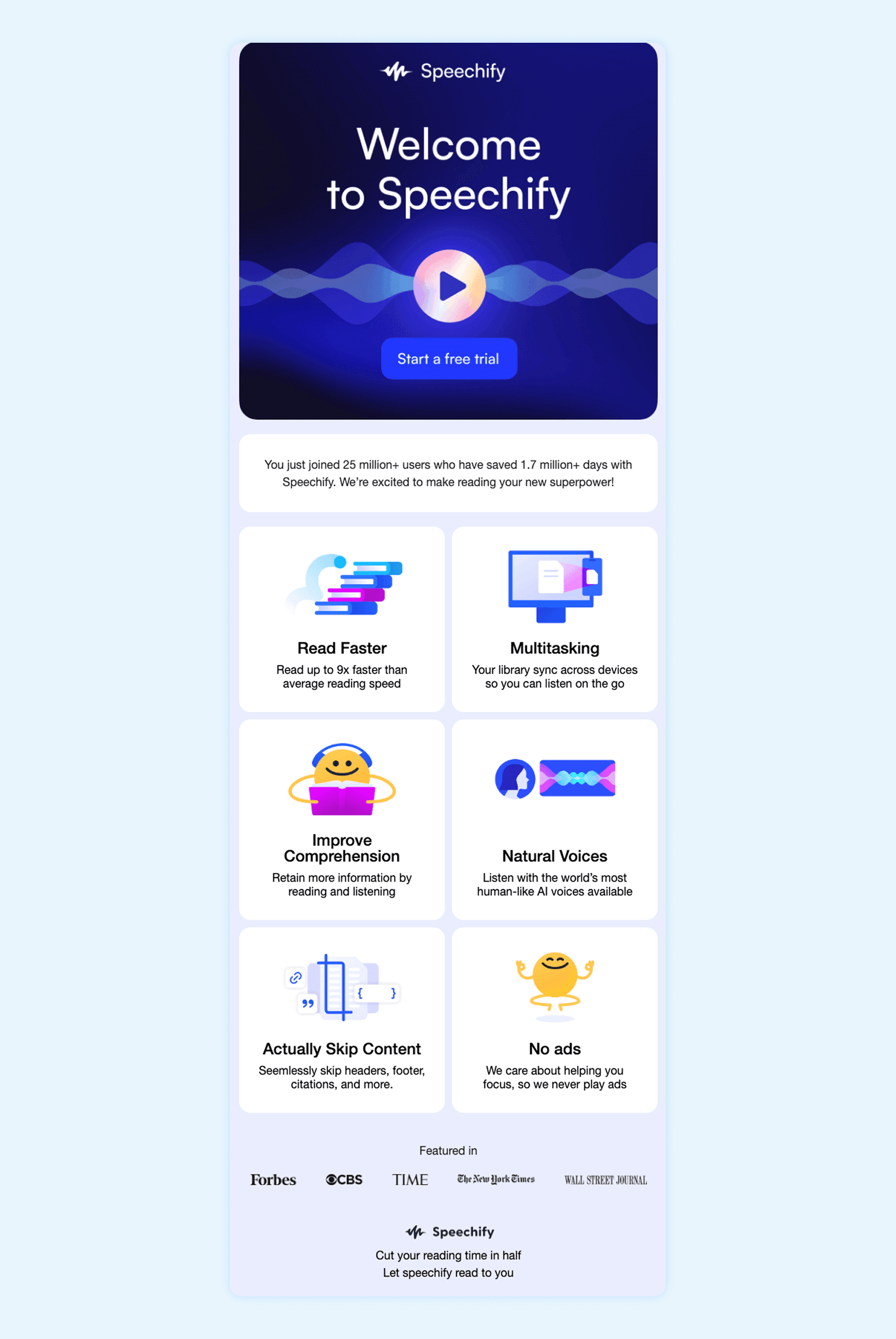
1. Speechify: Welcome Email
Speechify’s mobile-friendly onboarding email features a bold CTA (“Start a free trial”). The brand uses strong social proof—25 M+ users and 1.7 M+ days saved, to build trust. It highlights key benefits like faster reading, multitasking, and natural AI voices. The layout uses clean visuals and a concise copy spread over easily scannable sections.
2. PharmEasy: Abandoned Cart Recovery
PharmEasy, an online pharmacy, sought to reduce shopping cart abandonment rates and user drop-offs while personalizing the user experience. They used CleverTap for audience segmentation to precisely target various user groups, set up journeys to engage with users across the lifecycle, and trigger cart abandonment campaigns.
The emails are triggered when users leave items in their cart, resulting in a hyper-personalized experience. The content is tailored to the specific products left in each receiver’s cart. The design is responsive and ensures optimal viewing on mobile devices.

PharmEasy achieved a notable decrease in cart abandonment rates and enhanced its customer journey, leading to a 2X increase in direct conversions and a 10X increase in click-through rates.
Read the full case study here.
3. BlueStone: Product Recommendation Email
BlueStone, a leading online jeweler, aimed to boost engagement through personalized product launch campaigns and recommendations to maximize conversions. They set up unique customer journeys based on segmentation parameters like user PIN codes and past purchase behavior.
With CleverTap, BlueStone executed omnichannel retargeting campaigns for users who had either shown interest online or had paid a visit to one of their offline stores. They devised a win back email strategy disengaged users with product recommendations based on customer purchase behavior, buying patterns, and usage trends. The jewellery brand achieved an 8% increase in repeat visitors with personalization, a 32% boost in conversion rates through product recommendations, and an 18% revenue uplift.
Read the full case study here.
How CleverTap Can Help Improve Mobile Email Performance
CleverTap is an all-in-one engagement platform that can orchestrate an omnichannel customer experience. Mentioned below are some of the platform’s features and solutions that help marketers build mobile-friendly email campaigns.
Real-Time Segmentation & Behavioral Triggers
CleverTap enables real-time segmentation based on user behavior and customer lifecycle stages. Marketers can trigger personalized mobile-friendly emails in response to specific user actions, like app launches, cart abandonments, or purchase inactivity, ensuring timely, relevant engagement.
Responsive Previews Across Devices
The platform enables marketers to preview how emails render across over 90 mobile devices and inbox clients, including support for both light and dark modes. This helps identify rendering issues early and optimizes for diverse environments before sending campaigns.
A/B and Multivariate Testing
Marketers can experiment with variations in subject lines, content, and CTAs through built-in A/B and multivariate testing tools. This enables them to optimize email performance continuously.
Scribe: Emotionally Intelligent Content
CleverTap’s Scribe crafts emotionally intelligent, AI-generated subject lines, pre-headers, and email content that resonates with user segments. It enables personalization at scale without the manual lift.
Learn more about using AI in email marketing and tools that make it possible.
IntelliNode: AI-Driven Journey Optimization
IntelliNode, CleverTap’s AI optimizer, prescribes the best send times and engagement frequency based on behavioral data. This maximizes open rates, engagement, and conversions.
Omnichannel Journey Builder
CleverTap integrates email into its omnichannel journey builder, enabling marketers to coordinate campaigns across channels like push notifications, SMS, WhatsApp, and in-app messages for a consistent customer experience.
Advanced Deliverability & ESP Flexibility
The platform supports advanced email infrastructure, including domain authentication (SPF/DKIM), dedicated IP warming, and IP reputation monitoring. Marketers can choose between using CleverTap’s built-in ESP or integrating their existing one for flexibility.
Real-Time Analytics & Deliverability Reports
CleverTap provides comprehensive campaign reporting, including open/click rates, bounce tracking, spam diagnostics, and auto-appending UTM parameters to measure campaign ROI and effectiveness with precision.
Supercharge mobile email results with CleverTap’s AI-powered engine.
Mastering Mobile Email Marketing
As mobile continues to dominate how users access and interact with content, email marketers must prioritize mobile-first design and execution. Best practices include crafting responsive layouts and smartly segmenting users to leverage real-time testing and performance tracking.
Brands that embrace mobile optimization deliver better user experiences and drive higher engagement, stronger conversions, and long-term customer loyalty. The future of email is already in your customer’s pocket, but are your emails ready for that tap?
Need better engagement from mobile emails? Book a demo with CleverTap to explore mobile-first templates, A/B testing, and audience targeting.
Mobile-Friendly Email Marketing Infographic
Designing for mobile requires optimizing every element—copy, layout, CTA buttons—for smaller screens. This infographic shares must-know tips on mobile-friendly fonts, subject lines, screen sizes, and thumb-friendly spacing to boost email engagement and conversions.

Sagar Hatekar 
Leads product managementExpert in Marketing Analytics & Engagement platforms.
Free Customer Engagement Guides
Join our newsletter for actionable tips and proven strategies to grow your business and engage your customers.