


Table of Contents
Categories
Most Popular


It’s no secret that ecommerce has seen a major boost in the last year. More and more shoppers are turning to online and mobile shopping to make purchases instead of braving the mall or shopping in-store.
And retailers have bent over backward to respond to changing consumer needs: offering increased health and safety measures, expedited shipping, curbside pickup, alternate payment options, and more to keep their brands at the forefront of customers’ minds.
But one massively effective way to elevate your brand experience isn’t by overhauling your fulfillment process or expanding your product catalog — it’s in your mobile app.
You know your app’s UI is a key extension of your brand and your customer experience. The entire look and feel of your app should mirror who your company is and the value that you offer your customers, beyond just the products or services you sell. Features and functionality, navigation hierarchy, color palette: brands spend a ton of time researching, testing, and fine-tuning all of these things. And obviously, they are critical to your user experience.
And yet sometimes it’s the little things that stand out the most. Those small flourishes and finishing touches that make your mobile customers smile — and remind them of why they love shopping with you in the first place.
We’ve rounded up our best practical tips for perfecting the details of your UI with those special touches that take your UX to the next level. And we’re sharing a zillion real-life examples of how top retailers are using microinteractions and innovative UI elements to drive conversions and build customer loyalty.
Increase New Subscribers and Opt-Ins
The more information you have about your customers, the better you can optimize their experience with your brand. Everything from the products you show them to the offers and campaigns you send them and the channels you use to connect with them.
The trick is in getting users to share their preferences with you, especially in an age where data security is such a hot-button issue. The second you ask for an email address, users are imagining all the spam that’s about to crush their inboxes.
And while being responsible with your user data is a whole separate issue, brands that prove to customers that sharing their personal details will actually benefit them are in a much better position to nurture new users into repeat customers.
So how can you tweak your UI to boost registrations and opt-ins? A lot of brands prompt first-time users to create a profile or agree to notifications the second they launch the app. But sometimes a few little nudges are more effective than one big push.
Take ASOS. They let new users browse the app as much as they want without even mentioning a profile. It’s only when users want to favorite an item or view past orders that the app prompts a sign-up, with copy that clearly communicates the benefit for users. And the animated emoji elements reflect the youthful spirit of their customer base and instill a sense of fun. 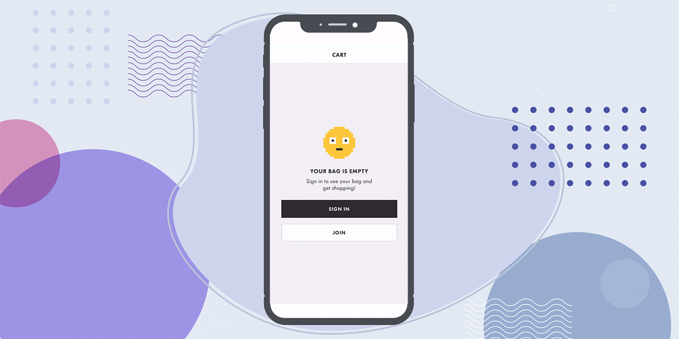
Sephora is another example of placing prompts at the right place, at the right time, with eye-catching UI elements. They place a push notification prompt on their Offers screen.
It’s all about understanding where the user is in the customer journey and what they want at that exact moment. If the user is actively searching for offers, chances are they’d be open to receiving notifications about them. It’s a much more effective place to prompt opt-ins than right at first launch.
What’s more, they don’t use a full-screen pop-up or UI overlay to shove the push notification prompt in users’ faces. It’s a simple footer that doesn’t cover up the details of the offers page, so users can see exactly what they’re opting into. 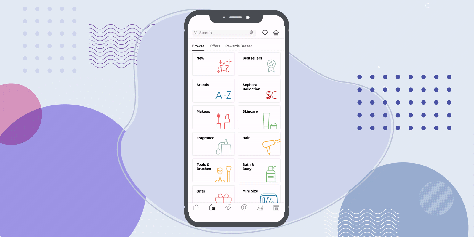
Once you’ve successfully convinced new users to create a profile and share their personal details, it’s vitally important that you make data entry as fast and as easy as possible. Confusing error messages mean users are guaranteed to bounce.
Nordstrom does a great job of using microcopy that only surfaces during key parts of data entry to guide users through the registration process and limit frustration.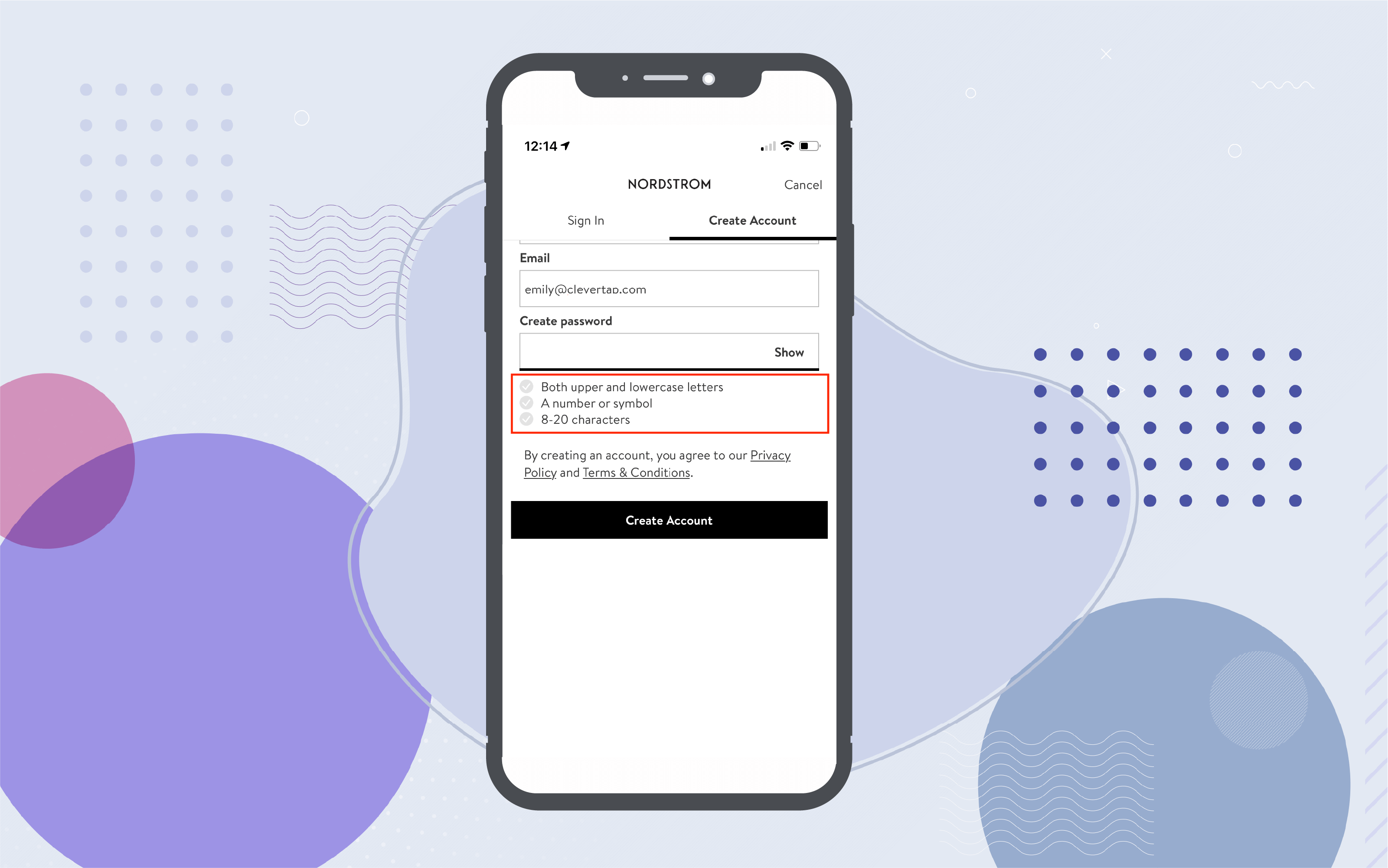
Guide New Users and Reduce Frustration
One of the most important aspects of an effective ecommerce app UI is to make the shopping experience as fun and frictionless as possible. Microinteractions play a big part in giving users those almost imperceptible hints that make viewing item details or adding products to a shopping cart seamless.
For example, Urban Outfitters adds a subtle prompt to their category pages to show new users that they can swipe on product images to view more photos. It’s a cool functionality that many users wouldn’t expect, and the app uses this simple and effective way to educate them on the feature without making too much of a fuss. It gives customers a better browsing experience by providing the info they need to decide if they want to view full product details. 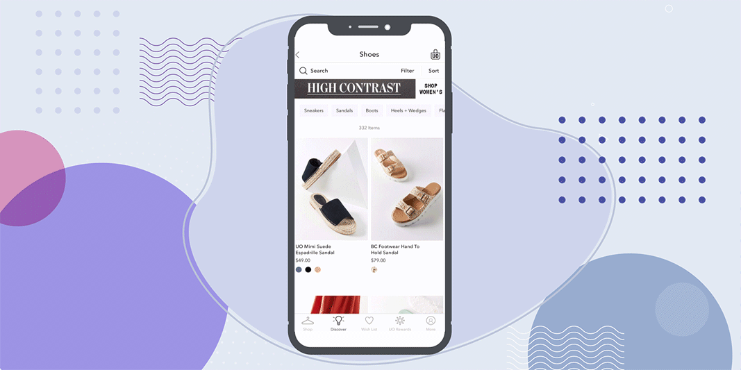
Zara does something similar on their product pages, hinting at new users to swipe up to view product details. Both the Zara and Urban Outfitters prompts are only shown to new users who haven’t used that feature before – once you use the swipe features to view more photos or product details, those prompts disappear. 
Nike is another brand that includes special UI elements just for first-time users to help them get more out of the app. It’s a clever way to avoid boring new users with a full feature tour on first-time app launch while still ensuring they get the full app experience.
Nike lets new users immediately browse products and introduces new features as users come across them. Here, the UI surfaces a prompt explaining their Add to Favorites feature. 
Target also does this with their AR feature, surfacing a prompt that walks new users through the steps of viewing a product in their space. Once a user agrees to camera permissions and the AR experience begins, the app further instructs users how to use one- or two-finger taps to manipulate the AR image to see the product from different angles or move it around their space. 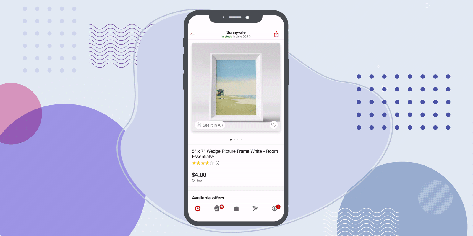
While microinteractions and prompts are a great way to surprise new users with helpful functionality, some elements have become so expected that they can frustrate users when your app doesn’t include them.
One example is the Added to Cart or Added to Favorites feedback. When shoppers tap that “Add to Cart” button and nothing happens, it can lead to confusion about whether the action was successful, repeat items added, and frustration at checkout.
Urban Outfitters doesn’t provide that feedback, instead simply updating the number shown on the shopping cart icon. Whether you update button text to change from ‘Add to Wishlist’ to ‘Added to Wishlist,’ include fun animation to the heart icon like Asos does, or show banner text with cart content details like Zara, these simple UI elements are necessary to reinforce critical user actions and reduce frustration. 
Help Shoppers Make Faster Decisions
Mobile shoppers don’t browse the same way desktop browser shoppers do — they need all the information required to make a purchase decision surfaced as quickly as possible, and they need quick and convenient checkout options.
One way microinteractions and UI elements can serve your mobile users is by helping them make faster decisions so they can get what they need with as few taps as possible.
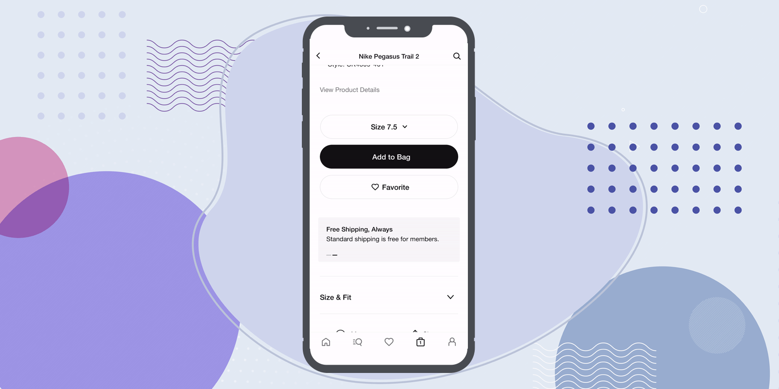
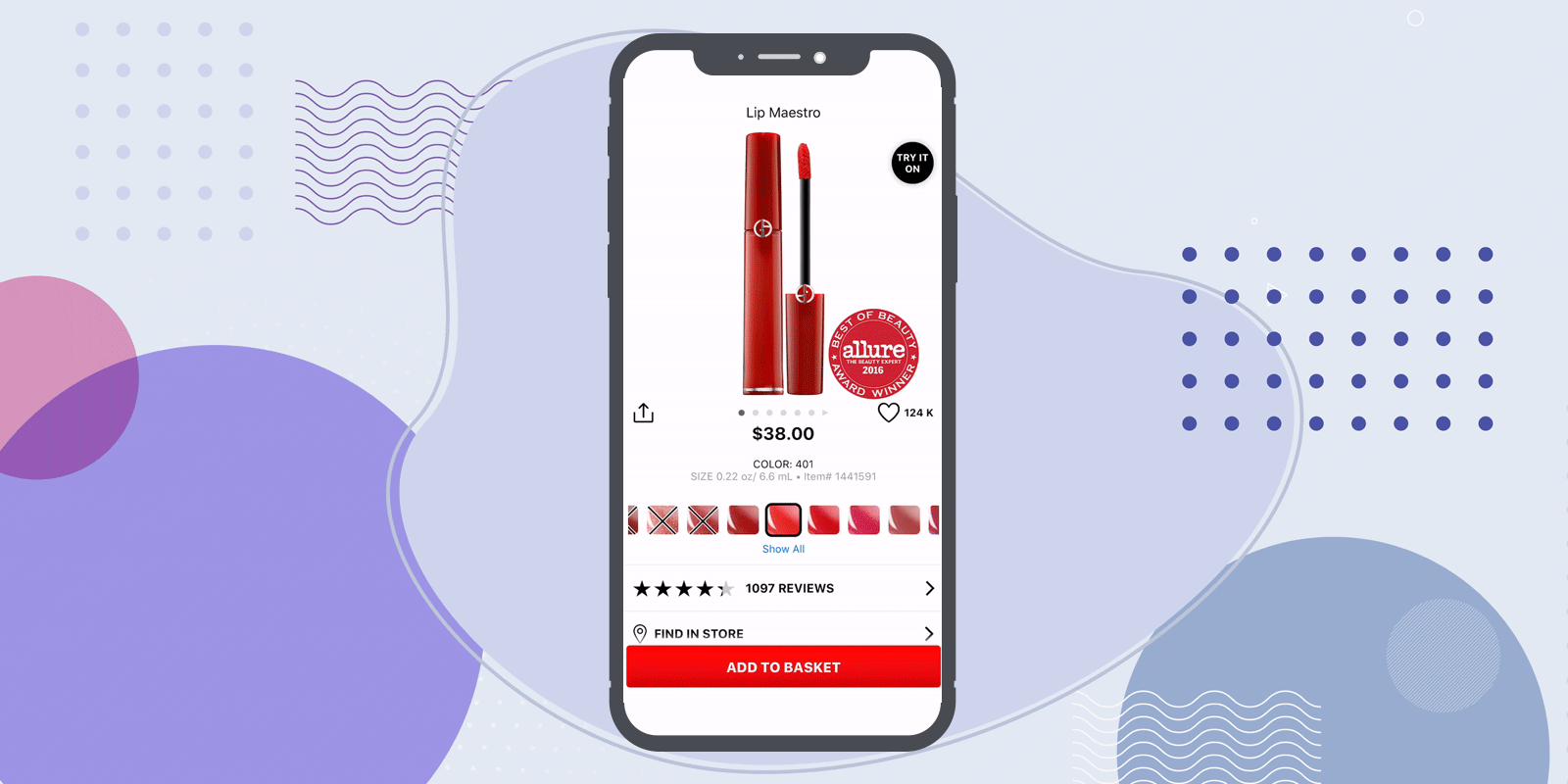
Sometimes this is as simple as updating product images when the user selects a new color, as Nordstrom does, or adding a small progress bar on the product photo carousel so users know they can swipe to see more. Other times it’s automatically selecting the correct shoe size, as Nike does for logged-in users, or highlighting the convenience of free shipping and returns. 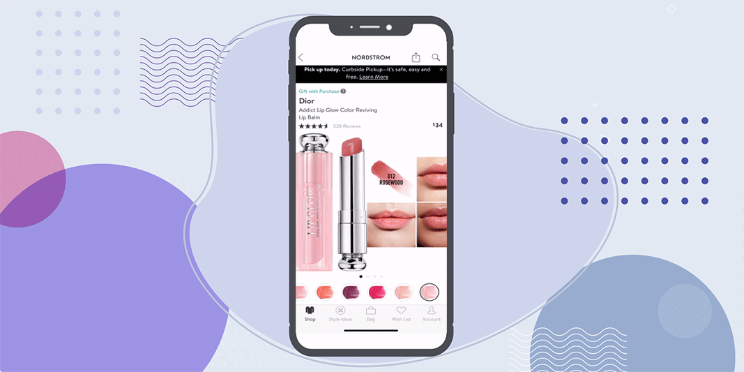
Nordstrom takes things a step further by adding microcopy that alerts users to how many other people are viewing that item at the moment. It’s an effective way to both provide social proof and instill a sense of FOMO for limited, on-sale, or low-in-stock items. Asos similarly surfaces a “Low in stock” microcopy after users make a specific color/size selection to nudge shoppers to complete their purchase. 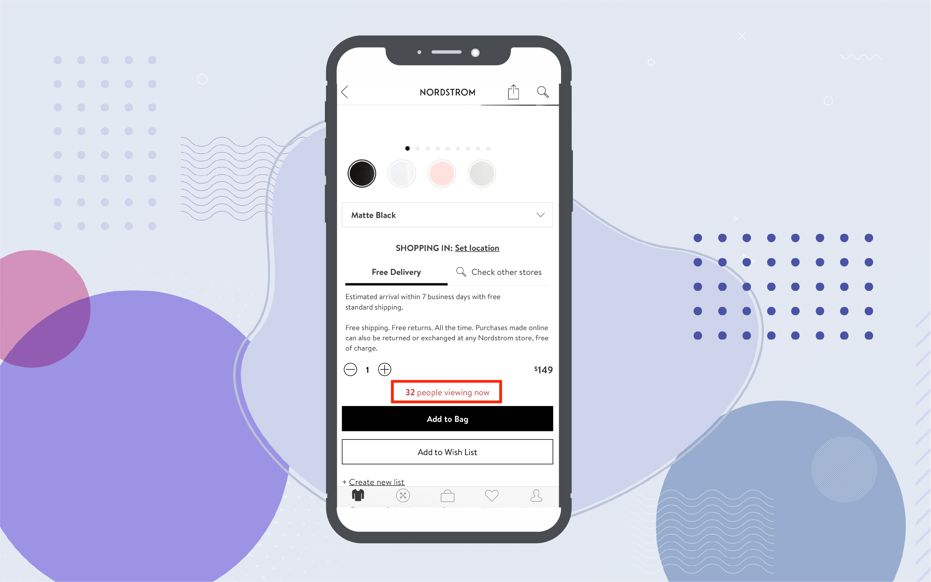
Build Trust During Checkout
For ecommerce apps, nothing is more important than earning and keeping a customer’s trust. And that goes double during the checkout process when users are entrusting you with their personal and payment information.
Optimizing your mobile checkout flow is a major topic— in fact, there’s so much to cover that we devoted an entire post to it. Instead of diving into every aspect of creating the perfect checkout flow here, we’ll just cover the little touches you can add to elevate the checkout experience and reinforce the sense of trust that customers have in your brand.
Simple can be powerful, especially when it comes to getting customers to share their payment info. Security badges and verified payment options are obvious, but subtle trust indicators can be equally effective, like automatically highlighting the correct credit card company when a user enters the first few digits of their card number. 
Another way to earn trust is to prove to customers that you want them to get the best deal. Instead of hiding promo codes, Sephora highlights active coupons and discounts within the checkout flow itself. It’s a smart move for a lot of reasons: in addition to building trust with customers, it keeps them from abandoning the checkout flow to go coupon hunting — which more than 25% of shoppers do.* 
Set the Stage for Future Purchases
What’s better than a new customer? A repeat customer.
We’ve said it before and we’ll say it again: retention is where growth lies. Repeat customers spend more money, are more receptive to your marketing campaigns, and are more likely to drive organic user acquisition through word of mouth.
Once shoppers make a purchase within your app, simple UI elements can deliver the kind of experience that makes customers come back for more. Whether it’s featuring an automatic subscription button on only their favorite products or surfacing back-in-stock notifications for wishlist items within the app, creating native app experiences that are tailored to each individual user is a powerful way to earn customer loyalty.
One way Target sets the stage for repeat purchases is by showing a pop-up for users who have items ready for in-store pickup. These users don’t have to hunt through their order histories or dig through their emails for confirmation codes or order pickup instructions – it’s right there on the app’s home screen the second they launch. And the prompt makes it easy to switch to curbside pickup without having to search for it. This quick and easy pickup experience makes it more likely that shoppers will come back for more. 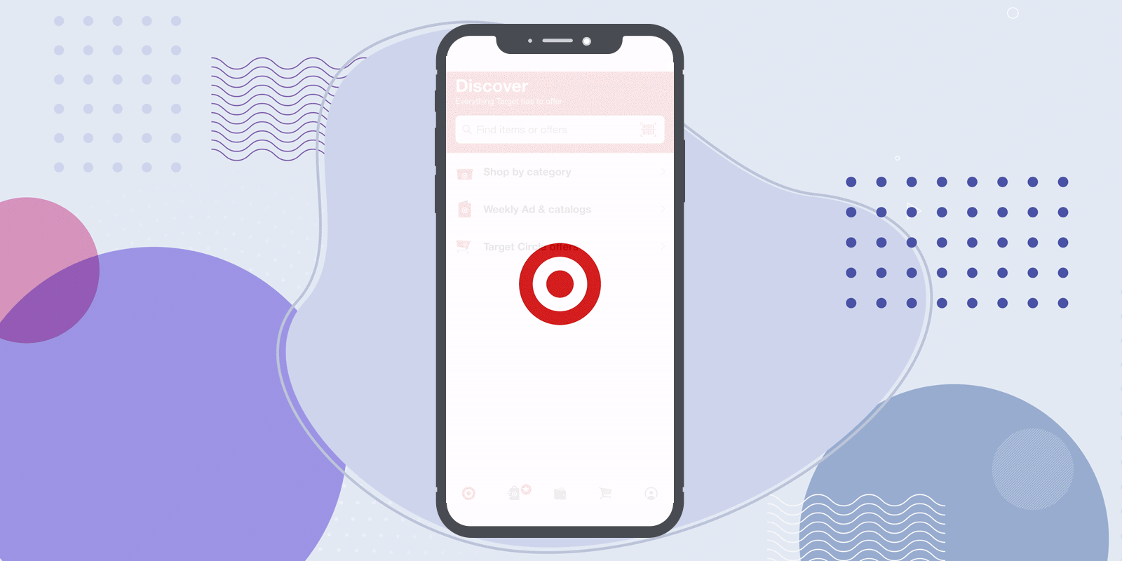
Evoke and Amplify Positive Emotions
While it’s true that these subtle UI elements and microinteractions can boost conversion rates, they’re first and foremost about something much simpler: making your users smile. Microinteractions are a great opportunity to instill some fun and give users a memorable shopping experience that sets your brand apart.
Microcopy like “You’ve got great taste!” when users add an item to their cart, or “Gift with Purchase!” are all ways to add excitement and a fun human touch to your app. Sephora’s Added to Cart animation includes a little twirl that’s completely unnecessary yet whimsically fun.
Nike customizes its launch screen for churned users who have launched their app for the first time after reinstalling it, showing a Welcome back message that demonstrates the company remembers me as a customer and is giving me a different experience than brand new, first-time shoppers. I’m not starting over, I’m coming back.
These little differences can seem like small potatoes, but they can have a real impact on how users feel about their relationship to your brand. 
Creating a Memorable Ecommerce App UX
To create an effective UI and memorable microinteractions you need to understand not only how customers use your app, but how they experience it. The best, most memorable UI elements are about how your app makes customers feel — amplifying positive emotions and smoothing over negative ones.
With CleverTap’s product experiences, you can create tailored app experiences for specific customer segments to give users that extra special personalized touch that sets your app apart. Schedule a demo to see it in action and learn how our platform can help drive growth for your ecommerce app.

See how today’s top brands use CleverTap to drive long-term growth and retention
Shivkumar M 
Head Product Launches, Adoption, & Evangelism.Expert in cross channel marketing strategies & platforms.
Free Customer Engagement Guides
Join our newsletter for actionable tips and proven strategies to grow your business and engage your customers.
