


Table of Contents
Categories
Most Popular
The journey is more important than the destination.
As creators of web and mobile experiences, it can be easy to focus on ensuring things work — which is still essential so don’t take this the wrong way — but we often lose focus on how the user perceives the app working.
It’s important to include microinteractions within your application because these can act as the pulse of your app and show signs of life. Even though it sounds counterintuitive, apps that load quickly can almost feel broken simply because there is no perceivable reaction to a user’s action.
In this article, we cover what microinteractions are, why they’re important, and examples of when to use them. Continue reading for an in-depth analysis or jump to our infographic for an overview.
What Are Microinteractions?
Microinteractions are the small or subtle changes within an app that signal a change has been made either successfully or unsuccessfully. Some examples:
- An animated check mark can signal a successful user action, such as a successful deposit from a Venmo transaction.
- A vibration of the input field can notify the user of an invalid entry, resembling the shaking of one’s head in disapproval.
Microinteractions are important components of the overall user experience because they can visually represent the intended message.
Why Microinteractions Are Important for UX
As marketers, we are well aware of the impact a slowly loading page can have on user experience. In fact, 53% of users abandon a web page if it takes longer than three seconds to load.01
But what about pages that load so fast you can’t tell anything happened?
Pages that load too quickly and don’t show any signs of an update may confound users just as much as a page that takes too long to load.
Let’s use a mobile shopping cart checkout page as an example. The user has inputted all of their information and clicks the final buy button — nothing. Well, not nothing. Actually, the transaction went through, but since there was no microinteraction to indicate that the purchase went through, the customer pressed the buy button again and was charged twice.
Microinteractions can be the difference between a user’s journey ending or continuing.
Microinteraction Examples: When To Use Them
Microinteractions are everywhere.
You react to a post on Facebook and experience a microinteraction. You try to log into your phone with an incorrect passcode, another microinteraction.
Below are some of the most common use-cases for microinteractions:
01. Loading Screens
We’ve already disgust (sorry, discussed) how users feel about waiting for a page to load.
But if users are going to wait, it’s important to dangle the metaphorical carrot in front of them to assure them that the app will (shortly) finish loading. This is where skeleton screens (the templated version of a page shown while it loads) and microinteractions can help keep users engaged while they wait patiently.
Slack, for example, occasionally uses skeleton screens and a loading wheel. Slack also does something interesting — they include a thoughtful quote, a helpful tip, or a fun sentence to add value during an otherwise useless loading screen experience.
02. Data Validation
Data validation is the ability to restrict what information is entered into a form field. Consider the common signup form that asks users to strengthen their password with requirements like capitalization, character count, use of special characters, etc.
When a user fails to include a specific required symbol, for example, data validation throws an error message. This error must be resolved before the form field will validate the data and successfully save a new password.
A common microinteraction associated with data validation is a shaking form field or the use of a color-coded alert. We’ve mentioned when an input form’s data validation is unsuccessful, the field will shake like a disgruntled gatekeeper.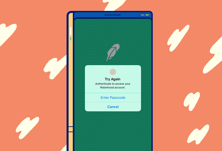
When data validation is successful, however, a green outline, shimmer, check-mark, or another variation of microinteraction will signal to users their password is sufficient to proceed.
Let’s say we want you to sign up for a demo. One of the steps of the signup form is the standard re-captcha from Google. If you successfully prove you are indeed a human (and we can’t be sure everyone reading this is human) you will see an animated green checkmark — a classic microinteraction.
03. Calls-to-Action
Call to (microinter)action.
This can be in the form of subtle animations drawing attention to the call-to-action button. Let’s assume we want our users to click the buy button. Adding a slight pulse can draw attention without making it overt and aggressive.
If an action absolutely needs to be taken, the microinteraction can become less subtle . For example, when users must approve cookies and other terms of service, the app is disabled in the background and the approval modal slides in to exert its dominance. A call-to-action tool can easily become an action requirement.
04. Simple Actions
If you are following a common UI design convention for the site search feature, you might simply have a magnifying glass icon (think Medium). When the user clicks on the magnifying glass icon the search bar unravels like a red carpet for the user to simply input their query.
This unraveling is a microinteraction that can make the user experience more delightful without sacrificing the intuitive nature of a search feature.
Another action could be clicking the emoji buttons at the bottom of this article to provide us feedback. If you click on “Upvote,” for example, you will see the number increase below the icon, a colorful circle briefly emanate from the number, and the thumbs up emoji grow in size. (Why don’t you try it and see? ?)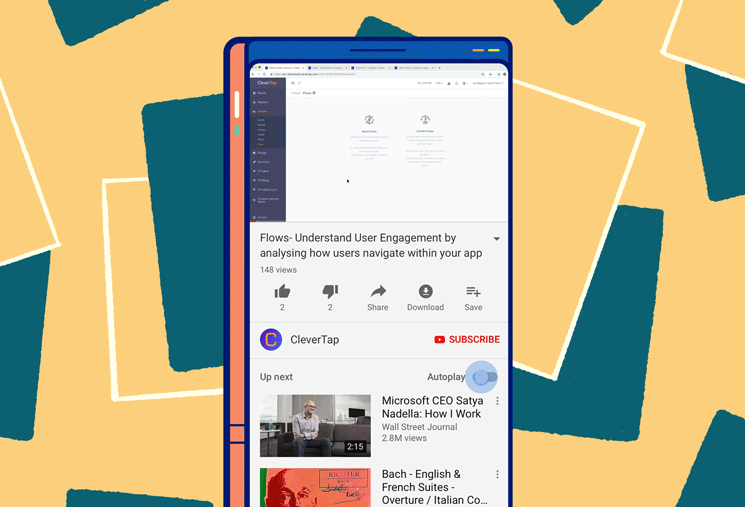
05. Progress Bar
Another common use case for microinteractions is to signify progress. The progress of a file downloading or the length remaining to finish a process — whether you’re on step two of 24 or have half of the article left to read — helps users see where they are in the big picture.
Many media sites use progress indicators to show how much more is left to read in the article. This acts as a sort of table of contents for what would otherwise be unstructured content.
Another great progress bar microinteraction is within the Chrome browser. When you open a new tab on mobile, it briefly shows you the grid of open tabs before transitioning to full screen on the current tab. This is helpful for users to understand their other browsing tabs are still open and where to refer back to them when necessary.
Microinteraction Tips For Your UX Design
You must cross your T’s and dot your I’s, or in this case, round your U’s and cross your X’s.
Attention to detail is possibly the most important skill for UX and UI designers to have. These details pleasantly surprise and delight users. Can you imagine if you went to double tap a photo on Instagram and the big heart didn’t expand over the image?
Below are some guidelines for successfully implementing microinteractions.
01. Conduct real-world testing to understand where UX could be improved
As marketers and product people, we build apps and experiences to be intuitive and approachable. Unfortunately, we cannot predict the circumstances (device, connectivity, psychographics, etc.) our real users will bring to the experience. This is where testing can uncover actionable insights into your UI and UX design.
Run A/B/C tests (C stands for the control group) or dig into your user journey data to expose common pain points within your app.
If A/B test results reveal any source of confusion, microinteractions can help add clarity around the intended action or the problem they encountered. Microinteractions can also act as ongoing onboarding if they are kept consistent across the user experience.
02. Use animation sparingly to avoid animation-creep (think feature creep)
Animation can be helpful for increasing engagement and even educating users on features and functionality, but it can reveal a new set of problems when used in excess.
Feature creep is when your product becomes bloated and daunting for users to understand based on the sheer number of features — like opening up a menu at The Cheesecake Factory and trying to decide.02 Animation creep is a similar term for overindulging in the art of adding motion to your app.
Not only can animations slow the app’s loading speed but using too many can distract users from the intended action and become a hindrance to a great user experience. When used in moderation, animation can be a great tool to call attention to a button, in-app message, or action.
A little goes a long way.
03. Avoid reusing microinteractions for different functions
Today’s modern approach to software development revolves around the concept of reusability. It can be easy to reuse a button, form field, or any other component of your application but if it includes the same microinteraction for a different feature, it will complicate and confuse the user.
For example, let’s assume an app uses a swipe feature from right to left to discard notifications but when an ad is shown, a swipe from right to left redirects users to the advertiser’s site. This user experience is deceitful and frustrating.
This is akin to Pavlov ringing his bell and not giving food to the dogs — infuriating.
04. Use triggers and descriptions to make UI intuitive
Triggers are built to be pulled. In the context of mobile app marketing, users pull the trigger by the very nature of their interaction with the app. If a trigger is pulled by mistake, microinteractions can help remedy the misfire.
The YouTube mobile app, for example, uses a microinteraction to highlight any changes to the slide switch setting for autoplay. If the user mistakenly clicked autoplay off, the microinteraction would call attention to this change visually, possibly catching the error and allowing the user to correct their desired setting.
Although simple, adding tooltips triggered by event listeners on a button can provide an amazing boost in user experience. For example, a button within a web app is represented by an icon. If the icon is vague to a user they might be hesitant to click it, but if the user hovers over the button and a helpful tooltip is displayed explaining what the button does, it can be really useful.
Microinteractions Within Your Mobile App Strategy
Implementing microinteractions within your mobile app can certainly help add value to the user experience, but is by no means a “set it and forget it” strategy. Mobile app marketing is difficult and requires a lot of attention and patience.
To better understand the correlation between microinteractions and your app’s success, a tool like CleverTap’s mobile marketing platform can deliver valuable insights in real time. Schedule a live product demo to see how CleverTap can increase your acquisition, engagement, and retention.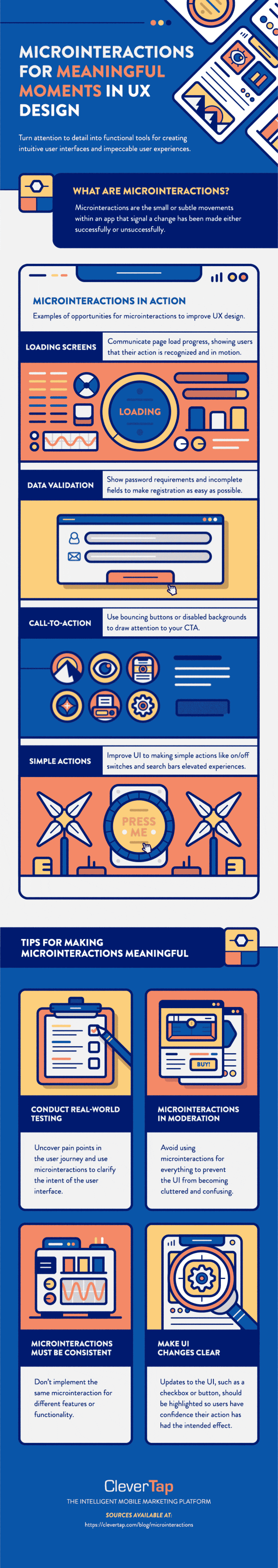
See how today’s top brands use CleverTap to drive long-term growth and retention
Subharun Mukherjee 
Heads Cross-Functional Marketing.Expert in SaaS Product Marketing, CX & GTM strategies.
Free Customer Engagement Guides
Join our newsletter for actionable tips and proven strategies to grow your business and engage your customers.
