It’s been over 6 months since I’ve started writing for a B2B enterprise product — CleverTap. Having earlier been in the B2C Fintech space, the last few months have been a roller coaster ride as I begin to understand the nuances of writing for SaaS.
“How different could it be?” is what I thought before I started. “Every product has its learning curve.” Even though I researched and studied how enterprise design works before joining, it was only after getting here and working on the product that I realized just how much of a change in thinking was required.
What is UX Writing?
UX writing in the simplest of terms is crafting the words that users see (and hear) when they operate your software. A UX writer is one who designs how product and user interact.
Like any writing, it’s a matter of choosing the right words. And the rubrics are the same as for writing content for example: your UX must be clear and easy to understand, consistent with the tone of your brand, precise as to features and functionalities, and it must pay close attention to the needs of your customers.
What is UX Writing for Enterprise SaaS, Specifically?
While the fundamentals of usability remain the same, the design approach in enterprise products tends to differ from consumer products. Enterprise products are more often than not heavy workflow tools — which means there’s an added amount of complexity in terms of data visualizations, scaling, and task flows. How users approach the platform is different in that they’re more task-oriented and looking to get a job done, requiring a strong design to support the same.
Here are a few of the lessons I’ve learned in the last few months:
Not All Information Needs To Be Up Front (AKA Hello, Tooltips!)
If a user needs to know any information related to a task, such as an explanation of the feature or how to use it, the approach I had been taking was to add it up front so it wasn’t missing. Using a tooltip was never my first choice. During my first few days, I was valiantly trying to make a case for avoiding tooltips with the other designers on the team using that reasoning. Only to learn that the approach didn’t apply.
That was my first lesson. If a user will be using your product frequently, adding information up front will only get in their way. Most information is only needed once, and if it’s a complex task, you can always point them toward documentation for more information. Embrace the tooltips! Also, hello information hierarchy.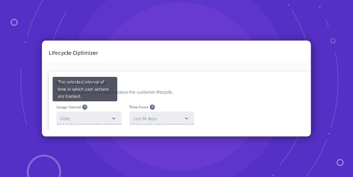
Delight… With Caution
Consumer products can leverage design for delight and gratification. Quirky microcopy, interactive UI loading states, and unconventionality have helped many products such as Mailchimp or Slack build distinctive personalities and experiences. But that same approach won’t work for all enterprise products.
When a user’s task involves heavy work, the concept of delight can pose a problem. Users are already experts at using the tool. Given they’re using the product almost every day, they’re also often repeating the same workflows, so big flashy animations or quirky copy can feel overdone to the point of being interruptive and annoying.
In this article,* John Saito elucidates about how delightful details in design can be dated, are subjective, and can get in the way of a user completing a task.
This doesn’t mean there’s no space for adding a bit of delight in micro-experiences, just allow the user to get their core tasks done first. That’s how you optimize the UX and delight your users.
To quote Matt Armstrong, Product Designer at Dropbox, from his interview with Adobe:
Whenever you add a detail to a design, it should enhance that specific element rather than overpower it, and ideally aid in making the overall experience more usable or comprehensible. Context presents an interesting challenge in that any extra detail or flourish runs the risk of becoming annoying really quickly. This makes users feel like their time is not respected, which is pretty much the opposite of what these sorts of details are intended to do.*
Simplicity is Overrated
This was probably the biggest unlearning I had to go through — that design needs to be simple.
As cognitive scientist Don Norman would say:
Simplicity is highly overrated. The world is complex and our tools must work in that world, so they must match it. People — and this includes you, dear reader — need complex tools, products, and services.*
In an enterprise product, even simple actions a user takes can have huge consequences — such as loss of data. By aiming to make a workflow simpler, one can take away the feeling of deliberate choice and action by way of either words or design.
As a UX writer, this is an area of struggle. Complex words are almost dreaded in the writing universe, but there’s no living without them. Every single word is loaded, and can give a feature an entirely different meaning. Attempting to oversimplify a feature through words can undermine a feature’s power or the consequence of an action. For the same reason, there’s a lot of conversation and collaboration between product managers and even developers.
A Recent UX Writing Conversation at Work
Me: The feature allows you to add and maintain data to…
PM: Hmm, that’s inaccurate. We cannot say add… or maintain. There’s no maintaining.
Me: Okay, I’ll remove it. What is the user doing if not adding though?
PM: Ingesting is the right word.
Me: … Is there another word we can use?
An hour and half later, the word we ended up using was thankfully neither. We went with “populating.” Had you asked me 6 months ago, I’d have said it’s a UX writing nightmare to use terminology like that, but for now there’s nothing but learning. Embrace and enjoy the complexity!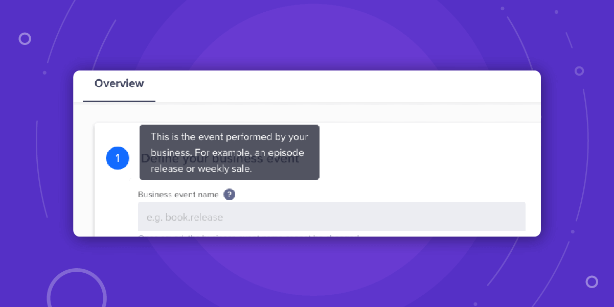
Understand Complexity and Scale
Many enterprise products involve organizing and displaying large amounts of data. Various features in the product are also intertwined. The first problem this poses is that even a minor change in one place can have multiple, rippling effects across the system and create inconsistencies everywhere.
For example: a label used in a table column heading would be tied as a property field to a system query the user runs daily. Change the label, and you’ve disrupted and broken an entire workflow. The flip side of this being that when designing and writing, you’re required to make sure every possible scenario is considered when working on the design, content, and terminology.
Final Thoughts
That’s about it for now. For one, I never understood why people would swear that working for a SaaS company was great and why it would be any different. But here I am, and all I can say is that enterprise products have an understated thrill (can complexity be addictive?).
As someone rightly (and humorously) said, “But consumer products are simple. It’s an app, there’s an onboarding, product journey, and maybe a few more extra things. But enterprise products, they’re a beast.” To be taken with a pinch of salt. 🙂
Of course, none of this downplays the importance of having the fundamentals right: you’ve got to understand your users and make sure you know the product inside out — which is a monstrous feat for any enterprise product, but is all part of your own journey.

The Experience Optimization Pocket Guide
Shivkumar M 
Head Product Launches, Adoption, & Evangelism.Expert in cross channel marketing strategies & platforms.
Free Customer Engagement Guides
Join our newsletter for actionable tips and proven strategies to grow your business and engage your customers.


