


Table of Contents
Categories
Most Popular


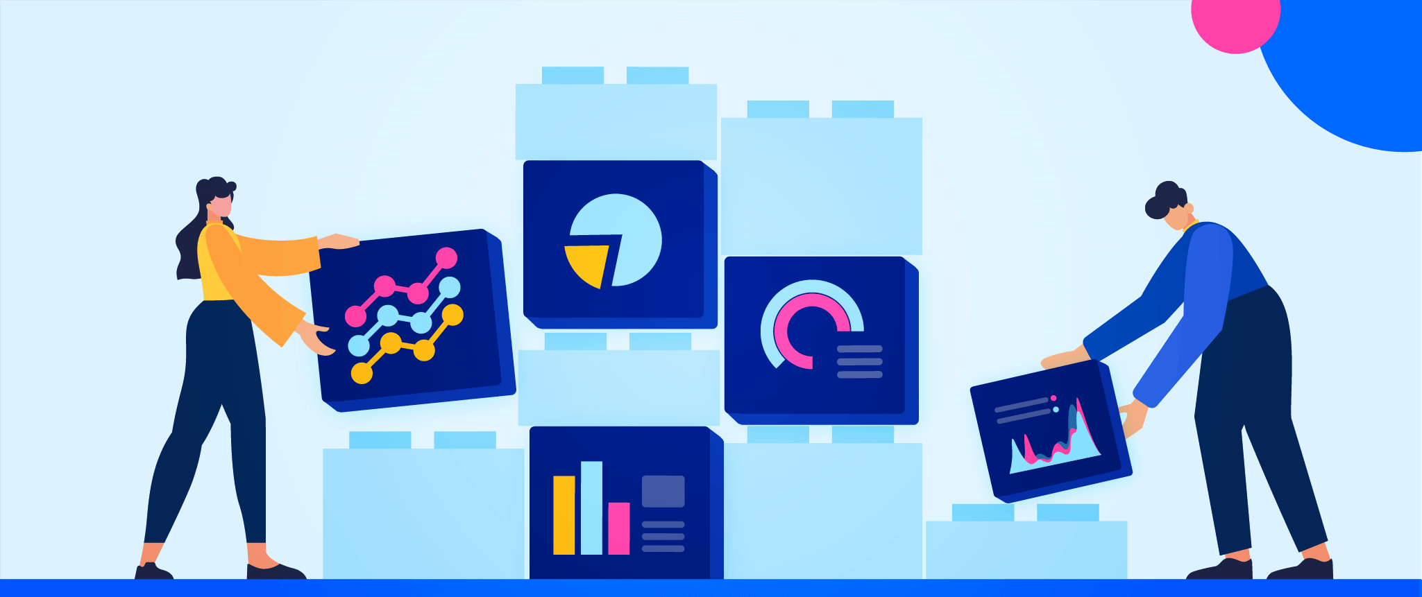
As our platform evolved over the last six years to respond to market needs, its tools grew in complexity and strength. We came to a point where we were confronted with a fundamental challenge inherent to growth over time; it was time to take a step back and look holistically at how all the building blocks are connected.
Our platform is unique in that it offers capabilities that typically require multiple vendors. Each component of our platform was developed to help create personalized experiences and engage users — our primary goal being to improve user retention for consumer brands.
We wanted to address the design challenge of having all of these capabilities in one platform, driving value for our customers in a way that no other solution can, with a completely intuitive experience.
I talked with Geetaa Bhatt, our Head of Design, about the story behind the platform’s growth and how these changes paved the way for a better CleverTap experience going forward.
Q: What’s the story behind our platform?
A: Six years ago, we bootstrapped our first version of the product with limited features. As we reached product-market fit and began to grow, we built various controls and features customized to our product, such as a high-end query engine and an app switcher widget. Because our teams were small, we quickly tweaked the product according to user feedback and shipped. A lot of features were built with this baseline.
Q: So what prompted the redesign? What was the problem statement we were trying to solve?
A: We reached a point last year when we realized we couldn’t progress without restructuring. Over the last few years, we built heavy data-driven features and queries. The product grew in complexity. Our front-end architecture was unable to support the data influx resulting in UI latency and making it difficult for users to navigate across the platform.
Prioritizing user needs, we decided to fix the baseline of our design components and information architecture. We analyzed how users accomplished everyday tasks and modeled our new navigation around that.
Q: Did we try out any other solutions in the meanwhile?
A: We did a round of UI consistency in between, but that wasn’t enough as it didn’t solve the underlying problem users faced. Our basic component blocks needed to be rebuilt for scale to bring users a cleaner and more intuitive dashboard experience.
Q: What was the approach to the problem?
A: How do you change the wheels of a moving train? We had to rebuild the platform from scratch and do it alongside building new features. The rate at which we were building (and still are), we couldn’t stop the train.
There wasn’t a separate team to work on these changes in the background as we’re a lean organization. The same people are building new features and working on redefining the basic building blocks at the same time. There was also heavy work involved from the tech and product end. Here’s how we went about it:
- Understanding user needs: We started exploring how users navigated through the platform and how it could be scaled considering their goals and requirements. Based on this research, we pinpointed the changes that needed to be made.
- Exploring tech options: We also decided to change the front-end architecture, as our old tech of native JavaScript wasn’t enough. We needed tech that supported complexity, improved latency, and provided out-of-the-box components to fast-track our building process. After exploring multiple options, we settled on Vue.JS.
We made one feature in Vue.JS to understand if the integration would work. The patch was a success! We started building new features with Vue.JS, making sure we didn’t touch any features that had dependencies on the old code. The overall look and feel of the product remained the same as we blended the new tech with the existing tech.
Over the year, the new 1% became almost 10% as we built multiple new offerings with Vue.js. But the problem remained: the new code masked in the old look was creating more product debt.
To improve this broken experience, we took a call on restructuring the entire information architecture so that the platform could be modularized and features could be redesigned independently. Our first release includes a restructured information architecture, navigation redesign, and improved dashboards.
Q: What was the design process like when building this new experience?
A: We conducted qualitative research to identify user needs and pain points. We also looked at sales requests and the feedback shared with our customer success team to understand the capabilities we needed to build. We conducted quantitative research by analyzing feature adoption rates and the workflow users followed.
There are a couple of pain points in our navigation that we found and addressed in this release:
- The left navigation felt cluttered as new features were added over the last 6 years
- There was little consistency in the secondary and tertiary navigation models
- Limited visuals on graphs couldn’t support increasing data points
- The complex user interface with an old technology added UI latency
- A dated look and feel
With this research we made quick prototypes for navigation, exploring multiple options and testing with both internal and external users. We simultaneously started building our design system and mapped components that were needed for new features. The design and development happened simultaneously here, which is pretty unique.
As I mentioned, the train couldn’t be stopped. An extremely important aspect we had to accept in all of this was that the platform will have visual inconsistencies for a time until all modules can be converted to the new design and technology.
Q: That’s pretty interesting! So what can we expect in the first release and the coming days?
A: Over the years, we changed from a simple SaaS product to an enterprise-grade product with multiple complex features. In this release, we’re going live with an improved design and new front-end stack for our out-of-the-box as well as custom dashboards.
But as I mentioned, not all changes can happen simultaneously. This release forms a baseline for all our future platform changes. Everything we are releasing in the coming weeks is going to add significantly to the experience.
We have a new design system and a front-end stack ready — and it’s only a matter of time before we convert all modules in the product. We look forward to delivering a delightful user experience attuned to our customers’ needs and focused on improving user retention.
Included in the NEW CleverTap redesign:
- Reorganized navigation for quick access to everything users need. We’ve reorganized the primary navigation so that users have instant access to tools they use every day such as Campaigns, Journeys, Conversations, and Product A/B Tests.
- New dashboards with improved look and feel. We’ve updated the look and feel of our graphs. Users can track various out-of-the-box metrics under Daily Boards, and create their own Custom Boards.
- More intuitive and better-organized settings. We’ve reorganized settings. We’ve grouped everything users need to manage their organization: billing, account, usage, security, users, and roles under Organization. All app-specific options remain in ‘Settings’.
What’s Next?
Over the next few months, we look forward to rolling out significant changes to the platform to bring our users an improved, faster, and more intuitive experience that’s attuned to their needs.
See what the power of this feature can do for your business.
Shivkumar M 
Head Product Launches, Adoption, & Evangelism.Expert in cross channel marketing strategies & platforms.
Free Customer Engagement Guides
Join our newsletter for actionable tips and proven strategies to grow your business and engage your customers.
