


Table of Contents
Categories
Most Popular


Have you ever tried a video streaming app and then been so frustrated by the sheer number of ads that you decided to uninstall within minutes of downloading?
Or have you ever installed a mobile app that promised to make your to do list more functional only to begin scratching your head, wondering how to use the gnarly abundance of menu options?
Both of these examples show the deadly effect that a poor user experience (UX) can have on your app.
See, UX isn’t only an art. It’s also a science with very clearly defined principles. And mastering those principles can lead to a better app and happier users.
What is UX?
Technically, user experience is the process of creating and then improving user satisfaction with your app. This is done by making an app more usable, making its features easier to understand, and designing the mobile app user experience so it leads users toward conversion.
Here’s a great user experience definition from one of its foremost practitioners: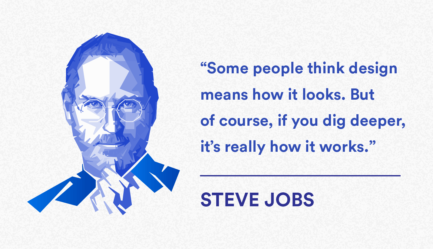
If you’re more concerned with how it looks, you’re probably a UI designer. But anyone earning a UX designer salary better be more concerned with how the app works!
What is UX Design vs UI Design?
While the two terms may sound similar, they are actually very distinct in meaning.
UX design is more analytical and technical — and more holistic in view. It concerns itself with the entire journey that users undergo as they move from being prospects to actual app users to paying customers.
UX is also the process of improving customer interactions with your app. To do this, user experience design relies heavily on tried and tested UX principles as well as customer feedback.
Meanwhile, UI (user interface) design is more artistic in direction. It deals more with graphic design than workflow though it also holds a lot of responsibility in pleasing the customer. After all, it takes skill to craft an interface that is both visually appealing and elegantly useful.
UX Design Process: Getting Your App Off the Drawing Board
The process of continuously improving your product so users are satisfied with their experience does not change whether you’re designing the UX of an app, a robotic vacuum, or an airport lounge.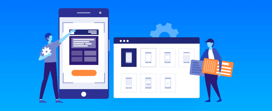
This UX design process involves three basic phases:
- Planning
- Prototyping
- Proving
These phases aren’t one and done either. They’re a continuous cycle that repeats and iterates as your app evolves, and as the needs of your users change.
Phase 1: Planning
This is really the research and strategy phase because it involves understanding your competitive landscape and plotting out how you intend to conquer the world. Some tasks you need to do in this phase include:
- Customer analysis: In order to learn how to please the customer, you need to find out what they want and need.
- Competitor analysis: You should know how your competition is currently working to please their own customers.
- Product strategy: What app are you building? How will you release it? What does the product roadmap look like?
- Marketing strategy: What content will you need to promote your app and your brand? What marketing channels do you intend to use? Where are your users congregating? How will you establish your brand as a leader in this space?
Phase 2: Prototyping
There’s a story that James Dyson and his team tested 5,127 prototypes of his cyclone technology before deeming it worthy to be sold as a vacuum cleaner.**
This phase is where you do like Dyson and create wireframes and prototypes to test whether your ideas have any real traction. User experience testing comes into play here – the process of collecting both qualitative and quantitative data from users as they test your prototypes.
This testing can be both moderated (a user playing around with your app while a researcher observes or guides the actions) and unmoderated (a user playing with your app, usually remote, with several scenarios they need to accomplish).
Having users try out the various iterations and then collecting feedback is what will differentiate your product from the rest of the pack when you finally launch.
Phase 3: Proving
This is where the pedal meets the metal.
You work with your UI designers and developers to bring everything together into a launch-ready version of your app. Then you finally release your app and monitor analytics to see if things are working, if users are behaving as you expect, and if you are on track to meet your business goals.
UX Design Principles to Guide Your App’s User Experience
All the best UX design examples are built using elements from various disciplines. UX combines elements from graphic and UI design, customer research, and information architecture.
Here are some overarching principles to keep in mind as you improve the quality of users’ interactions with your app.
Pretty is Useless Unless It’s Pretty Usable
All design elements from the UI to UX should serve to make the experience better — not just prettier. If it looks great but leads the user to uninstall in frustration, you’ve failed.
Some tips:
- Design for thumbs: A user’s thumb can only extend up to certain reachable zones in your app. Place important features and frequently used elements where the thumb can naturally reach.

- Cut out the fat: Get rid of clutter – anything from extra buttons that don’t need to be there right away to extra submenu options that make navigation needlessly complex. There isn’t much space on a mobile device. Keep it spartan!
- Give them context: Show the user where they are in the interface. Use status indicators to show them they are at step 1 of 3. Or tell them what something does with a screen overlay. Basically, give them access to the larger picture, whether that’s a menu, or a function.
Consistency is Key in the Omnichannel World
Users carry multiple gadgets and shift from device to device as the need arises. They expect a consistent omnichannel experience from your brand.
Some tips:
- Respect UX conventions: You don’t have to reinvent the wheel with your app. Users expect a colored rectangular button to be clickable. Or that a menu button on the top section will give them navigation options or app settings. Some things should not be messed with, especially when it comes to commonly understood elements like navigation, buttons, and forms.
- Ensure the message is the same: No-brainer here, yet worth mentioning. Make sure the messaging on your website is the same as what’s on your app and social channels. Nothing is more jarring than seeing different taglines or themes in each channel.
Build an Emotional Connection with Users
You need to establish an emotional connection between your app and your users. It’s partly using marketing psychology and partly proving your brand is committed to delighting users.
Some tips:
- Don’t just tell facts, tell stories: We connect with stories better than mere bar charts. For example: if your onboarding video wants to show how stressful a typical morning is for a user, instead of a chart showing stress levels in the US, show the hourly schedule of a typical user persona to tell the story of her morning. Other ways to include storytelling in your UX: include customer success stories on your website. Or showcase customer quotes in your app store description to prove your app can solve real world problems.
- Add social features: When you include social sharing buttons to Twitter, Facebook, and Instagram, you’re allowing your users to show the world your content. Small things like this can help turn part-time users users into 24/7 brand evangelists.
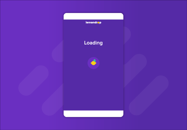
- Delight and entertain: When they accomplish a task, does your app celebrate? While your app is loading, do your wait screens contain delightful (or useful) elements that can make that emotional connection stronger?
Keep Things Simple & Clear
Can the user figure out what to do upon installing your app? Is your mobile app onboarding process easy to understand? 72% of users say completing the app onboarding process in less than a minute is an important factor in their decision to keep using an app.**
Clarity and simplicity are crucial to engaging users, particularly when they’re looking at your app for the first time.
Some tips on keeping things clear and simple:
- Idiot-proof the next step: Show the user what the desired action is by highlighting the button you want them to click or action they need to take. You should have only one primary action per screen.
- Use the info you have: For example, auto-fill forms since you already have the user’s info. Don’t waste their time by making them fill it up again. Or use their location if they’ve already permitted the app to use GPS, instead of asking where they are.
- Make it easy to find main features: Lay things out so users can find what they need the first time they launch your app.
- Reduce the number of taps: Will the user be able to do what they need quickly? If it takes too many steps, pare it down.
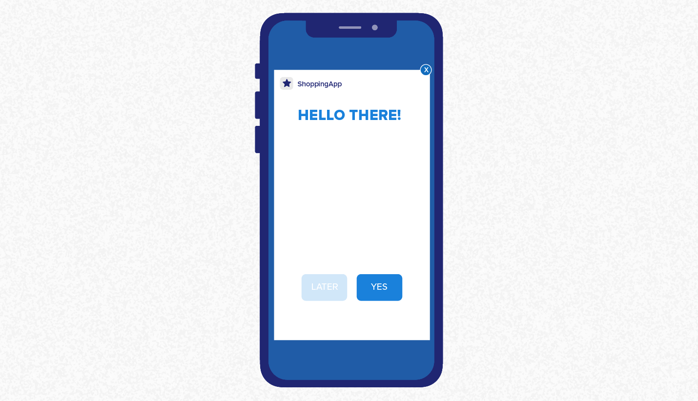
- Give them confirmation: Confirmation dialogs can do several things. They can make things more convenient for the user (e.g., asking if they want to save a search item). Or they can warn users before they do something drastic such as downgrading their account and losing access to premium features or content (e.g., for a media or entertainment app), or even withdrawing permissions that help the app function properly (e.g., GPS for a ridesharing app).
- Eliminate friction points: Make it easy for app users to convert (whatever a conversion is for your app — a purchase, share, upload, listen, etc.). So if there’s a form, make it super short. If people need to enter credit card info, offer them quicker options or a 1-click buy option.

Top UX Design Examples
To illustrate some of the principles above, we’ve pulled screenshots from three apps in various verticals that have UX design examples worth emulating.
Travel: FLIO
If you’re a frequent traveler, FLIO will help you navigate over 3,000 airports plus offer you discounts and deals on airport stores. The navigation menu is all under a sidebar. And under every airport’s name, you get the three most important details you need: WiFi availability, timetable of flight schedules, and an airport map. Logical layout, easy to use, and immensely useful for frequent fliers.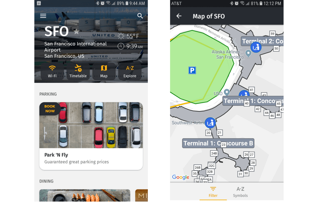
Productivity: Asana
When you need to organize a project, you create tasks in the Asana mobile app, which is consistent with their website. But one exemplary way their UX designers delight users is when a task is completed, you can enable the option to have “celebration creatures” appear and fly over your task list – whether you’re on desktop or on mobile. What’s more human than celebrating checking an item off your to do list? Instant emotional connection.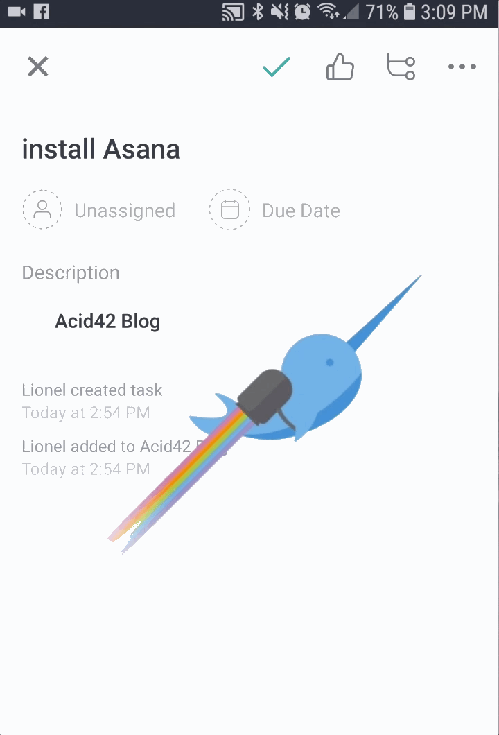
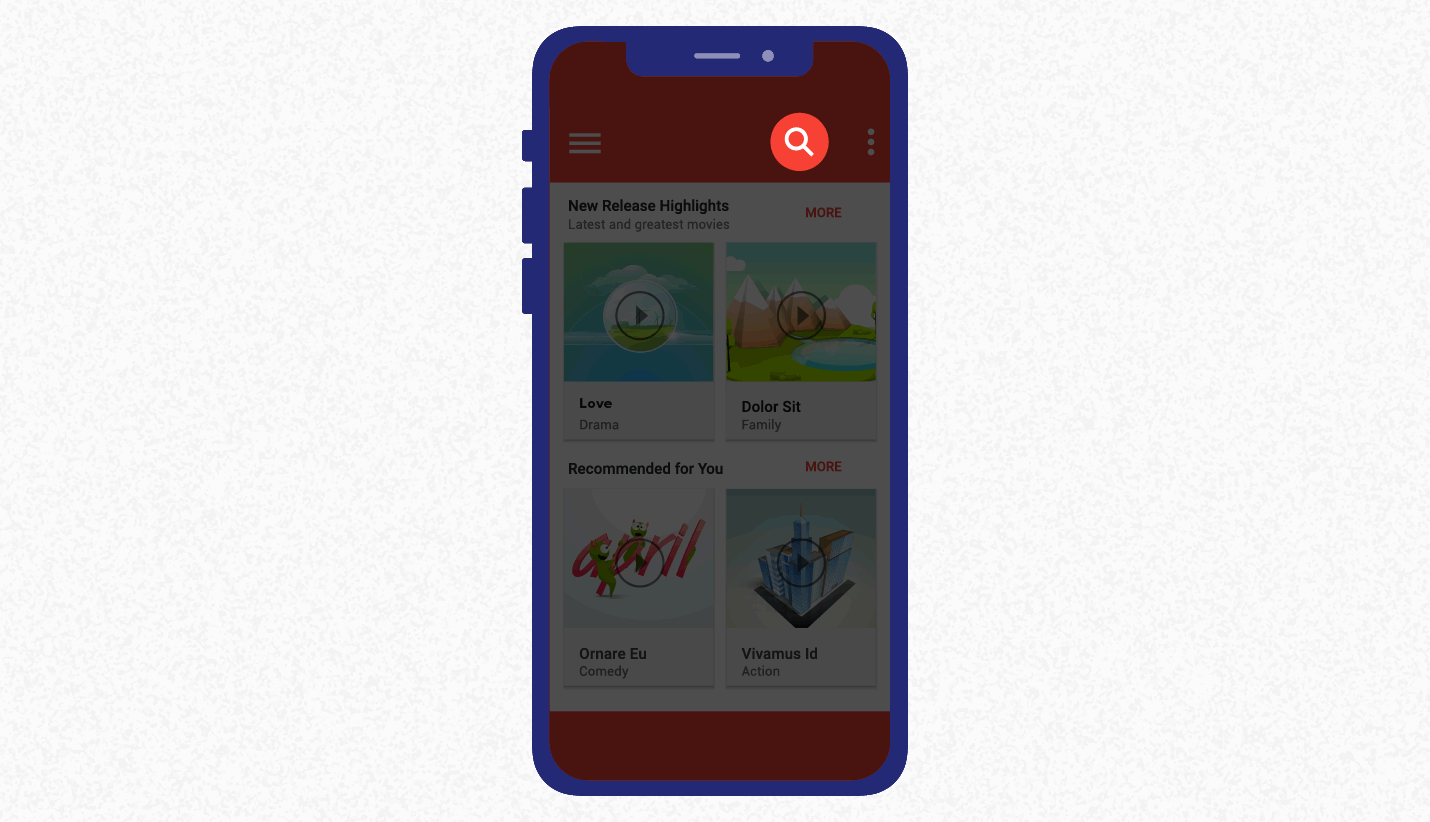
Media/Entertainment: Tidal
A sleek and high contrast color palette is the first thing that you may notice about Tidal’s UX and UI. But once you wade into their Explore menu, Tidal gives you some unique features that other music players don’t have.
For one, they’re supposed to have more music: 48.5 million tracks** compared to Spotify’s over 40 million.**
For another, Tidal allows you to stream music at the highest resolution possible (lossless CD quality). No other streaming service offers this high fidelity listening experience though Spotify is testing a lossless streaming option as of this writing.
A third reason: unlike other music streaming services, they’ve incorporate the viewing of music videos into their app, giving music lovers a way to experience music not just for the ears but also for the eyes.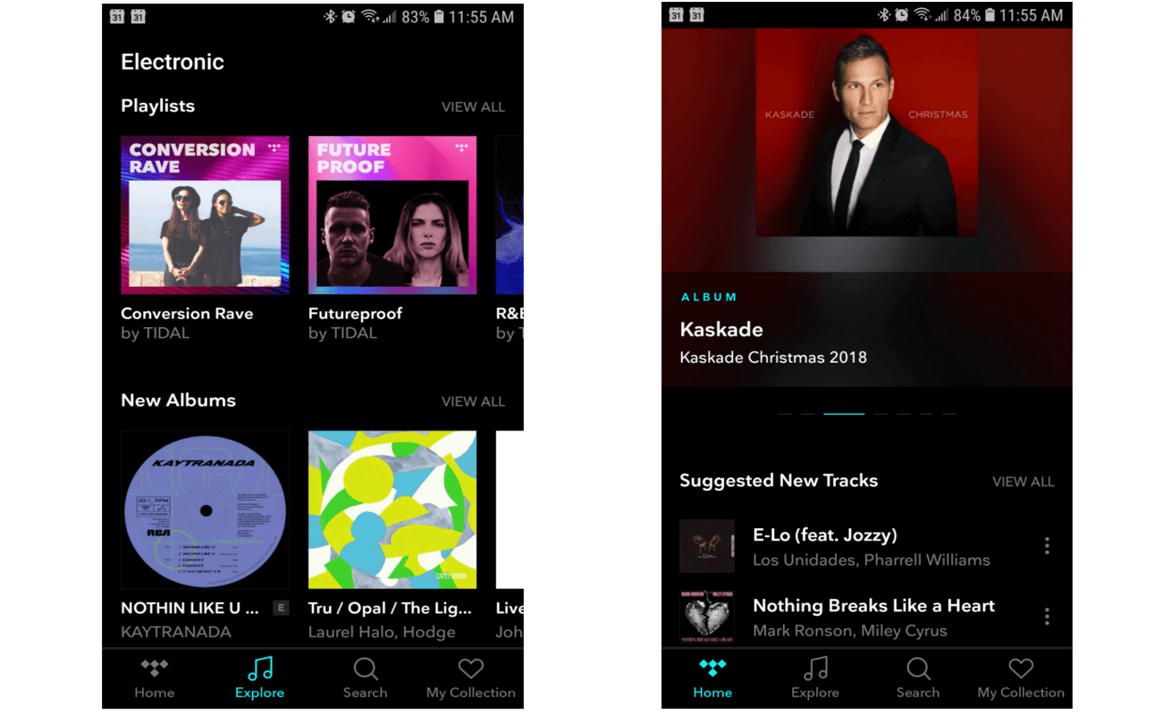
More User Experience Resources
The entire point of UX is to improve the quality of user interactions with your app. Look at the user journey and step into their shoes to understand where improvements can be made. Make the experience smoother, more delightful, more engaging.
We’ve got more tips for you at these links:
- 6 Mobile App Design Tips for a World-class User Experience
- User Journey Mapping to Improve UX
- How to Use the Google HEART Framework to Measure and Improve Your App’s UX
- The Hidden Psychology of Successful Mobile Apps (Infographic)

The Psychology of Insanely Addictive Apps
Shivkumar M 
Head Product Launches, Adoption, & Evangelism.Expert in cross channel marketing strategies & platforms.
Free Customer Engagement Guides
Join our newsletter for actionable tips and proven strategies to grow your business and engage your customers.
