It’s summer time and travelers are itching to explore new destinations. The travel industry has bounced back post-COVID, and analysts anticipate that it will generate $855 billion globally by the end of this year. Travel apps have made it easier to organize overseas holidays as well as spontaneous weekend getaways. However, even though there’s a significant increase in the number of travel app downloads, the developers and companies providing these services are battling to attract and retain customers. It’s a conundrum—but why?
Here, we’ll give you three big reasons why your travel app is having a hard time with customer retention.
Clunky User Interface
By definition, clunky means heavy, awkward, and solid. It follows that a clunky user interface (UI) is difficult to navigate—which won’t do your app any favors. In fact, users may feel frustrated and decide to abandon it altogether. Even though travel apps are improving, they still need to catch up in terms of providing a better user experience.
Many travel apps are slow, and in addition to having a clunky UI, they don’t provide a clear user journey. Moreover, they’re not easy to use or navigate. It takes forever to sign up or make a purchase, buttons aren’t intuitive, the color palette doesn’t highlight the priority areas, and so on.
And if a user wants to modify their plans—especially on short notice—even the best travel apps fail to secure a quick resolution. Our Travel App Engagement Benchmark Report found that the average time to register for these apps is 31 seconds. Further, 80% of users will register within this time frame. In other words, the majority of users are keen to get results ASAP.
That said, the average time to action for travel apps is considerably lower. Only 36% of people dive deeper into the funnel engagement within a week. For fintech apps, this rate is 76%. What’s stopping travel app users?
Could it be a clunky UI? Absolutely. Bad UI is the ultimate demotivator for travel app users. According to Think With Google, 58% of people opt for travel apps with a smooth and user-friendly interface*.
So, when building a travel app, remember that a simple, smooth, and navigable interface is non-negotiable. You want to aim for a higher retention rate, which is critical for securing the optimal lifetime value from your users.
Poor Onboarding Experience
A poor onboarding experience is another roadblock to user engagement. Travel apps often struggle to achieve the level of smoothness and convenience users desire during onboarding. The result is app abandonment.
There are methods to ensure a smooth and seamless onboarding experience. However, from the moment a user downloads your travel app, you only have 20 seconds to impress them*.
Have a look at these priority tips for building an intuitive onboarding experience:
- Don’t ask unnecessary questions or bombard users with suggestions
- Provide one-click sign-up through Gmail or Facebook
- Build a fast-performing application
- Deliver a personalized experience for users
- Collect useful information to deliver customized recommendations and experiences
With travel apps, the average user engagement rate is 42%. By contrast, the engagement rate for fintech apps is 95%. Although there may be many factors responsible for the low engagement rate of travel apps, a poor onboarding experience ranks near the top. As important as your content might be, don’t compromise on ease of use and intuitiveness.
High Competition
The travel industry is highly competitive. But with new players emerging regularly, how do you build a loyal customer base? The best way to stand out from the crowd is to make your travel app unique. At its most fundamental, this means offering users something they don’t find in other apps. The key is to provide a value-added experience.
Wondering how to rise above the competition? Put these guidelines into action:
- Show your worth with a compelling narrative that makes users want to engage with your application. One of the biggest problems with travel apps is irrelevant content. Identify what your customers need and deliver the appropriate content or services. Offer discounts, rewards, and personalized recommendations to attract and retain users.
- Analyze the market, understand your competition, and become your user’s best friend. You want to offer something different? Then find out what other travel apps aren’t providing! For instance, BringFido helps you create a dog-friendly travel itinerary. Or BabyQuip makes it convenient to travel with babies. Highlight your USP and build your brand messaging around it.
- Add CTAs (calls to action) at relevant points in the customer journey. For this, you’ll need to trace your user’s path and add relevant CTAs for specific stages, such as the decision phase and the buying stage.
Use CleverTap’s Resources to Build Better Travel Apps
Travel apps have become indispensable. However, with the huge number of apps on the market and the intense competition among them, users are spoilt for choice. Moreover, if your app has performance or UI issues, users will abandon it without a second thought.
To gain customer loyalty and increase their lifetime value, your travel app needs to be better, faster, and more personalized. We’ve done the research so you can better understand the factors that affect user behavior.
Download CleverTap’s Travel App Engagement Benchmark Report report now to meet your users’ expectations for service and satisfaction.
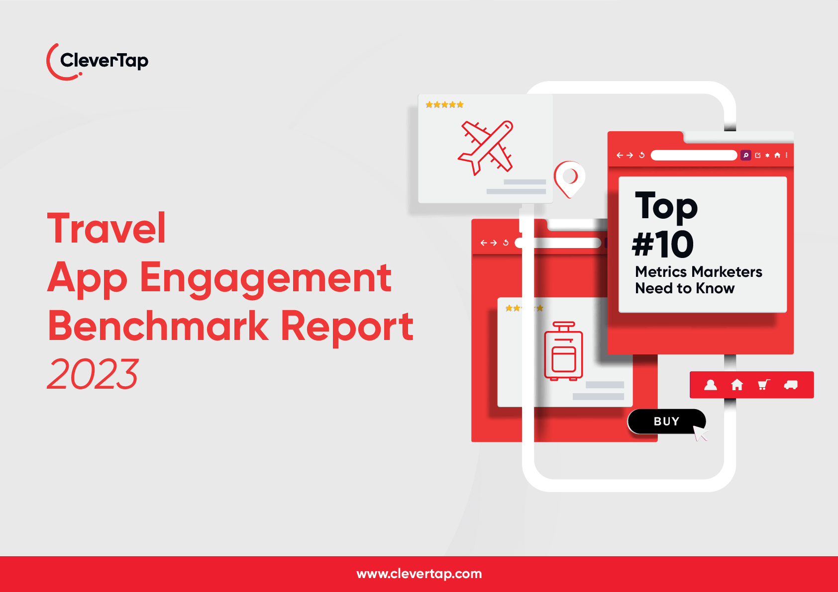
Travel App Engagement Benchmark Report
Shivkumar M 
Head Product Launches, Adoption, & Evangelism.Expert in cross channel marketing strategies & platforms.
Free Customer Engagement Guides
Join our newsletter for actionable tips and proven strategies to grow your business and engage your customers.


