One of the most intriguing questions that product managers and marketers face is, ‘What are users doing on my app?’
Even tougher is how to extract actionable strategies from user data. Luckily, modern data visualization and analytics best practices exist to help better understand your users. Two potential methods for visualizing data are the sankey chart and the sunburst chart.
Though the underlying data may be available, it becomes a tedious job to sift through tons of user data. Let’s take the simplest form of user journey in a tabular data:
| Step I | Step II | Step III | Step IV | Step V | Users |
|---|---|---|---|---|---|
| App Launched | App Launched | Category Viewed | Searched | App Launched | 4512 |
| App Launched | UTM Visited | Searched | Product Viewed | Product Viewed | 3012 |
| App Launched | Searched | Category Viewed | Product Viewed | Added To Cart | 422 |
| UTM Visited | App Launched | Product Viewed | Added To Cart | Charged | 312 |
| ……… | ……… | ……… | ……… | ……… | ……… |
The above table contains the first 5 sequence of steps users take after launching an app.
It is very difficult to draw insights from such data. This is where visualization helps. With the use of the right visualization, we can summarize and effectively draw analytical insights from the data. In simple terms, delivering more insights per pixel is the goal of good visualization.
What is a Sankey Diagram?
A Sankey diagram is a type of chart that displays flows and their quantities. Arrows of various thickness are used to visualize the quantity in each flow as well as the direction or path in which they flow. You might typically see this diagram used to show the flow of money, materials, information, or energy.
What is a Sunburst Diagram?
A sunburst diagram, on the other hand is a type of data visualization that is radial in shape. It is also known as a multi-level pie chart or a radial treemap. Each ring shows hierarchy with the center being the root. And rings can be sliced for each category.
Data Visualization Constraints
We faced 2 main constraints while selecting the right type of visualization:
- Capture maximum sequential data
- Since we are
analyzing user journey across sessions
- , we will definitely be analyzing more than 10 sequences of events users perform. Hence, the visualization should be able to capture the maximum number of sequences possible.
- Space constraint
- The space required to depict the visualization should not be more than 70%-80% of user’s visible area of the screen.
Given the above 2 constraints, we had to choose between two main type of plots:
1. Rectangular Plot – i.e. Sankey Chart
2. Radial Plot – i.e. Sunburst Chart
The easier way to find out the winner was to apply the plots to actual data. As we experimented with actual data, we were inching towards Radial plot.
Let’s take a couple of examples to highlight the benefits of the radial plot.
Rectangular vs Radial Data Visualization Clock Example
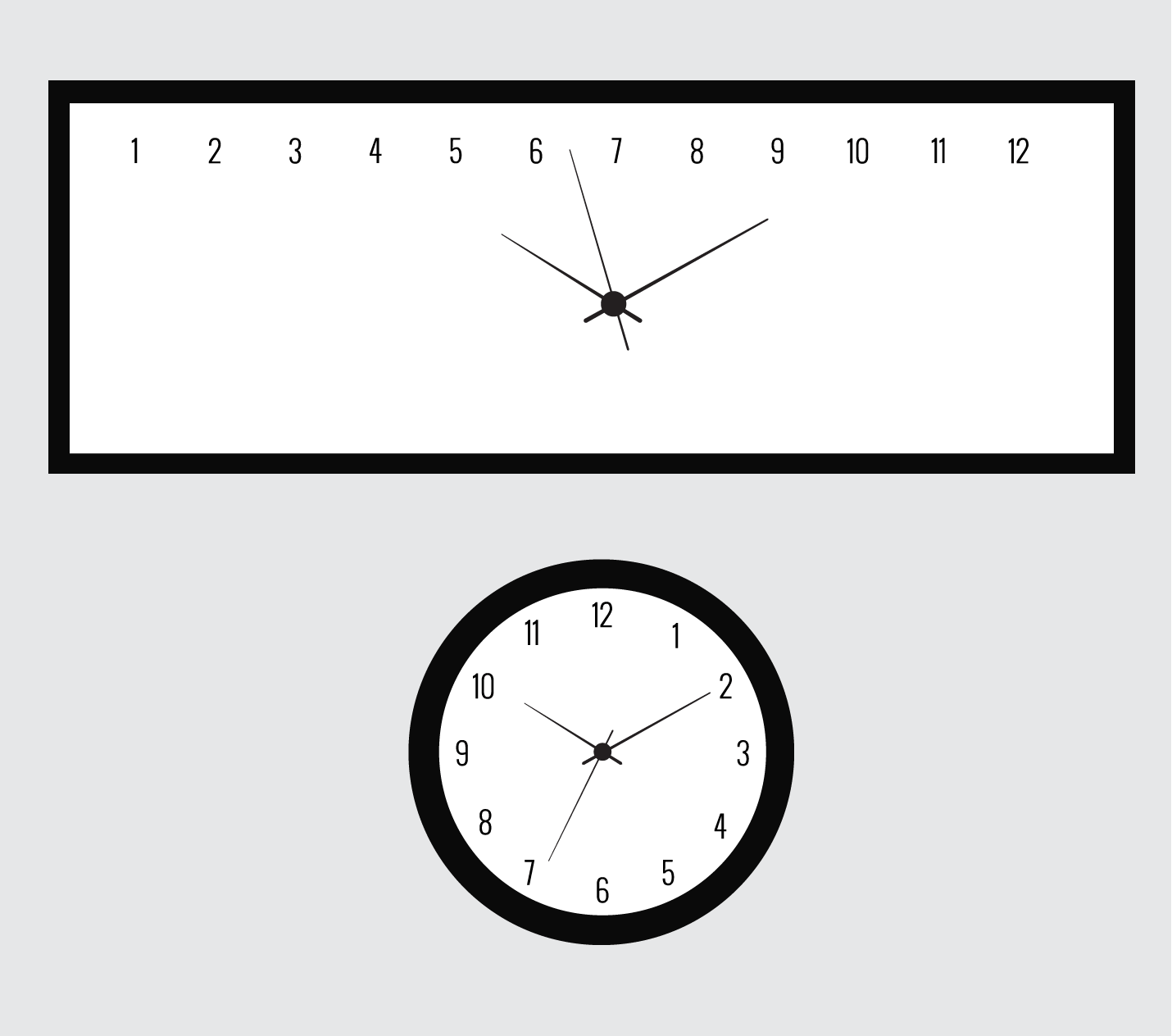
The above example is a no-brainer. We can’t imagine a rectangular clock.
Rectangular Heatmap vs Radial Heatmap
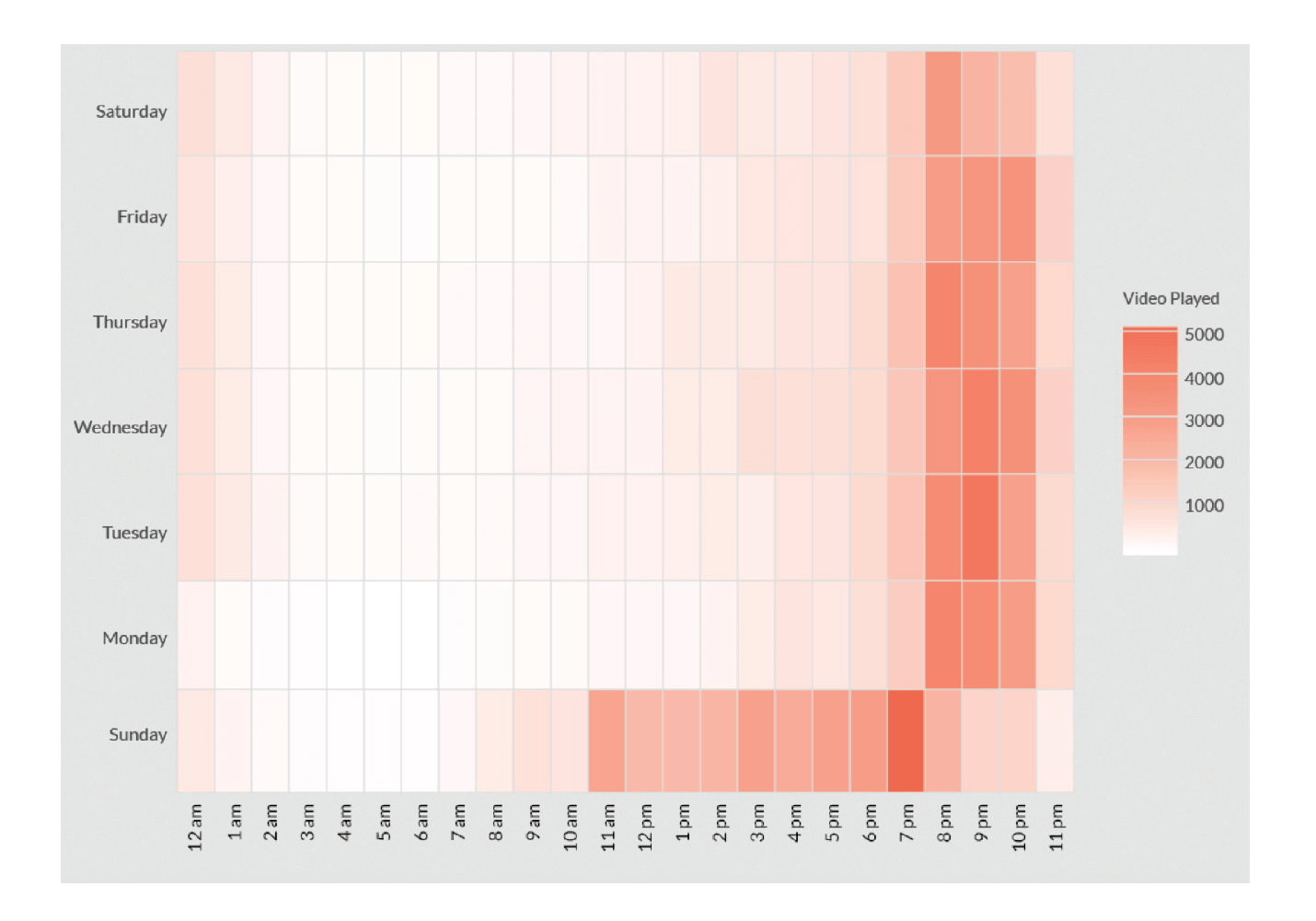
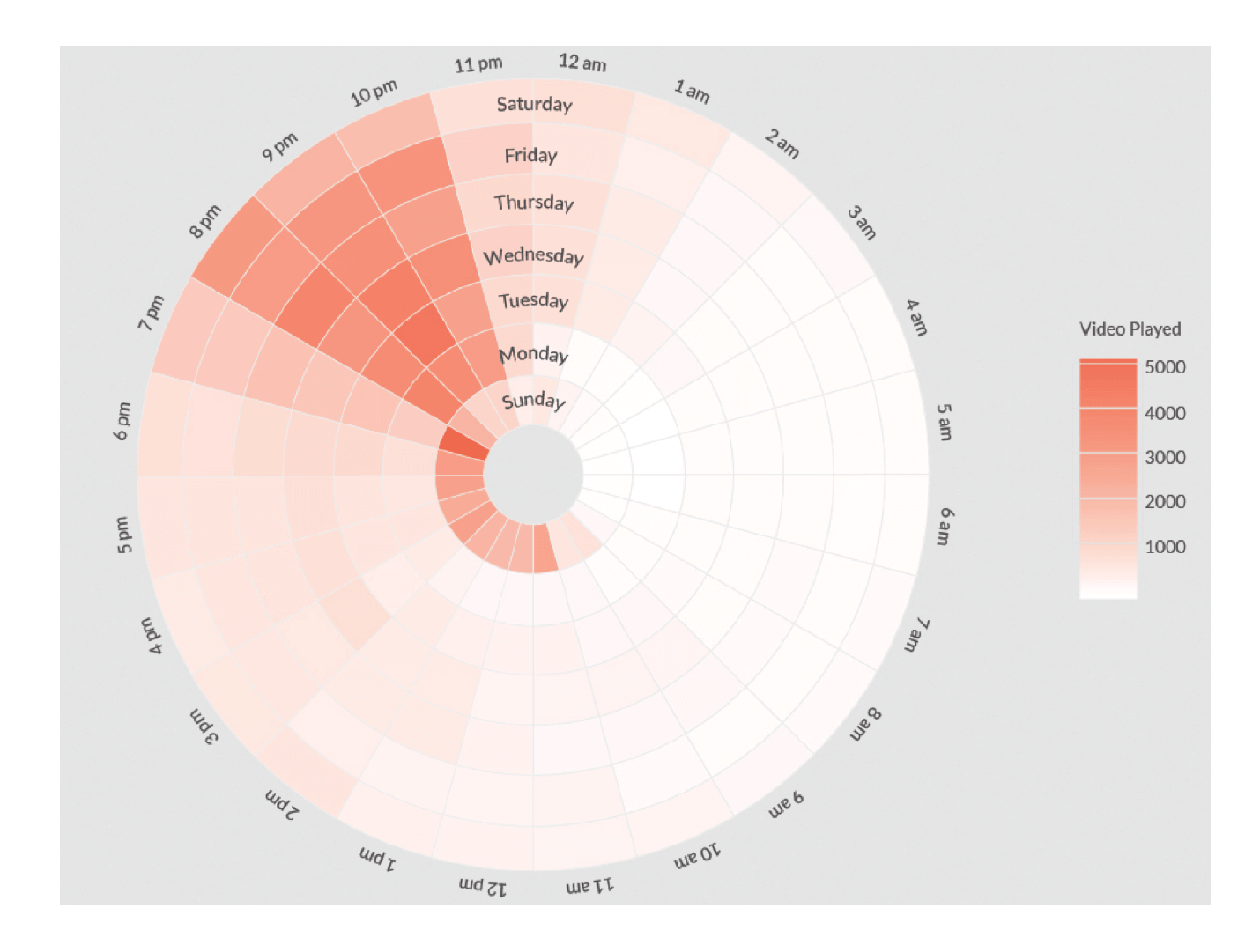
The above graphs show the heatmap of Videos played by Day of the week and Hour of the day. The radial heat map conveys the message where the heat is more concentrated much faster than the rectangular heat map. It is clear that the heat is relatively more concentrated between 8pm-10pm between Mondays-Saturdays whereas it is relatively more concentrated between 11am-7pm on Sundays.
Key Learnings
In both the examples, we had to deal with a lot of information or categories. The Clock had the first 12 integers depicting the hour, minute and seconds information. The heatmap had a total of 168 grids (24 hours * 7 days) to depict the information. In both cases, Radial plots were able to relay the required information faster.
Now that we established Radial plots scored over Rectangular plots in the above use cases, let’s apply Sankey and Sunburst charts to the main problem statement of depicting user flows.
Sankey Charts
The current industry practice to visualize user paths/flows is a Sankey Chart, which is a rectangular plot.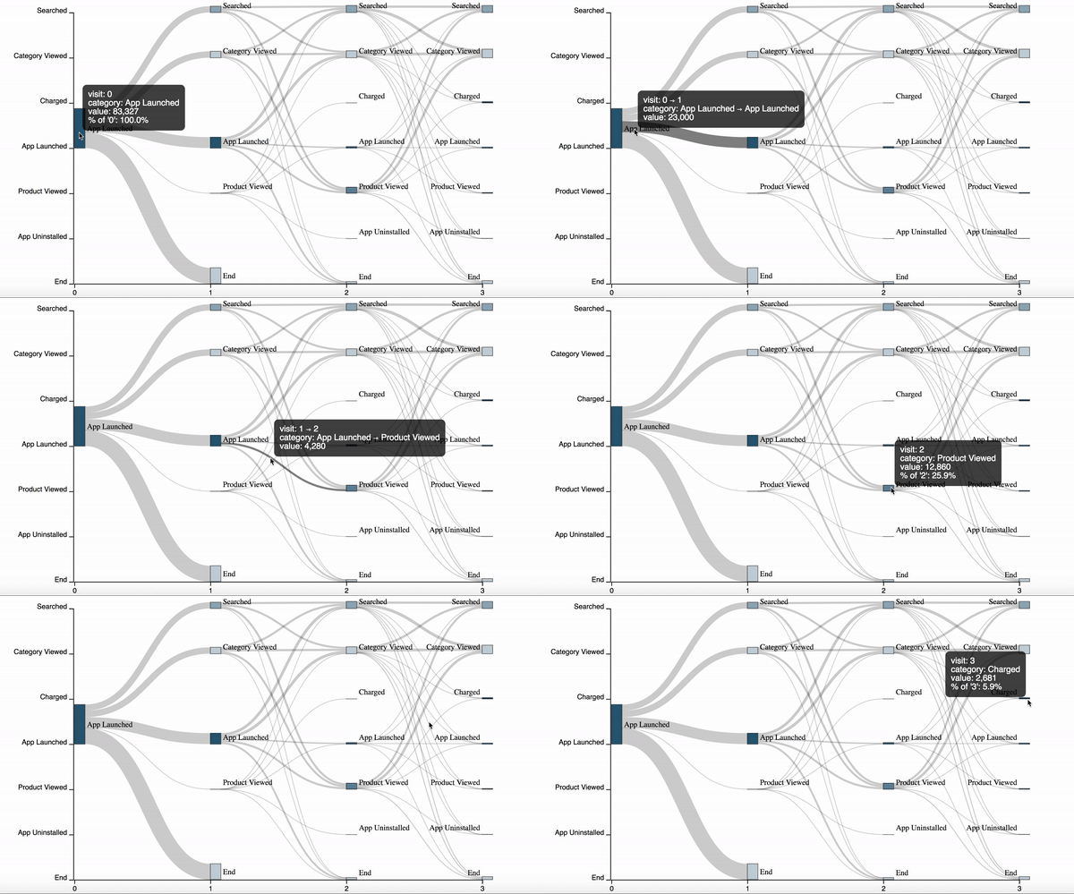
In the above diagram, there is a flow of one set of values to another. The values connected are nodes and the connections are links. The width of the link signifies the relative strength of a flow from a node to another node. It gives a bird’s eye view of the journey and allows the viewer to interact and see the relation between certain nodes in the visualization.
Plot Twist Takeaways from Chart Examples
- Dominant Nodes and Links are easily visible
- Easy to analyze sequences up to 4 levels. Dominant contributions to each node from previous nodes can be easily analyzed.
- Difficult to analyze the chart as the user moves ahead in their path. Extremely difficult to analyze the journey if the path extends over 5 sequences due to the intersection and relative size of the links and node
- Difficulty in showing more than 8 sequences due to the space constraint
Sankey charts are great to visualize transitions from one event or state to another. But the number of such transitions should ideally be not more than 4-5. Since we are depicting journeys across sessions, Sankey charts become unreadable.
Sankey charts could still be useful if we are limiting our analysis to a session rather than multiple sessions.
Sunburst Charts
Sunburst charts are radial charts.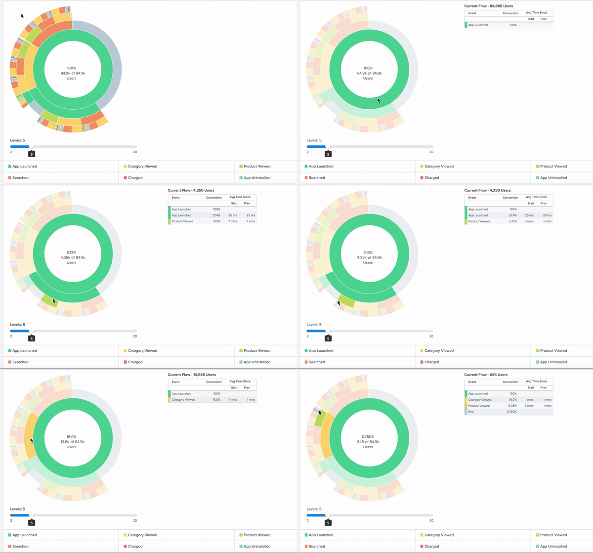
This type of visualization shows hierarchy through a series of rings that are sliced for each category node. Each ring corresponds to a level in the hierarchy, with the central circle representing the root node and the hierarchy moving outwards from it. Rings are sliced up and divided based on their hierarchical relationship to the parent slice. In the above graph, the size of each slice is made proportional to the value of its immediate parent ring.
Key Learnings:
- Less space required compared to Sankey chart and hence, more sequences can be accommodated.
- Absence of intersections makes the chart more readable compared to Sankey Chart, especially after 3 sequences.
- Relative strength of the hierarchy came out more clearly in Sunburst chart than in Sankey chart.
Sunburst Charts: Final Choice
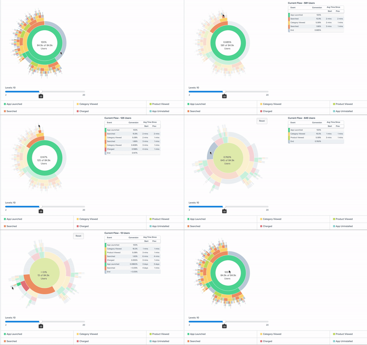
Based on our findings, Sunburst had a clear lead over Sankey chart to depict the user flows. In fact, we had enough space show the sunburst chart with 20 sequences but also an accompanying table with the following key details:
- Sequences
- % User Conversion at each step
- Average Time taken to convert at each step from the beginning of the journey
- Average Time taken to convert at each step from the previous step in the journey
Conclusion
What a script is to a movie is what data is to visualization. Choosing the right visualization is important to tell the story that the data intends. The right visualization for us to depict user journeys is Sunbursts.
Initial feedback from our clients has been encouraging as they were able to discover:
- Surprising Journeys
- Desirable User Segments
- Understand when they should engage their users to minimize drop-offs
- Improve their event design
Schedule a demo with one of our growth specialists to see it in action.
The Intelligent Mobile Marketing Platform
Jacob Joseph 
Heads Data Science.Expert in AI, Data & Analytics and awarded 40 under 40 Data Scientists in India.
Free Customer Engagement Guides
Join our newsletter for actionable tips and proven strategies to grow your business and engage your customers.


