


Table of Contents
Categories
Most Popular


More than 1 billion people around the globe live with some form of disability, making app accessibility in mobile design a necessity. When mobile applications are built with accessibility in mind, everyone can independently engage with your digital products.
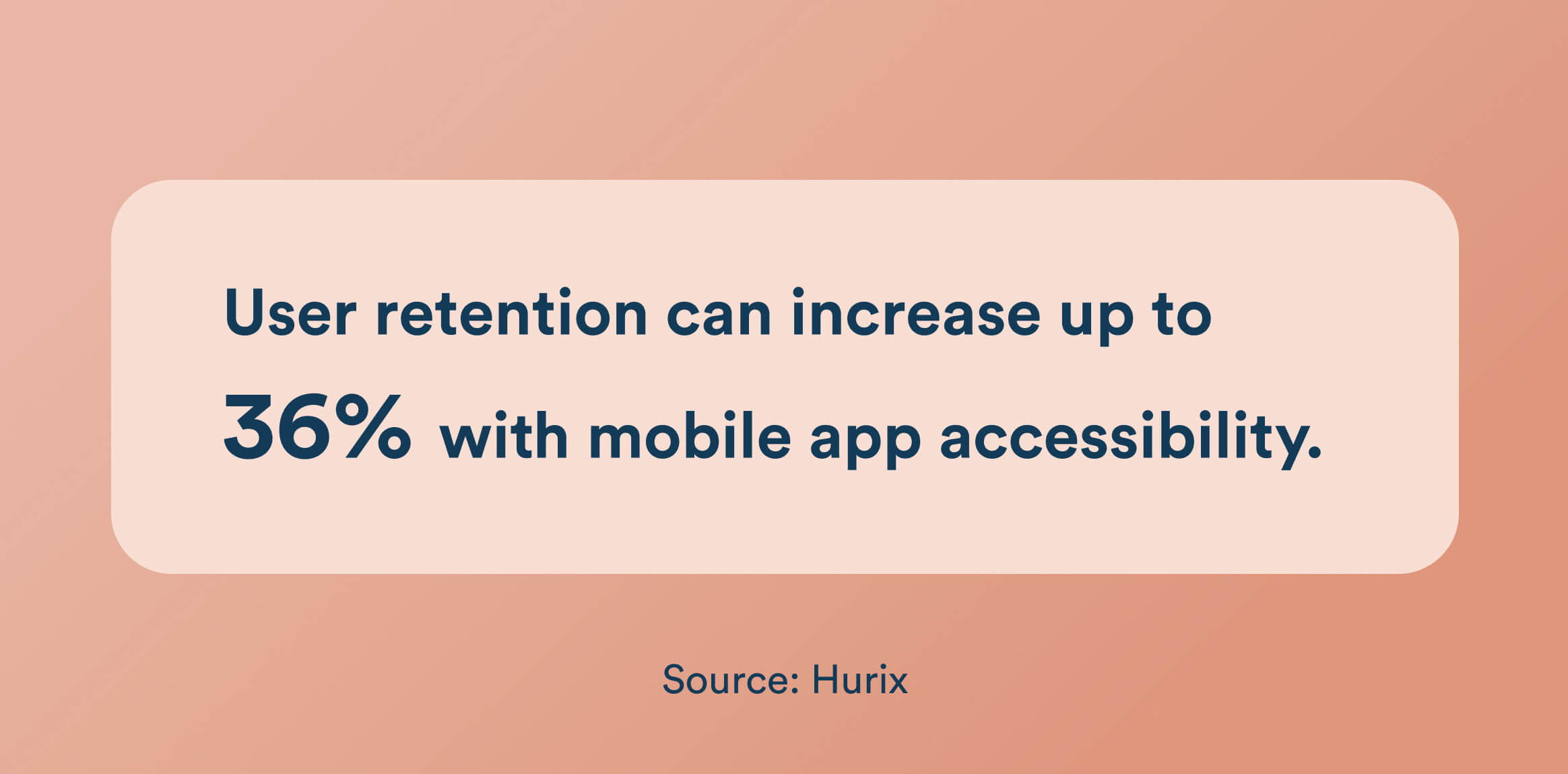
App accessibility not only expands your audience, but it also directly influences user retention and conversions. Research shows that accessible mobile app solutions can increase customer retention by up to 36%, as users are far more likely to stay engaged when they encounter fewer barriers. By removing obstacles and creating seamless experiences, brands foster loyalty, improve conversions, and build a reputation for inclusivity.
This guide will show you how to make accessibility a core part of your mobile app strategy. You’ll learn practical techniques for designing accessible mobile applications, understand key compliance requirements like Web Content Accessibility Guidelines (WCAG) for mobile apps, and discover actionable steps to create mobile experiences that are inclusive, compliant, and high-converting.
What Is Mobile App Accessibility?
Mobile app accessibility involves developing and designing apps in a specific way, allowing people of all abilities, including those with disabilities, to use them with ease. According to Pew Research Centre, 72% of differently abled Americans use a smartphone.
You ensure that every part of your app, including the content, interface, and features, remains usable for everyone, regardless of their unique needs or challenges. This approach takes into account users with visual, auditory, motor, or cognitive impairments, as well as those who learn or interact with technology in different ways. This also helps in retaining users, as a surprising stat reveals that 61% of people won’t return to an inaccessible mobile site.
App accessibility also helps people with temporary limitations, such as someone recovering from surgery or dealing with an injury, as well as those facing situational challenges. For example, someone might need to use your app with one hand while carrying groceries, or struggle to see the screen in bright sunlight, or have trouble hearing audio in a noisy place.
What Are The Benefits Of Mobile App Accessibility?
Making app accessibility a priority delivers measurable value for users and businesses. Here’s how accessible mobile applications drive impact across multiple dimensions:
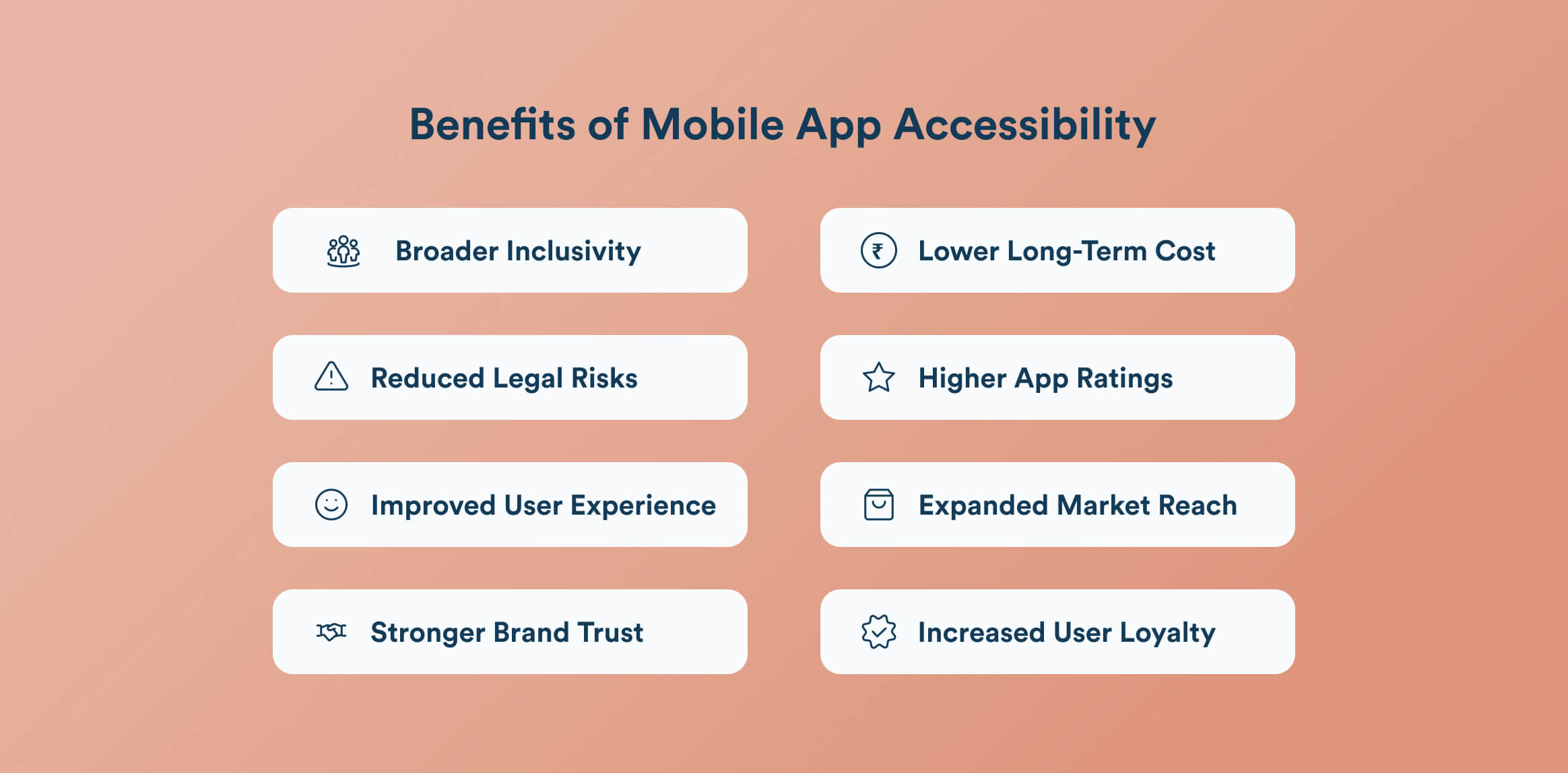
1. Broader Inclusivity
Focusing on app accessibility creates mobile experiences that welcome everyone, no matter their abilities. By designing for users with visual, auditory, motor, or cognitive impairments, you open up your app to people who might normally be excluded, helping them feel valued and included in the digital space.
2. Reduced Legal Risks
By complying with accessibility standards for mobile apps, such as WCAG and ADA, you avoid costly lawsuits and legal disputes. Many countries now recognize digital accessibility as a basic right, so failing to meet these guidelines can result in a big dent not only to your wallet but to your reputation as well.
3. Improved User Experience
When you add features such as scalable text, straightforward navigation, and multiple ways to interact with your app, you make it more user-friendly for everyone. With the help of these improvements, you remove barriers and streamline how people navigate through your app, creating a smoother and more enjoyable user experience.
4. Stronger Brand Trust
Mobile app accessibility shows that your brand genuinely cares about fairness and social responsibility. Users notice this commitment to inclusivity, which builds trust and encourages long-term loyalty. Over time, a reputation for putting people first helps your brand stand out and strengthens your position as a leader in digital inclusion.
5. Lower Long-Term Costs
Adopting mobile app accessibility guidelines early makes the development process smoother, keeps ongoing maintenance affordable, and simplifies future updates. It helps avoid costly changes and overhauls later on. Taking this proactive route not only conserves resources but also helps you avoid last-minute rushes to meet compliance requirements.
6. Higher App Ratings
Ensuring your mobile app is accessible encourages users to leave positive reviews and give higher app ratings. When your app works well for a wider audience, it tends to receive better feedback, boosting its visibility in app stores and helping you attract even more users.
7. Expanded Market Reach
By designing your app with accessibility in mind, you are opening up your app to more than 1 billion users worldwide. You are tapping into a larger and often underserved market, increasing your downloads, app engagement, and, in the end, even your revenue potential.
8. Increased User Loyalty
When your mobile app is accessible, users can interact with it smoothly and without hassle. The confidence that your app will work for them in any situation makes people more likely to remain loyal and recommend it to others. This reliability not only strengthens user retention but also helps your app stand out in a crowded market.
Key Principles of Mobile App Accessibility
The foundation of app accessibility rests on four essential principles, often referred to as POUR. These principles, adapted from the WCAG, ensure that mobile applications work for users with a wide range of abilities and needs.
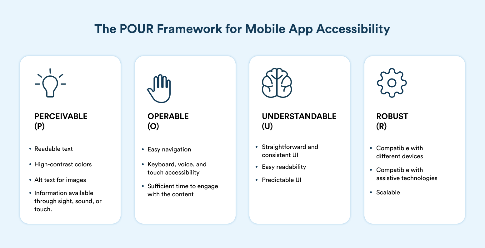
1. Perceivable: Make sure everyone can access and understand your app’s content, regardless of their abilities. This means using readable text, high-contrast colors, alt text for images, and making information available through sight, sound, or touch.
2. Operable: Users should be able to navigate and use your app with various input options, including touch, keyboard, and voice commands. Ensure your app functions smoothly for individuals with motor challenges and those who rely on assistive tools.
3. Understandable: Keep your app’s information and interface straightforward and consistent. Users should easily grasp how to navigate the app and what each part means, without confusion.
4. Robust: Build your app so it works well with different devices and assistive technologies. This way, your app stays accessible and dependable, even as technology evolves or updates are made.
Accessibility Standards and Guidelines for Mobile Apps
Building an accessible app isn’t just about how it looks, but it’s about meeting established standards so everyone can use it comfortably. Here’s what you need to know when it comes to the key guidelines and legal frameworks for app accessibility.
Setting the Bar for Mobile App Accessibility With WCAG 2.1 and 2.2
The Web Content Accessibility Guidelines (WCAG) 2.1 and 2.2 are recognized globally as the main reference for digital accessibility. Initially, they were aimed at websites, but now these guidelines greatly influence the development of mobile apps.
WCAG encompasses a range of topics, such as using alternative text for images, supporting screen readers, and ensuring your app works smoothly in portrait and landscape modes. The newer updates specifically address mobile challenges, like ensuring various features are usable without being tricky. Meeting at least Level AA of WCAG is considered the minimum for app accessibility.
ADA, Section 508, EN 301 549, and CVAA
In many countries, it’s required by law to have your mobile apps accessible. In the U.S., the Americans with Disabilities Act (ADA) and Section 508 mandate that digital products, including mobile apps, are accessible to people with disabilities. In Europe, EN 301 549 has set similar standards for public apps and heavily references WCAG as a base guideline. By not following these rules, you can land in deep legal waters and damage your brand’s reputation.
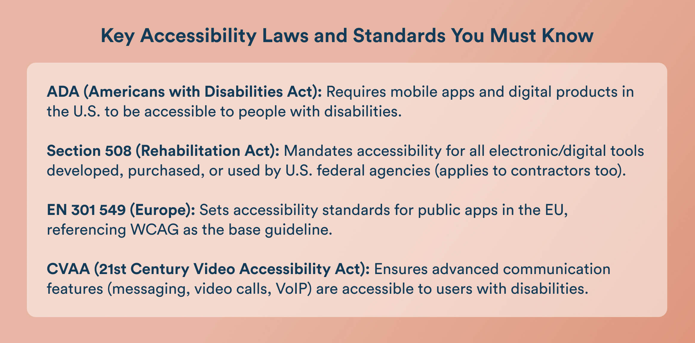
Additionally, if your app includes “advanced communications” features, such as messaging, video calls, or VoIP, it must also comply with the 21st Century Video Accessibility Act (CVAA). The CVAA requires that these communication features be accessible to users with disabilities, ensuring equal access to essential digital communication tools.
If your app is used by U.S. federal employees or is procured by a federal agency, it must comply with Section 508 of the Rehabilitation Act. Section 508 requires that all electronic and information technology (including mobile apps) developed, purchased, or used by federal agencies be accessible to individuals with disabilities.
This applies not only to public-facing apps but also to any internal tools or software used by federal employees. Contractors and third-party providers working with federal agencies are also required to meet these standards.
Native Mobile App Accessibility Guidelines
Apple’s guidelines for iOS focus on aspects like maintaining strong color contrast, supporting adjustable text sizes, and ensuring compatibility with assistive technologies such as VoiceOver.
Similarly, Google’s Android guidelines emphasize the use of TalkBack, flexible layouts, and support for various input methods to accommodate different user needs. Both iOS and Android come equipped with built-in accessibility features designed to enhance usability:

- Screen Readers: VoiceOver on iOS and TalkBack on Android provide spoken feedback to help users navigate apps.
- Adjustable Text: Features like Dynamic Type on iOS allow users to customize text size for better readability.
- Additional Tools: Magnification, color inversion, closed captions, and voice control options help users with vision, hearing, or motor impairments interact more easily.
When it comes to designing your app’s interface, using native UI components is generally the safest choice. These components are built to work seamlessly with accessibility tools and require less extra effort to make accessible.
However, if custom UI elements are necessary, it’s crucial to test them thoroughly and follow best practices to ensure they don’t create barriers for users relying on assistive technologies.
Key Mobile App Accessibility Features with Examples
To make your mobile app welcoming and easy to use for everyone, it’s essential to include features that cater to a range of accessibility needs. Below are some key areas to focus on:
1. Text and Typography: Large Text and Scalable Fonts
Clear and legible text is fundamental to app accessibility. Your app should let users increase font sizes as needed and maintain a strong contrast between text and backgrounds for easy reading. Avoid embedding text within images since this prevents resizing and can’t be read by screen readers, limiting access for some users. This helps users with dyslexia, ADD, or color blindness.

Apple’s iOS is a gold standard for text accessibility:
- The Dynamic Type feature allows users to adjust font sizes system-wide, and well-designed apps automatically adapt their layouts to these changes.
- Apple uses high-contrast settings and clear, legible system fonts (San Francisco) by default.
- In the Messages app, text size and boldness can be increased for better readability, and all text remains selectable and readable by screen readers.
2. Color and Contrast: High Contrast Themes
Choosing the right colors is crucial. Make sure your app uses color combinations that provide enough contrast to meet app accessibility standards. Also, don’t rely solely on color to communicate important information; use additional cues like icons or labels so that everyone can understand your app’s content.
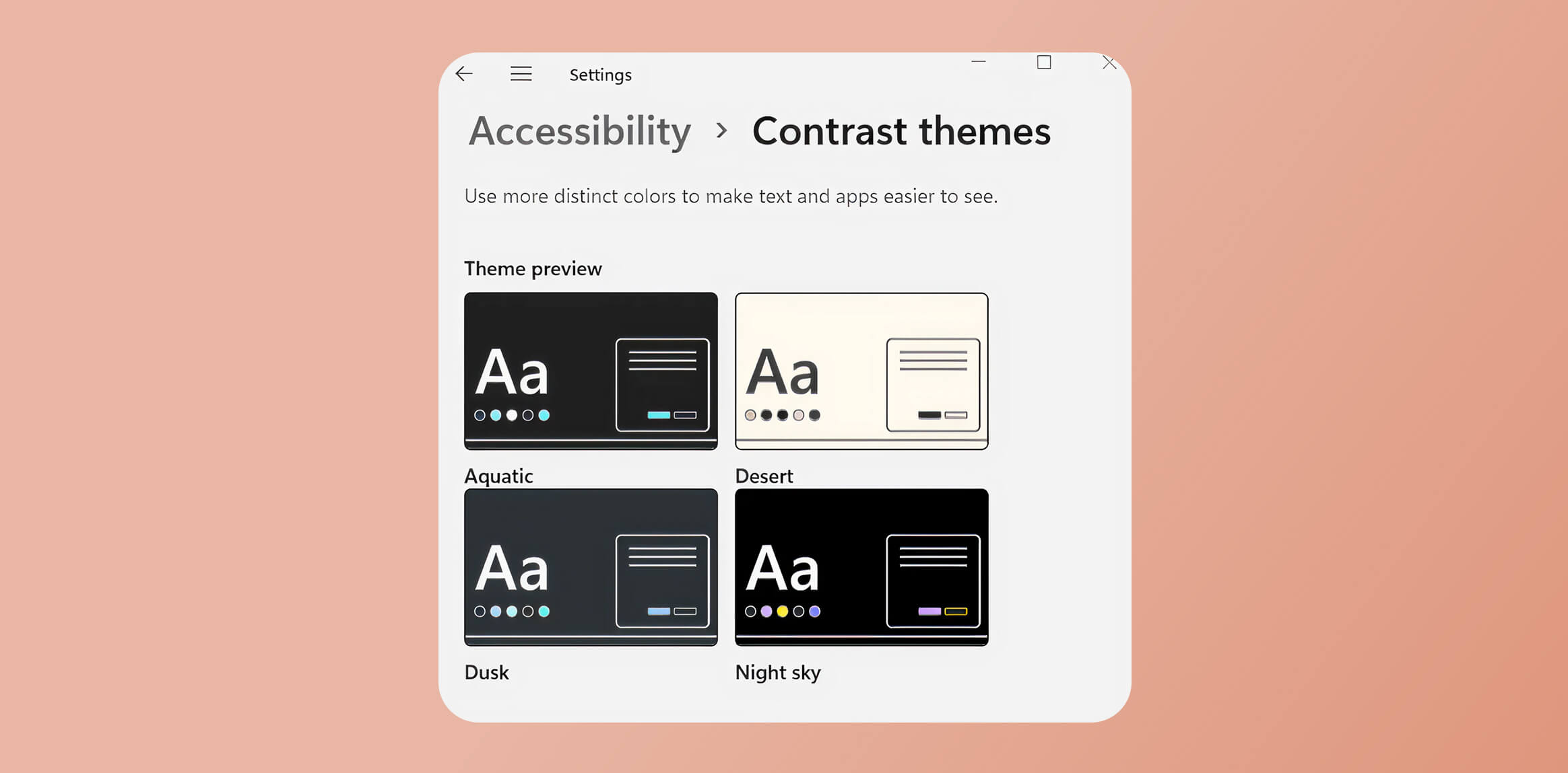
A great real-life example is Windows High Contrast Mode. When enabled, it transforms the interface to use bright text (like white or yellow) on a solid black background, making menus, buttons, and text much easier to read for users with low vision or color blindness while meeting accessibility standards.
3. Touch Targets and Keyboard Navigation
Interactive elements need to be easy to tap or select. Ensure buttons and links are large enough to accommodate users with limited dexterity, and organize navigation in a logical order with visible focus indicators for keyboard users. If your app uses gestures, provide alternative ways to perform those actions so no one is left out.
A standout example is Apple’s iOS Calculator app. The buttons are large, well-spaced, and easy to tap, making it user-friendly for people with limited dexterity. Additionally, iOS system apps support keyboard navigation with visible focus indicators and offer alternatives to gestures (like using on-screen buttons), ensuring everyone can interact with the app comfortably.
4. Alternative Text for Images and Screen Reader Support
For users who depend on screen readers, every meaningful image should have a clear, descriptive alternative text. Similarly, make sure buttons and controls are properly labeled so their purpose is obvious when read aloud by assistive technologies.
For example, an image of a city skyline with the alt text “city” is too vague and doesn’t explain the context. A better alternative would be “New York City skyline at sunset,” which provides specific and useful information for users relying on screen readers. When writing alt text, aim for about 125 characters or fewer, as screen readers may cut off longer descriptions.
Avoid phrases like “image of” or “picture of,” since screen readers already announce images. Focus on the function or content relevant to the context, use plain language, and end with a period to provide a natural pause. This approach ensures your app is more accessible and usable for all players.
5. Audio/Video and Multimedia
Make multimedia content accessible by including captions for videos and transcripts for audio. Adding audio descriptions for important visual elements ensures that users with vision impairments can fully engage with your content.
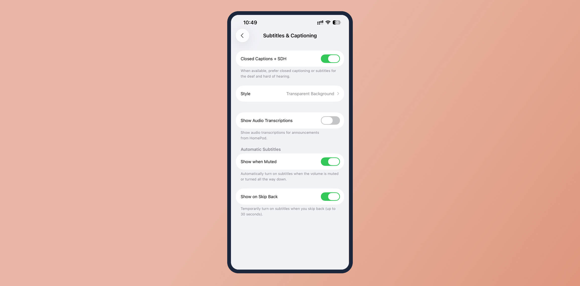
For example, YouTube offers automatic captions for videos and allows creators to upload detailed transcripts and audio descriptions, making its content more accessible to users who are deaf, hard of hearing, or visually impaired.
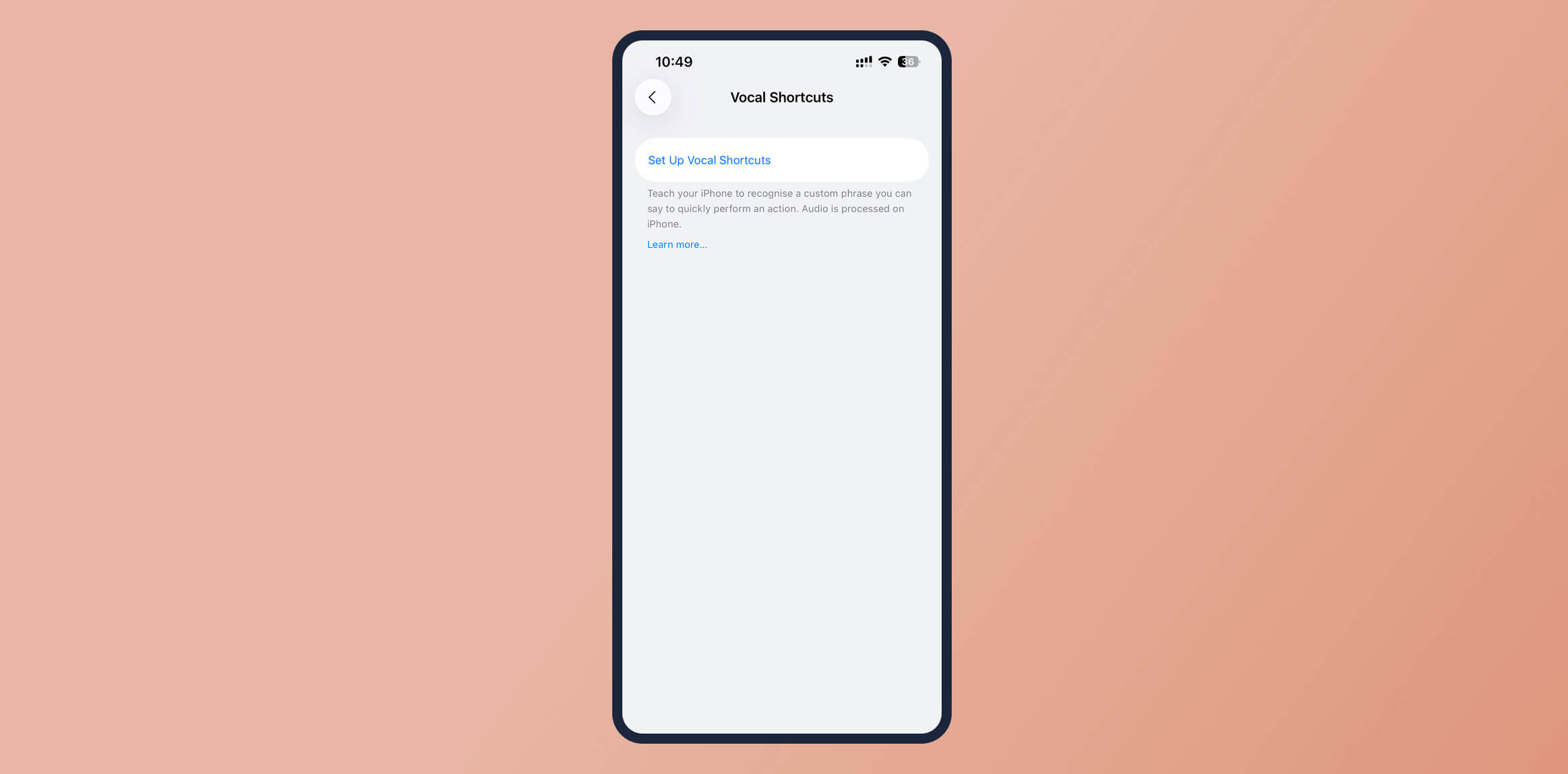
6. Voice Commands
Allowing users to control your app through voice commands makes it easier for those who can’t use touchscreens or keyboards, such as those with paralysis or limited motor skills. Supporting hands-free navigation broadens your app’s accessibility and convenience for many users.
How to Integrate App Accessibility in the Development Lifecycle
To build truly accessible apps, start considering accessibility from the very beginning of your development process.
1. Planning & Requirements
- Establish Accessibility Goals: Define what accessibility means for your app and set clear, measurable objectives (e.g., WCAG 2.1 AA compliance).
- Prioritize Requirements: Identify and prioritize the most critical accessibility features based on user needs and business impact.
- Accessibility Research: Understand your audience, including users with disabilities, by gathering insights and reviewing accessibility personas.
2. Design
- Accessibility-Friendly Design: Design UI elements with accessibility in mind. Consider color contrast, scalable fonts, logical navigation, and sufficient touch target sizes.
- Use Design Tools: Leverage tools like Figma or Adobe XD, which offer plugins and features for simulating color blindness and testing contrast ratios.
- Involve Experts: Consult accessibility specialists or include users with disabilities in the design review process to ensure your designs are truly inclusive.
3. Development
- Coding Best Practices: Write semantic HTML, use ARIA attributes where appropriate, and ensure all interactive elements are keyboard accessible.
- Automated Testing: Integrate automated accessibility testing tools (like Axe, Lighthouse, or Accessibility Insights) into your CI/CD pipeline to catch common issues early.
- Manual Testing: Go beyond automation by manually testing with screen readers, keyboard navigation, and other assistive technologies.
4. Testing
- Accessibility Testing: Make accessibility a standard part of your QA process. Test different user scenarios, devices, and assistive technologies.
- Test with Real Users: Involve users with disabilities in usability testing to uncover real-world barriers and gather authentic feedback.
- Iterative Improvement: Treat accessibility issues like any other bug. Track, prioritize, and fix them as part of your regular development cycle.
5. Deployment & Beyond
- Validate Compliance: Before launch, validate your app against recognized accessibility standards (such as WCAG, ADA, or Section 508).
- Continuous Improvement: Monitor accessibility post-launch, gather user feedback, and make regular updates to address new issues or standards.
- Establish Accountability: Assign responsibility for accessibility within your team and document all accessibility efforts for transparency and future reference.
CleverTap’s Product Experiences: Test and Improve Your App’s Accessibility and User Experience
Making your app accessible and user-friendly is an ongoing process, and having the right tools can make all the difference. CleverTap’s Product Experiences offers a no-code platform that lets you easily test, optimize, and iterate on your app’s user experience without needing to redeploy your app every time you make a change.
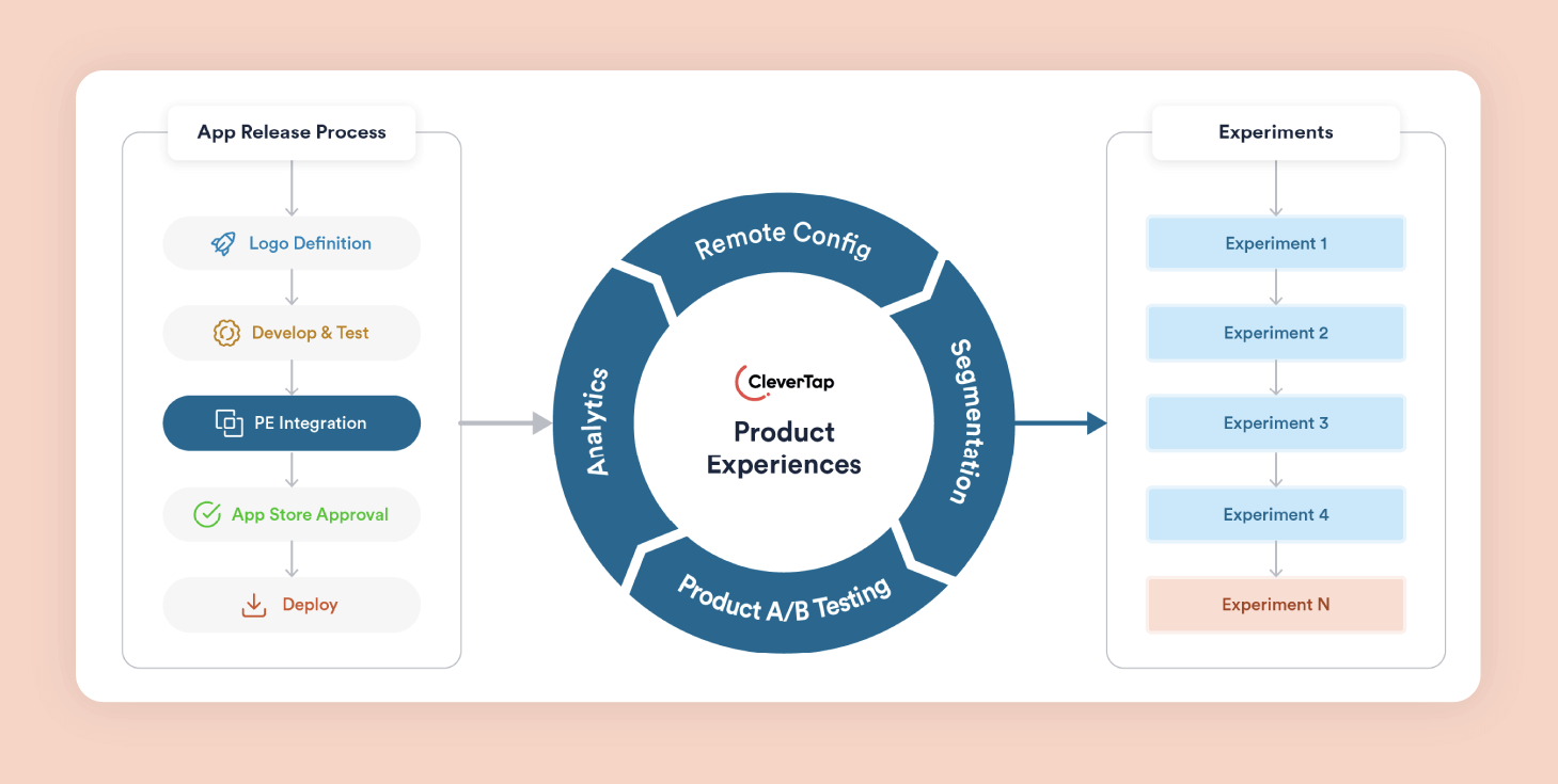
With CleverTap, you can:
- Remotely configure home screen layouts to highlight content that’s most relevant for each user, ensuring everyone finds what they need quickly.
- A/B test onboarding flows and other key journeys, helping you identify which designs or processes are most intuitive and accessible for new users.
- Adjust features dynamically for different user segments, such as tweaking gameplay or content access, so your app remains engaging and easy to use for everyone.
- Manage promotions and exclusive content with targeted rules, making sure important information is visible and accessible to the right audiences at the right time.
By using CleverTap’s Product Experiences, you can continuously test and refine your app’s accessibility and usability, making data-driven improvements that benefit all users, including those with disabilities. This approach not only enhances user satisfaction but also helps you stay ahead in delivering an inclusive digital experience.
Learn how CleverTap can help you with mobile app accessibility.
Design for All
Embracing accessibility is not just about meeting guidelines but about creating mobile experiences that everyone can enjoy. By making accessibility a priority from the start, you not only reach a wider audience but also show your commitment to inclusive, user-friendly design. Don’t wait for regulations or user complaints to prompt action; take the initiative and audit your app’s accessibility today.
If you’re looking for tools to help you test and optimize your user experience, CleverTap’s Product Experiences can make the process easier and more effective. Start building a better, more accessible app for all your users, because everyone deserves a great mobile experience.
Subharun Mukherjee 
Heads Cross-Functional Marketing.Expert in SaaS Product Marketing, CX & GTM strategies.
Free Customer Engagement Guides
Join our newsletter for actionable tips and proven strategies to grow your business and engage your customers.
