


Table of Contents
Categories
Most Popular


So you’ve built your app and are ready to unleash it upon the world? Not so fast.
Part of the process of building a product is making sure it satisfies customers. And a critical component remains: you need to optimize the user experience as much as possible before releasing it.
The alternative is dire: almost one fourth of all apps (24%) are used only once. Mostly because they don’t live up to user expectations. So optimizing the UX not only helps you retain the users who install your app, it also improves conversion rates, inevitably leading you to increased revenue.
While there are many techniques and methodologies that marketers use to streamline their UX, this article focuses on just one: the heuristic evaluation.
The Heuristic Evaluation: What Is It?
A heuristic evaluation is a detailed analysis of your app’s user interface and overall user experience. It is judged using predetermined qualitative criteria (AKA heuristics), which are derived from usability principles.
The evaluation results in an analysis of usability issues — basically, pinpointing areas where your app’s UI or UX need to improve.
An important note here is that this evaluation is accomplished by usability experts, not your internal team. There are several reasons for this:
- Experts already know usability principles inside out.
- They are not connected in any way with the company so their feedback is impartial and free of internal politics.
- This doesn’t tie up any internal resources. Once the experts provide their feedback, the development team can implement immediately.
What Do You Need for a Heuristic Evaluation?
In order to get a heuristic evaluation going, you will need:
- At least three external usability experts who can test your app objectively
- To come to a consensus on what criteria they will use to judge the user experience
- Someone internal to act as recorder and secretary: this person will record the session on video or audio, and can also answer any questions the usability experts may have
- To compile the evaluation data from your experts
Here’s a sample image of an actual heuristic evaluation: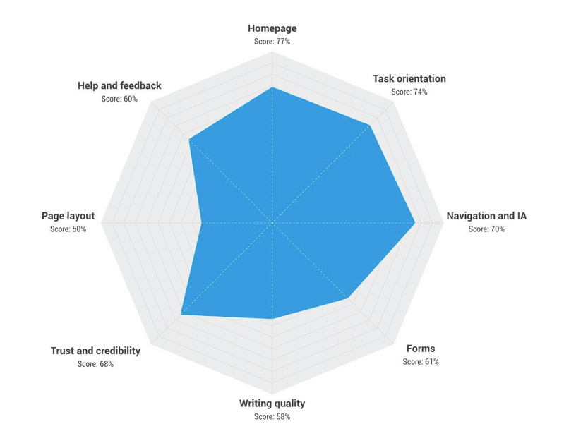
Nielsen’s 10 Heuristics, Explained
While there are more than 200 criteria that experts could, theoretically, use to judge your app’s usability, in actuality, they use only 10.
And these 10 are the ones developed by Jakob Nielsen and Ralf Molich in 1990 as general principles for user interface design. They were called “heuristics” because these were general rules of thumb and not meant to be prescriptive guidelines.**
Below we tackle each of Nielsen’s 10 heuristics. Read on for a more comprehensive take on each of them, or jump straight to the infographic to see a more concise version.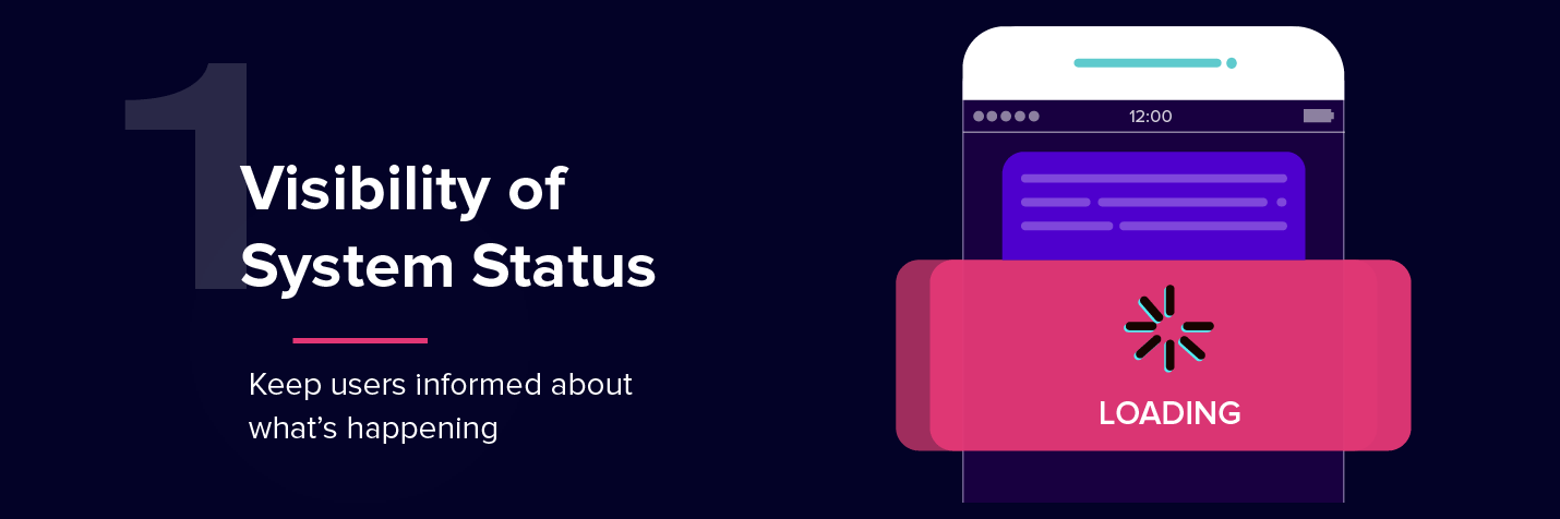
1.Visibility of system status
Does your app keep users informed about what’s happening, whether it’s loading or uploading, whether it’s stuck or is completing a step?
A large part of usability is transparency into what the app is doing and giving users the right feedback within a reasonable amount of time.
Say a user is uploading a photo to your social media app. Is there a progress bar or an animation showing the percentage of the job being completed? Make sure the user knows what’s happening, so they don’t click back or uninstall out of frustration.
2.Match between system and the real world
Does your app communicate with a user utilizing language and design elements that are familiar to them?
Language is one aspect of it. And we’re not just talking geographical language here, but also the choice of certain words, phrases, even concepts. In short, is your app using real-world, layman’s terms or software/system terminology? Your app needs to speak the way your users speak.
Some tips:
- Avoid wording that’s overly technical — unless you’re certain that your audience is technical. Stick to simple terms and communicate clear benefits.
- Always explain acronyms and abbreviations. Don’t assume casual readers know what those letters stand for.
- Communicate like a human. Not like a machine. It’s important to present information in a natural way that also makes sense to the user.
- Read our blog post for more tips on copywriting for mobile.
The other side of the coin is imagery and design. Do your UI elements look like objects in the physical world (e.g., clocks, buttons, dials)? Then they better act like the physical objects, otherwise there will be a disconnect between how the user manipulates the physical object and how they manipulate your app’s interface.
3.User control and freedom
Does your app have the ability to undo or redo an action?
New users have the freedom to tap anywhere and everywhere in your app. And before long, they may encounter options or settings that mess up their experience. To ensure they have control over their situation, build a way for them to get out of trouble without having to contact technical support. Because, seriously, you won’t want to have to field support tickets starting out with “I accidentally deleted…”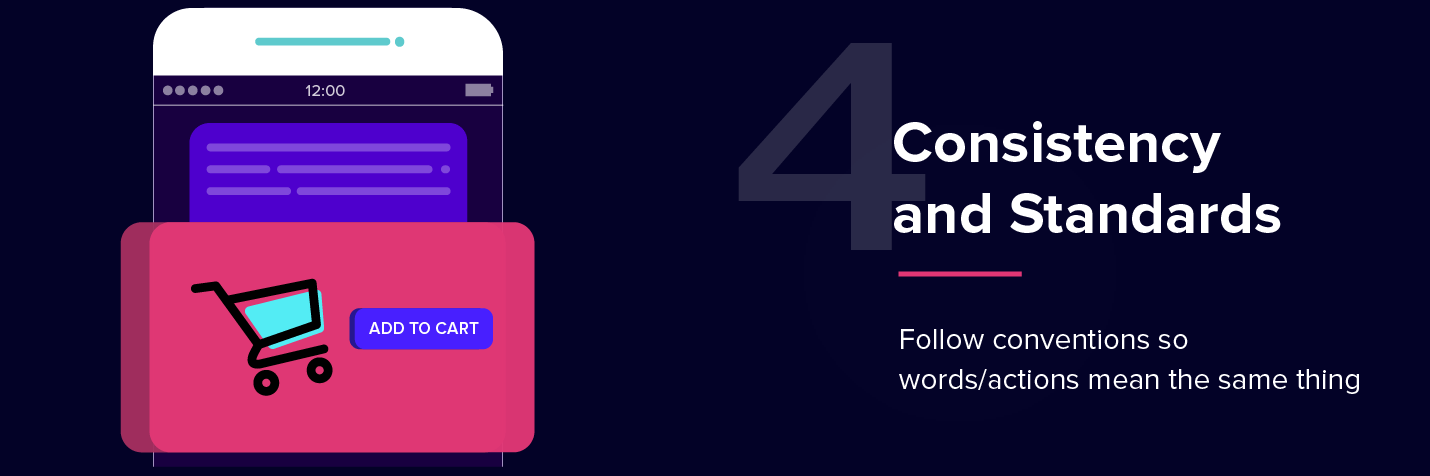
4.Consistency and standards
Does your app follow interface standards and platform conventions?
There are existing platform conventions that you need to abide by. Don’t reinvent the wheel!
When a user encounters an icon on your app with a shopping cart image, it better mean “shopping cart” and not “share this with friends.” Because usability means consistency with other platforms around the web, and with other apps.**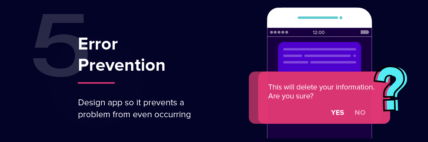
5.Error prevention
Does your app help prevent the user from making serious errors?
Design your user experience so that users are presented with ways to sidestep a probable mistake or eliminate the possibility of the error being made at all.
For example: when a user is creating a password for their account, do you have a tooltip outlining some guidelines for password creation? Give them clues, guide them away from a fatal error (such as using “password123”) as they interact with your app.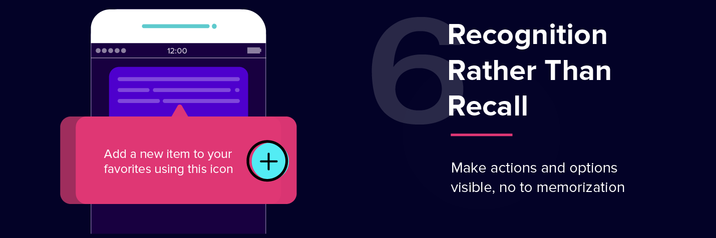
6.Recognition rather than recall
Does your app present important options visibly? Are instructions or help materials easily found in the app?
The point here is: lessen the amount of memory work the user has to do. If your app can make the most crucial actions and options immediately visible, there’s less for users to have to remember as they navigate to different areas of your app.
Tips:
- Have helpful tooltips ready for new users.
- Have tutorials and support options clearly marked in your main menu.
- Allow auto-complete as users type something in your app’s search box.
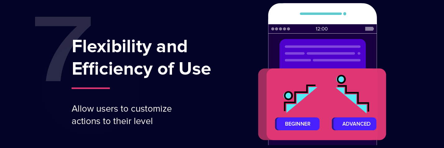
7.Flexibility and efficiency of use
Is your app flexible enough to cater to power users as well as novices? Can you personalize frequent actions so it’s one less tap for the user?
Your app will have a wide variety of users — both newbies and experts. But It will only have one user interface. Make sure you design it in such a way that you can cater to both types.
For example: have only the most important items in your main menu, but also have an “advanced” toggle to allow power users to tweak settings or customize their menu items.
8.Aesthetic and minimalist design
Does your app’s interface show the user everything onscreen, or does it show only the most essential elements? Is every word in your UI necessary?
If you overload your user with information, they won’t know what to do. Pare it down to the basics. Be minimalist — whether it’s in the graphical elements onscreen or the words in a dialog box.
For example: in your registration step, do you need users to complete five fields? Or do you really only need two fields, name and email?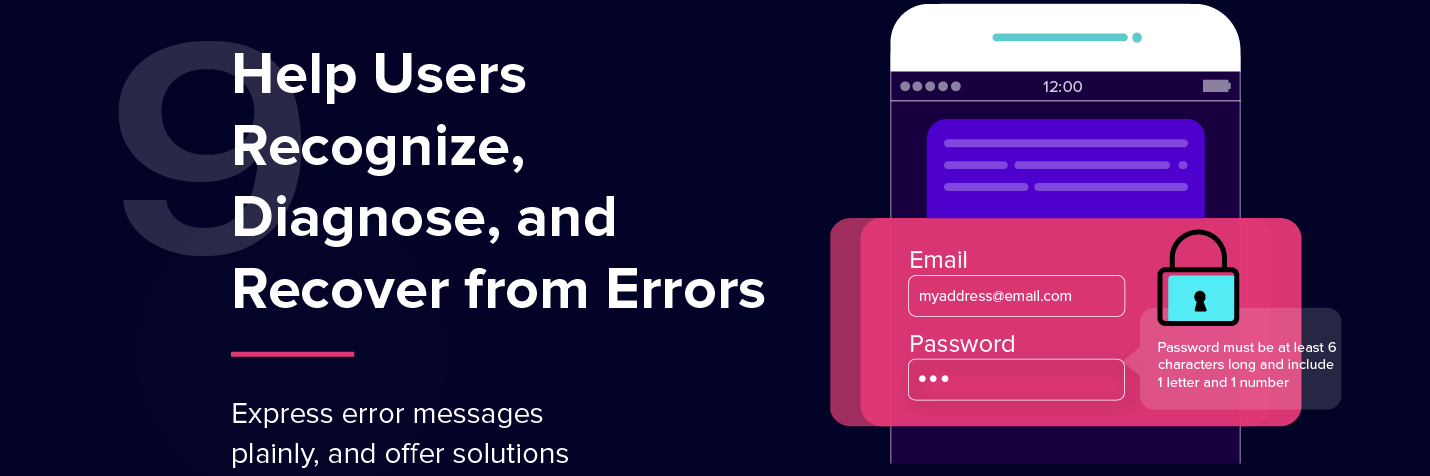
9.Help users recognize, diagnose, and recover from errors
Does your app explain an error when a user makes one? Is it clear what the user has to do next when an error happens?
Yes, we need to create error messages. And yes, they need to be human readable. (Don’t just say “Fatal Error 999!”) But more than that, they need to be precise so users know exactly what’s wrong and can avoid that same mistake in the future.
One of my all-time favorite error messages is “Could not complete that action.” It leaves me asking “Why? Is it my internet connection? Is your server down? Is the file too large?“ That sort of vagueness is not clear, and worse, it’s not constructive as it doesn’t give the user the next step.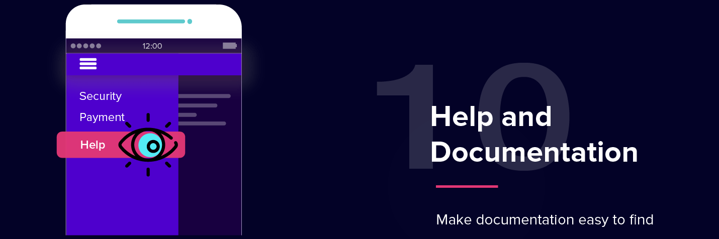
10.Help and documentation
Does your app provide documentation so that users can find answers when they need it?
In an ideal world, users would never need documentation. But in case they do need help, make sure your FAQs or help pages are easily found, thoroughly organized, and fully searchable. In short, make it easy for users to help themselves.
Furthermore, in each entry includes information that is focused on user tasks (not your app’s features), and be sure to outline the steps they need to take to remedy the situation they’re in.
The Heuristic Evaluation: Do You Really Need It?
Because an actual heuristic evaluation is done by usability experts, it will cost money and time. And not every brand with an app can afford to sink in the resources this may require.
But here’s the thing: you can still use Nielsen’s 10 heuristics to do an internal examination of your user experience.
Since these heuristics run the gamut from app consistency, to design aesthetic, and even customization, they can be a good checklist for any brand willing to spend time analyzing features. Just remember to look at it from the eyes of a user. This is, after all, a tool to optimize the USER experience.

A Complete Guide to User Engagement
Shivkumar M 
Head Product Launches, Adoption, & Evangelism.Expert in cross channel marketing strategies & platforms.
Free Customer Engagement Guides
Join our newsletter for actionable tips and proven strategies to grow your business and engage your customers.
