The Fintech industry is booming.
Growing demand and adoption of mobile banking and finance apps have the market on track to hit $460 billion by 2025.* And with the current global health crisis driving more customers to digital and touchless transactions, the future looks bright for Fintech brands who can deliver value and convenience to customers.
Take a look at how the hottest Fintech apps around the globe are attracting, activating, engaging, monetizing, and retaining their users.
Fuel Acquisition Through Smart App Store Optimization
Wildly popular budgeting app Mint dominates app store listings for personal finance and budgeting. Including keywords like “Personal Finance & Money” in its title and “Budget, Bills & Credit Score” in its subhead help it rank for searches like “Finance tracker,” “Finance manager,” “Budget app,” “Budget planner,” “Budget tracker” and more high-volume searches.
Mint also cleverly uses social proof to instill confidence in prospective users. “The #1 finance & budgeting app” and “Join the 24 million users that have signed up with Mint” are featured in big enough letters to clearly read from the results page, along with a blue ribbon icon, to set it apart from competitors. 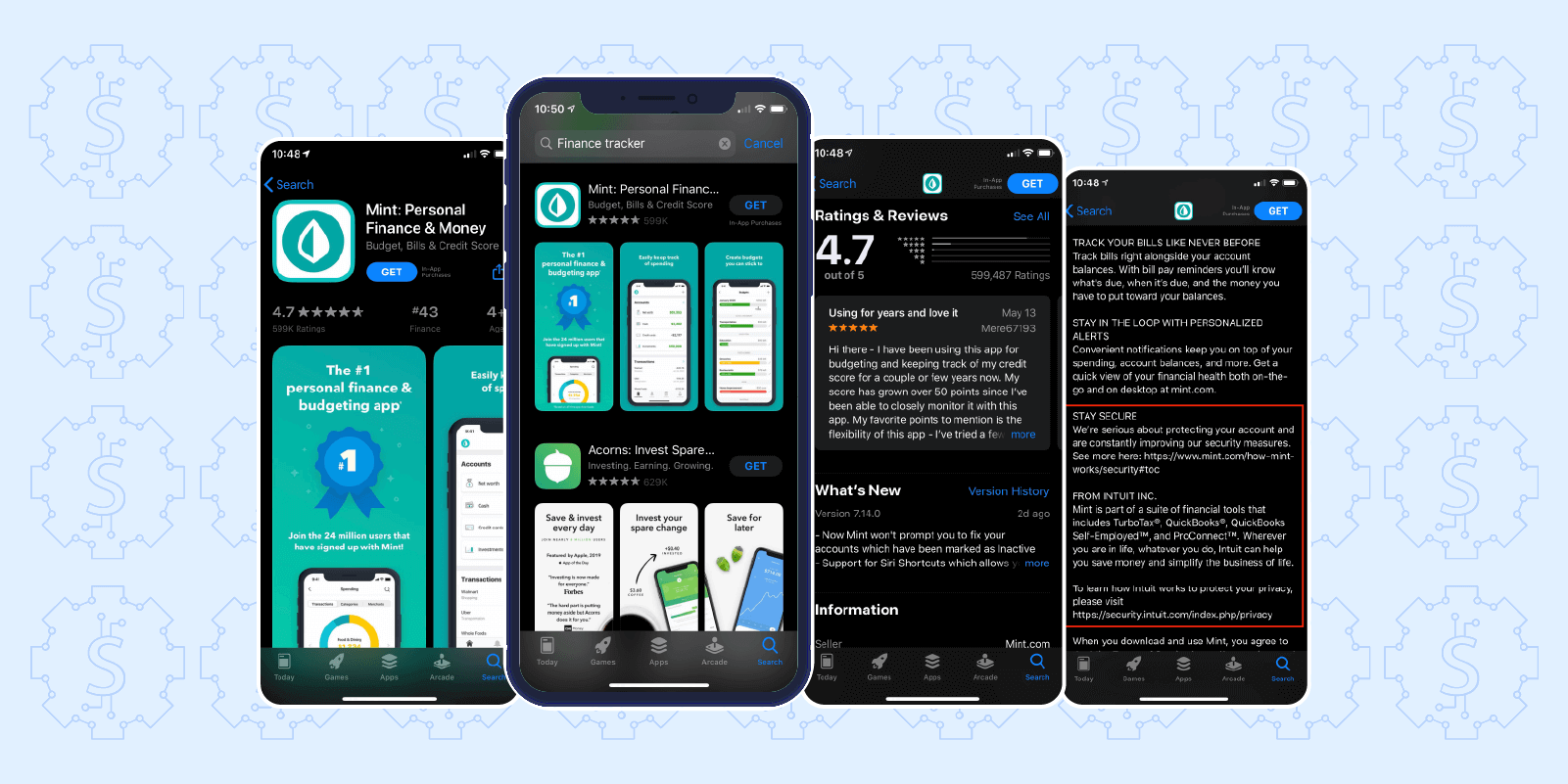
Tap into the app’s listing page and you’ll see featured screenshots that showcase a simple, intuitive UI. They highlight key features that resonate with audience pain points: managing spending and bills, creating budgets, setting financial goals, tracking credit scores, and getting important account alerts. A blue and green color palette, common among Fintech brands, signals trust and prosperity.
Of the nearly 1 in 4 adults who don’t use Fintech apps, 42% say it’s because they don’t trust their security.* Because building customer trust is such a key element to success for fintech brands, Mint makes a point to emphasize safety and security in its app description. It includes a link to its full security document and highlights its ties to enterprise financial software brand Intuit to prove its legitimacy and security.
And because nothing instills trust quite like social proof, Mint’s nearly 600k ratings and 4.7 stars are featured with a glowing review from a long-time user.
Activate More Users by Perfecting the Onboarding Flow
Micro-investment platform Acorns aims to make saving and investing effortless. Every time a user makes a purchase, Acorns rounds it up to the nearest dollar, takes the spare change, and intelligently invests it.
Upon first-time app launch, new users are greeted with a beautiful UI and smooth animations that demonstrate the level of care and detail that went into building the app. Simple, persuasive copy explains the app’s premise and benefits: “We help you grow your money.”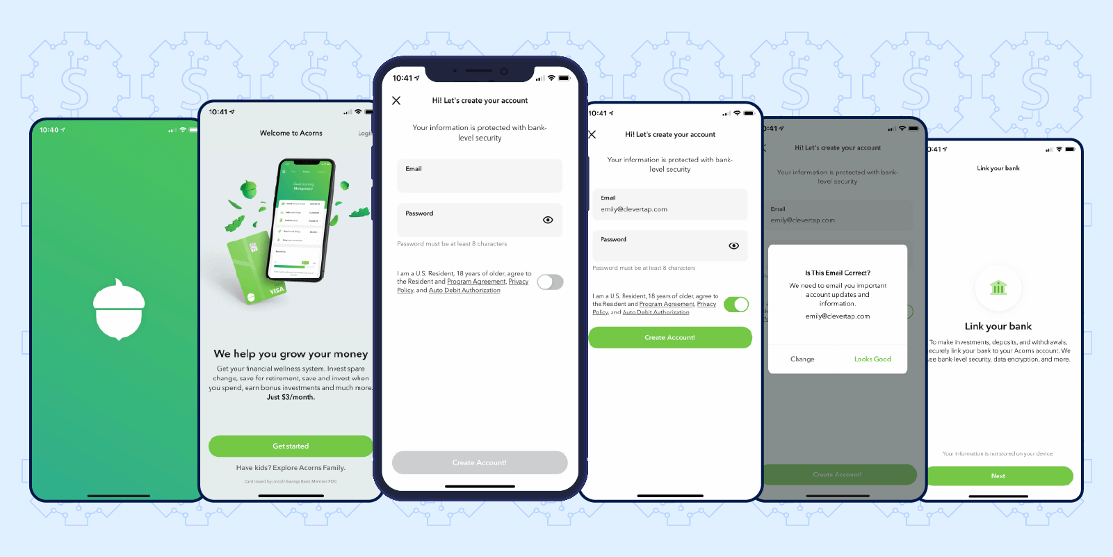
The Acorns onboarding process is a great example of addressing the inherent friction of Fintech apps. While many other types of apps do well by creating as simple an onboarding flow as possible, Fintech apps actually benefit by slowing down the sign-up process. This both ensures they get all the user information they need to securely deliver their service and reinforces the impression that the app is thorough and secure.
With the Acorns sign up flow, new users need to verify their email, link their bank account, and provide the personal information needed to open an investment account. Acorns makes the process as smooth as possible with clever micro-interactions that simplify the data entry process. For instance, password requirements are clearly explained and a green checkmark appears when the requirements are met. The CTA button also changes colors and positions when the form is complete.
Acorns’ sign up process may not be super streamlined, but it’s definitely effective at showcasing the service’s benefits and getting new users active on the app. The company boasts 4.5 million users and an $860 million valuation.*
Build User Habits with Omnichannel Engagement Campaigns
Budget and spending tracker Clarity Money greets new users with a welcome email outlining its benefits and encouraging them to link their bank account to get started. The email is light on copy and includes multiple CTAs to cover its users’ main pain points: budgeting, meeting savings goals, tracking credit scores, and trimming unwanted expenses and subscriptions.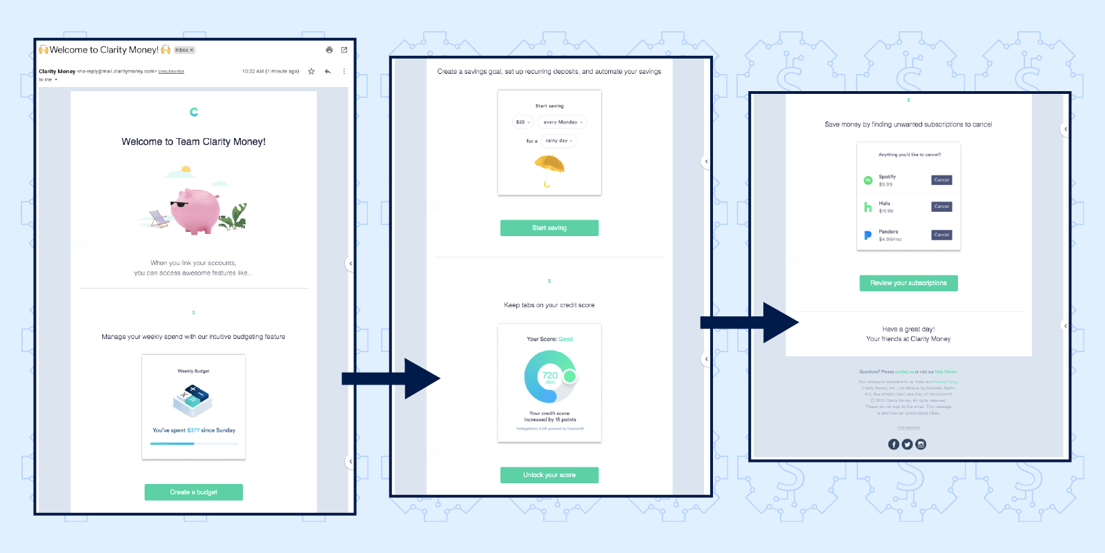
Inactive users are re-engaged with a follow-up email a week later, emphasizing the app’s strong security protocols to put users at ease, build trust, and remind new users to get started tracking their financial wellness. 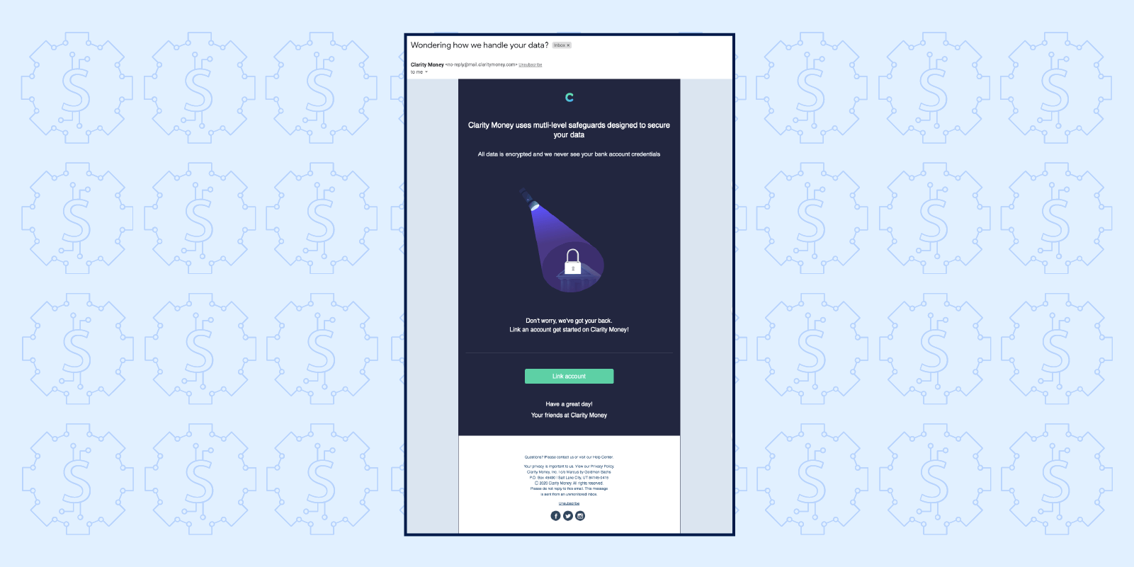
Mobile wallet and digital currency exchange service Coins uses multiple channels to keep bringing users back to the app. In-app messages feature exclusive promotions to help users quickly reload mobile credits. Users can also instantly purchase credits on Facebook Messenger just by chatting with the Coins bot, giving them multiple convenient channels to load money and engage with the brand. 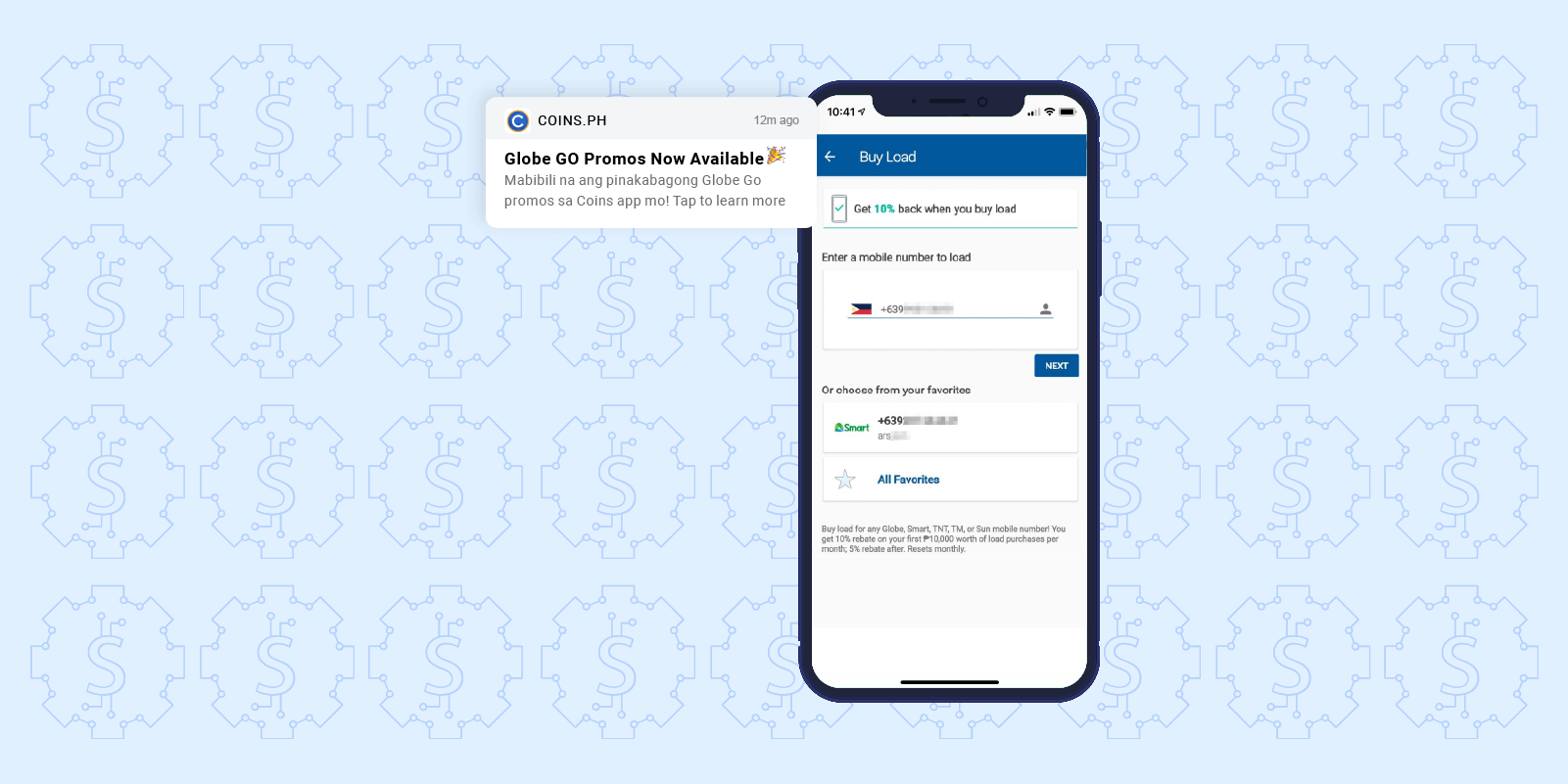
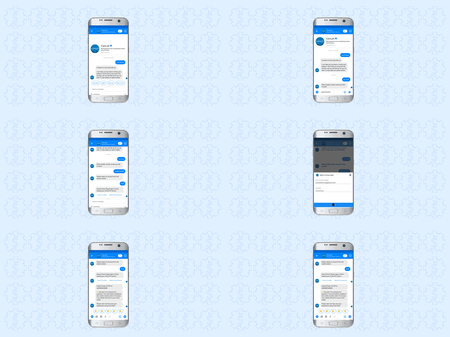
Users receive personalized incentives and discounts via push: all they have to do is tap the notification to open the app and claim their offer. It’s an effective strategy for getting users back into the app: Coins sees push notification CTRs over 5x higher than the Fintech industry average.
Increase Conversions with Personalized Prompts
User experience extends to every aspect of your app, not just the in-app experience. Every message, every channel, every touchpoint has to be carefully thought out, and that goes double for highly personal channels like push notifications.
Fintech customers expect highly personalized, perfectly timed push notifications that don’t feel spammy or intrusive. So how do you go beyond to delight them with your messages and bring them into deeper engagement with your app?
Deep links are an essential tool in the mobile marketer’s toolkit, and ecommerce payment platform Paytm has them mastered. Deep links bring users directly to specific content within your app. For example, a payment reminder notification could bring the customer directly to the payment page, or a budgeting alert could open that user’s monthly spending details.
Paytm uses deep links with personalized cashback offers. Tap on this offer for cashback on kids’ clothing and you’re not only taken directly to the appropriate collection page, but the promotion is also automatically applied on every screen, all the way through checkout. 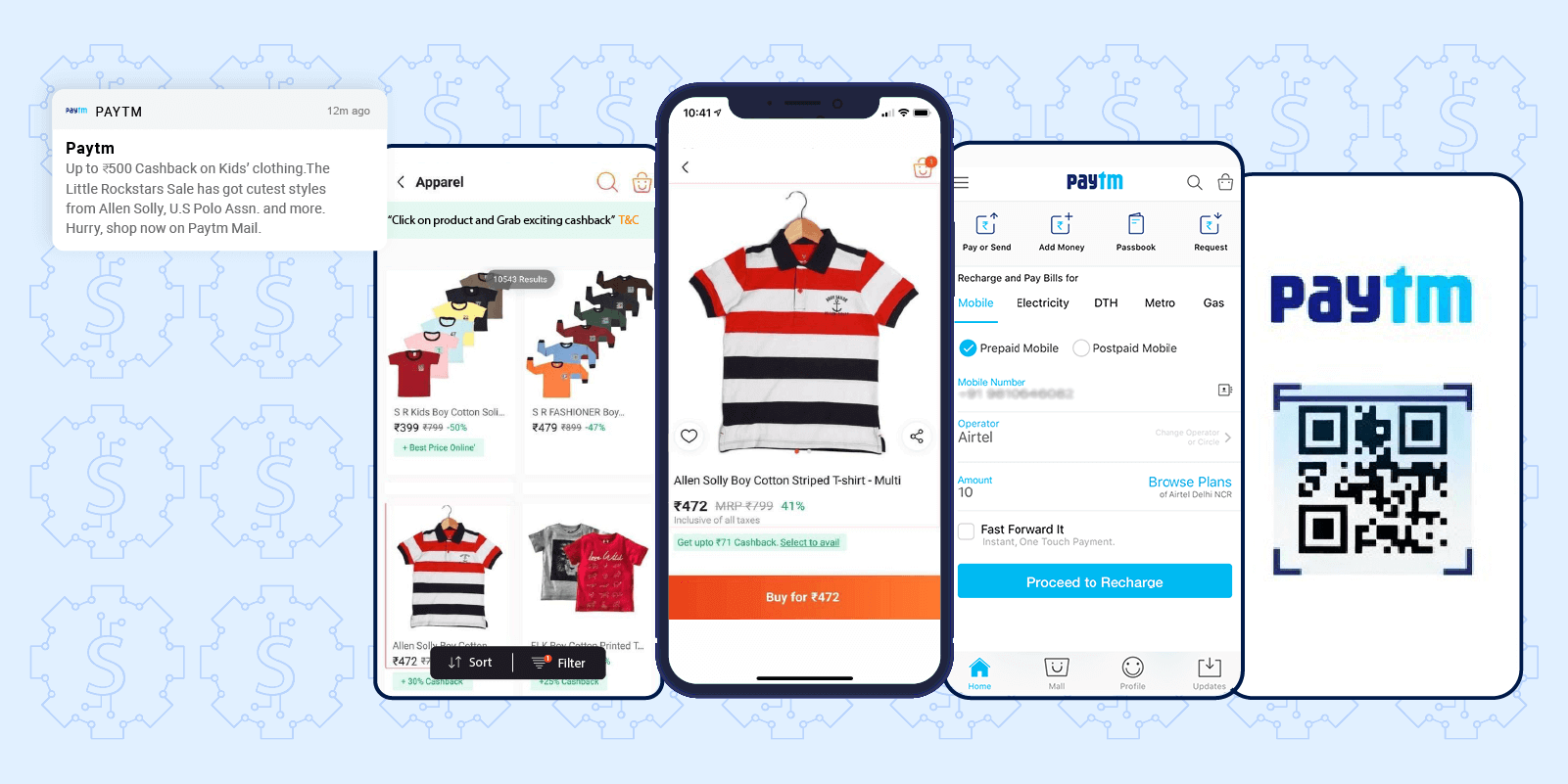
Paytm also includes multiple CTAs on their Android push campaigns, with each button taking users directly to the appropriate section of the app. For instance, “Mobile Recharge” takes users straight to the recharge page with their previous payment information already loaded, while tapping “Pay/Scan” immediately launches the app’s P2P/P2B payments page.
Apps that use deep links see 2x higher engagement and retention rates* and a 66% rise in conversions.*
Amplify Retention Rates by Delivering Value at Every Touchpoint
Engagement campaigns are effective for bringing users back to your app. But you have to go a step further and focus on retention, which means continuously improving your service to earn the kind of loyalty that makes your brand a habitual part of your customers’ lives.
Malaysia’s Touch ‘n Go eWallet is a prime example of a Fintech brand with an airtight retention strategy. Campaigns are tailored for individual user segments to ensure every message is relevant and delivers value to each of the app’s 14 million active users.
Touch ‘n Go eWallet uses advanced segmentation and predictive modeling to target users based on purchase behavior and interest. Push notifications deliver deals to specific user segments, like this one for a limited rewards offer, and prompt action with “Hurry, vouchers are running out!” Weekly rewards are sent to a segment of current customers to encourage repeat transactions and further build loyalty. The app boasts a 43% week 1 retention rate with nearly 45% of returning users completing repeat transactions.
In-app notifications share the latest promotions and feature releases, which refresh and reinforce a perception of value for active users. In-app notifications are personalized for each user segment based on their profile properties, in-app behaviors, and purchase history. For example, a user that has just completed a transaction and has a low remaining wallet balance is shown an in-app notification that highlights the app’s auto-reload feature.
The app is not only helping customers transact in a way that’s convenient, secure, and rewarding, it’s continually improving its service.
Encourage Referrals with Smart Incentives
Customer acquisition costs are rising dramatically: according to our latest data report, cost per install has jumped 30-40% since mid-March. Fintech brands have to find more cost-effective ways of driving new user acquisition, and many are turning to referral programs that attract customers through word of mouth.
Investment and trading app Robinhood has built a thriving business on a clever referral program. Instead of offering a simple discount, Robinhood appeals to their customers’ primary interest: building their investment portfolios.
Free stock is already an enticing incentive, but the brand takes it a step further by adding an exciting element of gamification. They keep the exact stock a surprise while name-dropping big companies like Apple and Facebook, explicitly stating users have “a 1 in 250 chance” at these high-value stocks. And because Robinhood gives free stocks to both the referrer and the new user, referrers feel like they’re helping their friends build wealth while helping themselves. It’s a powerful viral loop for exponential growth.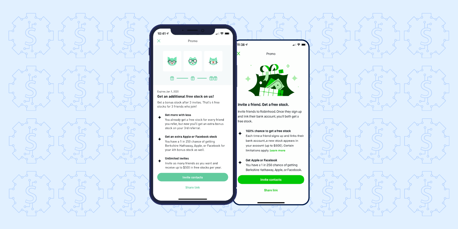
Online forums like Reddit have become hot spots for users to share which referral stocks they earned.* While most users received stocks that were less valuable than teased companies like Facebook, those that did confirmed the program’s legitimacy and helped add fuel to the referral program.
As of July 2020, Robinhood boasts 13 million brokerage accounts and an $8.3 billion valuation.*
Grow Your Fintech App with a Focus on Retention
73% of new Fintech app users churn within 7 days. Building a healthy business requires brands to find ways to deliver value, nurture customer relationships, and win loyalty.
These examples of successful brands demonstrate best practices for App Store Optimization and user acquisition, effective engagement campaigns, and smart customer retention strategies that improve CLTV and revenue.
But along with the right strategies, marketers need the right tools to understand their users, build successful campaigns, and deliver a superior user experience. A complete marketing platform like CleverTap combines industry-first analytics and engagement capabilities to keep your users coming back to transact. Schedule a demo or learn more about what makes our solution special.
See how today’s top Fintech brands use CleverTap to drive long-term growth and retention
Shivkumar M 
Head Product Launches, Adoption, & Evangelism.Expert in cross channel marketing strategies & platforms.
Free Customer Engagement Guides
Join our newsletter for actionable tips and proven strategies to grow your business and engage your customers.

