Learn how you can Unlock Limitless Customer Lifetime Value with CleverTap’s All-in-One Customer Engagement Platform.

As an analyst, you can explore the relationship between variables both quantitatively and visually. However, only looking at the quantitative indicators like correlation could be leaving out much of the bigger picture.
Numerical v/s Numerical
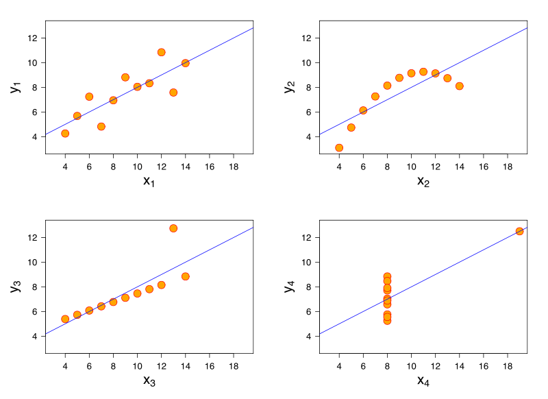
The Anscombe quartet as shown below is a classic example:
 Source: Wikipedia
The points in the datasets are such that the mean, variance and correlation are all the same for each of the 4 datasets. What gets confusing is though the regression line suggests a linear relationship, the relationship among variables for all the datasets is in fact, not linear.
Categorical v/s Numerical
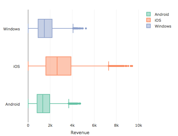
Let’s now take a look at the relationship between a categorical and numerical variable with the help of box plots:
Here, we look at the relationship between revenue and Operating System (OS). Box plots are a quick and efficient way to visualize a relationship between a categorical and a numerical variable. The boxes represent the observations from the 25th percentile (Q1 – Quartile 1) to 75th percentile (Q3 -Quartile 3). Together, the data between Q1 and Q3 constitute IQR – Inter Quartile Range of the data and the line in the middle of the box represents the median (Quartile 2 – Q2). The points beyond the IQR (below Q1 and above Q3) and which are within 1.5 times the IQR constitute the whiskers. All points beyond the whiskers qualify to be outliers. (Read this article to know more about outliers)
From the above graph, it seems the Q1 (25th percentile observation) of iOS users is higher than the median (Q2) on both Android and Windows users. It can be inferred that users who have transacted an amount greater than $2600 (median of the iOS users) are more likely to be iOS users. The type of OS does seem to have a bearing on the amount of Revenue generated per transaction.
Categorical v/s Categorical
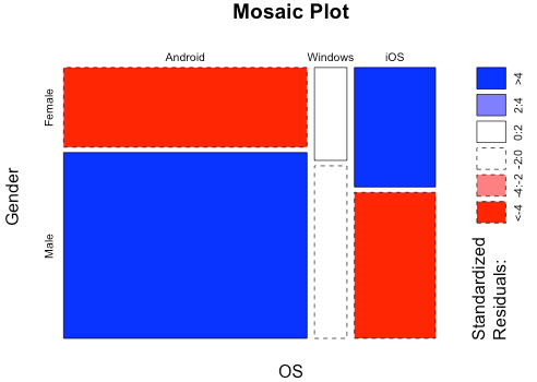
Suppose we have table for Gender by OS in the below format: Let’s now take a look at the above table by visualizing the relationship between the categorical variables with the help of mosaic plots:
The essential idea behind a mosaic plot is to recursively sub-divide a unit square into rectangular tiles such that the area of each tile is proportional to the cell frequency. The cell frequency in the above case is for Android users whose gender is male represented by the larger rectangle shown in blue. The color range from red to colorless to blue is based on a chi-square statistical test. The darker shades indicate that the observed frequency exhibits a large deviation from the expected frequency as compared to lighter shades.
In the above plot, the observed female android users seems to be quite less compared to expected female android users while it is the opposite for iOS female users. It may be concluded that gender has a bearing on type of users on iOS and android whereas it doesn’t seem to have a bearing on windows users.
Thus, visualizing variable relationships are not only desirable but also required to confirm the relationship between variables arrived with quantitative indicators. When it comes to variable relationships, numbers simply may not be enough. Get the full picture by building a visual representation of the data.
Source Code and Dataset to reproduce the above article available here