Almost one fourth of all apps (24%) are used only once. Why? Mostly because they don’t live up to user expectations.
That’s the reality we face as mobile marketers engaged in customer experience optimization.
Your goal isn’t just to stay out of the 24% of apps that are immediately uninstalled. It’s to create an experience that leads to customer satisfaction.
This is where psychology can come into play in your user experience optimization efforts.
In this article, we’ll tackle psychologist Mihaly Csikszentmihalyi’s psychology of optimal experience. To build a satisfying app experience, your app user must:
- Know what to do in your app and how to do it
- Know how well they’re doing in any in-app activity
- Know where to go in your app
- Be free from distractions
- Be challenged so they’re not bored, but not so challenged that they’re frustrated
A Poor App Experience Leads to Churn
Here’s why this entire process is important. If an app fails to delight users or doesn’t perform as expected, your users will ditch you faster than their fitness-related new year’s resolution.
There are many reasons why people uninstall an app. When we asked 2,000 users why they uninstalled an app, we found: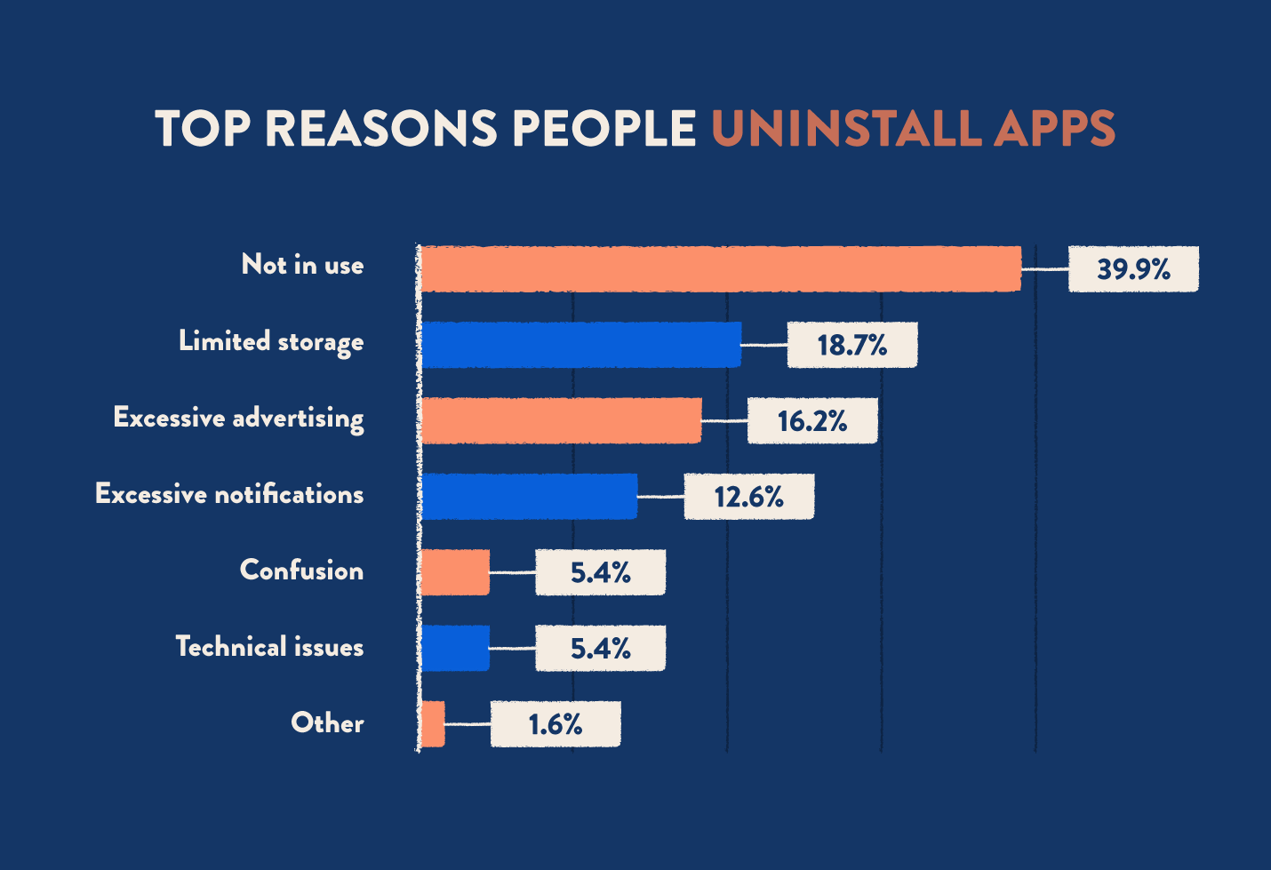
What’s common among all those reasons? They can all be bucketed under one general heading: “poor user experience.”
If you can improve the app experience, you will improve retention.
The Psychology of Optimal Experience
But in order to excel at improving the customer experience, you have to know what an optimal experience is. What are you aiming for? Rave reviews in app stores? High Net Promoter Scores? Or something more?
In 2008 a psychologist named Mihaly Csikszentmihalyi published Flow: The Psychology of Optimal Experience that helped explain why we enjoy certain activities over others.
Csikszentmihalyi spent 12 years studying people around the world to learn how enjoyable activities take away worries and distractions and can even distort your sense of time (e.g., “Where did the last three hours go?!”).
These satisfying, pleasurable activities he called “optimal experiences,” “flow states,” or simply ”‘flow.” And for the rest of the article, we’ll be using these terms interchangeably to mean the same thing: a favorable experience while using your app.
What Conditions Lead to an Optimal Experience?
Csikszentmihalyi eventually defined the psychology of optimal experience, defining 9 specific factors that are all present in an experience of flow: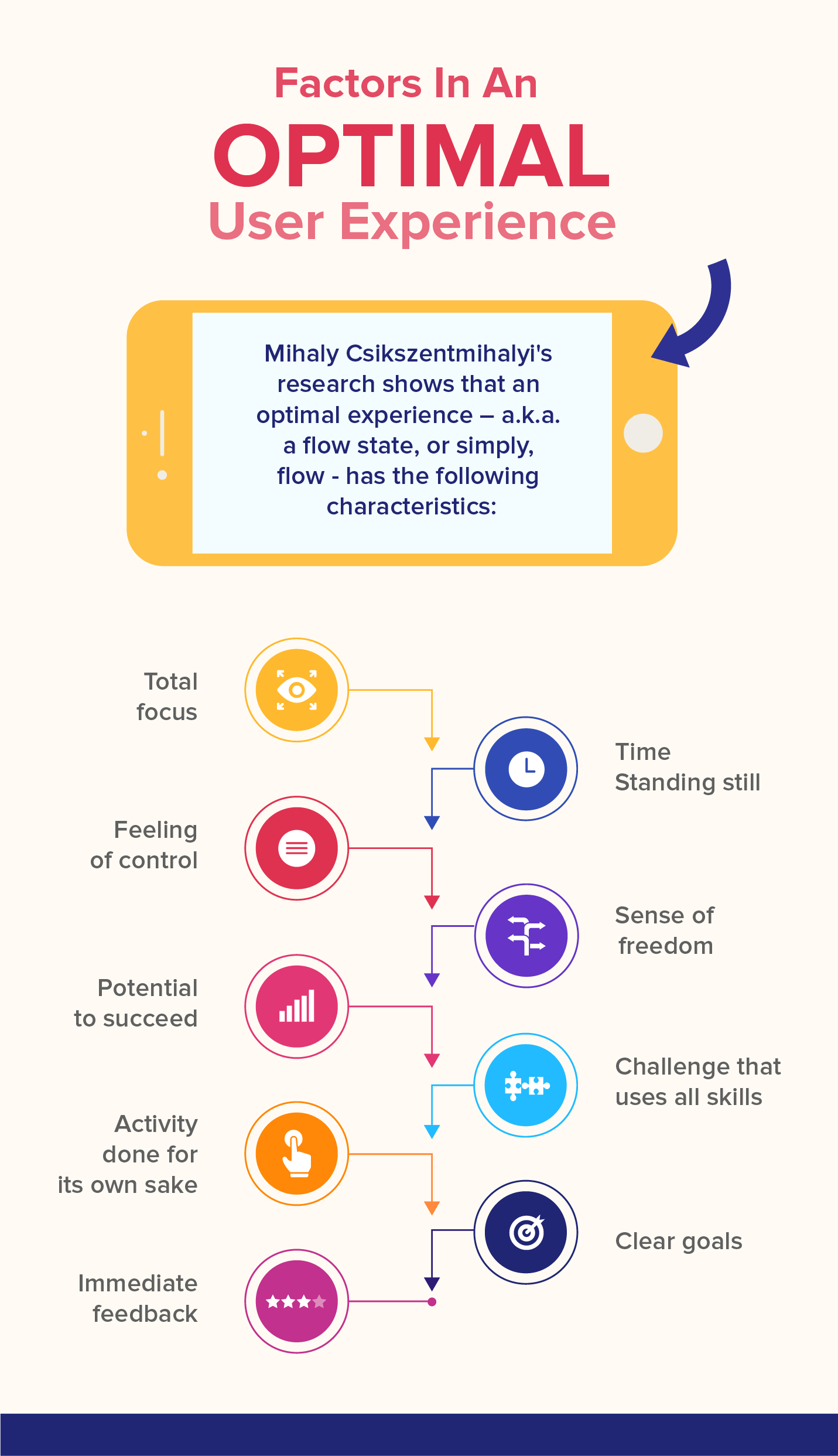
But in order to actually use his ideas for optimizing the app experience, we need Owen Shaffer. In 2013, he expanded on Csikszentmihalyi’s research and proposed seven conditions that lead to a flow state:
- Knowing what to do
- Knowing how to do it
- Knowing how well you are doing
- Knowing where to go (if navigation is involved)
- High perceived challenges
- High perceived skills
- Freedom from distractions
And here’s where all these ideas become applicable to mobile marketing.
App Experience Optimization: Using Psychology to Get Users Into the Flow
How can we use these flow conditions in the context of app experience optimization?
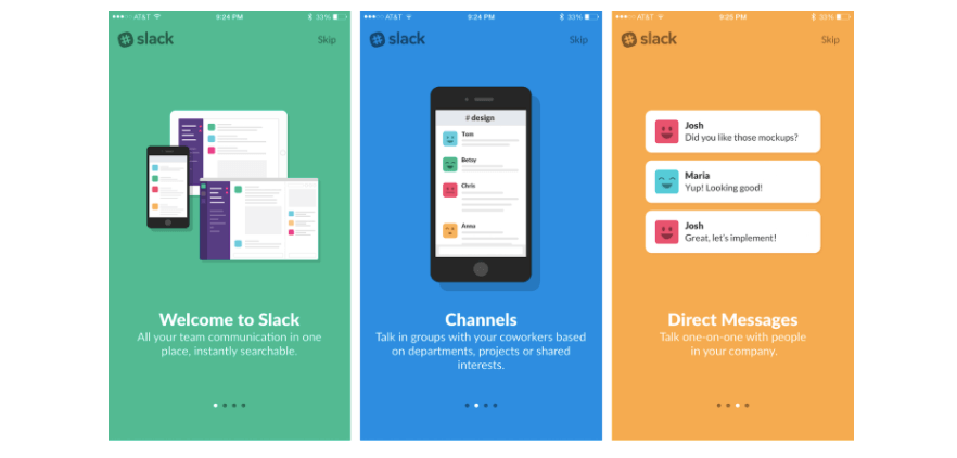
01. Tell Users What to Do and How: Onboarding & Ongoing Education
If knowing what to do and knowing how to do it are prime conditions for getting into a flow state, then it’s clear that your app needs to continuously educate users.
And not just about features and functionalities, but also communicating to users the benefits and value of using your app.
- Follow the golden rules of onboarding in order to quickly get new users up to speed.
- Make sure you have a stellar support team and an online knowledge base that can be consulted if users have questions.
- Since one of the factors that lead to flow is having clear goals, give new users an objective they have to achieve by the end of each session. Line these goals up to your user journey map so you can visualize where you need to nudge users.
- Continuously educate users on how to use your app or on any newly released features using all channels available – in-app notifications, emails, push notifications, SMS, and more. Here are 5 “Welcome” push notifications you can use to onboard new users.
- Make use of Intent Based Segmentation to figure out whether a user segment is more likely to convert. This way, you can hold off on conversion campaigns for those users and not waste resources. Conversely, if a segment is in danger of churn, you can send that segment more conversion-based messaging, and encourage them to engage with your app using promotions.
02. Show Users How Well They’re Doing: Instant Feedback
Feedback mechanisms are vital for an optimal experience. If we can’t tell whether we’re doing well, then we never get into a flow state.
For a gaming app, it’s immediately obvious that you can’t succeed at a game without seeing a progress bar, a points system, or a dashboard with the player’s stats. For an ecommerce or travel app it could be a panel showing how much money the user has saved thus far.
Whatever your app category, you need to deliver instant feedback to users so they know if they’re using it correctly!
- In any multi-screen explanation such as an onboarding walkthrough, number your screens (e.g., 1/6, 3/5, etc.) to indicate how many they have to finish.
- Or simply provide progress bars to indicate status and even increase the likelihood that users complete an action.
- Give users custom dashboards so they can personalize the data they need to see in your app as well as have a quick view of their stats.
- Send a confirmation dialog when a user is about to do something drastic like change permission settings or delete account information.
- Send users visual rewards that congratulate them for reaching a milestone in your app. Some examples below:
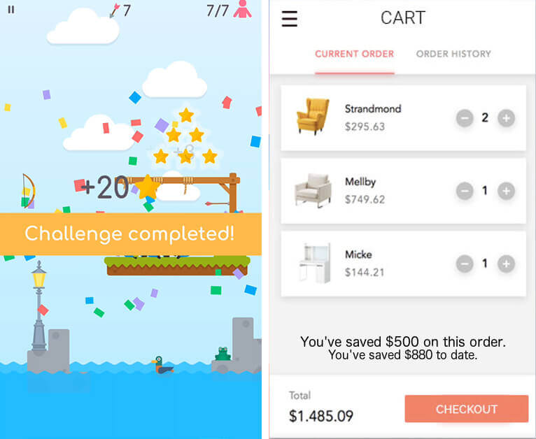
[L to R] A game thrives on visual rewards. Ecommerce apps can use some feedback such as money saved using discounts.
03. Nudge Users Where to Go: Navigation Cues
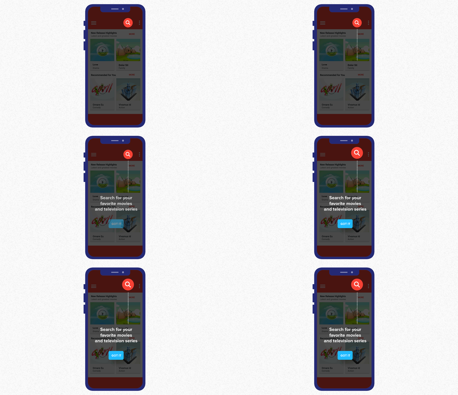
Part of educating users on what to do is giving them a way to know where they are in your app, and what they need to do if they want to move around. Since flow is dependent upon people feeling like they have a sense of control and mastery over the task, you need to give them navigational cues so they can find their own way.
- Use lightboxes to gray out other options and highlight your recommended option.
- Use familiar menu conventions that are the same as in other apps. This simplifies the learning process. Users will prefer your app work in much the same way as all the other apps and websites they already know and use (see Jakob’s Law of Internet UX**).
- Provide a good (and easy-to-find) help screen or help documentation so your users can find answers for themselves, should they want to.
- Use breadcrumbs to indicate how users can navigate their way back to a previous screen.
- More tips on improving UX navigation here.
04. Take Away Distractions: Simplify & Streamline
App users are a fickle bunch. Every new notification is a chance that they might move away from your app and launch some other tool.
Accept that this is outside your control. What is in your control is simplifying and streamlining everything within your app.
- Ensure that you’re providing a seamless omnichannel experience to users. They should be able to switch from desktop to mobile and still know they’re interacting with your brand.
- Another potential cause for distraction and annoyance: too many notifications. Give users a sense of control over how often you communicate with them by allowing them to set communication preferences for their push notifications.
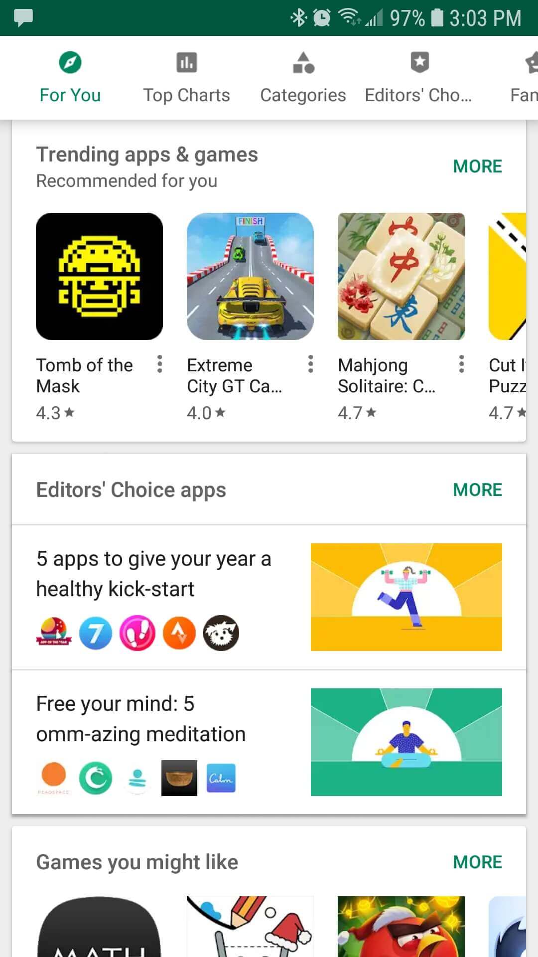
- Don’t overwhelm the user with choices. Instead, highlight the recommended options you want them to take and gray out the others. Remember Hick’s Law: the time it takes to make a decision increases with the number and complexity of choices**.
- Another way to prevent choice paralysis is by grouping content. People can only retain 5-9 items in their working memory. See how the Google Play store groups its apps:
05. High Perceived Skills & Challenges: Don’t Bore Them Silly
A balance between perceived skills and challenges is necessary for an optimal experience.
According to Csikszentmihalyi’s research, when a task is too easy, a person gets bored. If it’s too difficult, it builds anxiety.
The tasks you design in your app must be challenging enough not to bore users, but not so difficult they give up in frustration.
- Let users choose difficulty level. Gaming apps already know this by default, allowing users to select whether their gameplay is for beginners, intermediate players, or bloody experts.
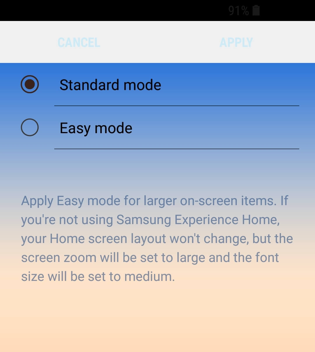
- Some productivity and utility apps give users a choice between “Basic” and “Advanced” modes. One example is Samsung Experience Home. Users can toggle between Easy and Standard modes of their app launcher, allowing people to customize their Android home screens with either simplified features or more advanced ones.
Final Words on the Optimal User Experience
Every customer interaction can be optimized, tested, and improved.
After all, what is digital experience? When you come right down to it, it is an opportunity to wow users.
An optimal user experience for your mobile app can tip the scales and move users from customers to evangelists.
And like any human interaction, you can use the psychological principles of flow to improve your digital optimization efforts. Not in a manipulative, evil scientist way, but in a way that allows you to give users an immersive, creative experience.
Read More
- User Experience: UX Design Principles That Deliver Awesome Apps
- Why Users Uninstall Apps: 28% of People Feel Spammed [Survey]
- 6 Mobile App Design Tips for a World-class User Experience
- User Journey Mapping to Improve UX
- The Hidden Psychology of Successful Mobile Apps (Infographic)

The Psychology of Insanely Addictive Apps
Shivkumar M 
Head Product Launches, Adoption, & Evangelism.Expert in cross channel marketing strategies & platforms.
Free Customer Engagement Guides
Join our newsletter for actionable tips and proven strategies to grow your business and engage your customers.

