The majority of people want to touch and feel a product before making a purchase.1
The same is true for mobile apps. Whether someone is window shopping the app store or laser-focused on finding a specific app, those app store screenshots play an essential role.
Although every app marketer has the same number of pixels to work with, how those pixels are used is the subject of this article. You will learn how to create app store screenshots that attract users and lead to more downloads featuring real examples from the Google Play Store and Apple’s App Store.
How Screenshots Play a Part in ASO
Just like people debate whether the color of a button or the layout of a landing page impacts conversion rates, you may question how screenshots can impact app store optimization (ASO).
It’s no surprise that apps successful in acquiring and retaining users reap the benefits of higher app store rankings. This is because the best way to influence app store optimization is to enhance the user experience.
App ratings, reviews, and more play a huge part in signaling to the App Store which apps best match search queries. One possible signal is click volume, or how many users click on an app listing.
One way to receive more click volume is to have screenshots that not only meet the app store’s requirements but inform and entice users to learn more about your app.
Apple App Store’s Requirements For Screenshots
Apple provides a checklist of guidelines that must be met before your app is eligible on the App Store.2 Requirements range from properly sized app icons to updated contact info in the event Apple’s App Review team needs to reach you.
More specifically, Apple provides insights on how a great product page should look.3
Screenshots have their own unique set of requirements:
- You must upload at least one screenshot of your app
- Up to 10 screenshots can be included
- Screenshots can include text and overlaid images
- One screenshot can be 100% text
- Remember to keep screenshots up-to-date with new versions of your app
- Must meet app store size specifications:4
App Store Screenshot Sizes for Mobile
| Device | Portrait | Landscape |
| 6.7 inch (iPhone 12 Pro Max) | 1284 x 2778 pixels | 2778 x 1284 pixels |
| 6.5 inch (iPhone 11 Pro Max, iPhone 11, iPhone XS Max, iPhone XR) | 1242 x 2688 pixels | 2688 x 1242 pixels |
| 6.1 inch (iPhone 12/12 Pro) | 1170 x 2532 pixels | 2532 x 1170 pixels |
| 5.8 inch (iPhone 11 Pro, iPhone X, iPhone XS) | 1125 x 2436 pixels | 2436 x 1125 pixels |
| 5.5 inch (iPhone 6s Plus, iPhone 7 Plus, iPhone 8 Plus) | 1242 x 2208 pixels | 2208 x 1242 pixels |
| 4.7 inch (iPhone 6, iPhone 6s, iPhone 7, iPhone 8) | 750 x 1334 pixels | 1334 x 750 pixels |
Although you will need to upload screenshots for select devices, like the iPhone 6s Plus, 7 Plus, and 8 Plus, they will scale down to smaller devices. This is why you should upload the highest resolution images possible for these devices.
Similarly, screenshots for the 2nd and 3rd generation iPads are required, but will scale down for smaller devices. If your app is compatible with WatchOS or other devices, you’ll need to upload screenshots for those as well.
What is an App Preview?
App previews are short (up to 30 seconds) audio/video screen recordings that showcase your app. The video will automatically play without sound when users view your app listing in the app store, which is why it should start with a visually informative or subtitled shot.
Uploading an app preview to your app store product page is optional but you can include up to three (for each language and localization).5
Google Play Store’s Requirements For Screenshots
Google says it plainly and simply, “Apps and games that comply with these guidelines are more likely to be promoted across Google Play.”6
- You must add a minimum of 2 and a maximum of 8 screenshots for each supported device type.
- Do not include content suggestive of your app’s Play Store performance, ranking, or promotional information.
- Some gaming sections of the Play Store will feature screenshots but to be eligible, you need three landscape (16:9 aspect ratio) screenshots.
- Image format: JPEG or 24-bit PNG
- Dimensions must be a minimum of 320px and maximum of 3840px, but the maximum dimension cannot be more than twice as long as the minimum.
Tips to Make Your App Store Screenshots Stand Out
Now that you know the requirements of the respective app stores, it’s time to make your screenshots do the work for you.
Apple’s app store places the most emphasis on screenshots. Screenshots are prominently placed within the app store’s search results and take up more space on the app’s product page. Google Play, on the other hand, features no screenshots within the search results page, and a much smaller proportion of the product page. 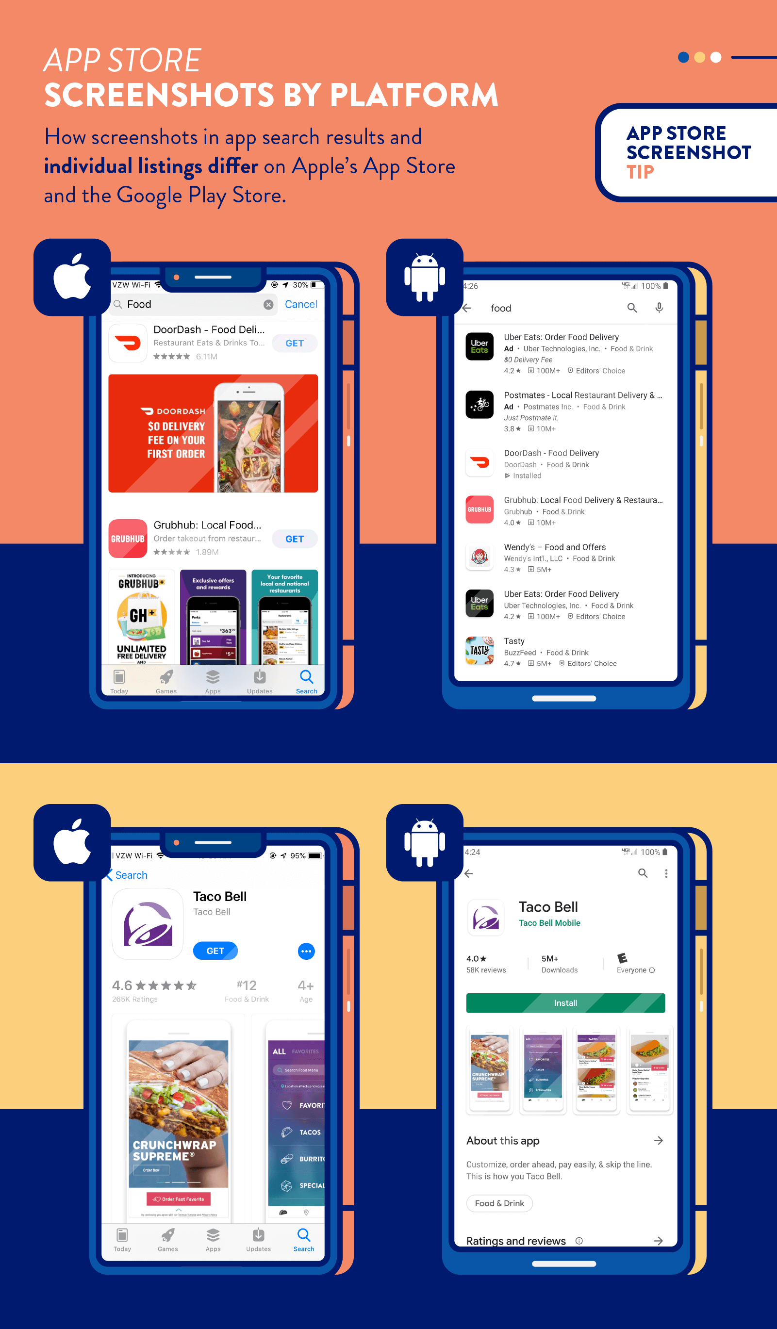
1. Display Awards and Accolades
If your app was once featured as the app of the day, ranked highly in your category, or has an impressive number of 5 star ratings, tell the world about it.
Even if your award is applicable to only one channel, such as Apple’s App Store versus Google Play, use different screenshot strategies for each. The meditation app Ten Percent Happier prominently displays that they were awarded Apple’s App of the Day.
On the Google Play store, however, making suggestive claims about your app’s performance (number of reviews, rankings, app store accolades, etc.) is prohibited which is why the same screenshot makes no mention of the award.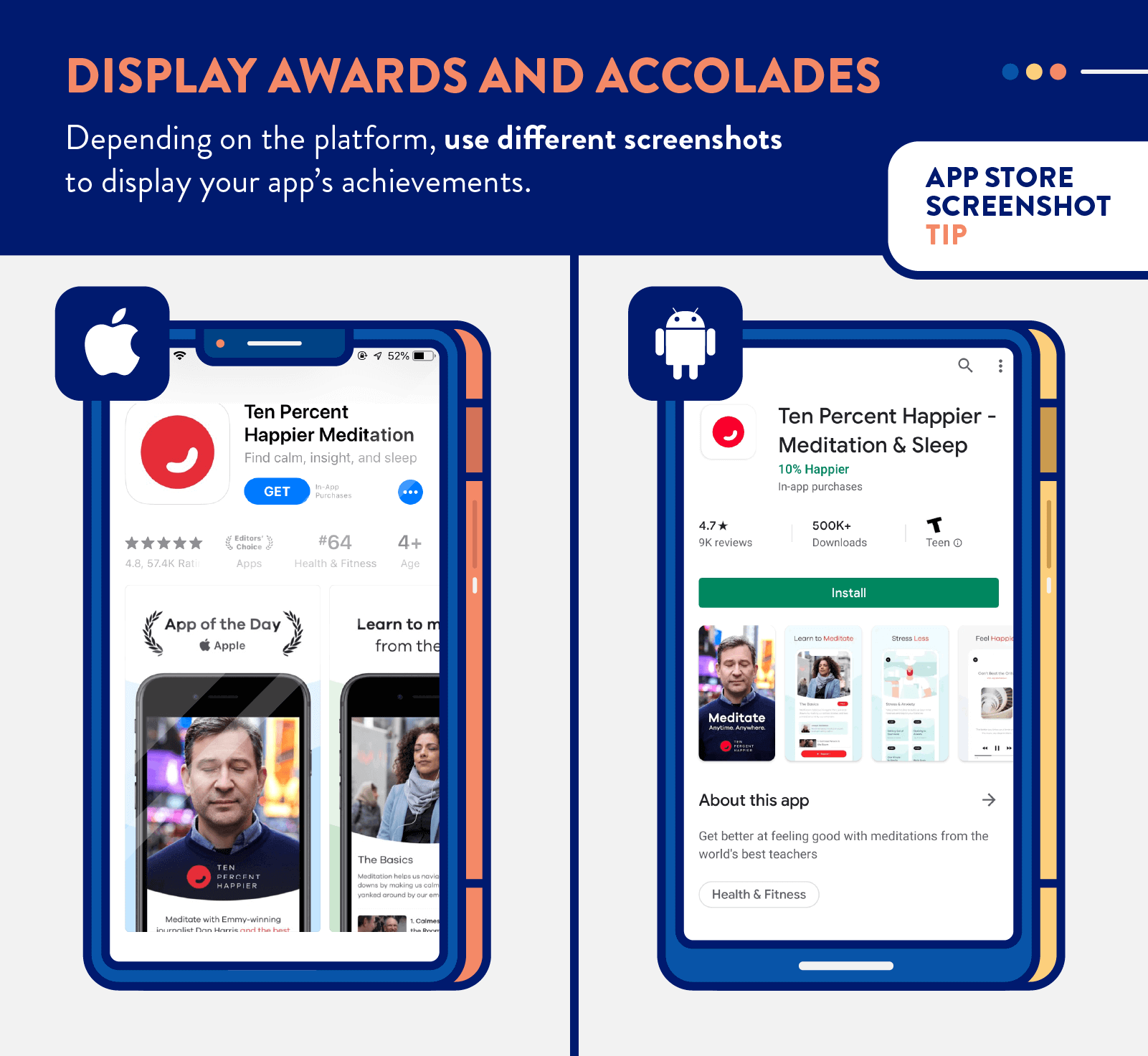
2. Show Screens, Not Devices
It can be tempting to show your app being used with the latest and greatest iPhone or Android device in your screenshots, but this can alienate users with older devices.
One of the benefits of app store screenshots is that they let users visualize how the app would look on their phone, like trying on an outfit in the mirror. If your screenshots are on a different device, it can be like looking at the outfit on a model: it looks good but you don’t know if it will work for you, specifically.
This is why it is best to simplify the screenshots down to the screen level, not device-specific.
In the example below, Quibi uses floating screens and is careful to not attach them to any specific device that the user may or may not own.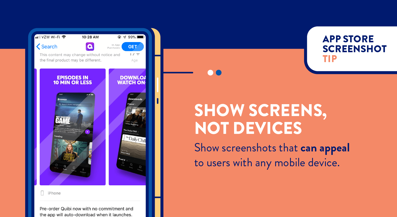
3. Mirror Your Top Competitor
If your app is competing with an 800-pound gorilla in the app store, an effective strategy is to mimic the elements that are working for them.
Copying what competitors are doing successfully (while being cognizant of intellectual property rights) is a strategy that has dominated in nearly every business, industry, and economy. If you’ve ever wondered why car dealerships, restaurants, and other retail stores tend to be next to each other, it’s because a classic business strategy is to position yourself close to your competitors.
In the example below, it’s obvious that FreeForm TV has mimicked the elements within Hulu’s screenshots. Both apps use short sentences with their value propositions and showcase some of the content available on their platforms.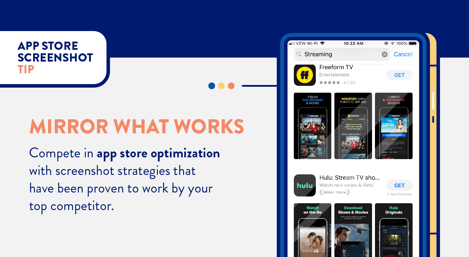
4. Do Something Unique
Every mobile marketer has the same number of pixels to work with. It’s about what you do with those pixels that matters.
In an effort to stand out among the crowd, it can be beneficial to use one or more of your screenshots for something unique. Most mobile marketers will feature their value proposition and show off the app’s user interface (the latter of which is required by the app stores). What if one screenshot was used for another end-goal, like gratitude?
The IFTTT app does something unique in their screenshots. They give credit where credit is due: the team responsible for building the app. Potential users may see this screenshot and connect with the company on a human level. 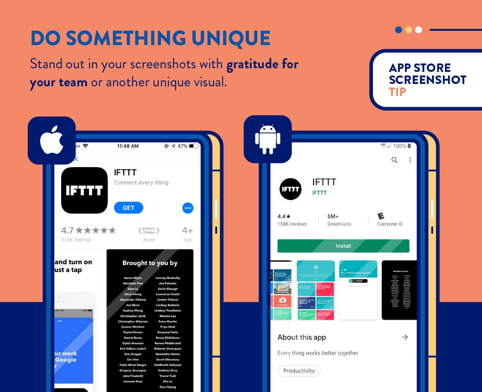
5. Feature Recognizable Content
If your app has a celebrity spokesman, public figurehead, well-circulated advertisement, or other recognizable content, it can be extremely beneficial to display this connection in your screenshots.
In the example below, Masterclass features the celebrity chef Gordon Ramsay among other famous celebrities that have released a masterclass. The Geico app features Martin, their long-time commercial star gecko. Both of these are likely to be recognized by, and resonate with, potential users. 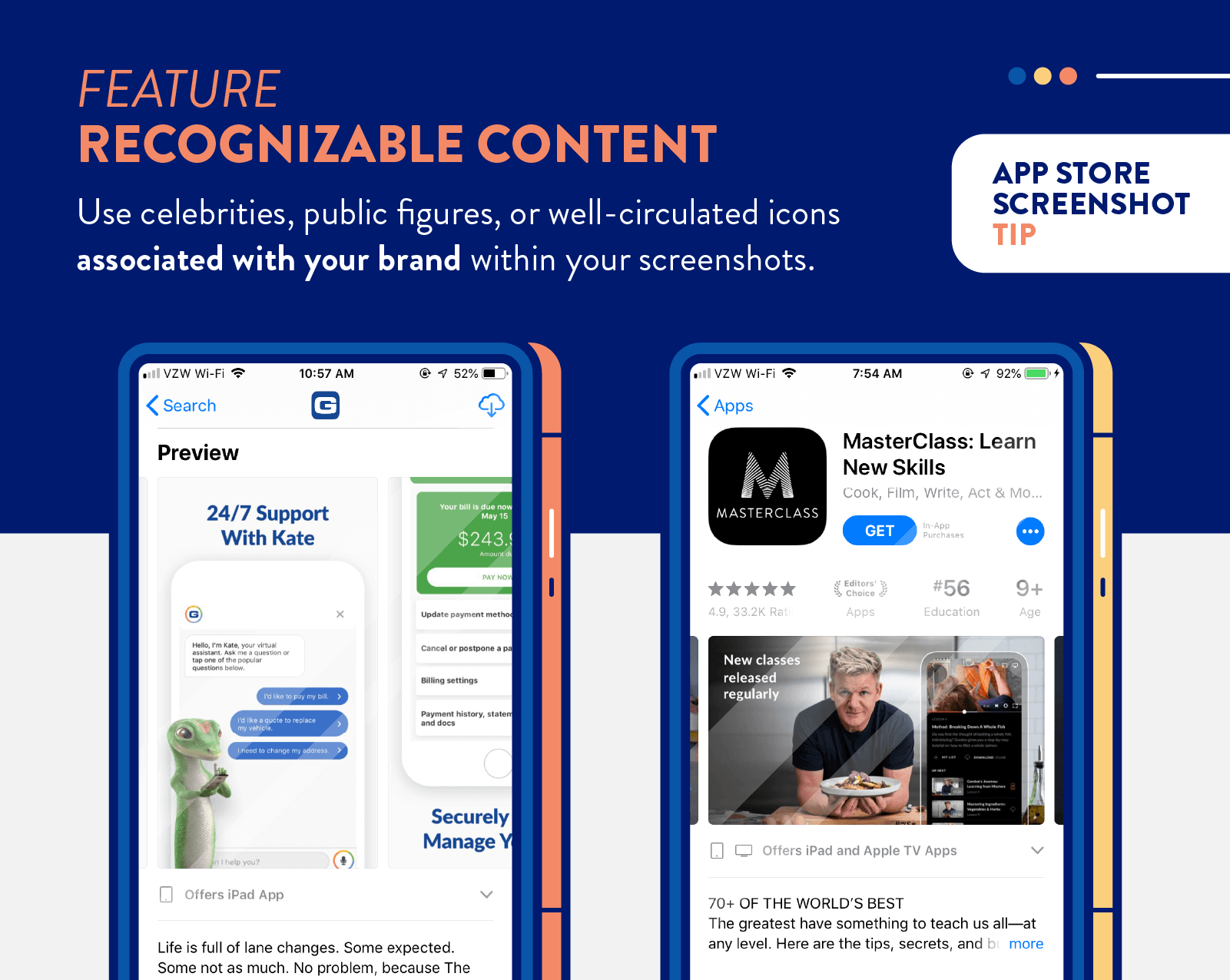
6. Use Your First Screenshots Wisely
Your first screenshot (or three) will be featured in the App Store search results. In the Google Play Store, however, screenshots are only shown when users navigate to your app listing from the search results.
The first screenshot is the most important, and in many cases is where app marketers choose to use an app preview video. Whether your app displays one or three initial visuals depends on whether you upload screenshots with landscape or portrait orientation.
Either way, you should use that initial real estate wisely. Consider this space your prime window placement to attract any and all passersby. Text should be concise and legible, given how small they are (especially in the Google Play Store).
In the example below, Bird Scooter uses the first three screenshots as an opportunity to advertise their value proposition, showing the app and visualizing how it can be used to find and share electric scooters. 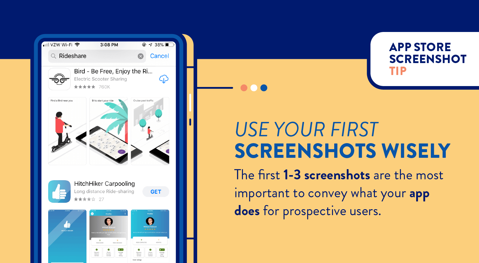
Compared to the HitchHiker Carpooling app below it, Bird’s screenshots have more surface level information. If both were shown to someone who had never heard of either app, it would likely be easier to figure out what the Bird app does compared to HitchHiker Carpooling.
7. Take Users Through the Journey
While it’s great to show users how your app looks, it’s even better to show them how your app works.
Understanding the user journey can be beneficial for a number of reasons (like trigger campaigns) but when considering your app preview, you can show prospective users how the app can benefit them.
McDonald’s does a great job of this. In their app preview, they showcase how users can order food, pay, and select the most convenient delivery or pick up method.
Optimizing Your App’s Screenshots and Beyond
Whether you are convinced app store screenshots can benefit your ASO strategy or not, it’s clear there are definitive strategies for improving this section of your app store listing.
The biggest challenge with user acquisition is the ability to quickly convey to users what your app does for them. Use screenshots effectively, and they might have their aha moment right then and there in the app store.
Once downloaded, the real challenge starts: retention. The promises made in your screenshots must now be fulfilled. Once your screenshots are perfected, you are ready for our book on customer retention. Check out our resources and sign up for a free demo of CleverTap’s intelligent mobile marketing platform.
See how today’s top brands use CleverTap to drive long-term growth and retention
Subharun Mukherjee 
Heads Cross-Functional Marketing.Expert in SaaS Product Marketing, CX & GTM strategies.
Free Customer Engagement Guides
Join our newsletter for actionable tips and proven strategies to grow your business and engage your customers.


