


Table of Contents
Categories
Most Popular


Mistakes happen. Sometimes your users did something wrong, other times it’s a bug in your app. Either way, a friction point within your app prevents your users from progressing forward and converting.
Although all apps strive to dodge these situations altogether, the apps who recover with humility and grace reduce the number of users who churn because of an error.
The point is, regardless of who’s at fault, how you handle the mishap in your app can influence your users’ decision to forgive or forget.
Enhancing App UX: 6 Error Message Tips
1. Think prevention
While all apps optimize their UI to minimize errors, there are ways you can prevent common mistakes from occurring before they happen.
For example, let’s say you require all new users to complete a profile when they download your app. Instead of alerting them that a password requires a certain number of characters and numbers after they type one in, let them know before they create one. That way, they can follow the rules from the beginning and not left frustrated that their password didn’t go through.
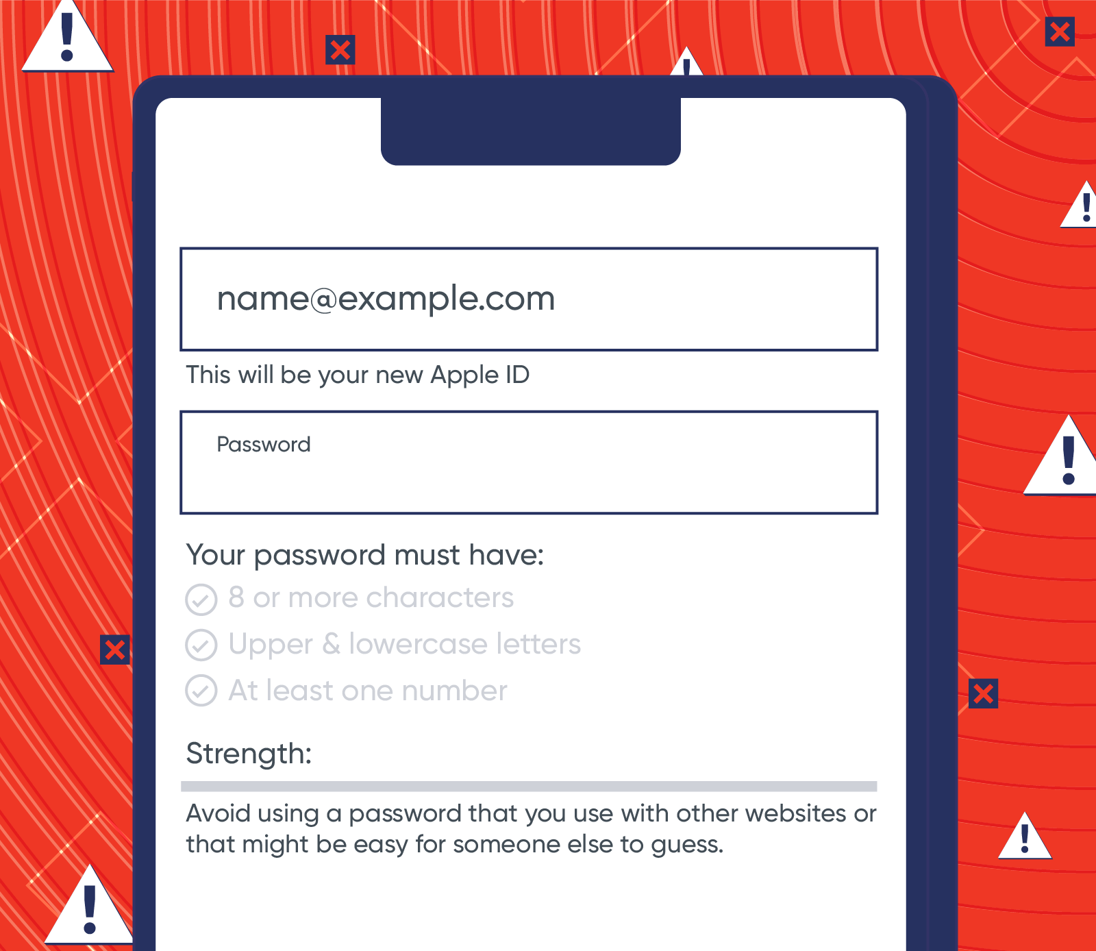
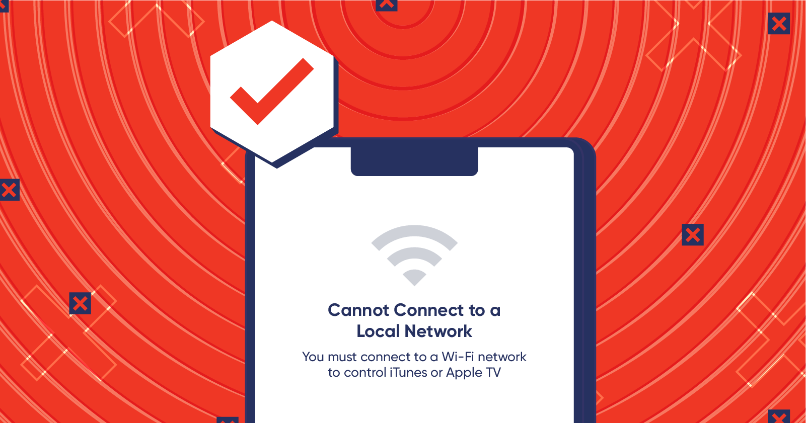
Not sure what common errors occur within your app? Flows help you understand how users are navigating your app — revealing what users do right before they churn. This can inform you of friction points you might not know exist within your app.
2. Provide a clear explanation & solution
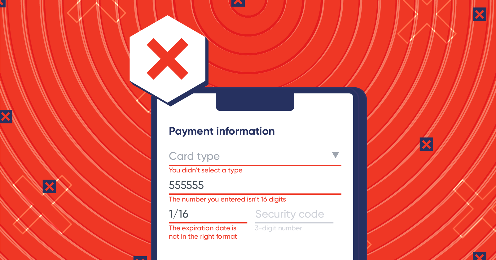
“Error” in big red letters with vague information on why it happened will only ignite frustration and anger in your users. If the user does not know what they did wrong, how do you expect them to fix it?
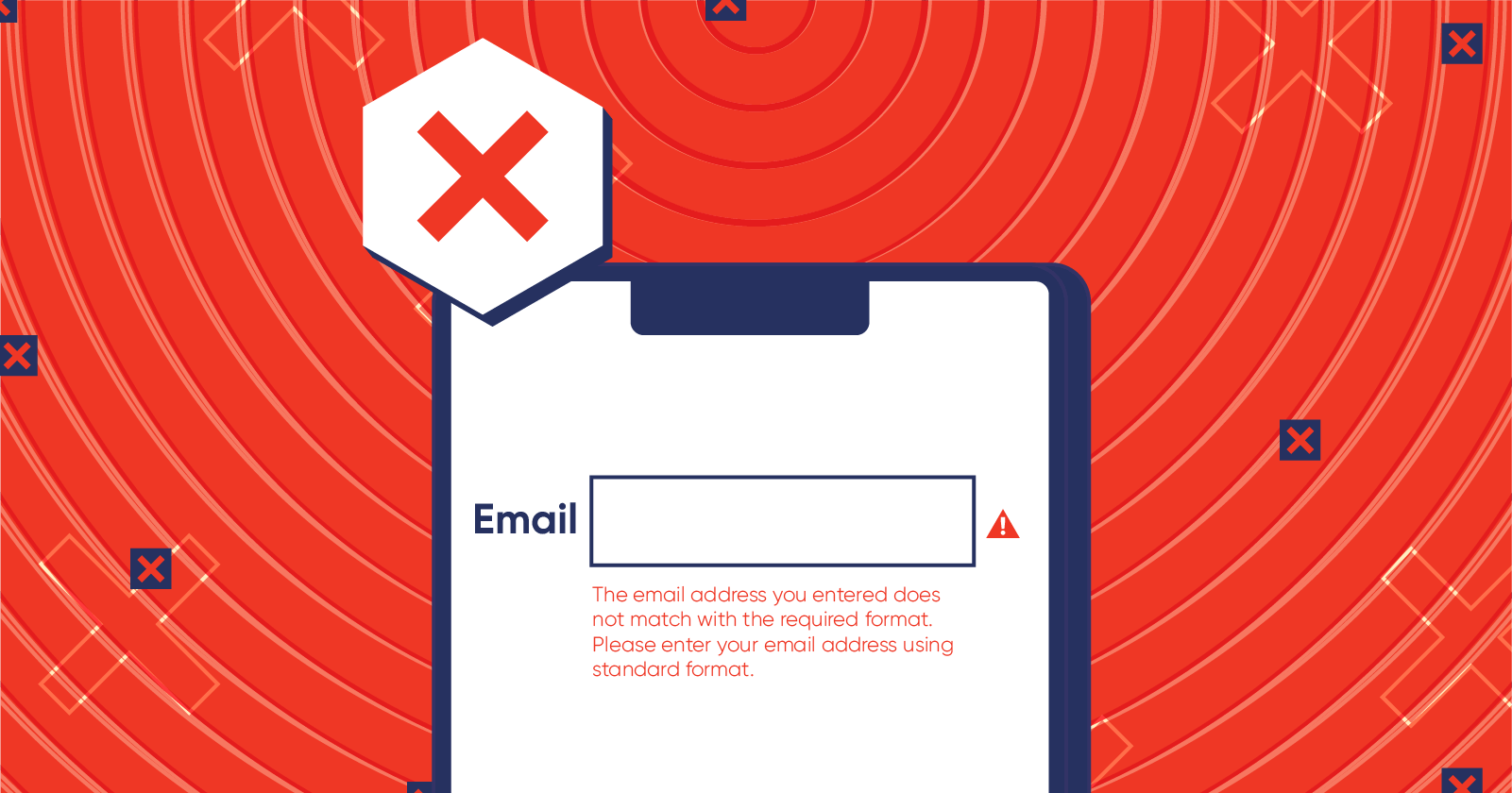
This message is way too long and ambiguous about why the entered email address did not work.
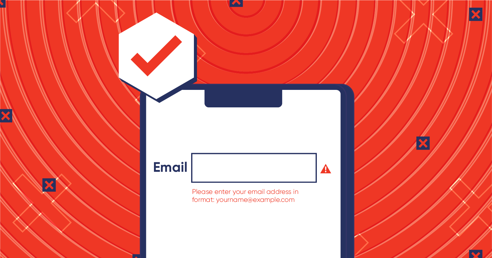
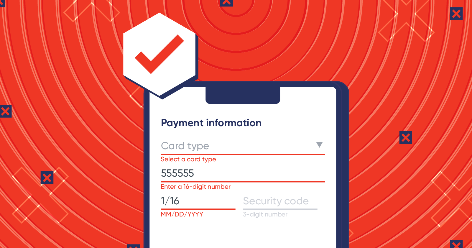
In the second example, both the explanation and solution are clear — allowing the user to quickly understand and fix what they did wrong.
3. Avoid fancy jargon
The user doesn’t care (and often doesn’t know) about the technical issues that caused the error. They’re just hoping for an easy way to fix it.
When you throw cryptic messages or fancy vocabulary at them, users only get confused and frustrated. If you must include a certain error message, direct the user to a troubleshooting page where you can provide a more technical explanation of what went wrong.
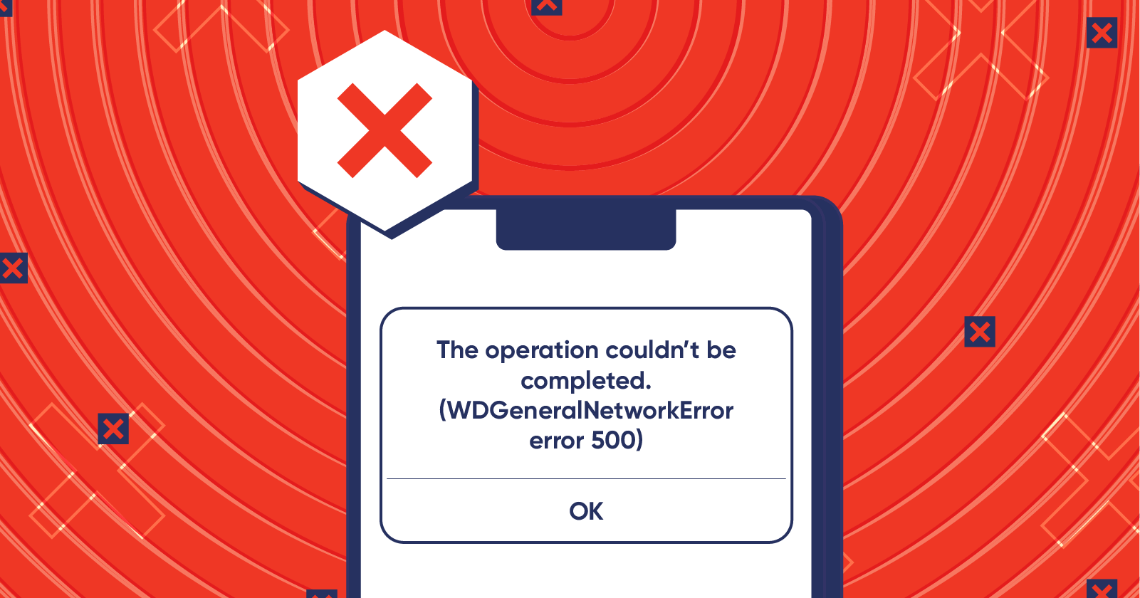
This technical jargon doesn’t mean anything to users. Nor does it help them resolve the issue.
Instead, simplify what went wrong and what can be done to fix it. Even if the user can’t resolve it right away, they feel better knowing what caused the error.
4. Don’t blame the user
There’s alerting the user to what they did wrong, then there’s blaming. Even if it was “user error” that led to the glitch, there are ways to word the message so it’s not perceived as an accusation.
A good way of brainstorming the right error message to use is to practice how you would explain it to someone. If you call them out by saying “you messed up” or “you didn’t fill it out properly,” you’ll most likely get a defensive response. Instead, think of a way to gracefully and humbly ask the user to do it differently.
This messaging points the finger at the user instead of politely telling them how to fix it.
In this version, the user is notified about how to fix the error without being blamed.
5. Use humor and imagery (when relevant)
Sometimes, making light of sticky situations can calm and delight your users when they hit a snag in your app. You can go a step further and communicate an error using text and illustrations that showcase your brand’s personality.
Humor should be contextual — meaning you don’t want to use it in every error encounter. For example, if a user has spent hours trying to upload photos into your app and suddenly your app crashes with an, “Oops, please try again!” and a sad cat illustration, this will only infuriate your users.
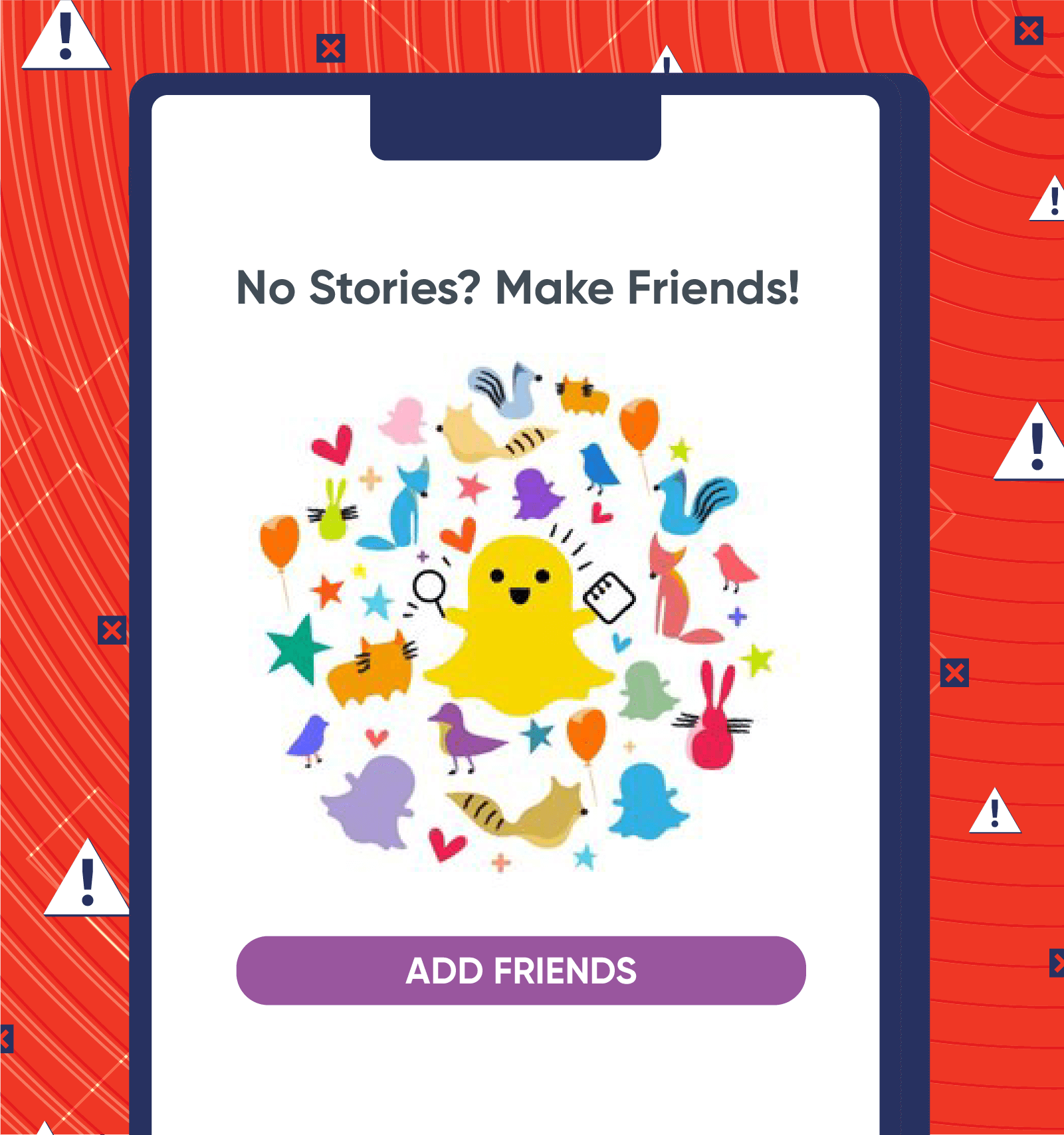
When a user runs into a snag in your app, what do they see? Snapchat found a visual and creative way to show users that in order to see stories, they need to make friends first. So when they stumble upon this empty page, they aren’t left wondering where to go.
6. Remain positive
Imagine you’re about to board a flight and you ask two different attendants if you could get upgraded to first class.
The first employee says: “Sorry, no. It costs extra to be seated in first class.”
The second employee says: “Absolutely! How would you like to pay for that?”
Both employees are essentially saying the same thing: it costs extra to be upgraded. But the second employee put a more positive spin on the response, which most likely garnered a more positive reaction.
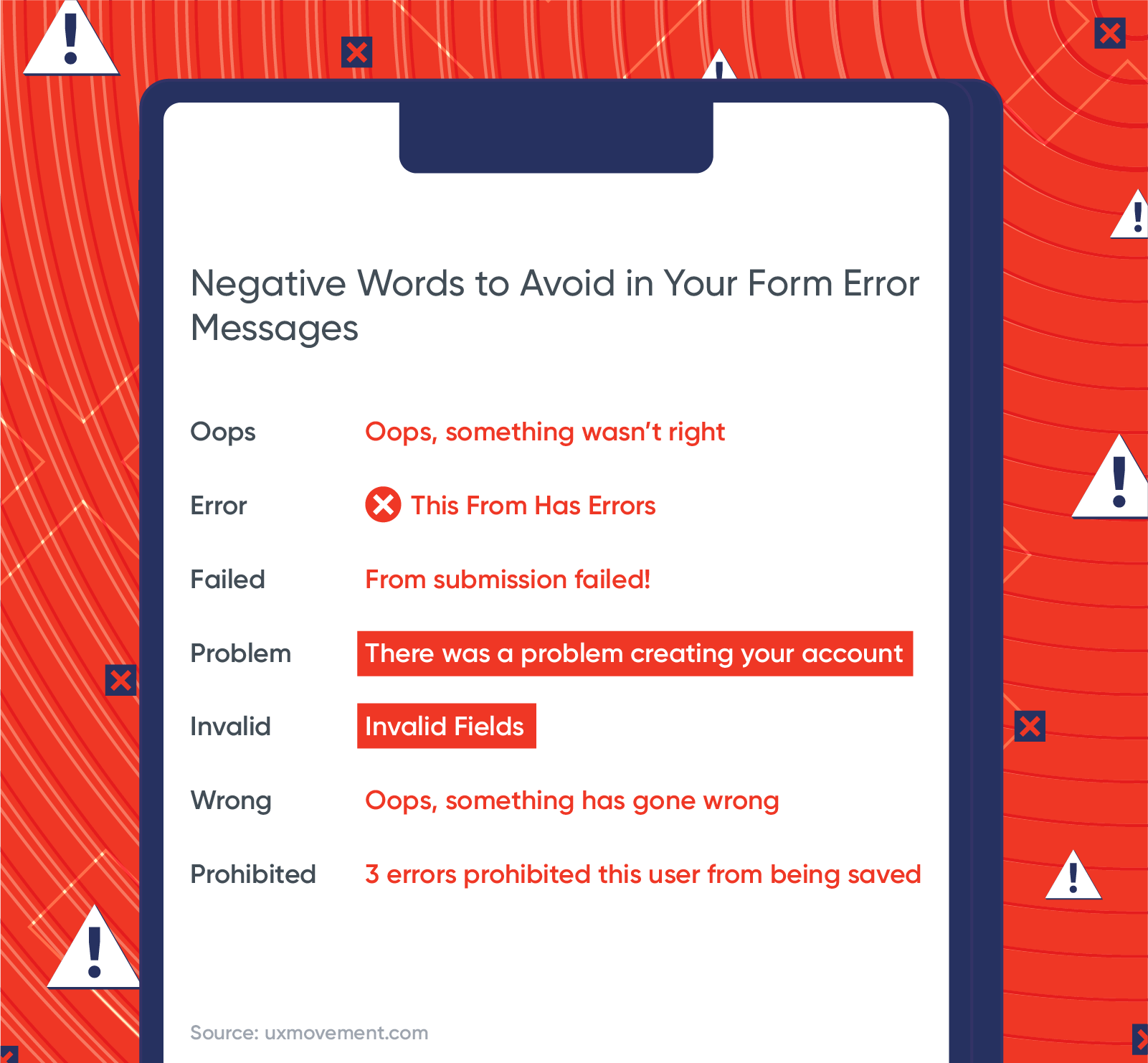
When you use negative words like “wrong” or “failed,” you’re eliciting a negative response from your users. These words trigger cortisol — a biomarker of psychological stress.1 That stress buildup can turn into anxiety and cause a user to give up.
Try adding a positive spin on your error messages. When I typed “Newwyork” into the Budget.com app, here’s the error page that popped up:
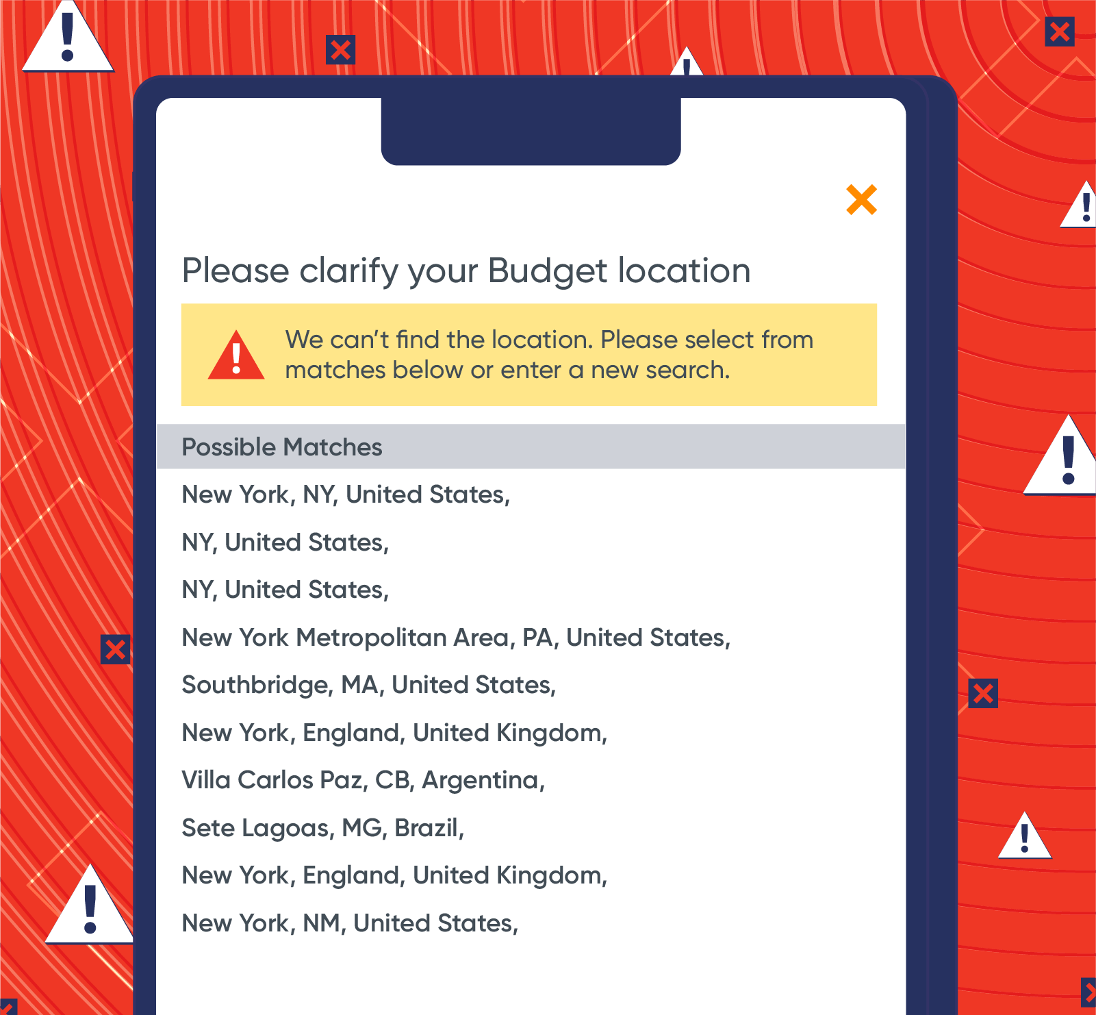
Instead of saying “Oops, that location does not exist,” they ask to clarify and offer suggestions on locations that are spelled in a similar way.
In addition to word usage, colors and text can also convey a negative tone. Use yellow or a muted red color instead of bright red and avoid using words in all caps. Language in bright red or all caps can elicit a negative and stress-inducing reaction from your users.
Error Messages Don’t Have to Be All Doom and Gloom
Of course, you want users to avoid errors at all costs. But don’t make it the end of the world when they run into one.
Adding personality and positivity to your error pages can help minimize your user’s frustration and get them back on the right track in no time.

The Mobile Copywriting Pocket Guide
Subharun Mukherjee 
Heads Cross-Functional Marketing.Expert in SaaS Product Marketing, CX & GTM strategies.
Free Customer Engagement Guides
Join our newsletter for actionable tips and proven strategies to grow your business and engage your customers.
