Finance + tech = an exciting, evolving industry that everyone is talking about in 2021. The further adoption of digital payments and increased demand from financial services to implement the latest technology has noticeably disrupted the once traditional financial ecosystem.
In the first two weeks of January 2021, Fintech startups recorded 10 deals worth $100 million or more, compared to three in the same period in 2020.* In a single week, more than $1.7 billion in Fintech startup funding was announced.
There is no need to refresh your browser because you read that right: $1.7 billion in funding in a single week. This enormous investment had our team – and apparently the whole world – talking, so we decided to dig a little deeper to try and answer the question that is likely on every mind: what makes a great Fintech app?
Through in-depth analysis, this post outlines the winners of key categories: App Store optimization, user retention, key features, and colors/logos. We uncovered some fascinating takeaways and learned even more about the world of Fintech. Don’t miss our infographic that visualizes all the essential information and takeaways.
App Store Optimization
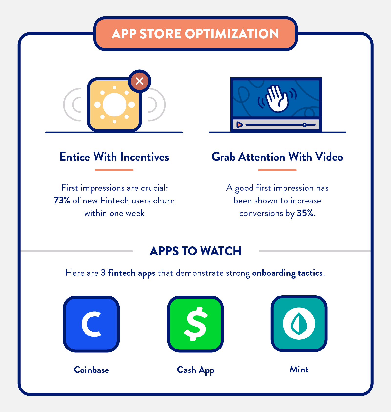 First impressions are crucial, especially since 73% of new Fintech users churn within one week.
As of February 2021, there were 10,605 Fintech startups in the Americas*, and that number is only growing. It’s even more important to create a user-friendly, memorable onboarding experience that extends not only a warm welcome, but showcases the benefits that the app offers users. Here are three Fintech apps that present a strong approach to App Store optimization.
Incentives, Colors, and Videos: First Impressions are Everything
Important stat: A good First Impression has been shown to increase conversions by 35%*
Example: Coinbase
Number of users: 43M+
Number of App Store Ratings: 1.1M
App Rating Average 4.7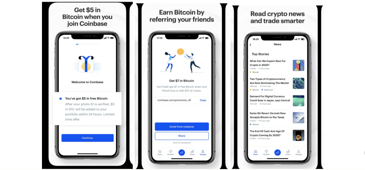
What They Got Right: When we talk about that First Impression, it’s about those first few seconds when a visitor takes in your page on the App Store. For a potential Coinbase user, it’s clear that downloading the app will earn you a number of benefits:
- $5 in Bitcoin when you join
- A referral program to earn Bitcoin for you and a friend
- A dedicated news feed to help you stay on top of crypto news
This established app is regularly cited as one of the best cryptocurrency apps for beginners, and a simple, easy-to-follow approach carries over into the sign-up process as well.
There are no bells and whistles after you download the app. New users are asked to create an account with topline information (e.g. full name, email address and password). From there, new users receive an email prompt to verify details and the account is set up. 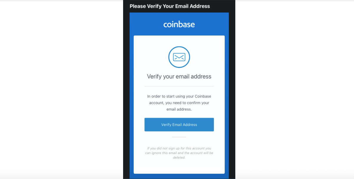
Key Takeaway: Show prospective users how they will benefit from your app at every stage. Coinbase lets its users know immediately that the incentives don’t start and stop at the onboarding stage. Users will appreciate knowing about these in-app extras – a sign-up reward, a friend referral program, and an up-to-date industry news feed — upfront.
Example: Cash App
Number of users: 3 million made bitcoin transactions in 2020
Number of App Store Ratings: 1.7M
App Rating Average: 4.7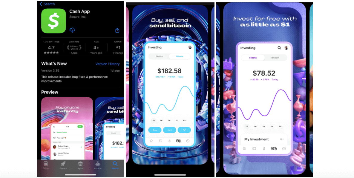
What They Got Right: Just because you’re in Fintech doesn’t mean your branding has to play it safe, and Cash App is a great example of this mantra. When you visit Cash App’s dedicated Bitcoin* landing page, users are treated to a story called ‘The Legend of Satoshi Nakamoto’ – the presumed inventor of Bitcoin. The colors used within the story are bold and dynamic and as you scroll to the bottom, users see a clear call-to-action to download the app and start their own epic Bitcoin story.
Each image within the App Store preview does a great job showcasing the app’s features and incorporating that vibrant color palette. It’s no surprise that the logo is green — the color of money, growth, and health — as well as blue which represents trust, strength, and dependability. You can find out more about the science behind colors in this great ”Color Emotion Guide” from Good Barber*.
Key Takeaway: Cash App utilized the power of green for their logo but embraced a wide range of colors for the actual app interface. A/B testing is a great way to analyze how users — existing and prospective — feel about your proposed color palettes. While blue and green are popular primary colors within Fintech, don’t be afraid to experiment.
Example: Mint
Number of users: 24M
Number of App Store Ratings: 656K
App Rating Average 4.8
What They Got Right: One of the things that stands out in their App Store listing is a useful video that offers prospective users a 30-second snapshot of the app’s features and USPs. In half a minute, a user knows that Mint is designed to help them track spending and cash flow, spend smarter, create custom budgets, and set spending and saving goals.
Using mock data, the video shows prospective users how the app is valuable and will provide an easy-to-use platform to manage financial habits and goals. App demos are great for quickly educating users and helping them become familiar with the user interface. Acquisition might be a small piece of the onboarding pie, but it’s a very important one.
Key Takeaway: Create a 30-second demo video to give users everything they need to make an informed decision before downloading. You may know everything about the app, but think like a brand new user when creating this video. Don’t overwhelm users with too much information: only show key features and focus on benefits.
User Retention
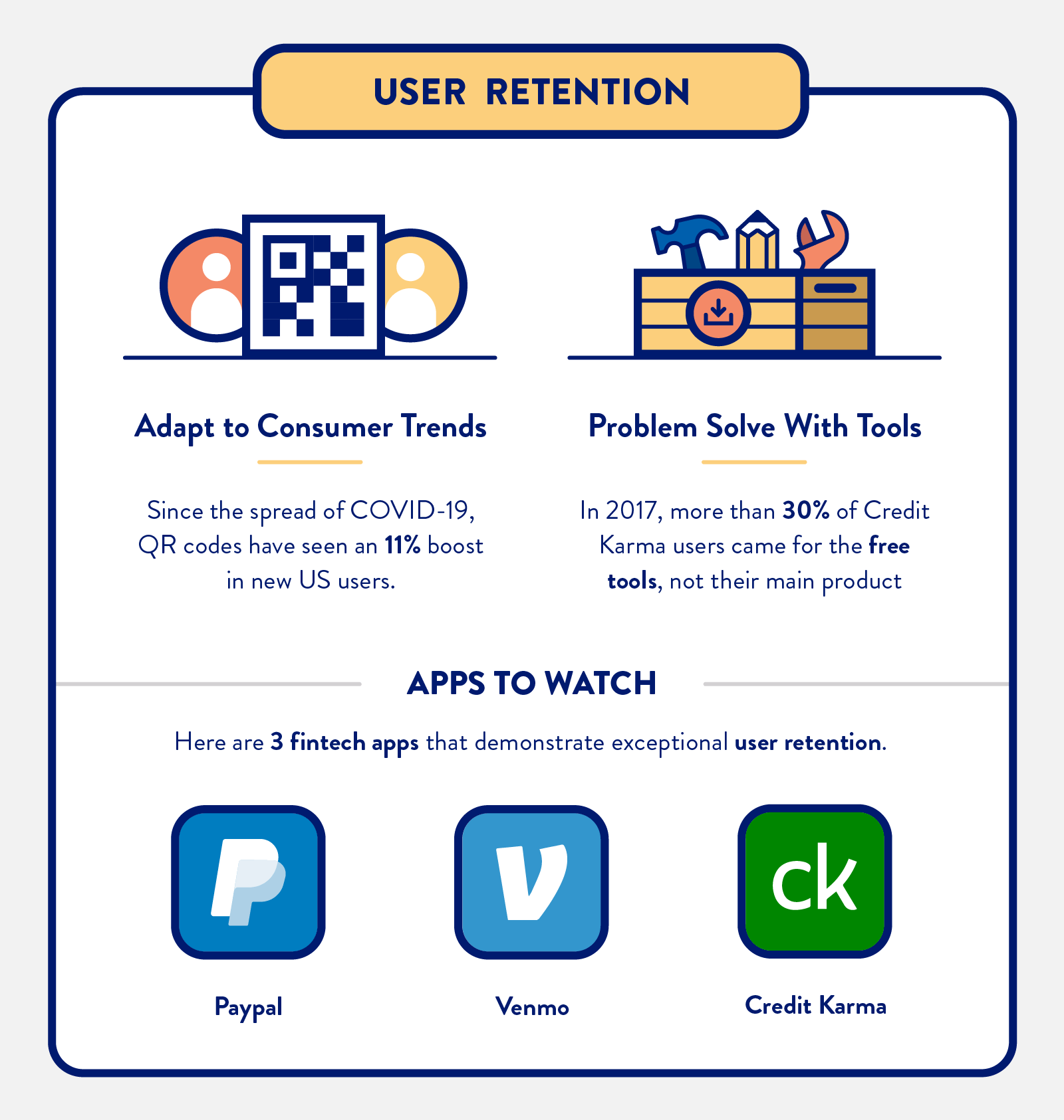
In our Complete Guide to Customer Retention for Fintech Apps, we highlight that 73% of new users churn within one week. If three-quarters or your hard-won new users churn after only seven days, your ROI is going to suffer. Take a look at these three Fintech apps that are winning when it comes to user retention techniques.
Two Steps Ahead of the Mobile Payment Curve – The Demand is Real
Important stat: Since the onset of lockdown restrictions, 65% of Americans now say they use at least one fintech app or platform*
Example: PayPal
Number of users: 377 M
Number of App Store Ratings: 4.9M
App Rating Average 4.8
Images credit: PayPal
In February 2021, PayPal set an ambitious target: 750 million active accounts by 2025. Their plan to achieve this goal: become a “super-app.” This one-stop app approach might seem like a steep climb, but 2020 was a significant growth year for PayPal: on both the customer and merchant side, the online payment service saw 67.4 million customer additions and 5.3 million merchants joining its platform*.
What They Got Right: PayPal’s commitment to its users is evident by the rollout of new features, including its Buy Now, Pay Later (BNPL) service and cryptocurrency trading. Rather than wait around for the status quo to return, PayPal proactively adapted to new consumer behavior and introduced new features. Increased engagement = a reduction in churn.
What’s more, PayPal has already seen ROI from the cryptocurrency trading option they launched in November 2020. In a recent investor update, PayPal confirmed that customers who purchase cryptocurrency have been logging into PayPal twice as frequently as they did prior to purchasing cryptocurrency*.
Key Takeaway: It can be tempting to stay within your comfort zone, but success means staying ahead of the curve. Pay close attention to Fintech industry trends, what leading apps are rolling out, and, of course, your own app users.
Hands Down: Contactless Transactions are Here to Stay
Important stat: Since the spread of COVID-19, QR codes have seen an 11% boost in new US users.*
Example: Venmo
Number of users: 60M+
Number of App Store Ratings: 11M
App Rating Average 4.9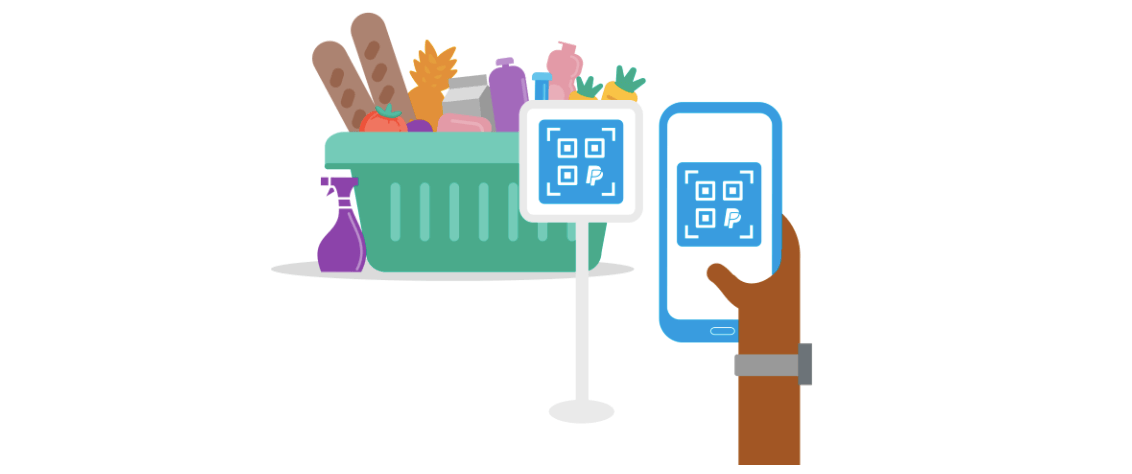
Source: Venmo
What They Got Right: In October 2020, Venmo introduced its first credit card and the front was stamped with a QR code. A month later, Venmo introduced QR Code touch-free payment technology in CVS stores.
This example of Venmo monitoring consumer behavior and acting on it showcases why the app is a frontrunner for user retention success. Although QR codes aren’t a new technology, they’re still not completely adopted by American users. However, the advent of peer-to-peer payment apps has been expedited by the pandemic and consumers responded as a result. Over a quarter (27%) of customers experimented with QR codes payment during COVID*.
Key Takeaway: Successful retention requires a deep understanding of your customers. Collect and learn from behavioral data as well as regularly ask for user feedback.
Free Tools Can Attract Millions of Users
Important stat: In 2017, more than 30% of Credit Karma users came for the free tools, not its main product: short-term loans.
Example: Credit Karma
Number of users: 100M+
Number of App Store Ratings: 3.3M
App Rating Average 4.9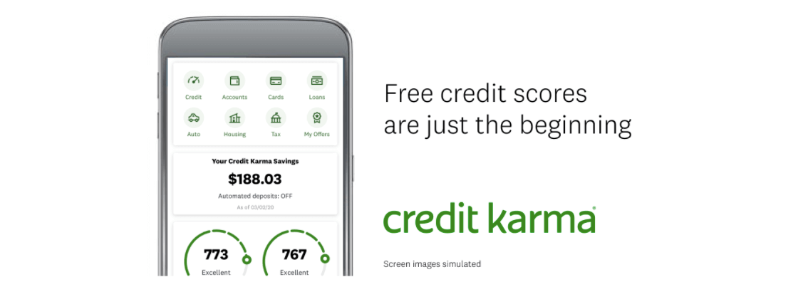
Image credit: Credit Karma
What They Got Right: In 2017, more than 30% of Credit Karma users came for free tools such as the Debt Repayment Calculator and the Credit Score Simulator. These tools built up credibility over time, and even four years later, this retention success story still stands out.
When you Google “Debt Repayment Calculator” or “Credit Score Simulator,” Credit Karma ranks number one for both. This happened because of two things: Credit Karma invested in these tools from the beginning, and free solution-driven tools offer tremendous value to users.
By answering questions that a large number of consumers have about their finances and showing examples of how the full product adds value, Credit Karma successfully brought in 5M monthly visitors from Google in 2017.
The number of users and time they spend using these tools add up over time, which ultimately leads to an increase in credibility and potential upsells. By demonstrating value through the free tools, while also highlighting the tools users can unlock by becoming a full Credit Karma user, they offer users the best of both worlds: answering basic financial questions while also showcasing the added value of the full app experience.
Key Takeaway: Identify pain points and problems that your users have and address them with tools, resources, content, and services within your app. Not every tool can be free but if you demonstrate value immediately and align with relevant search trends, users won’t think twice about paying.
Features
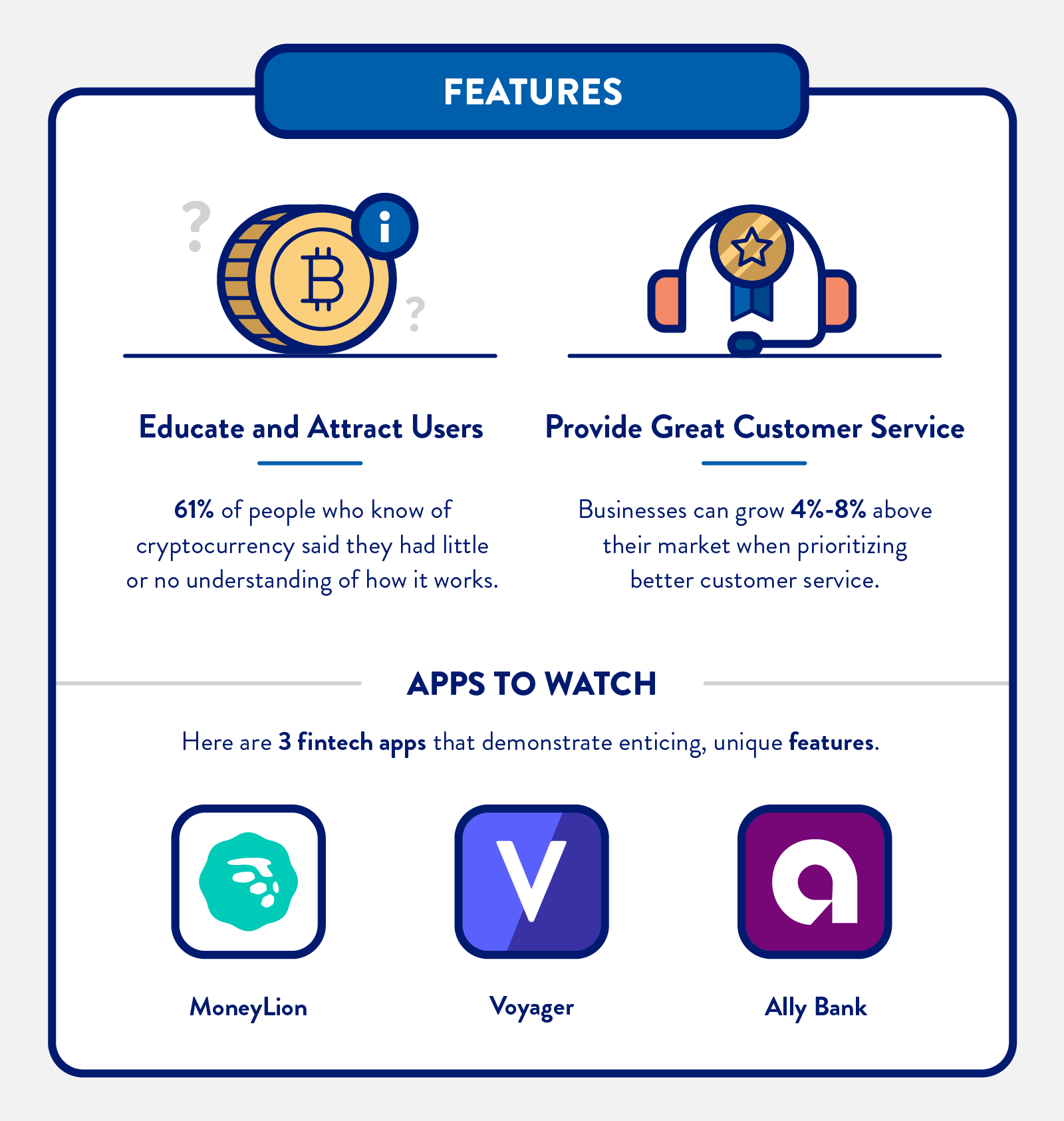
Here’s a prediction worth remembering: the value of the Global Fintech Market is expected to reach around $305 billion by 2025*. With exciting trends such as AI, partnerships between digital and traditional banks, as well as digital-only banking, it’s no wonder that 2021 has app developers, investors, and consumers buzzing.
However, although the evolution of Fintech apps will soon have even more technology for users to enjoy, there is still an underlying trust issue that exists. Most (85%) Americans are taking advantage of online banking at least some of the time, while 25% are using online banking exclusively. The catch: 13% say they don’t trust their banking app*.
These three apps stood out for being transparent, forward-thinking with educational resources, and essential to their users.
Impress with features and fees transparency
Important stat: Lack of product/cost transparency is the #1 contributor to the decrease in trust of financial services*
Example: MoneyLion
Number of users: 7.5M
Number of App Store Ratings: 69K
App Rating Average 4.7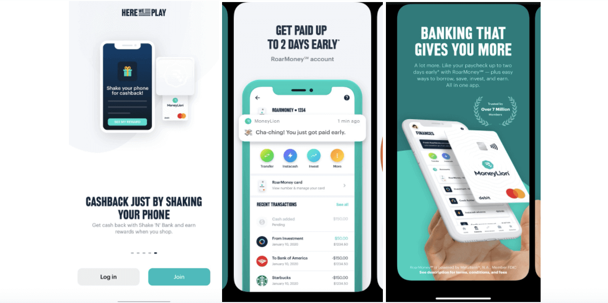
What They Got Right: Two words: RoarMoney, a new demand deposit account. Since it launched in July 2020, RoarMoney has made noise within the Fintech industry.
Here’s what you get as a RoarMoney account holder: a virtual debit card and a Mastercard Tap & Go contactless card. The contactless card comes with a price protection plan that will refund users up to $250 if they find a lower price within 90 days.
Two features within the app that stood out:
- Shake ‘N’ Bank: Users can earn cashback simply by shaking their phones. An amount from one cent to $120 randomly shows up. The reward is invested into the consumer’s MoneyLion investment account.
- Early Payday: Users can get paid two days early and benefit from 0% APR cash advances up to $250 after direct deposits are set up with RoarMoney.
MoneyLion has created a mighty tool with RoarMoney. Not only do users have access to cool features, but they also have exclusive access to the Mastercard network of benefits and products. The neobank is honoring its commitment to value and fee transparency. Priced at $1 a month, RoarMoney has no account minimums and no fees for its standard service.
Key Takeaway: While you highlight the benefits and USPs of your app, explain the total cost of ownership so users aren’t hit with surprises. Offer a quantitative explanation of how the app adds value to their lives. Every penny and minute counts.
App Users Still Need Lessons in the Basics
Important stat: 61% of people who had heard of cryptocurrency coins said they had little or no understanding of how they work.*
Example: Voyager
Number of users: 10M
Number of App Store Ratings: 26K
App Rating Average 4.8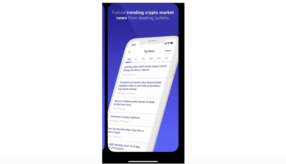
Image credit: Voyager
What They Got Right: Designed with intermediate traders in mind, Voyager is a comprehensive exchange app that offers its users simple trades and intuitive investing. However, it’s the education features that are noteworthy, proving that even intermediate traders can benefit from lessons in cryptocurrency.
- A real-time newsfeed: Voyager’s newsfeed offers users holistic, up-to-the-minute market information as well as news that is specific to the tokens and coins that each user has in their portfolio.
- An integrated profit and loss calculator: This feature helps users track balances more effectively, especially those who have a wide range of assets and want to see how their investments are performing.
- NODE by Voyager: Although Voyager’s blog is not technically part of the app, it’s definitely a feature worth highlighting. An impressive database of informative, educational, and straightforward posts on everything from how to buy a particular coin/token to crypto scams and how to avoid them.
Key Takeaway: Remember that your users download your app with different objectives and levels of knowledge. If your app mostly serves advanced users, it’s still beneficial to offer educational resources that offer a “refresher” course in various topics. Additionally, identify opportunities where you can attract beginners with similar resources. Bottom line: design your app to be user-friendly for all levels of users.
You Can’t Serve Customers without Prioritizing Customer Service
Important stat: Businesses can grow revenues between 4% and 8% above their market when they prioritize better customer service experiences.*
Example: Ally Bank
Number of users: 2.25 million total deposits
Number of App Store Ratings: 31K
App Rating Average 4.7
What They Got Right: You’ve probably heard of Ally Bank. But have you heard of Ally Bank Lab? This innovation lab launched in 2018 and is made up of a small team from different areas of expertise who work on special projects. One example: when Ally Bank is working on a new product or service, they send representatives out to talk to customers and non-customers about their financial plans and gather feedback that helps inform their progress.
This approach to customer service means that Ally Bank can confidently roll out app features that they know customers (and non-customers) are interested in. Here are two features that address pain points and provide valuable solutions.
- Buckets: Users can select 10 savings goals in a single savings account. They are essentially digital envelopes and you can have different categories/goals without the need for multiple accounts or tricky calculations. You also earn interest on the total balance of your account.
- Boosters: Rather than just offer tips on how to save, the Boosters feature facilitates your saving goals. Surprise Savings analyzes your spending to identify areas where you could be saving more. If you like your checking account, it will automatically transfer money (amounts under $100 and no more than 3x a week) into your savings account. Additionally, you can set up recurring transfers.
Key Takeaway: Customer service is not a feature or add-on within your app. It’s crucial to success at any level. Think outside the box when it comes to how you can better serve your customers. Whether it’s addressing pain points, commissioning surveys, hosting virtual focus groups, or a combination of all three, your customers rate all aspects of the app experience — especially customer service.
Marketing
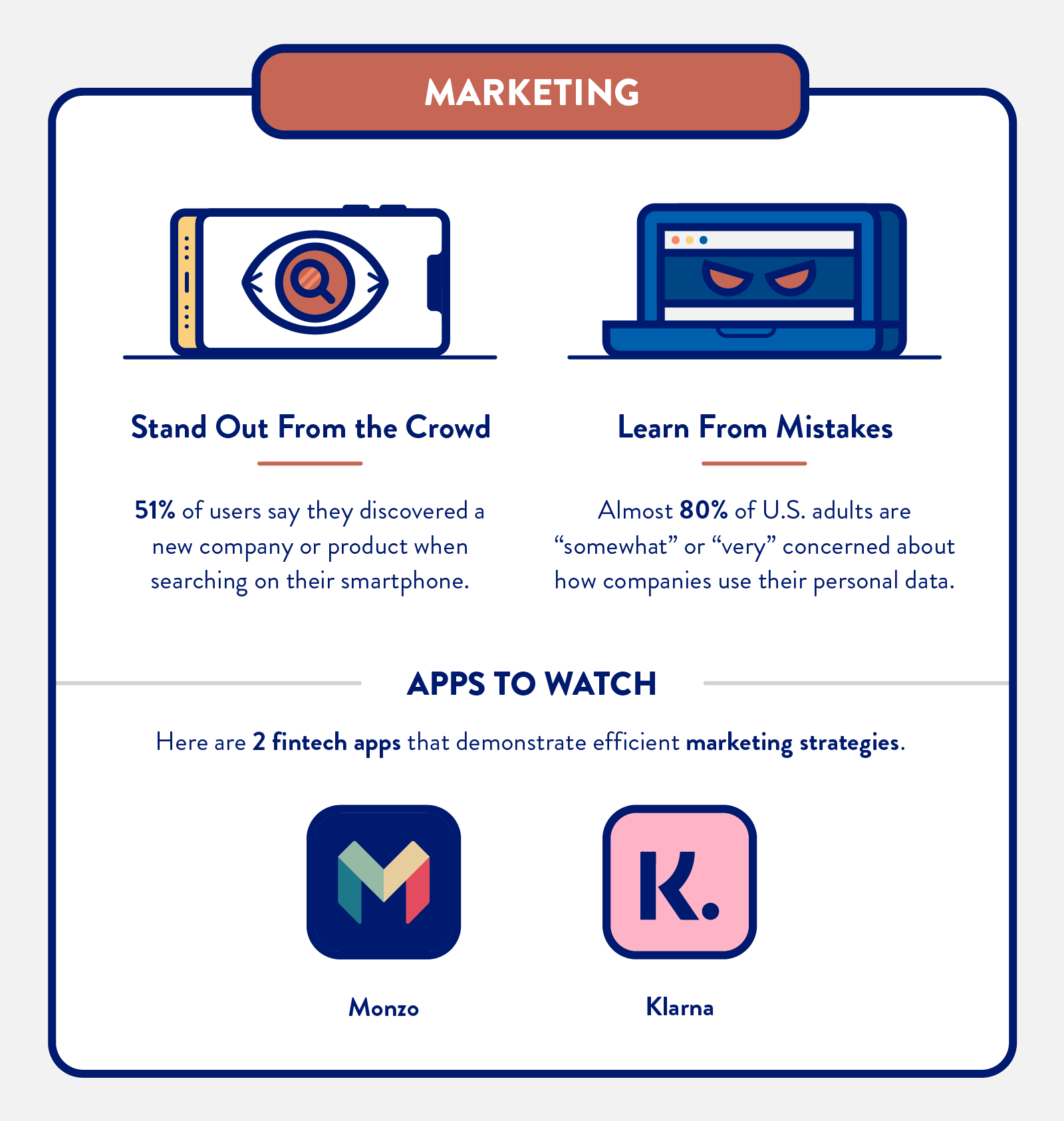
How do you market a Fintech app?* On a global level, consumers accessed finance apps more than a trillion times in 2019, conversion costs dropped by over 76%, and registration rates rose by more than 71% compared to the previous year.* This proves that the demand is there, but what are the key pillars for marketing a Fintech app in 2021?
Here are three apps with impressive marketing campaigns that ultimately led to growth and attention from industry stakeholders, competitors, and customers.
Millions of Reasons to Market Innovatively and Intelligently
Important stat: 51% of users say they discovered a new company or product when conducting a search on their smartphone*
Example: Monzo
Number of users: U.S. data not available but five million customers (in total)
Number of App Store Ratings: 175
App Rating Average 4.7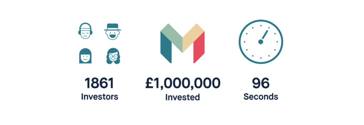 Image credit: Monzo
What They Got Right: UK-based neobank Monzo is a great example of standout marketing that other brands can learn from. Here are the highlights:
- Cultivate Your Community: Since Day One, building a community has been the backbone for Monzo’s marketing strategy. Originally starting out as a prepaid card in 2015 (under the name Mondo), Monzo set a record in its first year by raising £1m ($1.5M) in just 96 seconds via Crowdcube.

Another great example: the Community Forum* which both employees and customers contribute to. It’s an active platform where customers can help generate new product ideas by sharing feedback with the brand. Customer loyalty and advocacy at its best.
- Know Your Audience: Monzo successfully raised the funds but they also did something else: capitalized on consumer dissatisfaction with mainstream banks. This was particularly true for Millennials. In 2015, when Monzo launched as a prepaid card, data from the Millennial Disruption Index* revealed that 71% of millennial consumers would rather go to the dentist than listen to banks’ marketing messaging. The promise from Monzo: a more transparent, social banking experience that aligned with where Millennials were financially and in life. Build an audience + launch innovative and intelligent campaigns = success
- Create a Wallet-Friendly Product: The neon, coral-colored bank card looks miles different from traditional banking cards but the company never stopped treating its card as a key marketing asset. In 2020, it introduced a holographic card — an exclusive for Monzo Plus account holders — ensuring that FOMO (fear of missing out) would attract more customers.
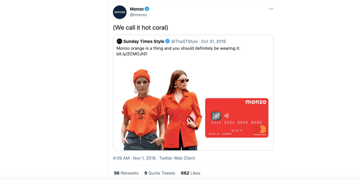
Key Takeaway: Your app will always have competition but that should inspire you to be even more innovative and disruptive. Don’t just talk about your USPs. Show your audience that your app and product helps them stand out from the crowd. Thinking intelligently and innovatively doesn’t start and stop at the R&D stage.
Be Responsible with Customer Data
Important stat: Almost 80% of U.S. adults are “somewhat” or “very” concerned about how companies use their personal data*
Example: Klarna
Number of users: 3.5M monthly active users
Number of App Store Ratings: 269K
App Rating Average 4.8
What They Got Right: The BNPL (Buy Now, Pay Later) phenomenon, led by Klarna, has reached American consumers: more than one-third of U.S. consumers have used a BNPL service*.
However, our reason for including Klarna in this list is to talk about a marketing misstep that we believe Fintech brands can learn from. In October 2020, a number of consumers went to Twitter to complain about receiving Klarna’s newsletter despite never using their service. Klarna owned up to the mistake — said it was a ‘human error’ and posted an apology on its website*.
The biggest question from affected consumers: where did you get my data?
Klarna’s response:
“The email was sent to Klarna consumers who have recently used one of Klarna’s products or services including Klarna’s checkout technology. When you use Klarna you agree to our terms and conditions and our privacy notice.”
The bottom line: People do not always read T&Cs or privacy notices. In fact, research from York University found that a quarter of respondents hit “join” to sign up for a fictitious social network despite the terms requiring them to give up their firstborn child and stating their data would be shared with the NSA*.
Key Takeaway: Be responsible with customer’s data. You have to earn a customer’s trust and this means being transparent about things like permissions and personal data and how those things are used in your app’s marketing campaigns.You should also always give customers the opportunity to opt in and out.
Key Takeaways
As the Fintech industry becomes more crowded, your brand can’t just exist. It must serve as a strong foundation for customers — existing and prospective — to ensure that the customer experience is memorable and valuable. Onboarding + user retention + features + marketing = Fintech success. It all adds up.
Methodology
These 11 apps were selected based on multiple references in online articles and their positions in the App Store. All data from the App Store was correct as of March 2021.
Metrics That Matter for Growth: A Handbook for Mobile Marketers
Subharun Mukherjee 
Heads Cross-Functional Marketing.Expert in SaaS Product Marketing, CX & GTM strategies.
Free Customer Engagement Guides
Join our newsletter for actionable tips and proven strategies to grow your business and engage your customers.

