


Table of Contents
Categories
Most Popular


Brands constantly battle for attention.
When consumers spend most of their free time digitally, this battle moves to their screens. For example, you’re reading an article when suddenly a push notification prompts you to add money to your savings account to avoid a fine.
Your attention quickly goes to the notification, driving your action. In the same way, different fintech marketing campaigns help you compete for attention and win it to convey the message.
This article will discuss the best fintech marketing campaigns, which have set the bar high. Before we go further, let’s touch base on what really makes a fintech campaign impactful.
What Makes a Fintech Marketing Campaign Stand Out?
Here are some traits of fintech marketing campaigns that make them truly stand out in impact:
High Customer Acquisition Rates
A successful campaign brings in new users at a lower cost. According to First Page Sage, fintech’s average customer acquisition cost (CAC) is $202 per consumer, depending on the product. Here’s an overview of CAC in all Fintech categories:
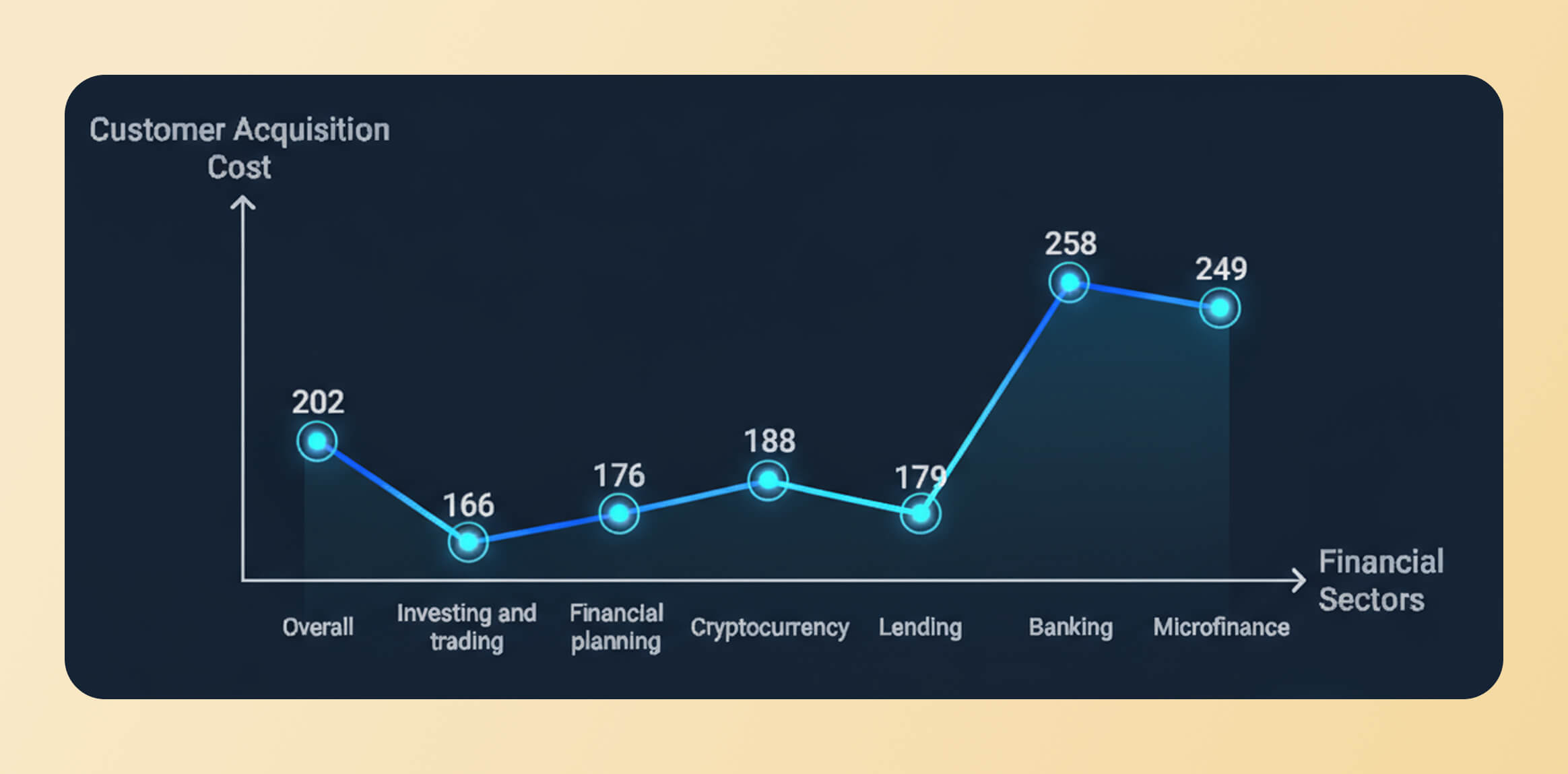
Source: First Page Sage
When you have a high rate of customer acquisition, it means the dollars you invest in marketing are bringing in ROI, which essentially reflects the relevance of the marketing campaign.
Strong App Engagement
Getting downloads isn’t enough. Users need to stick around and engage. Impactful fintech marketing campaigns usually have a strong app engagement. The more users engage, the likelier they’re to retain.
Several fintech businesses use personalization in their marketing campaigns to increase engagement. They employ real-time analytics to understand user behavior and trigger engagement campaigns.
Paysend, a fintech disruptor, saw a 22% increase in weekly registration and a 10% increase in CTR. This shows that app engagement shows impact and takes users toward bottom-of-the-funnel metrics that talk primarily about conversions.
Discover why CleverTap is a Leader in the 2026 Gartner® Magic Quadrant™ for Personalization Engines. Get the full report.
Improved Trust Metrics
Trust is everything in fintech. Without it, users won’t transact.
Using security certification or customer testimonials in your fintech marketing automatically builds trust in your brand. This trust improves the sign-up intent and encourages users to perform the desired action.
Chime, a San Francisco-based fintech company, has a dedicated landing page conveying its trust and safety approach.
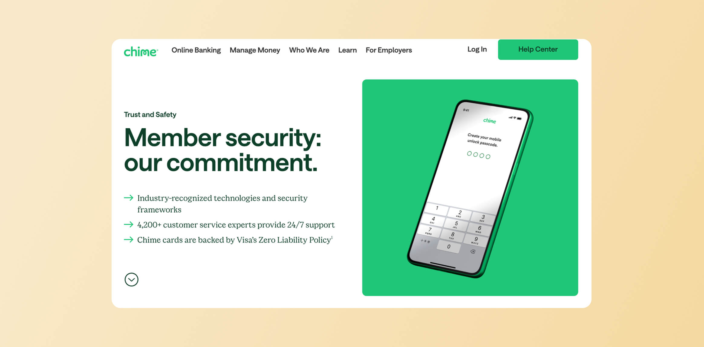
Source: Chime
This is helpful for the user to get information on how the brand is protecting their data. Since technology is a big part of fintech, conveying trust with technicalities of security and privacy becomes impactful marketing.
Learn how you can build trust in your fintech app.
Better Push Notification CTRs
This means that your brand is doing well in fintech marketing since push messages drive action only when relevant. The average CTR for fintech push notifications is 2.25%, but personalized messages can push this to 5% and above.
If you’re seeing a decent CTR or above the average, that’s a reason to celebrate your marketing strategy. If not, you can use different techniques to optimize your push notifications’ CTRs.
Learn more about banking push notifications and how they help improve engagement and loyalty.
Fintech Marketing Campaigns: 15 Examples to Inspire Your Strategy
Below are the top fintech marketing campaigns to spark creativity in your marketing game.
1. Niyo: Fine-Tuning Customer Engagement In Real Time
Niyo, a fintech startup, uses omnichannel campaigns and journey automation to ensure the customer experience is tailored to the buyer’s journey. The Niyo team used CleverTap to visualize the audience’s journey and draw insights to make data-led improvements.
With this personalized customer engagement, Niyo makes its marketing customer-focused and data-driven. As a result, they see a substantial impact on the metrics they care about, for example:
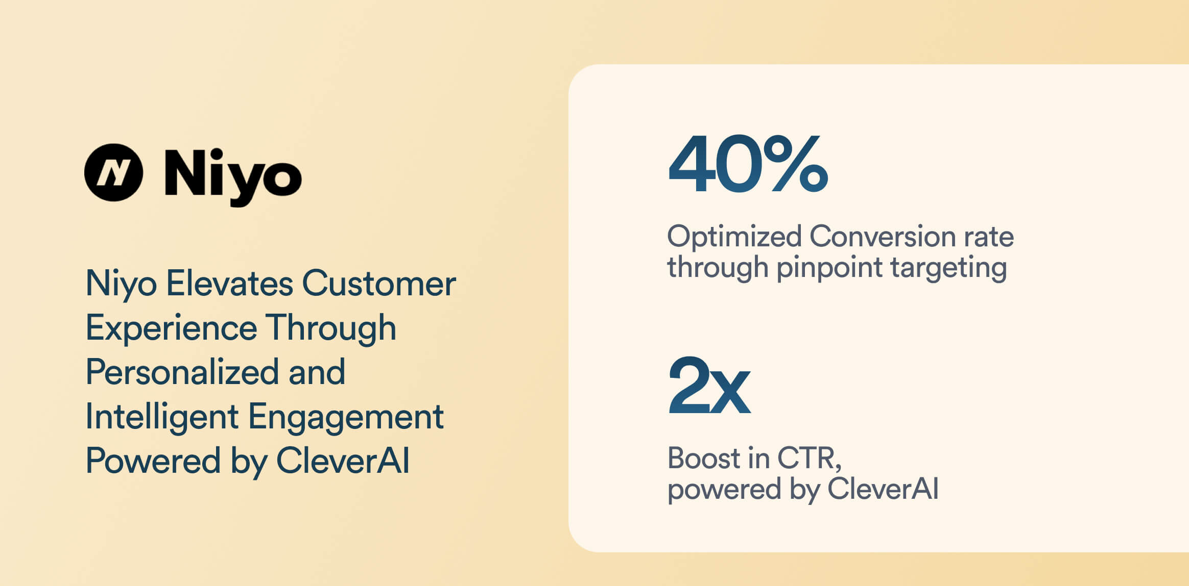
Learn more about how Niyo got these results.
2. Paysend: Using Omnichannel Campaigns for Targeted Engagement
Paysend, a fintech disrupter, segmented its user base to target key user groups. This clearly defined the segments, allowing for highly targeted engagement campaigns. In these segments, the marketing team tested different versions of messages in different languages.
For example, a split delivery test is conducted if users have French as their interface language. In this test, half of the users get campaigns in French, while the other half receive them in English. Campaign analytics then determine the effectiveness of each language variant.
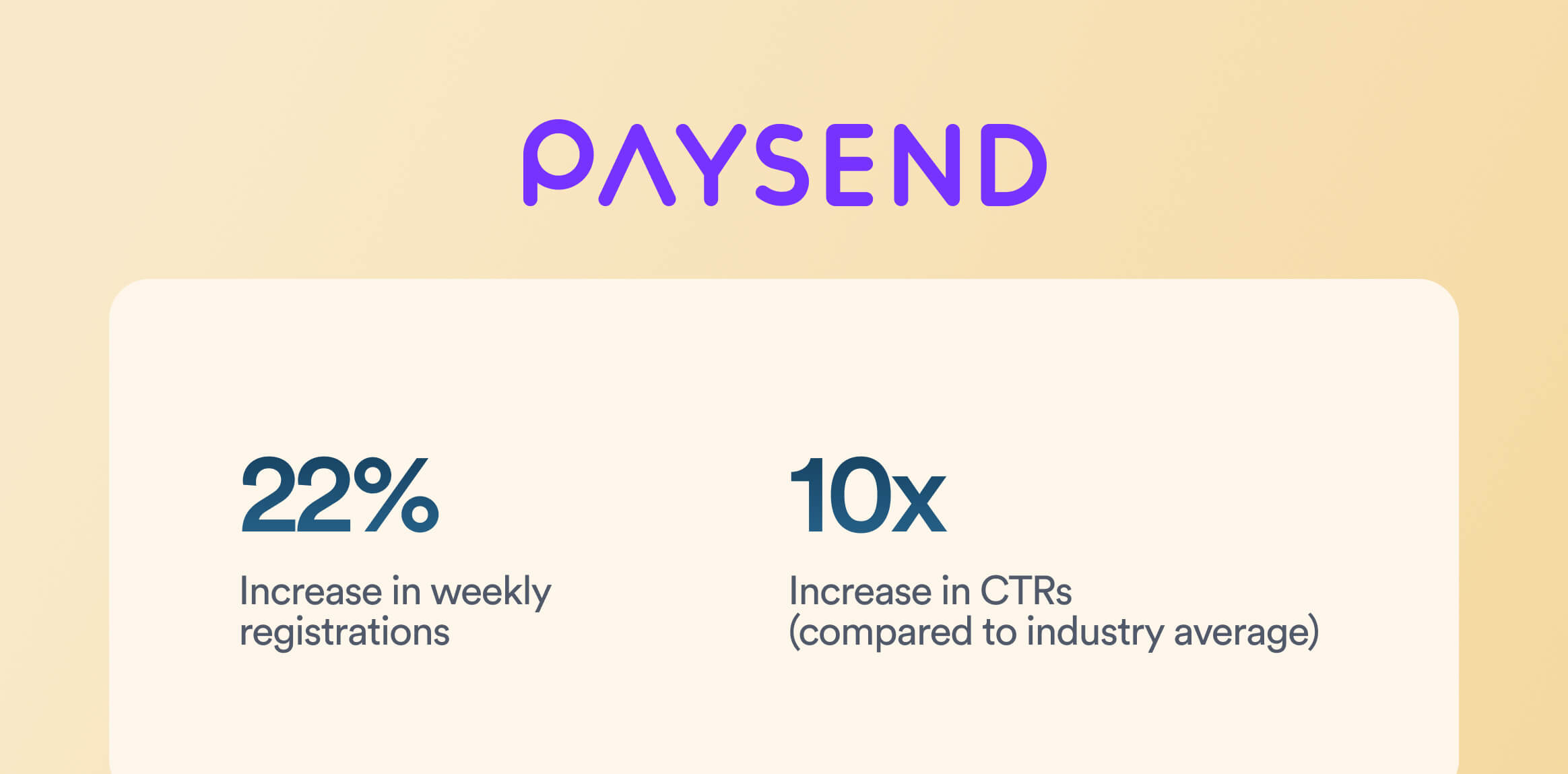
They ran omnichannel campaigns across these segments and got a 17% CTR in push notifications, which is roughly 10x the industry average. The number of users who installed and registered the app increased by 22%, and repeat transactions increased by 23% quarter-over-quarter.
Learn how Paysend achieved outstanding results with push notification marketing.
3. Nuvei: Using Celebrity Endorsement to Create Awareness
In early 2023, Hollywood actor Ryan Reynolds became an investor in Canadian payments company Nuvei and starred in a tongue-in-cheek video ad series. The campaign applied Reynolds’s signature humor to fintech to raise global awareness of Nuvei’s technology and Canadian roots.
Source: YouTube
The brand leveraged a celebrity endorsement to show off their technology, generating buzz in fintech marketing circles.
4. Starling Bank: Using Multi-Channel Camapign Distribution for More Impact
The Starling Bank developed a 30-minute TV commercial to expand its UK SME banking market share.
The marketing campaign aimed to inspire entrepreneurs to break free from their incumbent banks. It used TV commercials, video-on-demand, and supporting digital/OOH elements for campaign distribution. This contributed to Starling’s growing 7% market share in the target region.
Source: YouTube
5. Wise: Tweaking Positioning to Appeal to a Global Audience
Wise launched a global brand campaign in 2023 with the tagline “Take on the World” for Television ads and online video. The ad shows people around the globe, from Rio to Rome to a local cafe, using one Wise account to pay in 50+ currencies across 170 countries.
Source: YouTube
The campaign emphasizes that Wise is an everyday account made for the world, positioning its multi-currency account as a tool for anyone.
6. Revolut: Adopting Omnichannel Mix to Increase Brand Recognition
In August 2022, Revolut, a B2C neobank, rolled out its first major global brand awareness campaign and hit 5+ million UK customers. They adopted an omnichannel mix: a cinematic TV commercial, digital video, out-of-home (billboards, buses, underground posters), podcasts and social media.
Source: YouTube
This campaign significantly boosted Revolut’s brand recognition as a mainstream financial super-app.
7. SoFi: Leveraging PR buzz on Trending Topics for Brand Promotion
In June 2023, SoFi, a fintech in personal finance and neobanking, launched “Face of Finance,” a campaign spotlighting gender bias in financial imagery. SoFi asked an AI to generate images of “people good with money.” Only 2% of the AI’s outputs featured women. They publicized this finding via videos and created a pop-up photo booth in New York City, inviting real people to depict the “new face of finance.”
Participants who shared photos with the campaign hashtag had a chance to win tickets to a Taylor Swift concert at SoFi Stadium. This campaign generated PR buzz around diversity in fintech imagery and reinforced SoFi’s brand as a progressive, education-focused platform.
Source: YouTube
8. Nubank: Personalizing Campaigns for Its Targeted User Base
In October 2023, Brazil’s Nubank, one of the world’s largest digital banks, launched a campaign celebrating its first decade and 85 million customers. They did it through a broad multimedia rollout including a TV commercial (open broadcast), digital media, out-of-home ads, and influencer partnerships.
The campaign’s theme, roughly “Nu World, a world of N possibilities,” showcases how Nubank is woven into everyday life in Latin America and how it empowers customers with new possibilities and financial transformations. The feel-good campaign resonated with a massive user base (85M) and underscored Nubank’s regional dominance.
Source: YouTube
9. Razorpay: Building Awareness Through Customer’s Voice
In mid-2022, Razorpay’s business banking arm, RazorpayX, launched its first-ever ad campaign for its payroll product. The 3 Clicks, Payroll Fixed” featured startup founders, actual RazorpayX customers, sharing real-life month-end payroll headaches.
The narrative highlighted how payroll and compliance shouldn’t be hard, and how RazorpayX can simplify it.
This campaign’s goal was to build awareness in India’s SME/startup community that running payroll can be as easy as a few clicks.
Source: YouTube
10. PensionBee: Using Sports Partnership for Visibility
UK fintech PensionBee took a sports marketing route by partnering with Premier League football club Brentford FC (nicknamed “the Bees”). Initially, the Official Pension Partner in 2021, PensionBee, expanded the deal mid-2023 to a two-year kit sponsorship.
PensionBee’s logo appeared on the left sleeve of Brentford’s men’s first-team kit. The campaign builds on PensionBee’s “Building the Future” content series, in which Brentford women’s players discussed pension misconceptions. The company successfully boosted its visibility nationally while associating its brand with an inclusive and community-focused club.
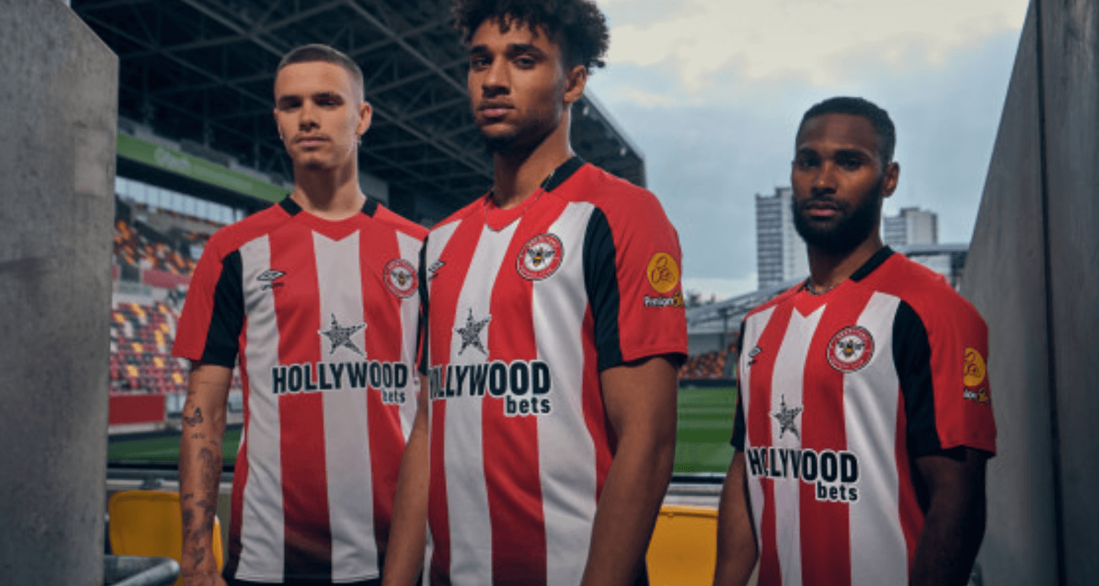
Source: PensionBee
11. Wealthsimple: Leveraging Content Marketing to Increase Credibility
Canadian fintech Wealthsimple has distinguished itself with a content-marketing-as-campaign approach through its online magazine Wealthsimple Magazine (formerly Grow). They published relatable financial stories and advice, driving engagement by keeping their audience well-informed.
Wealthsimple’s content strategy has been lauded for its quality, building a loyal readership, and improving the brand’s credibility. The magazine reportedly garnered millions of reads, contributing to Wealthsimple’s growth to 2+ million users as of 2022.
Take a look at the Wealthsimple magazine.
12: Checkout.com: Using Thought Leadership to Establish Authenticity
Rather than a traditional ad campaign, Checkout.com, a UK-based fintech unicorn, leaned into content marketing in 2022 with an in-depth industry report. They offered insights on optimizing every facet of e-commerce, from payments to fraud prevention.
The company aimed to establish thought leadership and provide value to current/prospective clients, such as online retailers.
Check out their retail report.
13. Current: Leveraging Influencer Partnerships for Creating Instant Buzz
A U.S. digital bank, Current, partnered with mega-influencer MrBeast, aka Jimmy Donaldson, in 2021 for a viral campaign. As part of a long-term partnership, MrBeast announced an exclusive giveaway of $100,000 to 100,000 of his fans via Current accounts, in a video titled “I Got Hunted by a Bounty Hunter”. The stunt was integrated into MrBeast’s content and highlighted Current’s app. The users needed a Current tag to receive funds. MrBeast’s massive Gen Z following helped Current to position itself as a bank for the digital generation.
The YouTube video hit over 18 million views in 24 hours, and the campaign drove a massive spike in Current account sign-ups.

Source: Current
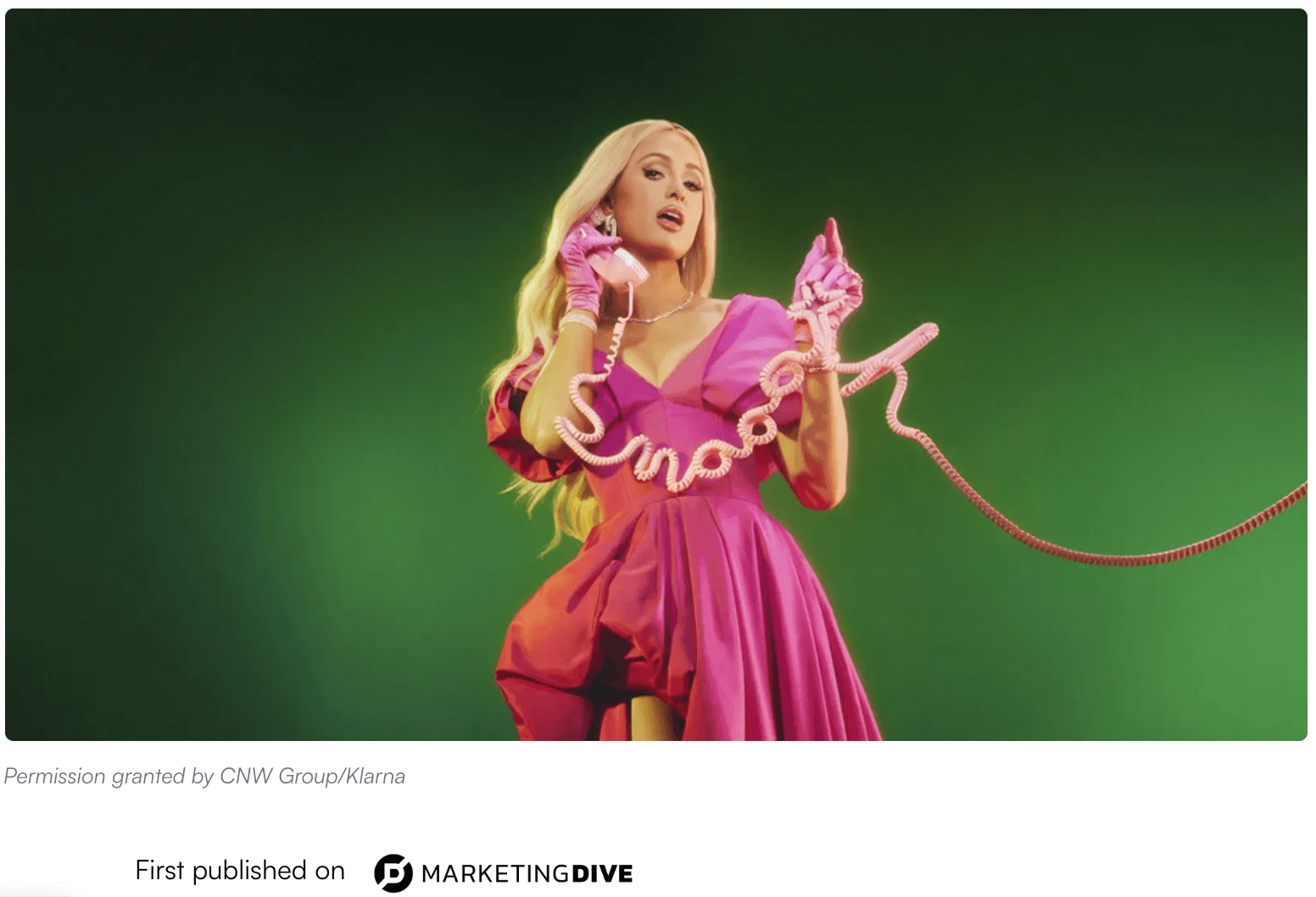
14. Klarna: Featuring a Celebrity to Drive Extensive Media Coverage
In Feb–Mar 2023, Klarna launched a global multimedia campaign featuring Paris Hilton.
Playing on Y2K nostalgia, the ads show Paris Hilton reacting to Klarna’s shopping app features with a new catchphrase, “That’s smooth,” a riff on her famous “That’s hot” line.
Dressed in early-2000s fashion, Paris promotes Klarna’s flexible payment options, buyer protection, and package tracking. The campaign generated extensive media coverage and social media chatter for Klarna, with an uplift in app downloads and consumer interest.
Source: Payments Dive
15. Robinhood: Reaching Masses Through Commercials
Amid the aftermath of the GameStop saga, Robinhood, a B2C trading and investing app, went ahead with its first-ever Super Bowl commercial in February 2021. Titled “We are all investors,” the ad depicts diverse people in everyday life, a barista, a father with a baby, etc., to convey that investing is for everyone, ending with the line: “You don’t need to become an investor. You were born one.”
The ad reached millions of TV viewers and sparked conversations about financial inclusivity. As a result, Robinhood’s user base continuously increased.
Read the report.
Fintech Marketing Strategy: How to Create Campaigns That Perform
These examples must have inspired you to create your “Oh! Wow” moment in the fintech world. So, where do you go from here? Remember, behind each and every example of fintech marketing we covered, there’s a whole strategy at play.
The strategy doesn’t just cover what campaign to create and how. It involves strategizing fintech marketing end-to-end. Here’s how you go about that strategy:
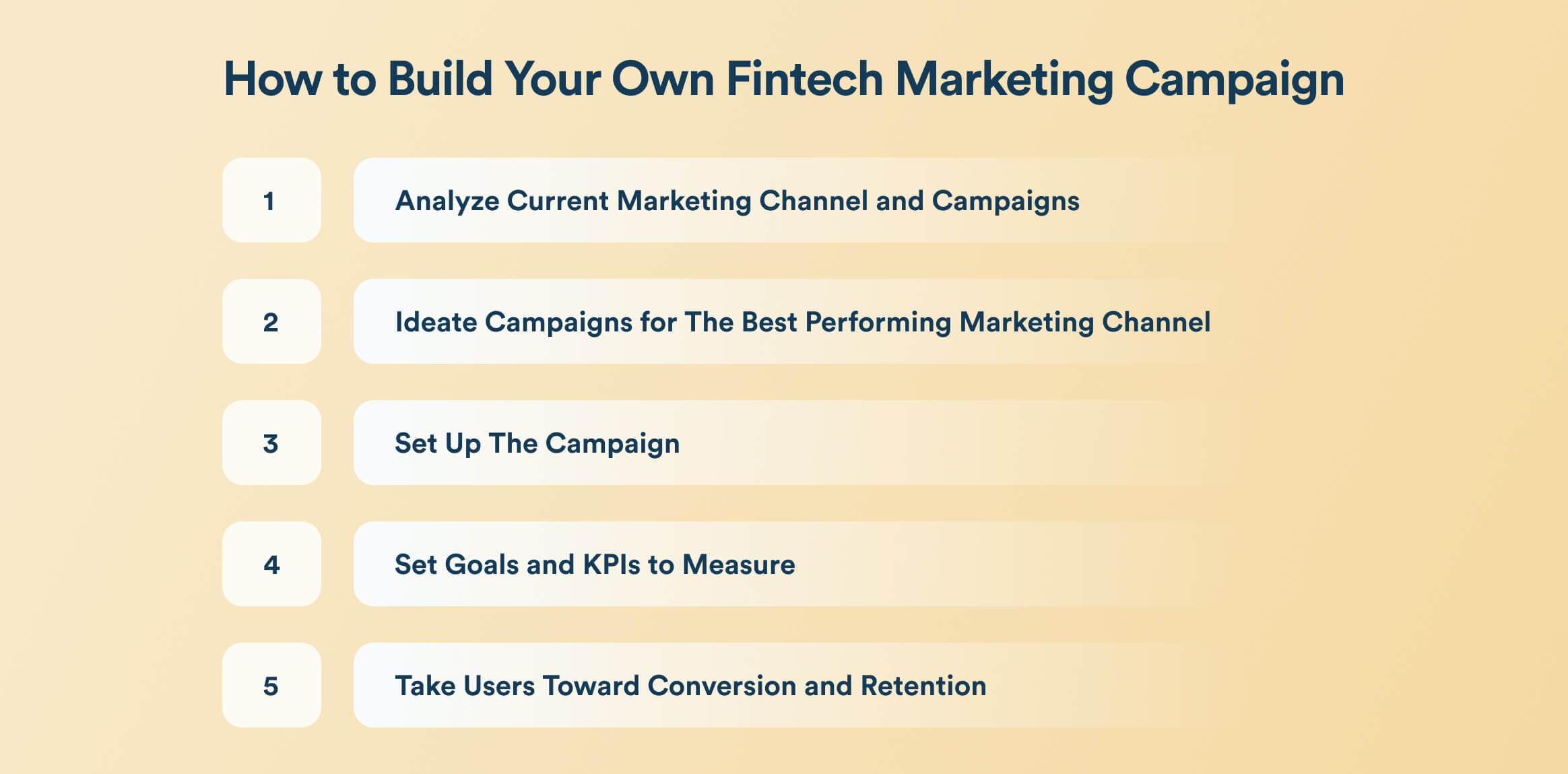
1. Analyze Current Marketing Channel and Campaigns
Dig into your data to figure out what your user base engages with the most, and where they exist. For example, platforms like Meta or YouTube make sense if you’re targeting a Gen Z user base.
Your present user acquisition channels would supply insights into what’s working best for you. If you’re not tracking it with a specialized tool, this data should be available in Google Analytics.
2. Ideate Campaigns for The Best Performing Marketing Channel
Once you have discovered the channel that gives you the best results, choose it to ideate the campaign. While you ideate, keeping the best channel in mind, strategize the fintech marketing campaign for different channels in your acquisition funnel.
It means that the campaigns you use to acquire users from the best marketing channel can be repurposed for other channels. This will maximize your ROI while helping you engage a broad audience base.
3. Set Up The Campaign
Based on the inspiration drawn from the above examples, create a fintech marketing campaign that would best engage your audience. Reconsider the following examples when you’re at it:
| Fintech Marketing | Examples |
| In-App Marketing | Niyo and Paysend |
| Digital Marketing | Nuvei, Starling Bank, Wise, SoFi |
| Content Marketing | Wealthsimple and Checkout.com |
| Influencer Marketing | Current and Klarna |
| Social Media Marketing | Revolut and Current |
These examples will help you draw inspiration to create the best-performing creatives, collaborations, and partnerships in your domain. Once you have narrowed down, execute and complete the production part.
4. Set Goals and KPIs to Measure
Decide on what you’ll see as the campaign’s success and how you’ll measure it. With the majority of channels being digital, you’ll likely need to set up tools to track the campaign’s performance actively. For example, if you’re running a fintech social media marketing campaign, you’ll likely need an analytics platform to assess views and engagements.
Similarly, when running in-app marketing strategies, platforms like CleverTap help you optimize and get the maximum ROI.
No matter what channel you’re using to acquire users, it’s essential to see their actions when they arrive. This is where a marketing CRM would help. It’s best to integrate all of these platforms to give you a unified system that allows you to assess campaign performance end-to-end.
This is necessary for optimization, learning, and strategizing future campaigns.
5. Take Users Toward Conversion and Retention
These marketing campaigns got you new users. Now what? You need to drive them toward taking action that helps drive revenue. For example, for a neobank, this action can be opening an account and conducting the first transaction.
Your marketing campaign doesn’t end when you drive people in. In reality, it never ends. You drive people in through acquisition campaigns, actively engage them toward conversion, and retain them firmly for high customer lifetime value (CLV).
The above marketing campaigns took care of the first part. The next part is active engagement and the next one after that is user retention, which is a different ball game. This is where CleverTap helps you the most.
How Does CleverTap Help?
CleverTap lets you visualize the complete user journey and see events where user drop-offs happen. CleverTap Journeys gives you detailed insights to act in real time, while its Funnel feature lets you personalize messaging to appeal to a particular user segment.
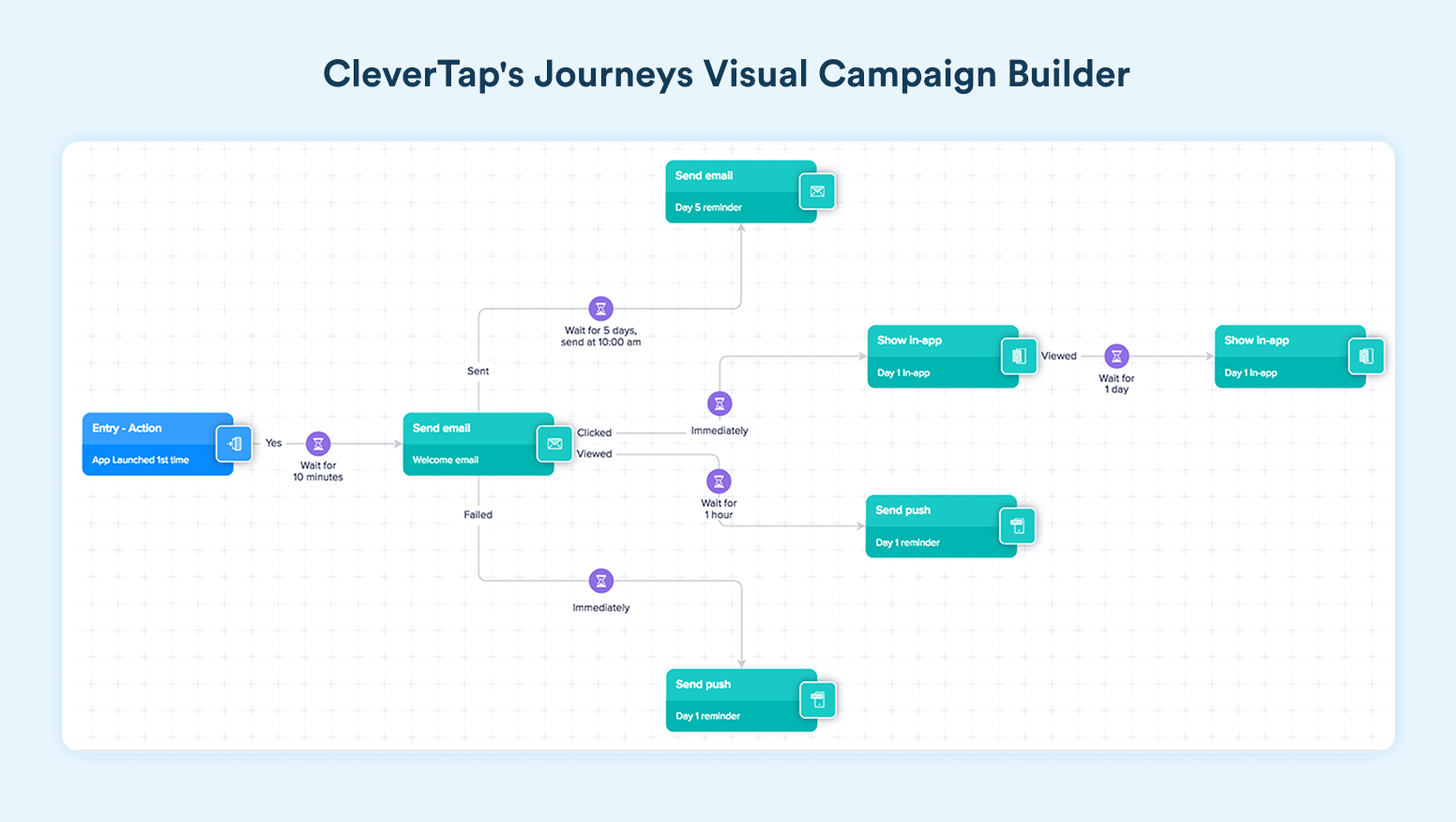
Source: CleverTap
The platform personalization engine empowers you to strategize and automate push notifications to convey the right things to the right user at the right time. It helps you engage users while gently moving them closer to conversion. After conversion, follow this retention marketing guide to ensure a high customer lifetime value.
Use CleverTap to level up your fintech marketing campaigns.
Make The Most of Every User Acquisition
The fintech marketing campaign you design will bring in new users. One part of the play is done. How you engage them and move them closer to conversion is the next part that will determine the marketing campaign’s success, not vanity metrics, but in real revenue.
Ensure you strategize the campaign end-to-end and get conversions that add to metrics your leadership cares deeply about.
Learn more about omnichannel engagement and gently push users toward conversions, no matter where they are.
Agnishwar Banerjee 
Leads content and digital marketing.Expert in SaaS sales, marketing and GTM strategies.
Free Customer Engagement Guides
Join our newsletter for actionable tips and proven strategies to grow your business and engage your customers.
