Mobile traffic is soaring, with the average consumer now spending a whopping 3 hours a day within mobile apps. However, there’s a catch – despite the surge in mobile activity, conversion rates on mobile are currently trailing behind their desktop counterparts, sitting at just half the rate. But fear not, as this article is your shortcut to success, distilling the wealth of knowledge from industry leaders and conversion experts into actionable insights for optimizing your mobile checkout.
We’ve delved into extensive research from authorities like NN Group, Baymard Institute, UX Collective, as well as insights from CRO experts at Moovweb and Crazy Egg, and the test-driven design team at Growth Rock. This article compiles the proven best practices and expert advice that will empower you to boost mobile checkout conversion rates and elevate your app’s revenue.
What is Mobile Checkout?
Mobile checkout refers to the process of completing a purchase or transaction on a mobile device. It specifically involves the steps a user takes to finalize a transaction, make a payment, and confirm the purchase while using a mobile phone or tablet. Mobile checkout is a crucial aspect of e-commerce and m-commerce (mobile commerce) as it caters to the growing number of users who prefer to shop and make transactions using their mobile devices.
Mobile Checkout Best Practices to Boost Conversion Rates & App Revenue
Mobile Conversions and Funnel Analysis
As a mobile marketer, you should know exactly where your app’s sticking points lie — especially when it comes to conversions.
Once people enter your conversion funnel by viewing a product page or adding an item to their cart, are they completing checkout? How long does it typically take them to do so? How far in the process do they make it before dropping off, and where can you stop the bleeding?
Funnel analysis is an essential tool for analyzing how well you’re converting customers, pinpointing exactly where you’re losing sales, and improving conversion rates at every step.
Here’s a funnel analysis example for ecommerce: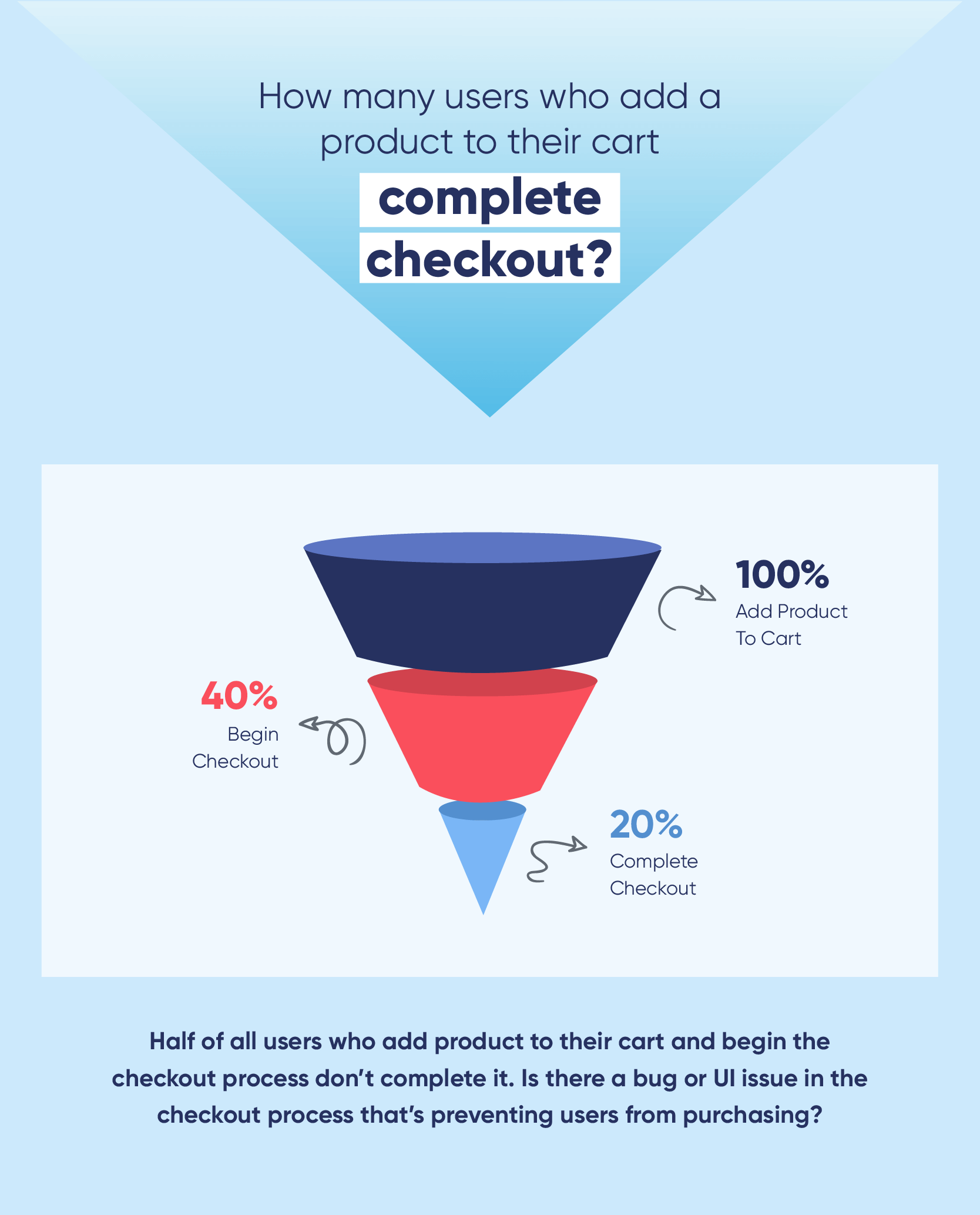
Funnel analysis can help you answer questions like:
- Do different types of customers follow different paths to conversion?
- What’s the most efficient and effective conversion path for each user cohort?
- Do customers acquired from one channel convert faster or have a higher average order value (AOV) than those acquired from other channels?
- Which marketing methods and campaigns are most effective for driving conversions and higher AOVs?
- Given current conversion rates and order values, how much can you afford to spend on customer acquisition and marketing campaigns for optimal ROI?
Once you have insights into how your app is converting customers, you can use them to optimize your checkout process UI, customer messaging, and marketing strategies to increase purchase frequency, AOV, and app revenue.
Adding to Cart
As you know, conversion rate optimization doesn’t start at checkout — it starts the second users launch your app. How can you improve the shopping experience so customers are more likely to move beyond passive browsing and make a purchase?
Give immediate feedback when an item gets added to the cart so users know it worked. Displaying a number in the cart icon is one way to do this, and/or changing the “Add to Cart” button text to “Added to cart” or “View in Cart”*
Beauty giant Sephora even includes an engaging animation to give customers an added sense of fun when adding items to their carts. 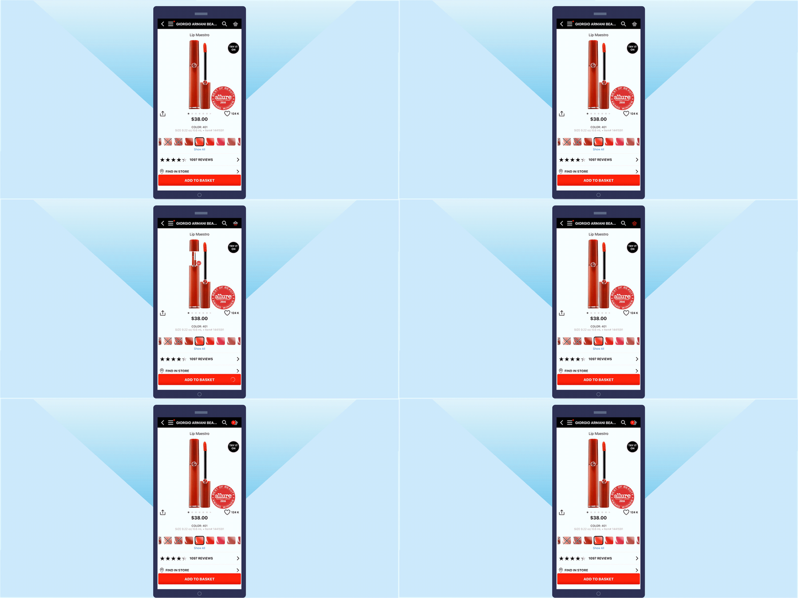
Provide continuity across channels. Users should be able to add an item to their cart on their mobile app and see that on your website (and vice versa). If users have to sign in to their accounts to make this work, explain that.*
Make the cart super easy to access — and exit. Obviously, your cart should have a prominent icon in your main screen UI. Take the next step by including a mobile “mini cart” that shows cart contents as a UI overlay when users tap on the shopping cart icon, instead of navigating them to an entirely new screen.
With the overlay, they can quickly check cart contents and order totals and either keep shopping or proceed to checkout.*
Shopping Cart
Once users have loaded up their carts, it’s essential that you optimize your mobile app checkout screen to include everything users need and expect — and exclude anything that will interrupt or distract them.
Here’s what you should include in your shopping cart UI:
- Product photo, name, and details
- Ability to remove, save for later, and change details like item quantity
- Total order value: product prices and any discounts
- Estimated date of delivery
- Clear calls to action (Checkout, Keep Shopping)
Make it easy to update. Setting an item quantity to zero is not intuitive — use a clear “x” or “Remove” option. Users should be able to easily remove or adjust the number of items within their cart. And when they do, they should immediately see that item disappear from their carts. Don’t force users to tap “update cart” to see changes reflected.
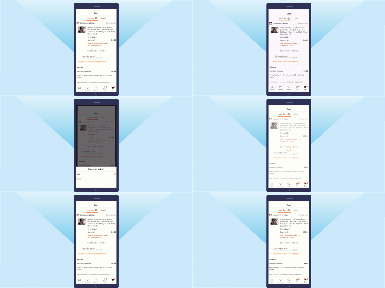
Allow users to edit item details like color and size within the cart itself, instead of removing the item and going back to the product page.* Etsy and Neiman Marcus are both great examples of this, allowing users to go beyond item quantities and edit color/materials and sizes within the cart. 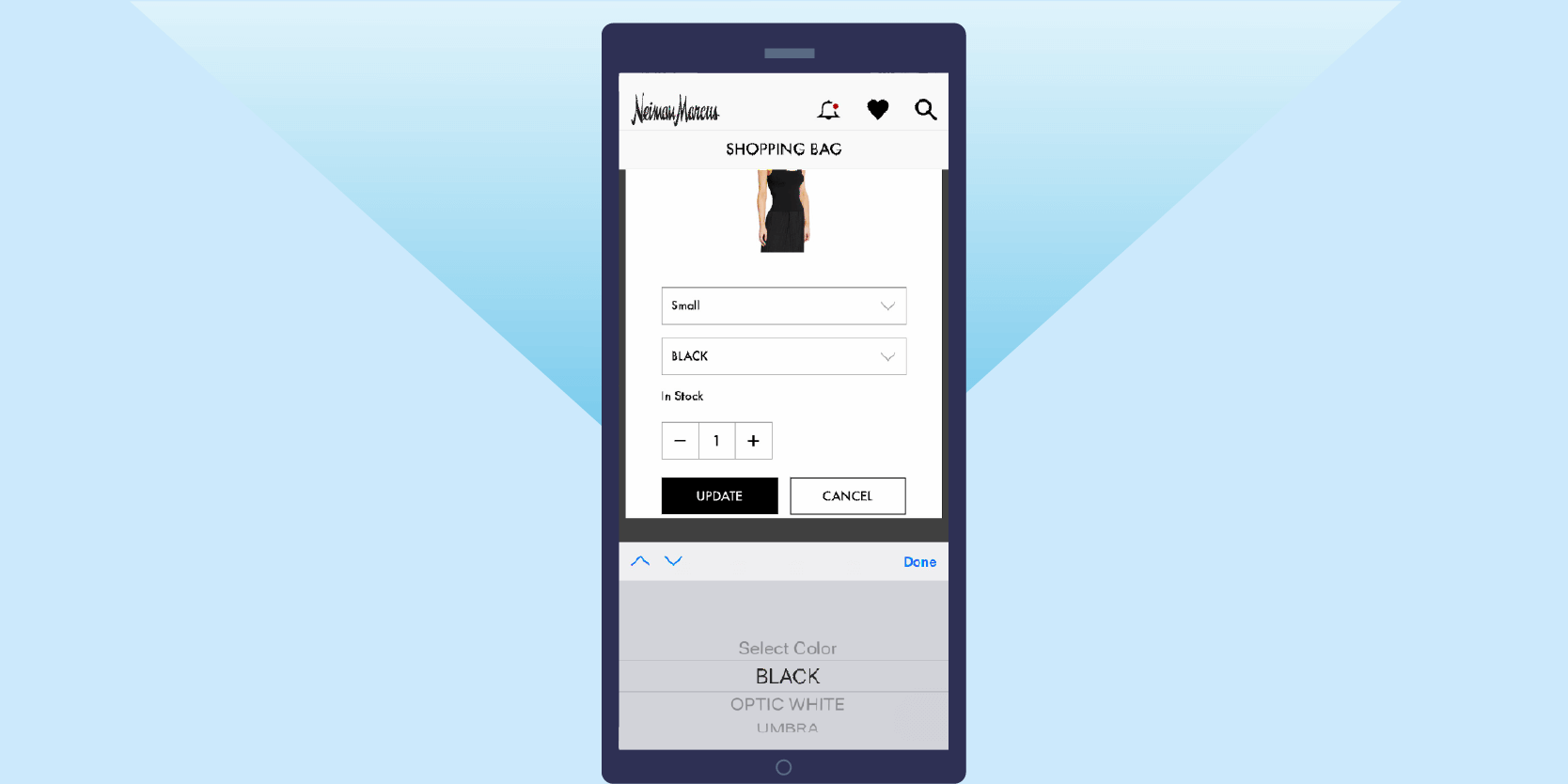
Display savings for each item rather than order total. The team at Growth Rock found that highlighting savings at the product level had a significant positive impact on conversion rates compared to highlighting total order savings.*
Include a “Save it for Later” option. It’s not exactly breaking news that shopping habits have changed in the mobile-first era. Your customers may have wildly different purchase intent: some hop on your app knowing exactly what they want and complete a transaction in minutes. Others use mobile shopping carts as a way to bookmark a product, keep a shopping list, or even gather gift ideas. This means they may add something to their cart with the intention to purchase — but perhaps not until days or even weeks later.
By including a “Save it for later” option in your mobile checkout page, users won’t have to purchase everything in their cart immediately, or all together. It’s also a great way to prompt users to create an account* so you can follow up with them via push notifications, emails, and other personalized mobile marketing campaigns.
Checkout: Customer & Shipping Info
Because this stage involves users entering a lot of text, the difference between a good UI and a poor one can make or break your sale. It doesn’t take a lot to frustrate customers, so pay careful attention to how you ask users to share information.
Where can you make it faster and easier for customers to fly through data entry?
Minimize scrolling by breaking up the checkout process. No scrolling makes it easier for users to input, review, and edit their information. And shorter pages give users the sense that they’re progressing through checkout quickly.
Use breadcrumbs to show users how many pages they’ll need to complete to give a clear sense of progress and make it easy to go back to the previous page.* See Jet’s checkout process:
Offer guest checkout. 30% of mobile users abandon their cart if asked to register up front,* and yet it’s surprising how many ecommerce apps force users to sign in or register to complete a purchase.
Given the option, over 60% of users opt for guest checkout in a mobile app.* Even if a customer is already a registered user, lots of people forget their login details and don’t want to deal with the hassle of resetting passwords on mobile.
Yes, having users log in to complete a purchase does have some compelling advantages: you can personalize future shopping experiences, send email and push notification campaigns featuring promotions and sales, and build a more meaningful relationship with that customer.
But you may be missing out on a major slice of revenue by failing to offer a guest checkout option: the share of revenue contributed by mobile shoppers selecting guest checkout is 13% higher than that contributed by logged-in users.*
Clearly label required fields. Three out of four mobile users experience usability issues and “field is required” validation errors.* A simple asterisk can give users a clear signal and save them a lot of frustration (and save you a lot of abandoned carts).
Get specific with error messages. “Error” is vague and frustrating. “Expired card” or “Invalid zip code” is much clearer.
Show errors as they happen or when users advance to the next field, not when they try to proceed to the next page. And don’t clear all form fields when there’s an error — just the one that needs to be fixed.*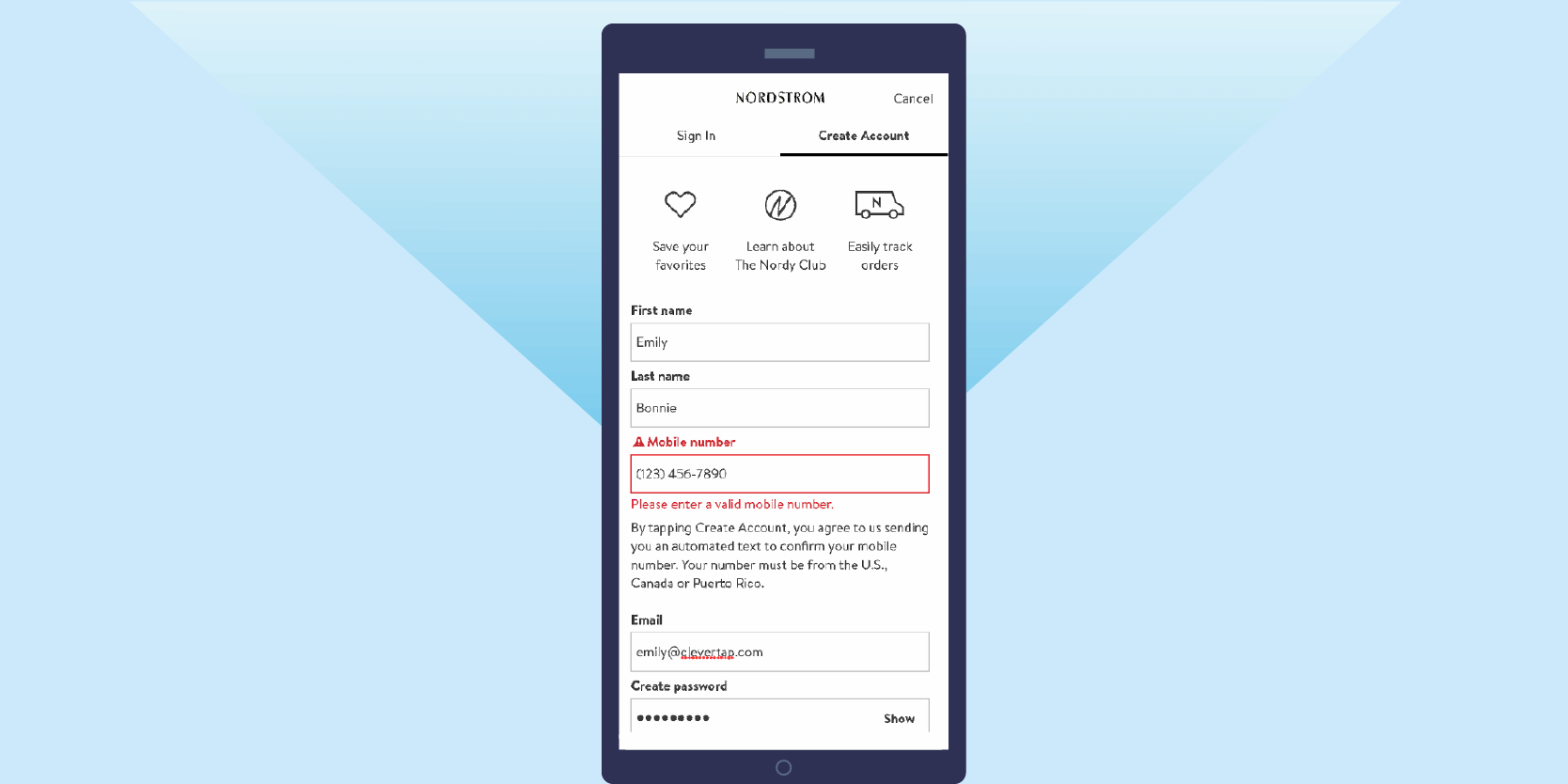
Automatically complete fields with data you already know while making it easy for users to edit or correct mistakes. If you have access, go beyond first and last name and use geolocation to automatically calculate and customize shipping times, delivery dates, sales tax, local pickup options, etc.*
Target automatically pulls all of this information when I check out as a logged-in user, saving me the trouble of manually entering in contact, shipping, and billing details and showing accurate delivery dates. 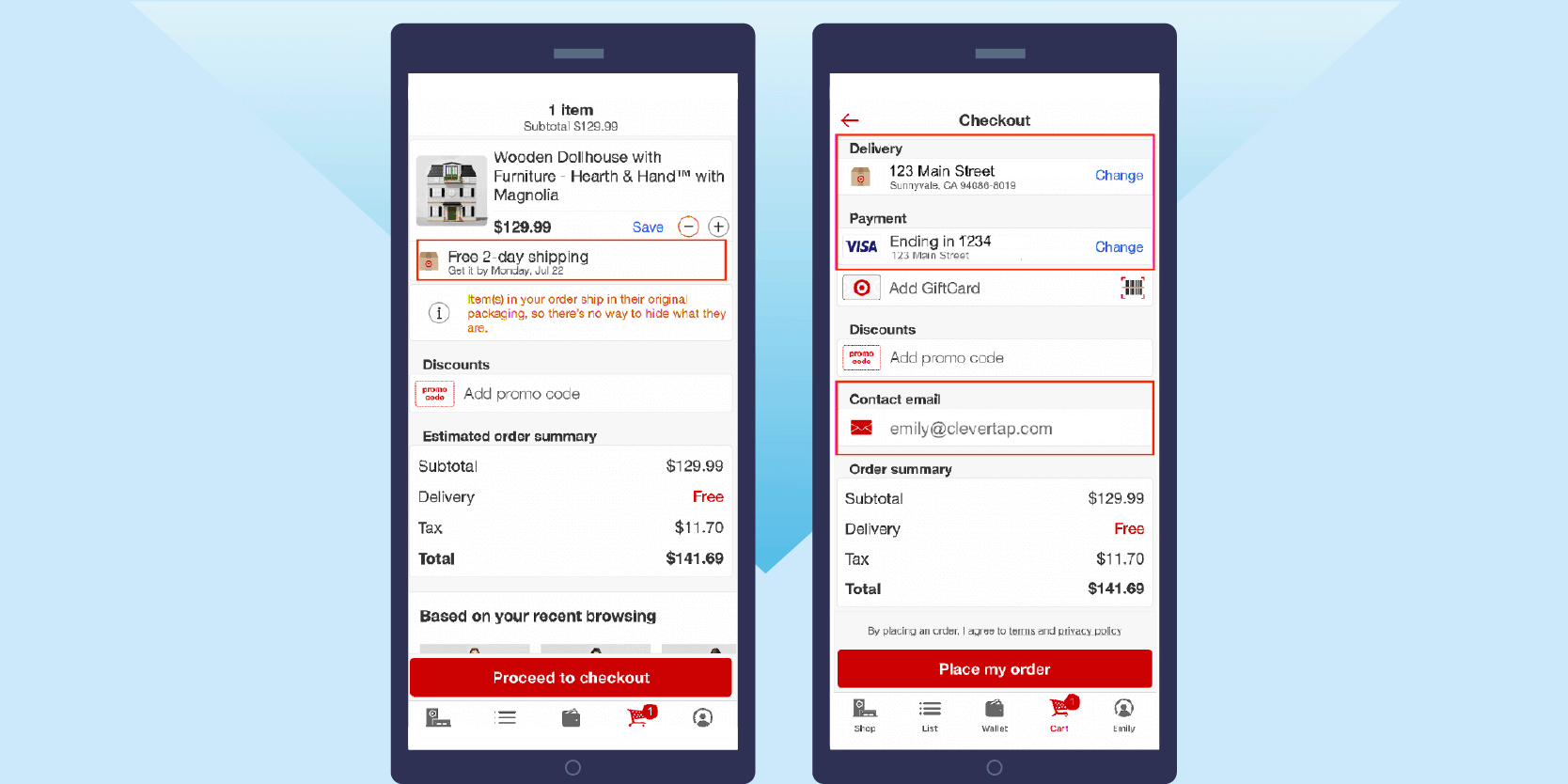
Automatically display the numerical keyboard for things like credit card info and phone numbers.
Use regular text form fields for states and countries instead of dropdowns (it’s faster and easier to type NY or IL than to scroll through a long list).*
And if text needs to be entered a specific way, follow Zara’s lead and provide that guidance upfront instead of letting users guess and then displaying an error.
Default select “Same as billing address” or “Same as shipping address” to save most users a tap.*
Make text easier to input by using easy to tap full-width text rows.* And include a tabindex HTML directive to enable customers to quickly speed through the form.* 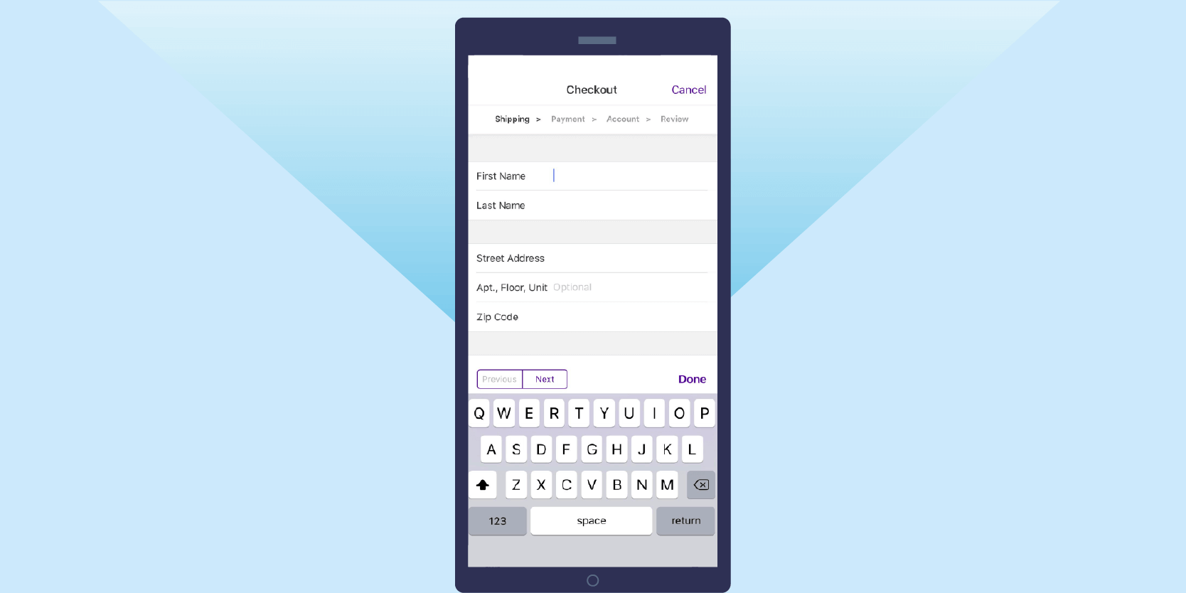
Checkout: Payment Details
46% of all cart abandonments happen at this step in the checkout process — and four out of the top five reasons users bail at this stage are due to the logistics of entering payment information.*
Simply making it easier for users to sail through this step can have a massive impact on your conversion rates and app revenue.
Offer multiple payment methods. When available, over 23% of smartphone users checkout with an alternative payment method.*
Apple Pay, PayPal, and Amazon Pay are all easy and trusted ways for users to submit payments without pulling out their credit cards and manually entering info.
Automatically enter payment details for logged-in users who have saved a payment method. Manually entering payment info gives customers ample time to rethink their purchase or get interrupted. One-click ordering and saved payment methods save your customers the hassle of stopping what they’re doing to pull out their wallets.
Keep the coupon code form closed or minimized. More than 25% of shoppers exit the checkout process to look for a coupon.* The last thing you want is to have users leave to go promo code hunting and never come back.
Instead, use deep links in your push notifications to automatically apply a coupon code at checkout, advertise relevant promo codes with in-app messages — or even display them within your ecommerce checkout flow, as Sephora does.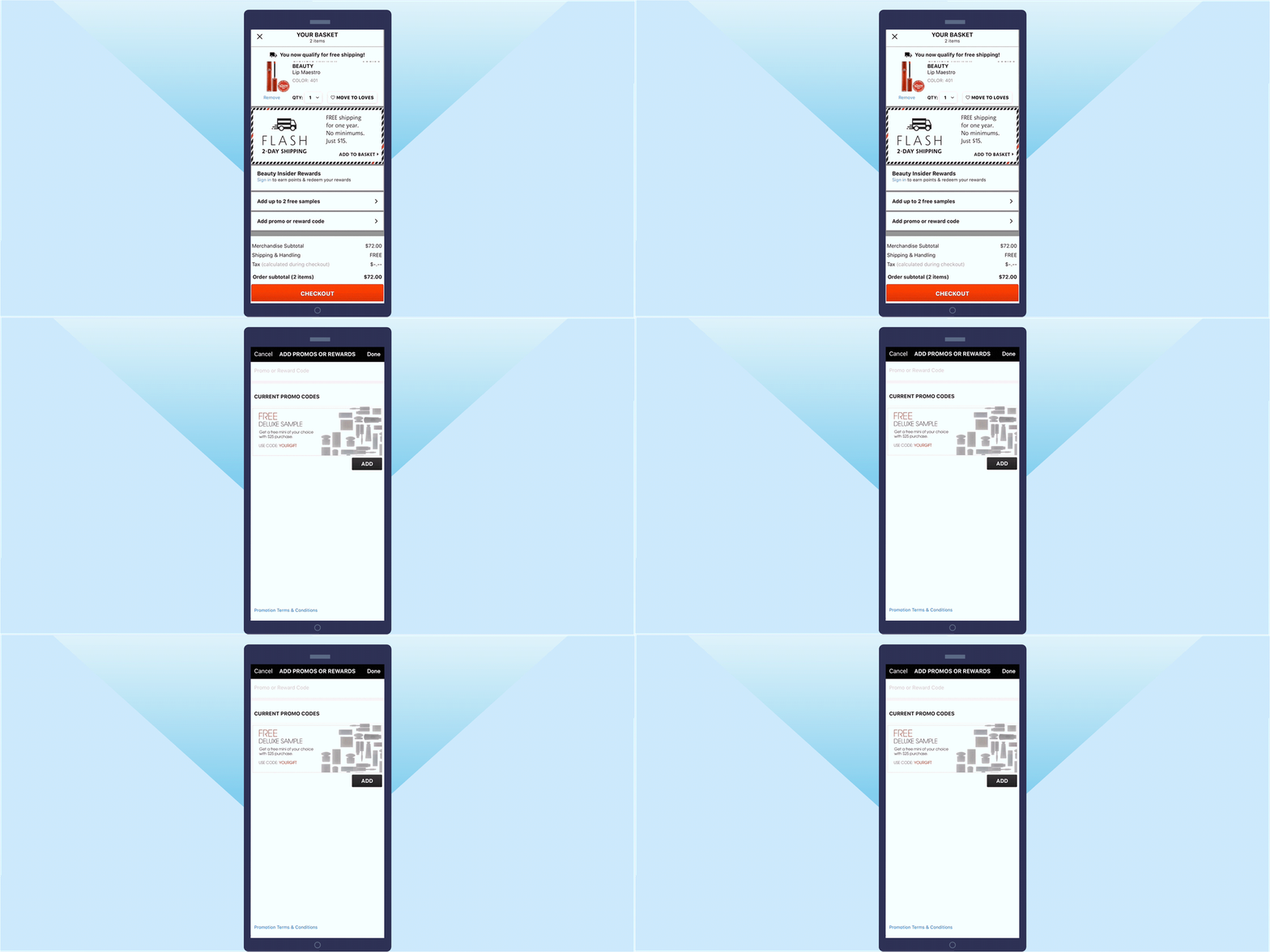
Skip security badges. A lot of advice on mobile checkout design will mention featuring security badges to assure users that their personal and payment information is safe. However, Growth Rock found that these badges don’t have an impact on conversion rates.*
Of course, you should use verified payment methods so users feel secure about transacting on your app. But adding in badges is at best unnecessary and at worst additional clutter on your mobile checkout flow.
Checkout: Order Review
Almost there! Give users a clear path to conversion in this final step of the checkout process.
Keep important details above the fold. Users should be able to view order summaries and charges like tax and shipping without scrolling to the bottom of the page or hunting for these details.*
Use color sparingly. Only use a colored button for completing a purchase and make it wide and easy to tap. Back and any other buttons should be smaller and a neutral color.*
Keep navigation minimal, with options limited to completing a transaction or going back to the previous page.*
Order Confirmation
Customers may have already made a purchase, but don’t write off this step! It’s an important part of the user experience and a good one will set customers up for repeat purchases.
Immediately display an order confirmation and summary, and let users know where, how, and when to expect order updates. I.e., “We’ll send you an email when your order ships” or “Check your inbox for an order confirmation.”
Many customers will wait until they see an email confirmation before navigating away from this page in the app, which means they’re effectively at a standstill when it comes to further engagement. If users are signed in, mention on the confirmation page that they can view order details and history in their account.
Amazon does this well (one of the many reasons they’re the rulers of ecommerce): 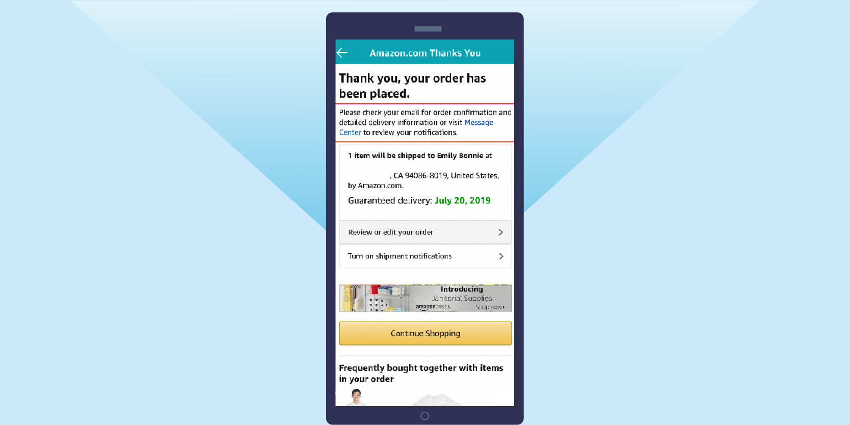
How to Improve Mobile Checkout
So to recap, what can mobile marketers do to improve their mobile checkout UI and boost conversions?
- Use Funnel Analysis to get important insights into how customers are transacting on your app and where you need to focus efforts and resources on minimizing drop offs.
- Recognize evolving buying behavior by nurturing prospective buyers over multiple channels and longer timelines.
- Use push notifications, emails, and other external channels wisely to remind customers about items of interest, abandoned carts, and meaningful discounts.
- Add deep links to marketing campaigns to bring customers not just back to your app but to a specific stage in the checkout process or to automatically apply coupon codes.
- Streamline copy during mobile checkout screens to highlight important details like item savings and delivery dates while minimizing distractions.
- Create a thoughtful order confirmation page and email message to complete a positive purchase experience and set customers up for repeat transactions and referrals.
With a complete mobile marketing suite like CleverTap, you can analyze your conversion funnels, view the paths your customers take to conversion, create automated omnichannel marketing campaigns to nurture users over the entire customer journey, and much more.
Learn more about CleverTap or get a customized demo for your ecommerce app with our mobile marketing experts.

See how today’s top brands use CleverTap to drive long-term growth and retention
Shivkumar M 
Head Product Launches, Adoption, & Evangelism.Expert in cross channel marketing strategies & platforms.
Free Customer Engagement Guides
Join our newsletter for actionable tips and proven strategies to grow your business and engage your customers.


