You may have stumbled across a website within a website — a separate place on a domain that had a theme different from the main site — and wondered: what is this? And why would a brand do this at all?
If so, you’ve been to a microsite. It’s a valuable tool to have at your disposal, assuming you know what it’s good for, and are using it for the right purpose.
Allow us to clue you in on what is a microsite and how it can be used for your marketing campaigns.
What is a Microsite?
A microsite is nothing but a separate space within your larger website. Typically, it is smaller and simpler than your main website and can be characterized by having its own subdomain (or sometimes its own top-level domain name). The microsite is usually created in order to separate its content from the rest of your website content.
A microsite definition only makes sense when you look at its objectives alongside the overall goals of your main website.
While the main website may be built to bring in prospects and nurture them into customers, a microsite is often meant to be a standalone space to promote a single product, product line, project, or campaign. That means its main purpose is marketing, pure and simple.
Creating a microsite is a way to break off from the objectives (and even the design parameters) of your main website and have a unique goal (or look and feel) for the specific project.
Microsite Use Cases
So when does it make sense to build one? There are primarily two good reasons to create a microsite for your brand:
1. Promote a Standalone Campaign
Microsites are perfect for investing in a standalone marketing campaign that pulls out all the stops and provides not just informational brochureware, but also interactive material such as quizzes, games, surveys, and videos.
This microsite can then become a temporary location for readers to visit. It can be turned off once the campaign ends, or simply absorbed into the main website. Meanwhile, your brand enjoys the extra traffic the microsite campaign brings in.
In this use case, a microsite can have its own traffic and lead generation campaigns while your main website provides the visitor with the larger, more evergreen content that will outlast your campaign.
2. Build a Content Repository
Another use case for microsites is for creating and storing specific content that you want to be available at all times to your visitors or your customers.
Ideas here include: a wiki of support materials, an online glossary of terms, a reference area for industry concepts, and more.
For a prime example of this, take a look at our very own Mobile Marketing Glossary. We built it to help educate our users on marketing terminologies and concepts. Having an online reference such as a glossary gives us materials that we can point customers toward, materials that help answer their questions, or simply enrich their experience.
Microsite vs Landing Page: What’s the Difference?
One possible area of confusion is the similarity between a microsite and a landing page. After all, both are created to push a specific call-to-action to users. And both can be as concise as a single page.
So what’s the difference? And when should you choose a microsite vs. landing page?
Microsite vs. Landing Page: A Chart of Similarities
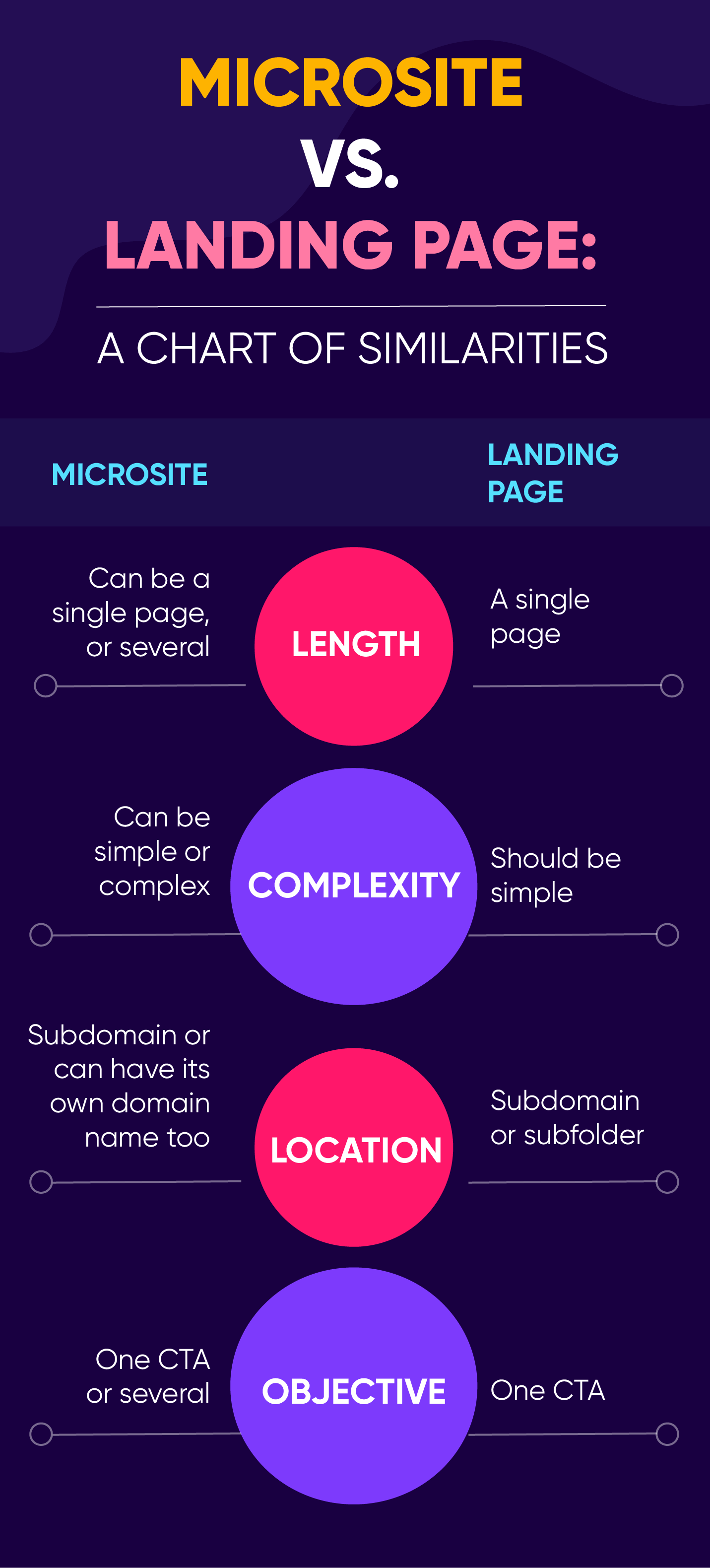
The long and short of it: if you have a simple goal, a single CTA, and only need a single page, a landing page makes much more sense.
But if you have a more complex project in mind and need the flexibility to branch out to several pages of content or even provide more than one CTA, then a microsite is preferable so as not to dilute the landing page experience.
Microsite Examples, and Why Build Them?
Sounds like a lot of work? It could be. But the results are worth it.
Below we tackle several benefits of building a microsite and give you examples of effective microsites that hit their KPIs.
A. Brand Awareness
A standalone microsite helps increase awareness of both your campaign and your overall brand. Having a dedicated space allows you to dictate the rules and break out of the sometimes limiting parameters of your corporate look and feel — even your traditional content types.
Suddenly, instead of plain text articles on your blog, a microsite could allow you to experiment with interactive games and video. Combine that with some viral marketing best practices and you could hit the goldmine of traffic and brand awareness.
Office Max’s “Elf Yourself”
What better example to give here than everyone’s favorite holiday microsite, ElfYourself.com? By creating a microsite that made customers the stars, and by limiting the call-to-action to simply sharing the resulting video with friends, Office Max was able to get its brand in front of a veritable host of highly entertained consumers. Viral microsite for the win.
Mailchimp’s “Content Style Guide”
Another brilliant example of a KPI-busting brand awareness microsite is the Mailchimp Content Style Guide. It started off as an internal document outlining the company’s best practices for written communication, but seeing as the Mailchimp brand is all about empowering small businesses to be world-class, they decided to turn their own style guide into an open source, Creative Commons-licensed resource that anyone can now use as their own. As long as they credit Mailchimp. A look through ahrefs.com shows that there are now 1.6K domains referring to their humble style guide. How’s that for brand awareness and traffic?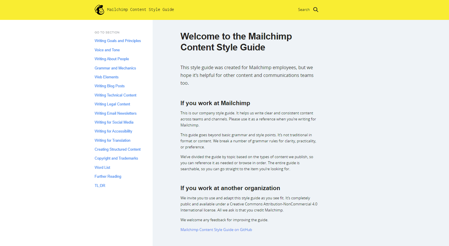
B. Laser-like Focus
Let’s face it, when you have a focus on only one campaign or product, you can highlight it in its full glory using a plethora of audio-visual aids. And suddenly your consumers are faced with a distraction-free experience minus all the corporate trappings your main website may have.
Patagonia’s Blue Heart Campaign
Connecting with their core audience of outdoors-loving customers, the lifestyle brand put together a nature advocacy microsite and urged customers to sign a petition against constructing a hydropower dam in the Balkan region. The microsite combined interactive content with stunning visuals, a bevy of statistics, and even a 43-minute documentary film highlighting the possible fate of the last wild rivers on the European continent.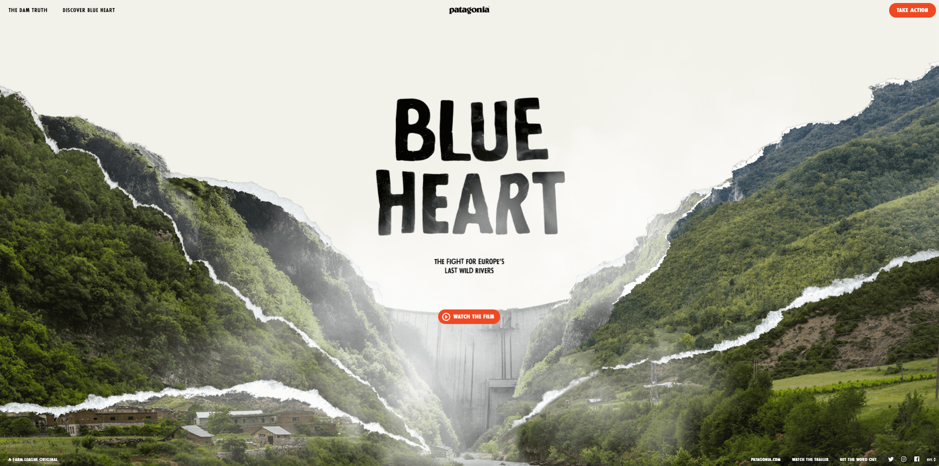
C. Cost Effectivity
Microsites can be as simple as a single page or even a bunch of pages strung together with a simple navigation system, often only one level deep. The point is not to be as complex as the main website, but to be a focused way to navigate a campaign. As such, it is a very cost-effective way to market your brand, especially when compared to creating, launching, and maintaining a totally separate website!
Red Cross’ Microsite for Game of Thrones
For the final season of HBO’s Game of Thrones, the American Red Cross teamed up with HBO to motivate viewers to quite literally bleed for the throne. A blood donor would be entered in a raffle to win a full-sized Iron Throne from the TV series. And all participants got to take home posters. The CTA? Make an appointment to donate blood. The cost for the microsite? A simple HTML page.
D. Organic Search
A microsite can live on its own domain or in a subdomain under your main brand’s website. But by setting up content that is keyword rich and is based on the possible intent of customers, you now have extra web property to bring in organic search traffic to your brand. And this gives you extra SEO power.
AT&T Microsite for 5G
With the advent of 5G, there was a lot of misinformation about what it was and why it was deemed such an innovation in the world of wireless communication. The AT&T microsite was a way to solve this by creating a repository for all things 5G, including articles and resources explaining what 5G was and how consumers could benefit from it.
Of course, by building it, the brand also positioned itself as the trusted source of both 5G products and information, with organic searches bringing in all those searching for more information on 5G.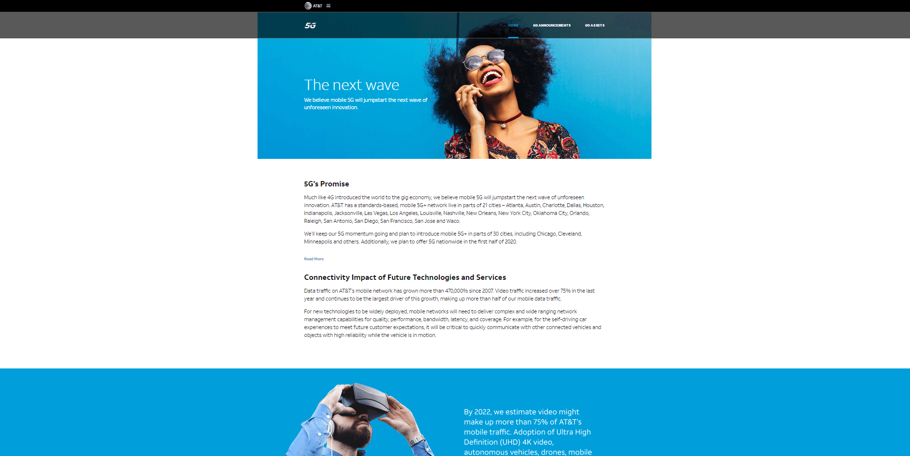
Don’t Forget to Optimize for the Customer Experience
Before going off to build your next microsite, don’t forget to keep your consumers in mind. Use the right tools to optimize your customer experience for the people who will be using it either for entertainment or for information, whether its goal is to increase brand awareness or to get them to convert using a CTA button.
That’s what we do here at CleverTap. Our intelligent mobile marketing platform gives you the tools to build out engaging experiences for your users — experiences that result in customer retention and a healthy bottom line.
For more on CX and UX, read:
- The Hidden Psychology of Successful Mobile Apps (Infographic)
- Why Users Uninstall Apps: 28% of People Feel Spammed (Survey)
- Customer Experience Optimization: Using Psychology to Improve Your UX

Shivkumar M 
Head Product Launches, Adoption, & Evangelism.Expert in cross channel marketing strategies & platforms.
Free Customer Engagement Guides
Join our newsletter for actionable tips and proven strategies to grow your business and engage your customers.


