Automation has fundamentally changed how business is conducted. Chatbots are available 24/7 to assist customers with immediate questions, content is auto-sent to prospects who express interest in a brand (and sometimes when they don’t), and customers are automatically notified when their latest purchase is on its way.
Although automation helps companies rapidly scale, improve efficiency, and minimize error, it can lead to a brand’s death sentence: dehumanization.
The truth is, people want to connect with other people… not robots. Connecting with your users using humanization tactics will not only make your brand more memorable but foster trust with your customers.
Brand trust means more conversions, more referrals, and (best of all) more loyalty. According to a survey conducted by PwC in 2018, more than one in three consumers ranked “trust in brand” among the top three factors, other than price, influencing their decision to shop at a particular retailer1.
Let’s take a look at 7 different ways you can get your customers to say “they just get me.”
7 Ways to Humanize Your App
1. Give users a behind-the-scenes look
Users want to know what else your brand is doing other than trying to win their business. Showing your users what goes on “behind the brand” is a great opportunity to highlight the amazing employees that make it happen. You can feature a story or video on social media or your blog about how your employees are making a difference — in and out of the office.
Example: Peloton
Fitness app Peloton launched a video featuring pro football quarterback, Cam Newton, and one of their cycling instructors. This is a visual way to showcase the instructor’s personality while tying their brand to a pro athlete.
2. Send personalized campaigns
Nothing is more frustrating to a user than receiving a promo that doesn’t apply to them or seeing an ad for something they’ve already purchased.
Knowing who your customers are, what they’ve purchased, and what they want from your app should dictate what content you include in your campaigns. In fact, an email is 26% more likely to be opened if it’s tailored to the customer’s needs2.
Providing the status on purchases, personal progress updates, or asking for a review of a movie or TV show they recently streamed are a couple of ways you can cater to your users’ personal interests while encouraging them to engage with your app.
Example: Fitbit
Every week, Fitbit sends users a personal highlight of all their achievements during that week and compares their progress to prior weeks. This is not only beneficial to the user, because it provides a comprehensive look at their progress, but also encourages them to continue to use the app. 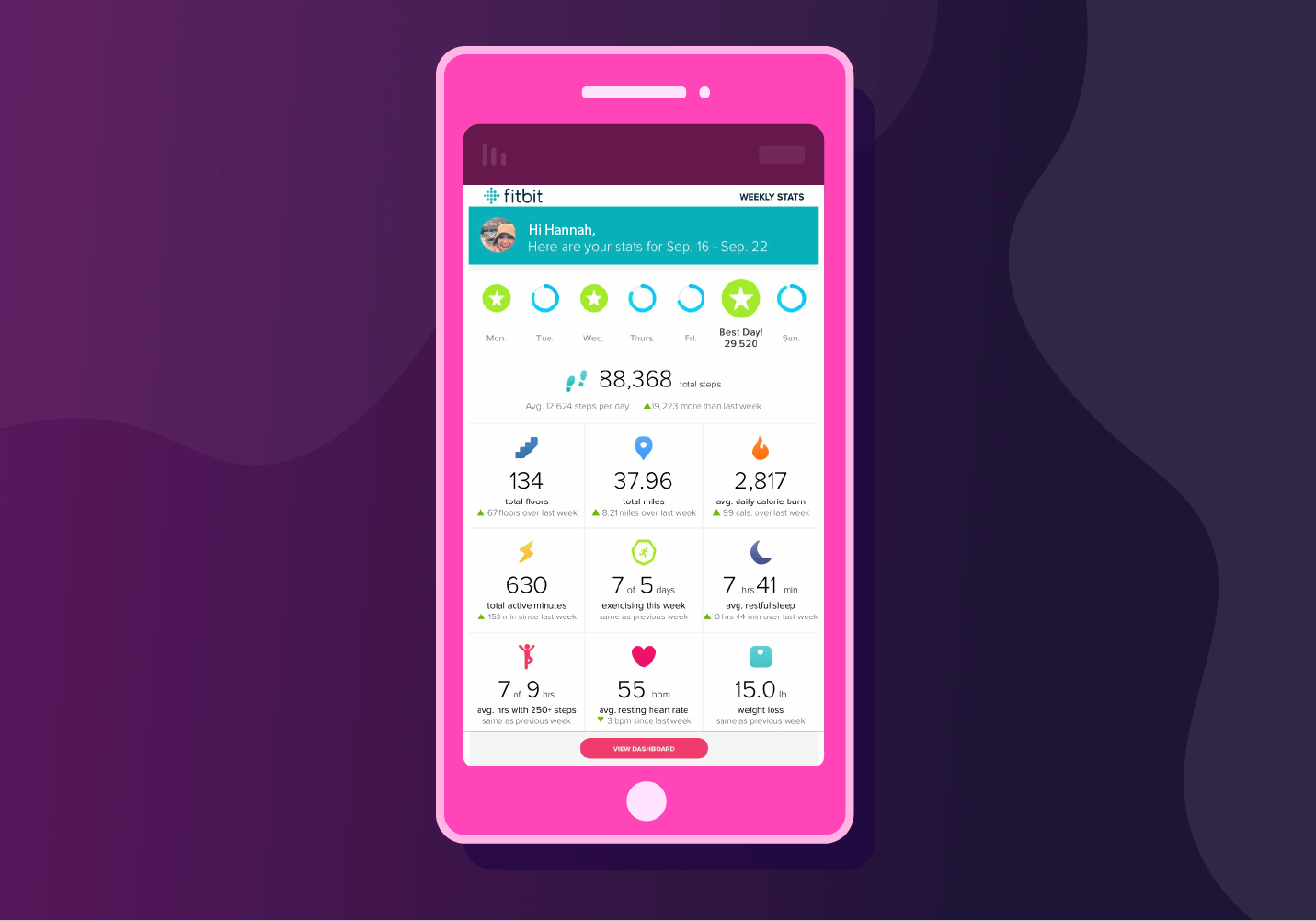
3. Explain why you need certain information
When it comes to users, the more info they provide… the better. That’s how apps are able to create a customized and valuable experience.
However, users don’t see it that way. Users fear their personal information will be used for spam, unrelated content, and pushy emails. And it only takes one annoying campaign for them to opt out altogether.
If you’re upfront and honest with your users about what you will use their information for, they will be more likely to give it to you. Over 80% of users say they want apps to provide a clear reason for requesting personal information3.
For example, if you deliver goods, asking for their address shouldn’t come as a surprise. If you want them to create an account, make it optional but share some benefits of having an account — such as shipping updates, recommended items, and discounts.
Example: Instacart
As a grocery delivery service, Instacart exhibits an easy and fluid First Time User Experience (FTUE) giving users a reason for requesting their personal information. After they request your address, they suggest providing your email for order updates and receipts or give you the option to checkout as a guest. 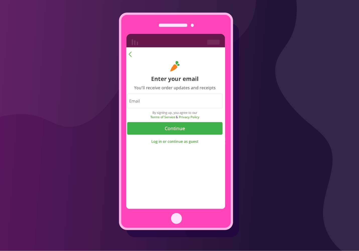
4. Be conversational
Users don’t want to feel that they’re just an email in a lead list. Using casual, conversational language in your campaigns reminds users that there are actual people behind your brand who share similar experiences.
This also comes into play when we think about CTAs. Not every push, email, or content piece should push users to convert. Sometimes, it’s just about piquing their interest so they start browsing around the app.
Example: CNN
This push notification from CNN pokes fun at the idea that everyone’s had an awkward interaction with a delivery person, while also providing a brief overview of what the article is about. 
5. Give your pushes personality
They say a picture is worth a thousand words — which can come in handy when you’re sending notifications with limited room for text.
Enter emojis. Our data showed an average CTR uplift of 124% with pushes that used emojis. Plus it makes your brand come across as more approachable and friendly.
Example: NY Times
This newspaper app uses emojis to convey stories with personality and draw readers into their app.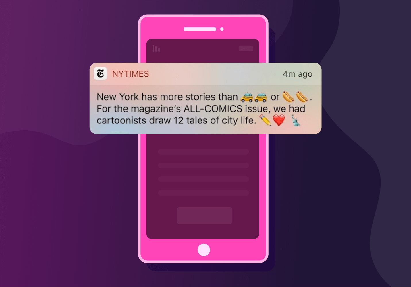
6. Reflect on your failures
Brands aren’t perfect. And neither are their apps. When something goes wrong, the worst thing you could do is pretend it never happened.
When customers are affected or victimized by your brand’s shortcomings, it’s important to confront the issue at its source.
But admitting your mistake is only the first step. Here are the components of an effective apology campaign:
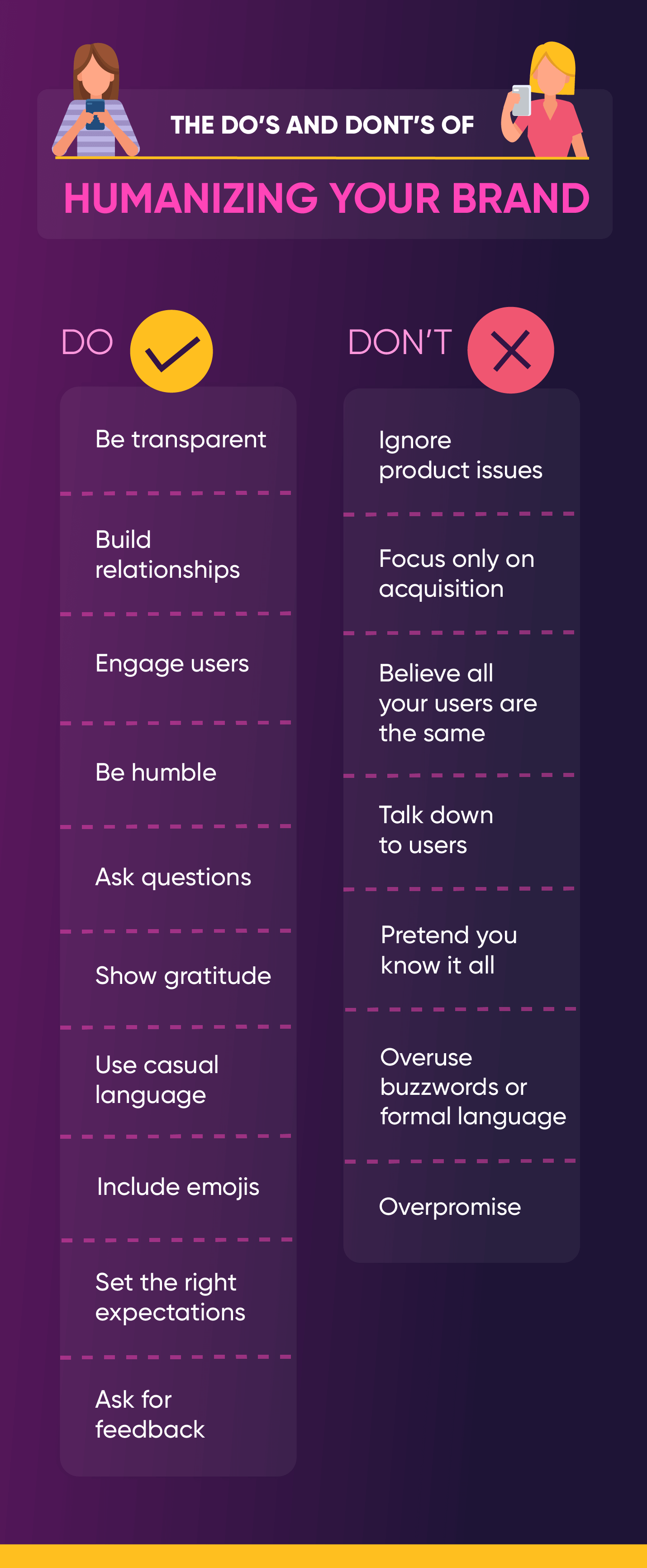
- Be transparent: Users want to know how they were affected by the incident. Be as specific and clear as possible when describing what happened.
- Show remorse: “I’m sorry” may not cut it, but it goes a long way. Apologizing to your users shows humility and reminds them that no one is perfect.
- Define next steps: Users want to know first, that it won’t happen again, and second, what you are planning to do to reconcile the situation. If you’re unsure, ask them.
Example: Airbnb
In 2015, home-sharing app Airbnb was under fire for racial profiling and discrimination from reports and travelers experiencing the prejudices first-hand and sharing it on social media.
Instead of dodging the issue, Airbnb proactively addressed it. It started with this email from CEO and co-founder Brian Chesky: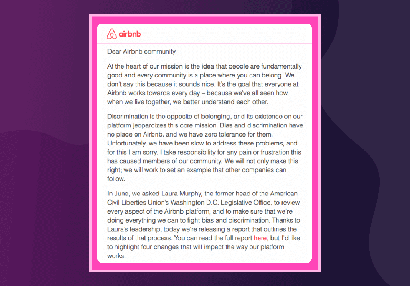
Then followed it up with a very public campaign promoting racial inclusion:
7. Let your bots be bots
Newsflash: Your users know when they’re talking to a bot. And 40% of users do not care whether a real person or a bot helps them as long as they get the help they need.
However, the last thing your users want is to be deceived into thinking they’re chatting with a person when they’re really chatting with a bot.
Rather than thinking of human and bot interactions as mutually exclusive, the most successful apps integrate the two. In other words, common issues or FAQs can be within the realm of automation and humans can fill in the gaps when more technical and specific issues arise.
Example: Hipmunk
This travel app nudges users along through a Facebook Messenger bot that literally tells the user it’s a bot. From there, it asks for information that helps make the user’s search a bit easier. 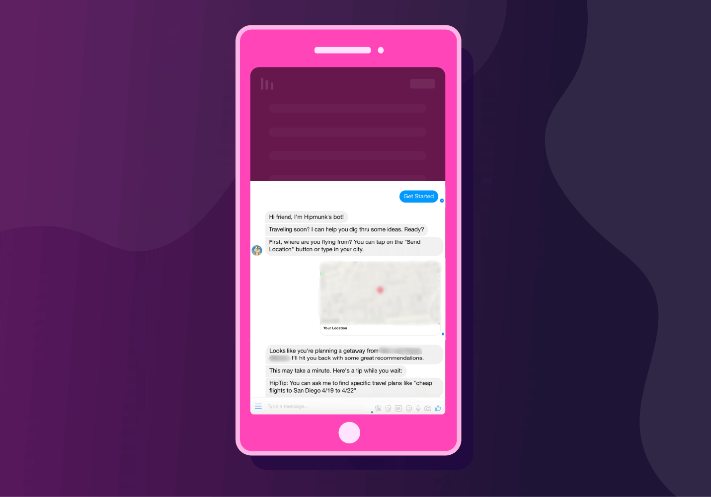
You’re Only Human
Regardless of your industry, giving your users a reason to connect, trust, and follow your brand is key to earning their loyalty. Being honest about your successes and failures not only helps your brand evolve, but proves to your users that you are just like them — human.

A Marketer’s Guide to Personalizing User Experiences
Subharun Mukherjee 
Heads Cross-Functional Marketing.Expert in SaaS Product Marketing, CX & GTM strategies.
Free Customer Engagement Guides
Join our newsletter for actionable tips and proven strategies to grow your business and engage your customers.

