Fintech onboarding is the first form of experience you give to your users.
This experience covers a series of steps: registration, identity verification (through KYC checks), linking a bank account, and making a first deposit. A good onboarding flow would quickly communicate value and walk users through data collection and security steps with clear guidance.
This article will discuss some of the best practices of fintech website onboarding, helping you deliver value instantly and intelligently.
Looking for best practices to optimize onboarding on apps? Start mastering fintech mobile app onboarding best practices.
Why Fintech Onboarding Is Uniquely Challenging
Fintech onboarding carries high stakes. Users trust your website or web application with their money and personal data. Any sign of friction or hidden steps causes anxiety. Below are some key reasons why fintech onboarding is uniquely challenging.
- Trust Barriers: Users are usually defensive about sharing their banking details or any information that can put them at risk. As scams increase in complexity, many people question themselves before sharing any sensitive information. When they’re self-questioning, reassuring cues from UX help. Write microcopies like, “Your data is encrypted and never shared” to give assurance to people.
- Regulatory and Verification Hurdles: The initial onboarding process involves many checks. Users must comply with KYC and anti-money laundering (AML) rules. However, some customers may feel it’s intrusive. You must explain the “why” behind it to help users understand the need.
- High Bounce Risk. If the signup is too lengthy, users are prone to drop off. This is highly likely for mobile users since their screens are comparatively smaller, adding more mental weight to answer a series of questions. According to statistics, 55% of customers prefer mobile banking apps, making it critical for companies to orchestrate onboarding flows with a mobile-first ideology.
- Diverse User Segments: Fintech products serve different personas. Some look for advanced features while others are cautious savers. Strategize the onboarding flow for unique users so they don’t feel limited by a one-size-fits-all onboarding.
Onboarding is one of the most significant drop-off points for banks. CleverTap’s banking on AI report observes that onboarding dropoff reduces customer retention and transactions by 50%.
9 Fintech Onboarding Best Practices to Reduce Drop-offs
Below are some fintech onboarding best practices to help you develop a more seamless onboarding workflow.
1. Show Immediate Value Above the Fold
Communicate the platform’s core benefit before asking users to sign up. For example, a hero section might say “Earn 1.5% cash back with no fees” alongside a demo image of the app.
Put interactive teasers, such as a sample dashboard or quick financial calculator, to give users a “look around” taste of the product. Demonstrating value up front rather than a blank sign-up form builds user confidence and makes the decision to register feel natural.
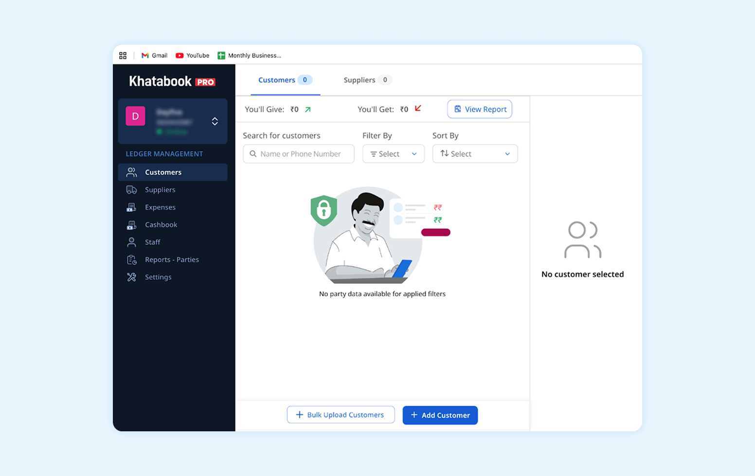
For example, Khatabook, a business management app, just asks for your phone number while onboarding and lets you access and use the application. Later, you can add business details at a convenient time.
2. Offer Soft Conversion Paths for Anonymous Visitors
Allow unregistered visitors to explore features or tools in a limited way. For example, let them simulate an investment plan, view a mock portfolio, or use a budgeting widget without logging in. This “peek before you sign” strategy shows the app’s benefits first, reducing perceived risk.
Collect low-touch leads via email gates or “get started” buttons for later follow-up. Let users interact with the website in a limited way, for example:
- Let them work up a sample portfolio
- Simulate a savings goal
- Browse different investment options available
- Tie the signup action with a benefit to justify users’ efforts
3. Use Progressive Disclosure in Forms
Break long onboarding forms into small, manageable steps. Ask only for the information you need now, and collect extra details later. Chime, a mobile-banking services provider, does this perfectly well. It just asks one question per screen.
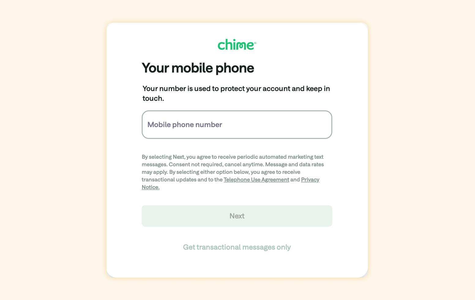
Ensure you validate each field in real time, for example, email format or password strength. In case of any errors, users can modify and fix them. However, if errors occur at the last minute, re-requesting the same information doesn’t deliver a good CX.
4. Build Trust with Clear Microcopy
The wording on buttons and help text should reassure and be human. For every data request, add a brief context line. For example, instead of a dry label “Upload ID,” you might say “We’ll check your ID to keep your account secure,” or “Your driver’s license to verify your identity.”
Similarly, explain why you need each piece of info: “Your SSN is required by law to open your account, and we protect it with bank-grade encryption.” Friendly, guided copy without jargon or all-caps warnings builds confidence.
While this conveys the substance around why you’re seeking customers’ sensitive information, it’s best to personalize how you ask. This makes it easier for users to trust you when you speak their case on websites and mobile applications.
5. Make Security Tangible, Not Assumed
Actively show security features rather than hiding them behind the scenes. Here are a few ways to do it:
- Display lock icons or secure-badge graphics near sensitive fields.
- Offer biometric login or hardware security key options as part of onboarding.
- Introduce two-factor authentication proactively, where a user is encouraged to prove their identity through two methods.
Even a subtle note like “We follow GDPR/CCPA rules and encrypt your data end-to-end” can reassure users. An onboarding must immediately signal security, credibility, and transparency.
Want to know more about data privacy laws? Read our comprehensive guide on GDPR and CCPA compliance.
6. Personalize Onboarding by Channel or Behavior
Use early signals, like referral source or browsing patterns, to tailor the flow. For example, if an incoming user clicked an ad about investing, skip the general explanation and jump to setting up their investment profile.
Make use of behavioral segmentation to adapt a user’s journey in real time. For example, if users browse investment features, guide them toward setting a goal. If they skip linking an account, trigger a nudge about its benefits later. CleverTap helps you trigger such push notifications and deliver them across different channels.
Deliver smarter, personalized push notifications with CleverTap.
A user coming from a salary payment site might see different microcopy than one from a savings tips newsletter. Contextual recommendations reduce friction and encourage users to move forward confidently in the onboarding flow.
7. Use Behavioral Nudges to Prevent Drop-off
Onboarding shouldn’t be static. It should respond to user actions. If someone stalls partway, e.g., stops after entering basic info, automatically trigger a timely reminder or tip.
For instance: “Almost there! Verify your email now to activate your account,” sent via email or in-app message after a pause. CleverTap’s journey orchestration engine lets you define such triggers.
Multi-channel follow-ups on email, SMS, WhatsApp, or web pop-up ensure you catch them even if they leave the site. The key is to tie each nudge to something they did (or didn’t do) in onboarding, so the message feels relevant rather than generic.
8. Connect Onboarding to Activation Metrics
Treat onboarding as the first segment of your overall funnel. It should lead directly to meaningful activation events like the first deposit, the first trade, or the first credit card issued. Instrument your funnel to see how many users finish each step and how many become active. For example, industry data shows that 95% of new fintech users will make at least one financial transaction in their first month, and 76% of newly signed-up users move from onboarding to deeper-in-the-funnel engagement in 7 days.
If your rates are lower, use funnel analytics to find where people drop off. Is it the signup form, ID upload, or funding page? Then, iterate the UX or messaging at those points.
9. Test, Measure, and Iterate Continuously
Onboarding flows should never be “set it and forget it.” Use A/B tests to compare variations, such as different button text or form layouts, and rely on analytics to measure which version drives higher completion.
Marketers rely on platforms like CleverTap to monitor conversion funnels, identifying where users exit. For example, if a new signup form change increases completion by 5%, keep it. If an extra step causes significant drop-offs, remove or simplify it. Regularly revisit your assumptions. A data-driven culture with A/B tests and analytics ensures onboarding stays optimized as user expectations evolve.
Discover effective app onboarding best practices and examples to learn from.
Optimizing Fintech Onboarding For Websites: Examples
See the examples below to understand how fintech applications implement onboarding best practices.
Niyo: Tailored the Onboarding Flow For Users
Niyo, a fintech startup, firmly believes that the first experiences matter and can be pivotal to a customer’s journey toward conversion. The Niyo team simplified and made the long onboarding flow more user-friendly.
For example, a Niyo user may request a credit or debit card from Niyo’s partner bank. Multiple steps are involved here. They’ll have to verify on mobile, set a passcode, choose a card, verify their documents, go through video KYC, and place the card’s order. Once the card is delivered, there’s a separate flow for its activation.
Niyo relies on CleverTap to automate notifications to alert customers when they complete the next step in their flow. It helps a company ensure that document verification and vKYC are done in a compliant manner. This takes a customer from wishing for a card to gaining from the Niyo community fast and without any hassle.
Niyo uses separate conversion funnels for each user flow and product offering. These funnels help them tailor omnichannel journeys, improving customer experience.
For example, if someone verifies their mobile but doesn’t pick a banking partner within 15 minutes, CleverTap sends them a quick email and text. The messages gently remind them to finish signing up and show how the app can help once they’re on board. This targeted approach led to the team realizing a 40% conversion and a 2% CTR for SMSes for the mobile-verified funnel.
Read the full story on how Niyo made its onboarding more seamless.
BharatPe: Increased the Weekly Registration by 22%
BharatPe allows merchants to accept payments from their clients through a QR code. They strategized their onboarding flow to educate users, leading to a 22% increase in weekly registration.
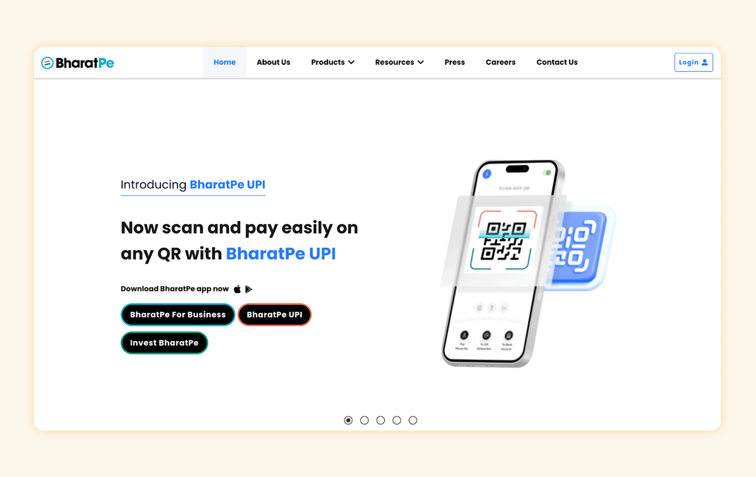
They analyzed user drop-offs through funnels and created a journey for the KYC process. Events and trends helped them understand merchants’ behavior across transactions. These inputs allowed the company to personalize the user experience through vernacular languages and user attributes.
Read more about BharatPe’s story.
Chime (US Neobank) Achieves a 4 ½ Minute Average Onboarding Completion Time
Chime’s (US Neobank) signup is famously streamlined. Opening a checking account requires only 11 screens (22 clicks). Each screen asks for exactly one piece of information (e.g., name, address, DOB) and provides a brief explanation of why it’s needed.

A progress bar keeps users informed. This helps Chime achieve a ~4½ minute average completion time, making onboarding feel effortless.
N26 Builds Trust In Its Onboarding Flow
In Europe, N26’s web onboarding clearly builds trust. Its site uses a neutral color scheme and straightforward copy to emphasize security and simplicity. A headline might read “The Bank You’ll Love” and immediately note a USP (no hidden fees).
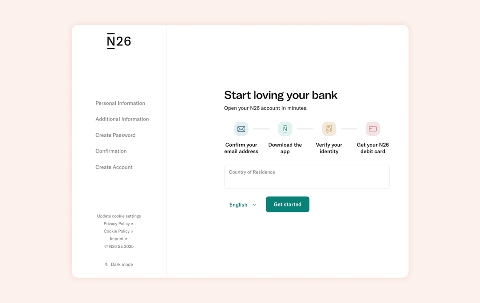
During signup, N26 explains each requirement, such as scanning ID documents, in plain language. This transparency reflects strict privacy norms in the region.
How CleverTap Improves Fintech Onboarding
CleverTap’s engagement platform directly addresses the unique challenges of fintech website onboarding. CleverTap Journeys lets you build adaptive onboarding flows across channels (push, in-app, web pop-ups, email, WhatsApp, etc.).
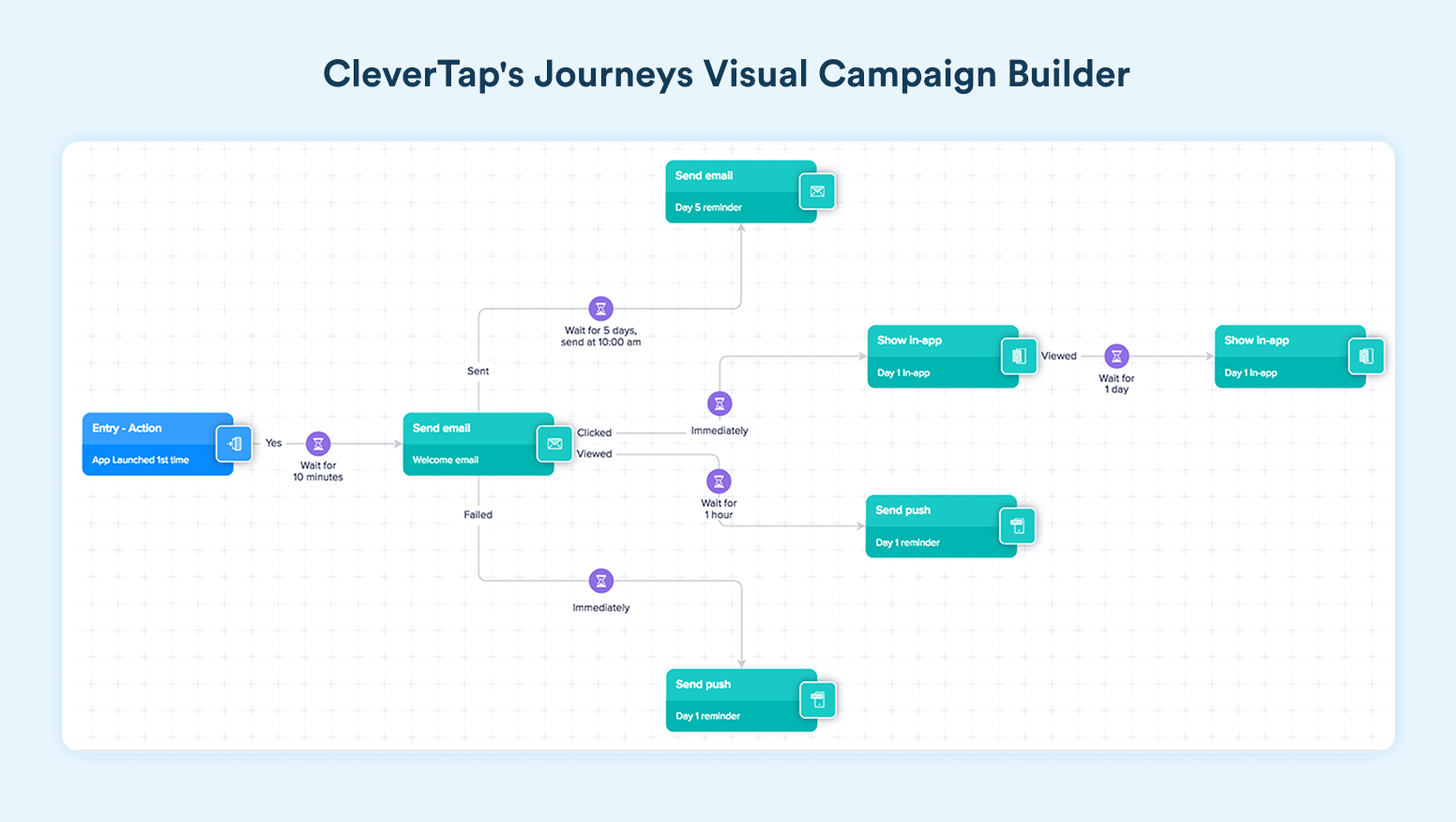
For example, you can send a real-time push nudge when a user skips a step (like, “Almost done! Verify your email). These multi-step campaigns ensure users get the right message at the right time, based on their behavior.
Below are a few CleverTap functionalities that make it a significant solution for optimizing onboarding flows.
- Identity Resolution: CleverTap automatically creates an anonymous profile for every website visitor assigning a CleverTap ID and then unifies it when they sign up. This means you can engage users as soon as they land with web pop-ups or notifications and seamlessly continue once they become known.
- Smart Segmentation and Funnels: The segmentation platform offers advanced features to target onboarding messages to the right cohorts. CleverTap’s funnel analytics pinpoint exactly where drop-offs occur during signup. Marketers can do further A/B testing with different flows and use variants that lead to higher completion.
- RenderMax™ and Multi-Channel Delivery: CleverTap’s push technology, RenderMax™, dramatically improves delivery and visibility of push messages. Combined with email automation, in-app banners, and new channels like WhatsApp, this ensures critical onboarding prompts aren’t missed.
- Analytics and AI Optimization: Behind the scenes, CleverTap’s dashboards and Clever.AI recommendations help continuously optimize onboarding. For example, the platform might highlight that a particular country’s users drop off most often at the address entry screen, suggesting a localized tweak.
These features allow fintech businesses to get more ROI from their acquisition efforts. The more users you try to bring to the website or application, the more users will complete onboarding with CleverTap.
Simplify fintech onboarding with CleverTap’s real-time engagement tools.
Explore CleverTap’s Solution for Fintech
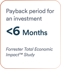
According to a Forrester study, CleverTap customers saw up to 30–35% higher conversion rates and a 561% ROI from improved engagement. These gains come from precisely the kind of real-time segmentation and funnel-driven improvements crucial for fintech.
Several leading banks, like ICICI, and various fintech startups worldwide, are already using CleverTap to implement these best practices. You wouldn’t want to be late to the game. Would you?
Explore CleverTap’s fintech use cases with a personalized strategy demo.
Subharun Mukherjee 
Heads Cross-Functional Marketing.Expert in SaaS Product Marketing, CX & GTM strategies.
Free Customer Engagement Guides
Join our newsletter for actionable tips and proven strategies to grow your business and engage your customers.


