There’s nothing more frustrating for a user than to launch an app to do one thing, and then have to tap multiple times to get to the action they need. Or search through navigation menus to find the sought-after command.
Task analysis is one way that app creators can look at their app’s usability and figure out where it needs to improve. We’ve previously discussed other ways such as: heuristics evaluation, experience optimization psychology, and using UX design principles.
What is Task Analysis?
Task analysis is basically a process that a UX team goes through to determine your most crucial user goals in the app (e.g., purchases, social shares, adding bookmarks, etc.) and the number of steps (or tasks) that a user must complete to get to the objective.
By breaking down your most important user goals into a series of subtasks, app developers and UX designers are able to dig into the user experience and draw insights that help improve the product.
In the book User and Task Analysis for Interface Design, authors JoAnn Hackos and Janice Redish outline the task analysis definition as the process by which app creators discover:*
- What the user’s goals are
- What tasks users have to do to achieve those goals
- What experiences they bring to those tasks
- How users are affected by their physical environment
- How their previous knowledge and experience with apps influences how they think about their in-app tasks and the process they use to complete them
Why Use Task Analysis At All?
Improving the user experience cannot be done without a thorough understanding of the user’s perspective. In fact, a simple task analysis definition is that it’s a tool by which marketers can capture the thinking process behind users’ actions. It’s a detailed investigation into what your users are trying to do and what they feel as they do it.
It helps you to discover:
- Whether you’ve built your app in a logical way — whether navigation menus and user actions are clear and workflows are efficient enough to keep users from getting frustrated
- Whether you’ve added too much complexity to your app, and now have users jumping through hoops in order to do the simplest tasks
This process is integral to seeing things from the eyes of your customer.
Just as the journey map is a useful tool for seeing the customer journey from their perspective, task analysis helps app marketers and creators see user actions from their point-of-view.
Types of Task Analysis
A. Cognitive Task Analysis
You can have a cognitive task analysis that seeks to understand the deeper mental processes involved in accomplishing a goal — i.e., decision making, problem solving, memory, even attention.
This type is used primarily for examining the mental models and decision-making processes that experts vs. novices use when performing a task. As such, it’s used mostly in educational (studies in learning) and clinical settings (digressing and not particularly useful for app design or UX.
B. Hierarchical Task Analysis
But the more common type is the hierarchical task analysis. This is basically a study of behavior since it breaks down high-level goals into tasks and subtasks.
The deliverable in this type of task analysis is a visual diagram that outlines steps needed to accomplish a goal within your app or product. For example: if the goal is to add an item to your ecommerce app’s shopping cart, then a simple task analysis would include the following: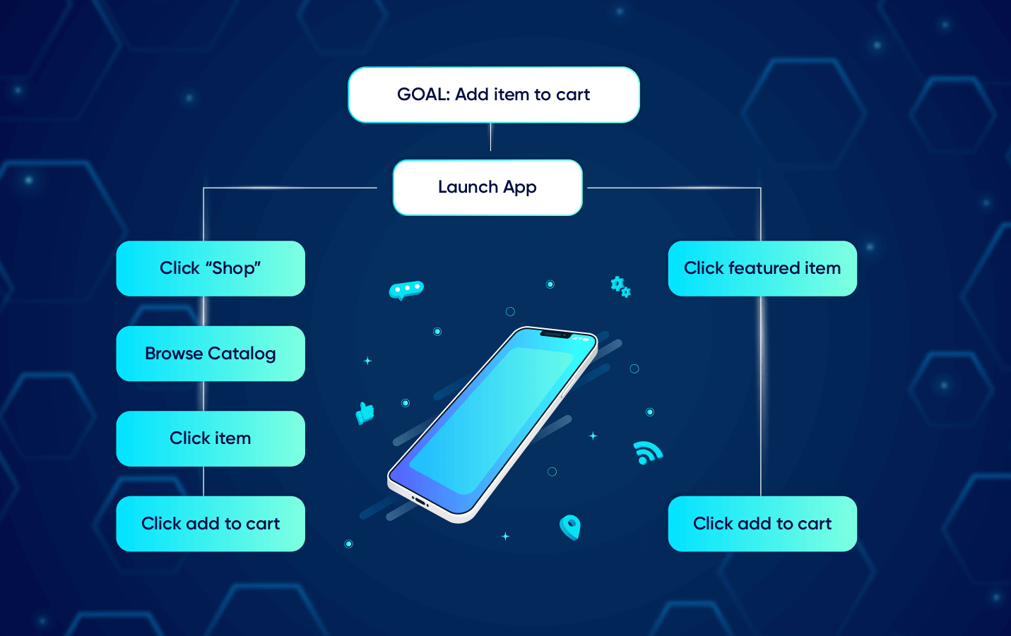
Except that a real task analysis would have all the major goals laid out side-by-side in a document, with all their subtasks underneath, showing you the full complexity of your app. If that sounds overwhelming, rest assured it’s supposed to be. That way, you can prioritize the most crucial tasks amongst the ones available, and feature those on your navigation or send users to them via marketing.
It’s Not Task Analysis Unless Users are Consulted
The problem — and many UX designers out there will agree — is that very few brands actually take the time to conduct a real task analysis.
What happens is that internal teams will map out what THEY think the actions and goals are without consulting end users. What they end up with is a technical hierarchy of how their company views the app’s usability.
Wrong way around, my friends.
The goal of this process is not to draw a perfect diagram of ideal actions. It’s to capture the imperfect reality of how your app is being used and experienced by actual customers.
Task Analysis: How to Conduct It
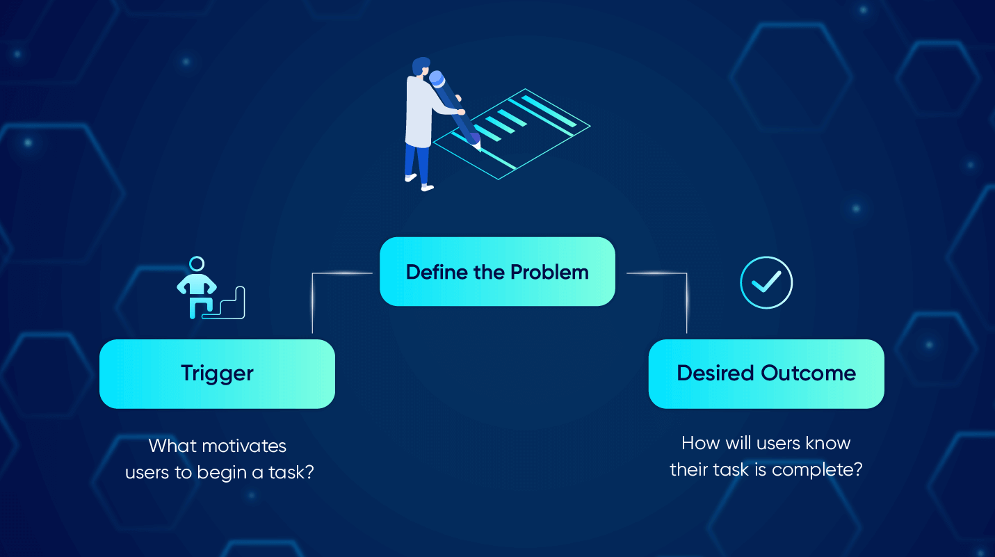
01. Define the Problems
No problem can be solved unless it’s first expressed. App developers and UX designers cannot assume to know the user’s problems. Have users express what their problems are so you know what data to collect.
Look for the:
- Trigger: What motivates users to begin a task?
- Desired Outcome: How will users know their task is complete?
02. Do the Research
Next, go out and observe your customers using your app. Schedule focus group discussions. Ask them what they are trying to do and what they’re thinking or feeling at each step. Have them evaluate their entire customer experience.
Watch closely to identify:
- Base Knowledge: What are users expected to know when starting a task?
- Required Knowledge: What must they actually know in order to complete the task?
- Artifacts: What tools or information did they use during the task?
Additional research can be conducted by your marketing team as this information comes in the form of customer feedback interviews, comments left on social media, and user surveys. Keep an eye out for comments on what UX issues people experience or even what features they enjoy.
03. Diagram the Tasks
Using the insights from the research phase, you can start building out the hierarchical diagram with all the high-level goals on top and with subtasks branching out from under the topmost goals.
You can use design software to map it out. Or start with analog sticky notes in order to be as flexible as possible before pegging down the final structure.
Once you’re done, however, this diagram is just phase 1. Meaning: this is how your users are acting RIGHT NOW. The beauty of task analysis is that you can use it to pinpoint areas that can be OPTIMIZED, and in doing so, create the differentiation needed to set you apart from your competition.
04. Optimize at Every Opportunity
How do you optimize? You look at all the research you have at hand, all the tasks your users are facing, and identify opportunities and unmet needs.
Just as in making the diagram, you begin from the end goal and work backwards. The goal is to eliminate user steps so they need to do less. And find ways to automate or allow your system to do some of the work for your users.
Optimization could be as simple as removing all the extra steps in pursuit of a high-level goal. But it could also mean figuring out how to keep users on your app much longer.
If, during your research and initial diagramming, you discover your users are going through extra steps in order to accomplish a goal that you didn’t even have on your radar, then it’s worth exploring that opportunity.
For example: you find out users are taking extra steps to go back and forth comparing the different features on similar products. This could be an opportunity to create a new product/price comparison feature for your app.
The Goal is Optimized User Experience
Remember that the entire objective of doing task analysis in the first place is to improve the user experience. After all, what is task analysis but a tool to simplify their app experience? If the result of your analysis is a more complex, convoluted app, then you’re doing it wrong.
For more on the user experience and how to optimize for it, read these blog posts:
- Heuristic Evaluation: Improve Your App’s UX Using 10 Usability Heuristics
- User Experience: UX Design Principles That Deliver Awesome Apps
- Customer Experience: Tools to Build Outstanding Experiences

Shivkumar M 
Head Product Launches, Adoption, & Evangelism.Expert in cross channel marketing strategies & platforms.
Free Customer Engagement Guides
Join our newsletter for actionable tips and proven strategies to grow your business and engage your customers.

