


Table of Contents
Categories
Most Popular

If you’ve come across our social media channels or website in the past month, then you may have noticed something new. We’ve gone through a complete rebrand from our color palette and fonts to our logo and graphic elements.
When a company goes through a rebranding process, it’s a transformation of the corporate image to differentiate itself from the competitors in the market, sometimes from its own past. In our case, the objective of the rebrand was to give CleverTap a new lease of life in an ever-evolving global SaaS landscape. We wanted something striking yet simplistic, distinctive yet relatable.
It wasn’t an overnight decision to part ways with the old logo, especially since it served us well. Rather, it was a carefully considered process by both the founders and our in-house marketing team — one brought about by the need to show how our brand has matured beyond its humble beginnings.
“Rebranding is about more than just slapping up a new logo and calling it a day. It’s about helping your company, and your customers, make the switch gradually and confidently to a company that demonstrates how it aligns with the very same values it presents to its customers every day. It’s about making sure that pride, quality, and satisfaction are more than buzzwords. And it’s about honoring your commitment to the new brand without abandoning the old.” – Neil Patel, Co-founder of NP Digital and Subscribers
The Process: Ideate, Create, Iterate!
4 designers. Countless ideas. One new logo. 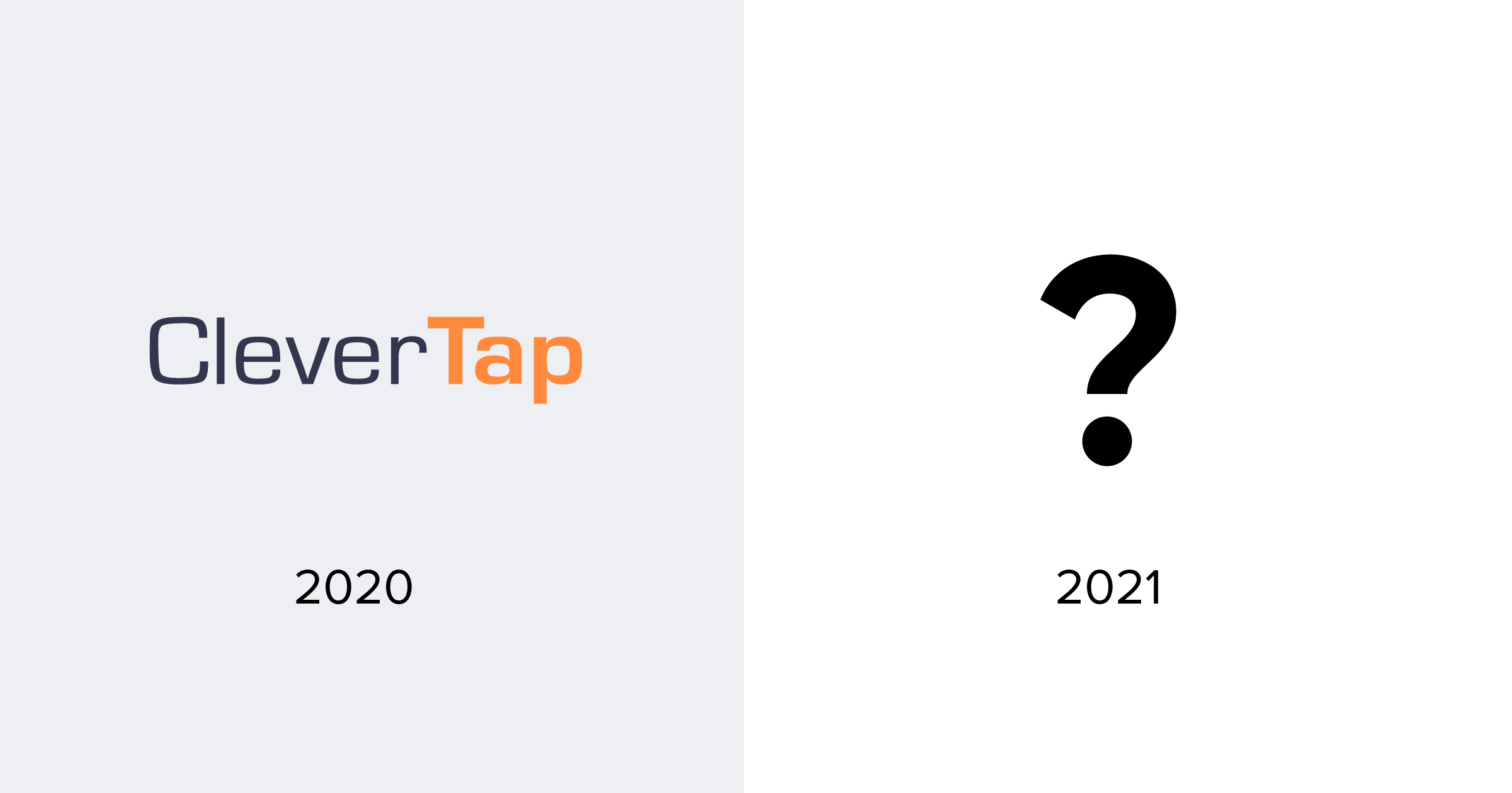 What’s it going to be?
The design team followed a simple design thinking mantra, ‘Ideate, Create, and Iterate.’ A detailed understanding of the briefing document helped us analyze the core messaging and value proposition as well as the brand positioning of our product. We developed initial concepts of wordmarks, pictorial marks… and even mascots!
After some creative (and heated) brainstorming sessions, the team collectively chose the route of a combination mark that involves a play of symbol and type. A cohesive integration of the two helps deliver a lasting impression, enabling the brand to become instantly recognizable.
We explored a wide range of possibilities for the new brand identity, including a retention magnet, a loading symbol, a mouse click/tap action, a rising sun, a lightning symbol, and more. But none struck gold.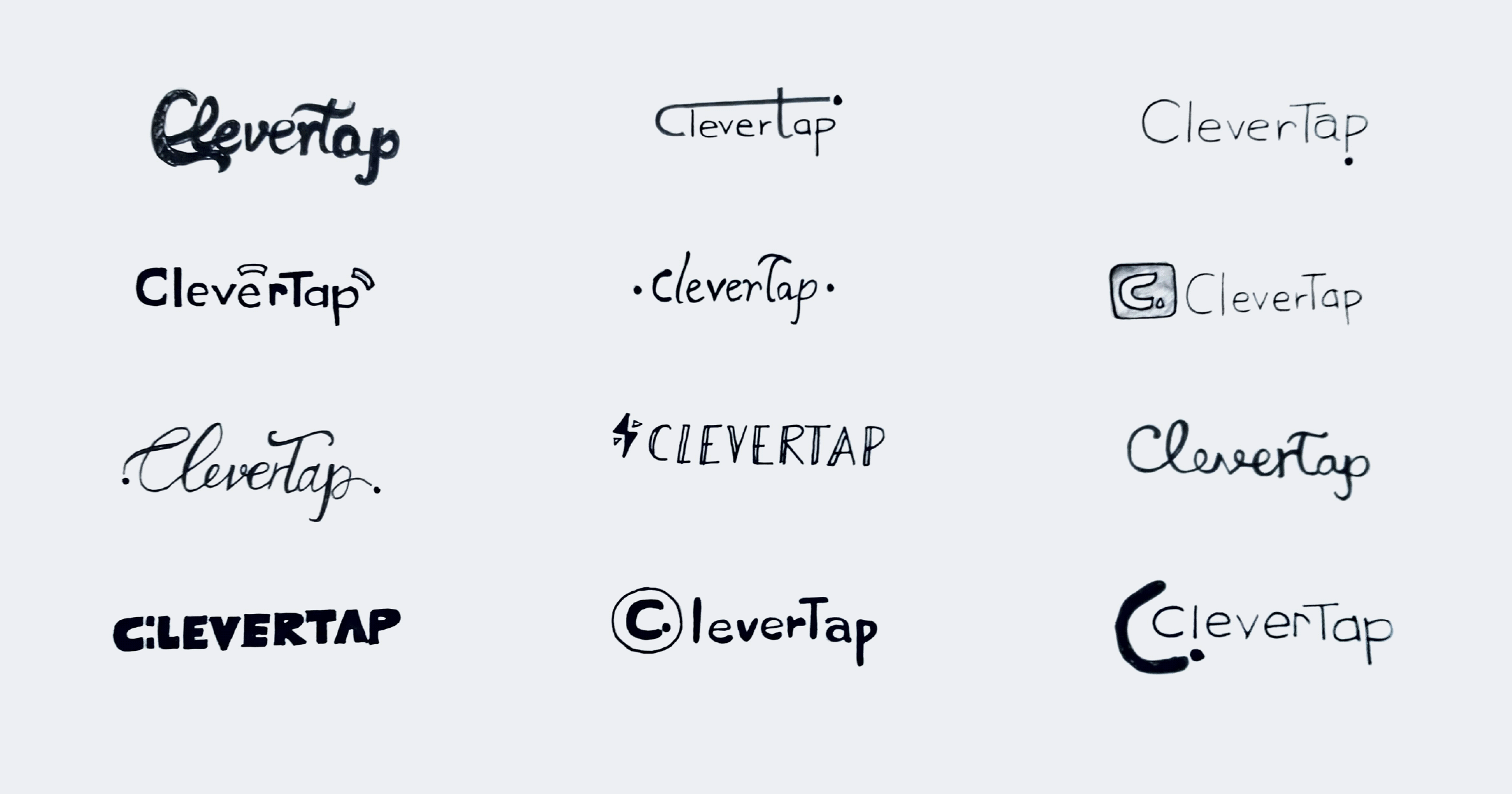
Initial Sketches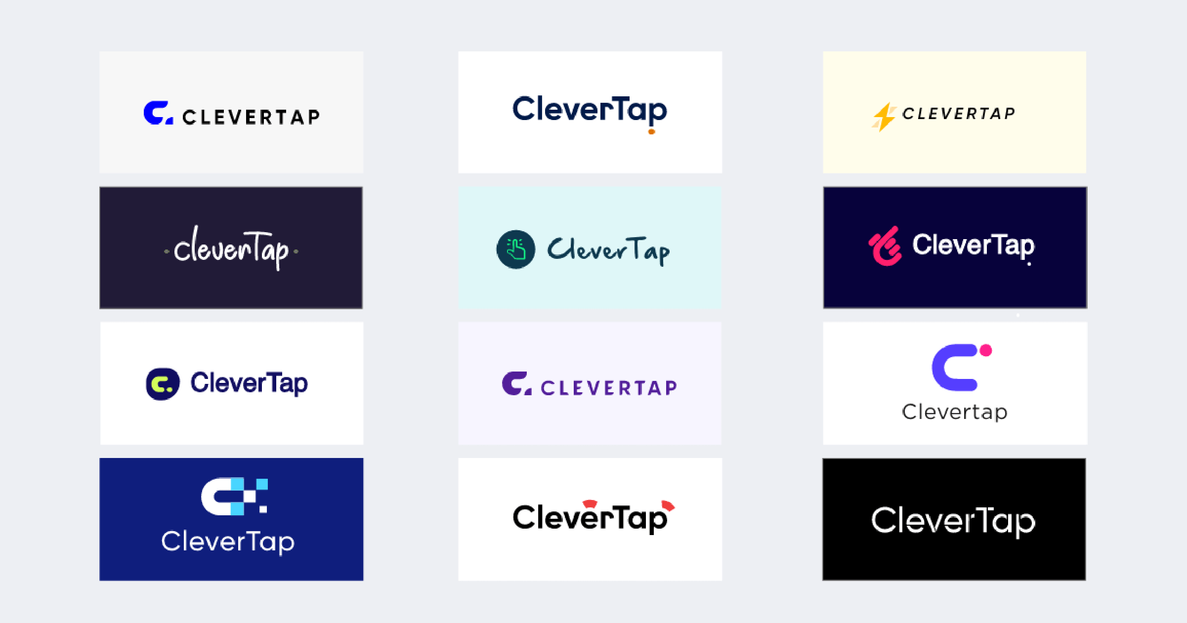
Graphic explorations
Ultimately, the team decided to focus on the letter C, and how it could incorporate both our intended messaging and our brand identity. After all, C is the first letter of our brand name, as well as other terms that capture our brand personality: change, challenge, candid, creative, and clever.
The Result: New, Bold and Fabulous
Say hello to CleverTap 2.0.
The Foundation: Fortune Favors the Bold
“Fortune favors the bold” was the foundation of the reimagined, renewed CleverTap. We wanted to transform the brand into one that was ready for global expansion. This pushed us to develop a strategy and identity design system that could capture the spirit of a bold, confident, and power-packed company.
Which led to a question: what makes us different from our competition?
The CleverTap Difference: ARC Technology
When you come right down to it, what sets us apart are the technology that powers the platform and the people that are behind the company.
Our ARC technology is designed specifically for fast-growing mobile brands. It can handle anything thrown at it and continue to deliver incredible performance, amazing customer experiences, and revolutionary targeting capabilities. It was built from the ground up to work with the most innovative apps in the world. Because of the giant leap in its data processing speed, every mobile app that uses ARC technology is elevated into a completely different class.
But how do you capture this idea in a rebrand?
You start with the logo.
Designing the Symbol
We explored a multitude of ‘C’ symbols and arrived at one that was versatile, memorable, and had the flexibility to be scalable across brand applications.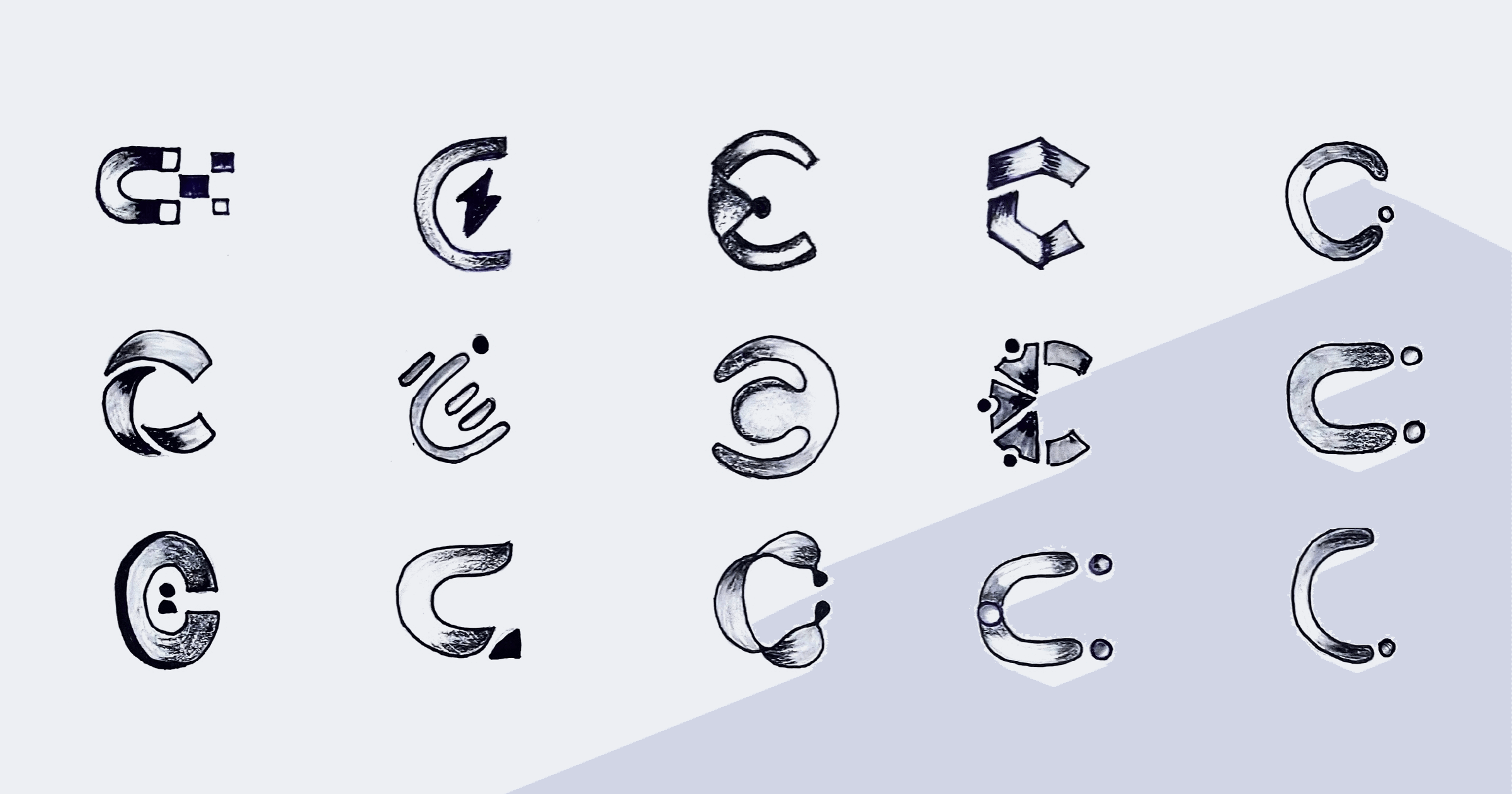
Explorations of the C symbol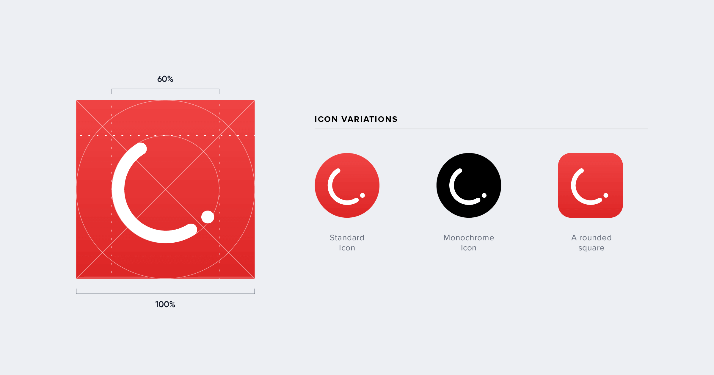
Final logo symbol
The CleverTap Arc
We settled on an arc as the central design element because the CleverTap Arc symbolizes the USP of the product — Automation, Retention, & Conversion. It is the arc of every user action.
An arc is a portion of the circumference of a circle: like our logo, and like the letter C.
An arc is a path an individual takes: like a customer journey, and like our product delivers.
Paint the SaaS World Red
Alongside the redesigned logo, we had to decide the brand’s color palette, which goes beyond visual boundaries to define the brand personality. Colors both strengthen and elevate the brand’s positioning as well as establish greater customer recall.
And we chose a daring, fearless, and striking CleverTap Red! It defines our passion for excellence, excitement for creating unforgettable customer experiences, and confidence to grow through challenges.
Complementing the fiery red is the quiet sophistication of Rich Black Fogra along with the classic elegance of gray and white, enveloped by the optimistic warmth of Canary Yellow.
Primary brand colors and extended palette
Just Your Typography
When used consistently, a brand’s typography helps unify messaging and create brand recall. Like CleverTap itself, our typography is unique, modern, and versatile. It was designed for maximum impact and easy readability across all applications.
We went with Proxima Nova as the versatile body copy typeface. And supplemented it with Gilroy as the more impactful typeface for accents and headlines since it’s a modern sans serif with a geometric touch.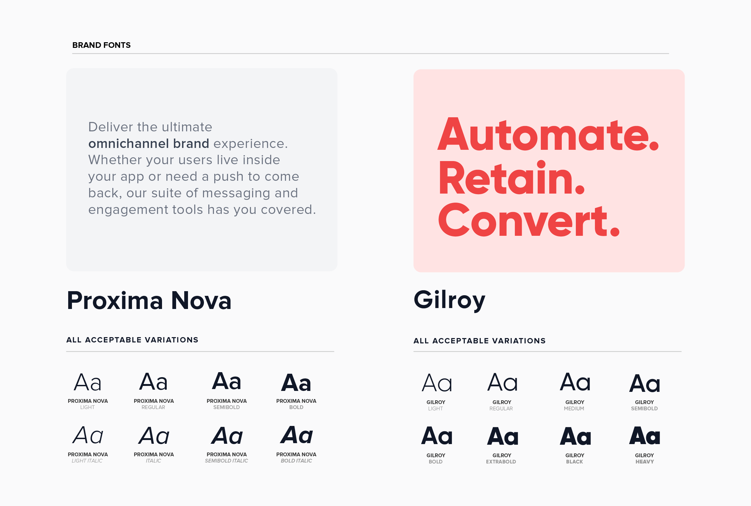
Rework the Copy
We decided to keep our content fun, engaging, and relatable. After all, even though we are selling software as a service, we are selling it to people. People with goals, targets, deadlines, dreams, desires, and well, hopefully a sense of humor. It was of paramount importance that our target audience not feel alienated or disinterested.
In addition, we chose simplicity as the core of our communication strategy. As the saying goes, “If you can’t explain it simply, you don’t understand it well enough.” 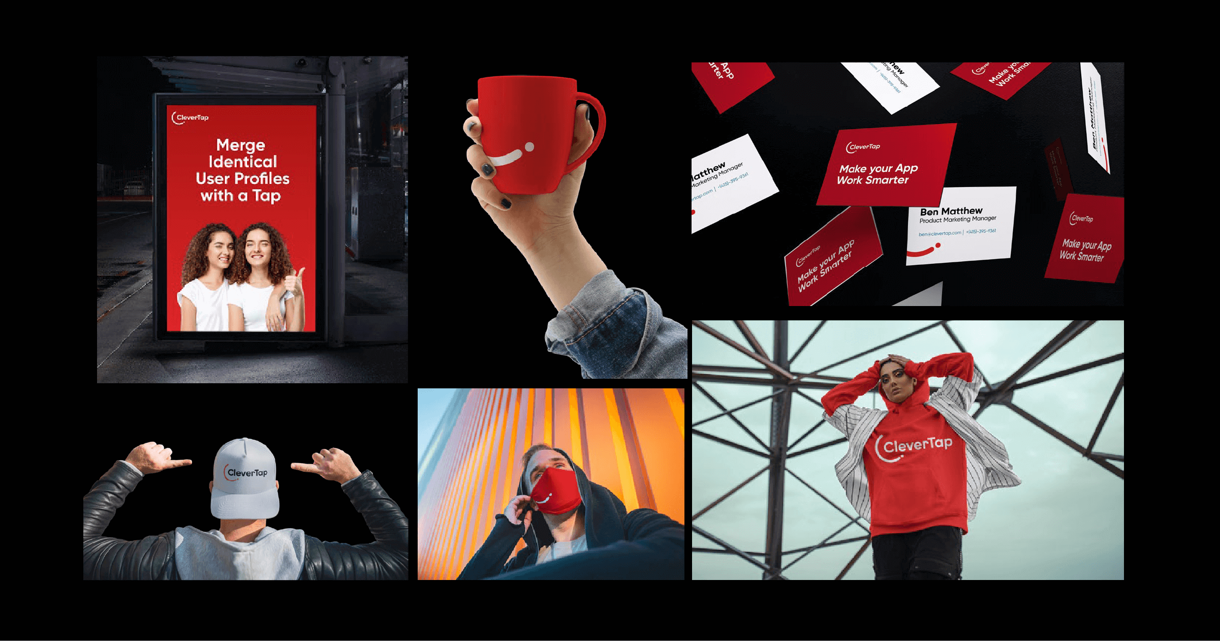
Brand application
Mrinal Parekh 
Leads Product Marketing & Analyst Relations.Expert in cross-channel marketing strategies & platforms.
Free Customer Engagement Guides
Join our newsletter for actionable tips and proven strategies to grow your business and engage your customers.
