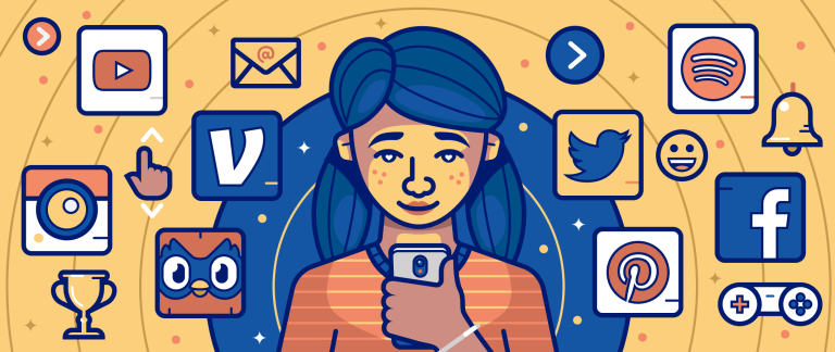
Can’t stop playing Candy Crush Saga?
You have Aristotle to thank for that.
That’s because BJ Fogg, the psychologist responsible for the theories and methods companies use to create addictive mobile apps got the idea for them while he was reading Aristotle’s works.
TL;DR – Aristotle was obsessed with discovering the patterns behind events and phenomena that seem unpredictable, but in fact, are. And while reading his treatise on persuasion, Fogg realized that his ideas could be used to design computers (and software) that increased a user’s desire to use them.1
So if it seemed like building an addictive mobile app only happens by chance, the truth is, there are actually concrete reasons why some apps are irresistible and others are forgotten.
Here’s why the most addictive apps are so hard to put down and how you can apply the strategies they use to improve user engagement and retention for yours.
Behavior Design: The Science That Makes Apps Addictive
The scientific field that BJ Fogg developed from his initial research in 1997 is known as Behavior Design. The idea behind it is that computers can be designed such that they influenced the behavior of the people who used them: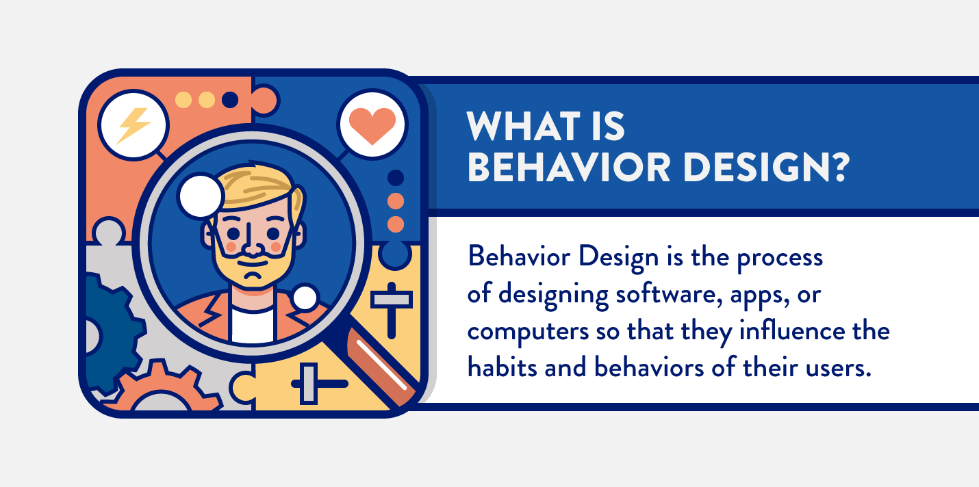
Sounds like a terrifyingly brilliant idea, right?
Indeed, Behavior Design is a controversial science. While Fogg originally developed his theories with the idea of using it to help people improve their lives (to help students study longer and learn more for instance), some have questioned the ethicality of how tech companies are applying it… including Fogg.1
That’s because just like casinos make millions off of the people who play the slots (which are also designed to be addictive), many tech companies have used these techniques to build highly-addictive apps that earn them the same.2
There is no defined code of conduct regarding how Behavior Design should be applied (some are trying to develop one, however). So how you choose to incorporate it is truly up to you.3
However, one thing is for sure — it works. Here’s how.
How to Create Addictive Apps With Behavior Design
To design addictive apps, we first need to understand Fogg’s Behavior Model, which is based on the idea that for a person to do anything, 3 things must be true: 1
- Motivation. They have to want to do it.
- Ability. They have to be able to do it.
- Triggers. They have to be prompted to do it.
Motivations are your users’ internal desires and emotions (often negative, like loneliness or boredom) where the prompt (trigger) is a call to action that addresses them.
Ability refers to how easy the action is to take. The easier a task is to complete, or the more motivated a person is to complete it, the more likely they are to take action.
Here’s how Fogg puts it all together:4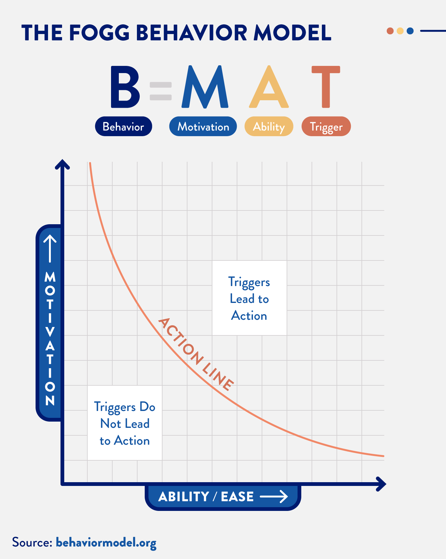
However, while Fogg’s model is foundational for designing your app so that it is enticing to use, it’s not enough by itself to make it addictive — that requires two additional things.
Rewards and Investment
In a famous experiment, B.F. Skinner (a scientist from Harvard in the 1930s), put a rat in a box with a lever that released a food pellet when pulled.5
Initially, the rat bumped the lever on accident and got a nice surprise. But over time, it learned to go straight to the lever once it was placed in the box.
The key takeaway? We have to reward our users for the actions they take with something that makes them want to do it again.
This is the theory of Nir Eyal, a student of Fogg’s, who combines lessons from Skinner’s experiment with Fogg’s Behavior Model — and adds another important additional element to deepen the connection: investment.
The idea being, the more invested a user is in an app or device, the more likely it is that they’ll incorporate it into their daily lives.
The best way to get users more invested according to Eyal’s research is by allowing them to personalize or customize their experience. He puts it all together in his book, How to Build Habit-Forming Products:6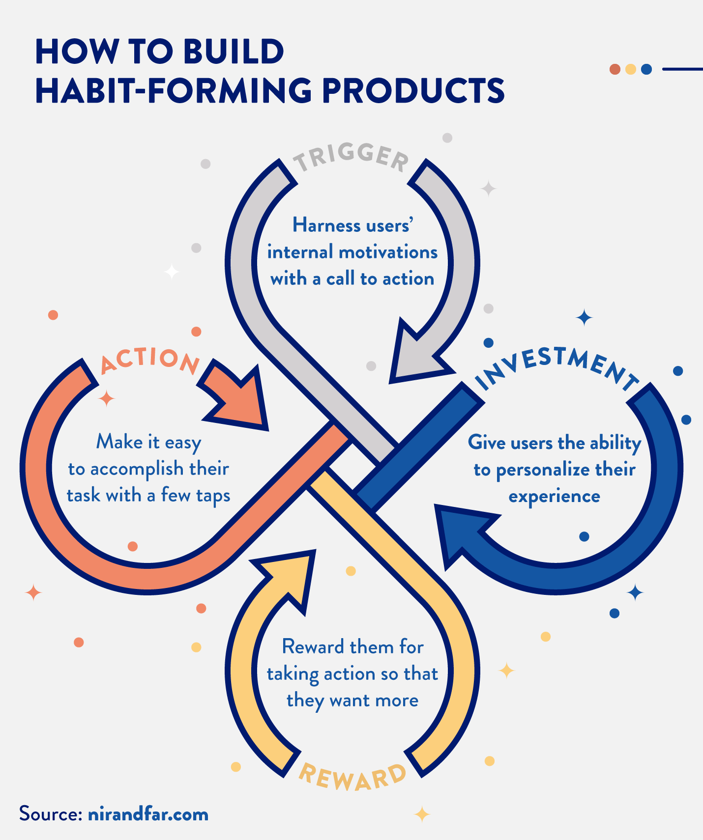
Note: “Action” is similar to “Ability” in the Fogg Behavior Model
Ok, enough theory. How do you incorporate this into your app’s design? How are others implementing it?
Here are 9 specific ways the most addictive apps are using Behavior Design to make them such.
9 Design Elements That Make Mobile Apps Addictive
Addictiveness isn’t a spice you just sprinkle on top of your app so your users will come back for seconds. It has to be baked into its core functionality.
Each of the design elements below, when incorporated into your app’s primary functions, will help you design your app so that using it becomes a habit.
Engaging Onboarding
Studies show that 77% of users drop an app just 72 hours after they downloaded it. Which means you have a very short period of time to prove your app’s worth with users before it’s uninstalled.7
The best way to get them onboarded is to reward them with the thing they downloaded your app for in the first place. If you do this quickly, it’s much more likely that they’ll integrate your app into their everyday lives right away.
For a game app like Candy Crush Saga, this means making sure that users have fun the first time they play. And for an app like Venmo, this means helping users send money quickly to their friends, plus showing them other situations they could use it for in their immediate future: 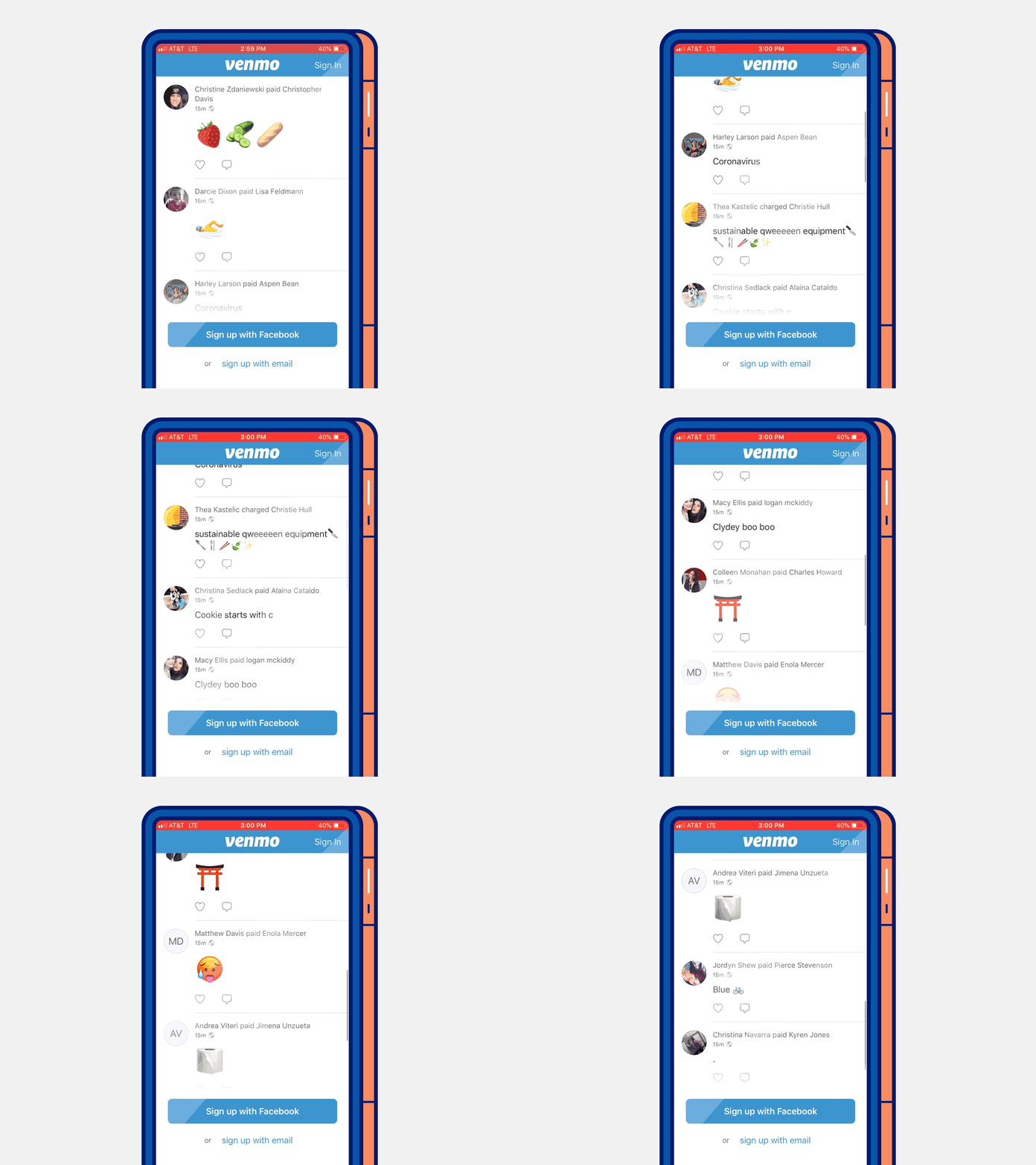
Think about how you can reward users with the things they downloaded your app for immediately after they install it. Then show them the promise of what’s to come if they use it again.
And keep in mind, some of those things might be emotional in nature.
Design For Emotions
Part of the reason Facebook is so addictive (and why it has been a top app for years) is that it combats several negative emotions that people have all at once.
For example, when you’re lonely, it provides a way for you to feel connected to people even if they’re not there. Your news feed also helps you combat boredom, as it provides you an endless stream of content to consume.
Even LinkedIn does this, but targeting a different emotion — they help you connect with other professionals which makes you feel successful and important.
The takeaway? Keep in mind that your users may be downloading your app to address a negative feeling they have. Design with that in mind!
Notifications
If someone downloaded your app, they were motivated enough to do so because they hoped to get something specific from it. But most users need help seeing how it can do that for them.
That’s where emails and push notifications can be effective triggers for mobile app marketers.
For example, the dating app Hinge exists to help you find a romantic partner. So they let you know when someone likes you so you can check them out: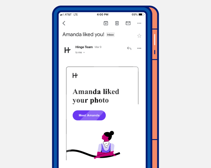
Or Netflix for instance, which gives you a heads up about new seasons with a creative push notification: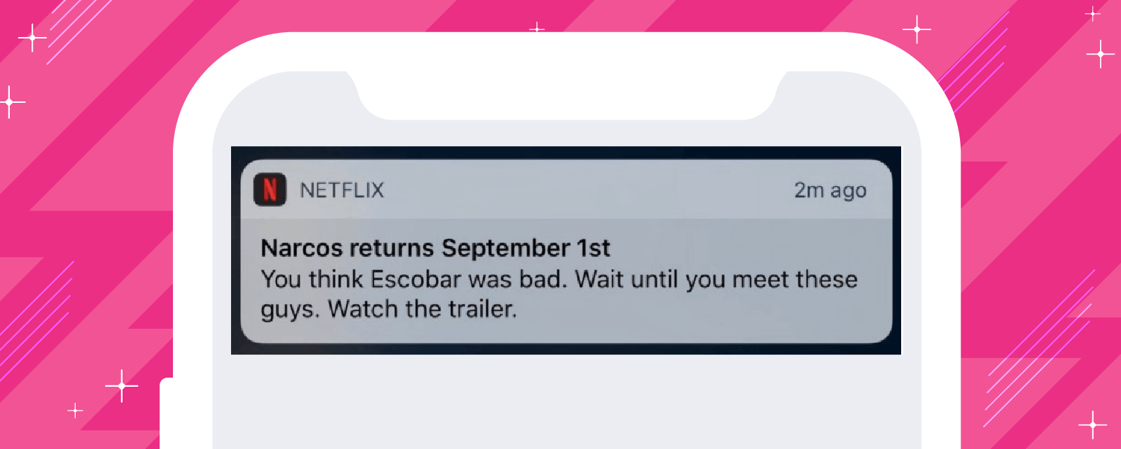
Each of these triggers is effective for 2 specific reasons:
- They speak to users’ motivations for downloading the app. Hinge users want to find love. Netflix users want to watch their favorite shows. Each notification helps users do these things if they take an easy action (open it).
- They spark curiosity and intrigue with a reward. Hinge rewards users for opening the app with someone fun and new who is already into them, while Netflix rewards them with a trailer for their favorite binge-worthy show.
If you can incorporate these elements into your notifications, it will help you hook users on your app.
Auto-Play Next
TV shows are binge-worthy because they’re entertaining, yes. But they’re also that way because streaming services design their interfaces to enhance that fact.
Think about how an episode of your favorite show ends… it leaves you hanging, right?
Well, streaming services work in conjunction with your burning desire to see what happens next by automatically playing the next episode.
They actually make it more work to stop watching — you’d have to physically tell the app to not play the next episode!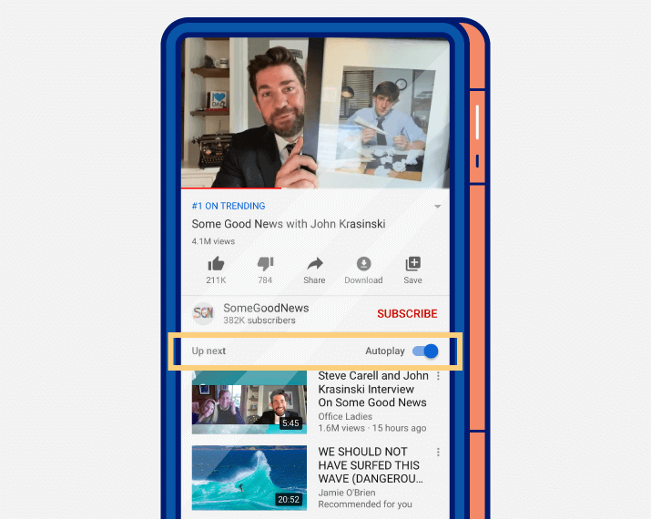
The key takeaway is this: even if your app doesn’t stream videos, if you can find ways to make it easier to keep using your app than quit, usage numbers will increase.
The next two design elements are additional ways to do that.
Mounting Loss
Imagine what would happen if Instagram disappeared tomorrow… all of the influencers who make their living from the platform would lose their way of life!
That’s an example of mounting loss, or another way to think about the idea of “investment.” It’s the idea that the more someone uses your app, the more they’d lose if they walked away.
And the most common way to create it is in the form of a “collection.”
For example, Instagram and LinkedIn users collect followers or connections. Apps like Pinterest or Evernote help users collect articles or “pins.”
Even Spotify incorporates this — if you delete it, you’d lose all of the music that you’ve bookmarked (not to mention your playlists).
Simply put, if you build your app such that your users have valuable things to collect, it’ll be easier to retain them.
Infinite Scroll
Infinite scroll increases the addictiveness of your app like bottomless mimosas at your favorite brunch place. Just like an endless supply of your favorite drink makes it easy to stay at the restaurant longer, an endless stream of content your users enjoy will do the same for your app.
That’s why Facebook rolled out their news feed all those years ago. It makes it harder to exit the app because there’s always more content to consume.
However, just like bottomless mimosas only keeps diners in the restaurant if they like to drink them, an infinite content feed only works if that content is something your users actually enjoy.
That’s where most addictive apps also combine this feature with an algorithm.
A great example — remember when Instagram announced the fact that your feed was no longer going to be chronological?8
It turns out, there was a very good reason for this — namely because they knew it would help users see more of the content they liked, which would keep them in the app longer.
So no matter what your app does, think about how you can provide an endless stream of the thing people download it for. It will make your app more addictive, especially with regards to content discovery.
Gamification
Games are addictive by their very nature because they’re fun. And most importantly, because the outcomes are ever-changing.
That’s why many apps (even those that aren’t games) incorporate game-like elements into their design — to keep things fresh and exciting.
DuoLingo is a great example of an app that does this well. They incorporate a number of different game-like elements, including “daily lesson completion streaks,” variable rewards, and the ability to compete against your friends (or random strangers) in “leagues” to help you learn languages: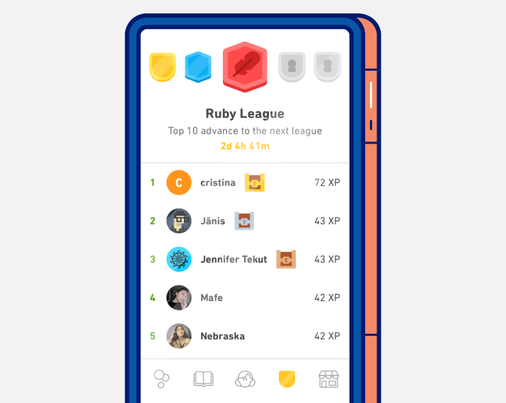
Think of ways you can introduce game-like elements and variable rewards into your app to keep your users hooked on seeing what happens next.
Customized Experiences
One of the reasons Spotify has become so popular is that they make listening to music a completely customizable experience, which is evidenced by their tagline: “Soundtrack your life with Spotify.”
You can create your own playlists, share them with friends, or follow ones that complete strangers have put together.
Spotify even builds playlists they think you’ll like especially for you: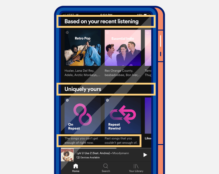
Simply put, people like personalization. The more you can give users the ability to shape their experience with your app, the more they’ll become invested in it.
Speed and Ease
Fact: 79% of online shoppers will not return to a website if load speed is a problem.
This is why good UX is such a critical element of your app’s design. Your users will not engage with an app if it’s hard to use, per the Fogg Behavior Model. They expect things to be quick and easy.
And if they’re not? It doesn’t matter how motivated they are or how great the copy on your push notifications is — they won’t stick with you.
Your best bet is to follow website accessibility guidelines, as they are very closely associated with good UX.
However, design elements that create the perception of speed (like skeleton screens) can also go a long way to meet their expectations, even if loading is taking longer than they expect.9
Advanced Strategies For Building Addictive Apps
We’ve compiled six of the most powerful principles of consumer psychology that apps like Facebook, Snapchat, and Clash of Clans use to build habits and drive long-term retention — including the 3-step process that billion-dollar businesses have used to reach unicorn status. Learn more here. 

The Psychology of Insanely Addictive Apps
Shivkumar M 
Head Product Launches, Adoption, & Evangelism.Expert in cross channel marketing strategies & platforms.
Free Customer Engagement Guides
Join our newsletter for actionable tips and proven strategies to grow your business and engage your customers.

