When mobile apps first hit the scene in 2008, there were only 500 available for download.
Fast forward to the end of 2019 and there are a combined 4.4 million apps between Google and Apple app stores. And that number is climbing rapidly — Apple currently receives 1,000 submissions to its store every day.1,2
Needless to say, today’s smartphone users are inundated with an unbelievably large number of apps to choose from in almost every category and niche.
And when you consider that the average smartphone user has between 60-90 apps on their phone, each hitting them with push notifications, ads, and emails, it’s pretty understandable that they may be overwhelmed.3
This leads to app fatigue. And if you’re struggling to grow your user base, it could be the cause.
The good news? It’s possible to cut through the noise and grab your users’ attention with the right approach. Keep reading to learn how or jump to our infographic.
What is App Fatigue?
App fatigue is caused by the fact apps have become such a pervasive part of modern life. Between the number of apps available and their constant presence via notifications, they’ve become something we’ve started to grow weary of rather than excited by.
You’ve likely experienced app fatigue yourself. For example, how often do you actually get excited about a new app a friend shows you? Or download one, but intentionally turn off push notifications because you start from the assumption that it’s going to be too much?
You’re not alone. We asked 1,539 people via Google Consumer Surveys when they had last downloaded an app and found that of those with smartphones, most hadn’t done so in over 3 months:
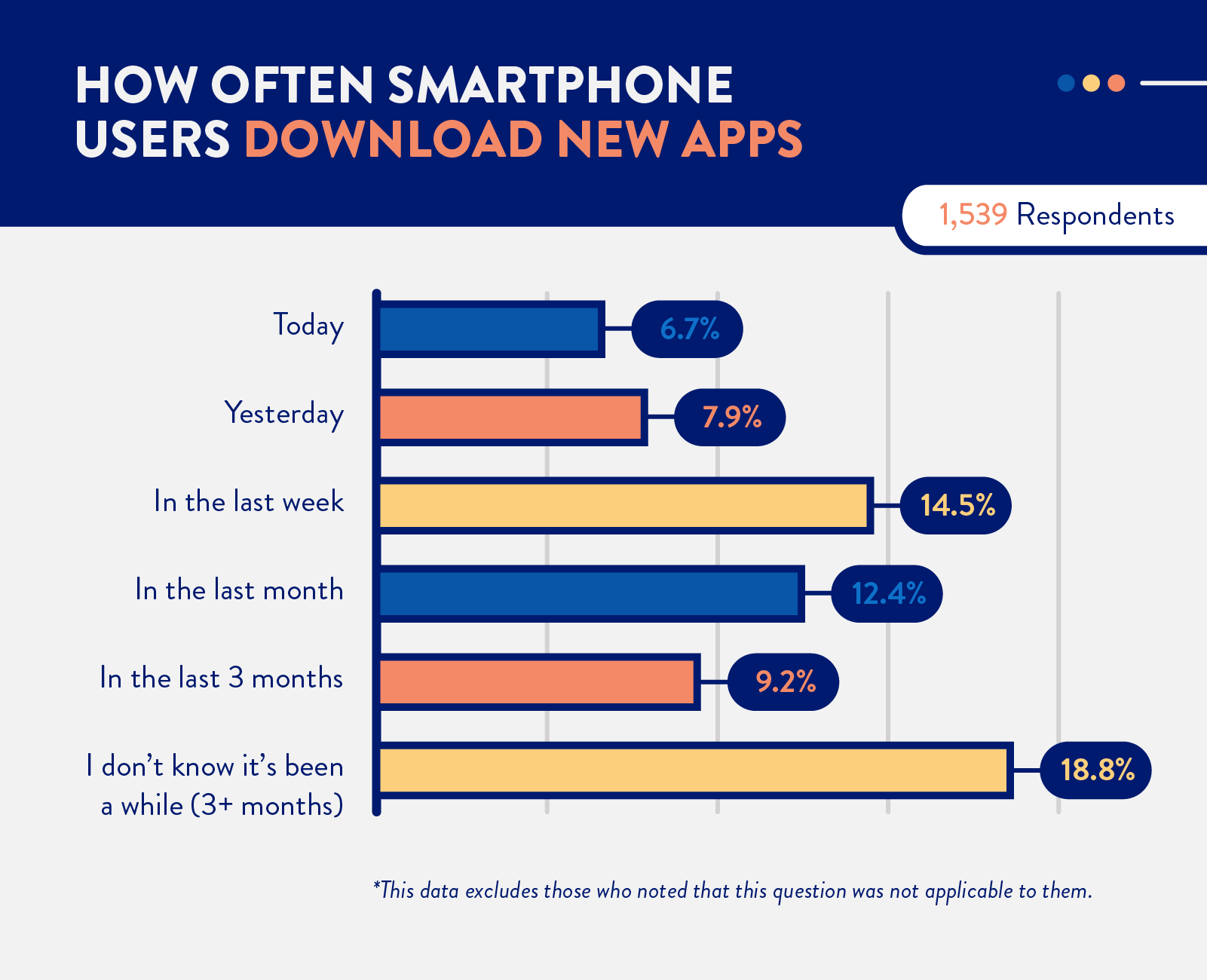
This survey was conducted in March of 2020. Post-stratification weighting has been applied to ensure an accurate and reliable representation of the total population.
A study by Comscore also confirms this is not a fluke. Their research found that 65% of Americans won’t download a single app in a given 3-month period.4
We wanted to know why app users aren’t downloading apps. So we also asked what they thought of app stores and the app choices they had available to them.
Here is what we found.
What Causes App Fatigue?
There’s an app for everything, and in some cases, there are multiple apps for the same thing.5
Many smartphone users we surveyed are still excited about the number of apps available. Over 45% of those we surveyed said they still love the fact that “there’s an app for everything.”
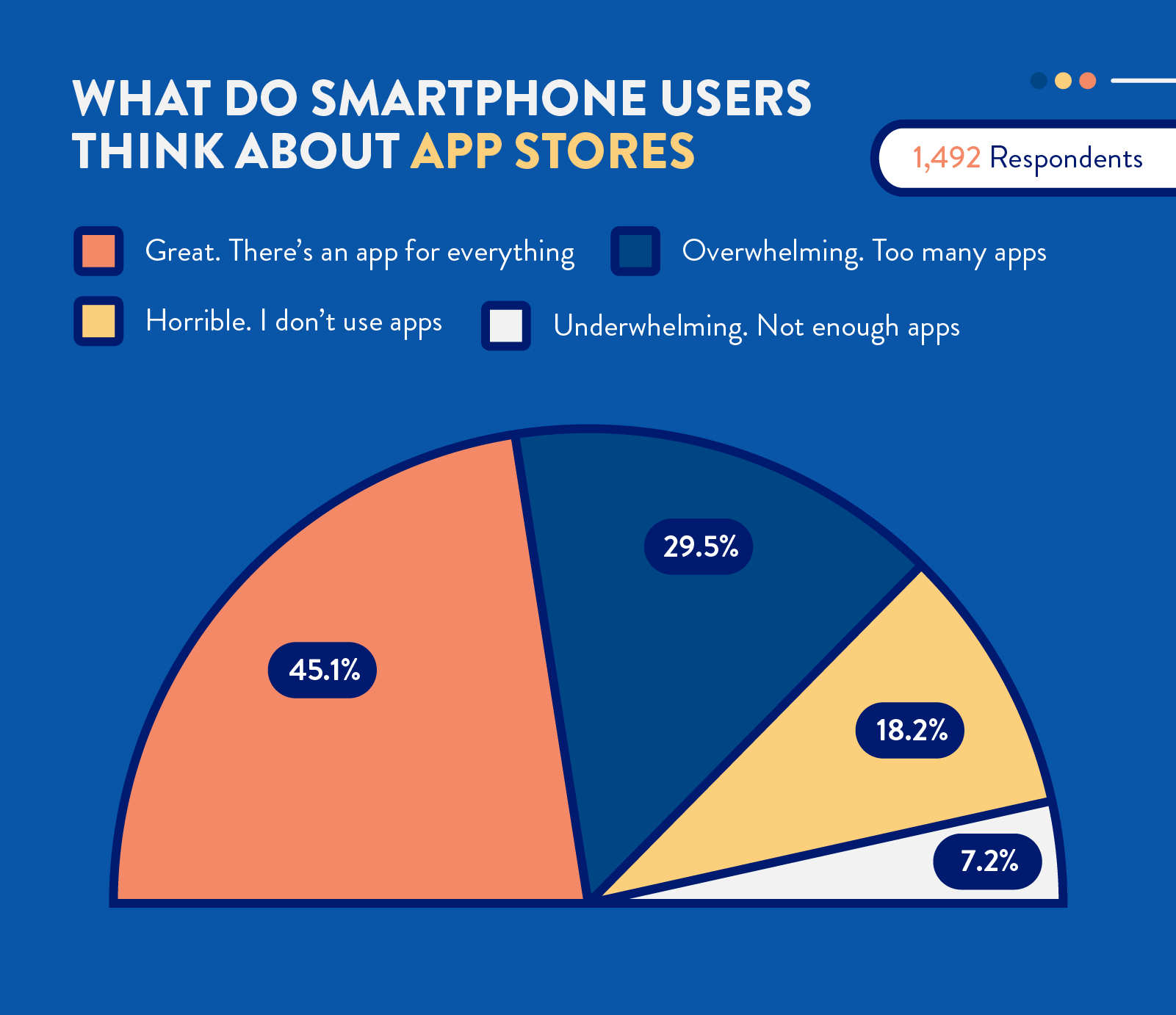
At first glance, this seems to contradict the idea of app fatigue. How can users be overwhelmed by the number of apps if they like the fact they have all those choices?
Simply put, they’ve realized they don’t have time for all of them and have to be more selective.
For example, research from Forrester found that smartphone users spend almost half (46%) of their mobile screen time on a single app — and that their top 5 apps get a whopping 88% of their time.6
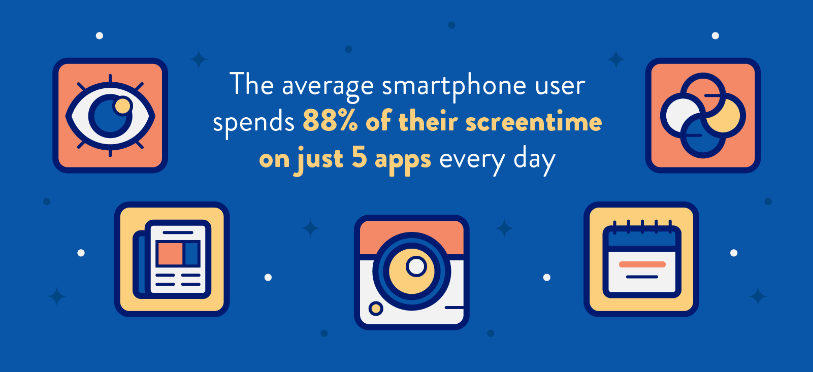
So unless your app is essential enough to break into your users’ “inner circle,” you’ll just be another app they have to swipe past to find the one that is, creating app fatigue for them in the process.
A survey we did in 2019 confirms this as well. Most of those we surveyed said they primarily uninstall apps because they’re not in use or taking up space (which wouldn’t be a problem if they were being used):
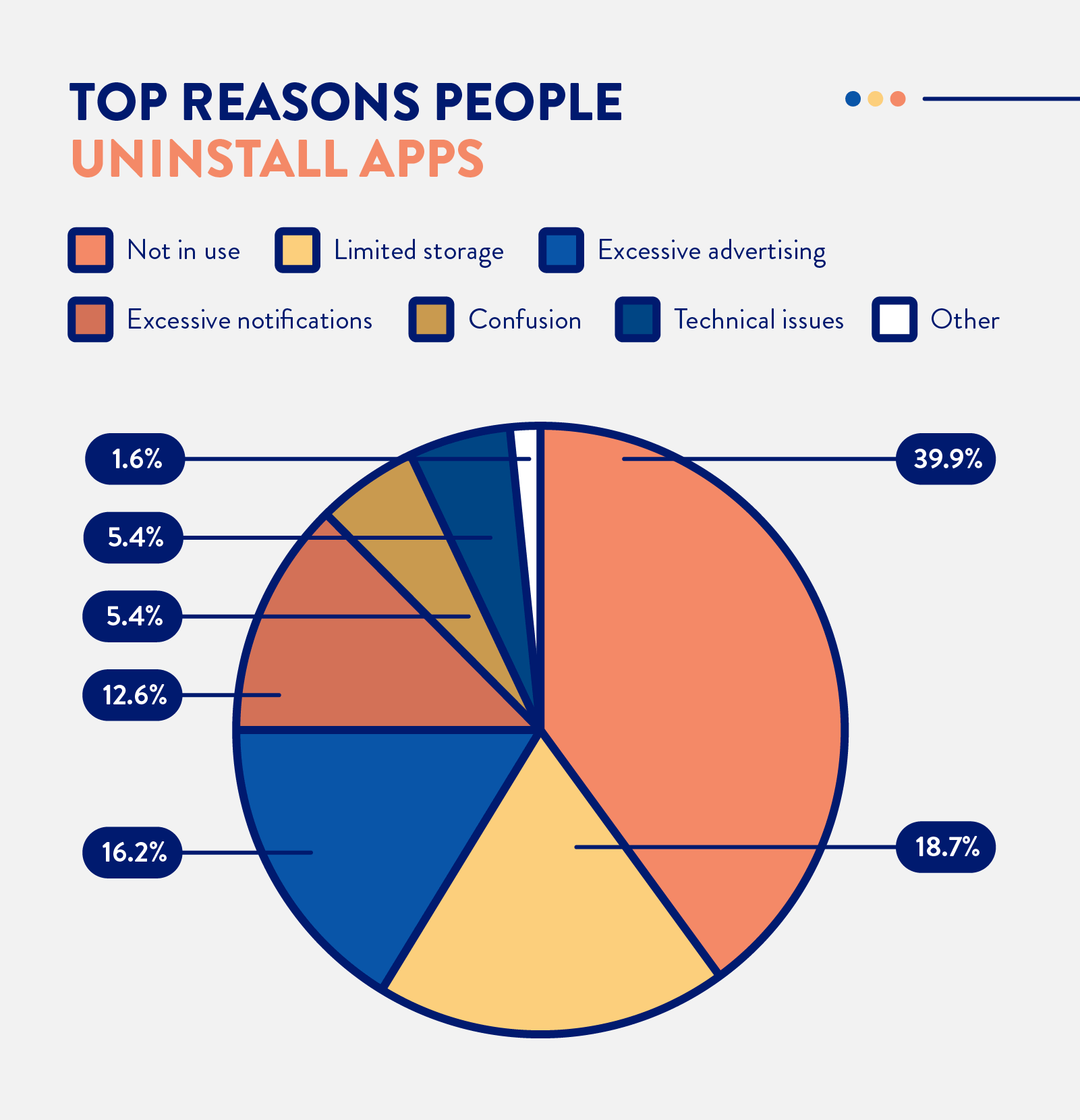
From our 2019 survey: Why Smartphone Users Uninstall Apps
However, as the data above also shows, the second biggest cause of app uninstalls is excessive notifications and advertising. So it’s not just your app that has to be essential if you want to cut through app fatigue—the overall user experience has to delight them as well.
Here’s how to tackle both of these issues at once.
How to Cut Through App Fatigue
On a conceptual level, combatting app fatigue is simple: give your users what they want. The more you can provide the functionality and experience they are looking for, the less likely you’ll fatigue them.
Here’s how:
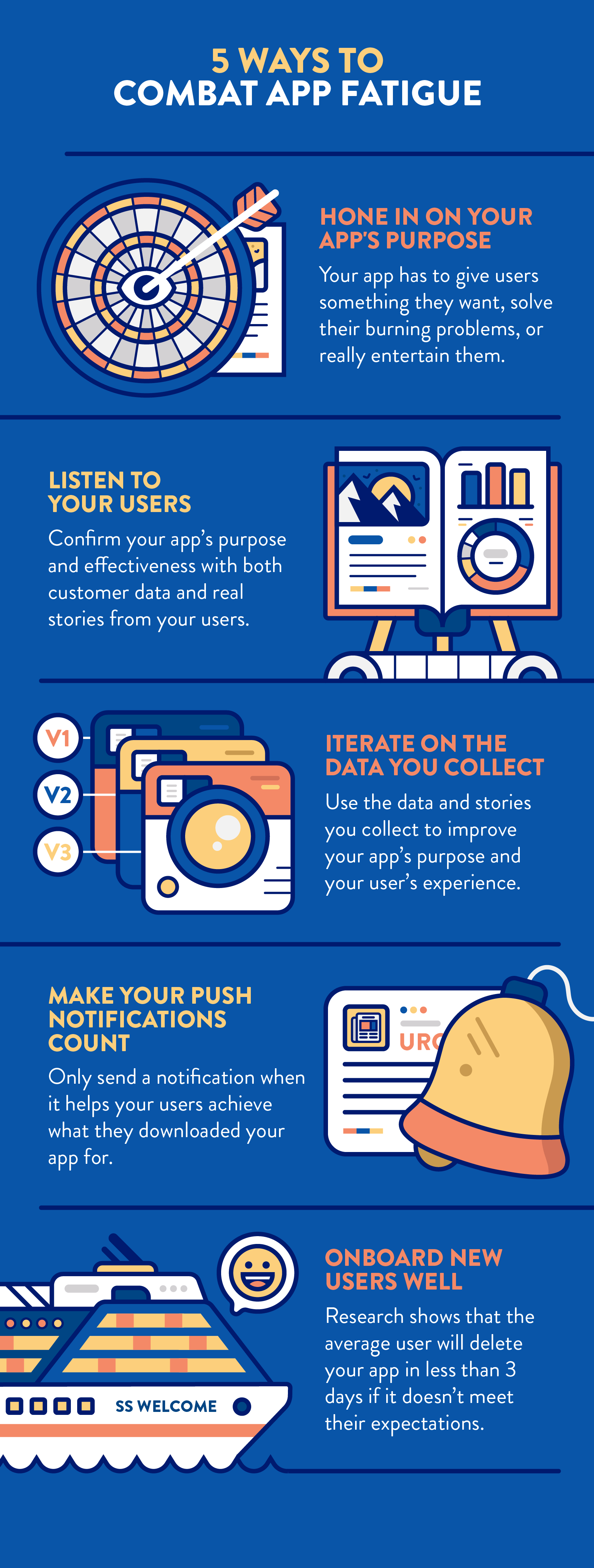
Hone in on Your App’s Core Purpose
Simplicity can be scary for app developers — it feels much safer to incorporate every feature plus the kitchen sink into your app to increase its value.
But the reality is, simplicity is usually better for your users.
New bells and whistles may capture your users’ attention for a hot minute. But they’ll also distract from your app’s core purpose and functionality, driving many users away. So it’s best to focus on what your app does best and to do it really, really well.
This is the growth strategy Whatsapp used to become the most popular messaging app in the world.
They focused on building a “simple, secure, reliable messaging platform” with the essential features users wanted, like message receipt confirmation and integration with existing phone contacts… and without extra features that would distract from this purpose.7
They now have 1.5 billion users in 180 countries.8
Listen to Your Users and Iterate on What You Learn
Not sure what your users want or what your app is best positioned to help them do? Your app (and your app’s users) have all of the information you need to figure it out.
Your app’s usage data is a record of your users’ actions while interacting with it. It can tell you what features they use most, when they use your app most, and more.
Keep in mind, however, that not all of your data will tell you why. You’ll want to gather qualitative, anecdotal evidence (stories) that provide the context in which the data was created as well to ensure that any insights learned are accurate.
The dating app Bumble is a great example of this process in action. They noticed that a large percentage of their users were using their app for social networking instead of dating (and that they were requesting a more explicit way to do so as well).9
So they introduced Bumble BFF and Bizz to make it easier for their users to find friends and business partners on their platform:
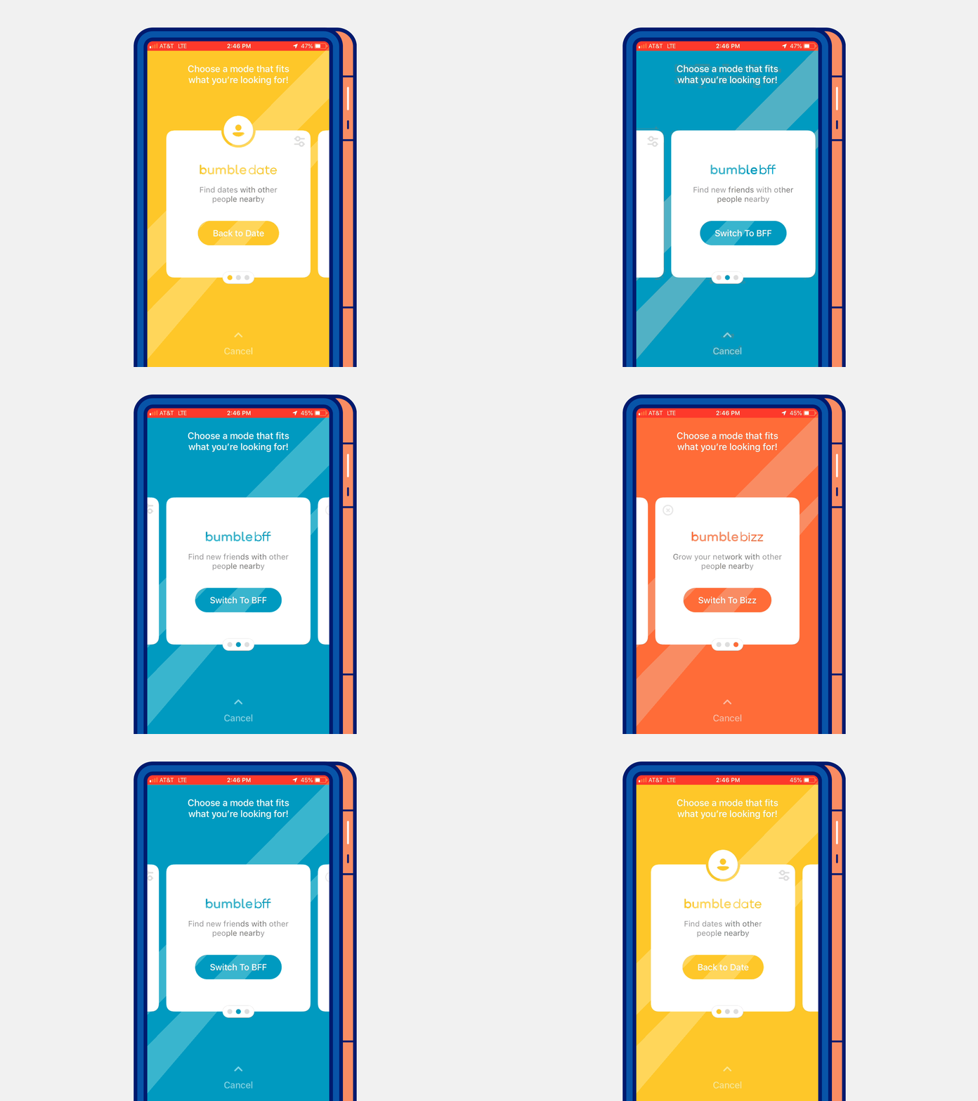
Adding these “features” has helped make Bumble one of the most popular lifestyle apps in the world.10
Make Your Push Notifications Count
Your users receive roughly 46 push notifications per day.11
So if you want your app’s notifications to actually grab their attention (rather than be an annoyance that leads to being uninstalled), you have to make sure that each notification you send them is something they actually care about.
Ideally, the best way to do that is to ensure that every notification you send is aligned with the reason your users downloaded your app in the first place.
Duolingo is a great example. Since consistent practice is a key part of learning a new language (and hard to follow through on), they use creative push notifications to help users get their daily lessons in:
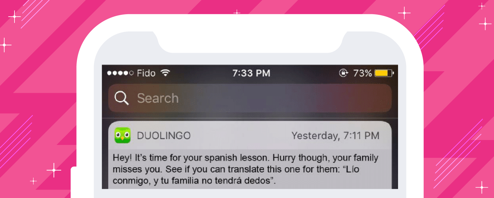
As a company, Duolingo is now valued at over $1.5 billion — more than double what they were valued in 2018.12,13
Onboard New Users Well
A study by Adjust found that the average app user deletes a new app in less than 6 days if it doesn’t live up to their expectations.14 That means you have to make a great first impression if you want to avoid being uninstalled.
The best way to do that? Demonstrate your app’s value immediately with your onboarding process.
Your users downloaded your app for a reason. Show them they made a smart choice by helping them see the benefits or results they are looking for from your app right away.
Venmo is an example of an app that does this well.
Since the purpose of their app is to help you easily send money with friends, the very first thing they show new users when they launch it for the first time is a live feed of Venmo transactions from other users around the world:
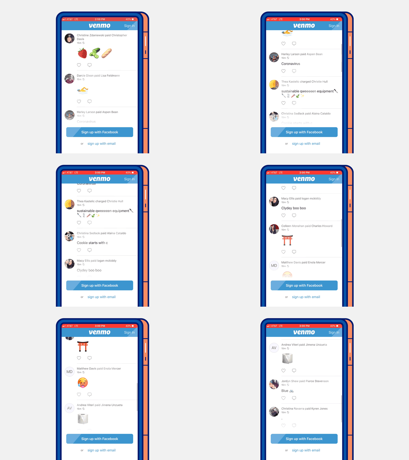
This shows new users all of the situations the app can make their lives easier — and it also provides social proof that shows them they’re not the only ones using it (Venmo is only useful if their friends are on it too).
It’s clearly working because between 2015 and 2019, their average quarterly payment volume (the total amount of money moving between their users in a 3-month period) has increased nearly 10x.15
Let The Data Guide You
To avoid creating app fatigue for your users, your app (and their experience while using it) has to be essential to their daily lives. And the key to ensuring yours is essential is in the data your users produce while using your app.
By understanding what your users like and dislike through the data they create and incorporating the lessons learned back into your app to make it better, you’ll ensure that each iteration delivers more of what users want.
CleverTap can help you get the data you need to do this. Learn more here.

See how today’s top brands use CleverTap to drive long-term growth and retention
Subharun Mukherjee 
Heads Cross-Functional Marketing.Expert in SaaS Product Marketing, CX & GTM strategies.
Free Customer Engagement Guides
Join our newsletter for actionable tips and proven strategies to grow your business and engage your customers.

