App demonstration videos, also known as app demo videos or app explainer videos, help showcase your app’s key features and value in seconds. Application demo videos can dramatically improve user onboarding by familiarizing users with the app before they even download it, speeding up adoption.
Users form judgments within 50 milliseconds, and nearly 1 in 4 abandon an app after the first use. That drop-off often comes from uncertainty: What does this app do? How do I get started? A strong demo video answers these questions before frustration sets in.
In this article, you’ll learn how to create high-converting app demo videos that accelerate activation. We’ll walk through strategic use cases, real-world examples, and distribution tips, plus best practices for measuring impact and improving performance over time.
Why App Demo Videos Matter for User Onboarding
A great app demo video walks viewers through the app’s interface, features, and benefits in a compelling way. By showing rather than telling, you can immediately convey how your app works and why it’s useful.
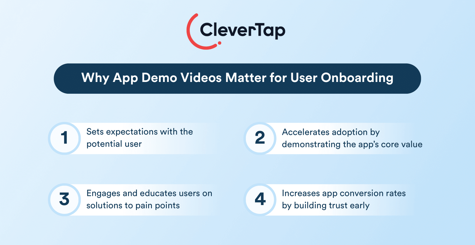
- Sets Expectations: An app demo video gives potential users a preview of the UI and functionality, so nothing is a surprise. This transparency can reduce app store abandonment.
- Accelerates Adoption: By demonstrating the app’s core value, you shorten the learning curve. Users who watch a demo are already familiar with the interface, which accelerates onboarding once they install the app.
- Engages and Educates: Video is more engaging than text or screenshots alone. A short mobile app demo video can highlight solutions to user pain points in an easily digestible format.
- Boosts Conversions: On marketing channels, app demo videos can increase app conversion rates by building trust. Seeing the app in action, whether it’s an iOS app demo video on the App Store or an explainer video for an Android app on Google Play, helps users feel confident about downloading. (Both Apple and Google allow you to add preview videos to app listings, which is a prime opportunity to showcase your app’s best features.)
App Demo vs. Demo App
While they sound similar, app demos and demo apps serve different purposes:

App Demo Videos: These are visual presentations designed for onboarding and user experience guidance. They show users how to navigate through the app, highlighting key features and functionality without requiring direct interaction.
Demo Apps: These are functional versions of applications created specifically for enterprise sales and evaluation purposes. Demo apps allow potential customers to interact with your product in a controlled environment, often populated with sample data to demonstrate specific use cases.
The distinction is important, app demos help educate existing users, while demo apps help convert potential customers by providing hands-on experience.
Strategic Use Cases for App Demo Videos
App demo videos can be deployed at various touchpoints throughout the customer journey. Here are the most strategic applications:
Customer Onboarding
Customer onboarding represents the most critical application of app demo videos. During this initial phase, users are most vulnerable to confusion, frustration, and ultimately, abandonment.
App demo videos during onboarding can:
- Reduce Friction: By providing visual guidance on navigation and key features, app demo videos eliminate the uncertainty that often leads to drop-offs.
- Explain Complex UI Elements: For apps with unique or sophisticated interfaces, app demo videos can quickly familiarize users with non-standard controls or interaction patterns.
- Accelerate Time-to-Value: By guiding users directly to high-value features, app demo videos can help users experience the app’s core benefits faster.
Product Launches
When introducing a new app to the market, app demo videos offer an efficient way to communicate your value proposition quickly and clearly.
Effective product launch app demo videos:
- Showcase Unique Selling Points: Highlight what makes your app different from alternatives in the marketplace.
- Demonstrate Primary Use Cases: Show potential users exactly how your app will solve their problems or improve their lives.
- Build Excitement: Create anticipation and enthusiasm for actually downloading and trying the app.
Feature Announcements
Existing users also benefit from app demo videos when you release new features or significant updates.
Micro-demos for feature announcements help:
- Educate Users About New Functionality: Show exactly how new features work without requiring users to figure them out independently.
- Increase Feature Adoption Rates: Users are more likely to try features they understand clearly.
- Reduce Support Inquiries: Proactive demonstration answers common questions before they arise.
These videos can be delivered through in-app messaging, push notifications, or customer onboarding email campaigns to drive awareness and adoption of new capabilities.
App Landing Pages
Demo videos on app landing pages significantly impact conversion rates and user acquisition. Landing pages with video can increase conversion rates by up to 80% compared to those without.
When placed on landing pages, demo videos:
- Make Complex Apps More Approachable: By showing the app in action, potential users can quickly grasp how it works.
- Reduce Perceived Risk: Seeing the actual interface and functionality helps users feel more comfortable making the download decision.
- Boost User Acquisition: Compelling demonstrations with strong calls-to-action drive higher download rates.
15 Inspiring App Demo Video Examples from Real Brands
Below is a list of 15 real-world app demo video examples across various industries. Each example illustrates a unique approach to demonstrating a mobile application, from simple screen walkthroughs to cinematic storytelling.
1. Calm: Communicates Value Proposition
Calm’s demo video focuses on creating an emotional connection with viewers by showcasing the app’s serene interface and soothing audio features. The video highlights functionalities, such as guided meditations and sleep stories, emphasizing the app’s role in promoting relaxation and mental well-being.
This mood-setting approach effectively communicates the app’s value proposition.
2. Google Translate: Engages with a Feature Walkthrough
Google introduced its Tap to Translate feature through a lively demo. It begins with a clear problem, copying and pasting into translation apps, and presents the feature as a easy solution. Using quirky animation and a calm voiceover, the video walks viewers through how the feature works within any app.
By combining a relatable scenario with upbeat music and clean visuals, the demo effectively explains the feature while maintaining user engagement.
3. Slack: Employs Conversational Tactics for Onboarding
Slack’s onboarding video opens with a friendly hook: “You’ve probably heard of Slack…” It features an actor named Brianna interacting with app screenshots and playful motion graphics. The narration feels like a casual conversation, making Slack’s complex features (channels, integrations) approachable.
The video breaks down Slack’s value proposition and debunks the idea that it’s just a chat tool. In under 90 seconds, it encourages adoption by showing how teams actually use Slack to collaborate.
4. IKEA Place: Focuses on a Problem-Solution Framework
IKEA’s demo for IKEA Place uses a first-person view to show how the AR app helps users visualize furniture in their homes. A narrator introduces the app casually and presents the problem of buying items that don’t fit.
The video walks viewers through scanning their space and placing virtual furniture, with bright, realistic visuals and an upbeat tone. It blends instruction and inspiration, helping users picture themselves using the app while showing exactly how it works.
5. Duolingo: Uses On-Brand, Quirky, Feature Walkthrough
Duolingo’s 30-second demo skips narration and uses upbeat music, bold on-screen text, and app screen recordings. It introduces key features like gamified lessons and quizzes while highlighting the app’s fun personality.
The Duolingo owl mascot adds charm, popping in to reinforce branding. Despite its brevity, the video clearly communicates how the app works and why it’s engaging, demonstrating that great mobile explainer videos can be concise, silent, and still highly effective.
6. Canva: Focuses on Beginner-Friendly Onboarding
Canva’s tutorial is designed for new users. It combines UI screen recordings with live-action shots, guided by a friendly narration. The video shows how to select templates, customize designs, and export content.
It highlights ease of use, even for non-designers, and feels like a mini-onboarding session. By the end, users are equipped to try Canva confidently. The mix of people using the app and interface walkthroughs builds trust and approachability.
7. Instacart: Uses Mockup-Based Feature Walkthrough
Instacart’s demo introduces Shop Talk, a community feature for users to post ideas and feedback. Animated UI mockups explain the feature’s value – participating in discussions, earning kudos, and influencing product development.
With no actors or narration, the clean animation keeps the tone clear and engaging. It educates existing users on how to get involved and adds value to the Instacart experience beyond groceries, emphasizing user feedback as a vital part of the brand’s growth.
8. Traveloka: Employs Brand Storytelling
This upbeat demo positions Traveloka as a one-stop travel platform. It highlights features like hotel booking, rescheduling, and refunds with bright visuals and smooth transitions. Text overlays communicate key benefits (“100,000+ destinations”) and a final rallying line—“Traveloka first, then the world!”—boosts emotional resonance.
It’s a great blend of product showcase and brand storytelling, using energy and clarity to appeal to travelers seeking convenience and confidence.
9. Western Union: Uses Step-by-Step Explainer for New Users
Western Union’s demo introduces its WU Money app with yellow-branded UI visuals. It uses on-screen text and animations to explain how users can send and receive money digitally. Aimed at those unfamiliar with mobile banking, the tone is educational and reassuring.
The video highlights benefits like speed and security, helping to build trust. It’s a strong example of how fintech apps can overcome adoption barriers by clearly walking through a new process step by step.
10. TradeHero: Makes Trading Topics Accessible
TradeHero’s app demo blends education and gamification. It shows users how to simulate trading, follow experts, and compete on leaderboards. UI recordings and animated elements explain the app’s tools and community aspects.
The video promotes learning-by-doing, easing the intimidation of stock trading. It appeals to users who want to improve skills while enjoying a game-like experience—ideal for fintech or e-learning app marketers seeking to combine function and fun in a demo.
11. Square: Uses Real-Time Editing and Narration
Square’s walkthrough tackles e-commerce onboarding. It walks users through customizing their online store, highlighting no-code editing tools like banners, product layouts, and preview mode.
The tone is reassuring, with real-time editing and narration that simplifies each step. The demo doubles as both tutorial and promotional content, showing how easy it is to build a polished store. It’s ideal for retail and DTC apps looking to convert curious viewers into confident users.
12. Pleo: Uses Creative Metaphors and User-Benefit Messaging
Pleo’s demo video shows how it replaces manual expense reporting with a smarter process. It begins with a comparison of chaotic spreadsheets vs. the simplicity of snapping receipts with a Pleo card.
The visuals show automatic matching of receipts to purchases and emphasize time saved. Creative metaphors and a pain-relief narrative make the app feel indispensable for business teams. It’s an excellent example of user benefit-first messaging in a fintech demo.
13. Capital One: Showcases Core Features Highlighting Ease of Use
Capital One’s video showcases core features—like check deposits and bill pay—using bright visuals, branded colors, and clean animations. Icons and interface taps guide viewers through typical user flows. The message is simple: mobile banking is easy and secure.
The tone is optimistic and helpful. It’s a clear model for fintech demos that need to convey multiple features without overwhelming users, highlighting ease and speed as the app’s key differentiators.
14. TomTom: Balances Depth and Accessibility
TomTom’s demo for its Map Maker tool is styled with dark mode UI and vivid contrasts. It shows how users can style maps, change color schemes, and mark routes. The narration explains the tool’s value while keeping it approachable for both hobbyists and developers.
With a sleek interface and enthusiastic tone, the demo balances depth and accessibility. It’s perfect for apps with technical audiences who still value intuitive onboarding.
15. Axis Bank: Simplifies Investments Using a Ste-by-Step Explainer
Axis Bank uses bright visuals and simple iconography to demystify investing via mobile. The demo shows users selecting funds and making investments with a few taps. The interface is highlighted clearly, and animations guide the user step-by-step.
It transforms a traditionally intimidating process into something friendly and doable, encouraging first-time investors to take action through the app. A great example of simplifying fintech for mass-market users.
Tips for Creating an Effective App Demo Video
Below are some best practices to help you create a mobile app demo video that engages users and improves onboarding:
Start with the Value, Not the Features
The best app demo videos don’t open with what your app does, but with what it achieves. Lead with outcomes. Show users what life looks like after they’ve solved their problem using your app.
In the first 7–10 seconds, aim to answer, “What’s in it for me?” This might involve starting with a relatable problem or visualizing a satisfying result. Traveloka’s demo highlights the ease of booking, navigating, and rescheduling, then seals the emotional payoff with the tagline.
Before writing a script or capturing footage, define the core problem your app solves and identify the moment a user truly experiences its value — the “aha” moment. Your video should build up to and showcase this clearly.
Google Translate’s demo of Tap to Translate is a great example. It starts with the universal frustration of copying text across apps, then shows the feature in action, resolving the problem in seconds.
Show, Don’t Tell
One of the biggest advantages of a demo video is that it can visually demonstrate how the app works. Prioritize real screen recordings over static mockups. Let users see authentic interactions like swiping, tapping, or dragging.
Slack’s product video pairs motion graphics with real interface shots, making abstract features like integrations and channels feel tangible. Use subtle animation like zooms or highlights to draw attention to key interactions without overwhelming the viewer. Avoid unnecessary text overlays and let the app speak for itself.
Think in Storyboard, Not Screenshots
Think of an app demo video as a story. Structuring your video with a clear beginning, middle, and end helps viewers stay oriented and engaged. This often takes the form of a problem → solution → how it works → next-step narrative.
Sketch out this flow early on. Decide which screens to show, how to transition between them, and what narration or captions will guide the viewer. IKEA Place’s demo excels here — it sets up the challenge of choosing furniture that fits, then guides users step-by-step through using the AR feature in a home setting.
Keep It Short, Shorter Than You Think
App users aren’t watching your demo for entertainment — they’re looking for a reason to care. Attention drops quickly after the one-minute mark. Aim for 60–90 seconds maximum unless you’re creating a deep tutorial.
Duolingo proves this point well. Its 30-second demo uses just visuals, music, and UI footage to communicate gamified learning. No voiceover. No fluff. And yet it’s clear, engaging, and memorable.
Cut everything that isn’t essential. Avoid showing the same interaction twice unless repetition reinforces a key concept. Save advanced features for follow-up videos or tooltips within your app.
Make It Feel Real and Relatable
Generic lists of features won’t convince anyone. Instead, put your app in real-life contexts that your users can identify with. Rather than saying “our app lets you manage expenses,” show someone photographing a receipt and seeing it auto-match to a transaction, like Pleo does in their demo.
CleverTap enables hyper-personalized experiences by dynamically tailoring onboarding flows and demo prompts based on user behavior, demographics, or in-app actions. Using micro-segmentation, marketers can show the most relevant video walkthroughs (e.g., a premium feature demo for power users vs. a basic tutorial for first-timers).
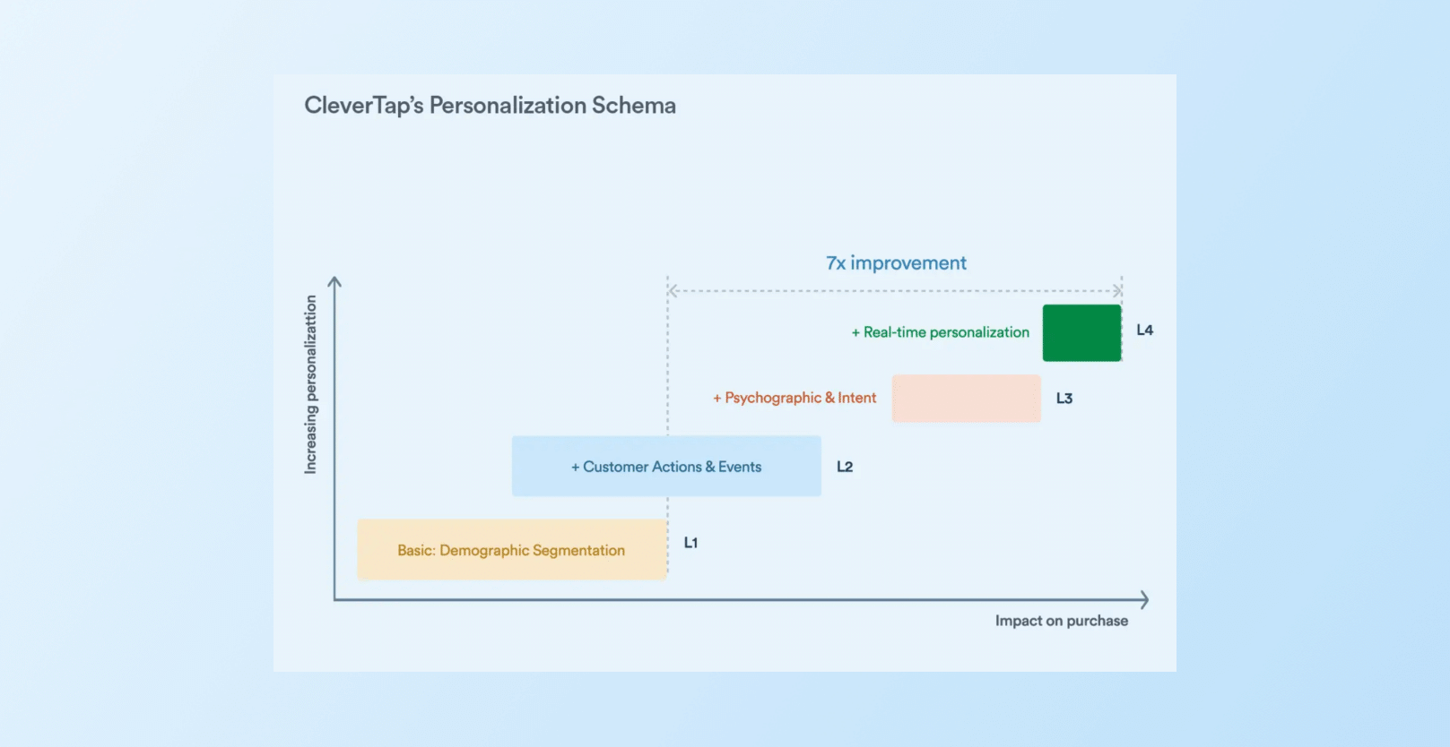
CleverTap allows you to create real-time audience segments and push targeted app demo videos that speak directly to where users are in their journey—maximizing relatability and effectiveness.
Match the Look and Feel of Your Brand
Your app demo video should feel like an extension of your product, not a standalone commercial. Visual and tonal consistency reinforces brand identity and builds trust.
Use your app’s actual UI, not stylized versions. Keep the fonts, colors, and animations aligned with your in-app experience. Voiceover or on-screen text should also match your brand’s voice. This continuity reduces friction and helps users feel confident transitioning from demo to download.
Consider Going Interactive
If you want to go beyond passive viewing, interactive demos can dramatically improve engagement.
These demos can be embedded on landing pages or used in retargeting campaigns. For apps with complex workflows, interactive elements like clickable hotspots or gamified tutorials can improve understanding and reduce onboarding time. Interactive demos with benefit-led CTAs can achieve conversion rates as high as 24.35% — far above the 3.05% average for static content.
Learn how to gamify your apps, and get inspired from top brands doing it right.
Use a Friendly, Conversational Tone
A warm, confident tone goes a long way. If using voiceover, make it feel like a helpful friend walking you through the app, not a robotic explainer. Conversational narration works well for mainstream users who may feel overwhelmed by new tech.
On-screen captions or text bubbles can substitute narration if preferred, but they should remain succinct and support what’s shown visually. In Slack’s video, the narrator chats casually with the on-screen character, demonstrates how a human tone creates a more inviting user experience.
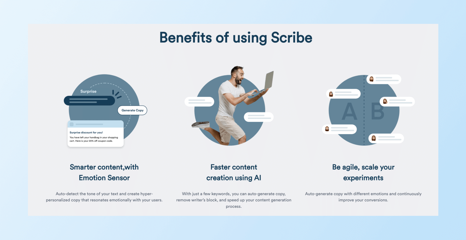
Use Clever.AI‘ Scribe to generate emotionally resonant, AI-assisted text for accompanying demo scripts or captions, matching tone with user mood or context.
Don’t Forget the Call-to-Action
All of this effort leads to one goal: prompting users to take the next step. Your video should end with a clear, benefit-oriented call-to-action. Not just “Click Here,” but “Start saving now,” or “Book your trip in 30 seconds.”
Use action verbs, make the CTA visually distinct, and, ideally, tie it back to the original value proposition. Whether you’re directing users to download the app, start a trial, or explore further, make the path forward obvious and rewarding.
How to Distribute Your App Demo Videos
Creating an effective demo is only half the battle—strategic distribution ensures it reaches users at the right moment:
- Embed in App Onboarding Sequence: Integrate app demo videos directly into your first-launch experience, particularly before complex features.
- Email and Push Notification Campaigns: Send targeted app demo videos to segments based on their usage patterns or lifecycle stage. For example, send feature demos to users who haven’t yet engaged with specific capabilities. Using Clever.AI and behavioral analytics, CleverTap identifies drop-offs or skipped steps post-video and automates targeted re-engagement nudges, ensuring the demo leads to action.
- App Store Listings: Both Apple’s App Store and Google Play allow video previews that significantly impact conversion rates. Optimize these for the specific requirements of each platform.
- Product Landing Pages: Place app demo videos prominently on your website’s product pages to help potential users understand your app before downloading.
- Social Media Campaigns: Create platform-optimized versions of your demos for Instagram, TikTok, or YouTube to reach potential users where they already spend time.
- Sales and Customer Success Materials: Equip your team with demo videos that address common questions or highlight features relevant to specific customer segments.
CleverTap supports omnichannel orchestration across push, in-app, email, WhatsApp, and web—ideal for distributing demo videos at strategic moments. You can trigger a demo video via:
- Push notification after app download
- In-app message during first-time feature usage
- Email follow-up after partial onboarding completion
CleverTap’s real-time analytics dashboards help you see not just if users watched your demo, but whether it translated into feature adoption or conversion—enabling instant iteration.
Learn how CleverTap can support you to build and distribute app demo videos.
Use App Demo Videos to Tell Your App’s Story
Creating the best app demo video requires understanding your users’ needs and telling a clear, engaging story about how your app can meet those needs. By focusing on real use cases and key benefits, keeping the content concise, and staying true to your brand’s voice, you can produce an app demonstration that not only impresses viewers but also converts them into users.
Subharun Mukherjee 
Heads Cross-Functional Marketing.Expert in SaaS Product Marketing, CX & GTM strategies.
Free Customer Engagement Guides
Join our newsletter for actionable tips and proven strategies to grow your business and engage your customers.


