


Table of Contents
Categories
Most Popular


Being a startup makes us continually iterate and improve design and copy on our website. Here is how we improved, tested and optimized one of the most important pages – our online product demo signup page. Once someone fills up the demo request, we schedule an online, personalized walk-through of the CleverTap dashboard with them.
Our existing product demo page was getting us around 100 demo requests per day.
We decided to redesign the page to see if we could
- Improve it visually
- Increase the number of product demo requests we received and
- Help our Customer Success team collect more information about the visitor when these product demo requests come in
Here is what our old demo page looked like – 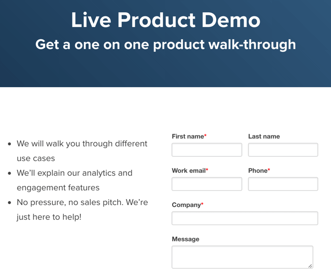
What we thought was wrong with this design –
- Our form said “Live Product Demo” – but actually it wasn’t. Interested visitors got into a queue and a few hours later someone from our Customer Success team would email them to schedule a demo.
- The signup form did not provide us much information about the visitors who signed up for the product demo. Their work email id was the only contact information we requested.
- The landing page design was boring! Well, we are a startup and decided to build the entire website in three days. Not much visual love had gone into it.
Here is what we fixed
First
Aspirational imagery plays a significant role improving the design visuals of a dull and drab web page. We changed the top fold which was just a solid color band to a hero fold.
This immediately made the page pop visually and the design was much more pleasant to look at.
Next
We added a few extra fields in our demo form. ‘Contact number’ in addition to an ‘email id.’ ‘Job role,’ ‘whether a user had an app’ and if yes, ‘how many downloads did the app have.’ We intended to get a fair idea of who was signing up and also prep the product demo around the scale and potential customer’s interest.
We experimented with the content on the product demo page. To provide some social proof, we added customer testimonials and logos. To match up that expectation of a live demo, we gave an instant glimpse of the product with our product walk-through video right on the demo page.
And while we did all this, we also renamed our form to say “Schedule a Product Demo”.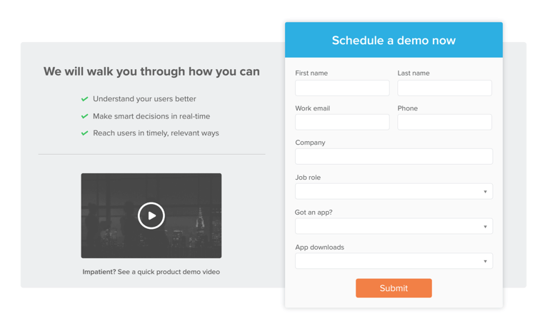
What actually happened
In the next few days, the sign-up for the demo requests REDUCED to about 67 per day — a drop of 30% and a major disaster! We realized that people clicked directly on the video instead of signing up and left without filling up the details in the demo form.
Why was this a mistake?
We did two fixes at the same time which contradicted each other. The form name changed to “Schedule a demo” to set the correct expectations; at the same time, we also added a video on the demo page.
Based on these observations, we did a second iteration of this page. Here is how it looked – 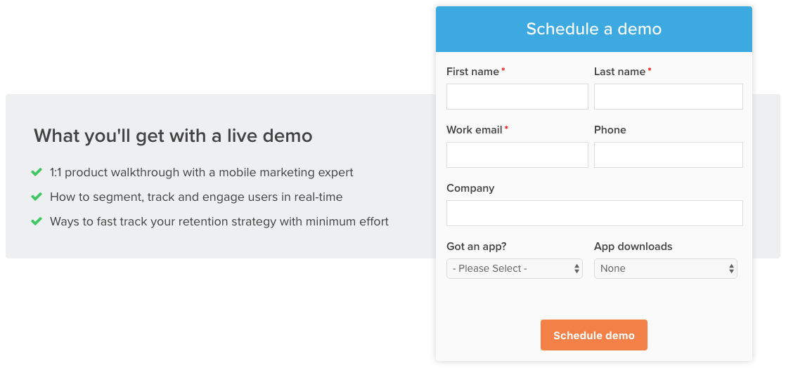
Soon after the new design went live, we saw an immediate improvement in the number of product demo requests — they shot up to about 140 per day. Not only did we increase the number of form fields, but we also increased our product demo requests by 40% from the original numbers.
Here are our top 3 learnings –
Visual deceptions work
We made some visual design changes in the form. The form fields were now bigger and had white space between them. We added more contrast between the text and the background. The font sizes went up from 14 px to 16 px. To bring the Call to Action above the fold, we optimized the form space by making it 2 column. Another visual change was to de-mark the dropdowns for “Got an App” and “App downloads” with the grey color to make the form look less cluttered. With all these changes, we could achieve a simpler looking form while keeping the key form fields intact.
Focus on the key call to action. Less distractions are better
The new content was less text heavy and had a cleaner design. We just kept a clear 3 point text next to the form which elaborated on what potential customers can expect in a demo. Instead of trying to sell the features of the product on the demo form, we decided to focus on the ‘moment’ where the user could sign up for a product demo.
Provide right content at the right time
The video was an early reveal. We shifted it to the ‘Thank you’ page, and it was shown after the successful product demo signup.
The current version of our page is at https://clevertap.com/live-product-demo/
Geetaa Bhatt 
Heads product and brand design.
Free Customer Engagement Guides
Join our newsletter for actionable tips and proven strategies to grow your business and engage your customers.
