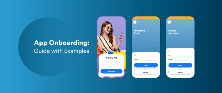
A smooth app onboarding experience on mobile can mean the difference between a one-time user and a loyal customer. About 25% of users abandon an app after just one use. A confusing or tedious start can lead users to drop off, contributing to the high percentage of people who install an app only to uninstall it shortly after. This is where app onboarding comes in.
In this blog, we’ll explore what app onboarding is, the best practices to perfect it, and highlight 10 of the best app onboarding examples that you can learn from and apply to your mobile product.
What is App Onboarding?
App onboarding is the introductory process that welcomes users to an app and educates them about the app’s functions and benefits. It involves a series of onboarding screens or interactions to help them set up an account (or initial preferences), and guide them toward the app’s core value.
A successful onboarding process typically covers three key components to ensure a convenient first experience: education, setup, and personalization.
- Education means showing users how to use the app or what value it offers. For example, an interactive tutorial or a brief tour of features.
- Setup involves gathering any necessary information or permissions, such as creating login credentials or requesting preferences in a quick and user-friendly manner.
- Personalization tailors the app to the user’s needs or interests like, selecting topics, setting goals, or enabling notifications for relevant updates).
Types of App Onboarding Flows
There are three common types of onboarding flows used in mobile apps, each with a different approach.

Benefits-Oriented Onboarding: This style highlights why the user should use the app, focusing on value propositions and benefits. Think of those welcome slides that show statements like “Save time and stay organized” – they’re selling the outcome, not the mechanics. Benefits-oriented onboarding appeals to emotions and motivations, getting users excited about the possibilities.
Function-Oriented Onboarding: This approach teaches how to use the app’s core functionalities. It usually involves guidance on the app’s features or a tutorial that walks users through performing key tasks without overwhelming the user.
Progressive Onboarding: Progressive app onboarding introduces information and features gradually as the user navigates the app. Instead of front-loading all instructions, it displays tips or tutorial prompts contextually at the moment they’re needed. It is great for reducing cognitive load, often even allowing them to use parts of the app before signing up.
12 Exemplary App Onboarding Experiences
Real apps provide some of the best onboarding flow examples to learn from. We’ve gathered 12 mobile app onboarding examples from popular applications, focusing on what makes their new-user experience stand out:
1. Movii
Movii, a Colombian fintech offering digital debit cards, was experiencing high churn during the onboarding phase of its mobile app. Many users would begin registration but failed to complete the process. Even those who successfully onboarded were often reluctant to make their first transaction. This hesitation stemmed largely from low confidence in digital payment systems and a prevailing cultural preference for cash.
To tackle these issues, Movii partnered with CleverTap to implement a data-driven onboarding and engagement strategy. They used behavioral analytics, specifically Funnel analysis, to pinpoint where there were user drop-offs.
Based on these insights, they created automated, omnichannel user journeys that targeted inactive users and nudged them toward completion—leading to a 63% reactivation rate. CleverTap’s automated segmentation allowed Movii to tailor messages based on user demographics and in-app behavior. Additionally, personalized campaigns and A/B testing helped optimize communication, educate users about digital payments, and boost their confidence.
Results
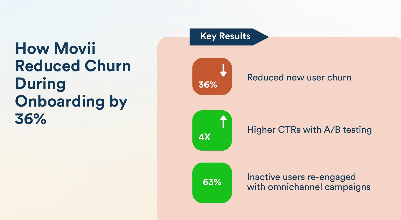
This strategic revamp of the onboarding experience led to a 36% reduction in churn during onboarding, significantly improved user activation, and built greater trust in Movii’s digital financial services. By transforming onboarding into a personalized, guided experience, Movii not only improved early user engagement but also laid a stronger foundation for long-term retention.
Read the full case study here.
2. Kitabisa
Kitabisa, Indonesia’s leading online fundraising platform, faced significant challenges in user engagement and retention. Despite a high volume of transactions, over 50% of users dropped off between app installation and onboarding, failing to register or make their first donation. This early-stage churn hindered the platform’s ability to build a loyal donor base and maximize customer lifetime value.
To address these issues, Kitabisa partnered with CleverTap to implement a data-driven engagement strategy:
- Behavioral Analytics: Utilized funnels and cohort analysis to identify friction points in the user journey and understand churn trends.
- Automated Segmentation: Created actionable user segments based on demographics and behavior, enabling targeted messaging.
- Omnichannel Journeys: Orchestrated seamless marketing campaigns across multiple channels without additional coding, reducing reliance on the development team.
- Personalized Engagement: Sent relevant messages through preferred channels, such as in-app notifications during the first app launch, to guide users through onboarding.
These strategies collectively improved the First Time User Experience (FTUE), encouraged initial donations, and fostered long-term customer engagement.
Results
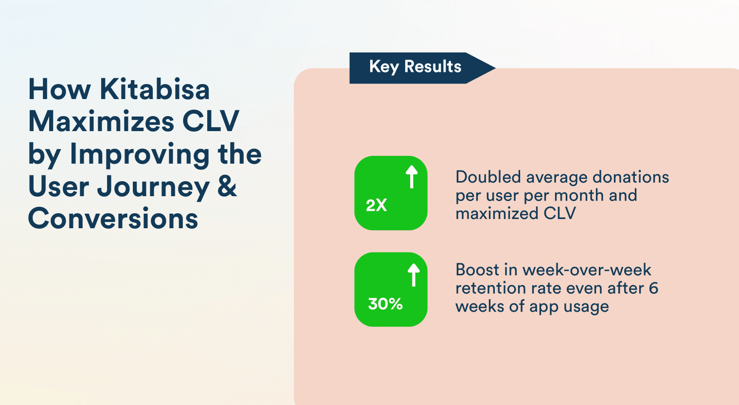
The implementation of CleverTap’s solutions led to significant improvements:
- 30% Increase in Week-on-Week Retention: More users remained active week over week.
- 2x Increase in Donations per User: Users were more engaged and contributed more frequently.
- Enhanced User Stickiness: Improved daily active users (DAU) relative to monthly active users (MAU), indicating higher user engagement.
Read the full case study here.
3. Duolingo
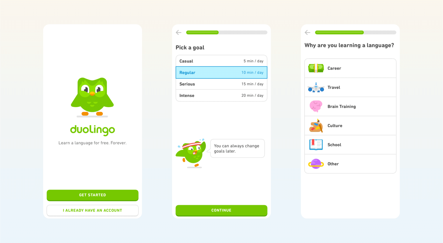
Try Before Sign-Up With Gamified Learning: The Duolingo language-learning app exemplifies progressive onboarding by letting users start learning immediately without any signup required. New users are guided through a quick interactive lesson (translating a few words) from the get-go, so they experience early success and see how easy learning a language can be.
This gradual engagement tactic means Duolingo postpones the “create account” barrier until after the app’s value has already hooked the user.
Source: AppCues
Personalized Goal-Setting and Motivation: Duolingo’s onboarding asks users about their learning goals and motivations right after a friendly greeting from its mascot, Duo. You choose a daily practice goal and answer why you’re learning (travel, school, brain training, etc.), and even select your skill level or take a placement test. The app makes the content personally relevant by customizing the experience to your goals and proficiency.
4. OfferUp
Purposeful Permission Prompts: OfferUp, a marketplace app for buying and selling used items, streamlines onboarding by guiding users toward key actions—like listing items and messaging buyers. A major focus is securing opt-ins for permissions essential to this experience, such as camera access and notifications.

Source: OfferUp
Contextual Opt-in Strategy: Instead of prompting users too early, OfferUp explains the value behind each permission. For example, it frames notification access as a way to receive instant alerts when someone shows interest in your listing. This contextual approach builds trust and increases opt-in rates by linking permissions directly to user benefit.
5. MyFitnessPal
Goal-Driven Personalization: MyFitnessPal begins the onboarding process by asking users to define their health goals—such as losing or gaining weight—and collects basic metrics, including age, height, and current weight. It then creates a personalized daily calorie plan, making the app immediately relevant to each user’s fitness journey.

Source: App Fuel
Guided Feature Tour: Once goals are set, the app walks users through key functions like logging meals, tracking water, or recording workouts using on-screen prompts. This combination of benefits-oriented and function-oriented onboarding helps users confidently start using the app.
6. Slack
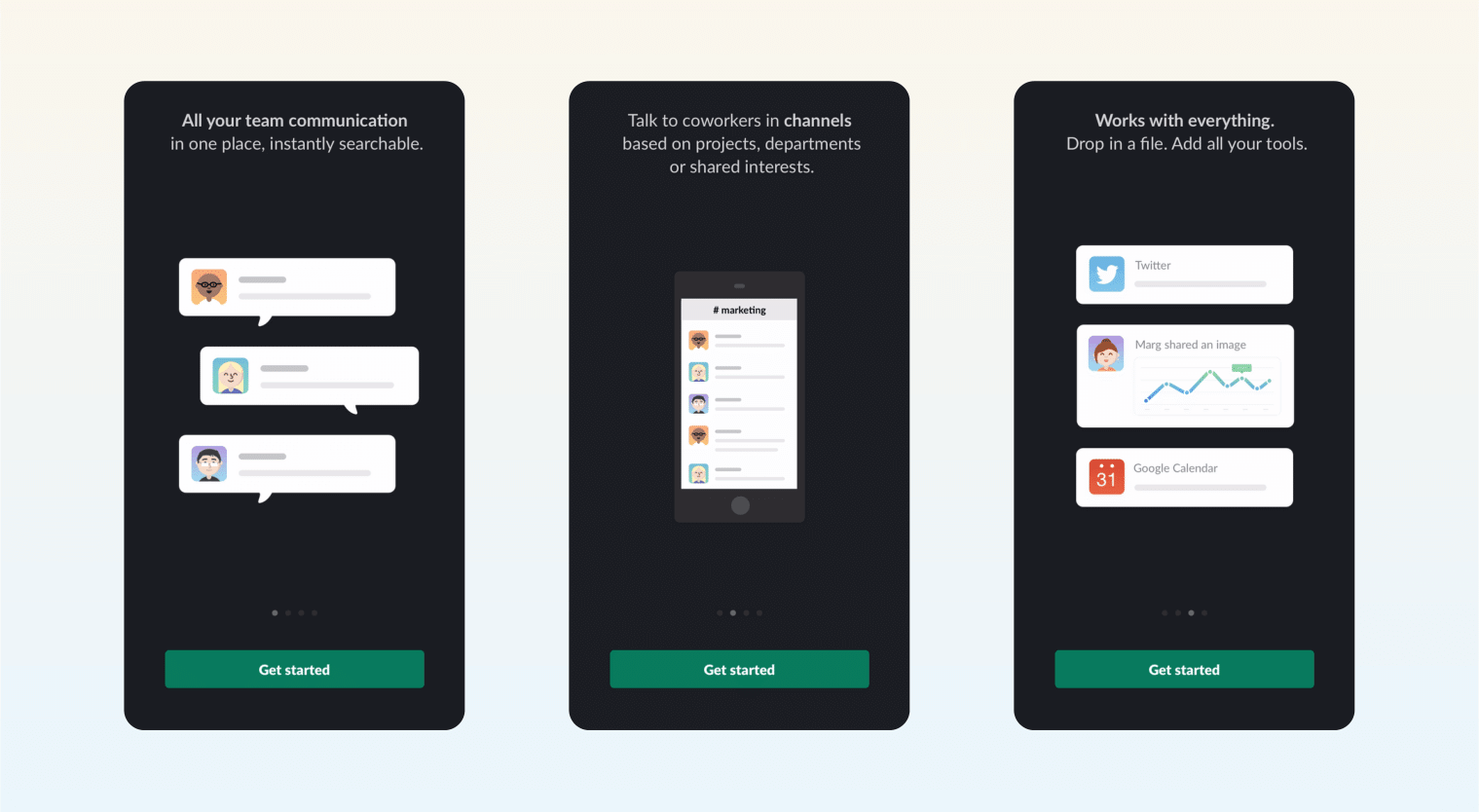
Progressive Feature Introduction: Slack uses progressive onboarding to avoid overwhelming new users. Instead of presenting all features up front, it introduces them gradually as users explore the app. For instance, tooltips appear contextually when a user tries to create a channel or send a direct message. This approach keeps onboarding light and intuitive, helping users learn as they go.
Source: App Fuel
Interactive Product Tours: Slack’s guided tours walk users through setting up their first workspace and sending their first message. These steps mirror real use cases, reinforcing learning through action. By blending hands-on tutorials with real-time usage, Slack ensures that new users reach early success moments—boosting confidence and driving deeper engagement.
7. Dashlane
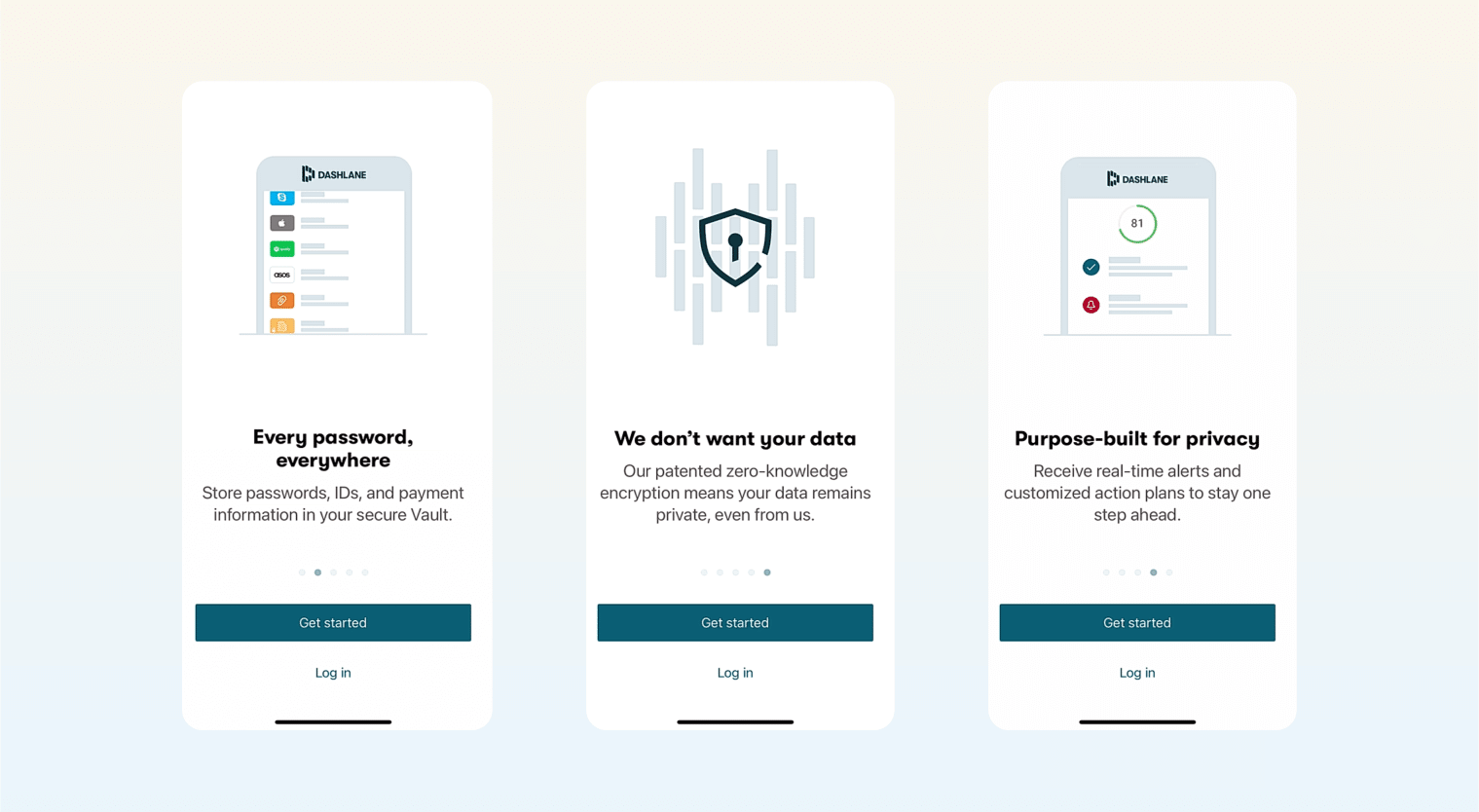
User-Driven Onboarding: Dashlane’s onboarding begins by asking users what they’re most interested in—such as managing passwords, securing payments, or autofilling forms. This approach not only personalizes the experience but also provides valuable insights into user priorities. By aligning the app’s features with individual needs, Dashlane ensures users immediately see its relevance.
Source: App Fuel
Clear Value Communication: The onboarding flow presents Dashlane’s core benefits—like enhanced security and convenience—through concise, focused screens. Each step is designed to highlight how the app addresses specific user concerns, reinforcing its value proposition. This targeted approach helps users quickly understand and appreciate the app’s functionalities.
8. Daylio
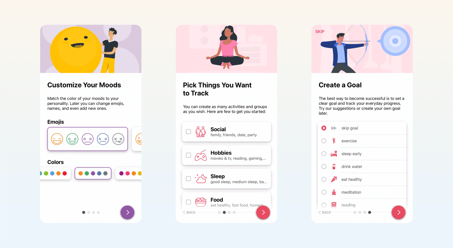
Intent-focused setup: Daylio’s onboarding starts by asking users how they plan to use the app—tracking mood, building habits, or monitoring mental health. This early question personalizes the experience, ensuring users feel understood from the first tap.
Source: App Fuel
Minimalist and Visual Onboarding: With only a few well-designed screens, Daylio introduces its core features visually—no lengthy text, just clean illustrations and concise captions. Users learn about mood tracking, journaling, and stats in a way that’s digestible and friendly. The simplicity reduces friction and lowers the barrier to entry.
9. WhatsApp
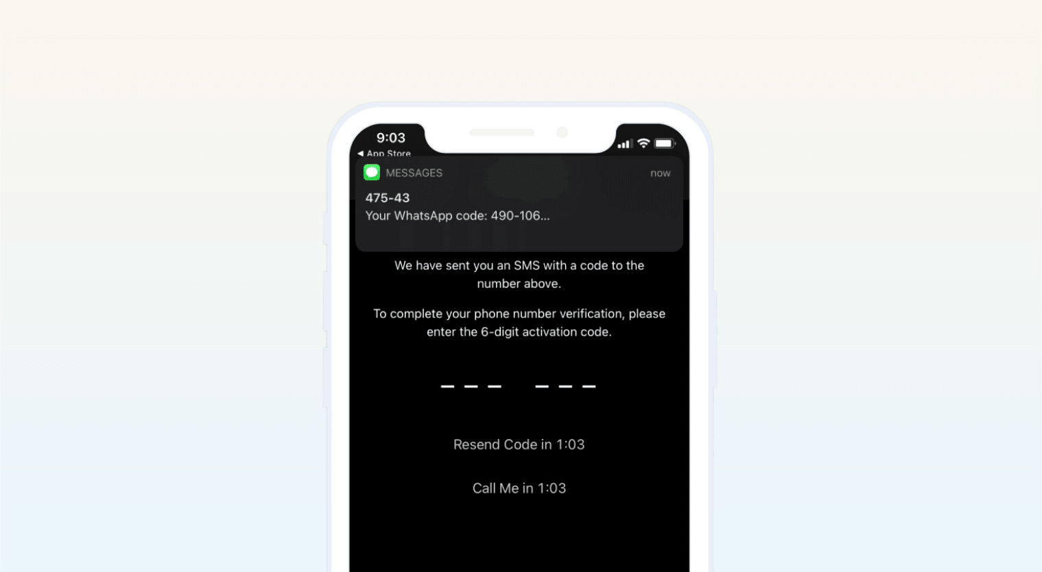
Seamless Verification: WhatsApp streamlines its onboarding by automatically detecting incoming SMS messages for verification. This eliminates the need for users to manually enter codes, reducing friction and enhancing the user experience. By simplifying the sign-up process, WhatsApp ensures that users can quickly access its core messaging features.
Source: WhatsApp
Immediate Engagement: Upon launching the app, users are guided through a minimal setup, focusing on essential features. This approach allows users to start messaging almost immediately, emphasizing WhatsApp’s commitment to simplicity and reliability. The swift onboarding process contributes significantly to its high user retention rates.
10. Masterclass
Exploration Before Commitment: Masterclass, the e-learning app featuring celebrity instructors, offers a standout onboarding by letting users explore content before signing up. New users can freely browse classes, watch previews, and get a feel for the platform without hitting a login wall. A brief intro highlights key features like offline access or class categories, then hands control to the user.

Source: App Fuel
Concise and Informative Onboarding: This benefits-oriented onboarding shows the platform’s quality upfront, allowing users to discover its value naturally. When the app eventually prompts for sign-up—such as to save a course or begin a free trial—the user is already engaged.
Masterclass also includes a few concise onboarding screens that explain how it works, reinforcing its value clearly and quickly. The experience is short but effective, respecting users’ time and building trust. This approach makes users more likely to convert because they’ve already seen what they’ll get.
11. Bloom
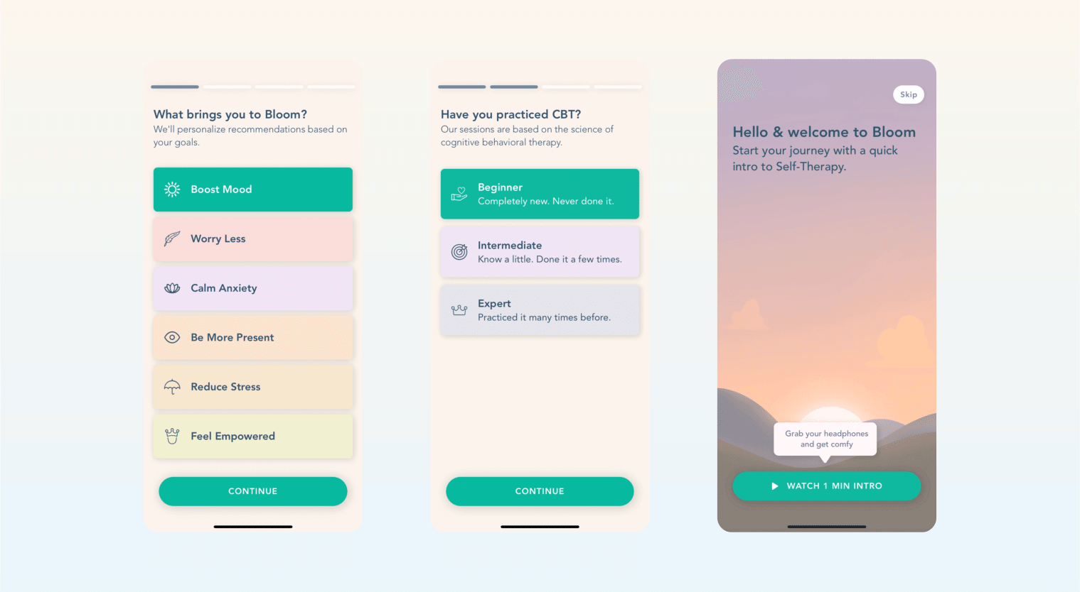
Emotionally Engaging Start: Bloom, a self-therapy app, begins onboarding with affirming, emotionally supportive messaging. Users are asked how they feel and what they want to work on, fostering a sense of trust and personalization.
Source: App Fuel
Interactive, Goal-Based Setup: Users are guided through a friendly, animated sequence that includes selecting goals, choosing a daily check-in time, and previewing how Bloom sessions work. The onboarding simulates a session with a therapist, combining voiceover, calming visuals, and questions that tailor the experience. It clearly communicates what users can expect while gradually building commitment.
12. UberEats
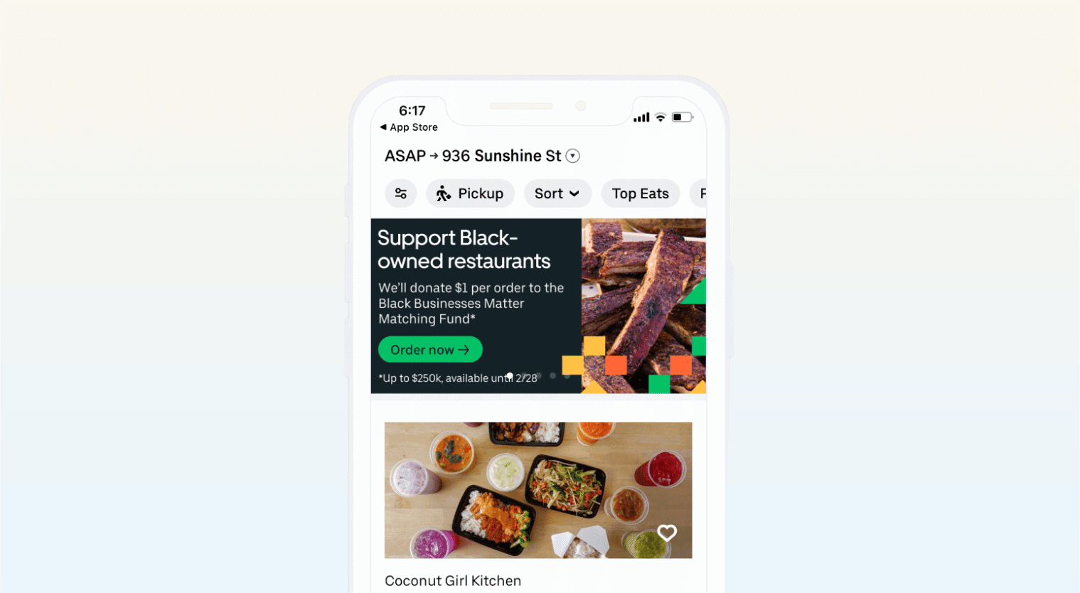
Frictionless Path to Value: UberEats eliminates onboarding barriers by focusing on what users care about most—fast, convenient food delivery. After gathering just the essentials (like location), the app immediately displays nearby restaurants that can deliver within 30 minutes, helping users reach their goal quickly.
Source: UberEats
Incentivized First Order: To sweeten the experience, UberEats highlights a prominent $20 off coupon across multiple screens. This clear, value-driven messaging—“get food fast and save money”—reduces hesitation and encourages users to complete their first order without delay. The onboarding is optimized for speed, simplicity, and satisfaction.
App Onboarding Best Practices
Designing a great mobile onboarding experience starts with putting the user first. Here are some proven app onboarding best practices to guide your approach:
- Personalize the Experience: Tailor onboarding to user goals or preferences. A fitness app, for example, might ask the user if they want to lose weight or build muscle, and then adjust the tips and content accordingly. Personalization makes the onboarding application feel relevant, increasing engagement.
- Minimize Friction During Sign-Up: Keep registration simple. Reduce form fields and offer one-tap logins. Allow users to explore before signing up. Delaying account creation can increase app conversion rates.
- Use Interactive Tutorials: Help users learn by doing. Tooltips, walkthroughs, and prompts can guide users through core features without overwhelming them. Interactive onboarding screens are more effective than static instructions.
- Apply Progressive Disclosure: Don’t dump every feature up front. Reveal options gradually as they become relevant. This keeps the experience focused and manageable, which is central to effective application onboarding.
- Show Value Early: Let users experience a quick win or core feature in their first session. Whether it’s completing a task or previewing content, an early “aha moment” can drive retention.
- Allow Exploration Pre-Sign-Up: Guest modes or limited feature access help users get a feel for the app. This benefits-oriented approach builds trust and often leads to stronger engagement once users are ready to convert.
- Gamify and Reward: Use progress bars, badges, or small wins to encourage completion. These elements add fun and boost motivation.
- Collect Feedback And Iterate: Monitor drop-off points using a user onboarding flow chart or customer onboarding process flow chart. Use analytics and in-app feedback to refine your onboarding flows continually.
You’ll create a smoother, more engaging path to activation by applying these mobile onboarding best practices.
Make onboarding simpler for your customers with an onboarding email marketing strategy. Learn how to build one.
Improve Your Mobile App’s Onboarding With CleverTap
CleverTap enhances app onboarding by delivering a seamless, data-driven, and personalized experience across the customer journey. Here’s how:
1. Personalized Onboarding Journeys
Using CleverTap’s journey builder, brands can create automated onboarding workflows triggered by user behavior. These include welcome messages, product walkthroughs, and feature discovery nudges that engage users right from app install.
2. Real-Time Profile Conversion
The CleverTap SDK automatically creates an anonymous profile when a user opens the app. Once they sign up or log in, this converts to a known profile—retaining all prior actions for a unified view and continued engagement.
3. Lifecycle Optimization
With the Lifecycle Optimizer, users are mapped to onboarding stages (e.g., “New”, “Active”) and nudged with targeted messages. Brands can identify drop-offs, test engagement strategies, and automate best-performing onboarding flows to boost conversions and retention.
4. Real-Time Segmentation & Engagement
CleverTap enables real-time segmentation based on live user behavior, enabling precise targeting during onboarding. Campaigns can be tailored for first-time users, referrals, or users from specific sources—ensuring highly relevant messaging from day one.
5. Omnichannel Onboarding
CleverTap supports onboarding across several channels including push (powered by RenderMax™), email, WhatsApp, SMS, and in-app messaging. These channels can be orchestrated into onboarding flows, creating consistent, multi-touchpoint experiences.
6. Actionable Analytics & Optimization
Brands can analyze onboarding effectiveness using funnels, cohorts, and A/B testing. This helps identify friction points, measure retention, and continuously refine onboarding strategies.
CleverTap transforms onboarding into a high-impact engagement phase—driven by real-time data, intelligent automation, and omnichannel outreach—ensuring new users become active, loyal customers quickly.
Create the best app onboarding flows with CleverTap. Learn how.
App Onboarding: Turn First Impressions Into Lasting Loyalty
App onboarding is your first and best chance to convert new users into engaged customers. Keep it user-focused: personalize, reduce friction, and deliver value fast. As shown in top app onboarding examples, great onboarding adapts to user needs and builds confidence early. Get it right, and you’ll boost retention, satisfaction, and long-term growth.
Shivkumar M 
Head Product Launches, Adoption, & Evangelism.Expert in cross channel marketing strategies & platforms.
Free Customer Engagement Guides
Join our newsletter for actionable tips and proven strategies to grow your business and engage your customers.

