If you want to connect with your users when they’re most engaged, then in-app messaging offers one of the most effective ways to do it.
As opposed to push notifications that try to bring users back, in-app messages appear while users are already active in your app. This lets you share updates, highlight new features, or guide users through their next steps when it matters most. One study found that in-app messaging had a 75% open rate, nearly three times higher than push notifications.
In this guide, you’ll learn what in-app messaging is, how it works, and why it matters for marketers. We’ll explore the benefits, best practices, and real-world examples to help you create in-app messaging campaigns that boost customer engagement and keep users coming back, whether they are on Android, iOS, or any other mobile platform.
What Is In-App Messaging?
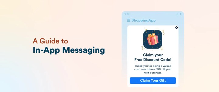
In-app messaging is a way to communicate with users directly while they’re using your mobile app. These messages can take many forms, such as banners, pop-ups, carousels, or even full-screen. They typically appear in response to specific user actions or behaviors within the app.
By delivering timely information right in the flow of the user experience, in-app messaging helps guide users, highlight new features, share special offers, and encourage deeper engagement.
Unlike push notifications, which reach users outside the app and aim to draw them back in, in-app messages show up only when someone is already active in your app. This makes them less intrusive and more relevant, since they’re triggered by what users are actually doing in real time. As a result, in-app messaging has become an essential part of mobile engagement strategies, allowing brands to connect with users at key moments and drive meaningful actions.
How In-App Messaging Works
In-app messaging delivers messages to users while they actively use your app. So, the system triggers messages based on specific user actions or behaviors. For example, you might show a welcome message when someone opens the app for the first time, offer a discount when they browse certain products, or send a reminder if they add items to their cart but don’t complete the purchase. These triggers help you reach users at the right moment, increasing the chances they’ll engage.
Behind the scenes, in-app messaging platforms track user interactions and app events to determine when and which message to display. Marketers set up rules or workflows that automatically deliver these messages without disrupting the user’s flow.
Benefits Of In-App Messaging: 9 Reasons to Use In-App Campaigns
In-app messaging offers a wide range of advantages for brands looking to create meaningful, real-time connections with their users: you can drive key actions, boost satisfaction, and build long-term loyalty. Here’s a closer look at the most significant benefits:
1. Enhanced User Engagement
Timely in-app messages grab users’ attention while they’re already active, making it easier to prompt immediate action. By reaching users in the right moment, you can encourage them to explore features, complete onboarding, or take advantage of offers.
2. Personalized User Experience
In-app messaging lets you deliver content tailored to individual users based on their behavior, preferences, or stage in the user journey. This personalization makes messages more relevant and valuable, which users appreciate. Research from Leanplum (a CleverTap company) shows that personalized in-app messages can boost response rates by 800 times compared to generic notifications.
3. Improved Retention Rates
By guiding users, offering timely tips, and re-engaging those at risk of dropping off, in-app messages help keep users coming back. According to a study by Business of Apps, apps that use in-app messaging see retention rates improve by almost 30% and enjoy higher retention than those that don’t use this channel.
Want to boost your app’s retention rates? Learn various proven strategies and actionable tips in our full guide to user retention.
4. Increased Conversion Rates
In-app messages are highly effective at nudging users toward key actions, such as making a purchase or subscribing. Delivering offers or recommendations at the right moment can directly drive conversions and sales.
Converting users might be difficult, but with our guide on improving conversion rates, it might just become a bit more easier.
5. Faster Onboarding
Use in-app messages to help new users navigate your app by providing timely tips, guided walkthroughs, or celebrating key milestones. This hands-on support helps users quickly understand your app’s value and reduces the chances they’ll abandon it early on.
6. Real-Time Feedback Collection
Request feedback or reviews while users are actively engaged with your app. In-app prompts typically achieve higher response rates than emails or push notifications, giving you valuable insights when the experience is fresh in users’ minds.
7. Seamless Communication
In-app messaging lets you reach users instantly within the app itself. Because users don’t have to leave their current activity, these messages feel less intrusive and encourage quicker responses or actions.
8. Greater Reach and Targeting
You can deliver messages to your entire active user base or focus on specific segments based on behavior, location, or other criteria. This precise targeting ensures your messages are relevant and timely, increasing their effectiveness.
9. Easy Tracking and Measurement
Most platforms for in-app messaging offer built-in tools to monitor how users interact with your messages, including opens, clicks, and conversions. These metrics help you understand performance and fine-tune your campaigns for better results.
Key Use Cases For In-App Messaging: When Should You Use This Channel?
In-app messaging gives you a direct line to users while they’re already engaged with your app. When you use this channel thoughtfully, you can guide, inform, and motivate users at exactly the right moments. Here’s how brands and product teams put in-app messaging to work:
1. Onboarding New Users
A smooth start matters. With in-app messages, you can welcome new users, walk them through your app’s main features, and point out important actions. Interactive tips and milestone celebrations help users feel confident and find value quickly, which lowers the risk of early drop-off.
2. Announcing New Features
When you roll out new features or updates, in-app messages let you spread the word instantly. You can highlight what’s new with banners, pop-ups, or carousels, encouraging users to try out fresh functionalities as soon as they’re available. This keeps your audience engaged and excited about what’s next.
3. Offering Promotions and Discounts
In-app messages are a powerful way to share special deals or limited-time discounts. Because these offers appear while users are active, they’re more likely to catch attention and drive immediate action.
4. Collecting User Feedback
The best time to ask for feedback is while the experience is still fresh. In-app surveys, quick polls, or review requests make it easy for users to share their thoughts on the spot. This approach usually leads to higher response rates and gives you more relevant insights than channels like email.
5. Sending Transactional Messages
Keep users informed by sending confirmations, receipts, or status updates directly in the app. Whether it’s an order confirmation or a booking update, these messages provide reassurance and keep users in the loop without disrupting their flow.
6. Boosting Re-Engagement and Retention
If users become inactive or lose interest, in-app messages can help win them back. You can remind them about unfinished actions, highlight new content, or offer personalized incentives to return. Targeted re-engagement messages help reduce churn and boost long-term loyalty.
7. Providing Educational Tips and Contextual Guidance
As users move through your app, they might need help discovering advanced features or overcoming obstacles. Use in-app messages to share helpful tips or context-specific guidance right when users need it. This support makes your app easier to use and encourages deeper engagement.
8. Sending Loyalty and Rewards Notifications
Recognizing loyal users goes a long way. In-app messages can alert users about earned points, reward milestones, or exclusive perks. These notifications encourage ongoing engagement and help build a stronger connection with your brand.
9. Sending Security and Compliance Alerts
For apps that handle sensitive data or operate in regulated spaces, clear communication is essential. Use in-app messages to notify users about important security updates, privacy changes, or actions they need to take. This keeps users informed and helps you maintain trust.
Best Practices for Effective In-App Messaging
To get the most out of in-app messaging, focus on creating experiences that feel natural, relevant, and genuinely helpful. The most effective in-app messages do more than share information; they solve problems, delight users, and blend seamlessly into your app’s overall experience. Here’s how you can build messaging campaigns that truly make an impact:
1. Segment and Personalize Messages
Tailor your messages to fit different groups of users. Segment your customer by their behavior, preferences, or where they are in their journey. For example, greet new users with onboarding tips, send exclusive offers to your most loyal customers, or request feedback from users after they complete a specific action. Personalized messages connect better and encourage more engagement.
For example, OurBus triggered in-app messaging campaigns to non-returning segment of users, enabling the team to re-engage and incentivize them at optimal moments—significantly boosting the chances of driving the intended user actions.
2. Maintain Regular Intervals and Spaces Between Messages
Send messages at moments that matter. Trigger notifications when users complete meaningful actions, like making a purchase, reaching a milestone, or exploring a new feature. Avoid overwhelming users by spacing out your messages and focusing on quality over quantity. Well-timed messages feel helpful rather than intrusive.
3. Keep the Content Clear and Concise
Keep your messages brief and to the point. Use compelling headlines to draw attention and focus on one key message or action. Since space is limited, avoid clutter and get straight to the benefit. Always include a clear call to action (CTA) so users know exactly what to do next.
4. Highlight the CTA
Make your CTA easy to spot with clear language and a distinct button. Whether you want users to try a new feature, grab a discount, or share feedback, a strong CTA increases the chances they’ll take action.
5. Add Visuals
Add images, GIFs, or branded graphics to make your messages more engaging. Visual elements can quickly explain ideas and boost interaction. In fact, messages with visuals can achieve much higher engagement rates than plain text alone.
OurBus even went a step ahead and launched an app gamification strategy by leveraging CleverTap’s In-App HTML popups to launch personalized campaigns seamlessly within the app interface.
6. Turn Notifications Into Conversations
Treat in-app messaging as a two-way street. Encourage users to respond with quick surveys, ratings, or feedback prompts. When users see that you value their input, they’re more likely to stay engaged and loyal to your app.
7. Run A/B Tests
Test different versions of your messages, try out new headlines, images, timing, and placement. Run A/B tests to see what works best for each segment of your audience. Regular testing helps you fine-tune your strategy and discover what truly resonates.
8. Analyze Performance Metrics
Keep an eye on key metrics like open rates, clicks, conversions, and user feedback. Use these insights to spot what’s working and where you can improve. By regularly reviewing your analytics, you can keep your in-app messaging strategy sharp and effective.
9. Ensure Accessibility and Inclusivity
Make sure everyone can access your messages. Use easy-to-read fonts, strong color contrast, and support for screen readers. Inclusive design not only improves the experience for users with disabilities but also broadens your app’s appeal.
10. Maintain Consistency with Brand Voice and Design
Align your in-app messages with your app’s overall tone and look. Consistent branding builds trust and helps messages feel like a natural part of the app, rather than unwanted interruptions.
11. Optimize for Mobile-First Optimization
Design your messages for mobile screens first. Use large, easy-to-tap buttons, avoid overcrowding, and test your messages on different devices to ensure they always look and work great.
12. Respect Privacy and User Control
Respect your users’ privacy by being transparent about how you use their data. Give users control over the types of messages they receive, and offer easy opt-out options. This not only builds trust but also helps you comply with privacy regulations.
13. Use Advanced Behavioral Triggers
Go beyond basic triggers and use advanced behavioral cues, such as how long users spend in the app, how often they visit, or periods of inactivity. These insights let you deliver messages that feel timely and highly relevant, creating a more personalized experience.
Real-World Examples of Successful In-App Messaging Campaigns
In-app messaging, when used thoughtfully, can transform user engagement and loyalty. Let’s look at how two companies have mastered this channel with creative, data-driven strategies:
1. How WinZO Used CleverTap’s In-App Messaging Channel to Boost Retention
WinZO, India’s largest mobile social gaming platform, faced several challenges:
- User Churn Prediction: Difficulty in identifying and retaining users likely to churn shortly after app installation.
- Data Fragmentation: Challenges in consolidating and acting upon user data swiftly to enhance engagement.
- Personalization at Scale: Necessity to deliver personalized experiences across diverse regional languages and gaming preferences.
- Competitive Attention Economy: Standing out in a market saturated with numerous apps vying for user attention.
To address these issues, WinZO utilized CleverTap’s platform to deliver highly personalized communications through in-app messages, among other channels. For instance, when a surge in user activity was detected around 9 p.m. IST, WinZO leveraged this real-time data to send targeted in-app messages. These messages informed users about the trending game, encouraging them to join and thereby enhancing engagement during peak activity times.
The strategic implementation of CleverTap’s solutions yielded a 40% increase in retention rate.
Read the full case study here.
2. How OurBus Boosted Revenue Using CleverTap’s In-App Messaging Campaigns
OurBus faced multiple engagement and conversion challenges with traditional communication channels:
- Limited Reach via Push & Email: Due to device settings, battery optimization, and user opt-outs, many users were not receiving push notifications or emails consistently.
- Friction in Coupon Redemption: Users had to toggle between the app and their inbox or notification tray to access and apply coupon codes, causing drop-offs.
- Low Visibility for Time-Sensitive Offers: Important promotional messages were often lost among other notifications, lowering redemption rates.
To address these issues, OurBus adopted CleverTap’s In-App HTML popups to design gamified, personalized campaigns that engaged users directly within the app:
- Gamified Campaigns: They implemented interactive elements like “Spin the Wheel,” “Catch the Santa,” “Match the Card,” and “Scratch and Win.” These revealed coupon codes instantly upon completion.
- Single-Tap Coupon Use: Users could copy coupon codes with one tap, eliminating the need to leave the app.
- Targeted Nudges: Campaigns were tailored for non-returning users, with timing and segmentation ensuring outreach happened when engagement was most likely.
- No Engineering Bottlenecks: HTML popups allowed for dynamic, customizable experiences without needing app updates or developer effort.
The strategy delivered measurable improvements:
- 100% Increase in CRM Revenue: CRM-driven revenue grew due to more effective in-app engagement.
- 40% Boost in Campaign Engagement: Interactive campaigns kept users more engaged.
- 20% Higher Coupon Redemption: Easier access and visibility led to better conversion on offers.
“With customizable In-App campaigns, we brought the entire journey into one place, reducing drop‑offs and making offers more visible and engaging… It’s been a game‑changer for creating seamless, high‑converting experiences in the app.”
— Ayush Arora, Growth Product Manager, OurBus
Boost Retention with CleverTap’s In-App Messaging Channel
As demonstrated in the examples above, CleverTap provides all the in-app messaging capabilities you need to increase your retention rate and boost conversions. Here are some features at a glance:
- Personalized, Context-Rich Messaging: Deliver targeted messages within the app interface to enhance engagement at every stage of the user journey.
- Rich Media Support: Use images, GIFs, videos, audio, and more to make messages visually compelling and interactive.
- Dynamic Personalization: Customize messages with user attributes like name, location, and preferences, and support localization for regional relevance.
- No-Code Campaign Builder: Leverage a drag-and-drop editor and pre-built templates to design and deploy in-app campaigns without developer assistance.
- Behavior-Based Triggers: Launch messages based on real-time user actions or specific in-app events for maximum relevance and timeliness.
- Actionable Analytics: Track campaign performance with metrics like click-through rates and conversion goals to continuously optimize strategies.
Learn more about CleverTap’s in-app messaging capabilities.
Challenges and Considerations with In-App Messaging
While in-app messaging offers powerful benefits, you need to navigate a few key challenges:
- Avoiding Intrusiveness: Make sure your messages don’t interrupt or overwhelm users. Deliver notifications at the right moments so they feel helpful, not disruptive.
- Maintaining Relevance: Keep your content closely tied to each user’s interests and their activity within the app. Relevant messages are more likely to be welcomed and acted on.
- Compliance with Regulations: Respect user privacy by following all data protection laws and securing proper consent. Stay transparent about how you use data to build trust and avoid legal trouble.
Future Trends in In-App Messaging
In-app messaging is rapidly evolving, driven by advances in AI and machine learning that enable brands to deliver smarter, more personalized messages based on real-time user behavior. As part of a broader omnichannel strategy, in-app messaging works alongside email, push notifications, and SMS to create a seamless and consistent user experience across platforms.
At the same time, user expectations continue to shift toward more relevant, helpful, and non-intrusive communication. To stay ahead, brands must adapt their messaging strategies to these changing preferences and privacy considerations. By embracing these trends, companies can build stronger relationships, increase engagement, and deliver meaningful value through in-app messaging well into the future.
Shivkumar M 
Head Product Launches, Adoption, & Evangelism.Expert in cross channel marketing strategies & platforms.
Free Customer Engagement Guides
Join our newsletter for actionable tips and proven strategies to grow your business and engage your customers.


