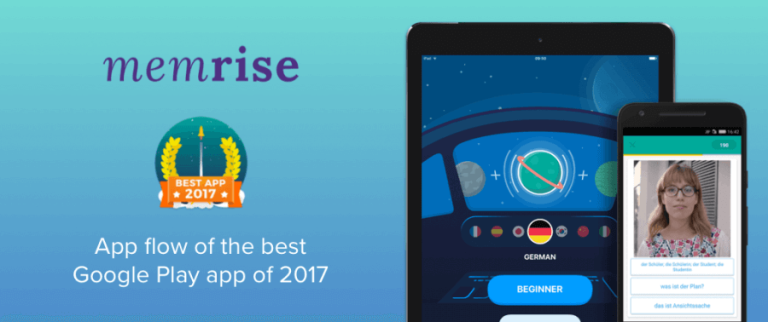
Memrise is a language learning app which won the best app award for 2017 on Google Play.
It bested thousands of apps to be crowned the app with “… beautiful design, intuitive UX and high user appeal.”
So what’s so special about Memrise?
Over the past few days I dug into the app and tried to figure out what makes this app different from the others, and what lessons could you use in building an app loved by users.
A Memrise Primer
The Memrise website has well-written content on the science behind the app, helpful for anyone curious about how the actual language learning process.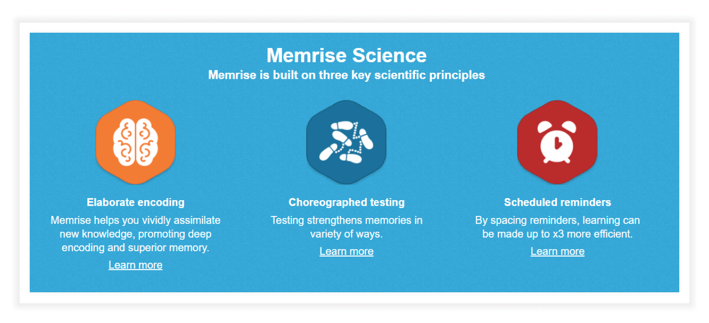
According to Memrise’s Google Play Store listing:
- 15 million people are using the app.
- There are 2 million words and phrases from 14 languages on the app.
- Chatbots and native speaker videos, along with traditional flash cards can be used to learn languages.
The app is rated at 4.7 with most users leaving five stars.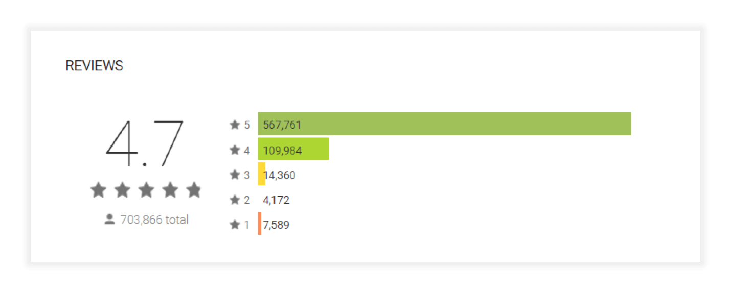
The app has been installed more than 10 million times.
Memrise operates on a freemium model. In the free mode you can:
- Learn new words: The app will prompt you to learn new words which you haven’t covered in the course yet.
- Review words: You can review previously learned words through two modes: a timed review mode called classic review and a gamified mode called speed review.
- Listen to pronunciation: Every time you pick a word, an automated voice will play the correct pronunciation (this might not apply for all courses).
In the Pro version you can have access to other features like learning difficult words, watching videos of other users talking in their native languages, and other features like in-depth lessons using chatbots.
For this review, we will be looking only at the free version.
Memrise Walkthrough
Once you have completed downloading the app, this standard window asking for permission to access files and media pops up.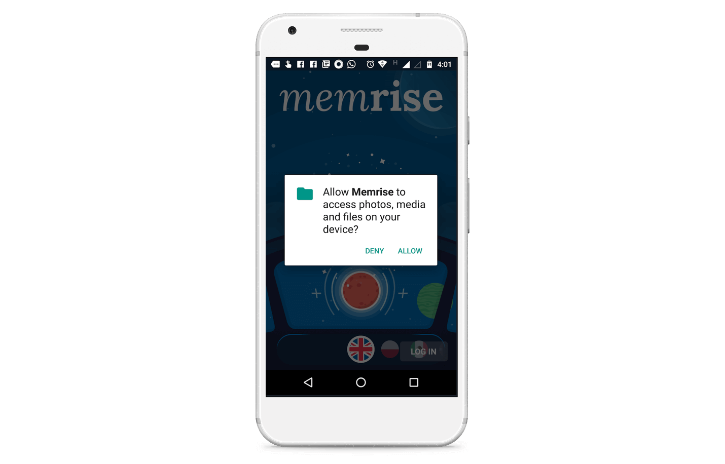
Once you tap on Allow, you will see a screen asking you to select the language you want to learn. You can swipe sideways through multiple options (notice the subtle cues to help with the navigation).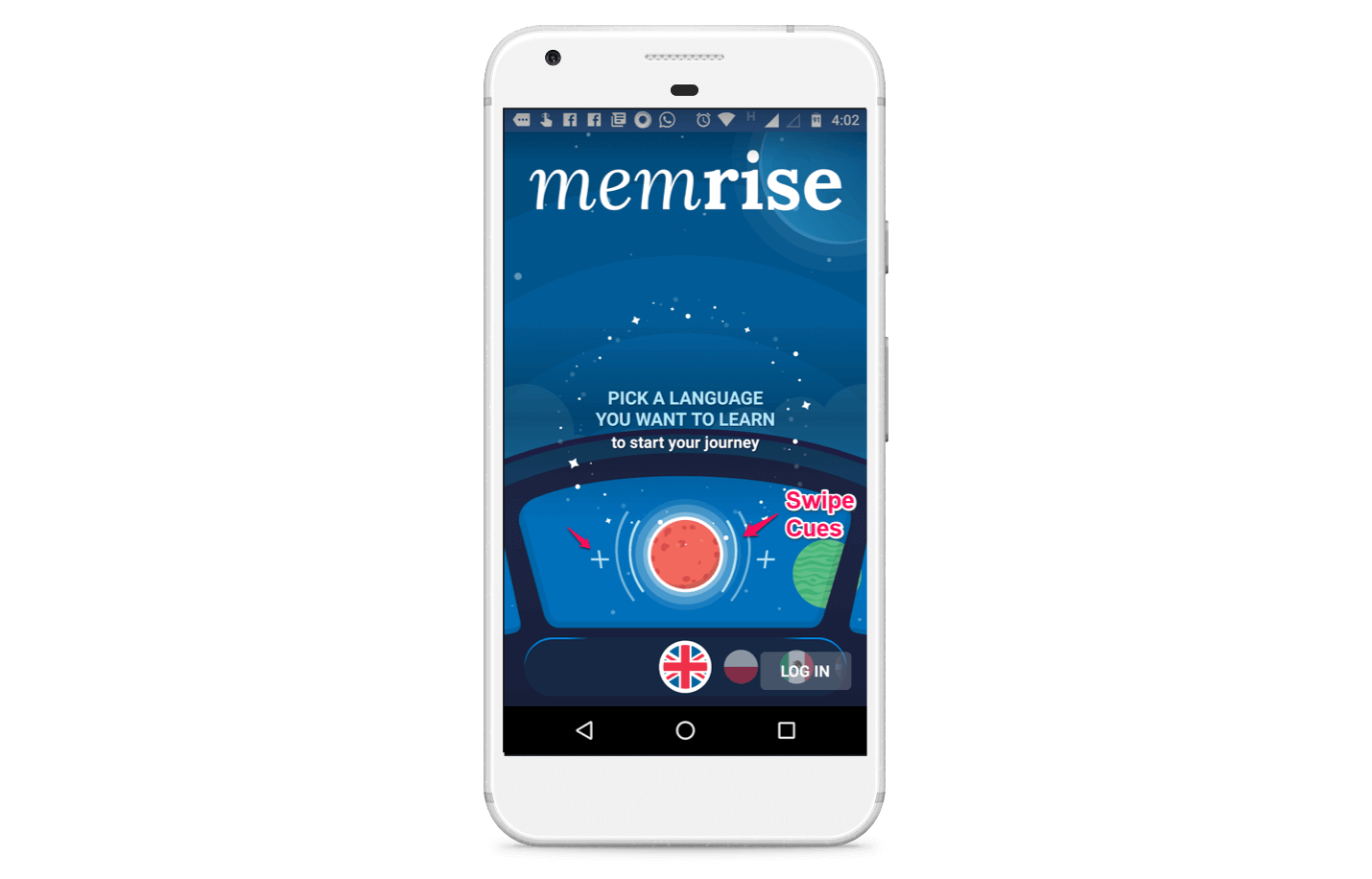
I swiped through the options and picked Brazilian Portuguese, and selected the beginner option.
I realize that the app screen seems like I am sitting at the controls of a spaceship, looking out into outer space. The design signals that it’s not going to be dry and boring, but full of space lasers and aliens (the second part was my imagination filling up the blank spaces).
Tip: While it’s absolutely essential to make the onboarding process as smooth as possible, you should also consider making the process fun and emotionally engaging. For most apps, using custom illustrations, mascots, and an unique visual totem can serve the purpose.
https://www.youtube.com/watch?v=2-ak_oslf7A
The visual identity of your app has to be aligned with your overall brand.
I am now taken to the sign in page, where I can use either Google or Facebook to sign in.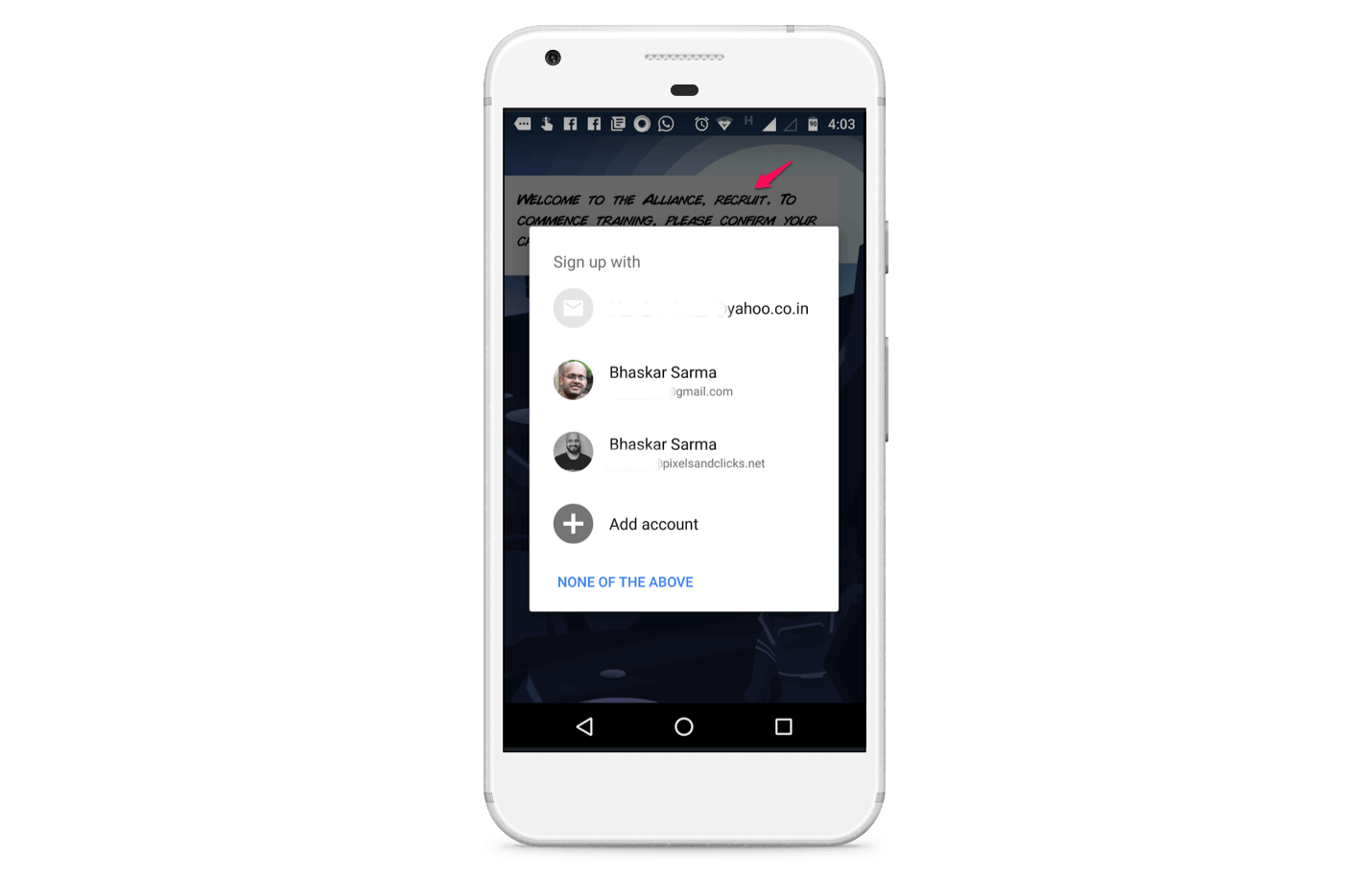
There’s some cool bit of storytelling going on in the background, where I am welcomed to the alliance (which is presumably fighting the Empire?) and asked to report to training.
This is much more fun than a milquetoast “Create an Account” dialog.
I choose Facebook.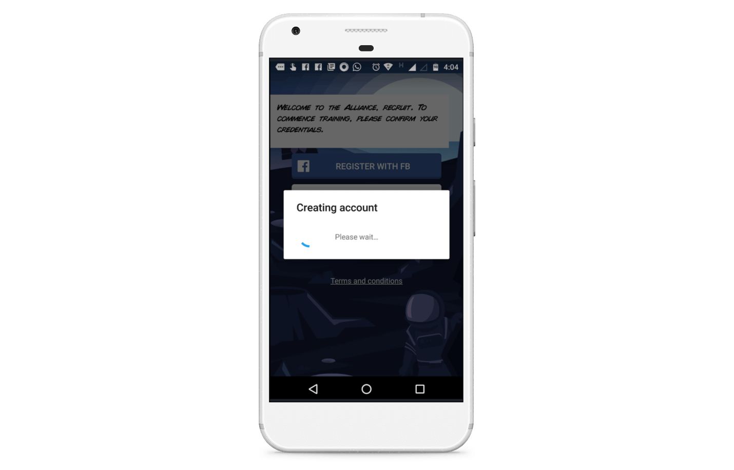
I am also asked if I want to save my account using Google Smart Lock for Passwords. The copy is very benefits oriented, and there’s a helpful link to learn more about this particular feature.
I tap on the Save Account option, and offer up more of my data at the altar of the Google Gods.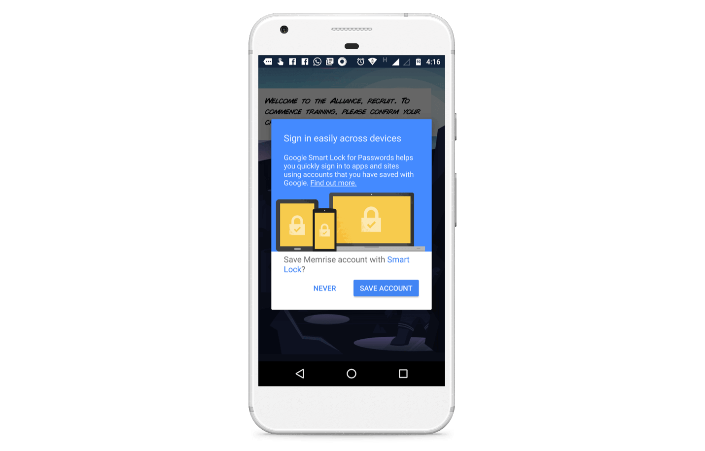
The first screen I land on after I have signed up and saved my account is a flashcard teaching me the Portuguese word for Hello. An overlay explains what I am looking at.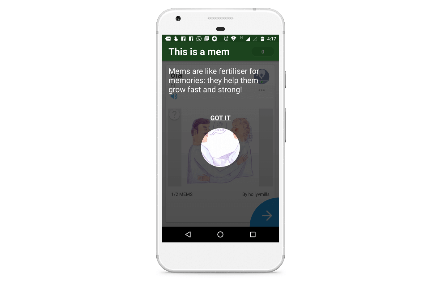
Most of these mems (why couldn’t they use meme?) are user generated.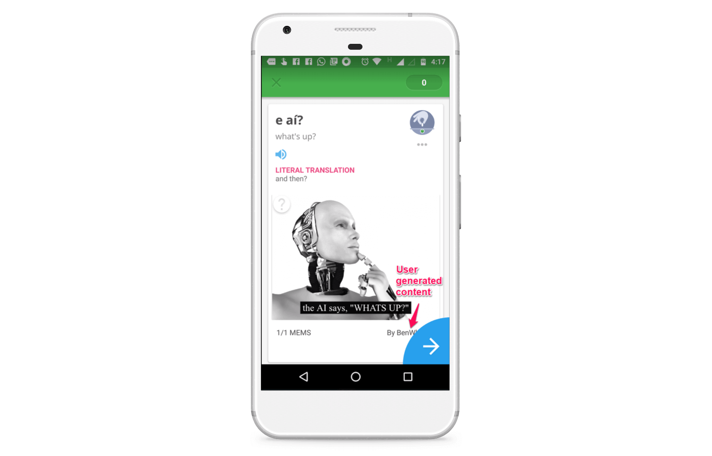
I didn’t see a clear option to add my own memes (you can add your own meme by swiping right on this image) but this is a great example of how apps can bolster engagement and retention by deploying the IKEA effect (From Wikipedia, the IKEA effect is a cognitive bias in which consumers place a disproportionately high value on products they partially created.).
Understand & Decode the IKEA effect
On tapping the blue arrow at the bottom right of the image I see a test for the word Hi.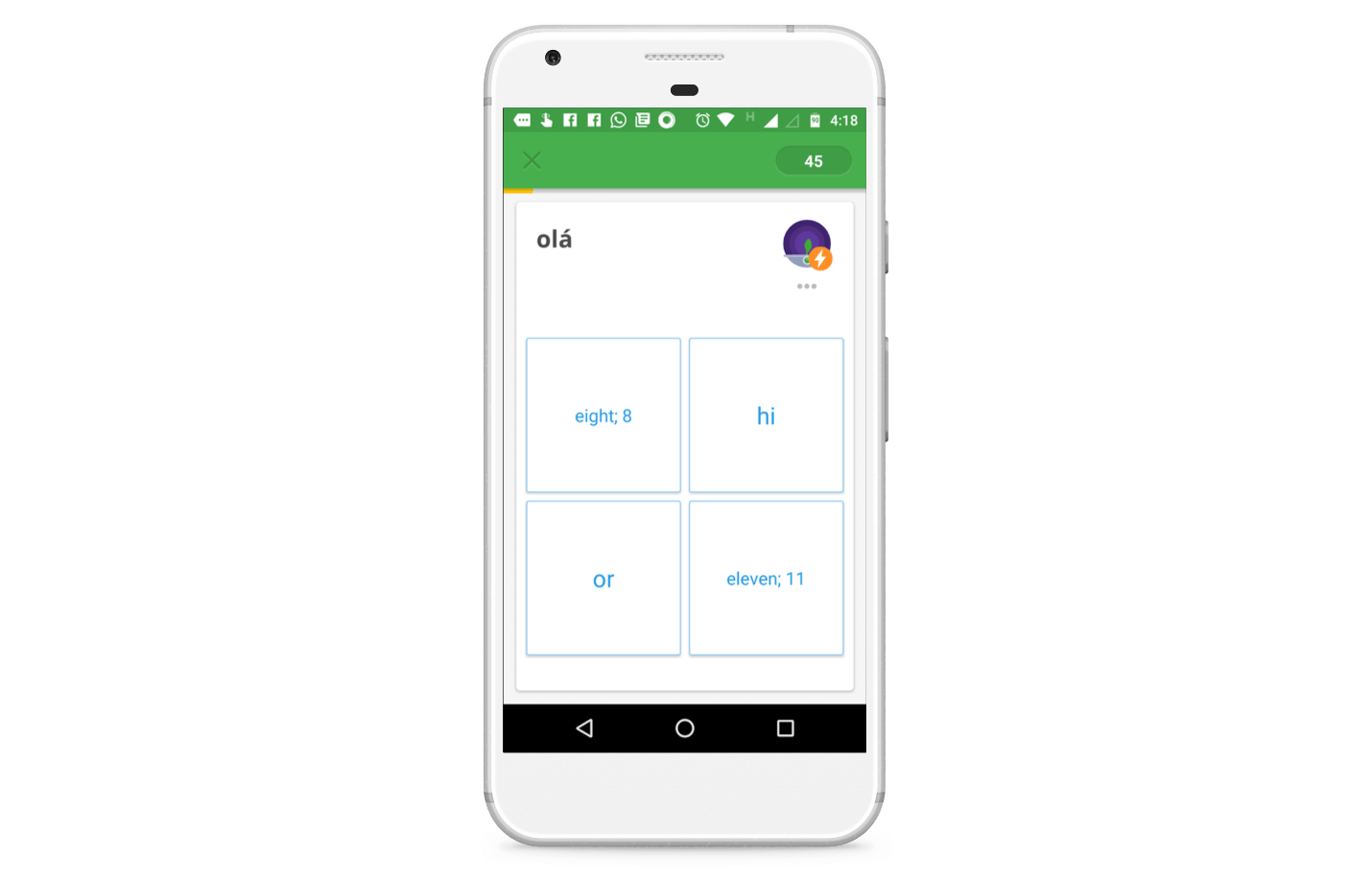
Tapping on the wrong square will hit you with the trifecta of vibration, a buzzing notification, and an impossible to miss red square.
Tap on the correct option, and you will get the green light, like so.
And barely did I get the Hi right when Memrise hits me up with a prompt to upgrade to the Pro version. I find it a bit aggressive, but the clever copy which uses lyrics of Adele’s Hello softens the blow for me.
I tap on the option at the bottom and move on.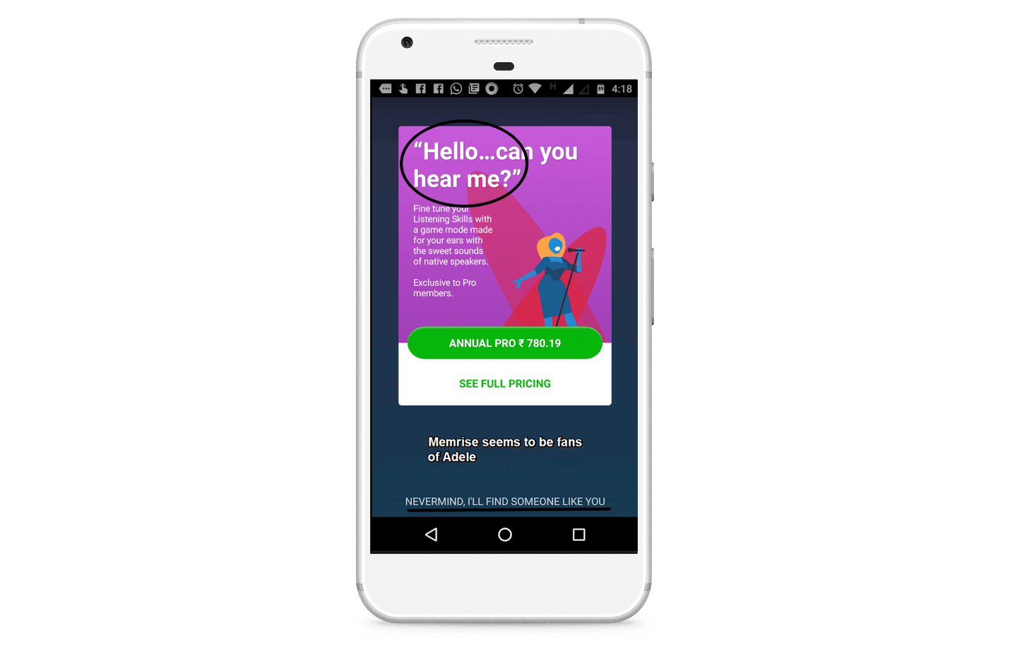
I then get the option to set a time for returning via a clock. I am not sure what I am supposed to get here after setting a time (I find out later that Memrise will send me a push notification every day at the selected time reminding me to open the app).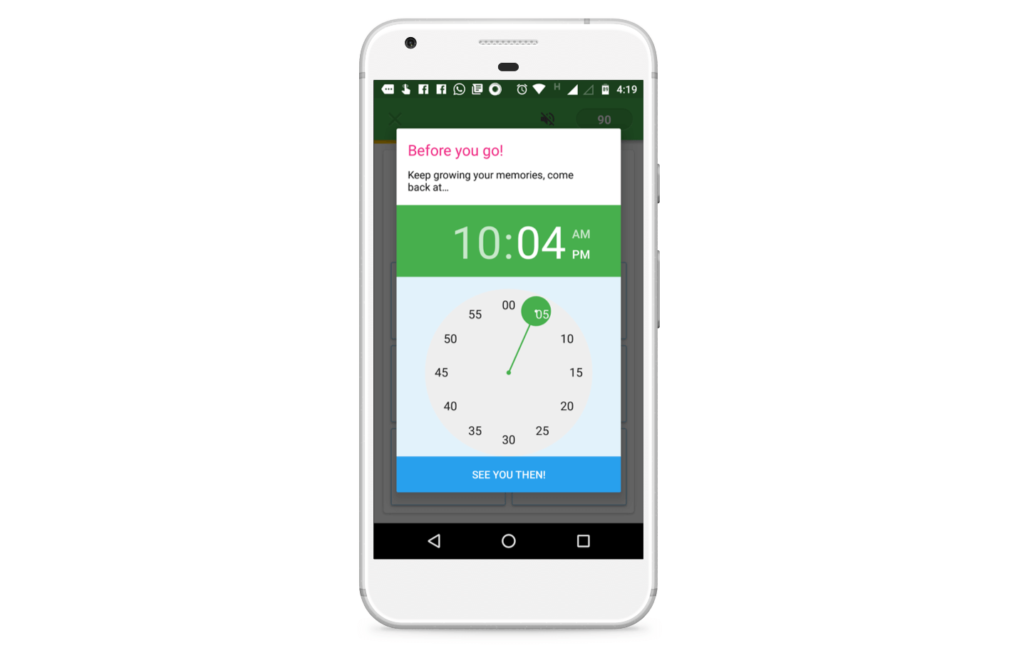
This closes the app.
When I open the app again I see my “dashboard”, where I can take stock of my Portuguese learning. The numbers on the screen isn’t telling me much right now, so I tap on the Learn New Words button.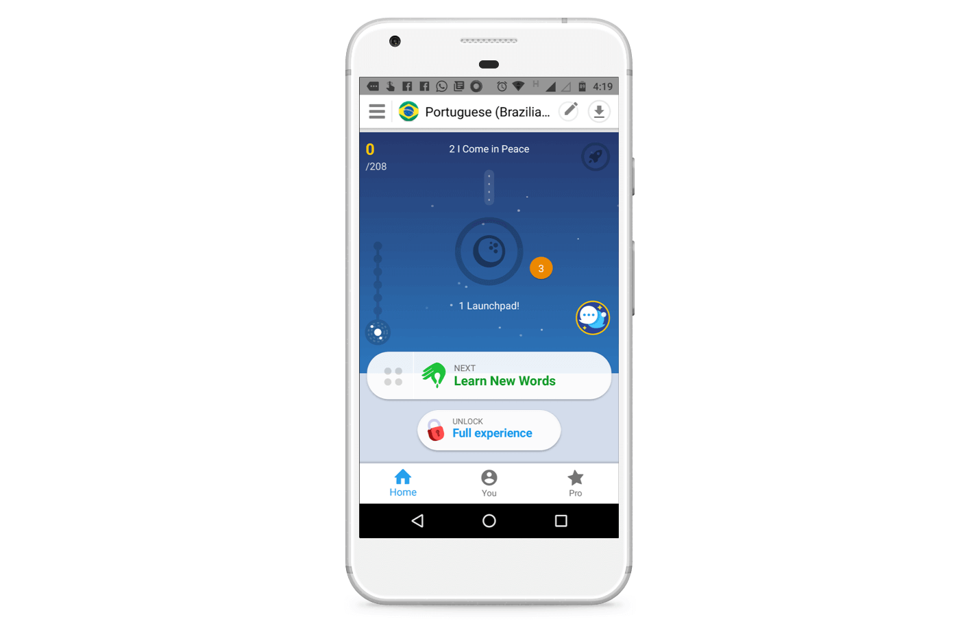
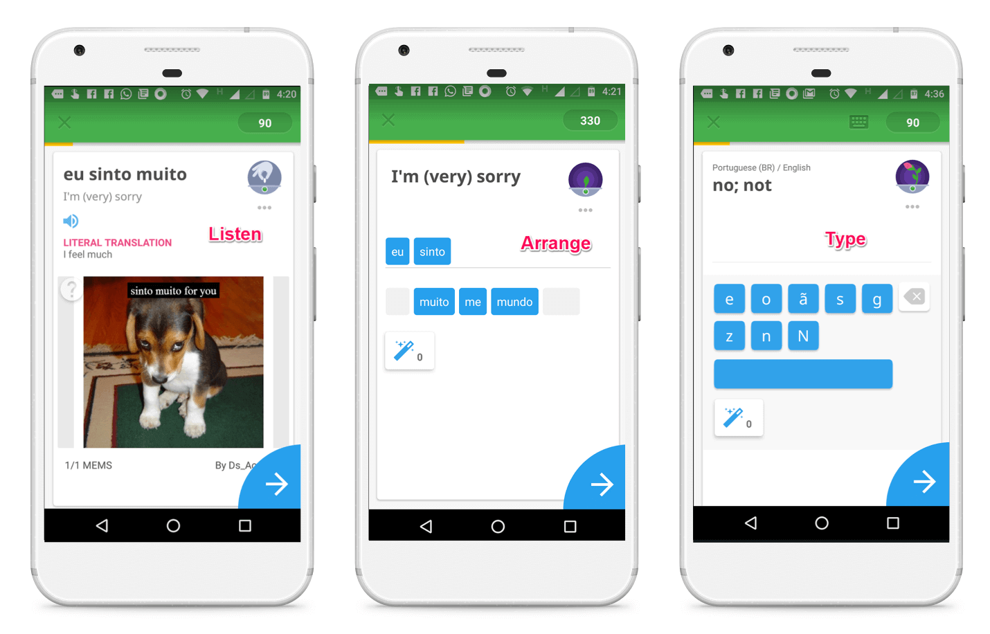
Another lesson starts for me, and I power through different screens where I can learn one phrase through different ways by:
- Looking and listening.
- Arranging different words in the proper order
- Typing out the words, keeping in mind the spelling and the pronunciation.
Once I am done with my daily goals, this update screen pops up (I didn’t realize I had 5 new words as my daily goal).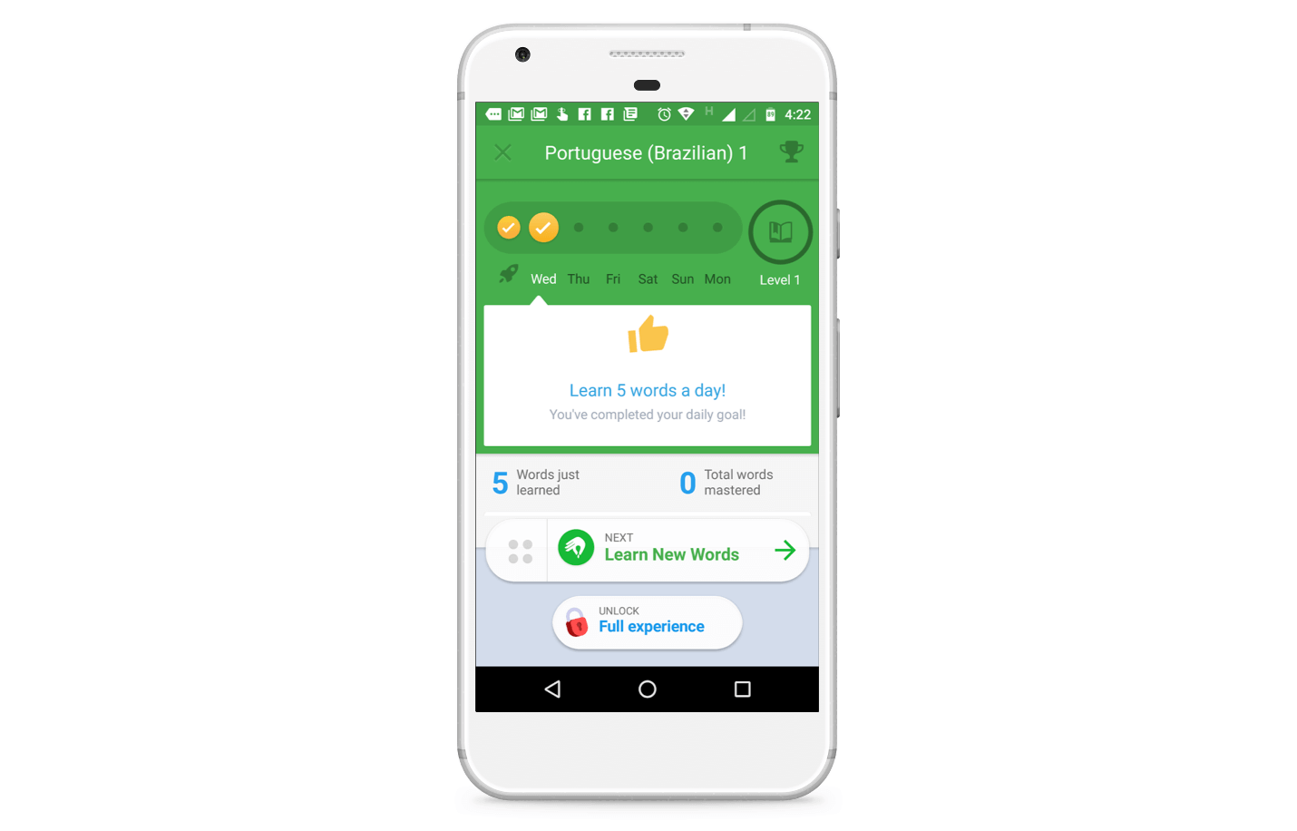
It’s interesting how Memrise doesn’t lose sight of monetization opportunities. That Unlock Full Experience button is always present after the user has achieved a milestone, where the chances of them clicking on the upgrade button might be higher.
[bctt tweet=”If you want your user to upgrade or buy, make an offer immediately after a positive experience.”]
Tapping on that button will show this screen with more details of the pro plan. You can scroll through the screen to see to find out what you are getting for the subscription.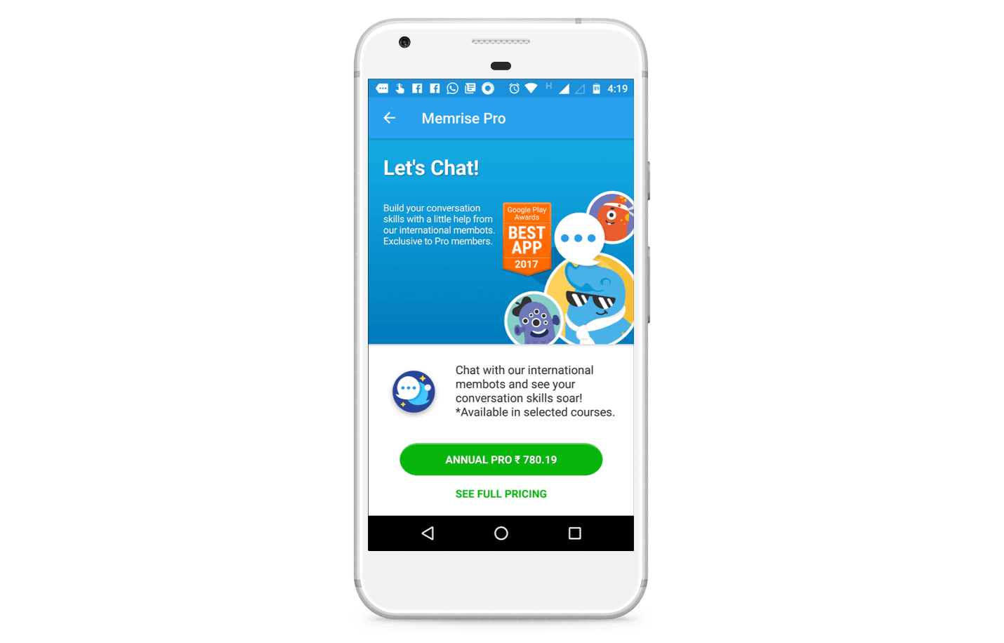
Notice the high contrast big green button smack dab in the middle of the screen, making it easy for users to tap on it?
Upon tapping, the user sees the standard Android payments menu.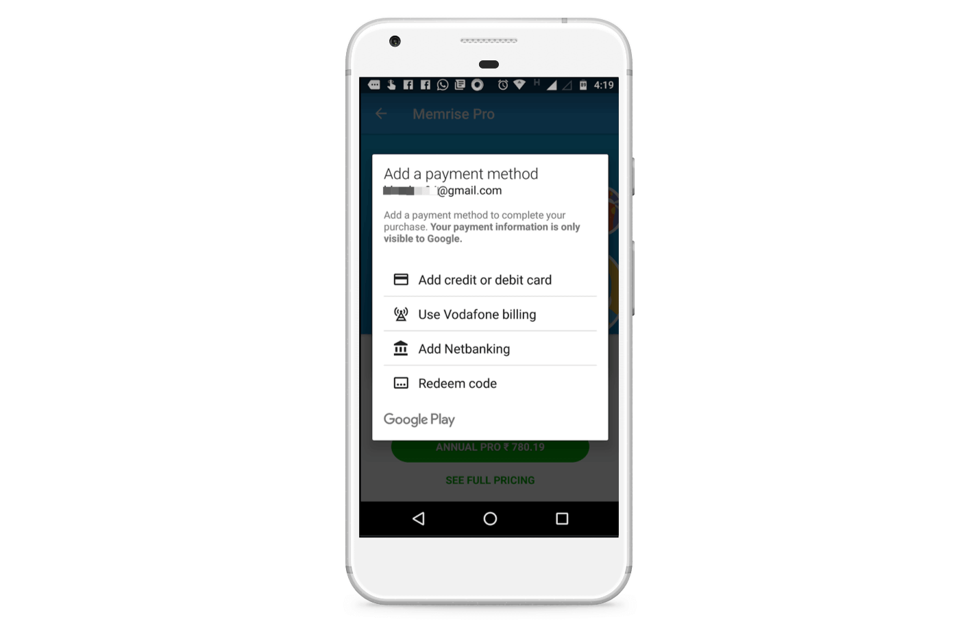
Memrise’s approach to onboarding is very different from a lot of apps. Instead of forcing the user to sit through a guided tour right after installation, Memrise makes the onboarding process more organic and less formulaic.
[bctt tweet=”To improve engagement and retention, make #onboarding exploratory and organic. #appmarketing.”]
The app uses overlays to tell me about the various features, but waits until I have discovered them. This makes it more likely that I would remember what a particular button does than if the information had been rammed down my throat in the beginning.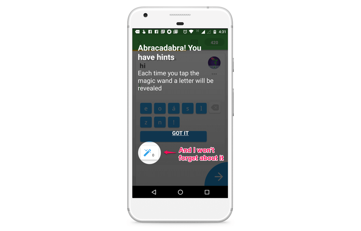
The app also encourages engagement by rationing out those sweet, convenient, handy hints.
The only way to get more hints is to complete the review process more often, something that I kept on doing without putting the phone down.

See the Endowed Progress Effect in action
I keep getting more hints, I keep learning more words, and as the seeds blossomed into flowers in the top right, I get hooked to the app.
Take a bow, Memrise!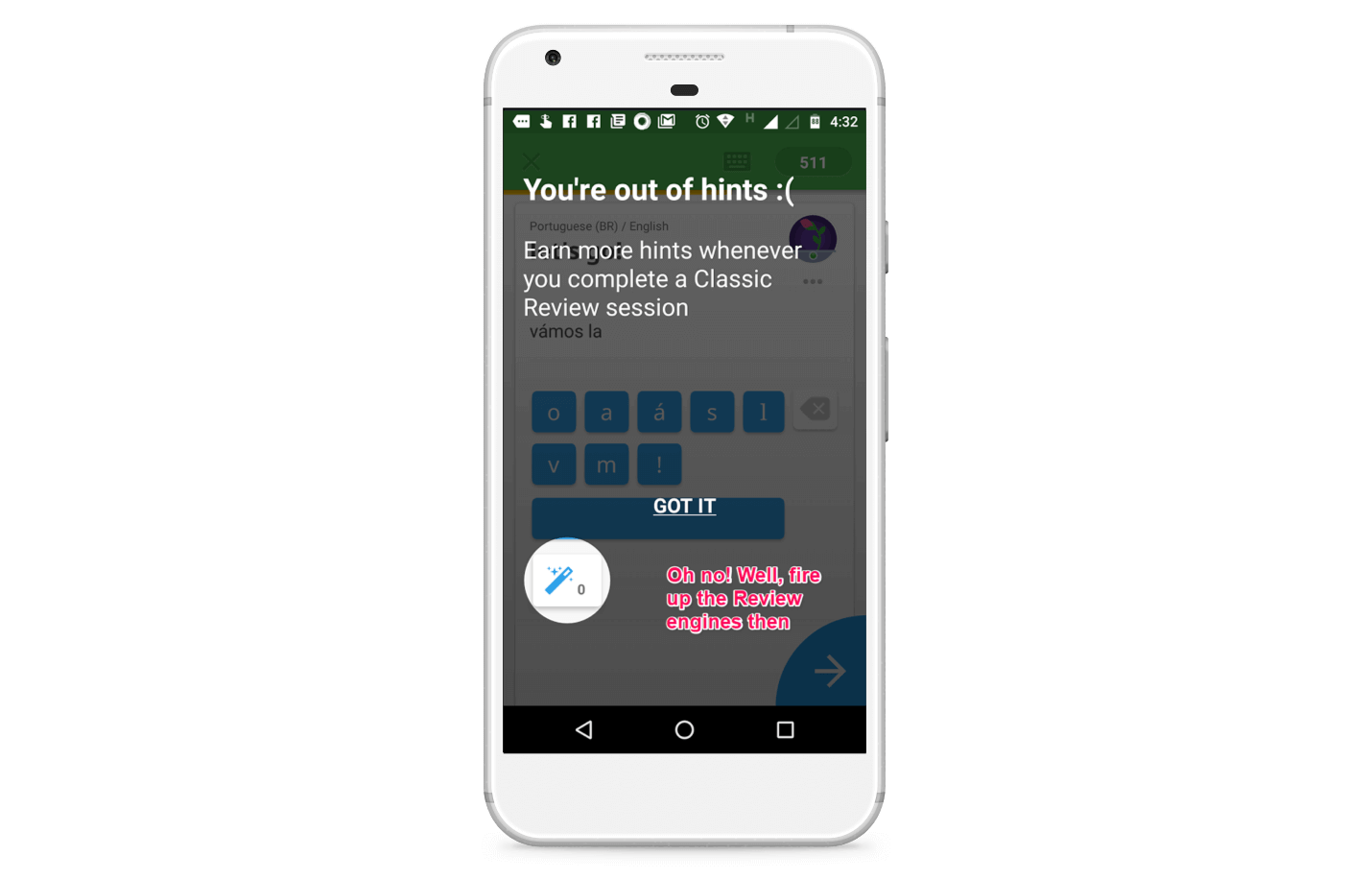
When I get a hint, Memrise congratulates me too. I gotta admit, seeing a wand with the word Shazam makes me feel good.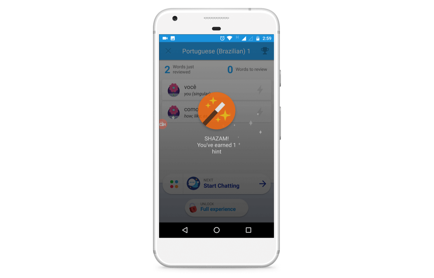
And while these moments are fleeting, they add dollops of personality to the app.
As they stack up on after the other, making me smile at the cute jokes and clever Adele inspired copy, Memrise stops becoming just another language learning app and starts taking a personality of its own.
[bctt tweet=”To make your app stand out, focus as much on personality/humor as you do on features. #appmarketing”]
And on the topic of engagement, Memrise brings out the big gamification guns by awarding me badges based on my progress. I am unsure whether the badge is only for bragging rights or can give me in-app goodies or unlock new features, but right now, I am okay with being called Memdicant.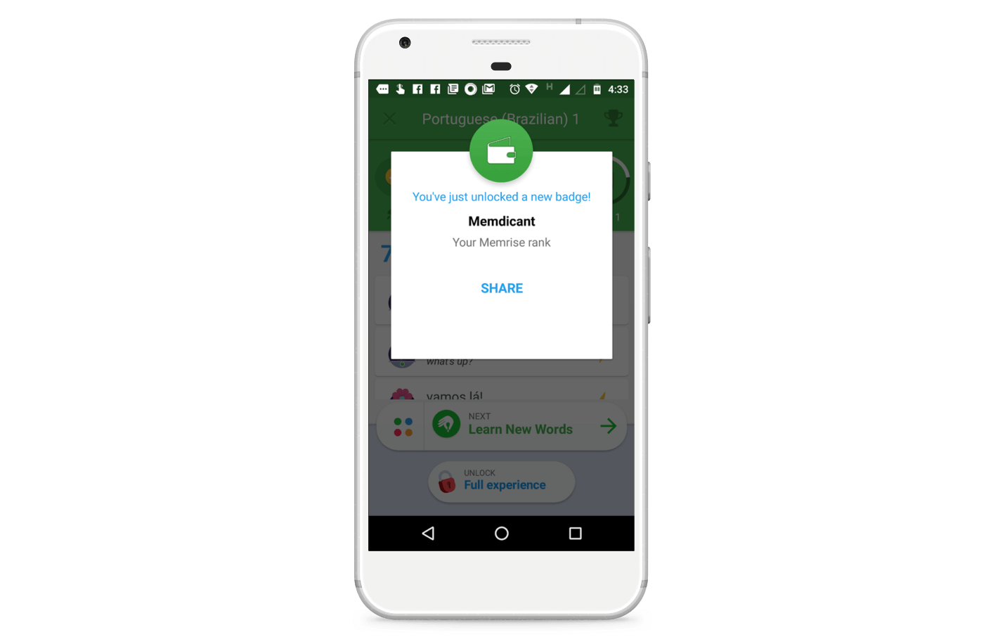
I can also share my badge, and get some word of mouth going.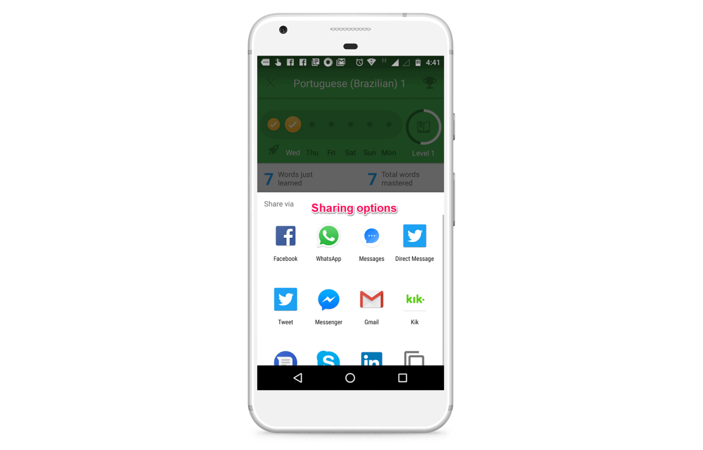
Memrise also incorporates chatbots to give users a feel for conversation. Instead of having a dry back and forth with a robot, I am asked to snoop around and get the name of the aliens who are posing as humans.
Neat!
I blew the mission multiple times, mostly because I hadn’t yet learned the words and phrases I was supposed to use.
While the concept is engaging, I found the implementation a bit lacking because I wasn’t yet aware of what “como você está” meant.
This is how the chatbot works.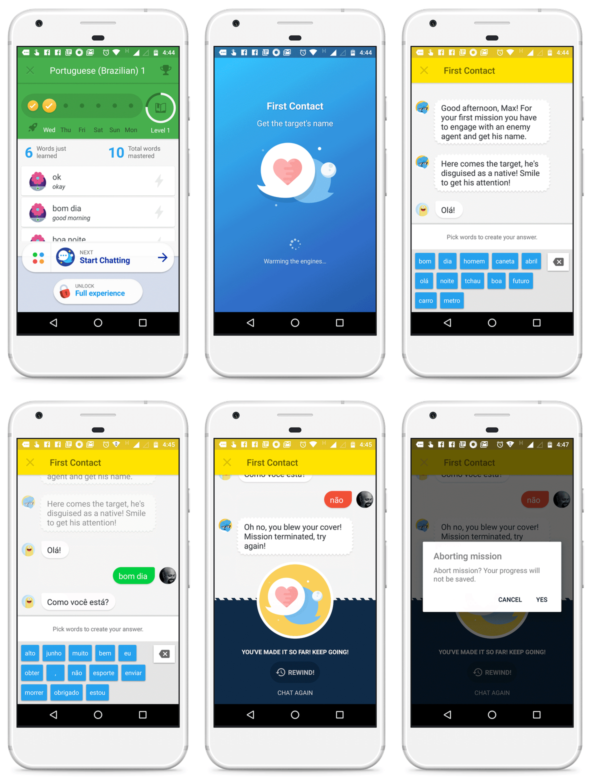
In terms of notifications, Memrise uses mobile push notifications to alert me for a regular review everyday at the time I had specified during setup.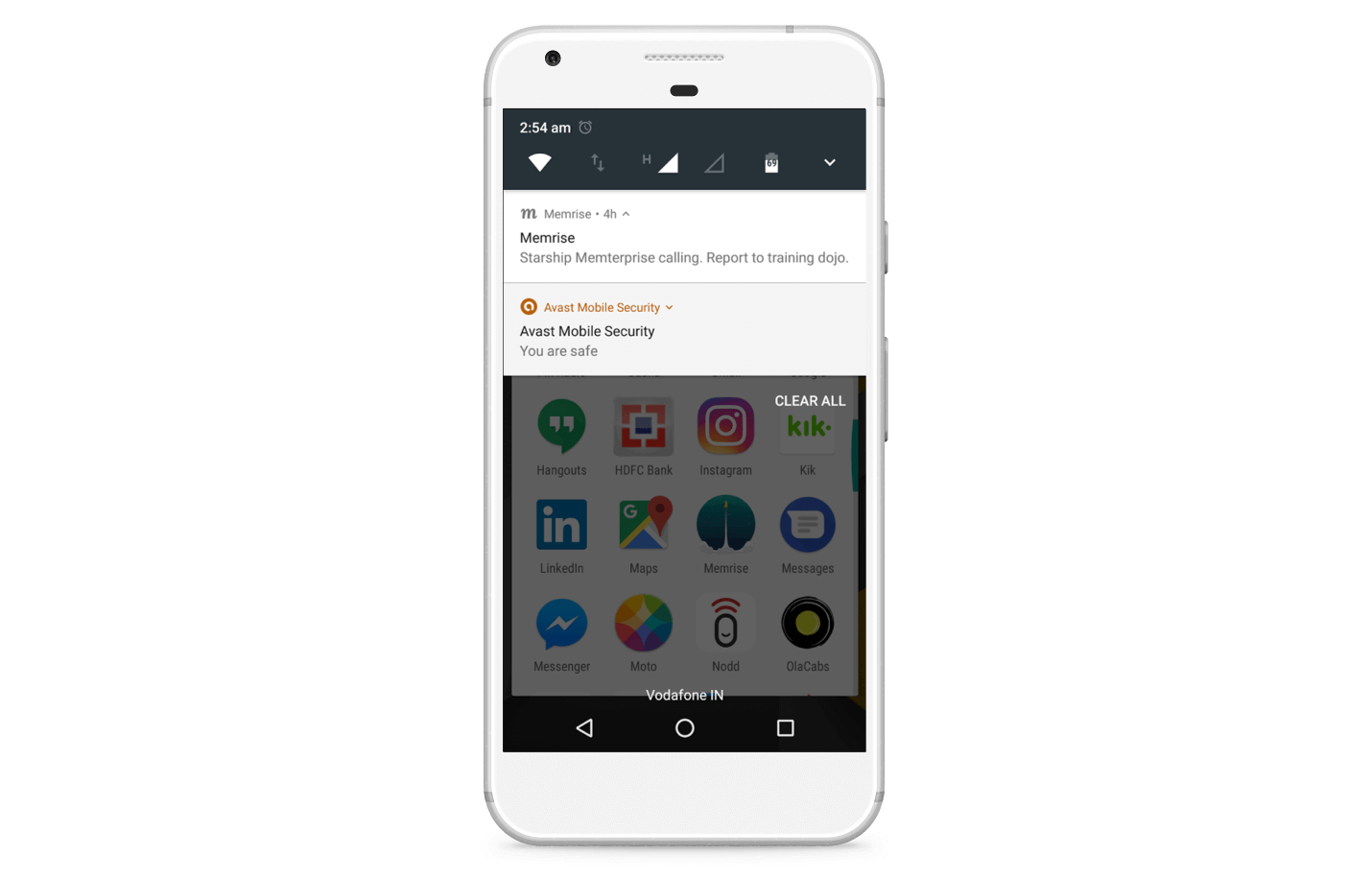
These notifications are a bit bland. I would have liked them to be more personalized and tied to my progress on the platform.
For instance, it would be cool if the notifications told me which words I was in the danger of forgetting, something which could be easily set up using triggered campaigns in Clevertap.
Memrise seems to have done precisely that when they recently started testing email notifications, telling me about my progress and inviting me back to the app.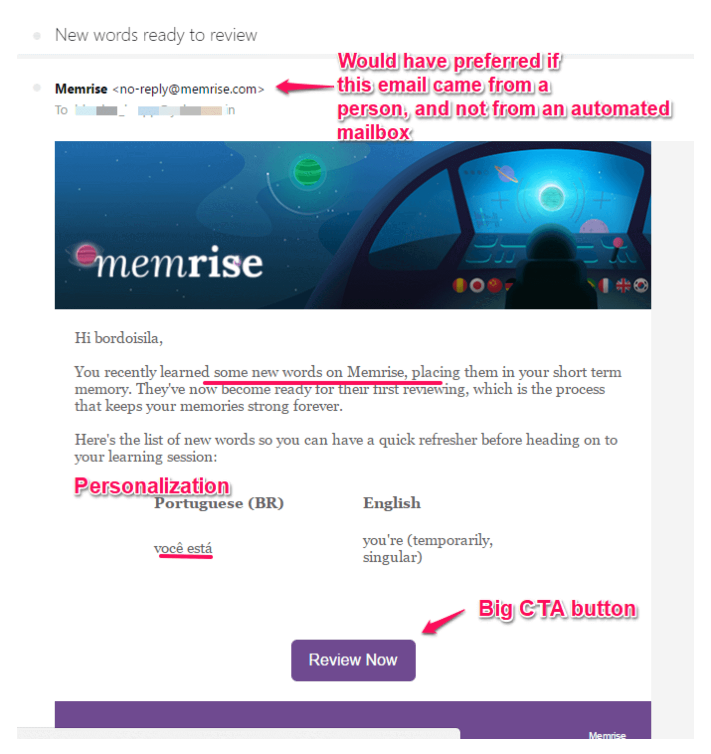
With a platform like Clevertap where analytics and engagement are tightly integrated, you have significant leeway in personalizing your engagement.
To review your progress, you can check out your Memrise profile, like so.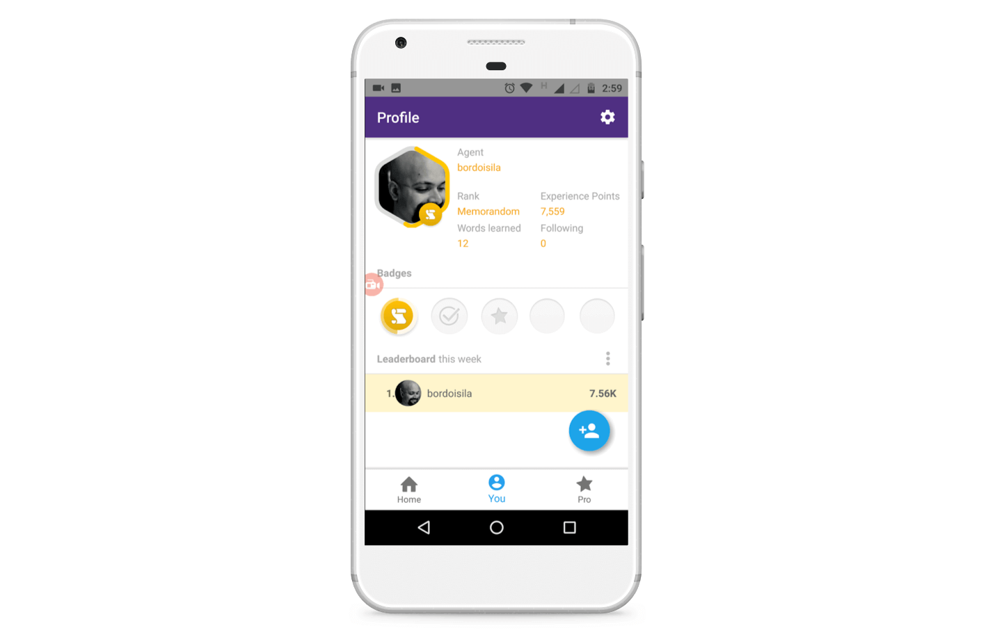
Learnings from Memrise
Memrise has been around for quite some time, and in the course of their existence they have amassed a large community.
There is a Memrise subreddit, and a community forum hosted on the site. They are quite active and the discussion threads are sometimes, um, raucous.
Furthermore, Memrise also has hundreds of reviews on Google Play and the App Store. Memrise also finds frequent mentions on Twitter and Facebook.
If you are an app, you should encourage users to speak up as much as possible, not only by asking to leave a review but also offering up spaces to discuss, criticize or offer feedback.
[bctt tweet=”Simple yet hard strategy to build an app that stands the test of time: Nurture a community.”]
Apart from that, some specific takeaways from this app are:
- Make the in-app experience part of a narrative. It’s a cliche, but storytelling is the best hook out there to engage users.
- Don’t be afraid to be quirky and different. The app landscape is saturated with me-too apps which look and feel the same down to their app icons.
- Make app onboarding an interactive instead of a forced process. Allow users to discover different features instead of force feeding them information right at the setup (You can use funnel analytics to understand the user flow inside your app in order to improve onboarding.)
- Where possible, encourage users to create content of their own to aid in-app experience. Spotify does this amazingly well when it asks you to create your playlists.
- Increase time spent per session and the session frequency by using gamification.
- Utilize positive experiences and milestones to convert free users to paying customers.
If you have already implemented these steps, you could go even further by:
- Making notifications (email, push etc) more personalized by alluding to past user activity( in this case,words learnt recently).
- Segmenting your users based on their responsiveness to channels (email, SMS, push etc) and contacting them only on their favorite channels.
- Creating offers based on user activity, or based on specific events like Father’s Day.
To build an app like Memrise, you have to break the data silos between analytics and marketing.
You need a single platform which not only tells you what users are doing inside your app, but even go at the level of the individual user in real time…
…but also allows you to reach out to them over multiple communication channels at a time and trigger of your choosing.
You need a platform like Clevertap, which does all this and more.
The Intelligent Mobile Marketing Platform
Subharun Mukherjee 
Heads Cross-Functional Marketing.Expert in SaaS Product Marketing, CX & GTM strategies.
Free Customer Engagement Guides
Join our newsletter for actionable tips and proven strategies to grow your business and engage your customers.

