


Table of Contents
Categories
Most Popular

We’ve all experienced the allure of a perfect call-to-action (or CTA) button when browsing online. Even though you know you don’t want those newsletters cluttering up your inbox every morning, sometimes the pull of a 15% coupon is too strong.
And who knows, you might enjoy that morning message more than you thought!
How Call-to-Action Buttons are Different
Simply put, call-to-action buttons are the place you want users to click in order to complete the desired conversion. This can be signing up for a free trial, joining an email list, adding an item to a shopping cart, or any number of other actions.
CTA buttons are usually found on homepages and on specific site landing pages that contain content relevant to the button. They’re different from more generic buttons (such as a “sign-in” button or social media share icons) because they encourage users to take specific actions that complete goal conversions.
Because of this, call-to-action buttons are typically the biggest, brightest buttons on the page. A little bit of well-placed flair can’t hurt.
15 Call-to-Action Button Examples
There are many ways to create a successful call-to-action button by making the text, colors, and location appeal to users. Below are 15 CTA button examples from some of the best brands around.
1. Spotify: Colors Make the Difference
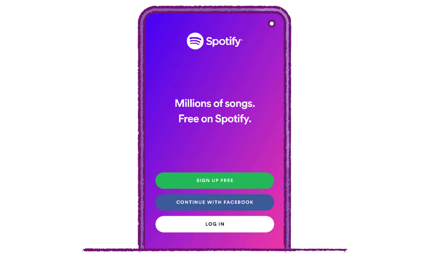
Spotify’s primary objective on this page is to recruit new users. They also have a secondary conversion goal of encouraging users to connect via Facebook.
Studies have shown that bright colors with contrasting backgrounds tend to receive the highest click-through rate (CTR), which is why the two most important buttons are bright green and blue. Be sure to focus on tones similar to these eye-catching colors, without overusing them.01
You want your buttons to stand out, so utilizing a contrasting color for the background, like Spotify’s purple-to-pink gradient, is a great way to make your CTA pop.
2. Coca-Cola: Generate Curiosity
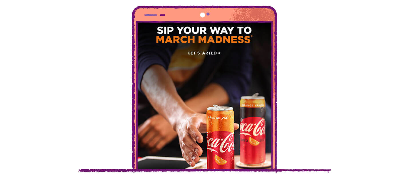
Draw attention to your CTA buttons with descriptive, original text that catches the eye. Though most of the time you want your buttons to be clear and concise, sometimes an air of mystery can be a good way to draw clicks. Just be sure the message is intriguing enough to pique curiosity and not so mysterious that they choose to ignore it.
In this example, it’s not entirely clear where the CTA button leads, but the text is alluring enough that users will be tempted to see where it goes. If you’re able, tie CTA buttons to popular current events such as March Madness as a great way to generate additional interest.
3. Airbnb: Surround It With White Space
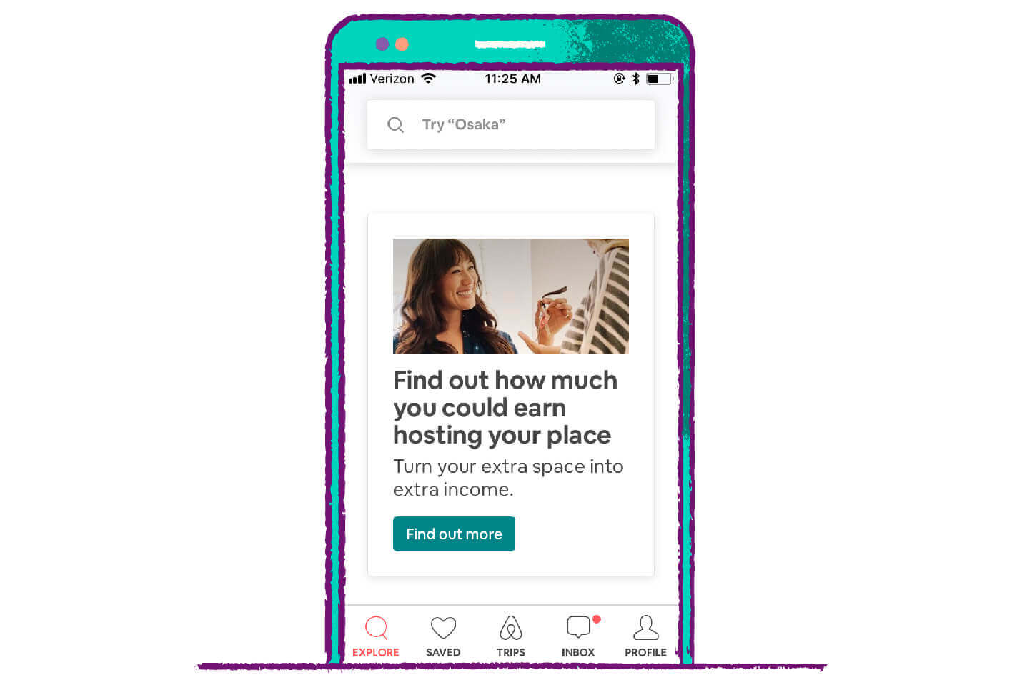
One of the best ways to help something stand out is to make sure there is no competition around it. This simple call-to-action button is the only splash of dark color on a minimalist page.
The prevalence of white space and subtle icons bring the user’s eye right to the button. Try experimenting with additional white space around your CTA buttons. You may be surprised by how much they stand out!
4. Disney: Discounts Work Wonders
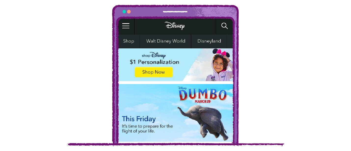
Never doubt the power of a good deal!
This “Shop Now” call-to-action button is preceded by a banner advertising Disney services for just $1. Discounts or super cheap pricing can encourage users to click, even if it’s for a service they didn’t know they wanted.
5. Headspace: Emphasize the Primary Conversion
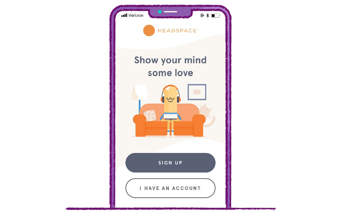
Humans are simple creatures, and these days our attention spans are at a record low.02 Make things easy for users by prioritizing the most important call-to-action buttons within the layout of the page.
In this example, Headspace’s primary conversion goal is to attract new users. This is why their sign up button appears on top of the login button and stands out much more with the full dark gray coloring.
Prompting users to sign in is not as important as bringing in new users, which is why this button comes second on the page hierarchy. Including an arrow can further call attention to the desired action and has been found to increase click-through rates by more than 26%.03
6. Southwest Airlines: Showcase Opportunities
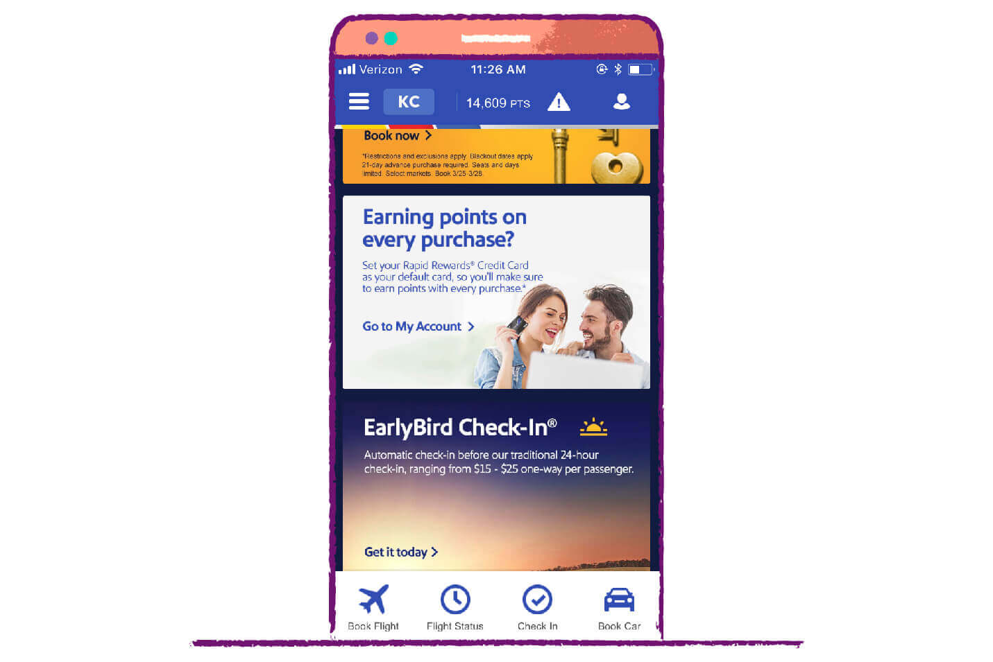
Another powerful motivator brands use is to point out any potentially missed opportunities, usually in the form of deals or savings. The tone of this Southwest call-to-action reads as an enticement to the user, as if to say, “Did you know you can earn rewards so easily?”
The headline text is big and bold, and the white box stands out amongst the other dark colors. Once this catches the user’s attention, the rest of the copy explains how the process works, with a handy link to set up the credit card right away.
7. Pocket: Make Calls-to-Action…Action-filled
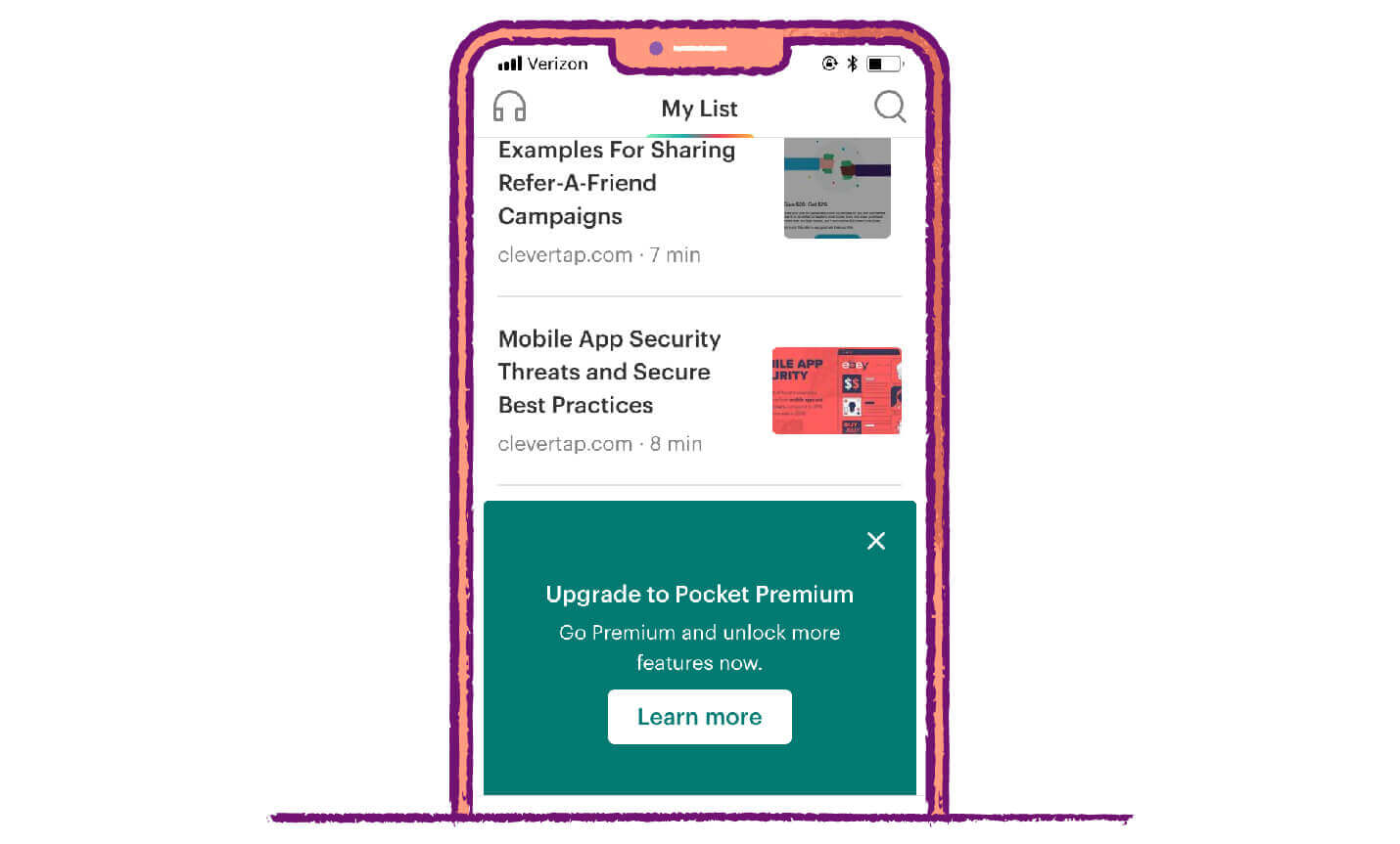
For this example, we’d like to showcase Pocket’s home screen featuring a few of our very own blog posts. It may seem like common sense, but good CTA button copy is essential for click-through performance. Long, descriptive sentences detailing why the user should click are not as effective as short, punchy statements that get right to the point.
This doesn’t mean the copy has to be boring, however. You should try to incorporate language with plenty of verbs and other action phrases that are a little more interesting than “click here” or “submit now.” In the above example, the words “Upgrade,” “Go Premium” and “Learn more” strongly sway the user to click.
8. Geico: Create a Sense of Urgency
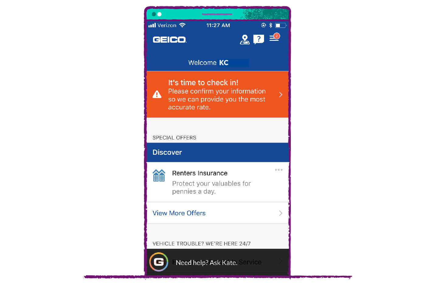
If the love of a discount won’t work, then how about fear of a late fee or penalty?
Realizing you’ve missed a bill payment or forgot to check a box on your taxes is a bad feeling that most of us can relate to. This CTA from Geico is a good example of creating a sense of urgency that encourages users to click.
The bright hazard orange is a color commonly associated with dangerous materials, as is the exclamation point icon to the left. In reality, it’s likely that nothing would happen if the user didn’t check in and confirm their information. However, the fear that something could happen (in this case, the threat of a higher rate) keeps people clicking.
9. Louis Vuitton: Don’t Rely on One Shape
One of the easiest things you can change about your CTA button is the shape. Depending on the landing page, industry, or desired conversion, different button shapes could entice different users.
For example, bubbly, rounded shapes are trendy these days, but Louis Vuitton decided to go with simple, elegant rectangles for their homepage buttons.
Don’t be afraid to do a little A/B testing to see which button shape works best for your audience. You may be surprised at how drastically your conversion rates improve!
10. Nike: Text Size Matters for Mobile
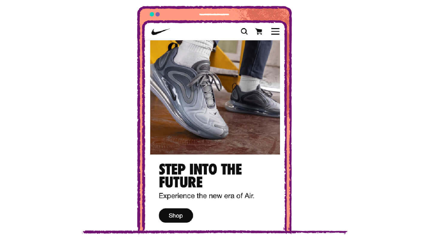
Bigger isn’t always better — at least when it comes to CTA text.
Obviously, you need the text to be large enough to attract the user’s attention, but you don’t want it to be overwhelming. If it detracts from the overall mobile experience, or if you’re making it way too obvious that you’re trying to get the user to do something specific, chances are they’ll take their business elsewhere.
Though most of us are conscious of it, we don’t like to be reminded when brands are trying to manipulate us. This button from the Nike homepage is the perfect example. The title text is eye-catching and bold, but the rest of the copy and the button itself are simple and understated so as not to overwhelm.
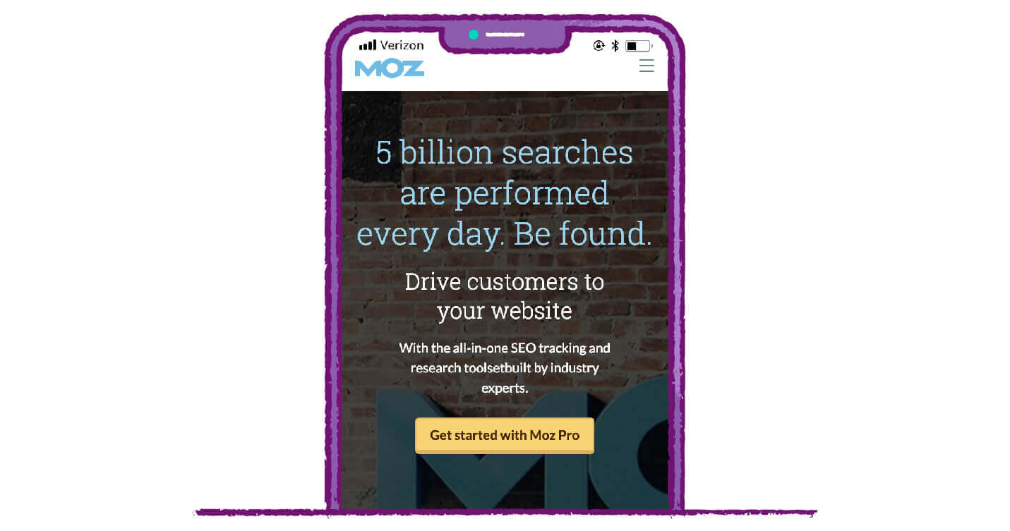
11. Moz: Text Length is Also Important
Though it can be tempting to pack in as much information as possible in order to entice users, CTA buttons are really much more effective when they’re as short as possible. This is why you see most of them containing phrases such as “Shop Now,” “Learn More,” or “Subscribe Today.”
The general rule of thumb is that you want your CTA button copy to have at least two words, but no more than five.04 The experts at Moz are setting a good example of how to be both descriptive and brief with CTA button text.
12. Lyft: Make Sure it Stays Top of Mind

An important factor in call-to-action button success is to make sure it stays “above the fold.” In other words, the user shouldn’t have to scroll to find it.
The button should appear at the top of the screen before the user has to go anywhere on the page. This ensures that the button grabs their attention immediately.
This example from Lyft is actually all one mobile app landing page. You can see that the “Apply to Drive” CTA button is one of the first things users see, and the rest of the page is accessed by scrolling below the fold.
13. Zoom: You Can’t Beat Free
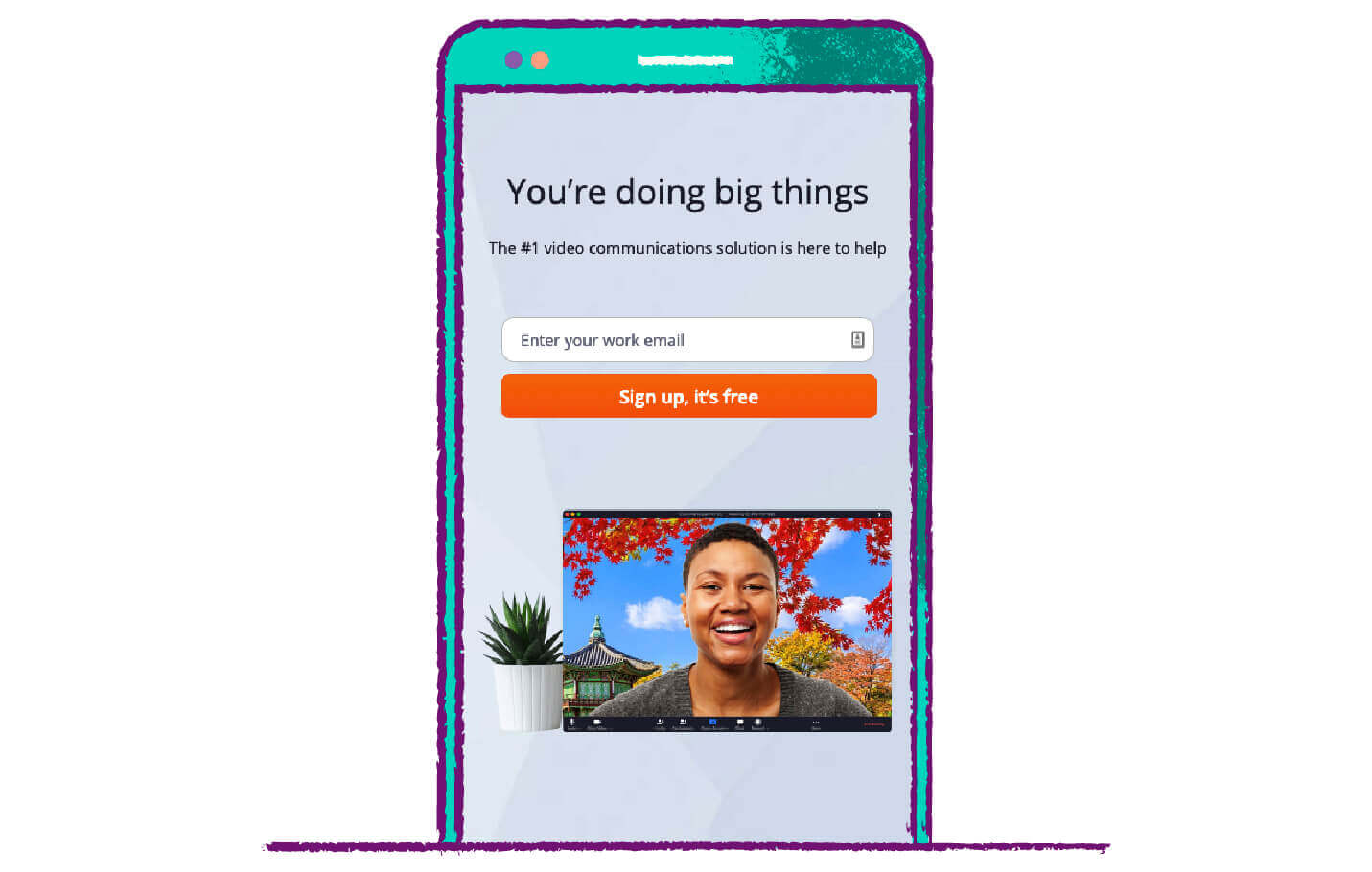
What’s better than a discount? Well, free of course!
People love free things, and this simple CTA button from Zoom is the perfect example of how to incorporate this “magic” word into your copy. This is one of the most effective words you can add to your buttons, though of course, some part of your product or service must actually be free for you to use this tactic.
By prompting users to sign up for a free account with no credit card commitment, Zoom ensures sign-ups with the hope that if the user enjoys the free version of their product, they’ll eventually upgrade to a paid subscription. There is a reason this type of strategy is so common — it works.
14. Buffer: Differentiate Options
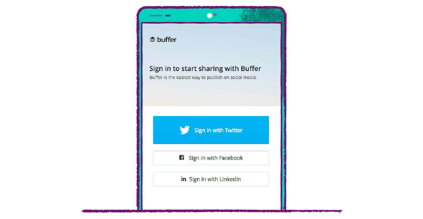
Again, humans are simple. We’re easily overwhelmed by too many choices, and there are beyond many choices on the internet these days. Try to limit your call-to-action buttons to just one or two options in order to avoid decision overload.
If you must have multiple options, prioritize one by setting it apart from the others. This login page from Buffer is a good example.05 By making the Twitter option bright blue and larger than the other buttons, they are encouraging users to choose this option.
Buffer might not care care whether new users create an account with their email, Facebook, or LinkedIn account, but they need to prioritize one (in this case Twitter) in order to make things as easy as possible for the user.
15. Mailchimp: Have Fun with Graphics
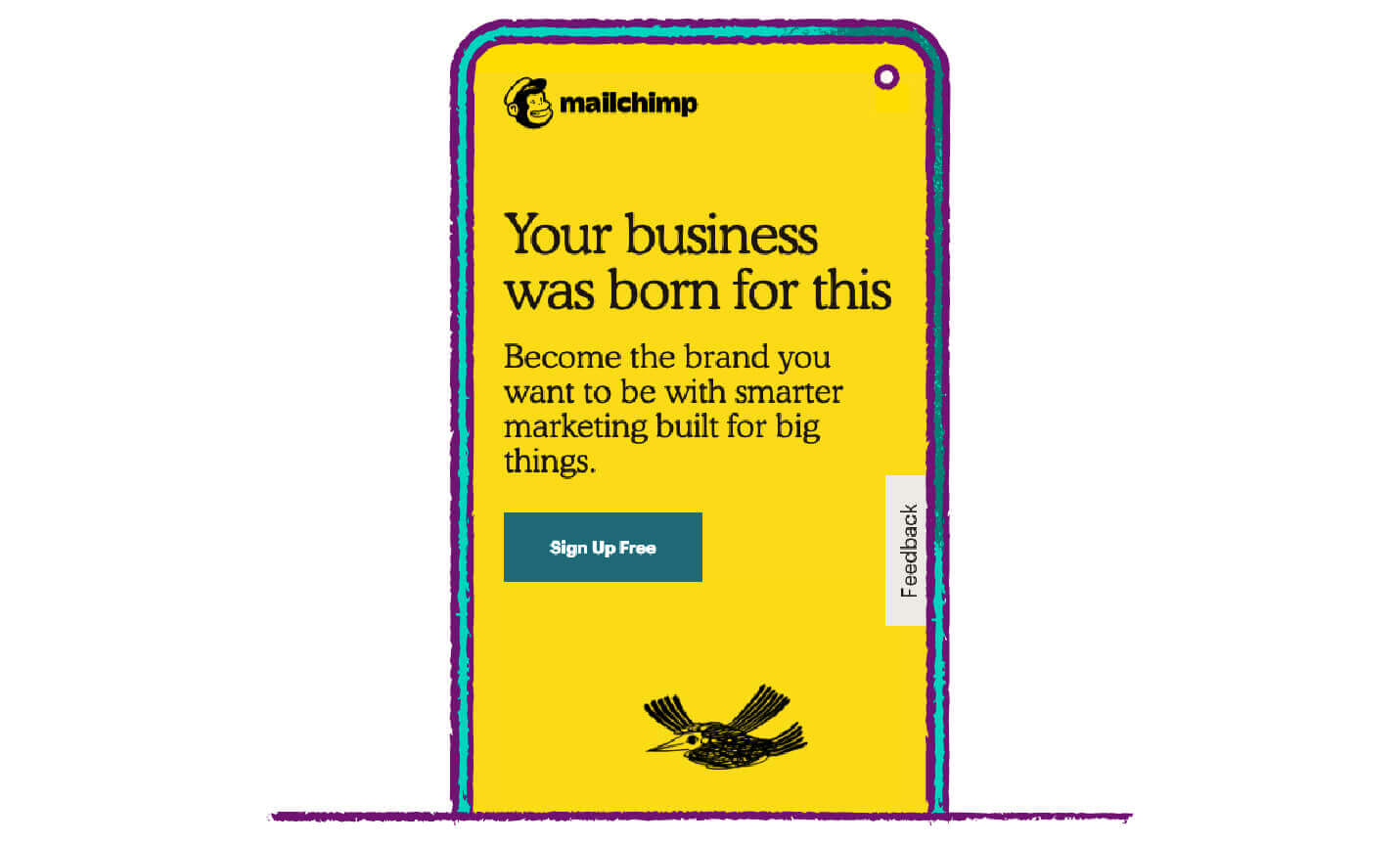
Mailchimp is known for its adorable mascot and goofy graphics, and these little touches can be great accompaniments to CTA buttons. Don’t be afraid to get a little creative with your designs — sometimes a little character like the bird above or another small graphic can give it flair.
However, everything is best in moderation! Again, you don’t want to overwhelm or annoy users — it’s best to leave out the rainbow-colored arrows pointing to the CTA button. Some users may be overwhelmed by Mailchimp‘s flair, despite a lack of rainbow-colored arrows.
Call-to-Action Button Best Practices
There are multiple factors that can affect the CTR of your buttons, that can be summarized in a couple of basic rules:
- Give a clear reason as to why the user would benefit from clicking on the button.
- Make your CTA button as noticeable and enticing as possible, without being annoying.
Keep in mind these key takeaways from some of the most successful brands on the market:
- Use appealing and noticeable colors such as green, blue, and orange, and make sure they’re placed on contrasting backgrounds.
- Keep the copy short and sweet (two to five words), but still interesting. Include action words and phrases.
- Limit the on-page competition — the CTA button should be the most noticeable thing on the page.
- Discounts, freebies, and rewards are some of the best ways to entice users to click.
- Create a sense of urgency or a feeling of missing out on some sort of reward.
- The CTA button should be placed strategically — this means above the fold and following the natural hierarchy.
- Limit CTA button options to as few as possible to avoid decision paralysis.
- A/B testing CTA buttons is key — this can include testing different text sizes, button shapes, graphic implementations, and more.
Much like the examples above, some of the world’s most elite companies are using CleverTap to deeply understand their users.
If you want insights into your user engagement and the performance of your mobile app’s calls-to-action and other marketing messages, sign up for a demo of CleverTap’s intelligent mobile marketing platform to understand analytics on a deeper level.
See how today’s top brands use CleverTap to drive long-term growth and retention
Subharun Mukherjee 
Heads Cross-Functional Marketing.Expert in SaaS Product Marketing, CX & GTM strategies.
Free Customer Engagement Guides
Join our newsletter for actionable tips and proven strategies to grow your business and engage your customers.
