In-app notifications are messages sent to a user while he/she is active in your app. When done right, they show higher efficiency of engagement over other methods like Push Notifications, SMS or Email.
That said, creating visually pleasing in-app notifications with images is an increasing problem due to the varying resolutions and screen sizes of devices launched by Apple, Google, Samsung and other major mobile phone manufacturers.
This post will help you design the best possible in-app messages that can be used across multiple devices, irrespective of the screen resolution of the device.
In-App Notification Templates with CleverTap
First you need to understand how CleverTap fits a given image within different types of in-app notification templates. Currently we offer 4 different types of templates –
- Interstitial – a portrait container in the middle of the screen
- Cover – a portrait container covering the whole screen
- Half Interstitial – a container in the middle of the screen
- Sticky – a landscape container on the top/bottom of the screen
The following sections describe the impact of the rule above depending on the type of image you want to use for creating the in-app notifications.
Using a landscape image
Let us see what happens when we put a landscape image in each of the above mentioned templates.
For three of the templates ( Interstitial, Cover and Half Interstitial), the longest side of the container is the height of the container. Applying the basic rule, the image will hence fit to the height of the container and will center align. The portions of the image outside the container with this alignment will be cropped out.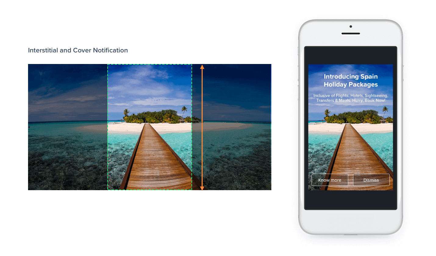
A landscape image within Interstitial and Cover notification templates
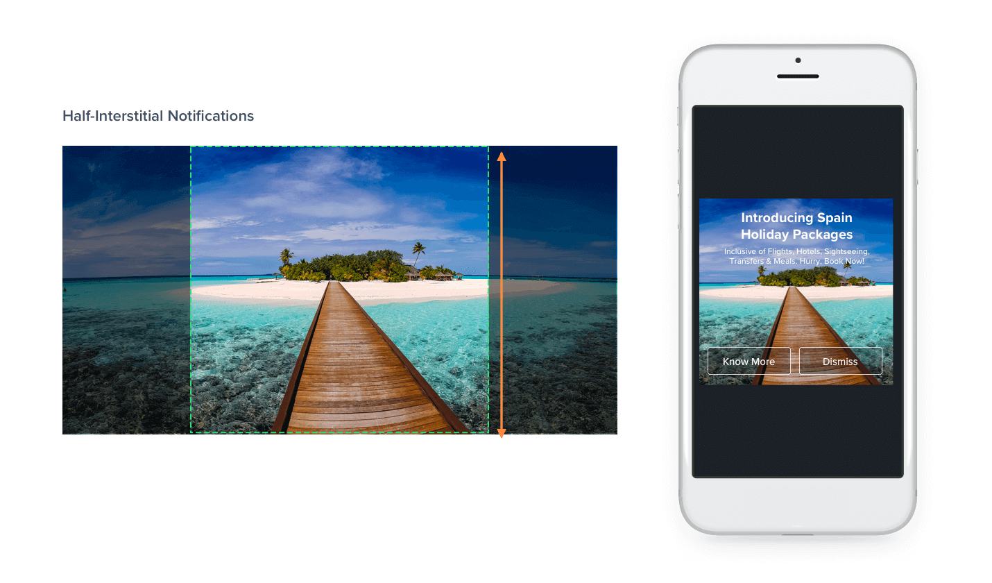
A landscape image within Half Interstitial notification templates
For the Sticky in-app template, the longest side of the container is the width of the container. Applying the same rule, in this case the image will fit to the width of the container and center align and crop accordingly.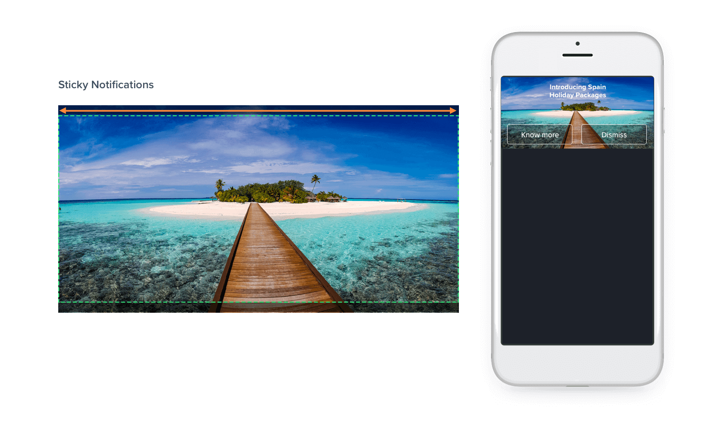
A landscape Image within Sticky notification templates
Using a portrait image
Now let us see what happens when using a portrait image for creating our in-app notification within every template. The basic rule remains the same that is, the image is center-aligned and fit to the longest side of the container.
Once again for three of the templates (Interstitial, Cover and Half Interstitial), the longest side of the container is the height of the container. So the image will fit to the height of the container and center align. For the Sticky template, the width of the container is the longest side, hence the image will fit to the width of the container, center align and crop out the rest of the image.
The following images show the effects of applying the rule and cropping for portrait images.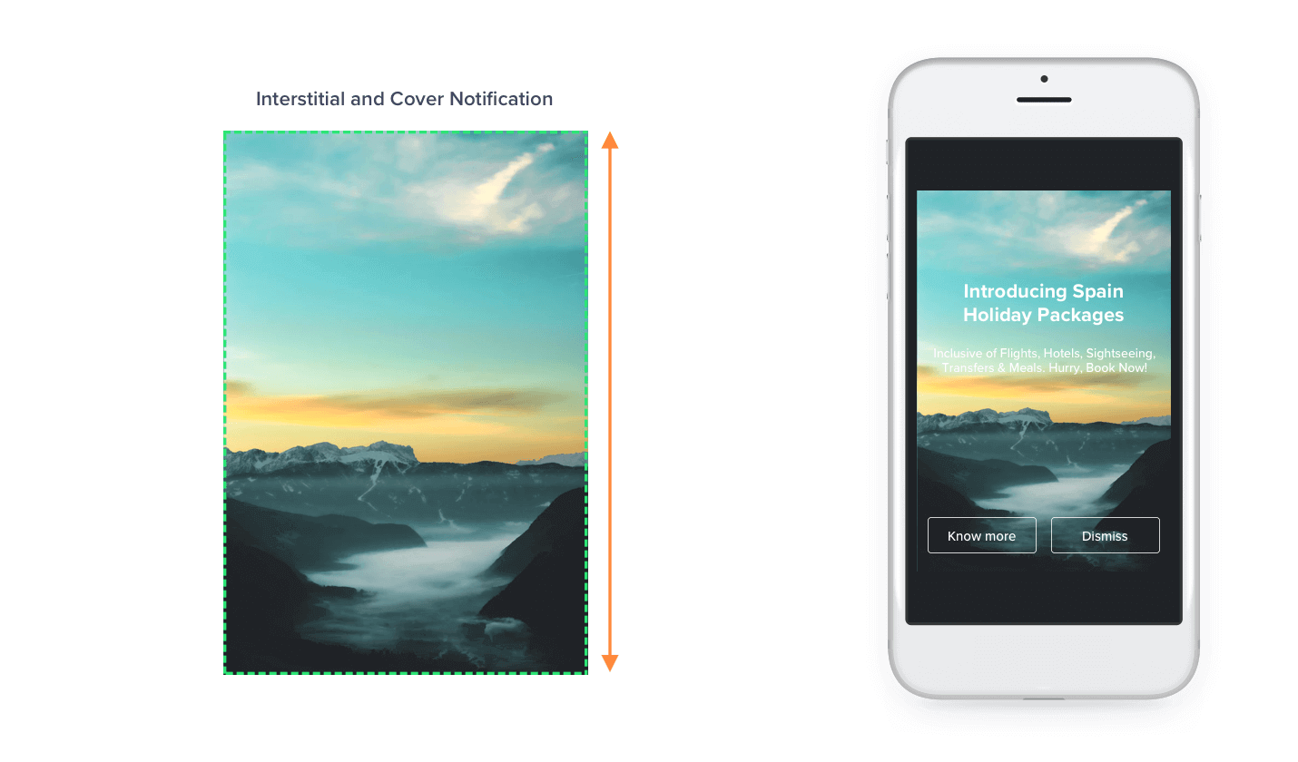
A portrait image within Interstitial and Cover notification templates
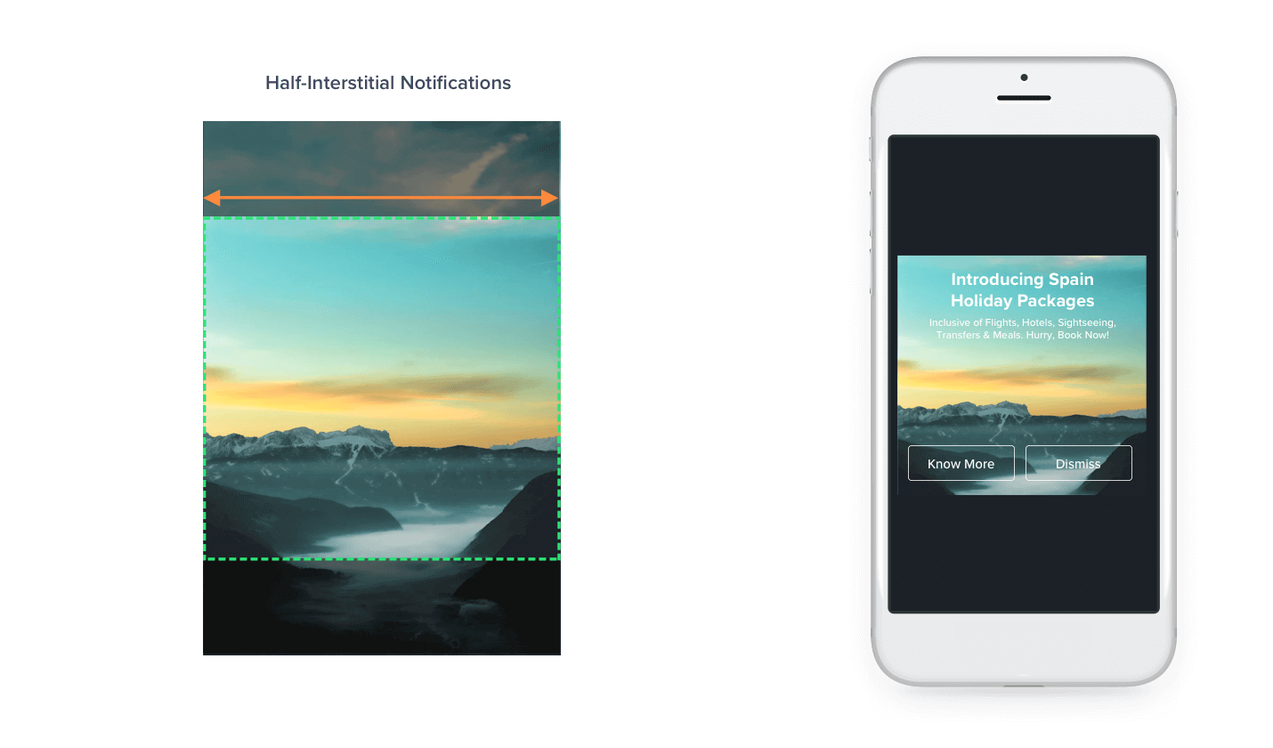
A portrait image within Half Interstitial notification templates

A portrait Image within Sticky notification templates
Using a square image
When using a square image the basic rule remains the same and the image cropping is dependent on the notification template selected. For Interstitial, Cover and Half Interstitial templates, the image will be made to fit to the height of the container and will be center-aligned cropping out the rest of the image. For the Sticky notification template, the image will fit to the width of the container, will be center-aligned and cropped. The following images show the rendering of the notifications when using square images.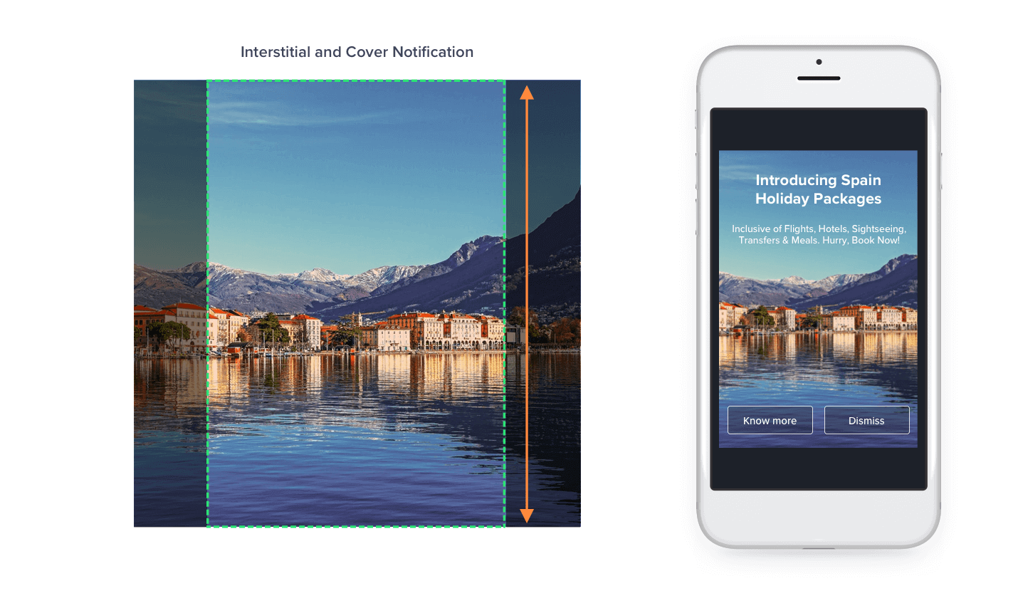
A square image within Interstitial and Cover notification templates
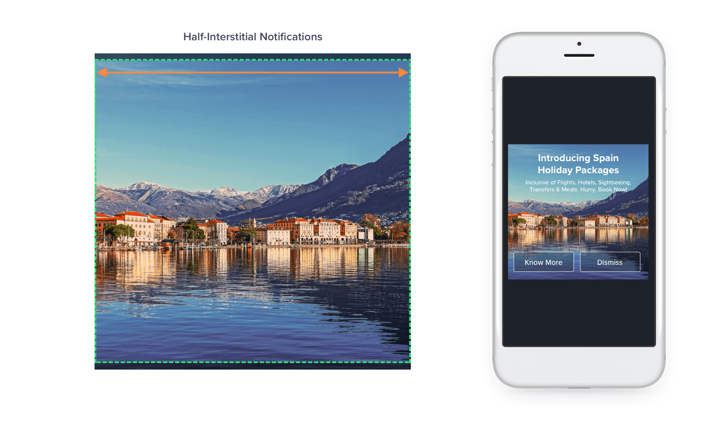
A square image within Half Interstitial notification templates
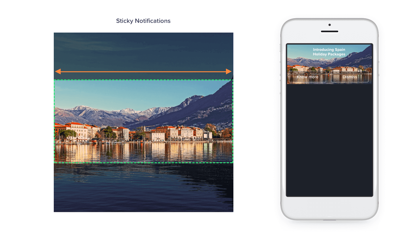
A square Image within Sticky notification templates
Using Text within In-App notifications
We’ve seen that any image used within in-app notifications will be center-aligned. If you have text as part of the image, it is advised that the text is in the center and hence won’t be cropped out.
However, a healthy tip is to avoid using a lot of text in an image and if text is needed then the CleverTap dashboard has a provision to add fully customizable text on top of your image while creating an in-app notification campaign. This ensures that all the text that the user should see is visible and not cropped out due to the different sizes of multiple devices.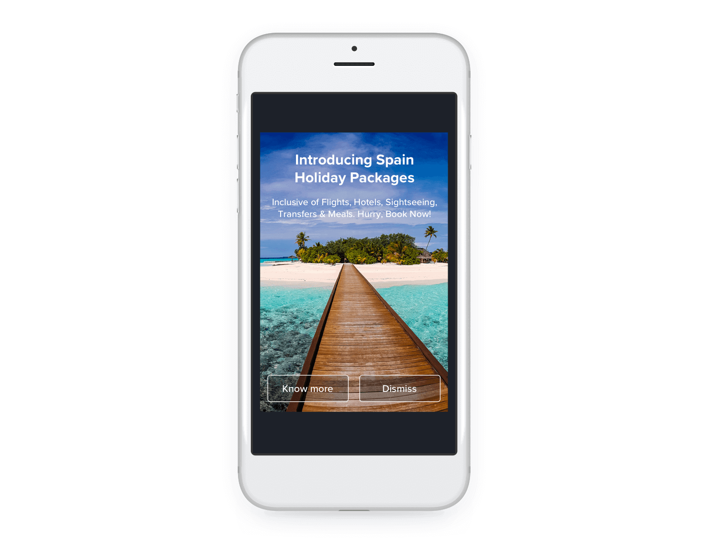
Fully customizable text through CleverTap dashboard
Advanced In-App notifications with Custom HTML
CleverTap also allows the use of custom HTML to be rendered in the in-app notification campaigns. If you are using a custom HTML of your choice, consider the template container as a web page where all text and images are top-left aligned. If you are using a background image in your HTML, the image will be aligned to start from the top-left of the container and hence you will have to add CSS styling to your HTML code to suit your requirements.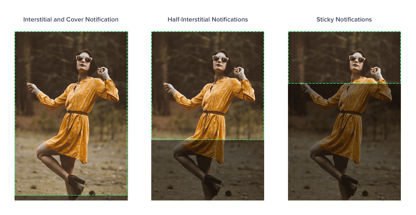
Using an Image tag in Custom HTML code on different templates
<p><img src="https://images.unsplash.com/photo-1491257380826-cb48ad840874?auto=format&fit=crop&w=2468&q=80" /></p>
<style type="text/css">
img {
   display: block;
   width: 100%;
}
p {
  margin: 0;
}
</style>
Sample HTML/CSS code
At the end of it, all we need to remember are the following 3 key points –
- While using an image, the basic rule is that the image will center-align and fit to the longest side of the container
- Avoid using text in your images, instead use the CleverTap dashboard to add fully customizable text on the top of your images
- While using custom HTML, the entire HTML rendered is top-left aligned.
Use this cheat sheet to know which kind of image is best suited for which template to create visually pleasing in-app notifications.
The Intelligent Mobile Marketing Platform
Darshan Pania 
Darshan Pania, Associate Director with 12+ years in mobile tech, SDKs, and Gaming. Leads CleverTap's Mobile SDK & LiveOps team, passionate about innovative tech solutions.
Free Customer Engagement Guides
Join our newsletter for actionable tips and proven strategies to grow your business and engage your customers.


