Every November, my mother-in-law gets an envelope from a charity organization complete with a bunch of address label stickers or generic Christmas cards, plus the perfunctory request for a donation.
She typically complains that she’s fed up receiving the same request year after year… but then she reaches for her checkbook.
When I tell her she can simply ignore the request, she shakes her head: “But they already gave it to me!” A day later, her check will be on its way to the charity.
Chalk it up to the successful use of marketing psychology!
To explain what compels her to donate to a charity she isn’t really passionate about – and to demonstrate how it can effectively help you drive user engagement within your app – we’ll refer to the six principles in Robert B. Cialdini’s seminal work Influence: The Psychology of Persuasion. Since its initial publish date in 1984, the book has become the standard starting point for those business owners and marketers who want to better understand consumer psychology.
The 6 Principles That Influence Consumer Behaviour
In his landmark book, Cialdini put forth six principles about how we all make decisions based on generalizations. And he shows how those generalizations can be exploited so that people can be influenced to take specific actions.
In a nutshell, the six principles are:
- Reciprocity: “I’ll do it because you already gave me something.”
- Social proof: “I’ll do it because everyone seems to be doing it too.”
- Commitment and consistency: “That’s so me, I’ll do it!”
- Authority: “I’ll do it because an expert said so.”
- Liking: “I’ll do it because I like you.”
- Scarcity: “I’ll do it because it’s my last chance.”

The Psychology of Insanely Addictive Apps
1. Reciprocity – We Give Tit for Tat
The idea: “I’ll do it because you gave me something already.”
Clearly, my mother-in-law fell for this strategy. She got free stickers or Christmas cards (although she didn’t ask for them), so she felt she had to donate back to the charity that spent money sending her these things.
See how Cialdini himself explains the principle in this 2-minute video:
Engagement Tip: Offer Something For Free
The simplest way to get people interacting with your app is to give them something that relates to your brand or your vertical.
- Give them free content: This is a tried-and-tested way to get people back into your app. Send them a push notification, email, or SMS message to give them a free ebook or a resource download that will answer a specific need of theirs. Offer them in-app freebies such as flair or themes for their profiles, or stickers. In return, you can ask users to rate or review your app. (Which nicely leads to principle number 2.)
- Give them a free upgrade: Offer them a free trial of your premium service and upsell them later on. Or give them a free upgrade in exchange for referring other users.
2. Social Proof – We Need to Belong to a Tribe
The idea: “I’ll do it because everyone seems to be doing it too.”
Social proof is one of those principles that is common enough in marketing that we need not go into detail here. Suffice to say: seeing proof that others are doing an action is enough for us to want to do it as well.
For example: if we see people on Facebook raving about the latest selfie camera app, we may be more inclined to check it out. Or if we read glowing book reviews on Amazon, we might order the ebook. There’s a built-in mechanism in our brains that makes us social animals craving to belong to a tribe. Doing what others are doing answers that craving.
Another curious fact that underscores the social proof in user reviews: the higher the ratings your app gets, the more people will download and install your app. Check out this graph from a 2016 Google I/O event: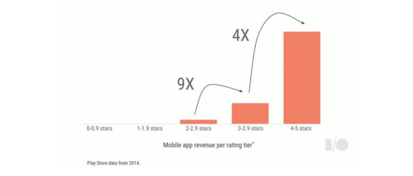
If your app’s score is above 3.0, it will garner 9x more downloads than if it falls below that score. And if your app’s score is 4 or 5, then you get 4x more downloads than if it were at 3.0 to 3.9.
Watch an animated explanation of the principle in this 2-minute video:
Engagement Tip: Share What Others Are Saying
If you want to use social proof to keep users engaged, then it’s as simple as taking every opportunity to show them what other customers are saying.
- Display user testimonials: Highlight those glowing 5-star reviews in your marketing materials. Show off testimonials not just on your app store listing, but also on your website, social media channels, and more.
- Show social engagement: If you have a sizable following on social media channels, display those follower numbers! This may influence new users to join the tribe.
- Display number of customers: It’s a standard feature on every website: showing off your number of customers/users/fans. Show off their logos! McDonald’s famously tells you they’ve served “billions and billions” of hamburgers. How many has your app served?
- What do experts say?: Show off any awards or honors your app has earned. Display statistics and research from credible sources such as analyst firms, scientific bodies, or professional associations. (This ties into principle 4: authority.)
3. Commitment and Consistency: We Decide Based on Self-Image
The idea: “That’s so me, I’ll do it!”
We routinely commit to making decisions that fit our self-image. Furthermore, once we make a small commitment, we tend to follow through and make bigger commitments in order to be consistent with that self-image.
Here’s an example of how our self-image leads us to make decisions consistent with that image:
- “I’m overweight.” (self-image) –>
- “I will take that free spin session at the gym.” (small commitment) –>
- “I’ve taken the free session, now I should sign up for an annual membership.” (larger commitment)
Which begs the question: do you know how your users view themselves? If not, you must spend the time and effort to find out. This self-image is crucial to understanding how your audience thinks and will be beneficial in leading them to their first conversion.
Engagement Tip: Reinforce Users’ Self-Image
If you want to use marketing psychology to get users to act, you need to know them inside out. What are their pains and what are their concerns? How does your app solve their pain?
- Learn the personas: User personas help you craft messaging that is both relevant and consistent (there’s that word again). Now you can write email subject lines, push notifications, or in-app messages that resonate with their experience, reinforce their self-image, and influence their consumer behaviour.
Engagement Tip: Start Small & Ramp Up
One small commitment from a user can be the stepping stone to bigger commitments down the road. Here’s more consumer psychology to speed up that process:
- Ask for one small action: Whether it’s a simple “Follow us on Twitter” or “Create a profile”, ask users to complete one simple action up front.
- Build a multi-channel nurture campaign: Lead users from the initial commitment down to a real conversion over several steps. Next actions could be: complete your profile, fill out your preferences, etc.
4. Authority: We Do What We’re Told
The idea: “I’ll do it because an expert said so.”
It’s human nature to want to follow, especially if a leader or authority figure has a message or an agenda we respect. Cialdini cites examples from history of authority figures who’ve made people do horrible acts, exploiting this follower tendency.
Authority figures, therefore have the power to influence people toward action, whether good or bad. And since your brand is the only authority within your app, you should be telling them what to do.
Engagement Tip: Teach New Users the Ropes
You have to onboard your users properly. Teach them how to begin using the app, and how to best make use of it.
- Show only the simplest function first: Introduce your users gradually. Don’t give them every single feature up front!
- Use notifications to teach them the rest: The second time a new user launches your app, show them some notifications. When they click on it to clear the alerts, show them more about how to use the various app functionalities.
- Make things easy: If, for example, you’re going to show users how to share a file on your messaging app, it’d be easier if you’ve already pre-created a fictitious user for them.
5. Liking: Who We Like Influences Us
The idea: “I’ll do it because I like you.”
It’s human to be influenced by those people we’re attracted to, or in a marketing sense, those brands we feel loyalty towards.
A real example: my wife’s family are all diehard Honda fans who have bought or leased nothing but Hondas in the past 20 years. So when they receive the annual brochure announcing new models, they always look through it to determine whether they need (or want) to upgrade.
Engagement Tip: Be Delightful, Be Likable!
There are many ways to become a more likable brand. It can be as simple as changing the tone of your communication, or it can be as complicated as giving your brand an entire design makeover. Some tips:
- Make your app fun: There are so many ways to make things fun no matter what industry you’re in. One suggestion: use game mechanics to spur engagement! Indicate progress (“Your profile completion: 85%”), or create levels of usage (“You’re now a productivity ninja!”). Hide easter eggs or special prizes within your app that will surprise and delight your most hardcore users.
- Look for low points in the customer journey: Use a tool like CleverTap’s Flows to find out where your users tend to drop off. What set of actions do they take before they uninstall? When you know what these actions are, sequence a positive experience in place of the low points. (Think Hotel apps showing users a coupon for a free breakfast, instead of showing them the bill for their reserved booking.)
- Cut the jargon: Whether you’re sending an email or a push notification, let your tone be conversational. Cut down on business jargon that might alienate you from your customers. Write like you’re meeting a friend over coffee.
- Show the world you’re helpful: Be friendly and helpful in all your communications and show people that you want to help your users out, whether that’s on Twitter or in the comments section of your app store listing.
- Be human: You may be a brand with millions of followers, but that doesn’t mean you can’t connect on a human level with your users. You can be funny and sympathetic as well. Create campaigns around special holidays, use funny GIFs, and use emojis to boost engagement!
- Redesign your visuals: Go over every design element in your app – from UI and UX to your app logo, email headers, social media profile images, down to app store screenshots. Would *you* be attracted to install your own app? The idea is to let every visual asset give the user a feeling of delight, excitement, friendliness, warmth, and humanity.
6. Scarcity: We React to Urgent Deadlines & Dwindling Supplies
The idea: “I’ll do it because it’s my last chance.”
How many times have you clicked on an online deal because of the phrase “while supplies last” or “limited time only?”
I’m betting we’ve all fallen prey to this perceived scarcity creating a sense of urgency within us. The limited availability of something we want generates an increased demand. Even the slightest perception that something is scarce will move us to act immediately or face the consequence of missing out on a great deal.
Engagement Tip: Show Timers & Deadlines
In the same way, we can use scarcity to propel our users to accomplish an action that leads to conversion or at the very least, engagement. Some examples:
- Discounts: Create price deals that last for a limited time, whether this means making a purchase on your app, or signing up for a promotion.
- Use countdown timers: We’ve all seen the countdown timers on Amazon ticking away the seconds before the deal disappears. Display it and place that urgency right in your users’ faces.
- Display units remaining: For events or physical goods, you can display a specific number of units or reserved seats remaining. This is one reason why travel apps always show “Only X seats left” when you’re trying to book an airline ticket.
Use These Marketing Psychology Principles Responsibly
Now that you know Robert Cialdini’s six principles of influence, you have an arsenal of tactics you can use to persuade users to engage. Just remember that it is your duty as an ethical mobile marketer to use these principles responsibly.
Don’t exploit them in the short run for profit and dispense them when you’re done. Play the long game and persuade your users toward action while building true loyalty for – and engagement with – your brand.
Read More
- Ebook: The Psychology of Insanely Addictive Apps
- What is Personalization in Marketing?
- Cyberpsychology and UX: What motivates your users?

The Psychology of Insanely Addictive Apps
Shivkumar M 
Head Product Launches, Adoption, & Evangelism.Expert in cross channel marketing strategies & platforms.
Free Customer Engagement Guides
Join our newsletter for actionable tips and proven strategies to grow your business and engage your customers.


