Learn how you can Unlock Limitless Customer Lifetime Value with CleverTap’s All-in-One Customer Engagement Platform.
Cohort Analysis is a way of grouping users who perform a certain event in your app and tracking their behavior over time. Cohorts are commonly used to understand user retention or churn by measuring how long it takes users who have launched your application to come back and launch it in a subsequent time. With the flexibility we provide, you are able to create a cohort of users based on any event in your system and measure the time it takes them to perform any other subsequent event – for example:
In our latest release we’ve added the ability to trend and compare cohorts so you can quickly isolate usage patterns and behaviors in your data.
Let’s say we want to analyze users who have launched your app and then went on to make a purchase. Under Cohorts you’ll select a First Event (App Launched) and a Return Event (Charged).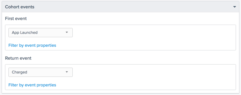
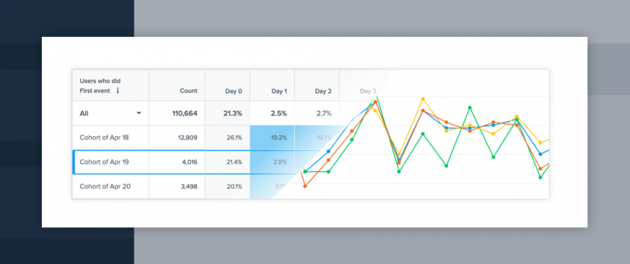
The corresponding Cohort Table for a Daily View looks like: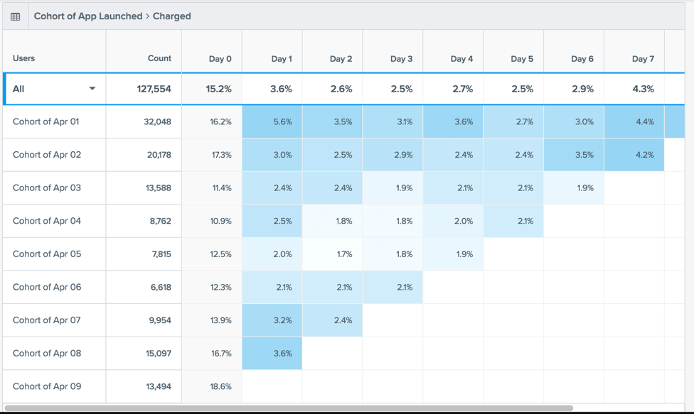
Each Row in the Table represents a cohort of users with the average of all the rows shown at the top labeled “All.”
For example:
The tabular view is great – but we’ve added a trend view where you can select individual cohorts (rows) and trend them side by side so you can see if you are improving desired behavior over time.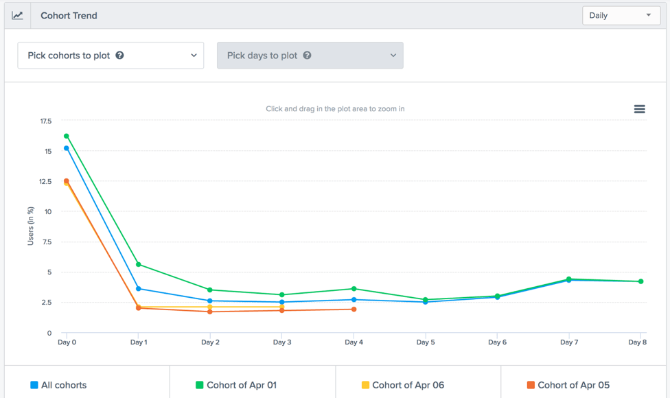
Another way to analyze your data is to look across cohorts – the columns in the cohort table above. Each column signifies how many users came back and did the Return Event on that particular Day, Week or Month.
Analyzing across cohorts lets you answer questions such as:
With the addition of Trending and Comparing across cohorts you can readily see such patterns in your data. For Day 1 and Day 2 below, we readily see that our retention rate is gradually improving across the Apr 06, 07 and 08 cohorts of users. So with each subsequent day (a new cohort of users) I’m improving my retention.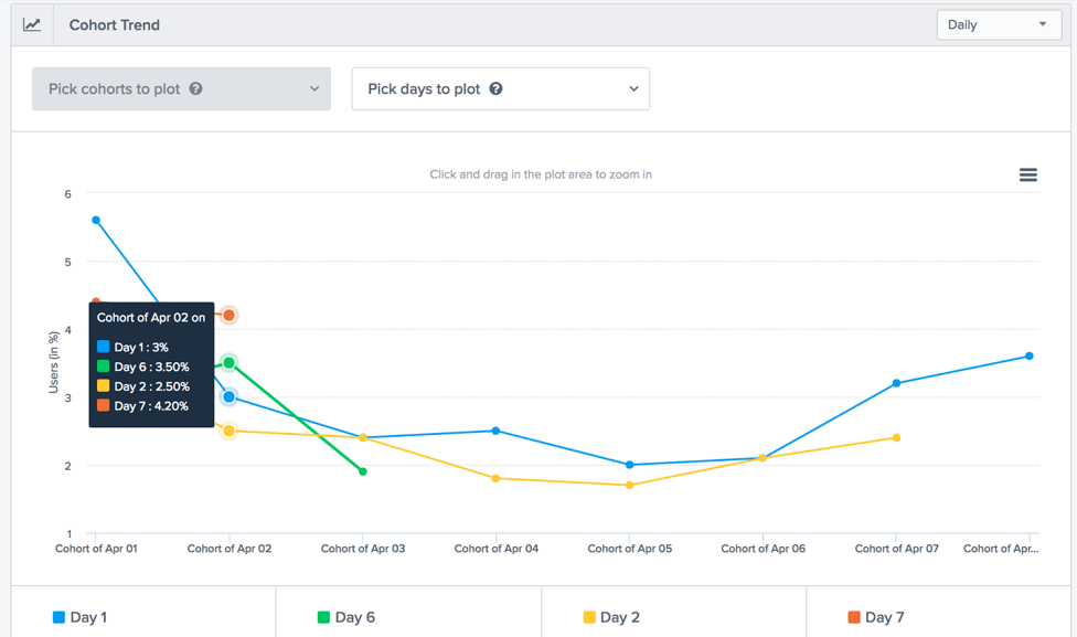
Trending and comparing are live the Dashboard today.
Here are some resources to help you understand and use cohorts better:
1. How to use cohort data to analyze user behavior
2. How to Use Cohort Analysis to Improve Customer Retention
3. Data Driven marketing – Cohorts
4. How to conduct cohort and segment analysis
5. Cohort Analysis: The Key to Improving User Retention for Your App
Make your apps smarter